Captions Design System
Captions' design system as a DESIGN.md file. Exposure serif headings, DenimINK body, 24 colors tokens, 17 components for React and AI tools.
Add shadcn.io to your AI agent. · Pro It installs blocks, icons and templates in your design system from a prompt, with Pro.
Set up MCP- Primary
- #1d1f20
- Typeface
- DenimINK
- Shape
- Soft
- Base radius
- 12px
- Colors
- 24
- Type tokens
- 11
- Components
- 17
- Spacing values
- 11
About
About Captions DESIGN.md
Curated by Dov Azencot · Updated May 13, 2026 · Source captions.ai (opens in a new tab)
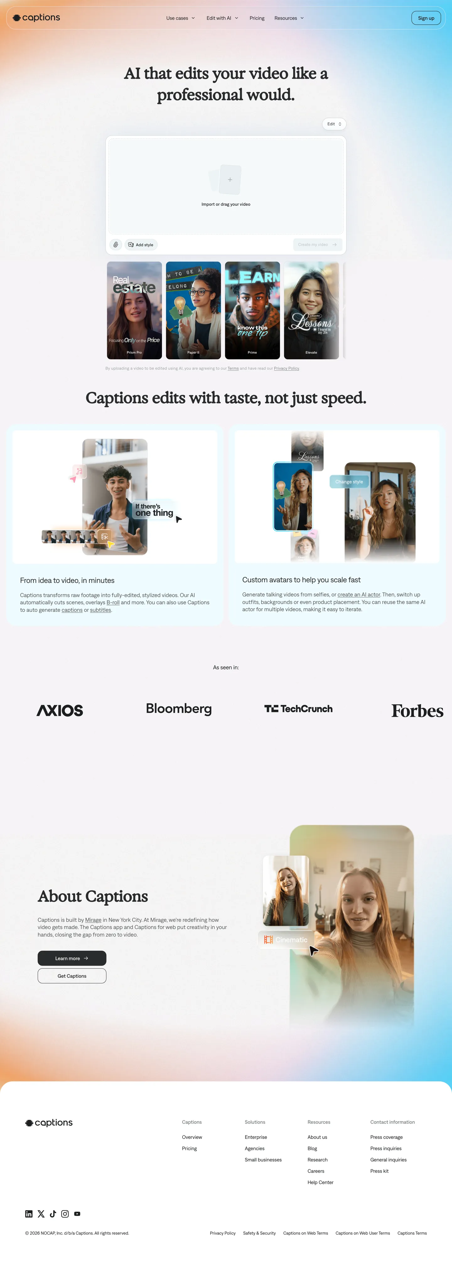
Captions is the AI video editor that promises to edit footage "like a professional editor would," and its marketing page wears that claim as a discipline rather than a slogan. The canvas is white "#ffffff". Display headings run Exposure, a serif, at 48px with -0.48px tracking and a stretched 67.68px line-height on the hero — the typographic equivalent of a film title sitting above a poster. Everything else — body, nav, button, footer, legal — is set in DenimINK, a custom sans, at 11–18px in weights 400 and 500. The only colors the page actually renders are charcoal "#1d1f20" (429 occurrences as text and border), a sequence of gray-200 through gray-950 neutrals, and white. Where most AI tools shout with gradients, Captions stays quiet so the AI-edited video thumbnails carry the saturation.
This DESIGN.md packages that discipline into Google Labs' machine-readable format. Inside: 24 colors tokens — split between a structural stack (charcoal, four gray steps, two off-white surfaces, hairlines) and a brand stack of 14 declared but unused-in-chrome accents (violet "#6c4df7", sea "#00d0ff", meadow "#5bf6bb", barbie-pink "#ff1476", mustard "#ffdd33", peach "#ffca9f", sunset "#f99f3f", and seven more), all of which live in CSS custom properties for use inside video preview chrome. Thirteen typography tokens map the Exposure/DenimINK split. Five radius tiers cluster around 12px. Sixteen spacing values, an Exposure-fronted hero/h2 pair, and 17 components recipes covering the pill-shaped sign-in badge, primary CTA, hero composer card, navigation, footer columns, and trust-bar logos.
Drop the file into Claude, Cursor, or Copilot and the agent will reproduce the two-family split — Exposure only on h1/h2, DenimINK on everything else — rather than collapsing to a single sans. Or reference the tokens directly: every hex, weight, tracking value, and 12px radius is a quoted string you can paste into Tailwind config or CSS variables. The system is worth studying because it answers an unusual question in the AI category: when the product generates colorful content, the marketing chrome should not.
What makes it distinct
5
- Two-typeface splitExposure serif for h1/h2 display only, DenimINK sans for every other role across the page
- Inverted palette economy24 vivid brand hexes live in CSS variables but render zero times in chrome; saturation is reserved for video content
- 12px radius as the system constant64 of 76 rounded surfaces use 12px, with 9999px pills appearing only twice on nav badges
- Display headings at 48px serif with -0.48px trackingfilm-poster compression rather than the SaaS 700-weight muscle move
- Charcoal ink #1d1f20 carries 429 occurrences as text and borderthe only color the interface actually wears
captions.ai
Live at captions.ai
A snapshot of the brand in production. Scroll the frame to see the whole page.
Colors
24 colors
Captions's system runs on #1d1f20 as its primary voltage, used in 9 of 17 components. Type is set in DenimINK across 11 tokens from 11px to 48px, weights 400–500. Shape language is soft — components average 13px corner radius, with no sharp interactive edges.
Text
Headlines, body, captions · 2
Semantic
Status, errors, success, links · 1
Other
Specialty colors · 21
Typography
11 type tokens
Set in DenimINK across 11 tokens, from 11px to 48px, weights 400–500. Shown in its own stack: where the font isn't installed, the fallback the file names stands in.
- display-hero48px · weight 400 · lh 67.68px · tracking -0.48pxThe quick brown fox jumps over the lazy dog
- display-section48px · weight 400 · lh 48px · tracking -0.48pxThe quick brown fox jumps over the lazy dog
- heading-card24px · weight 400 · lh 24px · tracking -0.24pxThe quick brown fox jumps over the lazy dog
- body-lg18px · weight 400 · lh 23.4pxThe quick brown fox jumps over the lazy dog
- body-md16px · weight 400 · lh 24pxThe quick brown fox jumps over the lazy dog
- body-md-medium16px · weight 500 · lh 24pxThe quick brown fox jumps over the lazy dog
- body-sm14px · weight 400 · lh 18.2pxThe quick brown fox jumps over the lazy dog
- label-md14px · weight 500 · lh 24px · tracking 0.14pxThe quick brown fox jumps over the lazy dog
- caption13px · weight 400 · lh 18px · tracking 0.3pxThe quick brown fox jumps over the lazy dog
- caption-medium13px · weight 500 · lh 18px · tracking 0.3pxThe quick brown fox jumps over the lazy dog
- micro11px · weight 500 · lh 16px · tracking 0.22pxThe quick brown fox jumps over the lazy dog
Layout
Radii and spacing
7 corner radii and 11 spacing values. Shape language: soft.
Radii
- none0px
- sm8px
- md12px
- lg15px
- xl20px
- composer30px
- full9999px
Spacing
- xxs4px
- xs6px
- sm8px
- md12px
- base16px
- lg18px
- xl24px
- 2xl30px
- 3xl40px
- 4xl60px
- 5xl80px
Components
17 components
Each rendered from its tokens (color, type, radius, padding) on Captions's own canvas.
- Top Navtop-navTop Nav
- Nav Linknav-linkNav Link
- Nav Signin Badgenav-signin-badgeNav Signin Badge
- Button Primarybutton-primaryButton Primary
- Button Primary Activebutton-primary-activeButton Primary Active
- Button Secondarybutton-secondaryButton Secondary
- Hero Headinghero-headingHero Heading
- Section Headingsection-headingSection Heading
- Composer Cardcomposer-cardComposer Card
- Thumbnail Cardthumbnail-cardThumbnail Card
- Feature Cardfeature-cardFeature Card
- Body Paragraphbody-paragraphBody Paragraph
- Trust Logotrust-logoTrust Logo
- Legal Notelegal-noteLegal Note
- Footer Columnfooter-columnFooter Column
- Footer Linkfooter-linkFooter Link
- Micro Labelmicro-labelMicro Label
In use
The system, in use
Captions's tokens on the kind of product it builds.
Build something people actually use.
A short paragraph of marketing copy that previews how the brand's display tier and body tier read together. Two sentences is usually enough.
FAQ
Captions design system FAQ
Common questions about Captions's tokens, components, and how to use this DESIGN.md in your project.
Read next
Related reading
Specs, directories, and component libraries that pair with this design system.
- Browse all design systemsThe full directory of DESIGN.md files on shadcn.io, with live mockups for each.shadcn.io
- Captions — official siteThe AI video editor that edits like a professional editor — generate, caption, and ship video from one composer.captions.ai (opens in a new tab)
- The DESIGN.md specificationGoogle Labs' open spec for machine-readable design system files — the format this page is built on.github.com (opens in a new tab)
Use it
Use Captions in your project
One machine-readable file. Drop it into Claude, Cursor, or any AI tool that reads DESIGN.md.
Download the DESIGN.md
One machine-readable file: every color, type, radius, spacing, and component token of Captions.
Feed it to your AI tool
Drop it into Claude, Cursor, or GitHub Copilot. The agent writes React components and Tailwind classes that match Captions's visual language.
Reference the tokens directly
Or paste the values into your Tailwind config, CSS variables, or component library: every color, size and radius is a quoted, ready-to-copy value.
Read the full DESIGN.md: overview, rationale, do’s and don’ts
Overview
Captions' page is built around an unusual two-family typographic split that does the entire job of brand differentiation. Exposure-on-display, DenimINK-on-everything-else: the serif Exposure is reserved exclusively for h1 and h2 (both at 48px, weight 400, letter-spacing "-0.48px"), and the custom sans DenimINK carries every other text role from the 18px paragraph down to the 11px metadata at letter-spacing "0.22px". Where most AI-product marketing sites pick a single sans and lean on weight to create hierarchy, Captions creates hierarchy through family contrast — and reserves bold weights almost entirely (the body sits at weight 400, with 500 used only on label-md and the nav sign-in badge).
The chrome itself is near-monochrome. Inverted palette economy: the stylesheet declares 14 vivid brand hexes — violet {colors.violet} ("#6c4df7"), sea {colors.sea} ("#00d0ff"), meadow {colors.meadow} ("#5bf6bb"), barbie-pink {colors.barbie-pink} ("#ff1476"), mustard {colors.mustard} ("#ffdd33"), and nine more — yet none of them render in the page chrome at all. Charcoal {colors.charcoal} ("#1d1f20") accounts for 429 of the page's rendered color occurrences (215 as text, 214 as border); white "#ffffff" carries the canvas with 91 occurrences. The vibrant tokens are pre-staged for the product app and for video thumbnails, not the marketing surface.
Geometry resolves around a single number. The 12px radius ({rounded.md}) appears 64 times on the page — on thumbnail cards, feature cards, sticker overlays, and the body of every CTA-adjacent surface. Pill geometry {rounded.full} ("9999px") is used twice and only on the small sign-in badge in the top navigation. The composer card itself jumps to 30px ({rounded.composer}) — the only place the system widens its corners to acknowledge that an input area needs visual softness. Unlike the convention of stacking three or four radius tiers across a single layout, Captions commits hard to 12px and uses scale-deviation as a rare deliberate signal.
Colors
The palette splits cleanly into two layers — what the chrome wears and what the product paints.
Structural ink and surfaces (rendered in chrome)
- Charcoal (
#1d1f20) — frequency 429. Used as text (215), border (214). The system's load-bearing color — every primary text block, every hairline, every nav label. Bound to CSS variables--color-gray-900and--color-charcoal. - White (
#ffffff) — frequency 91. Used as bg (48), text (21), border (21). The canvas; also the nav badge surface and the composer card fill. Clustered with near-whites#f5f9fa(bone) and#effbff(air). - Gray-600 (
#595e5e) — frequency 32. Used as text (16), border (16). Secondary text and footer link color; the system's "muted but legible" tone. - Gray-800 (
#2a2c2d) — frequency 24. Used as text (12), border (11). The hero h1 and h2 colors specifically — slightly lighter than charcoal so the serif headlines read warm rather than printed. - Gray-200 (
#d0d6d7) — frequency 24. Used as shadow (22), border (2). Bound to--color-medium-gray; the soft drop tone under composer cards. - Black (
#000000) — frequency 23. Used as gradient (20), border (1), text (1), shadow (1). Reserved for gradient stops on hero overlays and badge strokes — never as flat text. - Gray-500 (
#7e8486) — frequency 12. Used as text (6), border (6). Body paragraph text under feature cards. - Gray-100 (
#eef4f6) — frequency 5. Used as bg (5). The "pressed" surface variant; also the primary button rest fill. - Gray-400 (
#9fa5a7) — frequency 4. Used as text (2), border (2). Disclaimer and legal-note color. - Gray-300 (
#bec3c6) — frequency 4. Used as text (2), border (2). The disabled button border and label. - Gray-150 (
#dfe5e7) — frequency 0 on the captured viewport; declared as--color-gray-150and reserved for soft hairlines. - Gray-950 (
#141515) — declared as--color-gray-950; used in product chrome. - Gray-700 (
#434647) — declared as--color-gray-700/--color-dark-gray; reserved for darker body text.
Brand voltage (declared, not rendered in chrome)
- Violet (
#6c4df7) — Bound to--color-violet. Reserved for product accents and sticker overlays — appears zero times in the marketing chrome. - Sea (
#00d0ff) — Bound to--color-sea. A bright cyan held back from chrome use. - Meadow (
#5bf6bb) — Bound to--color-meadow. Mint accent reserved for video preview chrome. - Sky (
#a6ecff) — Bound to--color-sky. A lighter cyan companion to sea. - Mustard (
#ffdd33) — Bound to--color-mustard. The yellow of caption stickers, not nav badges. - Sunset (
#f99f3f) — Bound to--color-sunset. Warm orange held in reserve. - Peach (
#ffca9f) — Bound to--color-peach. A softer skin-tone-adjacent fill. - Barbie-pink (
#ff1476) — Bound to--color-barbie-pink. The hottest accent in the file — and it is genuinely absent from chrome. - Pink (
#ff9bb2) — Bound to--color-pink. The softer companion.
Frequency narration tier note: every vibrant token sits at the "absent" tier on the rendered surface — and the absence is the design move. The product paints in those colors; the page that sells the product does not.
Typography
Captions ships two custom families. Exposure is a serif, used exclusively on h1 and h2 — both at 48px, weight 400, letter-spacing "-0.48px". The hero h1 stretches its line-height to 67.68px (1.41x ratio) for a poster-like vertical presence; the section h2 collapses to 48px line-height (1.0x ratio) for tighter section markers. DenimINK is a custom sans, used on everything else — paragraphs at 18px / 14px / 13px, buttons at 16px, micro labels at 11px. The family-contrast carries hierarchy that other systems would assign to weight.
The DenimINK scale is unusually narrow on weight. Weight 400 is the default for paragraph copy, captions, body links, and micro labels; weight 500 appears in only four places — the 16px medium body, the 14px label, the 13px caption-medium, and the 11px micro. There is no weight 600 or 700 anywhere on the page. Whispered authority: the brand chooses to land its emphasis with serif/sans family contrast rather than weight muscle, which is the move that gives the page its understated voice.
Letter-spacing is positive at the micro end of the scale and negative at display. The 11px micro label runs "0.22px" tracking; 13px caption-medium runs "0.3px"; 14px label runs "0.14px". Above 24px the spacing flips negative: 24px heading at "-0.24px", 48px display at "-0.48px". The scale crosses zero around the body-md size, where DenimINK runs at "normal" — neutral spacing for the long-paragraph workhorse.
Layout
Spacing system
Captions runs an 8px-based scale with a 6px micro step and generous section gaps. Tokens: {spacing.xxs} 4px · {spacing.xs} 6px · {spacing.sm} 8px · {spacing.md} 12px · {spacing.base} 16px · {spacing.lg} 18px · {spacing.xl} 24px · {spacing.2xl} 30px · {spacing.3xl} 40px · {spacing.4xl} 60px · {spacing.5xl} 80px. The dominant block padding is 30–40px on composer cards and 60–80px between marketing sections.
Grid and container
--container-max-width is set to 1440px, the captured viewport width — wide but not cinema-wide. The hero centers a single Exposure h1 above a 705px-wide composer card; below the fold, a two-column "edits with taste, not just speed" band pairs a video preview with a body paragraph at roughly equal weight. The trust bar (AXIOS, Bloomberg, TechCrunch, Forbes) runs horizontally across the full container at 80px vertical padding.
Whitespace philosophy
The hero alone uses 200px top padding to push the h1 down from the nav, an unusually generous breathing band. Section-to-section padding sits at 60–80px. Inside cards the rhythm tightens — 24–30px interior padding — creating a contrast between expansive marketing-section air and compact content-card density. This is the deliberate inverse of a typical SaaS site, which packs marketing sections tight and pads its components heavily.
Elevation and Depth
Captions uses shadow-as-hairline: rather than dropping a heavy 0 12px 24px rgba(0,0,0,0.12) under cards, the system layers gray-200 {colors.gray-200} ("#d0d6d7") as a soft drop with low blur — 22 of the page's 23 shadow occurrences use this single tone. The result is depth so faint it reads more as a vignette than a shadow.
| Level | Treatment | Use |
|---|---|---|
| Flat | No shadow, no border | Body sections, nav, hero copy |
| Hairline | 1px solid {colors.gray-150} | Composer card, thumbnail cards, nav sign-in badge |
| Soft drop | 0px 0px 14px {colors.gray-200} | Composer card hover state, sticker overlays |
| Gradient overlay | Linear {colors.black} to transparent | Video preview thumbnails — 20 of 23 black occurrences are gradient stops |
Where most AI-product marketing pages drop heavy shadows under hero composers to suggest tactile depth, Captions keeps the composer card flat-with-hairline and lets the rounded corner do the lifting.
Shapes
The corner-radius philosophy is one-number commitment. The 12px radius ({rounded.md}) appears 64 times across the page — every thumbnail card, every feature panel, every CTA-adjacent surface. The other tiers are deliberate deviations:
| Token | Value | Where it appears |
|---|---|---|
{rounded.none} | "0px" | Body grid, hero heading container |
{rounded.sm} | "8px" | Primary CTA button only |
{rounded.md} | "12px" | 64 surfaces — the system constant |
{rounded.lg} | "15px" | Three softer image plates |
{rounded.xl} | "20px" | Prompt input |
{rounded.composer} | "30px" | The hero composer card — the system's softest geometry |
{rounded.full} | "9999px" | Twice only — the nav sign-in badge |
The composer card's jump to 30px is the system's softest geometry and a deliberate signal: this is where the user types, so the corners widen to invite input.
Components
Navigation
top-nav — Transparent over white canvas at 44px height. Houses three nav links and one pill-shaped sign-in badge.
nav-link — DenimINK at 16px / weight 400 in charcoal. No underline, no hover-color shift on the rendered state — {colors.charcoal} ("#1d1f20") is the only color the link wears.
nav-signin-badge — The only {rounded.full} pill in the system. White fill with a 1px gray-200 stroke and DenimINK at 16px / weight 500. Used twice (sign-in and sign-up) at the right edge of the nav.
Buttons
button-primary (rest) — {colors.gray-100} fill with {colors.gray-300} text and a matching 1px border, 8px radius, 40px height. The disabled-looking rest state is a deliberate "type your prompt first" cue.
button-primary-active — {colors.charcoal} fill with white text once the prompt input has content. Same geometry, no border. The activation is the only color shift the button performs.
button-secondary — Transparent fill, charcoal text, 1px gray-200 border, 8px radius. Used in the footer and dialog secondary actions.
Hero and Headings
hero-heading — Exposure at 48px / weight 400 / line-height 67.68px / "-0.48px" tracking in {colors.gray-800} ("#2a2c2d") — a notch lighter than charcoal so the serif reads warm. 200px top padding pushes the headline well below the nav.
section-heading — Same Exposure family at 48px, but line-height collapses to 48px (1.0x) for compact section markers like "Captions edits with taste, not just speed."
Cards
composer-card — The hero's central surface. White fill, gray-150 hairline, 30px radius ({rounded.composer}), 24px interior padding. The widest corner in the system.
thumbnail-card — Video thumbnails below the hero. White fill, gray-150 hairline, 12px radius ({rounded.md}).
feature-card — The two-column "edits with taste, not just speed" band uses {colors.gray-100} ("#eef4f6") fill, 12px radius, 30px interior padding. The page's only colored surface that isn't pure white.
Body and Legal
body-paragraph — DenimINK at 13px / weight 400 / "0.325px" tracking in {colors.gray-400} ("#9fa5a7"). The same tone is reused for legal disclaimer text, deliberately under-saturated.
legal-note — A muted variant of body-paragraph used directly below the composer ("By uploading a video to be edited using AI, you are agreeing to our Terms…"). Same DenimINK at 13px in gray-400.
Trust Bar and Footer
trust-logo — AXIOS, Bloomberg, TechCrunch, Forbes wordmarks rendered in charcoal on the white canvas at 80px vertical padding. No grayscale washing — the logos sit at their native press-release weight.
footer-column — White fill, 40px vertical padding, DenimINK at 14px / weight 400. Stacked into four columns under the page band.
footer-link — {colors.gray-600} ("#595e5e") DenimINK at 14px. Subdued.
Micro
micro-label — 11px DenimINK at weight 500 with "0.22px" positive tracking. The smallest text role in the system, used 20 times for category badges and metadata.
Do's and Don'ts
Do scope Exposure to h1 and h2 only. Once Exposure leaks into card titles (24px heading-card uses DenimINK at "-0.24px" tracking, not Exposure), the family-contrast that carries the brand collapses.
Do keep buttons in the 8px radius lane. The 12px system-constant radius applies to cards and surfaces; buttons specifically drop to 8px ({rounded.sm}) — a deliberate scale split that signals "interactive at a smaller-corner cadence."
Do treat the vibrant palette as product-only paint. Violet, sea, meadow, mustard, barbie-pink, and the rest are declared in CSS variables for in-product use (caption stickers, video overlays, thumbnails). The marketing page renders zero occurrences of them — keep that absence intact.
Don't use #000000 as flat text. Black appears 23 times on the page, but 20 of those are gradient stops on video thumbnail overlays. Flat text uses {colors.charcoal} ("#1d1f20") or {colors.gray-800} ("#2a2c2d") instead — pure black would read harsh against the warm-charcoal hero headlines.
Don't stack DenimINK weights to create hierarchy. Weight 500 appears only on label-md, the medium-body link, the medium caption, and the micro label. There is no weight 600 or 700 in the system — reaching for them re-introduces the SaaS muscle move the brand chose to avoid.
Don't widen all card corners to match the 30px composer. The composer's {rounded.composer} is a one-off softness signal for the input area; thumbnail cards stay at 12px. Widening every card collapses the deliberate contrast.
Don't use the {rounded.full} ("9999px") pill outside the nav sign-in badge. It appears twice on the entire page, both times on the small auth badge. Applying it to CTAs or chips re-introduces a SaaS shape language the brand specifically refuses.
Known Gaps
- In-app composer chrome: the timeline, layer panel, generation controls, and export dialog live behind authentication and aren't represented in this DESIGN.md.
- Hover and focus deltas: the button rest-to-active state shift (gray-100 → charcoal fill) is captured, but micro-hover transitions on cards and nav links are subtle enough that exact opacity and color deltas aren't reliably extractable from a static capture.
- Form validation states: error chips, helper text colors, and disabled input treatments aren't visible on the captured marketing surface.
- Vibrant palette in-product usage: the 14-token brand stack (violet, sea, meadow, barbie-pink, mustard, sunset, peach, pink, sky, and others) is declared but renders zero times on the page; exact usage patterns inside the product app aren't documented here.
- Dark mode: the marketing surface is light-only. The CSS variable structure suggests a dark theme could be supported, but no dark-mode tokens are paired in the captured CSS.
- Animation timing: the marketing page's scroll-triggered reveals and composer-card micro-interactions aren't captured — only static rest states.
AI & LLM Platforms
More systems like this
More DESIGN.md files in AI & LLM Platforms.
Pricing
Build it with Pro
The DESIGN.md files are free. Pro adds 6,000+ blocks, premium templates and the MCP server, so your AI editor builds in your system for you.
4.9/5 out of 5 · 150+ reviewsfrom 150+ founders and developers.
Billing
Billed once a year in USD. Cancel anytime.
- How many people can use the license.
- Client work, SaaS products and anything you charge for.
- Production-ready React sections: hero, pricing, features, dashboards and more.
- Complete multi-page sites you can ship as they are.
- React icons from every major library, installable with one command.
- Presets that restyle every block, in light and dark.
- Lets your AI editor search, preview and install blocks for you.
- Priority requests are answered first.
Individual
For personal projects & open source
$32instead of $49/mo
$389 billed yearly
- Seats: 1 seat
- Commercial use: Personal & open source only
- Pro blocks: 6,000+ blocks
- Templates: All 14 templates
- React icons: 294k+ icons
- Themes: All 59 themes
- MCP server: Basic usage
- Support: Standard
Team
Most popularFor freelancers, agencies & startups
$66instead of $99/mo
$789 billed yearly · ≈ $13/dev/mo
- Seats: Up to 5 seats
- Commercial use: Included
- Pro blocks: 6,000+ blocks
- Templates: All 14 templates
- React icons: 294k+ icons
- Themes: All 59 themes
- MCP server: High usage
- Support: Priority
Organization
For companies with larger teams
$132instead of $199/mo
$1,589 billed yearly
- Seats: Unlimited seats
- Commercial use: Included
- Pro blocks: 6,000+ blocks
- Templates: All 14 templates
- React icons: 294k+ icons
- Themes: All 59 themes
- MCP server: Unlimited usage
- Support: Priority
Billed once a year in USD. Cancel anytime.
Individual
For personal projects & open source
$32instead of $49/mo
$389 billed yearly
- How many people can use the license.Seats: 1 seat
- Client work, SaaS products and anything you charge for.Commercial use: Personal & open source only
- Production-ready React sections: hero, pricing, features, dashboards and more.Pro blocks: 6,000+ blocks
- Complete multi-page sites you can ship as they are.Templates: All 14 templates
- React icons from every major library, installable with one command.React icons: 294k+ icons
- Presets that restyle every block, in light and dark.Themes: All 59 themes
- Lets your AI editor search, preview and install blocks for you.MCP server: Basic usage
- Priority requests are answered first.Support: Standard
Team
Most popularFor freelancers, agencies & startups
$66instead of $99/mo
$789 billed yearly · ≈ $13/dev/mo
Everything in Individual, plus
- How many people can use the license.Seats: Up to 5 seats
- Client work, SaaS products and anything you charge for.Commercial use: Included
- Lets your AI editor search, preview and install blocks for you.MCP server: High usage
- Priority requests are answered first.Support: Priority
Organization
For companies with larger teams
$132instead of $199/mo
$1,589 billed yearly
Everything in Team, plus
- How many people can use the license.Seats: Unlimited seats
- Lets your AI editor search, preview and install blocks for you.MCP server: Unlimited usage
- Secure checkout via Stripe
- Code lives in your repo
- Keep what you've shipped if you cancel
- License terms
Your system, built for you
Every block, template and icon, installed by your AI agent in your design system. The DESIGN.md files stay free.