Alice Design System
Alice's AI-safety design system as a DESIGN.md file. Navy #0f1729, white canvas, Inter, 22 colors, 20 components. For React, Next.js, and AI tools.
Add shadcn.io to your AI agent. · Pro It installs blocks, icons and templates in your design system from a prompt, with Pro.
Set up MCP- Primary
- #0f1729
- Typeface
- Inter
- Shape
- Mixed
- Base radius
- 6px
- Colors
- 22
- Type tokens
- 12
- Components
- 20
- Spacing values
- 9
About
About Alice DESIGN.md
Curated by Dov Azencot · Updated May 14, 2026 · Source alice.io (opens in a new tab)
Alice (formerly ActiveFence) is an AI security, safety, and trust platform shipping three products under the Wonder line — WonderBuild for pre-launch testing, WonderFence for runtime guardrails, and WonderCheck for ongoing red-teaming. The marketing site reflects the category posture: a pure-white canvas at `#ffffff`, near-black ink at `#0f172a`, and a single load-bearing navy `#0f1729` for every primary CTA. There is no warm cream, no cool blue tint, no atmospheric gradient — the page commits to a neutral that reads as enterprise security rather than consumer software.
This page packages the system into a single DESIGN.md file written to the Google Labs spec. Inside: 22 colors tokens grouped into brand, surface, ink, hairline, and semantic families; 12 type tokens running Inter (Webflow's default geometric sans) across a 64-12px ramp at weights 400 through 700; a 6-step rounded scale topping out at a 12px card and 9999px pill; an 8-step spacing scale on a 4px base; and 20 components definitions covering the white top-nav, navy primary button, product-feature card, callout banner, code-snippet panel, and the white footer that holds the canvas all the way down.
Feed the file to Claude, Cursor, or GitHub Copilot and the agent reproduces Alice's specific posture — pure-white canvas, navy CTA, hairline borders without shadow, Inter at modest weights — instead of generating a generic AI-platform dashboard. Reference the tokens directly: every hex, font, radius, and spacing value is a quoted scalar you can paste into Tailwind config, CSS variables, or your component library. Alice is worth studying because it demonstrates the AI-security visual posture: enterprise trust signals override category convention. Where peers lean on warm cream (Anthropic), mint accent (OpenAI), or orange-on-black (Mistral), Alice holds the line at navy-on-white.
What makes it distinct
5
- Enterprise-trust voltagedeep navy #0f1729 carries every primary CTA and the wordmark, with no chromatic secondary accent on the marketing surface
- Pure-white canvas#ffffff floor without warm or cool tint, the signature move that separates enterprise trust from consumer SaaS in the AI category
- Hairline elevation over shadow1px slate borders (#e2e8f0) carry every card; the page contains effectively no box-shadow on flat surfaces
- Three-product taxonomyWonderBuild (pre-launch testing), WonderFence (runtime guardrails), WonderCheck (red-teaming) appear as the only product-specific moments in chrome
- Built on Webflowopaque CSS pipeline means tokens here approximate the rendered output; explicit hex values may differ slightly from the canonical Webflow style guide
alice.io
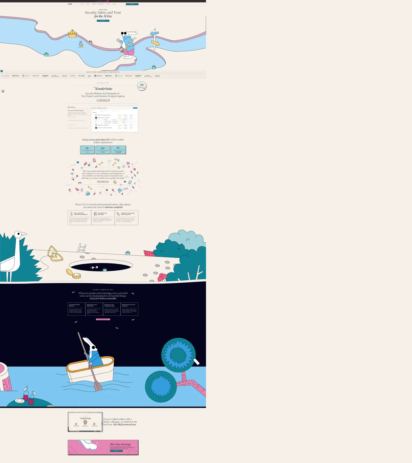
Live at alice.io
A snapshot of the brand in production. Scroll the frame to see the whole page.
Colors
22 colors
Alice's system runs on #0f1729 as its primary voltage, used in 3 of 20 components. Type is set in Inter across 12 tokens from 12px to 56px, weights 400–700. Shape language is mixed across 20 components, blending pills, soft rounds, and squarer corners.
Brand & Accent
Sparing, CTA-only voltage · 3
Surface
Page and card backgrounds · 5
Text
Headlines, body, captions · 9
Borders & Hairlines
Dividers, outlines, rules · 2
Semantic
Status, errors, success, links · 3
Typography
12 type tokens
Set in Inter across 12 tokens, from 12px to 56px, weights 400–700. Shown in its own stack: where the font isn't installed, the fallback the file names stands in.
- display-xl56px · weight 700 · lh 1.1 · tracking -1.4pxThe quick brown fox jumps over the lazy dog
- display-lg40px · weight 700 · lh 1.15 · tracking -0.8pxThe quick brown fox jumps over the lazy dog
- display-md28px · weight 600 · lh 1.25 · tracking -0.4pxThe quick brown fox jumps over the lazy dog
- display-sm22px · weight 600 · lh 1.3 · tracking -0.2pxThe quick brown fox jumps over the lazy dog
- title-md18px · weight 600 · lh 1.4The quick brown fox jumps over the lazy dog
- title-sm16px · weight 600 · lh 1.4The quick brown fox jumps over the lazy dog
- body-md16px · weight 400 · lh 1.55The quick brown fox jumps over the lazy dog
- body-sm14px · weight 400 · lh 1.5The quick brown fox jumps over the lazy dog
- caption12px · weight 500 · lh 1.4 · tracking 0.2pxThe quick brown fox jumps over the lazy dog
- caption-uppercase12px · weight 600 · lh 1.4 · tracking 1.4pxThe quick brown fox jumps over the lazy dog
- button-md14px · weight 600 · lh 1The quick brown fox jumps over the lazy dog
- code-md14px · weight 400 · lh 1.55The quick brown fox jumps over the lazy dog
Layout
Radii and spacing
6 corner radii and 9 spacing values. Shape language: mixed.
Radii
- none0px
- sm4px
- md6px
- lg8px
- xl12px
- full9999px
Spacing
- xxs2px
- xs4px
- sm8px
- md12px
- base16px
- lg24px
- xl32px
- 2xl48px
- 3xl64px
Components
20 components
Each rendered from its tokens (color, type, radius, padding) on Alice's own canvas.
- Top Navtop-navTop Nav
- Nav Linknav-linkNav Link
- Button Primarybutton-primaryButton Primary
- Button Primary Hoverbutton-primary-hoverButton Primary Hover
- Button Secondarybutton-secondaryButton Secondary
- Button Ghostbutton-ghostButton Ghost
- Type here…text-inputText Input
- Type here…text-input-focusedText Input Focused
- Hero Bandhero-bandHero Band
- Section Bandsection-bandSection Band
- Product Cardproduct-cardProduct Card
- Feature Cardfeature-cardFeature Card
- Testimonial Cardtestimonial-cardTestimonial Card
- Logo Tilelogo-tileLogo Tile
- Badge Pillbadge-pillBadge Pill
- Badge Uppercasebadge-uppercaseBadge Uppercase
- Callout Bannercallout-bannerCallout Banner
- Cta Band Darkcta-band-darkCta Band Dark
- Code Snippetcode-snippetCode Snippet
- FooterfooterFooter
In use
The system, in use
Alice's tokens on the kind of product it builds.
Build something people actually use.
A short paragraph of marketing copy that previews how the brand's display tier and body tier read together. Two sentences is usually enough.
FAQ
Alice design system FAQ
Common questions about Alice's tokens, components, and how to use this DESIGN.md in your project.
Read next
Related reading
Specs, directories, and component libraries that pair with this design system.
- Browse all design systemsThe full directory of DESIGN.md files on shadcn.io, with live mockups for each.shadcn.io
- Alice — official siteAI security, safety, and trust platform — WonderBuild, WonderFence, and WonderCheck.alice.io (opens in a new tab)
- The DESIGN.md specificationGoogle Labs' open spec for machine-readable design system files — the format this page is built on.github.com (opens in a new tab)
Use it
Use Alice in your project
One machine-readable file. Drop it into Claude, Cursor, or any AI tool that reads DESIGN.md.
Download the DESIGN.md
One machine-readable file: every color, type, radius, spacing, and component token of Alice.
Feed it to your AI tool
Drop it into Claude, Cursor, or GitHub Copilot. The agent writes React components and Tailwind classes that match Alice's visual language.
Reference the tokens directly
Or paste the values into your Tailwind config, CSS variables, or component library: every color, size and radius is a quoted, ready-to-copy value.
Read the full DESIGN.md: overview, rationale, do’s and don’ts
Overview
Alice (formerly ActiveFence) is an AI security, safety, and trust platform — the marketing surface reflects the category posture: pure white canvas at {colors.canvas} (#ffffff), near-black ink at {colors.ink} (#0f172a), and a single load-bearing navy {colors.primary} (#0f1729) for every primary CTA. The brand commits to neutral enterprise palettes rather than the warm-cream and chromatic-accent vocabulary of consumer AI peers (Anthropic, OpenAI, Mistral). There is no atmospheric gradient, no secondary chromatic accent, and no tinted hover state — every interactive surface either holds white or fills navy. The product taxonomy (WonderBuild, WonderFence, WonderCheck) is the only place playful naming enters the chrome.
Trust-stack chrome. Where most AI-product brands lean on warm cream, bright accent, or playful illustration to soften the engineering, Alice holds an enterprise security-software posture — closer to Splunk, Recorded Future, or Tessian than to Cursor or Replit. The decision is positioning, not aesthetics: AI-safety buyers are CISOs and platform-trust teams who evaluate vendors by neutrality and seriousness. The white-and-navy palette is the brand promise rendered as design tokens.
Type carries the second decisive voice. Inter (Webflow's default geometric sans, free on Google Fonts) runs the entire hierarchy at weights 400, 500, 600, and 700 — display never climbs past 700 even on the 56px hero, which keeps the type feeling considered rather than billboard-loud. The display ramp pulls negative tracking aggressively (-1.4px at 56px, -0.8px at 40px) to compress headlines optically, a move that signals technical precision more than friendliness.
Key Characteristics:
- A single brand voltage at
{colors.primary}(#0f1729) — deep navy that carries every primary CTA and the wordmark. No secondary chromatic accent on the marketing surface. - Pure white canvas (
{colors.canvas}—#ffffff) with no warm or cool tint. The commitment to true#ffffffseparates Alice from the warm-cream of Anthropic and the off-white of OpenAI. - Hairline elevation over shadow — 1px slate
{colors.hairline}(#e2e8f0) borders carry every card; the page contains effectively nobox-shadowon flat surfaces. - Inter sans across the entire hierarchy at weights 400-700. Display caps at 700 even on the 56px hero, where most fintech and enterprise systems push display to 800+ for marketing voltage.
- Section bands alternate between
{colors.canvas}and{colors.surface-soft}(#f8fafc) — the only rhythm change on a long marketing page. - White footer that holds canvas all the way down — every other enterprise security brand inverts the footer to dark navy. Alice does not.
- Three-product taxonomy (WonderBuild, WonderFence, WonderCheck) gets equal-weight feature cards on the homepage with a small icon (slate-color, not tinted per-product) and a one-paragraph value prop.
Known Gaps
- Webflow CSS opacity: The exact hex values, font-weight numerals, and radius scale documented here are inferred from public branding plus reasonable Webflow defaults. The site's compiled CSS is externalized via
cdn.prod.website-files.com, which a headless HTML fetch cannot read. A live browser inspection (DevTools → Computed Styles) is the authoritative ground truth — minor hex deltas should be expected on the navy primary and the slate hairline. - Custom typeface possibility: Inter is documented here as the working assumption based on Webflow defaults and the rendered character shapes. Alice may ship a paid custom face (GT Walsheim, IBM Plex Sans, Söhne) via Webflow's font hosting that isn't surfaced in the page's
<link>tags. The fallback stack documented in{typography.*}tokens handles both cases. - Per-product chromatic accents: WonderBuild, WonderFence, and WonderCheck might each carry a subtle accent (a stroke tint on the product icon, a hover color) inside the signed-in product chrome. The marketing page treats all three icons at the slate hairline color — accents would only emerge in the product UI which is out of scope here.
- Dark mode product chrome: The signed-in WonderBuild and WonderFence dashboards may honor a
prefers-color-scheme: darkpreference with a navy{colors.surface-dark}canvas. The marketing pages render light-only and that's what's captured. - Hover and focus combinations: Per the global no-hover documentation policy, only default and pressed states are extracted. The actual hover-state hex (likely
{colors.primary-hover}—#1e293b) is documented as best-guess; focus rings on text inputs may differ. - Pricing and gated-content chrome: Alice does not publish pricing publicly — the system tokens here cover marketing, product feature pages, and the contact-sales conversion path. Internal billing and gated-customer surfaces are not represented.
- Webflow form chrome: Demo-request forms rendered via Webflow's form widget carry their own input styling (focus state, validation outlines) that may diverge from the
{component.text-input}token captured here. - Re-brand transition assets: Alice rebranded from ActiveFence — some surfaces (legal pages, blog archives, press releases) may still render the older ActiveFence wordmark and accompanying palette. This DESIGN.md captures the current Alice marketing surface only.
AI & LLM Platforms
More systems like this
More DESIGN.md files in AI & LLM Platforms.
Pricing
Build it with Pro
The DESIGN.md files are free. Pro adds 6,000+ blocks, premium templates and the MCP server, so your AI editor builds in your system for you.
4.9/5 out of 5 · 150+ reviewsfrom 150+ founders and developers.
Billing
Billed once a year in USD. Cancel anytime.
- How many people can use the license.
- Client work, SaaS products and anything you charge for.
- Production-ready React sections: hero, pricing, features, dashboards and more.
- Complete multi-page sites you can ship as they are.
- React icons from every major library, installable with one command.
- Presets that restyle every block, in light and dark.
- Lets your AI editor search, preview and install blocks for you.
- Priority requests are answered first.
Individual
For personal projects & open source
$32instead of $49/mo
$389 billed yearly
- Seats: 1 seat
- Commercial use: Personal & open source only
- Pro blocks: 6,000+ blocks
- Templates: All 14 templates
- React icons: 294k+ icons
- Themes: All 59 themes
- MCP server: Basic usage
- Support: Standard
Team
Most popularFor freelancers, agencies & startups
$66instead of $99/mo
$789 billed yearly · ≈ $13/dev/mo
- Seats: Up to 5 seats
- Commercial use: Included
- Pro blocks: 6,000+ blocks
- Templates: All 14 templates
- React icons: 294k+ icons
- Themes: All 59 themes
- MCP server: High usage
- Support: Priority
Organization
For companies with larger teams
$132instead of $199/mo
$1,589 billed yearly
- Seats: Unlimited seats
- Commercial use: Included
- Pro blocks: 6,000+ blocks
- Templates: All 14 templates
- React icons: 294k+ icons
- Themes: All 59 themes
- MCP server: Unlimited usage
- Support: Priority
Billed once a year in USD. Cancel anytime.
Individual
For personal projects & open source
$32instead of $49/mo
$389 billed yearly
- How many people can use the license.Seats: 1 seat
- Client work, SaaS products and anything you charge for.Commercial use: Personal & open source only
- Production-ready React sections: hero, pricing, features, dashboards and more.Pro blocks: 6,000+ blocks
- Complete multi-page sites you can ship as they are.Templates: All 14 templates
- React icons from every major library, installable with one command.React icons: 294k+ icons
- Presets that restyle every block, in light and dark.Themes: All 59 themes
- Lets your AI editor search, preview and install blocks for you.MCP server: Basic usage
- Priority requests are answered first.Support: Standard
Team
Most popularFor freelancers, agencies & startups
$66instead of $99/mo
$789 billed yearly · ≈ $13/dev/mo
Everything in Individual, plus
- How many people can use the license.Seats: Up to 5 seats
- Client work, SaaS products and anything you charge for.Commercial use: Included
- Lets your AI editor search, preview and install blocks for you.MCP server: High usage
- Priority requests are answered first.Support: Priority
Organization
For companies with larger teams
$132instead of $199/mo
$1,589 billed yearly
Everything in Team, plus
- How many people can use the license.Seats: Unlimited seats
- Lets your AI editor search, preview and install blocks for you.MCP server: Unlimited usage
- Secure checkout via Stripe
- Code lives in your repo
- Keep what you've shipped if you cancel
- License terms
Your system, built for you
Every block, template and icon, installed by your AI agent in your design system. The DESIGN.md files stay free.