Spasex Inspired Design System
SpaceX's design language as a DESIGN.md file. Pure black #000000, D-DIN-Bold uppercase display, 13 colors, 10 components. For React and AI tools.
Add shadcn.io to your AI agent. · Pro It installs blocks, icons and templates in your design system from a prompt, with Pro.
Set up MCP- Primary
- #000000
- Typeface
- D-DIN
- Shape
- Soft
- Base radius
- 16px
- Colors
- 13
- Type tokens
- 8
- Components
- 10
- Spacing values
- 8
About
About Spasex Inspired DESIGN.md
Curated by Dov Azencot · Updated May 12, 2026 · Source spacex.com (opens in a new tab)
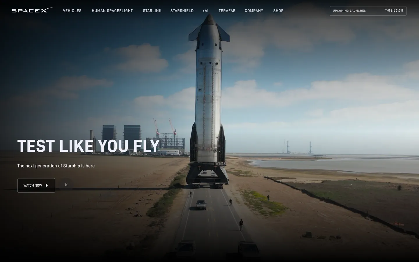
SpaceX's design language reads more like a film title card than a SaaS landing page. The marketing site is built on a single canvas — pure #000000 black — overlaid with full-bleed photography of Falcon 9 boosters at sunset, Mars terrain, and autoplaying rocket-launch video. There is no brand accent color anywhere. Type sits directly on the imagery at high opacity with no scrim, no gradient, no overlay layer. The photographs are graded so the type lands cleanly, and that single editorial decision carries the entire aesthetic.
This DESIGN.md captures the system in 13 colors tokens (mostly variants of black and white), 8 typography tokens running D-DIN-Bold for display and D-DIN regular for body, 5 corner-radius tokens topped by the 32px ghost pill, an 8-step spacing scale, and 10 components. The file follows the Google Labs DESIGN.md specification, so every color, type style, radius, and component is a quoted token referenceable as `{colors.canvas-night}` or `{typography.display-xxl}`. No invented fields, no proprietary syntax.
Feed this file to Claude, Cursor, or GitHub Copilot when you need React components that reproduce SpaceX's austerity rather than a generic dark-mode theme. The AI will respect the two-color rule, render display tiers in uppercase with positive tracking, and reach for ghost pills instead of filled buttons. Or use the spec as a design audit — if your aerospace or hardware brand has crept into multi-accent gradients and drop shadows, this is the corrective. The discipline of trusting photography over chrome is the entire point of the system.
What makes it distinct
5
- Two-color palettepure black #000000 and white #ffffff carry every surface, with photography supplying any other hue
- Uppercase D-DIN-Bold display at 80px with positive 1.6px trackingengineered industrial typography, not designed
- Single ghost-outlined pill CTA per band at 32px radiusnever filled, never tinted, never doubled
- Full-bleed photography or autoplaying rocket video as the only depth mediumzero drop shadows or gradients
- Tight 0.95 line-height on the 80px hero headlinevertical compression is the brand's load-bearing rhythm
spacex.com
Live at spacex.com
A snapshot of the brand in production. Scroll the frame to see the whole page.
Colors
13 colors
Spasex Inspired's system anchors on #000000 (primary) as its primary color. Type is set in D-DIN across 8 tokens from 12px to 80px, weights 400–700. Shape language is soft — components average 13px corner radius, with no sharp interactive edges.
Brand & Accent
Sparing, CTA-only voltage · 1
Surface
Page and card backgrounds · 4
Text
Headlines, body, captions · 8
Typography
8 type tokens
Set in D-DIN across 8 tokens, from 12px to 80px, weights 400–700. Shown in its own stack: where the font isn't installed, the fallback the file names stands in.
- display-xxl80px · weight 700 · lh 0.95 · tracking 1.6pxThe quick brown fox jumps over the lazy dog
- display-xl60px · weight 700 · lh 1.2 · tracking 1.2pxThe quick brown fox jumps over the lazy dog
- display-lg48px · weight 700 · lh 1.25 · tracking 0.96pxThe quick brown fox jumps over the lazy dog
- body-lg16px · weight 400 · lh 1.7 · tracking 0.32pxThe quick brown fox jumps over the lazy dog
- body-md16px · weight 400 · lh 1.5 · tracking 0.32pxThe quick brown fox jumps over the lazy dog
- button-cap13.008px · weight 700 · lh 0.94 · tracking 1.17pxThe quick brown fox jumps over the lazy dog
- micro-cap12px · weight 400 · lh 2 · tracking 0.96pxThe quick brown fox jumps over the lazy dog
- caption13.008px · weight 400 · lh 1.5The quick brown fox jumps over the lazy dog
Layout
Radii and spacing
5 corner radii and 8 spacing values. Shape language: soft.
Radii
- xs4px
- sm8px
- md16px
- pill32px
- full9999px
Spacing
- xxs4px
- xs8px
- sm12px
- md16px
- lg18px
- xl24px
- xxl32px
- huge48px
Components
10 components
Each rendered from its tokens (color, type, radius, padding) on Spasex's own canvas.
- Button Ghost On Darkbutton-ghost-on-darkButton Ghost On Dark
- Button Ghost On Lightbutton-ghost-on-lightButton Ghost On Light
- Button Filled Coolbutton-filled-coolButton Filled Cool
- Type here…text-inputText Input
- Card Photo Bandcard-photo-bandCard Photo Band
- Card Shop Productcard-shop-productCard Shop Product
- Nav Bar Overlaynav-bar-overlayNav Bar Overlay
- Link On Darklink-on-darkLink On Dark
- Link On Lightlink-on-lightLink On Light
- Footer Darkfooter-darkFooter Dark
In use
The system, in use
Spasex's tokens on the kind of product it builds.
Build something people actually use.
A short paragraph of marketing copy that previews how the brand's display tier and body tier read together. Two sentences is usually enough.
FAQ
Spasex Inspired design system FAQ
Common questions about Spasex's tokens, components, and how to use this DESIGN.md in your project.
Read next
Related reading
Specs, directories, and component libraries that pair with this design system.
Use it
Use Spasex Inspired in your project
One machine-readable file. Drop it into Claude, Cursor, or any AI tool that reads DESIGN.md.
Download the DESIGN.md
One machine-readable file: every color, type, radius, spacing, and component token of Spasex Inspired.
Feed it to your AI tool
Drop it into Claude, Cursor, or GitHub Copilot. The agent writes React components and Tailwind classes that match Spasex Inspired's visual language.
Reference the tokens directly
Or paste the values into your Tailwind config, CSS variables, or component library: every color, size and radius is a quoted, ready-to-copy value.
Read the full DESIGN.md: overview, rationale, do’s and don’ts
Overview
SpaceX's design language is an exercise in negation: pure black canvas ({colors.canvas-night} — #000000), white display type set in tight vertical leading and uppercase, full-bleed photography or autoplaying rocket-launch video as the only chrome. There is no brand color beyond black-and-white; there are no decorative shapes; there are no card grids or pricing tables on the marketing pages. Every band is a single full-viewport photograph or video paired with one all-caps headline at {typography.display-xxl} (80px D-DIN-Bold) and one ghost-outlined pill CTA. The composition is closer to a film title card than a SaaS landing page.
The brand's depth is photographic. Mars landscapes, rocket exhaust plumes, the F9 booster on a launchpad at sunset — these are the design system. Type sits over them at high opacity with no scrim, no gradient overlay; the photographs are graded so the type lands cleanly. When type does need a background, it sits on {colors.canvas-night-soft} (#0a0a0a — a barely-lifted near-black) with a 1px hairline in {colors.hairline-on-dark} (#3a3a3f).
Typography splits between D-DIN-Bold for display tiers (uppercase, tight tracking, condensed feel) and D-DIN regular for body and button labels. There is no third family — even pricing on the shop site uses the same two cuts. The display sizes are unusually tight in vertical leading (0.95–1.25) and unusually loose in horizontal tracking (1.6px positive at 80px) — the brand feels engineered rather than designed.
Key Characteristics:
- Single canvas: pure
{colors.canvas-night}(#000000) for marketing;{colors.canvas-light}(#ffffff) only on the shop site. - Display tier in uppercase D-DIN-Bold with positive horizontal tracking (1.6px at 80px) — the brand's typographic signature.
- Full-bleed photography or autoplaying video as the dominant decorative element; type sits directly on imagery with no scrim.
- Single ghost-outlined pill CTA per band, at
{rounded.pill}32px radius — never filled, never accent-colored. - All-caps eyebrow microtext (
{typography.micro-cap}and{typography.button-cap}) with positive 0.96–1.17px tracking — every chrome element shouts in caps. - Fixed top nav overlaid on photography — no opaque background, just white-on-image.
- Tight 0.95 line-height on the 80px display — vertical compression is the engineering aesthetic.
Colors
Source pages: home (
/),/shop,/vehicles/starship,/humanspaceflight/overview,/mission.
Brand & Accent
The brand has no accent colors. Black and white do all the chromatic work; photography supplies every other hue.
Surface
- Canvas Night (
{colors.canvas-night}— #000000): Default marketing canvas. Pure black, no tint. - Canvas Night Soft (
{colors.canvas-night-soft}— #0a0a0a): Barely-lifted near-black for content sections that need a subtle separation from the pure-black hero. - Canvas Light (
{colors.canvas-light}— #ffffff): The shop site's product surface. - Canvas Cool (
{colors.canvas-cool}— #f0f0fa): A pale cool-blue-white used as the secondary surface on the shop site and as the hover-canvas of certain ghost buttons. - Hairline on Dark (
{colors.hairline-on-dark}— #3a3a3f): 1px borders on dark surface chrome. - Hairline on Light (
{colors.hairline-on-light}— #e0e0e8): Borders on shop-site cards.
Text
- On Primary (
{colors.on-primary}— #ffffff): Default text on dark canvas; the dominant text color across the marketing site. - On Primary Mute (
{colors.on-primary-mute}— #f0f0fa): Slightly cooled-white used for secondary text on dark surfaces — barely distinguishable from{colors.on-primary}but enough to suggest a hierarchy. - Ink (
{colors.ink}— #000000): Default text on light surfaces (shop site). - Ink Mute (
{colors.ink-mute}— #5a5a5f): Secondary text on light surfaces.
Link
- Link on Dark (
{colors.link-on-dark}— #ffffff): Underlined inline link on dark canvas. - Link Blue Fallback (
{colors.link-blue-fallback}— #0000ee): The browser default that appears in unstyled fallback contexts — documented for completeness, not used as a brand color.
Typography
Font Family
The display tier is D-DIN-Bold — a condensed industrial sans inspired by the German DIN 1451 standard (used on autobahn road signage and engineering blueprints). When unavailable, fall back to Arial Narrow, then Arial, then Verdana — the fallback chain prioritizes width compression over ornament.
The UI tier is D-DIN (regular weight) — the same family at standard width — used for body, button labels, and captions.
D-DIN is freely available from the DIN Type Foundry (and a free version under the same name is widely distributed). For maximum brand fidelity, use D-DIN directly; as a substitute, Inter at heavy weights (700+) with letter-spacing of 1.6px positive tracking approximates the rhythm. Avoid serif or humanist sans alternatives.
Hierarchy
| Token | Size | Weight | Line Height | Letter Spacing | Use |
|---|---|---|---|---|---|
{typography.display-xxl} | 80px | 700 | 0.95 | 1.6px | Hero headline (uppercase) |
{typography.display-xl} | 60px | 700 | 1.2 | 1.2px | Section opener (uppercase) |
{typography.display-lg} | 48px | 700 | 1.25 | 0.96px | Sub-section heading (uppercase) |
{typography.body-lg} | 16px | 400 | 1.7 | 0.32px | Marketing body lead |
{typography.body-md} | 16px | 400 | 1.5 | 0.32px | Default UI body |
{typography.button-cap} | 13.008px | 700 | 0.94 | 1.17px | All-caps button label |
{typography.micro-cap} | 12px | 400 | 2.0 | 0.96px | All-caps eyebrow / nav item |
{typography.caption} | 13.008px | 400 | 1.5 | 0 | Helper / footer text |
Principles
- Uppercase across display. Every display tier renders in uppercase. The brand never uses sentence-case display headlines.
- Tight vertical leading on display. 0.95 at 80px and 1.2 at 60px — the type stacks engineer-tight.
- Wide horizontal tracking. Positive 0.96–1.6px tracking on display sizes; positive 0.96–1.17px on caps eyebrows. The wide tracking is the brand's signature optical air.
- No mono. Code blocks are not part of the brand's typographic system.
Note on Font Substitutes
D-DIN is freely available (the original DIN-style face under that name is widely distributed). When unavailable, use Inter at 700 weight with letter-spacing: 1.6px, text-transform: uppercase, and line-height: 0.95 for display sizes — this matches the rhythm. Avoid Helvetica or Arial at default weights — the brand needs the condensed industrial cut. Avoid serif fallbacks entirely.
Layout
Spacing System
- Base unit: 8px (with denser sub-units 4 / 12 / 16 / 18 / 24).
- Tokens:
{spacing.xxs}4px ·{spacing.xs}8px ·{spacing.sm}12px ·{spacing.md}16px ·{spacing.lg}18px ·{spacing.xl}24px ·{spacing.xxl}32px ·{spacing.huge}48px. - Section padding: full-viewport bands on marketing — no internal padding above/below; the photograph IS the section. On the shop site, sections use 48–64px vertical padding.
Grid & Container
- Marketing pages have no container — every band is full-viewport-width, full-viewport-height (or close to it) with photography filling the entire frame.
- Shop product grid: 4-up at desktop, 2-up at tablet, 1-up at mobile.
- Type sits inside an inner ~1200px reading column centered horizontally over the full-bleed photograph.
Whitespace Philosophy
The marketing pages have minimal traditional whitespace — the photograph occupies all space. "Whitespace" here means the dark sky in a rocket photograph or the empty stretch of Martian terrain. Negative space is photographic, not a UI choice. On the shop site whitespace returns to standard 32px grid gutters.
Elevation & Depth
| Level | Treatment | Use |
|---|---|---|
| 0 | Flat | Default — and the only level on marketing surfaces |
| 1 | Photographic — full-bleed image or video | The primary depth medium; photographs do all the lifting |
The brand does not use drop shadows, blurs, glows, or gradient overlays. Depth is photographic: a rocket launching at twilight has natural atmospheric depth that no CSS shadow could simulate. When type needs separation from imagery, the image is graded darker rather than scrimmed.
Decorative Depth
Photography and autoplaying rocket-launch video are the only decorative depth. There are no illustrations, no icons beyond a few minimal SVG arrow chevrons in nav and CTA hover states.
Shapes
Border Radius Scale
| Token | Value | Use |
|---|---|---|
{rounded.xs} | 4px | Form inputs (shop site) |
{rounded.sm} | 8px | Shop product card chrome, video frames |
{rounded.md} | 16px | Larger surface chrome |
{rounded.pill} | 32px | Ghost outlined pill CTAs (the brand's signature button shape) |
{rounded.full} | 9999px | Circular play-button overlays on video frames |
Photography Geometry
Every photograph is full-viewport-bleed, edge-to-edge, never inset in a card on the marketing site. On the shop site, product photography sits inside {rounded.sm} 8px containers with no shadow. Aspect ratios on marketing photography vary with the source image — there is no enforced ratio; the photograph leads.
Components
Buttons
button-ghost-on-dark — the universal CTA on marketing surfaces.
- Background
{colors.canvas-night}(transparent against the photographed canvas), 1px solid{colors.on-primary}border, text{colors.on-primary}, type{typography.button-cap}(uppercase, 13px / 700 / 1.17px tracking), padding{spacing.lg} {spacing.xl}(18px 24px), rounded{rounded.pill}32px.
button-ghost-on-light — the same button on shop / light pages.
- Background
{colors.canvas-light}(transparent against light canvas), 1px solid{colors.ink}border, text{colors.ink}, otherwise identical.
button-filled-cool — fill variant on shop product cards.
- Background
{colors.canvas-cool}, text{colors.ink}, same pill geometry. Used as "Add to cart" or similar product CTAs.
Cards & Containers
card-photo-band — full-bleed photographic band on marketing pages.
- Background
{colors.canvas-night}, padding 0, rounded{rounded.xs}. The photograph fills the entire band; type and CTA sit overlaid.
card-shop-product — product card on the shop site.
- Background
{colors.canvas-light}, padding{spacing.md}16px, rounded{rounded.sm}8px, 1px{colors.hairline-on-light}border. Product photo on top, name in{typography.body-md}, price in{typography.body-md}700 weight, "Add to cart" button at the bottom.
Inputs & Forms
text-input — form input on the shop site.
- Background
{colors.canvas-light}, text{colors.ink}, type{typography.body-md}, padding{spacing.sm} {spacing.md}(12px 16px), rounded{rounded.xs}4px, 1px{colors.hairline-on-light}border.
Navigation
nav-bar-overlay — top nav across the marketing site.
- Background
{colors.canvas-night}(transparent over the hero photo), text{colors.on-primary}, type{typography.button-cap}(uppercase). Logo wordmark on the left at ~147×19px, nav items horizontal in caps, padding{spacing.xl} {spacing.xxl}(24px 32px). The nav is fixed/sticky on scroll, retaining the overlay treatment.
Signature Components
Full-Bleed Photo / Video Hero — every marketing band is a full-viewport photograph or autoplaying rocket-launch video. Type and CTA sit overlaid on the photograph at high opacity with no scrim. The photograph is graded so type lands cleanly without an overlay layer.
Uppercase Display Headline — the 80px D-DIN-Bold uppercase headline with 1.6px positive tracking is the brand's most recognizable typographic moment. Always uppercase, always bold-weight, always positively tracked.
link-on-dark — inline links on dark canvas.
- Text
{colors.link-on-dark}(white) with persistent underline.
link-on-light — inline links on light canvas.
- Text
{colors.ink}with persistent underline.
footer-dark — site-wide footer.
- Background
{colors.canvas-night}, text{colors.on-primary}, type{typography.caption}, padding{spacing.xxl} {spacing.xl}(32px 24px). Holds nav columns in{typography.micro-cap}(uppercase), and a small legal/copyright row at the bottom.
Responsive Behavior
Breakpoints
| Name | Width | Key Changes |
|---|---|---|
| Wide | ≥ 1500px | Full hero photograph; max-content type column at 1200px |
| Desktop | 1280–1499px | Default desktop layout |
| Laptop | 961–1279px | Type column tightens; photo crops adjust |
| Tablet | 768–960px | Display drops 80 → 60px; nav compresses |
| Mobile | 600–767px | Display drops to 48px; ghost button retains pill shape |
| Small Mobile | < 600px | Display drops to 40px; nav becomes hamburger |
Touch Targets
- Ghost pill buttons hit ≥ 50×50px due to the 18px vertical padding × 13px line-height. WCAG AAA compliant.
- Form fields stay at the 44px minimum height.
Collapsing Strategy
- Display sizes stair-step 80 → 60 → 48 → 40px through the breakpoints.
- Photography re-crops to focal subject on smaller widths (rocket centered, Mars landscape centered).
- Top nav collapses to hamburger below 768px; menu retains the dark overlay treatment.
- Shop product grid stair-steps 4-up → 2-up → 1-up.
Image Behavior
Marketing photography uses srcset for desktop / tablet / mobile with art-direction crops at major breakpoints. Mobile crops favor the central focal subject; wide crops favor environmental context (full launch pad, full Martian horizon).
Known Gaps
- Hover state colors: intentionally minimal — SpaceX marketing surfaces follow a near-zero hover policy, so precise hover variants aren't documented.
- Video player chrome: autoplaying rocket-launch video has minimal UI but the full control surface (volume, scrubber, fullscreen) wasn't reliably extracted.
- Shop product detail pages: the 4-up product grid is captured, but individual product detail layouts (image galleries, spec tables, size selectors) were not.
- Form error states: the 1px hairline input is documented, but full validation outline + helper-text combinations on failure weren't visible in the captured surfaces.
- Starlink sub-brand: the Starlink site runs its own typographic variant and product surfaces — not captured here.
Hardware & Robotics
More systems like this
More DESIGN.md files in Hardware & Robotics.
Pricing
Build it with Pro
The DESIGN.md files are free. Pro adds 6,000+ blocks, premium templates and the MCP server, so your AI editor builds in your system for you.
4.9/5 out of 5 · 150+ reviewsfrom 150+ founders and developers.
Billing
Billed once a year in USD. Cancel anytime.
- How many people can use the license.
- Client work, SaaS products and anything you charge for.
- Production-ready React sections: hero, pricing, features, dashboards and more.
- Complete multi-page sites you can ship as they are.
- React icons from every major library, installable with one command.
- Presets that restyle every block, in light and dark.
- Lets your AI editor search, preview and install blocks for you.
- Priority requests are answered first.
Individual
For personal projects & open source
$32instead of $49/mo
$389 billed yearly
- Seats: 1 seat
- Commercial use: Personal & open source only
- Pro blocks: 6,000+ blocks
- Templates: All 14 templates
- React icons: 294k+ icons
- Themes: All 59 themes
- MCP server: Basic usage
- Support: Standard
Team
Most popularFor freelancers, agencies & startups
$66instead of $99/mo
$789 billed yearly · ≈ $13/dev/mo
- Seats: Up to 5 seats
- Commercial use: Included
- Pro blocks: 6,000+ blocks
- Templates: All 14 templates
- React icons: 294k+ icons
- Themes: All 59 themes
- MCP server: High usage
- Support: Priority
Organization
For companies with larger teams
$132instead of $199/mo
$1,589 billed yearly
- Seats: Unlimited seats
- Commercial use: Included
- Pro blocks: 6,000+ blocks
- Templates: All 14 templates
- React icons: 294k+ icons
- Themes: All 59 themes
- MCP server: Unlimited usage
- Support: Priority
Billed once a year in USD. Cancel anytime.
Individual
For personal projects & open source
$32instead of $49/mo
$389 billed yearly
- How many people can use the license.Seats: 1 seat
- Client work, SaaS products and anything you charge for.Commercial use: Personal & open source only
- Production-ready React sections: hero, pricing, features, dashboards and more.Pro blocks: 6,000+ blocks
- Complete multi-page sites you can ship as they are.Templates: All 14 templates
- React icons from every major library, installable with one command.React icons: 294k+ icons
- Presets that restyle every block, in light and dark.Themes: All 59 themes
- Lets your AI editor search, preview and install blocks for you.MCP server: Basic usage
- Priority requests are answered first.Support: Standard
Team
Most popularFor freelancers, agencies & startups
$66instead of $99/mo
$789 billed yearly · ≈ $13/dev/mo
Everything in Individual, plus
- How many people can use the license.Seats: Up to 5 seats
- Client work, SaaS products and anything you charge for.Commercial use: Included
- Lets your AI editor search, preview and install blocks for you.MCP server: High usage
- Priority requests are answered first.Support: Priority
Organization
For companies with larger teams
$132instead of $199/mo
$1,589 billed yearly
Everything in Team, plus
- How many people can use the license.Seats: Unlimited seats
- Lets your AI editor search, preview and install blocks for you.MCP server: Unlimited usage
- Secure checkout via Stripe
- Code lives in your repo
- Keep what you've shipped if you cancel
- License terms
Your system, built for you
Every block, template and icon, installed by your AI agent in your design system. The DESIGN.md files stay free.