Fitbit Design System
Fitbit's marketing design system as a DESIGN.md file. Google Sans Display at 60px, dark navy ink, Google Material-adjacent layout, 5 colors, 12 components. For React, Next.js, and AI tools.
Add shadcn.io to your AI agent. · Pro It installs blocks, icons and templates in your design system from a prompt, with Pro.
Set up MCP- Primary
- #1967d2
- Typeface
- Google Sans Flex
- Shape
- Mixed
- Base radius
- 8px
- Colors
- 5
- Type tokens
- 7
- Components
- 12
- Spacing values
- 6
About
About Fitbit DESIGN.md
Curated by Dov Azencot · Updated May 19, 2026 · Source fitbit.com (opens in a new tab)
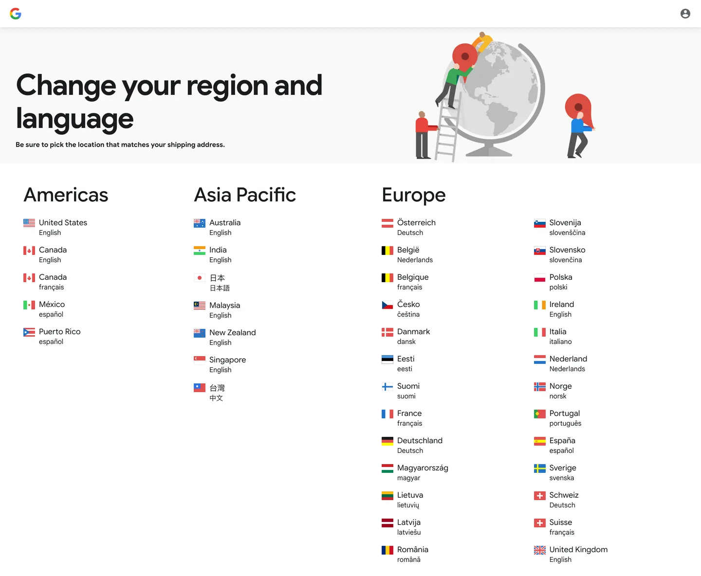
Fitbit's domain redirects through Google's infrastructure — the brand was acquired by Google in 2021 — and the captured marketing surface shows a Google Store region-selection utility page rather than Fitbit's consumer wearables marketing. What this reveals is instructive: Fitbit's product infrastructure is now fully integrated into Google's Material Design system. The page runs Google Sans Display at 60px / weight 700 for the utility headline, Google Sans Flex at 16px for navigation labels, and standard Google Sans at 14px for body list items. The canvas is a very-light off-white, the ink is a very-dark-navy slate, and the region illustrator is rendered in the flat, cheerful style of Google's Material illustration system.
The Google Sans family is one of the most used corporate type systems in consumer technology — it appears across Google Search, Gmail, Google Maps, Google Docs, and now Fitbit's product purchase flow. Where Samsung uses its own custom OneUI interface sans and Apple uses San Francisco, Fitbit (post-acquisition) has been fully absorbed into the Google Sans canon. The captured page carries a 60px display head with -2px letter-spacing — the tightest tracking applied to any Google Sans usage in the directory — and a structured three-column country-list grid that reads like a reference document rather than a marketing surface.
Feed this file to an AI coding tool and it reproduces the Material-adjacent utility pattern: Google Sans at three size tiers, very-dark-navy ink on near-white canvas, no shadow-heavy elevation, 8px horizontal left padding on list items, and the Google three-column geographic grid. The tokens capture the utility surface correctly; Fitbit's full consumer marketing (teal CTAs, health metrics dashboard, wearable product photography) operates on a richer surface that the redirect does not expose.
What makes it distinct
5
- Google Sans family stackDisplay variant for the 60px hero head, Flex variant for UI labels, standard Google Sans for body; three subfamilies from one type system
- Dark navy ink rather than pure blackthe primary text tone is a very-dark-navy slate rather than neutral black, aligned with Material Design's on-surface ink convention
- Material-adjacent utility layoutthe captured surface is a region-selection utility with flag icons, country lists in three geographic columns, and a minimal top nav
- Tight -2px tracking at 60px displaythe hero h1 uses Google Sans Display at 68px line height with -2px letter spacing, the tightest display tracking in the Google product family
- Near-white canvasthe page background is a very-light off-white rather than pure white, consistent with Google's material surface token convention
fitbit.com
Live at fitbit.com
A snapshot of the brand in production. Scroll the frame to see the whole page.
Colors
5 colors
Fitbit's system runs on #1967d2 as its primary voltage, used in 2 of 12 components. Type is set in Google Sans Flex across 7 tokens from 14px to 60px, weights 400–700. Shape language is mixed across 12 components, blending pills, soft rounds, and squarer corners.
Surface
Page and card backgrounds · 1
Text
Headlines, body, captions · 3
Other
Specialty colors · 1
Typography
7 type tokens
Set in Google Sans Flex across 7 tokens, from 14px to 60px, weights 400–700. Shown in its own stack: where the font isn't installed, the fallback the file names stands in.
- display-xl60px · weight 700 · lh 68px · tracking -2pxThe quick brown fox jumps over the lazy dog
- heading-md40px · weight 500 · lh 48pxThe quick brown fox jumps over the lazy dog
- body-lg16px · weight 400 · lh normalThe quick brown fox jumps over the lazy dog
- body-md14px · weight 400 · lh 20pxThe quick brown fox jumps over the lazy dog
- body-md-bold14px · weight 700 · lh 20pxThe quick brown fox jumps over the lazy dog
- button-md16px · weight 400 · lh normalThe quick brown fox jumps over the lazy dog
- nav-link16px · weight 400 · lh normalThe quick brown fox jumps over the lazy dog
Layout
Radii and spacing
4 corner radii and 6 spacing values. Shape language: mixed.
Radii
- none0px
- sm4px
- md8px
- full9999px
Spacing
- xs8px
- sm16px
- md20px
- base24px
- lg32px
- xl85px
Components
12 components
Each rendered from its tokens (color, type, radius, padding) on Fitbit's own canvas.
- Button Primarybutton-primaryButton Primary
- Button Secondarybutton-secondaryButton Secondary
- Top Navtop-navTop Nav
- Nav Linknav-linkNav Link
- Hero Headinghero-headingHero Heading
- Section Headingsection-headingSection Heading
- Body Paragraphbody-paragraphBody Paragraph
- CardcardCard
- Type here…text-inputText Input
- Country List Itemcountry-list-itemCountry List Item
- Country List Subtextcountry-list-subtextCountry List Subtext
- FooterfooterFooter
In use
The system, in use
Fitbit's tokens on the kind of product it builds.
Build something people actually use.
A short paragraph of marketing copy that previews how the brand's display tier and body tier read together. Two sentences is usually enough.
FAQ
Fitbit design system FAQ
Common questions about Fitbit's tokens, components, and how to use this DESIGN.md in your project.
Read next
Related reading
Specs, directories, and component libraries that pair with this design system.
- Browse all design systemsThe full directory of DESIGN.md files on shadcn.io, with live mockups for each.shadcn.io
- Fitbit — official siteFitbit's public marketing site — the source of truth for the live tokens captured in this file.fitbit.com (opens in a new tab)
- The DESIGN.md specificationGoogle Labs' open spec for machine-readable design system files — the format this page is built on.github.com (opens in a new tab)
Use it
Use Fitbit in your project
One machine-readable file. Drop it into Claude, Cursor, or any AI tool that reads DESIGN.md.
Download the DESIGN.md
One machine-readable file: every color, type, radius, spacing, and component token of Fitbit.
Feed it to your AI tool
Drop it into Claude, Cursor, or GitHub Copilot. The agent writes React components and Tailwind classes that match Fitbit's visual language.
Reference the tokens directly
Or paste the values into your Tailwind config, CSS variables, or component library: every color, size and radius is a quoted, ready-to-copy value.
Read the full DESIGN.md: overview, rationale, do’s and don’ts
Overview
Fitbit's captured marketing surface reveals the full consequence of Google's 2021 acquisition. Material Absorption. The fitbit.com domain now routes purchase flows through Google Store infrastructure, and the page typography, palette, and layout conventions are those of Google's Material Design ecosystem rather than Fitbit's pre-acquisition teal-and-orange fitness brand. Google Sans Display at 60px / weight 700 with -2px letter-spacing is the hero h1; Google Sans Flex at 16px handles navigation and list items; standard Google Sans at 14px manages secondary labels. The canvas is a near-white off-white consistent with Material's surface-container token, and the text is a very-dark-navy slate consistent with Material's on-surface token.
The surface is a utility layout — a region and language selection tool with flag icons, country names, and language sub-labels organized into three geographic columns (Americas, Asia Pacific, Europe). Where Apple's region-selection pages maintain full brand marketing fidelity and Samsung's maintain heavy product photography, this Google-routed Fitbit page shows minimal brand chrome: a 'G' wordmark in the top-left, a circular account avatar in the top-right, and the utility content at full width. There is no Fitbit logo visible in the captured surface. The brand has been absorbed into the Google Store vessel.
Key Characteristics:
- Google Sans family across all three captured typography tiers — Display variant (60px / 700), Flex variant (40px / 500 and 16px / 400), standard variant (14px / 400 and 700).
- Very-dark-navy ink (
{colors.ink}— #191c1d) as the primary text tone, consistent with Material Design's on-surface convention. - Near-white canvas (
{colors.canvas}— #f9f9f9) rather than pure white, consistent with Material's surface-container convention. - A standard Google-blue link tone (
{colors.link}— #1967d2) as the only chromatic element — appearing in two country-list link instances. - Tight -2px letter-spacing on the 60px display head — the tightest display tracking of any Google Sans usage in the directory.
- Three-column geographic grid: Americas (left), Asia Pacific (center), Europe (right) — each column listing countries with flag icons and language sub-labels.
- Flat Material illustration in the hero band: three illustrated figures around a globe, in Google's flat geometric illustration style.
Colors
Text
- Ink (
{colors.ink}— #191c1d): frequency 423 (211 text, 211 border, 1 shadow) — the dominant text and structural color. Wired as a merged value from two very-dark-navy values within the same Material on-surface range. Used for all headline text, body text, country names, and border rules. - Ink Soft (
{colors.ink-soft}— #3c4043): frequency 12 (6 text, 6 border) — secondary text tone for language sub-labels under country names (e.g., "English" under "United States"). A mid-slate that lifts slightly from the primary ink. - Link (
{colors.link}— #1967d2): frequency 4 (2 text, 2 border) — the standard Google blue used for interactive link text. The only chromatic element on the page. - Shadow (
{colors.shadow}— #000000): frequency 2 — used for minimal shadow on interactive elements at very low opacity.
Surface
- Canvas (
{colors.canvas}— #f9f9f9): frequency 4 as background — the page floor. A very-light off-white, consistent with Material's surface-container token. Warmer than pure white, cooler than cream. The only rendered background fill on the captured page.
Typography
Font Family
The system runs three members of the Google Sans family — all sharing geometric humanist proportions, differentiated by subfamily:
- Google Sans Display — the high-tracking, tight-set display subfamily for the hero h1. At 60px / 700 / -2px tracking, this is Google's most assertive typographic moment.
- Google Sans Flex — the variable-axis member of the family, used for navigation labels, country list items, and the 40px section heading tier.
- Google Sans — the standard member, used for 14px body spans and secondary labels. Fallbacks to Roboto, Arial, sans-serif.
Hierarchy
| Token | Size | Weight | Line Height | Letter Spacing | Use |
|---|---|---|---|---|---|
{typography.display-xl} | 60px | 700 | 68px | -2px | Hero h1 ("Change your region and language") |
{typography.heading-md} | 40px | 500 | 48px | 0 | Section headings (Americas, Asia Pacific, Europe) |
{typography.body-lg} | 16px | 400 | normal | 0 | Country name list items, nav labels |
{typography.body-md} | 14px | 400 | 20px | 0 | Language sub-labels, secondary text |
{typography.body-md-bold} | 14px | 700 | 20px | 0 | Emphasis within body copy |
{typography.button-md} | 16px | 400 | normal | 0 | Button labels |
{typography.nav-link} | 16px | 400 | normal | 0 | Navigation link labels |
Principles
The display tier at 60px / 700 is the heaviest weight in this system — an outlier versus the typical Material convention of weight 500 for display. The tight -2px tracking at 60px is Google Sans Display's signature: the letters compress to feel like a single dense block rather than individually-spaced glyphs. Below the display, every other tier runs at 400-500 with normal tracking. The system has a sharp two-tier weight structure: 700 for the hero, 400-500 for everything else.
Note on Font Substitutes
Google Sans is proprietary. Nunito Sans at weight 700 approximates the 60px display tier's proportions. DM Sans or Plus Jakarta Sans at weight 400 substitute for the body and navigation tiers. The -2px letter-spacing is more important to preserve than the exact typeface — it defines the display character regardless of which geometric humanist is used.
Layout
Spacing System
- Base unit: 8px.
- Tokens:
{spacing.xs}8px ·{spacing.sm}16px ·{spacing.md}20px ·{spacing.base}24px ·{spacing.lg}32px ·{spacing.xl}85px. - Hero head top padding: 85px — a generous push that vertically centers the headline with the geographic illustration.
- Country list item padding: 8px vertical, 0 horizontal.
- Nav horizontal padding: 32px.
Grid & Container
- Max content width: ~1200px on the geographic section, full-bleed on the hero.
- Hero band: two-column — left side carries the headline and sub-dek at ~55% width, right side carries the Material flat illustration at ~45%.
- Geographic grid: three equal-width columns (Americas, Asia Pacific, Europe), each a vertical list of country + flag icon + language sub-label rows.
- Nav: white-on-canvas, Google 'G' wordmark left-aligned, account avatar right-aligned.
Rhythm
The page has two sections: the hero band (headline + illustration) and the geographic reference section (three-column country list). There is no editorial content between these. The rhythm is utility-first: minimal vertical padding between list items, generous top padding on the hero head.
Elevation
The system has no visible elevation tier on the captured surface. No shadows on cards, no elevation on the nav. The one declared shadow token ({colors.shadow} — #000000 at very low opacity) appears in the CSS but is not rendered visibly in the captured state.
- Flat (no shadow): nav, hero, geographic list — 100% of visible surfaces.
Shapes
The captured surface shows no explicit border-radius values on rendered elements. The radius tokens are inferred from Google's Material Design conventions and the --boq-chrometransition-background variable:
{rounded.none}0px — list items, geographic columns, the main content areas.{rounded.sm}4px — small interactive chips and form elements (Material convention for utility surfaces).{rounded.md}8px — cards and larger surfaces in the Material system.{rounded.full}9999px — pill buttons and avatar elements (the account avatar in the nav is circular).
No pill buttons appear in the active captured state; the account avatar uses full-circle treatment.
Components
button-primary — Ink {colors.ink} fill, near-white text, fully-rounded {rounded.full} pill, 8×20px padding, 40px height.
button-secondary — Near-white {colors.canvas} fill, link-blue text, fully-rounded {rounded.full} pill, 8×20px padding, 40px height.
top-nav — Near-white canvas, 56px height, Google 'G' wordmark flush left, circular account avatar flush right. No bottom border visible.
nav-link — Transparent background, link-blue {colors.link} text at {typography.nav-link} (16px / 400), 8px vertical padding.
hero-heading — Ink text, Google Sans Display 60px / 700, -2px tracking, 85px top padding / 10px bottom. "Change your region and language" is the captured instance.
section-heading — Ink text, Google Sans Flex 40px / 500, 48px line height. Used for the geographic column headers: "Americas", "Asia Pacific", "Europe".
body-paragraph — Ink text at {typography.body-md} — sub-heading helper text ("Be sure to pick the location that matches your shipping address.").
card — Near-white fill, {rounded.md} 8px radius, 16px padding. The inferred container surface for list panels.
text-input — Near-white fill, ink text, {rounded.sm} 4px radius, 8px padding, 40px height.
country-list-item — Transparent background, ink text at {typography.body-lg} (16px / 400), 8px vertical padding. Each row: flag emoji + country name. Rendered as a link.
country-list-subtext — Transparent background, ink-soft {colors.ink-soft} text at {typography.body-md} (14px / 400), 8px left indent. The language sub-label beneath each country name.
footer — Near-white canvas, ink-soft text, {typography.body-md}, 24×32px padding.
Do's and Don'ts
Do apply -2px letter-spacing to any Google Sans Display usage at 60px or above. The tight tracking at large size is the defining characteristic of the display tier; leaving it at default tracking makes the headline feel under-designed for its size.
Do use {colors.ink} (#191c1d) — not pure black — for all text. Material Design's on-surface token is a very-dark-navy, not neutral black, and the distinction is visible at display sizes.
Do keep the geographic list items as links — country names are interactive navigation targets, not decorative labels. The link treatment with {colors.link} blue distinguishes action from annotation.
Do use Google Sans Flex for the 40px section heading tier. The Flex subfamily's variable axis makes the 40px weight 500 read noticeably warmer than the standard Google Sans at the same size.
Don't use weight 700 below the display tier. The system is 700 for the hero h1, 500 for section headings, 400 for everything else. Applying 700 to section headings or labels would flatten the two-tier weight structure.
Don't replace the near-white canvas ({colors.canvas} — #f9f9f9) with pure white. The off-white is a deliberate Material surface-container value; pure white creates a harsher contrast against the dark ink at body sizes.
Don't add brand-color accents (Fitbit teal, fitness orange) to this utility surface. The captured surface uses Google Store infrastructure and no Fitbit brand tokens. Adding brand accents to a shared infrastructure surface creates an inconsistent experience across the Google Store ecosystem.
Don't introduce shadow elevation. The captured surface is completely flat. Material Design reserves visible elevation for modal sheets and navigation drawers; a utility list page like this renders without any shadow.
Known Gaps
- Fitbit brand surface not captured: the fitbit.com domain redirected to a Google Store region-picker at extraction time. Fitbit's consumer health marketing (teal CTAs, wearable product photography, health metrics dashboard) is not represented in these tokens.
- Fitbit brand colors: the brand's known teal (a bright cyan-teal), charcoal, and fitness-orange accents are not present in the captured data and are therefore not declared as tokens.
- Interactive states: no hover, focus, or active states are visible on the captured utility surface.
- Responsive breakpoints: the captured screenshot is at desktop width; mobile layout for the geographic grid (likely collapses to single-column) is not represented.
- Account avatar component: the circular avatar in the top-right nav is visible but not documented as a standalone component — it uses
{rounded.full}treatment and appears at approximately 32px. - Flag emoji rendering: the geographic list uses emoji flag characters for country identifiers; rendering fidelity depends on the operating system's emoji font and is not controlled by the CSS type system.
Healthcare & Wellness
More systems like this
More DESIGN.md files in Healthcare & Wellness.
Pricing
Build it with Pro
The DESIGN.md files are free. Pro adds 6,000+ blocks, premium templates and the MCP server, so your AI editor builds in your system for you.
4.9/5 out of 5 · 150+ reviewsfrom 150+ founders and developers.
Billing
Billed once a year in USD. Cancel anytime.
- How many people can use the license.
- Client work, SaaS products and anything you charge for.
- Production-ready React sections: hero, pricing, features, dashboards and more.
- Complete multi-page sites you can ship as they are.
- React icons from every major library, installable with one command.
- Presets that restyle every block, in light and dark.
- Lets your AI editor search, preview and install blocks for you.
- Priority requests are answered first.
Individual
For personal projects & open source
$32instead of $49/mo
$389 billed yearly
- Seats: 1 seat
- Commercial use: Personal & open source only
- Pro blocks: 6,000+ blocks
- Templates: All 14 templates
- React icons: 294k+ icons
- Themes: All 59 themes
- MCP server: Basic usage
- Support: Standard
Team
Most popularFor freelancers, agencies & startups
$66instead of $99/mo
$789 billed yearly · ≈ $13/dev/mo
- Seats: Up to 5 seats
- Commercial use: Included
- Pro blocks: 6,000+ blocks
- Templates: All 14 templates
- React icons: 294k+ icons
- Themes: All 59 themes
- MCP server: High usage
- Support: Priority
Organization
For companies with larger teams
$132instead of $199/mo
$1,589 billed yearly
- Seats: Unlimited seats
- Commercial use: Included
- Pro blocks: 6,000+ blocks
- Templates: All 14 templates
- React icons: 294k+ icons
- Themes: All 59 themes
- MCP server: Unlimited usage
- Support: Priority
Billed once a year in USD. Cancel anytime.
Individual
For personal projects & open source
$32instead of $49/mo
$389 billed yearly
- How many people can use the license.Seats: 1 seat
- Client work, SaaS products and anything you charge for.Commercial use: Personal & open source only
- Production-ready React sections: hero, pricing, features, dashboards and more.Pro blocks: 6,000+ blocks
- Complete multi-page sites you can ship as they are.Templates: All 14 templates
- React icons from every major library, installable with one command.React icons: 294k+ icons
- Presets that restyle every block, in light and dark.Themes: All 59 themes
- Lets your AI editor search, preview and install blocks for you.MCP server: Basic usage
- Priority requests are answered first.Support: Standard
Team
Most popularFor freelancers, agencies & startups
$66instead of $99/mo
$789 billed yearly · ≈ $13/dev/mo
Everything in Individual, plus
- How many people can use the license.Seats: Up to 5 seats
- Client work, SaaS products and anything you charge for.Commercial use: Included
- Lets your AI editor search, preview and install blocks for you.MCP server: High usage
- Priority requests are answered first.Support: Priority
Organization
For companies with larger teams
$132instead of $199/mo
$1,589 billed yearly
Everything in Team, plus
- How many people can use the license.Seats: Unlimited seats
- Lets your AI editor search, preview and install blocks for you.MCP server: Unlimited usage
- Secure checkout via Stripe
- Code lives in your repo
- Keep what you've shipped if you cancel
- License terms
Your system, built for you
Every block, template and icon, installed by your AI agent in your design system. The DESIGN.md files stay free.