Oura Ring Design System
Oura Ring's consumer-health design system as a DESIGN.md file. Sandstone #f7f1e8 canvas, graphite #1c1b1a ink, AkkuratLL + Editorial New italic, 22 components for React and AI tools.
Add shadcn.io to your AI agent. · Pro It installs blocks, icons and templates in your design system from a prompt, with Pro.
Set up MCP- Primary
- #1e2427
- Typeface
- AkkuratLL
- Shape
- Soft
- Base radius
- 8px
- Colors
- 22
- Type tokens
- 15
- Components
- 22
- Spacing values
- 10
About
About Oura Ring DESIGN.md
Curated by Dov Azencot · Updated May 13, 2026 · Source ouraring.com (opens in a new tab)
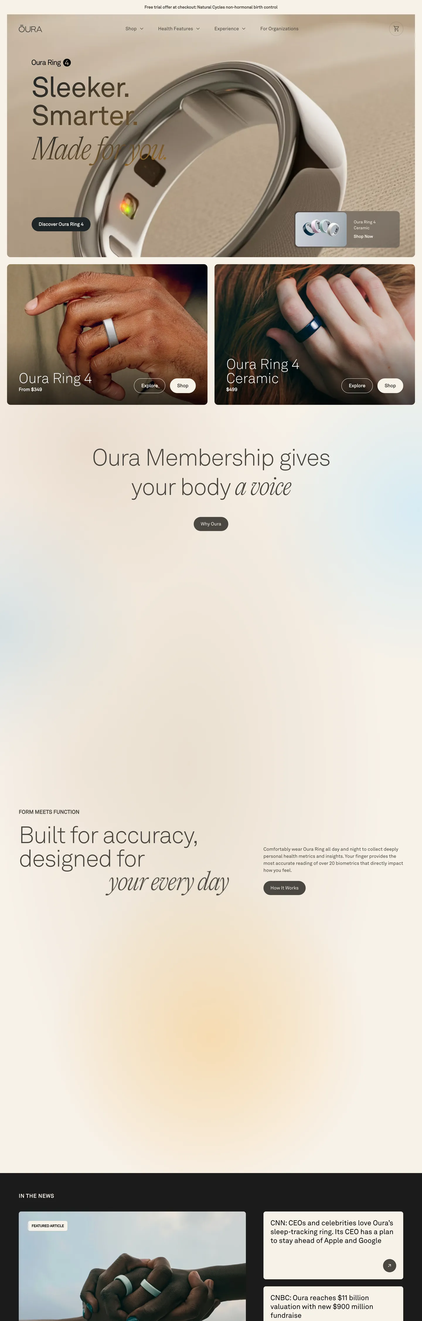
Oura's storefront is built around an unusual contradiction for a wearable-health brand: the page rejects every fitness-tech cliché. There is no neon-green heart-rate gradient, no dashboard mockup behind glass, no slate-and-cyan dark canvas. The chassis is a warm sandstone (#f7f1e8) tinted just past cream, body type runs AkkuratLL at 16px / 24px line-height, and the hero h1 sits at 96px weight 500 with negative tracking — the editorial cadence of a magazine cover. Once per heading, a single phrase ("Made for you", "a voice", "your every day") flips to Editorial New serif italic. That one swap is the entire brand-voice signature.
This page captures the homepage system as a DESIGN.md file — Google Labs' open spec for machine-readable design tokens. Inside: 22 colors tokens grouped into ink, sandstone-canvas, hairline, brand-voltage, and accent layers; 12 typography tokens covering AkkuratLL across weights 200 through 700 plus the Editorial New italic display-emphasis pair; a 6-step radius scale that pivots between 12px medium chrome and full-pill CTAs; an 8px-based spacing rhythm dominated by 8px (39 occurrences) and 16px (13); and 22 components covering the top nav, hero card, ring product tiles, membership panel, dark "in the news" rail, footer email capture, and the inverted dark surface used for editorial section breaks.
Feed the file to Claude, Cursor, GitHub Copilot, or any agent that reads structured tokens. The agent reproduces Oura's actual voice — sandstone restraint, two-typeface italic duet, full-pill CTAs, photography-first warmth — instead of a generic health-tech theme of dark dashboards and neon vitals. Reference tokens directly in Tailwind config, audit an existing wellness storefront against this baseline, or read the file as a study in how to sell a sleep-tracking ring without ever showing a sleep chart on the homepage.
What makes it distinct
5
- Two-typeface duetAkkuratLL grotesque handles 90% of the page; Editorial New serif italic appears exactly once per heading on the phrase that carries the emotional turn
- Sandstone canvas ladderthree warm cream tints (#fefaef, #f7f1e8, #efe6db) replace the white-card convention, with photography of the ring on skin doing the warmth work
- Full-pill CTAs at 48px heightprimary action is dark graphite #1e2427 on cream sandstone, never the saturated indigo or mustard the design tokens reserve
- Weight 300 hero at 80–96pxthe display tier sits airy and editorial; weight 700 is reserved for the small 18px sub-heads in caps
- Mustard and indigo as scarcity voltage#af751b and #4a4af4 live in the token system as accents that the homepage barely deploys, letting graphite and cream carry the page
ouraring.com
Live at ouraring.com
A snapshot of the brand in production. Scroll the frame to see the whole page.
Colors
22 colors
Oura Ring's system runs on #1e2427 as its primary voltage, used in 10 of 22 components. Type is set in AkkuratLL across 15 tokens from 12px to 96px, weights 100–700. Shape language is soft — components average 17px corner radius, with no sharp interactive edges.
Brand & Accent
Sparing, CTA-only voltage · 8
Surface
Page and card backgrounds · 3
Text
Headlines, body, captions · 9
Borders & Hairlines
Dividers, outlines, rules · 2
Typography
15 type tokens
Set in AkkuratLL across 15 tokens, from 12px to 96px, weights 100–700. Shown in its own stack: where the font isn't installed, the fallback the file names stands in.
- display-hero96px · weight 500 · lh 1 · tracking -2.4pxThe quick brown fox jumps over the lazy dog
- display-hero-italic96px · weight 500 · lh 1.25 · tracking -2.4pxThe quick brown fox jumps over the lazy dog
- display-lg80px · weight 300 · lh 1 · tracking -2pxThe quick brown fox jumps over the lazy dog
- display-lg-italic80px · weight 300 · lh 1 · tracking -2pxThe quick brown fox jumps over the lazy dog
- display-md48px · weight 200 · lh 1The quick brown fox jumps over the lazy dog
- heading-lg40px · weight 300 · lh 1The quick brown fox jumps over the lazy dog
- heading-lg-italic40px · weight 300 · lh 1The quick brown fox jumps over the lazy dog
- heading-sm24px · weight 400 · lh 1.25The quick brown fox jumps over the lazy dog
- eyebrow18px · weight 700 · lh 1.5The quick brown fox jumps over the lazy dog
- body-lg16px · weight 400 · lh 1.5The quick brown fox jumps over the lazy dog
- body-strong16px · weight 700 · lh 1.5The quick brown fox jumps over the lazy dog
- caption14px · weight 400 · lh 1.5The quick brown fox jumps over the lazy dog
- caption-strong14px · weight 700 · lh 1.5The quick brown fox jumps over the lazy dog
- micro12px · weight 400 · lh 1.5The quick brown fox jumps over the lazy dog
- pull-quote30px · weight 100 · lh 1.5The quick brown fox jumps over the lazy dog
Layout
Radii and spacing
7 corner radii and 10 spacing values. Shape language: soft.
Radii
- none0px
- xs4px
- sm6px
- md8px
- lg12px
- xl24px
- pill9999px
Spacing
- xxxs2px
- xxs4px
- xs8px
- sm12px
- base16px
- lg20px
- xl24px
- xxl32px
- band40px
- section48px
Components
22 components
Each rendered from its tokens (color, type, radius, padding) on Oura Ring's own canvas.
- Button Primarybutton-primaryButton Primary
- Button Primary Hoverbutton-primary-hoverButton Primary Hover
- Button Secondarybutton-secondaryButton Secondary
- Button On Darkbutton-on-darkButton On Dark
- Button Text Linkbutton-text-linkButton Text Link
- Top Navtop-navTop Nav
- Nav Linknav-linkNav Link
- Hero Sectionhero-sectionHero Section
- Ring Product Cardring-product-cardRing Product Card
- Ring Product Card Topring-product-card-topRing Product Card Top
- Ring Product Card Bottomring-product-card-bottomRing Product Card Bottom
- Membership Panelmembership-panelMembership Panel
- Pull Quote Bandpull-quote-bandPull Quote Band
- Editorial Rail Darkeditorial-rail-darkEditorial Rail Dark
- Press Card Darkpress-card-darkPress Card Dark
- Pill Tagpill-tagPill Tag
- Type here…text-inputText Input
- Newsletter Formnewsletter-formNewsletter Form
- Hairline Rulehairline-ruleHairline Rule
- Eyebrow Labeleyebrow-labelEyebrow Label
- Footer Darkfooter-darkFooter Dark
- Footer Linkfooter-linkFooter Link
In use
The system, in use
Oura Ring's tokens on the kind of product it builds.
Build something people actually use.
A short paragraph of marketing copy that previews how the brand's display tier and body tier read together. Two sentences is usually enough.
FAQ
Oura Ring design system FAQ
Common questions about Oura Ring's tokens, components, and how to use this DESIGN.md in your project.
Read next
Related reading
Specs, directories, and component libraries that pair with this design system.
- Browse all design systemsThe full directory of DESIGN.md files on shadcn.io, with live mockups for each.shadcn.io
- Oura Ring — official siteThe Finnish smart-ring brand's own storefront — the source for this design system.ouraring.com (opens in a new tab)
- The DESIGN.md specificationGoogle Labs' open spec for machine-readable design system files.github.com (opens in a new tab)
Use it
Use Oura Ring in your project
One machine-readable file. Drop it into Claude, Cursor, or any AI tool that reads DESIGN.md.
Download the DESIGN.md
One machine-readable file: every color, type, radius, spacing, and component token of Oura Ring.
Feed it to your AI tool
Drop it into Claude, Cursor, or GitHub Copilot. The agent writes React components and Tailwind classes that match Oura Ring's visual language.
Reference the tokens directly
Or paste the values into your Tailwind config, CSS variables, or component library: every color, size and radius is a quoted, ready-to-copy value.
Read the full DESIGN.md: overview, rationale, do’s and don’ts
Overview
Oura's storefront is the most editorial interface in the smart-wearable category — a sandstone-cream chassis ({colors.canvas-sandstone} — #f7f1e8) carrying warm graphite ink ({colors.ink-graphite} — #1e2427), with one Editorial New serif italic phrase dropped into every heading as the brand's only ornamental gesture. Where most fitness-wearable storefronts open with a dark dashboard mockup behind glass and a neon-cyan heart-rate gradient, Oura opens with a 96px AkkuratLL hero at weight 500 and an italicized "Made for you" serif span — the page reads as a magazine cover, not a product spec sheet.
The type system is bi-modal. AkkuratLL grotesque sans handles 90% of the page across weights 200, 300, 400, 500, 600, 700 — body, navigation, button labels, product names, footer columns. Editorial New serif italic appears as --font-serif at the same point sizes as its surrounding sans head, scoped to one noun-phrase per heading: "Made for you" at 96px / 500, "a voice" at 40px / 300, "your every day" at 80px / 300. This is the system's strongest editorial decision — one typeface holds the page; one italic phrase holds a single emotional turn per section.
Italic-as-emphasis: Oura's interface inherits its voice from print-magazine typography — a sans-serif headline interrupted by a single italicized phrase that names the brand promise. Where most consumer-electronics brands separate display and emphasis with weight (regular vs bold), Oura separates them with style (grotesque vs italic-serif). Where the typical health-tech storefront amplifies authority with deep slate panels and chart cards, Oura runs warm cream panels and lets a macro-photograph of the ring on a knuckle carry the entire technical claim.
Key Characteristics:
- Warm cream-sandstone canvas (
{colors.canvas-sandstone}— #f7f1e8) used 512 times across surface, border, and background — the dominant chassis tone. Tinted just enough to read as paper, not screen. - Graphite ink (
{colors.ink-graphite}— #1e2427) for the primary CTA fill, paired with the deeper{colors.ink}(#1c1b1a) for body text. Two near-blacks, neither pure. - Full-pill geometry (
{rounded.pill}— 9999px-class) on every primary CTA at 48px height — the same continuous-curve grammar as the titanium ring itself. - AkkuratLL is the default sans across weights 200 through 700; Editorial New italic appears exactly once per heading, never on body, never on buttons.
- Dual chrome-card geometry on the hero ring-grid:
24px 0px 0px 24pxfor the top-rounded panel and0px 0px 24px 24pxfor its bottom-rounded sibling — the split corner grammar that lets product imagery span two stacked panels. - Photography carries warmth: macro-shots of the ring on skin under low warm light, no clinical white-bench studio, no abstract data-visualization renders.
- Dark editorial rail (
{colors.ink-deep}— #0c0c14) used for the "In the news" press section and the footer — the page inverts to a dark canvas exactly twice per scroll. - Section rhythm
48px 24pxinterior padding inside cards;0px 0px 32pxfor stacked vertical breathing — denser than the 80px Apple-marketing standard, looser than a magazine column.
Colors
Ink
- Graphite Ink (
{colors.ink}— #1c1b1a): frequency 1. Used as background on the dark inverted panels. The deepest near-black in the system — chosen instead of pure#000000to keep the page warm rather than pharmaceutical. Token surfaces in--color-gray-550/--color-gray-600/--color-component-overlay-bg. - CTA Graphite (
{colors.ink-graphite}— #1e2427): frequency 3. Used as bg (1), gradient stops (2). The exact fill of{component.button-primary}and the dark press-card surface. Cooler than{colors.ink}by a few hue degrees — the small chromatic shift is intentional so buttons read as objects rather than ink stains. - Deep Tile (
{colors.ink-deep}— #0c0c14): the inverted-canvas hex for the footer and the "In the news" editorial rail. The faint purple cast (oklch hue 284°) is what separates Oura's dark surface from a flat neutral. - Warm Graphite (
{colors.ink-warm}— #4a4741): frequency 52. Used as text (39), bg (7), border (6). The workhorse body-text color and the nav-link rest tone — the warm-gray that everything below display size sits on. Token name--color-sandstone-500. - Soft Graphite (
{colors.ink-soft}— #838280): frequency 3. Used as text (2) and border (1). A mid-gray reserved for sub-labels and meta information. - Quiet Graphite (
{colors.ink-quiet}— #a8a5a0): frequency 24, all text. The disabled-state tone and the caption color on secondary metadata. - Disabled (
{colors.ink-disabled}— #d3d1ce): a near-hairline gray used as the text color for disabled buttons and form labels.
Canvas
- Cream (
{colors.canvas-cream}— #fefaef): the lightest sandstone in the ladder. Tinted just past pure white. Used as the membership panel background and the pill-tag fill. - Sandstone (
{colors.canvas-sandstone}— #f7f1e8): the dominant canvas tint, surfacing as--color-sandstone-200and clustering at frequency 512 with the gray-100 hairline neighbor. Used as the page floor, the hero card background, and the on-dark button text color. - Sandstone Deep (
{colors.canvas-sandstone-deep}— #efe6db): the warm-tile background inside the hero ring-product cards. One step deeper than the page canvas — just enough chromatic separation for the card to read as a surface without a border. - On Ink (
{colors.on-ink}— #f7f1e8): the text color for content sitting on the graphite CTA — the same sandstone hex as the page floor. The button label reads as cut-out cream against dark, not white-on-black. - Pure White (
{colors.on-ink-pure}— #ffffff): frequency 17. Used as text (8), bg (5), border (3), shadow (1). Reserved for the dark editorial rail and footer where sandstone is too warm and the press headlines need pure-white legibility.
Hairline
- Hairline (
{colors.hairline}— #ececec): frequency 512. Used as border (398), text (94), bg (19), gradient (1). The dominant 1px border tone — every product tile, button outline, and hairline rule sits on this exact warm gray. Functions across the page as separator-not-shadow. - Warm Hairline (
{colors.hairline-warm}— #eadccf): a sandstone-tinted hairline used inside warm-tile sections where the cooler{colors.hairline}would visually pop. Scoped narrowly.
Brand Voltage
- Mustard (
{colors.brand-mustard}— #af751b): frequency 2, both gradient. Token--color-mustard-500. The mustard accent appears on the homepage only in a faint warm gradient — Oura keeps the most chromatic color in the system reserved for product-color callouts (the Oura Ring Gold finish) rather than as a UI voltage. - Mustard Soft (
{colors.brand-mustard-soft}— #ffefd8): a cream-mustard tint used as a faint warm wash behind season-collection product callouts. - Amber (
{colors.brand-amber}— #ffb648): frequency 1, gradient. The brighter mustard sibling reserved for membership badge highlights — the "Oura Membership gives your body a voice" panel uses this in micro-gradient. - Indigo (
{colors.brand-indigo}— #4a4af4): the saturated brand-indigo. Token--color-fill-brand-indigo. Reserved for the embedded video player chrome and a small handful of in-app product moments — barely visible on the homepage itself. - Indigo Deep (
{colors.brand-indigo-deep}— #2f2fc1): token--color-primary-dark. The darker indigo sibling used for indigo-on-light hover and focus states. - Indigo Soft (
{colors.brand-indigo-soft}— #a8a9fc): token--color-primary-light. A washed lavender variant used for indigo-on-dark text and decorative chips.
Accent
- Sky Wash (
{colors.accent-sky}— #b5e4fe): frequency 1, gradient. A pale-sky accent used only in the membership-panel atmospheric gradient — appears once per scroll. Outside the warm sandstone family entirely; the contrast is deliberate. - Olive (
{colors.accent-olive}— #5b6550): frequency 1, all text. Token--color-olive-700. A muted olive reserved for occasional health-claim headlines on the women's-health and longevity sub-rails. Never as a button fill.
Typography
Font Family
The system runs AkkuratLL as the default sans across the entire page — declared as both --font-sans and --default-font-family. Weights 200, 300, 400, 500, 600, 700 are all in use, with the heaviest end (700) reserved for the small 18px eyebrow labels in caps and the very thin 200 / 300 reserved for the 80–96px hero display. Editorial New serif appears as --font-serif, deployed only on <em> spans inside headings — one italicized noun-phrase per section.
The split is editorial:
- AkkuratLL 400 → body, captions, footer, button labels
- AkkuratLL 300 → display tier at 40px and 80px sizes
- AkkuratLL 500 → the 96px hero only
- AkkuratLL 700 → the 18px eyebrow heads and 14px body-strong
- Editorial New italic 300 / 500 → exactly one noun-phrase per heading ("Made for you", "a voice", "your every day")
Hierarchy
| Token | Size | Weight | Line Height | Letter Spacing | Use |
|---|---|---|---|---|---|
{typography.display-hero} | 96px | 500 | 1 | -2.4px | The single homepage hero h1 — "Sleeker. Smarter. Made for you." |
{typography.display-hero-italic} | 96px | 500 | 1.25 | -2.4px | The italicized phrase inside the hero — "Made for you" |
{typography.display-lg} | 80px | 300 | 1 | -2px | Pull-quote headlines mid-page — "Built for accuracy" |
{typography.display-lg-italic} | 80px | 300 | 1 | -2px | The italicized phrase inside an 80px head — "your every day" |
{typography.display-md} | 48px | 200 | 1 | 0 | Pull-quote band at weight 200 — the airy mid-page beats |
{typography.heading-lg} | 40px | 300 | 1 | 0 | Section heads on membership and longevity sub-rails |
{typography.heading-lg-italic} | 40px | 300 | 1 | 0 | The italicized phrase inside a 40px head — "a voice" |
{typography.heading-sm} | 24px | 400 | 1.25 | 0 | Card and panel sub-heads |
{typography.eyebrow} | 18px | 700 | 1.5 | 0 | All-caps eyebrow labels — "FORM MEETS FUNCTION" |
{typography.body-lg} | 16px | 400 | 1.5 | 0 | Default running text — AkkuratLL 16/24 |
{typography.body-strong} | 16px | 700 | 1.5 | 0 | Button labels and inline emphasis |
{typography.caption} | 14px | 400 | 1.5 | 0 | Press-card body, secondary captions |
{typography.caption-strong} | 14px | 700 | 1.5 | 0 | Press headlines, pill-tag labels |
{typography.micro} | 12px | 400 | 1.5 | 0 | Fine-print, footer legal, breadcrumbs |
{typography.pull-quote} | 30px | 100 | 1.5 | 0 | Editorial New serif pull-quote at weight 100 — the lightest type in the system |
Principles
Oura's hero h1 sits at weight 500 with -2.4px tracking — the heavy tracking-tighten is what gives the 96px headline its compressed magazine cadence. The mid-page beats drop the weight to 300 and 200, so the page literally lightens as it scrolls. Editorial New italic appears at the same point size as its surrounding sans head, never resized — the only thing that changes is the typeface and the slant. Letter-spacing stays at 0 below 40px; negative tracking is reserved for display sizes 40px and up. Line-heights run tight at 1 for display tiers, loose at 1.5 for body — the rhythm reads as an editorial spread, not a SaaS dashboard.
If AkkuratLL is unavailable, Söhne or Untitled Sans at the same weights are the closest substitutes. For Editorial New, PP Editorial New is the direct source and Cormorant Garamond italic or GT Sectra Display italic are acceptable approximations. Never substitute a slab-serif or condensed display face — the italic-serif moment relies on humanist contrast against the sans, and a slab would shift the page from health-editorial to publication-magazine.
Layout
Spacing System
- Base unit: 8px.
- Tokens:
{spacing.xxxs}2px ·{spacing.xxs}4px ·{spacing.xs}8px ·{spacing.sm}12px ·{spacing.base}16px ·{spacing.lg}20px ·{spacing.xl}24px ·{spacing.xxl}32px ·{spacing.band}40px ·{spacing.section}48px. - Dominant rhythm: 8px (39 occurrences) and 16px (13) — the body breathing units.
- Button padding:
12px 24px— the canonical pill CTA padding, 12 occurrences across the page. - Card chrome: asymmetric
24px 0px 0px 24pxfor top-rounded panels and0px 0px 24px 24pxfor bottom-rounded siblings — 6 occurrences each, the split-corner grammar that lets the hero ring grid render as two stacked panels with a continuous photograph. - Section vertical rhythm:
0px 0px 32pxbetween stacked cards;20px 48px 28pxinside the pull-quote band.
Grid & Container
- Max content width: ~1440px (the
--breakpoint-xxltoken). - Hero ring grid: two-up card pair at desktop, stacking vertically at mobile.
- Press rail: 2–3-up dark cards at desktop, 1-up at mobile.
- Footer: 4-column dark link list at desktop, accordion at mobile.
Whitespace Philosophy
The warm canvas + 24px-rounded card chrome + 48px section padding create a magazine-spread pacing — Oura reads as an editorial feature on the ring rather than a marketing storefront. Section gaps stay generous (48px) so each card breathes; internal card padding stays compact (20–24px) so the ring photography sits as close to the headline as possible without crowding.
Elevation & Depth
| Level | Treatment | Use |
|---|---|---|
| Flat | No shadow, no border | Hero card, body sections, top nav |
| Hairline | 1px {colors.hairline} border | Secondary buttons, text inputs, divider rules |
| Tile lift | Surface color step ({colors.canvas-sandstone} → {colors.canvas-sandstone-deep}) | Hero ring cards, membership panel — color step replaces shadow |
| Dark inversion | {colors.ink-deep} background on cream | "In the news" press rail, footer |
| Drop shadow | 0 4px 4px #00000026 (--drop-shadow-lg) | Reserved for the membership-panel imagery overlay — used twice on the page |
The elevation philosophy is surface-step as separation: where most consumer-electronics storefronts use shadow tiers to ladder cards, Oura uses a 2-step warm-tint ladder (canvas → canvas-deep) and lets the chromatic shift do the lifting. The drop shadow is reserved for product photography composition only, never for chrome. The dark editorial rail at {colors.ink-deep} provides the strongest elevation moment per scroll — the entire surface flips to near-black, then returns to sandstone.
Shapes
Border Radius Scale
| Token | Value | Use |
|---|---|---|
{rounded.none} | 0px | Section dividers, hairline rules, full-bleed photography |
{rounded.xs} | 4px | Form-field inner radii, micro-chip borders |
{rounded.sm} | 6px | Eyebrow-pill chips, secondary tag rows |
{rounded.md} | 8px | Mid-chrome — press-card corners, dropdown panels |
{rounded.lg} | 12px | Default panel chrome — text inputs, secondary cards |
{rounded.xl} | 24px | Hero ring cards, membership panel, editorial dark rail |
{rounded.pill} | 9999px | Every primary CTA, every pill-tag — the full-pill grammar |
The two radii that carry the page are {rounded.xl} (24px) and {rounded.pill} (full). 24px appears 6 times in the extraction across card chrome. Full-pill geometry shows up 26 times — every interactive element that reads as an "action". The mid-tier radii (4 / 6 / 8 / 12) appear in form fields and dropdown chrome but never on the dominant card surfaces.
Photography
Oura's photography is the brand's load-bearing visual asset:
- Macro-shots of the ring on a single knuckle, low warm light, soft focus background
- Hand-skin tones — never face crops, often partial gesture or just-fingers framing
- The ring on its charging base in cream-tinted soft-light scenes
- Lifestyle shots of the ring under a watch cuff or against a cream linen surface
When photography is absent, the system falls back to warm-tile surfaces ({colors.canvas-sandstone-deep}) or dark inverted panels. Photography is never decorative — every shot carries the product.
Components
Top Navigation
top-nav — Sandstone nav bar pinned to the top of every page. Height 64px, {colors.canvas-sandstone} background, no border. Carries the Oura wordmark at left, primary horizontal menu (Why Oura, Shop, Membership, Health, App) and a search / sign-in / cart cluster at right. Menu items in {typography.body-lg} (AkkuratLL 16px / 1.5) with {colors.ink-warm} text and 12px 0px padding per link.
nav-link — Individual top-nav item. Transparent background, {colors.ink-warm} text, 12px vertical padding, {rounded.none} corners. No underline at rest.
Buttons
button-primary — The signature graphite pill CTA. Background {colors.ink-graphite} (#1e2427), text {colors.on-ink} (sandstone #f7f1e8), type {typography.body-strong} (AkkuratLL 16px / 700), padding 12px 24px, height 48px, {rounded.pill} full pill. Used for "Discover Oura Ring 4", "Get started", "Shop now".
button-primary-hover — Hover state darkens to {colors.ink} (#1c1b1a). The only state change documented in the system at the page-chrome level.
button-secondary — Sandstone pill button with hairline outline. Background {colors.canvas-sandstone}, text {colors.ink-graphite}, 1px {colors.hairline} border, same padding and height as primary. Used for "Learn more" and "Compare rings".
button-on-dark — Inverted CTA for dark editorial surfaces. Background {colors.on-ink-pure} (white), text {colors.ink-graphite}, same pill geometry and 48px height. Used inside the "In the news" dark rail.
button-text-link — Inline text button, no background. Used for "Read more" beneath press cards. Type {typography.caption-strong} (AkkuratLL 14px / 700), {colors.ink-warm} text.
Cards & Containers
hero-section — Sandstone hero card containing the 96px h1 and the inline italic phrase. Background {colors.canvas-sandstone}, padding 48px 24px, {rounded.xl} corners. Holds a left-aligned text column and a right-aligned ring photograph.
ring-product-card — The atomic catalogue unit on the hero ring grid. Background {colors.canvas-sandstone-deep} (one step deeper than the page canvas), {rounded.xl} corners, padding 20px. Carries a centered ring photograph, a 24px AkkuratLL product name (e.g., "Oura Ring 4", "Oura Ring · Ceramic"), a short price line, and a {component.button-primary} at the bottom.
ring-product-card-top — The top half of a vertically split ring-card panel. Same sandstone-deep fill, asymmetric padding 24px 0px 0px 24px to carry the top-rounded geometry. The lower half (with 0px 0px 24px 24px) stacks beneath it so a continuous ring photograph can span both panels.
ring-product-card-bottom — The bottom-rounded sibling. Mirror padding 0px 0px 24px 24px.
membership-panel — Cream panel with the centered 80px-300 pull-quote ("Oura Membership gives your body a voice"). Background {colors.canvas-cream}, {rounded.xl} corners, padding 48px 24px. The italic span inside the headline sits in {typography.display-lg-italic} (Editorial New 80px / 300).
pull-quote-band — Editorial mid-page band carrying the 80px / 300 weight pull quote with an italic phrase. Background {colors.canvas-sandstone}, padding 20px 48px 28px.
editorial-rail-dark — The dark "In the news" rail. Background {colors.ink-deep} (#0c0c14), text {colors.on-ink-pure} (white), type {typography.heading-sm} (AkkuratLL 24px / 400), {rounded.xl} corners, padding 32px. Carries 2–3 press cards inside.
press-card-dark — Individual press headline card inside the dark editorial rail. Background {colors.ink-graphite} (#1e2427), text {colors.on-ink-pure}, type {typography.caption} (AkkuratLL 14px / 400), {rounded.lg} corners, padding 20px. Carries a publication name, a 1–2 line headline, and a {component.button-text-link}.
pill-tag — A small cream-pill label used for product variant chips ("New", "Best for sleep"). Background {colors.canvas-cream}, text {colors.ink-warm}, type {typography.caption-strong} (14px / 700), {rounded.pill}, padding 8px 16px, height 32px.
Inputs & Forms
text-input — Email-capture form field used in the footer. Background {colors.ink-warm} (#4a4741), text {colors.on-ink-pure} (white), 1px {colors.hairline} border, type {typography.body-lg} (AkkuratLL 16px), {rounded.lg} corners, padding 8px 48px 8px 20px (the extra right padding accommodates the submit-arrow icon), height 40px.
newsletter-form — Pre-footer email-capture row. Single {component.text-input} field with an inline submit arrow on the right. Padding 16px 24px.
Decoration
hairline-rule — 1px horizontal rule in {colors.hairline}. Replaces every place a drop shadow would normally separate sections in other systems.
eyebrow-label — Small all-caps eyebrow text above section headings. Type {typography.eyebrow} (AkkuratLL 18px / 700), {colors.ink-warm} text. Used for category labels like "FORM MEETS FUNCTION".
Footer
footer-dark — Dark footer with 4-column link list. Background {colors.ink-deep} (#0c0c14), text {colors.canvas-sandstone} (the cream-on-dark inversion is the brand's strongest contrast moment), type {typography.body-lg} (AkkuratLL 16px / 1.5), padding 48px 24px. The footer inverts to dark because the hero opens on cream — the page bookends with a sandstone-to-near-black arc.
footer-link — Individual footer link. Transparent background, {colors.canvas-sandstone} text, type {typography.caption} (AkkuratLL 14px / 400), 8px vertical padding. Hover state is undocumented in the extraction.
Do's and Don'ts
Do
- Anchor every page on the cream-sandstone canvas
{colors.canvas-sandstone}(#f7f1e8). Pure white reads as health-tech-lab; the warm tint is the brand differentiator. - Use
{colors.ink-graphite}(#1e2427) for the primary CTA fill and{colors.ink}(#1c1b1a) for body text — the two-near-black system. Never#000000, which reads as pharmaceutical. - Render every primary action surface at
{rounded.pill}(9999px-class). The full-pill geometry is the system's strongest tactile signal — the same continuous curve as the titanium ring itself. - Reserve Editorial New italic for exactly one noun-phrase per heading. "Made for you", "a voice", "your every day" — that scoping is what makes the italic moment land.
- Preserve the asymmetric
24px 0px 0px 24px/0px 0px 24px 24pxcard-pair grammar for the hero ring grid. The split-corner panels carry a continuous ring photograph across two stacked surfaces. - Use the 2-step warm-tint ladder (
{colors.canvas-sandstone}→{colors.canvas-sandstone-deep}) for card elevation. Color step replaces shadow. - Apply hairline borders (
1px solid {colors.hairline}) instead of drop shadows for every UI elevation moment. Drop-shadow is reserved for photography composition. - Invert to
{colors.ink-deep}(#0c0c14) exactly twice per scroll — once at the editorial press rail, once at the footer. The dark surface earns its weight through scarcity.
Don't
- Don't use pure black (#000000) for body text — it reads as pharmaceutical against sandstone and breaks the warm-graphite continuity. Reserve true black only for the
--color-blackgradient-stop token, never for surface fills. - Don't paint the brand-indigo
{colors.brand-indigo}(#4a4af4) across primary CTAs — the homepage barely deploys this color and using it as a button fill destroys the graphite-and-cream restraint. Indigo is scoped to embedded video chrome and in-app moments. - Don't run Editorial New italic on more than one phrase per heading. Two italicized spans in a single h1 read as decoration rather than emphasis; the scarcity is the design.
- Don't render the primary CTA at 8px or 12px radius — every "action" element uses the full pill. A
{rounded.md}(8px) button immediately reads as a different brand. - Don't substitute a slab-serif or condensed display face for Editorial New. The italic-serif moment relies on humanist contrast against AkkuratLL; a slab would shift the page from health-editorial to publication-magazine.
- Don't add
box-shadowto product cards or panels. The system uses surface-color steps for separation; shadows immediately read as Material-Design dashboard. - Don't invert the membership panel to dark. Oura's mid-page editorial moments stay on cream because the brand reserves the dark-canvas inversion for the press rail and footer — using it three times destroys the bookend.
- Don't pair the brand-mustard
{colors.brand-mustard}(#af751b) with the brand-indigo{colors.brand-indigo}(#4a4af4) on a single surface — both are scarcity voltages and live in separate sub-rails. Putting them together creates a saturated chord the rest of the page is calibrated to avoid.
Known Gaps
- AkkuratLL and Editorial New are licensed typefaces not available as public web fonts. Substitutes (Söhne / Untitled Sans for AkkuratLL; PP Editorial New / Cormorant Garamond italic for Editorial New) are documented in the typography section.
- Oura's product macro-photography (warm-lit ring-on-skin shots, low-key linen surfaces, partial-gesture hand framing) is the brand's load-bearing visual asset, and photography direction is out of scope for a token document.
- Cart flyout, checkout flow, account dashboard, and the in-app companion chrome are not extracted from the homepage capture.
- The Oura Ring app's data-visualization chrome (sleep charts, readiness scores, cycle insights) is a separate component system from the marketing storefront and lives behind authentication — those tokens are not present in this extraction.
- Motion behavior (hover-lift product tiles, scroll-snap pull-quote bands, video-loop hero) is undocumented.
- The embedded video player chrome uses
{colors.brand-indigo}(#4a4af4) at saturated weight — that is the only place the saturated indigo appears, and it is a third-party player surface rather than canonical Oura chrome. - Dark-mode counterparts for the cream sandstone surfaces were not surfaced — the system documented is the light-dominant variant the storefront ships by default.
- Letter-spacing on body sizes is reported as "normal" by the extractor; the precise pixel offset is undocumented and may vary by platform.
Consumer Electronics
More systems like this
More DESIGN.md files in Consumer Electronics.
Pricing
Build it with Pro
The DESIGN.md files are free. Pro adds 6,000+ blocks, premium templates and the MCP server, so your AI editor builds in your system for you.
4.9/5 out of 5 · 150+ reviewsfrom 150+ founders and developers.
Billing
Billed once a year in USD. Cancel anytime.
- How many people can use the license.
- Client work, SaaS products and anything you charge for.
- Production-ready React sections: hero, pricing, features, dashboards and more.
- Complete multi-page sites you can ship as they are.
- React icons from every major library, installable with one command.
- Presets that restyle every block, in light and dark.
- Lets your AI editor search, preview and install blocks for you.
- Priority requests are answered first.
Individual
For personal projects & open source
$32instead of $49/mo
$389 billed yearly
- Seats: 1 seat
- Commercial use: Personal & open source only
- Pro blocks: 6,000+ blocks
- Templates: All 14 templates
- React icons: 294k+ icons
- Themes: All 59 themes
- MCP server: Basic usage
- Support: Standard
Team
Most popularFor freelancers, agencies & startups
$66instead of $99/mo
$789 billed yearly · ≈ $13/dev/mo
- Seats: Up to 5 seats
- Commercial use: Included
- Pro blocks: 6,000+ blocks
- Templates: All 14 templates
- React icons: 294k+ icons
- Themes: All 59 themes
- MCP server: High usage
- Support: Priority
Organization
For companies with larger teams
$132instead of $199/mo
$1,589 billed yearly
- Seats: Unlimited seats
- Commercial use: Included
- Pro blocks: 6,000+ blocks
- Templates: All 14 templates
- React icons: 294k+ icons
- Themes: All 59 themes
- MCP server: Unlimited usage
- Support: Priority
Billed once a year in USD. Cancel anytime.
Individual
For personal projects & open source
$32instead of $49/mo
$389 billed yearly
- How many people can use the license.Seats: 1 seat
- Client work, SaaS products and anything you charge for.Commercial use: Personal & open source only
- Production-ready React sections: hero, pricing, features, dashboards and more.Pro blocks: 6,000+ blocks
- Complete multi-page sites you can ship as they are.Templates: All 14 templates
- React icons from every major library, installable with one command.React icons: 294k+ icons
- Presets that restyle every block, in light and dark.Themes: All 59 themes
- Lets your AI editor search, preview and install blocks for you.MCP server: Basic usage
- Priority requests are answered first.Support: Standard
Team
Most popularFor freelancers, agencies & startups
$66instead of $99/mo
$789 billed yearly · ≈ $13/dev/mo
Everything in Individual, plus
- How many people can use the license.Seats: Up to 5 seats
- Client work, SaaS products and anything you charge for.Commercial use: Included
- Lets your AI editor search, preview and install blocks for you.MCP server: High usage
- Priority requests are answered first.Support: Priority
Organization
For companies with larger teams
$132instead of $199/mo
$1,589 billed yearly
Everything in Team, plus
- How many people can use the license.Seats: Unlimited seats
- Lets your AI editor search, preview and install blocks for you.MCP server: Unlimited usage
- Secure checkout via Stripe
- Code lives in your repo
- Keep what you've shipped if you cancel
- License terms
Your system, built for you
Every block, template and icon, installed by your AI agent in your design system. The DESIGN.md files stay free.