Apple Design System
Apple's design system as a DESIGN.md file. Action Blue #0066cc, SF Pro, 21 colors, 24 components. For React, Next.js, and AI tools.
Add shadcn.io to your AI agent. · Pro It installs blocks, icons and templates in your design system from a prompt, with Pro.
Set up MCP- Primary
- #0066cc
- Typeface
- SF Pro Text
- Shape
- Mixed
- Base radius
- 11px
- Colors
- 21
- Type tokens
- 16
- Components
- 24
- Spacing values
- 8
About
About Apple DESIGN.md
Curated by Dov Azencot · Updated May 12, 2026 · Source apple.com (opens in a new tab)
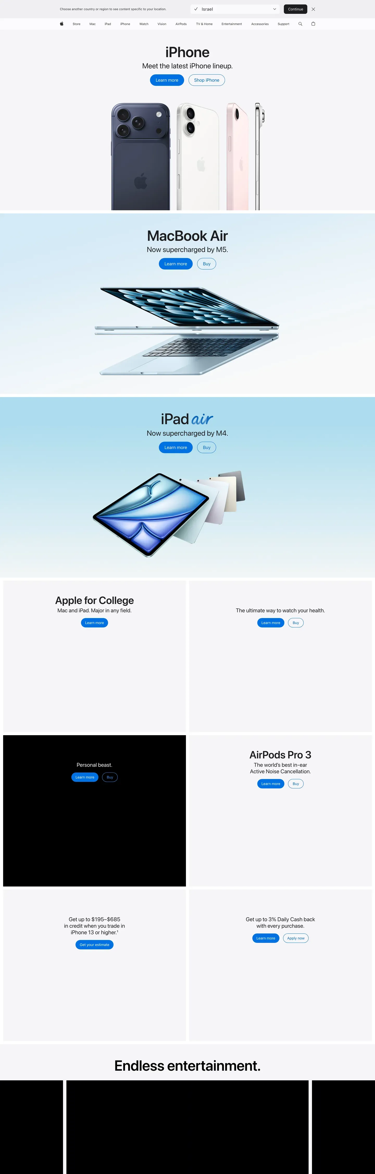
Apple's web presence is a masterclass in reverent product photography framed by near-invisible UI. Every page is a stack of edge-to-edge product tiles — alternating light and dark canvases, each centered on a hero headline, a one-line tagline, two tiny blue pill CTAs, and an impossibly crisp product render. Nothing competes with the product. Typography is confident but quiet; color is either pure white, an off-white parchment, or a near-black tile; interactive elements are a single, quiet Action Blue at #0066cc. Density is unusually low even by contemporary SaaS standards.
This page captures Apple's marketing system as a DESIGN.md file — Google Labs' open spec for machine-readable design tokens. Inside: 21 colors tokens covering the one signature blue, three near-black tile variants, white and parchment canvases, and a muted text ladder; 16 typography tokens running entirely on SF Pro Display (for display sizes) and SF Pro Text (for body and UI), with weight 500 deliberately absent from the ladder; seven radius tokens that hierarchically split between zero (full-bleed tiles) and pill (every interactive element); and 24 components definitions covering buttons, product tiles, the two-row navigation, store utility cards, the iPhone configurator, and a floating sticky purchase bar.
Drop the file into Claude, Cursor, GitHub Copilot, or any AI assistant that reads structured design tokens. The agent will produce React components and Tailwind classes that match Apple's actual voice — museum-grade reverence for product, not a generic SaaS template. Use it as a reference for design audits, a starting point for your own product-led marketing surface, or a teaching artifact for talking about restraint, single-accent systems, and the discipline of letting photography do the framing.
What makes it distinct
5
- Single interactive colorAction Blue #0066cc is every link, every pill CTA, every focus signal; no secondary brand accent exists
- Photography-first chromeUI recedes so the product can speak; exactly one drop-shadow in the system, reserved for product imagery
- Alternating tile rhythmfull-bleed light and dark canvases stack edge-to-edge; the color change itself is the section divider
- Body at 17px, not 16pxdisplay headlines carry negative letter-spacing for the signature Apple-tight cadence
- Weight 500 is absentthe type ladder runs 300/400/600/700, with the rare weight 300 reserved for airy moments
apple.com
Live at apple.com
A snapshot of the brand in production. Scroll the frame to see the whole page.
Colors
21 colors
Apple's system runs on #0066cc as its primary voltage, used in 6 of 24 components. Type is set in SF Pro Text across 16 tokens from 10px to 56px, weights 300–600. Shape language is mixed across 24 components, blending pills, soft rounds, and squarer corners.
Brand & Accent
Sparing, CTA-only voltage · 3
Surface
Page and card backgrounds · 8
Text
Headlines, body, captions · 8
Borders & Hairlines
Dividers, outlines, rules · 2
Typography
16 type tokens
Set in SF Pro Text across 16 tokens, from 10px to 56px, weights 300–600. Shown in its own stack: where the font isn't installed, the fallback the file names stands in.
- hero-display56px · weight 600 · lh 1.07 · tracking -0.28pxThe quick brown fox jumps over the lazy dog
- display-lg40px · weight 600 · lh 1.1The quick brown fox jumps over the lazy dog
- display-md34px · weight 600 · lh 1.47 · tracking -0.374pxThe quick brown fox jumps over the lazy dog
- lead28px · weight 400 · lh 1.14 · tracking 0.196pxThe quick brown fox jumps over the lazy dog
- lead-airy24px · weight 300 · lh 1.5The quick brown fox jumps over the lazy dog
- tagline21px · weight 600 · lh 1.19 · tracking 0.231pxThe quick brown fox jumps over the lazy dog
- body-strong17px · weight 600 · lh 1.24 · tracking -0.374pxThe quick brown fox jumps over the lazy dog
- body17px · weight 400 · lh 1.47 · tracking -0.374pxThe quick brown fox jumps over the lazy dog
- dense-link17px · weight 400 · lh 2.41The quick brown fox jumps over the lazy dog
- caption14px · weight 400 · lh 1.43 · tracking -0.224pxThe quick brown fox jumps over the lazy dog
- caption-strong14px · weight 600 · lh 1.29 · tracking -0.224pxThe quick brown fox jumps over the lazy dog
- button-large18px · weight 300 · lh 1The quick brown fox jumps over the lazy dog
- button-utility14px · weight 400 · lh 1.29 · tracking -0.224pxThe quick brown fox jumps over the lazy dog
- fine-print12px · weight 400 · lh 1 · tracking -0.12pxThe quick brown fox jumps over the lazy dog
- micro-legal10px · weight 400 · lh 1.3 · tracking -0.08pxThe quick brown fox jumps over the lazy dog
- nav-link12px · weight 400 · lh 1 · tracking -0.12pxThe quick brown fox jumps over the lazy dog
Layout
Radii and spacing
7 corner radii and 8 spacing values. Shape language: mixed.
Radii
- none0px
- xs5px
- sm8px
- md11px
- lg18px
- pill9999px
- full9999px
Spacing
- xxs4px
- xs8px
- sm12px
- md17px
- lg24px
- xl32px
- xxl48px
- section80px
Components
24 components
Each rendered from its tokens (color, type, radius, padding) on Apple's own canvas.
- Button Primarybutton-primaryButton Primary
- Button Primary Focusbutton-primary-focusButton Primary Focus
- Button Primary Activebutton-primary-activeButton Primary Active
- Button Secondary Pillbutton-secondary-pillButton Secondary Pill
- Button Dark Utilitybutton-dark-utilityButton Dark Utility
- Button Pearl Capsulebutton-pearl-capsuleButton Pearl Capsule
- Button Store Herobutton-store-heroButton Store Hero
- button-icon-circularButton Icon Circular
- Text Linktext-linkText Link
- Text Link On Darktext-link-on-darkText Link On Dark
- Global Navglobal-navGlobal Nav
- Sub Nav Frostedsub-nav-frostedSub Nav Frosted
- Product Tile Lightproduct-tile-lightProduct Tile Light
- Product Tile Parchmentproduct-tile-parchmentProduct Tile Parchment
- Product Tile Darkproduct-tile-darkProduct Tile Dark
- Product Tile Dark 2product-tile-dark-2Product Tile Dark 2
- Product Tile Dark 3product-tile-dark-3Product Tile Dark 3
- Store Utility Cardstore-utility-cardStore Utility Card
- Configurator Option Chipconfigurator-option-chipConfigurator Option Chip
- Configurator Option Chip Selectedconfigurator-option-chip-selectedConfigurator Option Chip Selected
- Search Inputsearch-inputSearch Input
- Floating Sticky Barfloating-sticky-barFloating Sticky Bar
- Environment Quote Cardenvironment-quote-cardEnvironment Quote Card
- FooterfooterFooter
In use
The system, in use
Apple's tokens on the kind of product it builds.
Build something people actually use.
A short paragraph of marketing copy that previews how the brand's display tier and body tier read together. Two sentences is usually enough.
FAQ
Apple design system FAQ
Common questions about Apple's tokens, components, and how to use this DESIGN.md in your project.
Read next
Related reading
Specs, directories, and component libraries that pair with this design system.
Use it
Use Apple in your project
One machine-readable file. Drop it into Claude, Cursor, or any AI tool that reads DESIGN.md.
Download the DESIGN.md
One machine-readable file: every color, type, radius, spacing, and component token of Apple.
Feed it to your AI tool
Drop it into Claude, Cursor, or GitHub Copilot. The agent writes React components and Tailwind classes that match Apple's visual language.
Reference the tokens directly
Or paste the values into your Tailwind config, CSS variables, or component library: every color, size and radius is a quoted, ready-to-copy value.
Read the full DESIGN.md: overview, rationale, do’s and don’ts
Overview
Apple's web presence is a masterclass in reverent product photography framed by near-invisible UI. Every page is a stack of edge-to-edge product "tiles" — alternating light and dark canvases, each centered on a hero headline, a one-line tagline, two tiny blue pill CTAs, and an impossibly crisp product render. Nothing competes with the product. Typography is confident but quiet; color is either pure white, an off-white parchment, or a near-black tile; interactive elements are a single, quiet blue.
Density is unusually low even by contemporary SaaS standards. Each tile occupies roughly one viewport, and there is no decorative chrome — no borders, no gradients, no decorative frames, no shadows on headlines. Elevation appears only when a product image rests on a surface (a single soft rgba(0, 0, 0, 0.22) 3px 5px 30px drop for visual weight). The result is a catalog that feels more like a museum gallery: the wall disappears and the artifact takes over.
Store and shop surfaces retain the same chassis but switch modes. The product configurator (iPhone 17 Pro, accessories grid) introduces a tight grid of white utility cards at {rounded.lg} (18px) radius with a thin border, paired with a persistent thin sub-nav strip. The environment page leans darker and more editorial. Across all five surfaces the typographic system, spacing rhythm, and the single blue accent are consistent — this is one design language expressed at different volumes.
Key Characteristics:
- Photography-first presentation; UI recedes so the product can speak.
- Alternating full-bleed tile sections: white/parchment ↔ near-black, with the color change itself acting as the section divider.
- Single blue accent (
{colors.primary}— #0066cc) carries every interactive element. No second brand color exists. - Two button grammars: tiny blue pill CTAs (
{rounded.pill}) and compact utility rects ({rounded.sm}). - SF Pro Display + SF Pro Text — negative letter-spacing at display sizes for the signature "Apple tight" headline feel.
- Whisper-soft elevation used only when a product image needs to breathe — exactly one drop-shadow in the entire system.
- Tight two-row nav: slim
{component.global-nav}+ product-specific{component.sub-nav-frosted}with persistent right-aligned primary CTA. - Section rhythm across multiple pages: light hero → dark product tile → light utility tile → dark tile → parchment footer — a predictable pulse.
Colors
Source pages analyzed: homepage, environment, store, iPhone 17 Pro buy page, accessories index. The color system is identical across all five surfaces; only the surface-mode mix differs.
Brand & Accent
- Action Blue (
{colors.primary}— #0066cc): The single brand-level interactive color. All text links, all blue pill CTAs ("Learn more", "Buy"), and the focus ring root. This is Apple's quiet but universal "click me" signal. Press state shifts to a slightly darker variant via the active scale transform rather than a hex change. - Focus Blue (
{colors.primary-focus}— #0071e3): A marginally brighter sibling of Action Blue, reserved for the keyboard focus ring on buttons (outline: 2px solid). - Sky Link Blue (
{colors.primary-on-dark}— #2997ff): A brighter blue used on dark surfaces for in-copy links and inline callouts, where Action Blue would disappear against the tile background.
Surface
- Pure White (
{colors.canvas}— #ffffff): The dominant canvas. Content, utility cards, store tiles, configurator grids. - Parchment (
{colors.canvas-parchment}— #f5f5f7): The signature Apple off-white. Used for alternating light tiles, footer region, and the default page canvas in store utility sections. Just different enough from white to create rhythm. - Pearl Button (
{colors.surface-pearl}— #fafafc): A near-white used as the fill for secondary "ghost" buttons — lighter than the parchment canvas so the button still reads as a button against{colors.canvas-parchment}. - Near-Black Tile 1 (
{colors.surface-tile-1}— #272729): The primary dark-tile surface on the homepage product grid. - Near-Black Tile 2 (
{colors.surface-tile-2}— #2a2a2c): A micro-step lighter — used where a dark tile sits directly above or below Tile 1 to create the faintest separation. - Near-Black Tile 3 (
{colors.surface-tile-3}— #252527): A micro-step darker — used at the bottom of the stack and in embedded video/player frames. - Pure Black (
{colors.surface-black}— #000000): Reserved for true void — video player backgrounds, edge-to-edge photographic overlays, the global nav bar background. - Translucent Chip Gray (
{colors.surface-chip-translucent}— #d2d2d7): The base hex of the translucent gray chip used over photography for circular control buttons. In production, applied at ~64% alpha asrgba(210, 210, 215, 0.64).
Text
- Near-Black Ink (
{colors.ink}— #1d1d1f): The voice of every headline, every body paragraph, and the dark utility button's fill. Chosen instead of pure black to keep the page feeling photographic rather than printed. - Body (
{colors.body}— #1d1d1f): Same hex as ink — Apple uses one near-black tone for all text on light surfaces. - Body On Dark (
{colors.body-on-dark}— #ffffff): All text on dark tiles and on the global nav bar. - Body Muted (
{colors.body-muted}— #cccccc): Secondary copy on dark tiles where pure white would be too loud. - Ink Muted 80 (
{colors.ink-muted-80}— #333333): Body text on the white Pearl Button surface — slightly softer than pure black. - Ink Muted 48 (
{colors.ink-muted-48}— #7a7a7a): Disabled button text and legal fine-print.
Hairlines & Borders
- Divider Soft (
{colors.divider-soft}— #f0f0f0): The "border" tone on secondary buttons — functions as a ring shadow rather than a hard line. In production, often applied asrgba(0, 0, 0, 0.04). - Hairline (
{colors.hairline}— #e0e0e0): The 1px hairline border on store utility cards and configurator chips.
Brand Gradient
No decorative gradients. Atmospheric depth on product photography (the iPhone 17 Pro camera plate, the Apple Watch bands, AirPods reflections) is inherent to the imagery, not a CSS gradient overlay. The environment page's hero uses photographic atmosphere (mountain vista at dawn) but no gradient tokens are defined. Apple is the rare luxury-brand site with zero gradient-based design tokens.
Typography
Font Family
- Display:
SF Pro Display, system-ui, -apple-system, sans-serif— Apple's proprietary display face, optimized for sizes ≥ 19px. Defines the voice of every headline. - Body / UI:
SF Pro Text, system-ui, -apple-system, sans-serif— the text-optimized variant used for body copy, captions, buttons, and links below 20px. - OpenType features:
font-variant-numeric: numeratoris enabled on numeric links (pricing tables, spec sheets). Display sizes rely on tight tracking rather than contextual ligatures.
Hierarchy
| Token | Size | Weight | Line Height | Letter Spacing | Use |
|---|---|---|---|---|---|
{typography.hero-display} | 56px | 600 | 1.07 | -0.28px | Hero headline; the signature "Apple tight" tracking |
{typography.display-lg} | 40px | 600 | 1.10 | 0 | Tile headlines atop every product tile |
{typography.display-md} | 34px | 600 | 1.47 | -0.374px | Section heads (SF Pro Text at display proportions) |
{typography.lead} | 28px | 400 | 1.14 | 0.196px | Product tile subcopy |
{typography.lead-airy} | 24px | 300 | 1.5 | 0 | Environment-page lead paragraphs (the rare weight 300) |
{typography.tagline} | 21px | 600 | 1.19 | 0.231px | Sub-tile tagline; sub-nav category name |
{typography.body-strong} | 17px | 600 | 1.24 | -0.374px | Inline strong emphasis |
{typography.body} | 17px | 400 | 1.47 | -0.374px | Default paragraph |
{typography.dense-link} | 17px | 400 | 2.41 | 0 | Footer / store utility link lists (relaxed leading) |
{typography.caption} | 14px | 400 | 1.43 | -0.224px | Secondary captions, button text |
{typography.caption-strong} | 14px | 600 | 1.29 | -0.224px | Emphasized captions |
{typography.button-large} | 18px | 300 | 1.0 | 0 | Store hero CTAs (the rare weight 300) |
{typography.button-utility} | 14px | 400 | 1.29 | -0.224px | Utility/nav button labels |
{typography.fine-print} | 12px | 400 | 1.0 | -0.12px | Fine-print, footer body |
{typography.micro-legal} | 10px | 400 | 1.3 | -0.08px | Micro legal disclaimers |
{typography.nav-link} | 12px | 400 | 1.0 | -0.12px | Global nav menu items |
Principles
- Negative letter-spacing at display sizes. Every headline at 17px and up carries a slight tracking tighten (
-0.12 → -0.374px). This produces the iconic "Apple tight" headline cadence. Never used at 12px or below. - Body copy at 17px, not 16px. Apple breaks the SaaS convention and runs paragraph text at 17px. The extra pixel gives the page an unmistakable "reading, not scanning" pace.
- Weight 300 is real and rare. Used deliberately on a handful of large-size reads (
{typography.button-large}at 18px/300 and{typography.lead-airy}at 24px/300). It's not an accident — it's a light-atmosphere cue reserved for moments where the content should feel airy. - Weight 600, not 700, for headlines. Apple's headlines sit at weight 600. Weight 700 is used sparingly for
{typography.tagline}(21px) when a touch more assertion is needed. - Line-height is context-specific. Display sizes use 1.07–1.19 (tight). Body uses 1.47. Utility link stacks in the footer/store use an unusually relaxed 2.41 (
{typography.dense-link}). The 2.41 is not a bug — it's how the footer's dense link columns breathe. - Weight 500 is deliberately absent. The ladder is 300 / 400 / 600 / 700. Mid-weight readings always use 600.
Note on Font Substitutes
SF Pro is Apple's proprietary system font. When building off-system:
- Use
system-ui, -apple-system, BlinkMacSystemFontas the first stack entry — on macOS/iOS/Safari this resolves to the real SF Pro. - For non-Apple platforms, Inter (Google Fonts, variable) is the closest open-source equivalent. Inter at weight 600 with
font-feature-settings: "ss03"approximates SF Pro's rounded "a" character. - Nudge
letter-spacingdown by-0.01emon display sizes to re-create the Apple tight feel; Inter's default tracking runs slightly wider than SF Pro. - For body text, tighten line-height by
0.03(from 1.47 → 1.44) when substituting Inter — Inter's taller x-height needs less leading.
Layout
Spacing System
- Base unit: 8px. Sub-base values (2, 4, 5, 6, 7) are used for tight typographic adjustments; structural layout snaps to 8/12/16/20/24.
- Tokens:
{spacing.xxs}4px ·{spacing.xs}8px ·{spacing.sm}12px ·{spacing.md}17px ·{spacing.lg}24px ·{spacing.xl}32px ·{spacing.xxl}48px ·{spacing.section}80px. - Section vertical padding:
{spacing.section}(80px) inside a product tile; tiles stack edge-to-edge with 0 gap (the color change provides the break). - Card padding:
{spacing.lg}(24px) inside utility grid cards. - Button padding: 8–11px vertical, 15–22px horizontal.
- Universal rhythm constants: the 17px body line-height multiplier (~25px line) and 21px tagline size show up on every analyzed page.
Grid & Container
- Max content width: ~980px on text-heavy sections (environment), ~1440px on product grids (store, accessories), full-bleed for product tiles (homepage).
- Column patterns: 3 to 5 column utility card grid on store/accessories; 2-column side-by-side tiles on homepage occasional sections; single-column centered stack on product tile heroes.
- Gutters: 20–24px between cards in a utility grid.
Whitespace Philosophy
Apple's whitespace is the product's pedestal. Every tile begins with at least 64px of air above its headline and 48–64px below. Product renders are never crowded; the nearest content to a product image is at least 40px away. The footer is the only area that breaks this — there, Apple goes deliberately dense to make the full information architecture visible at a glance.
Elevation & Depth
| Level | Treatment | Use |
|---|---|---|
| Flat | No shadow, no border | Full-bleed tiles, global nav, footer, body sections |
| Soft hairline | 1px rgba(0, 0, 0, 0.08) border | Utility cards, sub-nav frosted-glass separator |
| Backdrop blur | backdrop-filter: blur(N) on Parchment 80% | Sub-nav and the iPhone buy floating sticky bar |
| Product shadow | rgba(0, 0, 0, 0.22) 3px 5px 30px 0 | Product renders resting on a surface (the only true "shadow" in the system) |
Shadow philosophy. Apple uses exactly one drop-shadow, and it is applied to photographic product imagery — never to cards, never to buttons, never to text. Elevation in the UI comes from (a) surface-color change (light tile ↔ dark tile) and (b) backdrop-blur on sticky bars. The single shadow is about giving the product weight, not about UI hierarchy.
Decorative Depth
- Atmospheric imagery on the environment page (photographic vista) supplies mood; no CSS gradient involved.
- Edge-to-edge tile alternation creates rhythm without borders or shadows — the color change itself is the divider.
- Backdrop-filter blur on
{component.sub-nav-frosted}and{component.floating-sticky-bar}creates a "floating over content" effect that's functional, not decorative.
Shapes
Border Radius Scale
| Token | Value | Use |
|---|---|---|
{rounded.none} | 0px | Full-bleed product tiles (no corner rounding) |
{rounded.xs} | 5px | Inline links when styled as subtle chips (rare) |
{rounded.sm} | 8px | Dark utility buttons (Sign In, Bag), inline card imagery |
{rounded.md} | 11px | White Pearl Button capsules |
{rounded.lg} | 18px | Store utility cards, accessories grid cards |
{rounded.pill} | 9999px | Primary blue pill CTAs, sub-nav buy button, configurator option chips, search input — the signature Apple pill |
{rounded.full} | 9999px / 50% | Circular control chips floating over photography |
Photography Geometry
- Hero imagery: full-bleed, 21:9 or taller on the homepage; 16:9 on environment and shop pages. Product renders are photographic-realistic, often shot on a tinted surface that becomes the tile background.
- Product renders: PNG/WebP with transparency; rest on a surface tile and pick up the system shadow.
- Accessory grid: square 1:1 crops at
{rounded.lg}(18px) radius, light neutral backgrounds, product centered with 20–40px internal padding. - No rounded imagery in hero tiles — images are full-bleed rectangular. Rounding (
{rounded.sm},{rounded.lg}) appears only on inline card imagery. - Lazy-loading via responsive
srcsetandsizesacross all breakpoints; CDN-optimized WebP.
Components
Top Navigation
global-nav — Persistent, ultra-thin black nav bar pinned to the top of every page. Background {colors.surface-black}, height 44px, text {colors.on-dark} in {typography.nav-link} (12px / 400 / -0.12px tracking). Links are quiet, spaced ~20px apart, running edge-to-edge across the top. Right-aligned cluster: Search, Bag icons — always visible. On mobile, collapses to hamburger at ~834px and the Apple logo centers.
sub-nav-frosted — Surface-specific nav that sticks below the global nav. Background {colors.canvas-parchment} at 80% opacity with backdrop-filter blur, creating a frosted-glass effect. Height 52px. Content on left: product category name ("iPhone", "Store", "Accessories") in {typography.tagline} (21px / 600). Content right: inline nav links in {typography.button-utility} (14px), ending in a persistent {component.button-primary} ("Buy") or a utility link.
Buttons
button-primary — The signature Apple action. Background {colors.primary} (Action Blue #0066cc), text {colors.on-primary} in {typography.body} (SF Pro Text 17px / 400), rounded {rounded.pill} (full pill — capsule-shaped), padding 11px × 22px. The full-pill radius IS the brand action signal.
- Active state:
{component.button-primary-active}—transform: scale(0.95)(the system-wide micro-interaction). - Focus state:
{component.button-primary-focus}— 2px solid{colors.primary-focus}outline.
button-secondary-pill — Used as the second CTA when two blue pills appear together ("Learn more" / "Buy"). Background transparent, text {colors.primary}, 1px solid {colors.primary} border, rounded {rounded.pill}, padding 11px × 22px. Reads as a "ghost pill."
button-dark-utility — Global nav actions (Sign In, Bag, language selector). Background {colors.ink} (#1d1d1f), text {colors.on-dark} in {typography.button-utility} (14px / 400 / -0.224px tracking), rounded {rounded.sm} (8px), padding 8px × 15px. Active state shrinks via transform: scale(0.95).
button-pearl-capsule — Product-card secondary button. Background {colors.surface-pearl} (#fafafc), text {colors.ink-muted-80} in {typography.caption} (14px), 3px solid {colors.divider-soft} border (functions as a soft ring rather than a visible line), rounded {rounded.md} (11px), padding 8px × 14px.
button-store-hero — A larger primary CTA used on store hero surfaces. Same Action Blue + Paper White as {component.button-primary}, but with {typography.button-large} (18px / 300 — note the rare weight 300) and slightly more padding (14px × 28px). Used sparingly on the store landing.
button-icon-circular — Floats over photography. 44 × 44px, background {colors.surface-chip-translucent} at ~64% alpha, icon in {colors.ink}, rounded {rounded.full}. Used for carousel controls, close buttons, and in-image controls (product image thumbnails on the iPhone buy page).
text-link — Inline body links in {colors.primary} (Action Blue). Underlined or non-underlined per context.
text-link-on-dark — Inline body links on dark tiles in {colors.primary-on-dark} (Sky Link Blue #2997ff) — Action Blue would disappear against {colors.surface-tile-1}.
Cards & Containers
product-tile-light — Full-bleed light tile. Background {colors.canvas} (white), text {colors.ink}, rounded {rounded.none} (0 — tiles touch edges), vertical padding {spacing.section} (80px). Centered stack: product name in {typography.display-lg} (40px / 600) → one-line tagline in {typography.lead} (28px / 400) → two {component.button-primary} CTAs ("Learn more" / "Buy") → product render resting on the surface with the system shadow.
product-tile-parchment — Same as {component.product-tile-light} but on {colors.canvas-parchment} (#f5f5f7). Used to break two consecutive white tiles.
product-tile-dark — Full-bleed dark tile. Background {colors.surface-tile-1} (#272729), text {colors.on-dark}, rounded {rounded.none}, vertical padding {spacing.section} (80px). Same content stack as the light tile but with {component.text-link-on-dark} for inline copy and {component.button-primary} (Action Blue still works on the dark surface). Used on the homepage product grid as the alternating dark band.
product-tile-dark-2 — Variant on {colors.surface-tile-2} (#2a2a2c). Used where a dark tile sits directly above or below {component.product-tile-dark} to create the faintest separation through micro-step lightness change.
product-tile-dark-3 — Variant on {colors.surface-tile-3} (#252527). Used at the bottom of the stack and in embedded video/player frames.
store-utility-card — Used in store grid and accessories grid. Background {colors.canvas} (white), 1px solid {colors.hairline} border, rounded {rounded.lg} (18px), padding {spacing.lg} (24px). Top: product image (1:1 crop with {rounded.sm} (8px) inner image radius). Below: product name in {typography.body-strong} (17px / 600), price in {typography.body} (17px / 400), and a {component.text-link} ("Buy" or "Learn more"). No shadow by default; product render itself carries the system product-shadow.
configurator-option-chip — Pill-shaped tappable cell used in the iPhone 17 Pro buy page. Background {colors.canvas}, text {colors.ink} in {typography.caption}, rounded {rounded.pill}, padding 12px × 16px. Contains a small product thumbnail + label + price delta. Arranged in a grid of 4–5 options per row.
configurator-option-chip-selected — Selected state. Border upgrades to 2px solid {colors.primary-focus}. Same shape, same content.
environment-quote-card — A photographic-canvas hero specific to the environment page. Dark photographic backdrop (mountain vista at dawn) with {colors.surface-tile-1} as the fallback color, centered white-text headline in {typography.display-lg} (40px), small green "Apple 2030" pictographic logo above the headline, single {component.button-primary} below. Padding {spacing.section} (80px).
floating-sticky-bar — Floats at the bottom of the viewport on the iPhone 17 Pro buy page during scroll. Background {colors.canvas-parchment} at 80% opacity with backdrop-filter: blur(N), height 64px, padding 12px × 32px. Left: running price total in {typography.body}. Right: {component.button-primary} ("Add to Bag").
Inputs & Forms
search-input — The accessories search input. Background {colors.canvas}, text {colors.ink} in {typography.body} (17px), 1px solid rgba(0, 0, 0, 0.08) border, rounded {rounded.pill} (full pill — search is also pill-shaped, matching the CTA grammar), padding 12px × 20px, height 44px. Leading icon: search glyph at 14px, muted tint.
Error and validation states were not surfaced in the analyzed pages.
Footer
footer — Background {colors.canvas-parchment} (#f5f5f7), text {colors.ink-muted-80}. Link columns in {typography.dense-link} (17px / 400 / 2.41 line-height — the relaxed leading is what makes the dense columns scannable). Column headings in {typography.caption-strong} (14px / 600). Legal row at the very bottom in {typography.fine-print} (12px / 400) with {colors.ink-muted-48} text. Vertical padding 64px.
Do's and Don'ts
Do
- Use
{colors.primary}(Action Blue #0066cc) for every interactive element — links, pill CTAs, focus signals — and nothing else. The single accent is non-negotiable. - Set headlines in
{typography.hero-display}or{typography.display-lg}with negative letter-spacing (-0.28 → -0.374px) to get the signature "Apple tight" cadence. - Run body copy at
{typography.body}(17px / 400 / 1.47 / -0.374px) — not 16px. The extra pixel defines the brand's reading pace. - Alternate
{component.product-tile-light}(or parchment) and{component.product-tile-dark}for full-bleed section rhythm. The color change IS the divider. - Reserve
{rounded.pill}for the primary blue CTA and any other element that should read as an "action" (configurator chips, search input, sticky bar CTA). - Apply the single product-shadow (
rgba(0, 0, 0, 0.22) 3px 5px 30px) only to product renders resting on a surface — never on cards, buttons, or text. - Use
transform: scale(0.95)as the active/press state on every button — it's the system-wide micro-interaction. - Keep the global nav
{colors.surface-black}(true black) — it's the only place pure black appears on most pages.
Don't
- Don't introduce a second accent color; every "click me" signal is
{colors.primary}(Action Blue). - Don't add shadows to cards, buttons, or text — shadow is reserved for product imagery.
- Don't use gradients as decorative backgrounds; atmosphere comes from photography.
- Don't set body copy at weight 500 — Apple's ladder is 300 / 400 / 600 / 700, with 500 deliberately absent. Body is always 400; strong inline is 600; display is 600.
- Don't round full-bleed tiles — tiles are rectangular and edge-to-edge; the color change is the divider.
- Don't tighten line-height below 1.47 for body copy — the editorial leading is part of the brand.
- Don't mix radii grammars — use
{rounded.sm}for compact utility,{rounded.lg}for utility cards,{rounded.pill}for pills, and nothing in between (except the rare{rounded.md}Pearl Button). - Don't use
{colors.primary-on-dark}(Sky Link Blue) on light surfaces — it's the dark-tile-only variant. Action Blue is for light surfaces.
Responsive Behavior
Breakpoints
| Name | Width | Key Changes |
|---|---|---|
| Small phone | ≤ 419px | Single-column tiles; sub-nav collapses to category name + primary CTA only; hero typography drops to 28px |
| Phone | 420–640px | Single-column stack; product renders scale to 80% of tile width; hero h1 drops to 34px |
| Large phone | 641–735px | Tiles transition to tighter padding (48px vertical vs 80px); fine-print wraps |
| Tablet portrait | 736–833px | Global nav collapses to hamburger; sub-nav hides category chips, keeps primary CTA |
| Tablet landscape | 834–1023px | Global nav returns fully expanded; 3-column utility grids become 2-column |
| Small desktop | 1024–1068px | Product tiles use 2/3 width with margin gutters; hero h1 stays at 40px |
| Desktop | 1069–1440px | Full layout; 4–5 column store grids; 1440px content max |
| Wide desktop | ≥ 1441px | Content locks at 1440px, margins absorb extra width |
The structural breakpoints that matter for agents: 1440px (content lock), 1068px (small-desktop), 833px (tablet landscape switch), 734px (tablet portrait), 640px (phone), 480px (small phone).
Touch Targets
- Minimum 44 × 44px.
{component.button-primary}lands at ~44 × 100px (with the full-pill radius making the visible hit area more generous than the label suggests). {component.button-icon-circular}is exactly 44 × 44px.- Global nav utility links are smaller (~32 × 80px) — they deliberately sit at a tighter target because they're precision desktop actions, and the mobile hamburger replaces them at ≤ 833px.
Collapsing Strategy
- Global nav: full horizontal link row on desktop → collapses to Apple logo + hamburger + bag icon at 834px and below.
- Sub-nav: category name + inline links + primary CTA → category name + primary CTA only at mobile; inline links move into a hamburger tray.
- Product tiles: stack from 2-column to 1-column at 834px; vertical padding tightens from 80px → 48px at small-phone.
- Utility grids (store, accessories): 5-col → 4-col (1440px) → 3-col (1068px) → 2-col (834px) → 1-col (640px).
- Hero typography:
{typography.hero-display}(56px) →{typography.display-lg}(40px) at 1068px → 34px at 640px → 28px at 419px.
Image Behavior
- All product imagery uses responsive
srcsetwith breakpoint-matched crops. - Hero photography may switch art direction at mobile (e.g., the environment page's vista crops to a taller aspect ratio on mobile, framing the subject differently).
- Product renders maintain their 1:1 or 4:3 aspect ratios across breakpoints; only scale changes.
- Lazy-loading is default; the above-fold hero loads eagerly.
Iteration Guide
- Focus on ONE component at a time. Reference its YAML key directly (
{component.product-tile-dark},{component.search-input}). - Variants of an existing component (
-active,-focus,-2,-3) live as separate entries incomponents:. - Use
{token.refs}everywhere — never inline hex. - Never document hover. Default and Active/Pressed states only.
- Display headlines stay SF Pro Display 600 with negative letter-spacing. Body stays SF Pro Text 400 at 17px. The boundary is unbreakable.
- The single drop-shadow (
rgba(0, 0, 0, 0.22) 3px 5px 30px) is reserved for product photography only. - When in doubt about emphasis: alternate surface (light → dark tile) before adding chrome.
Known Gaps
- Form validation and error states were not surfaced on the analyzed pages; only the neutral search input is documented.
- The homepage's embedded video/player frame uses
{colors.surface-black}; interior player controls are not documented (they're a platform widget, not a web-design token). - Some component imagery is dynamic (rotating product hero) and its specific copy varies per surface — component specs name the structure, not the rotating content.
- Dark-mode counterparts for store and accessories utility cards were not surfaced on the analyzed pages; the system documented is the daytime/light-dominant variant Apple ships by default.
- Atmospheric photography (environment page mountain vista) is a content asset, not a design token; the documented
{component.environment-quote-card}describes the structural surface only. - The exact backdrop-filter blur radius on
{component.sub-nav-frosted}and{component.floating-sticky-bar}is platform-dependent; production CSS usessaturate(180%) blur(20px)as a typical baseline but the value isn't formalized as a token.
Consumer Electronics
More systems like this
More DESIGN.md files in Consumer Electronics.
Pricing
Build it with Pro
The DESIGN.md files are free. Pro adds 6,000+ blocks, premium templates and the MCP server, so your AI editor builds in your system for you.
4.9/5 out of 5 · 150+ reviewsfrom 150+ founders and developers.
Billing
Billed once a year in USD. Cancel anytime.
- How many people can use the license.
- Client work, SaaS products and anything you charge for.
- Production-ready React sections: hero, pricing, features, dashboards and more.
- Complete multi-page sites you can ship as they are.
- React icons from every major library, installable with one command.
- Presets that restyle every block, in light and dark.
- Lets your AI editor search, preview and install blocks for you.
- Priority requests are answered first.
Individual
For personal projects & open source
$32instead of $49/mo
$389 billed yearly
- Seats: 1 seat
- Commercial use: Personal & open source only
- Pro blocks: 6,000+ blocks
- Templates: All 14 templates
- React icons: 294k+ icons
- Themes: All 59 themes
- MCP server: Basic usage
- Support: Standard
Team
Most popularFor freelancers, agencies & startups
$66instead of $99/mo
$789 billed yearly · ≈ $13/dev/mo
- Seats: Up to 5 seats
- Commercial use: Included
- Pro blocks: 6,000+ blocks
- Templates: All 14 templates
- React icons: 294k+ icons
- Themes: All 59 themes
- MCP server: High usage
- Support: Priority
Organization
For companies with larger teams
$132instead of $199/mo
$1,589 billed yearly
- Seats: Unlimited seats
- Commercial use: Included
- Pro blocks: 6,000+ blocks
- Templates: All 14 templates
- React icons: 294k+ icons
- Themes: All 59 themes
- MCP server: Unlimited usage
- Support: Priority
Billed once a year in USD. Cancel anytime.
Individual
For personal projects & open source
$32instead of $49/mo
$389 billed yearly
- How many people can use the license.Seats: 1 seat
- Client work, SaaS products and anything you charge for.Commercial use: Personal & open source only
- Production-ready React sections: hero, pricing, features, dashboards and more.Pro blocks: 6,000+ blocks
- Complete multi-page sites you can ship as they are.Templates: All 14 templates
- React icons from every major library, installable with one command.React icons: 294k+ icons
- Presets that restyle every block, in light and dark.Themes: All 59 themes
- Lets your AI editor search, preview and install blocks for you.MCP server: Basic usage
- Priority requests are answered first.Support: Standard
Team
Most popularFor freelancers, agencies & startups
$66instead of $99/mo
$789 billed yearly · ≈ $13/dev/mo
Everything in Individual, plus
- How many people can use the license.Seats: Up to 5 seats
- Client work, SaaS products and anything you charge for.Commercial use: Included
- Lets your AI editor search, preview and install blocks for you.MCP server: High usage
- Priority requests are answered first.Support: Priority
Organization
For companies with larger teams
$132instead of $199/mo
$1,589 billed yearly
Everything in Team, plus
- How many people can use the license.Seats: Unlimited seats
- Lets your AI editor search, preview and install blocks for you.MCP server: Unlimited usage
- Secure checkout via Stripe
- Code lives in your repo
- Keep what you've shipped if you cancel
- License terms
Your system, built for you
Every block, template and icon, installed by your AI agent in your design system. The DESIGN.md files stay free.