Ferrari Design System
Ferrari's design system as a DESIGN.md file. Rosso Corsa #da291c, FerrariSans, near-black #181818 canvas, 24 components. For React, Next.js, and AI tools.
Add shadcn.io to your AI agent. · Pro It installs blocks, icons and templates in your design system from a prompt, with Pro.
Set up MCP- Primary
- #da291c
- Typeface
- FerrariSans
- Shape
- Sharp
- Base radius
- 6px
- Colors
- 26
- Type tokens
- 13
- Components
- 24
- Spacing values
- 9
About
About Ferrari DESIGN.md
Curated by Dov Azencot · Updated May 12, 2026 · Source ferrari.com (opens in a new tab)
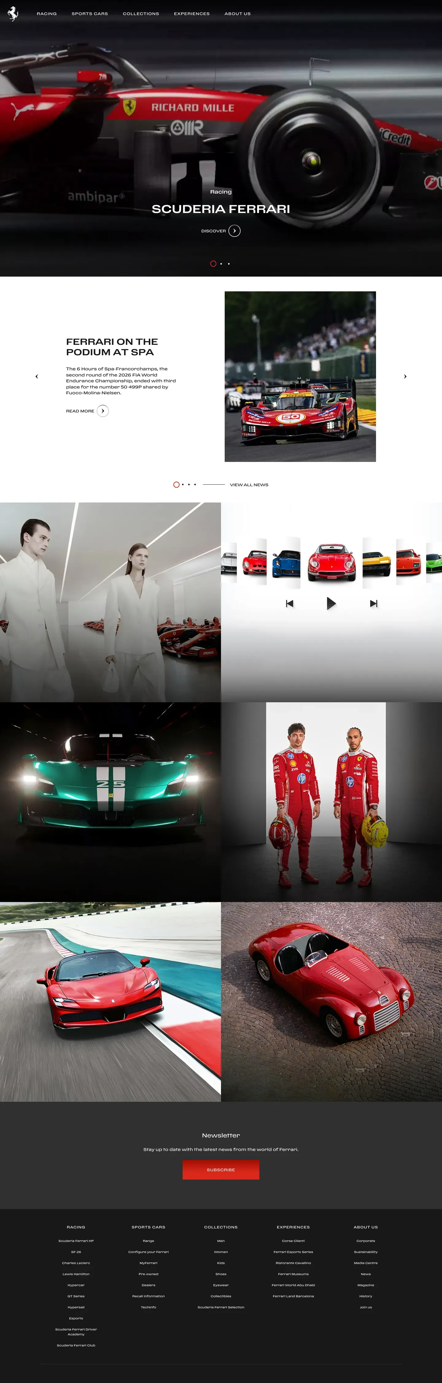
Ferrari's marketing site does not behave like a typical car-OEM site. It behaves like a luxury magazine spread. The canvas is near-black at #181818 — slightly warm, never pure black — holding pure white FerrariSans display type at a restrained 500 weight. The only saturated color in the system is Rosso Corsa at #da291c, the racing red Ferrari has used since the 1920s, and it appears scarcely: primary CTAs, the Cavallino mark, and Formula 1 race-position numbers. Everything else is photography. Full-bleed cinematic hero shots — car details, livery panels, trackside frames — carry the visual weight, while typography stays quiet beneath. The discipline is the point.
This page packages the system into a single DESIGN.md file using the Google Labs open spec. Inside: 26 colors tokens grouped into brand, surface, hairline, text, and semantic; 14 typography tokens running through FerrariSans at 500 for display and 400/700 for body; 7 corner-radius values capped by a dominant 0px sharp default; 9 spacing tokens on an explicit 8px ladder (xxxs 4px through super 128px); and 24 components covering top nav, buttons, hero bands, feature and driver cards, livery accent bands, preowned listing cards, spec cells, race-position cells, race-calendar rows, forms, badges, newsletter inputs, and the dark CTA and footer.
Feed the file to Claude, Cursor, or GitHub Copilot, and the AI writes React components that read as Ferrari — sharp 0px corners, uppercase tracked CTAs, FerrariSans 500 display, scarce Rosso Corsa — rather than a generic dark-mode SaaS theme. Reference the tokens directly in Tailwind config or CSS variables. Or use it as a design audit: most automotive sites copy the dark canvas but miss the restraint that makes it work. Ferrari's strength is what it refuses to do.
What makes it distinct
5
- Single accent voltageRosso Corsa (#da291c) reserved for primary CTAs, the Cavallino, and F1 race-position highlights
- Near-black canvas (#181818)never pure black, slightly warm; white bands appear only inside preowned and pricing surfaces
- Sharp 0px corners on every CTA, card, and bandpill geometry is reserved for badge labels only
- Display weight stays at 500uppercase CTA labels carry 1.4px tracking; the cinematic photography does the visual heavy-lifting
- Explicit 8px spacing ladder with named scalexxxs 4px through super 128px, no ad-hoc px values
ferrari.com
Live at ferrari.com
A snapshot of the brand in production. Scroll the frame to see the whole page.
Colors
26 colors
Ferrari's system runs on #da291c as its primary voltage, used in 3 of 24 components. Type is set in FerrariSans across 13 tokens from 11px to 80px, weights 400–700. Shape language is sharp — components average 1px corner radius, favoring crisp rectangles.
Brand & Accent
Sparing, CTA-only voltage · 5
Surface
Page and card backgrounds · 6
Text
Headlines, body, captions · 10
Borders & Hairlines
Dividers, outlines, rules · 2
Semantic
Status, errors, success, links · 3
Typography
13 type tokens
Set in FerrariSans across 13 tokens, from 11px to 80px, weights 400–700. Shown in its own stack: where the font isn't installed, the fallback the file names stands in.
- display-mega80px · weight 500 · lh 1.05 · tracking -1.6pxThe quick brown fox jumps over the lazy dog
- display-xl56px · weight 500 · lh 1.1 · tracking -1.12pxThe quick brown fox jumps over the lazy dog
- display-lg36px · weight 500 · lh 1.2 · tracking -0.36pxThe quick brown fox jumps over the lazy dog
- display-md26px · weight 500 · lh 1.5 · tracking 0.195pxThe quick brown fox jumps over the lazy dog
- title-md18px · weight 700 · lh 1.2The quick brown fox jumps over the lazy dog
- title-sm16px · weight 500 · lh 1.4 · tracking 0.08pxThe quick brown fox jumps over the lazy dog
- body-md14px · weight 400 · lh 1.5The quick brown fox jumps over the lazy dog
- body-sm13px · weight 400 · lh 1.5The quick brown fox jumps over the lazy dog
- caption12px · weight 400 · lh 1.4The quick brown fox jumps over the lazy dog
- caption-uppercase11px · weight 600 · lh 1.4 · tracking 1.1pxThe quick brown fox jumps over the lazy dog
- button14px · weight 700 · lh 1 · tracking 1.4pxThe quick brown fox jumps over the lazy dog
- nav-link13px · weight 600 · lh 1.4 · tracking 0.65pxThe quick brown fox jumps over the lazy dog
- number-display80px · weight 700 · lh 1 · tracking -1.6pxThe quick brown fox jumps over the lazy dog
Layout
Radii and spacing
7 corner radii and 9 spacing values. Shape language: sharp.
Radii
- none0px
- xs2px
- sm4px
- md6px
- lg8px
- xl12px
- full9999px
Spacing
- xxxs4px
- xxs8px
- xs16px
- sm24px
- md32px
- lg48px
- xl64px
- xxl96px
- super128px
Components
24 components
Each rendered from its tokens (color, type, radius, padding) on Ferrari's own canvas.
- Top Nav On Darktop-nav-on-darkTop Nav On Dark
- Top Nav On Lighttop-nav-on-lightTop Nav On Light
- Button Primarybutton-primaryButton Primary
- Button Primary Activebutton-primary-activeButton Primary Active
- Button Outline On Darkbutton-outline-on-darkButton Outline On Dark
- Button Outline On Lightbutton-outline-on-lightButton Outline On Light
- Button Tertiary Textbutton-tertiary-textButton Tertiary Text
- Hero Band Cinemahero-band-cinemaHero Band Cinema
- Hero Band Lighthero-band-lightHero Band Light
- Feature Card Photofeature-card-photoFeature Card Photo
- Feature Card Lightfeature-card-lightFeature Card Light
- Livery Bandlivery-bandLivery Band
- Preowned Listing Cardpreowned-listing-cardPreowned Listing Card
- Spec Cellspec-cellSpec Cell
- Race Position Cellrace-position-cellRace Position Cell
- Race Calendar Rowrace-calendar-rowRace Calendar Row
- Driver Carddriver-cardDriver Card
- Type here…text-input-on-darkText Input On Dark
- Type here…text-input-on-lightText Input On Light
- Badge Pillbadge-pillBadge Pill
- Cta Band Darkcta-band-darkCta Band Dark
- Newsletter Input Bandnewsletter-input-bandNewsletter Input Band
- Footer Darkfooter-darkFooter Dark
- Footer Linkfooter-linkFooter Link
In use
The system, in use
Ferrari's tokens on the kind of product it builds.
Build something people actually use.
A short paragraph of marketing copy that previews how the brand's display tier and body tier read together. Two sentences is usually enough.
FAQ
Ferrari design system FAQ
Common questions about Ferrari's tokens, components, and how to use this DESIGN.md in your project.
Read next
Related reading
Specs, directories, and component libraries that pair with this design system.
- Browse all design systemsThe full directory of DESIGN.md files on shadcn.io, with live mockups for each.shadcn.io
- Ferrari.comThe live brand site — see the cinematic hero photography and Rosso Corsa CTAs in production context.ferrari.com (opens in a new tab)
- The DESIGN.md specificationGoogle Labs' open spec for machine-readable design system files — the format this page is built on.github.com (opens in a new tab)
Use it
Use Ferrari in your project
One machine-readable file. Drop it into Claude, Cursor, or any AI tool that reads DESIGN.md.
Download the DESIGN.md
One machine-readable file: every color, type, radius, spacing, and component token of Ferrari.
Feed it to your AI tool
Drop it into Claude, Cursor, or GitHub Copilot. The agent writes React components and Tailwind classes that match Ferrari's visual language.
Reference the tokens directly
Or paste the values into your Tailwind config, CSS variables, or component library: every color, size and radius is a quoted, ready-to-copy value.
Read the full DESIGN.md: overview, rationale, do’s and don’ts
Overview
Ferrari's marketing site reads as cinematic editorial — closer to a luxury-magazine spread than a typical car-OEM site. The base canvas is near-black ({colors.canvas} — #181818) holding pure white display type; white-canvas bands appear only inside specific editorial contexts (preowned listings, pricing tables, dealer surfaces). The single brand voltage is Rosso Corsa ({colors.primary} — #da291c), the iconic Ferrari racing red, used scarcely on primary CTAs, the Cavallino mark, and Formula 1 race-position highlights.
Type runs FerrariSans as the single sans family at modest weights — display 500, body 400. CTA labels render in uppercase with generous tracking (1.1-1.4px). The brand never uses bold display copy.
The brand's strongest visual signature is the full-bleed cinematic hero photograph — top-of-page imagery shows car photography, model details, or trackside livery without any chrome competing with it. Headlines float over the bottom of the photo or sit in a tight band beneath. Spacing follows the explicit 8px token ladder: xxxs 4 / xxs 8 / xs 16 / sm 24 / md 32 / lg 48 / xl 64 / xxl 96 / super 128.
Key Characteristics:
- Single accent:
{colors.primary}(Rosso Corsa #da291c) for primary CTAs, the Cavallino, F1 race-position highlights. Used scarcely. - Near-black canvas (#181818) — never pure black. White-canvas bands only inside editorial contexts.
- Single sans family: FerrariSans across every text role.
- Display weight stays at 500 — never bold.
- CTA labels render uppercase with 1.4px tracking.
- Sharp
{rounded.none}(0px) corners on every CTA, card, and band — luxury-automotive precision. - Full-bleed cinematic hero photography is the page chrome.
- Explicit 8px spacing token ladder with named scale (xxxs through super).
- Hairlines + photographic depth — no drop shadow tiers.
Colors
Brand & Accent
- Rosso Corsa (
{colors.primary}— #da291c): The iconic Ferrari racing red. Primary CTA fill, Cavallino mark, F1 driver-position highlights. Used scarcely. - Rosso Corsa Active (
{colors.primary-active}— #b01e0a): Press state. - Rosso Corsa Hover-darker (
{colors.primary-hover}— #9d2211): Documented for completeness; per the no-hover policy this is not used in preview HTML. - Hypersail Yellow (
{colors.accent-yellow-hypersail}— #fff200) + Yellow ({colors.accent-yellow}— #f6e500): Sub-brand accents reserved for the Hypersail sailing program and the global focus-ring color. Not part of the main automotive palette.
Surface
- Canvas (
{colors.canvas}— #181818): Near-black page floor — never pure black, slight warmth. - Canvas Elevated (
{colors.canvas-elevated}— #303030): Cards and panels on dark canvas. - Canvas Light (
{colors.canvas-light}— #ffffff): White editorial bands (preowned listings, pricing). - Surface Card (
{colors.surface-card}— #303030): Same as canvas-elevated — driver cards, livery photo plates. - Surface Soft Light (
{colors.surface-soft-light}— #f7f7f7): Light editorial alternating band. - Surface Strong Light (
{colors.surface-strong-light}— #ebebeb): Light-canvas dividers, badges.
Hairlines
- Hairline (
{colors.hairline}— #303030): 1px divider on dark — same hex as{colors.canvas-elevated}. - Hairline On Light (
{colors.hairline-on-light}— #d2d2d2): 1px divider on light bands. - Hairline Soft (
{colors.hairline-soft}— #ebebeb): Lighter divider.
Text
- Ink (
{colors.ink}— #ffffff): Display, body emphasis on dark. - Body (
{colors.body}— #969696): Default running-text on dark. - Body Strong (
{colors.body-strong}— #ffffff): Same as ink. - Body On Light (
{colors.body-on-light}— #181818): Default text on light bands. - Muted (
{colors.muted}— #666666): Sub-titles, captions on dark. - Muted Soft (
{colors.muted-soft}— #8f8f8f): Disabled link text. - On Primary (
{colors.on-primary}— #ffffff): White text on Rosso Corsa.
Semantic
- Info (
{colors.semantic-info}— #4c98b9): Info badges, callout backgrounds. - Success (
{colors.semantic-success}— #03904a): Confirmation. - Warning (
{colors.semantic-warning}— #f13a2c): Validation warnings.
Typography
Font Family
FerrariSans is the licensed single sans family across every text role. Fallback: -apple-system, system-ui, sans-serif. No display/body family split.
Hierarchy
| Token | Size | Weight | Line Height | Letter Spacing | Use |
|---|---|---|---|---|---|
{typography.display-mega} | 80px | 500 | 1.05 | -1.6px | Homepage hero h1 |
{typography.display-xl} | 56px | 500 | 1.1 | -1.12px | Subsidiary heroes |
{typography.display-lg} | 36px | 500 | 1.2 | -0.36px | Section heads, livery band |
{typography.display-md} | 26px | 500 | 1.5 | 0.195px | Sub-section heads |
{typography.title-md} | 18px | 700 | 1.2 | 0 | Component titles |
{typography.title-sm} | 16px | 500 | 1.4 | 0.08px | List labels |
{typography.body-md} | 14px | 400 | 1.5 | 0 | Default body |
{typography.body-sm} | 13px | 400 | 1.5 | 0 | Footer body |
{typography.caption} | 12px | 400 | 1.4 | 0 | Photo captions |
{typography.caption-uppercase} | 11px | 600 | 1.4 | 1.1px | Section labels, badges |
{typography.button} | 14px | 700 | 1.0 | 1.4px (uppercase) | CTA pill labels |
{typography.nav-link} | 13px | 600 | 1.4 | 0.65px (uppercase) | Top-nav menu items |
{typography.number-display} | 80px | 700 | 1.0 | -1.6px | Race position highlights, spec values |
Principles
- Display weight stays at 500. Editorial confidence, not bombastic. The cinematic photography is doing the visual heavy-lifting — type doesn't need to compete.
- CTA labels are uppercase with 1.4px tracking. Luxury-precision feel.
- Nav labels are uppercase with 0.65px tracking. Consistent with CTA voice.
- Negative letter-spacing on display only. -0.36px to -1.6px on display sizes; body stays at 0.
Note on Font Substitutes
FerrariSans is licensed. Open-source substitute: Inter at weight 500 with letter-spacing -1%, or Söhne for closer humanist proportions.
Layout
Spacing System
- Base unit: 4px.
- Tokens:
{spacing.xxxs}4px ·{spacing.xxs}8px ·{spacing.xs}16px ·{spacing.sm}24px ·{spacing.md}32px ·{spacing.lg}48px ·{spacing.xl}64px ·{spacing.xxl}96px ·{spacing.super}128px. - Section padding:
{spacing.xxl}(96px) for major bands;{spacing.super}(128px) reserved for hero band depth.
Grid & Container
- Max content width: ~1280px on editorial bands. Hero photography goes full-bleed.
- Editorial body: 12-column grid.
- Feature card grids: 2-up at desktop for hero splits, 3-up for benefit grids, 4-up for preowned listing tiles.
- Footer: 5-column at desktop.
Whitespace Philosophy
Generous editorial pacing. Cinematic hero photography occupies generous viewport real-estate; body sections sit in tighter editorial layouts beneath. The canvas-light editorial bands (preowned, pricing) carry tighter density than the dark cinema bands.
Elevation & Depth
The system uses photographic depth + brightness-step elevation. No drop shadows except a single soft-small {shadow.small} documented in extracted tokens.
| Level | Treatment | Use |
|---|---|---|
| Flat (canvas) | {colors.canvas} (#181818) | Body bands, footer |
| Card | {colors.canvas-elevated} (#303030) | Driver cards, livery plates |
| Light band | {colors.canvas-light} (#ffffff) | Preowned listings, pricing |
| Hairline border | 1px {colors.hairline} or {colors.hairline-on-light} | Card outlines, dividers |
| Soft drop | 0 4px 8px rgba(0,0,0,0.1) | Hovered cards (single shadow tier) |
| Photographic | Full-bleed cinema imagery | Hero band, livery photographs |
Decorative Depth
- Full-bleed cinema photography is the brand's primary depth treatment.
- Brand red gradient (
linear-gradient(180deg, #a00c01, #da291c 64%)): The Rosso Corsa gradient used inside accent bands and CTA hover states. - Dark grey gradient (
linear-gradient(180deg, #3c3c3c, #030303 64%)): Atmospheric darken used at section transitions.
Shapes
Border Radius Scale
| Token | Value | Use |
|---|---|---|
{rounded.none} | 0px | Every CTA, card, band — dominant radius |
{rounded.xs} | 2px | Tight badges (rare) |
{rounded.sm} | 4px | Form inputs |
{rounded.md} | 6px | Compact cards (rare) |
{rounded.lg} | 8px | Mobile-only collapse cards |
{rounded.xl} | 12px | Modal/dialog corners (rare) |
{rounded.full} | 9999px | Avatar plates, badge pills |
The radius vocabulary is sharp by default. Sharp 0px corners are the brand button shape — never rounded pills. Pill geometry is reserved for badge labels only.
Components
Top Navigation
top-nav-on-dark — Default top nav on dark hero pages. Background {colors.canvas}, text {colors.ink}, height 64px. Layout: Cavallino mark left, primary horizontal menu (Models / F1 / Lifestyle / Owners / Preowned), language picker + utilities right. Menu items render uppercase with 0.65px tracking.
top-nav-on-light — White-canvas variant for editorial light bands.
Buttons
button-primary — The signature Rosso Corsa CTA. Background {colors.primary}, text {colors.on-primary}, type {typography.button} (14px / 700 / 1.4px tracking, uppercase), padding 14px × 32px, height 48px, rounded {rounded.none} (0px — sharp corners).
button-primary-active — Press state. Background {colors.primary-active}.
button-outline-on-dark — Transparent with 1px white border. Background transparent, text {colors.ink}, 1px white border, same sharp 0px corners.
button-outline-on-light — Transparent with 1px ink border on light bands.
button-tertiary-text — Inline text link, uppercase tracking.
Hero Bands
hero-band-cinema — Full-bleed cinematic photograph. Background {colors.canvas} underneath, but the photo fills the viewport. Display headline floats over the bottom of the photo or sits in a tight band beneath, in {typography.display-mega} (80px / 500 / -1.6px). One primary CTA + one outline CTA. Zero padding — the photo fills edge-to-edge.
hero-band-light — White-canvas variant for editorial bands. Background {colors.canvas-light}, text {colors.body-on-light}, padding 96px.
Cards
feature-card-photo — Image-first card. Background {colors.canvas}, text {colors.ink}, rounded {rounded.none}. Image fills the top edge-to-edge; title + body sit beneath in tight typography.
feature-card-light — White-canvas variant. Background {colors.canvas-light}, text {colors.body-on-light}, rounded {rounded.none}, padding 32px.
driver-card — F1 driver portrait card. Background {colors.canvas-elevated}, text {colors.ink}, rounded {rounded.none}, padding 24px. Layout: driver portrait + name + race number + team badge.
Editorial Surfaces
livery-band — A full-width Rosso Corsa accent band. Background {colors.primary}, text {colors.ink}, type {typography.display-lg}, 96px padding. Used as a standout livery callout between dark editorial bands.
preowned-listing-card — Used in the preowned Ferrari listing grid. Background {colors.canvas-light}, text {colors.body-on-light}, rounded {rounded.none}, padding 24px. Layout: car photo top + model name + year/mileage + price.
Spec & Race Surfaces
spec-cell — Technical spec callout. Transparent background, value in {typography.number-display} (80px / 700 / -1.6px white), label below in {typography.caption-uppercase}.
race-position-cell — F1 driver finishing position. Same number-display geometry but text in {colors.primary} Rosso Corsa for the brand's racing identity.
race-calendar-row — Hairline-divided row in the F1 race calendar. Layout: date column left, race name + circuit middle, results column right.
Forms & Tags
text-input-on-dark — Background {colors.canvas}, text {colors.ink}, rounded {rounded.sm} (4px), padding 14px × 16px, height 48px, 1px {colors.hairline} border.
text-input-on-light — White-canvas variant.
badge-pill — Small uppercase pill. Background {colors.canvas-elevated}, text {colors.ink}, type {typography.caption-uppercase} (11px / 600 / 1.1px tracking, uppercase), rounded {rounded.full} (9999px), padding 4px × 12px. The only place pill geometry is used.
Newsletter / CTA / Footer
newsletter-input-band — Newsletter signup band. Background {colors.canvas-elevated}, padding 32px, rounded {rounded.sm}. Holds an inline email input + primary CTA.
cta-band-dark — Pre-footer band. Background {colors.canvas}, centered display headline in {typography.display-lg}, single Rosso Corsa CTA. 96px padding.
footer-dark — Closing dark footer. Background {colors.canvas}, text {colors.body}. 5-column link list. 64×48px padding.
footer-link — Background transparent, text {colors.body}, type {typography.body-sm}.
Do's and Don'ts
Do
- Reserve
{colors.primary}(Rosso Corsa) for primary CTAs, the Cavallino mark, and F1 race-position highlights. - Set every CTA at
{rounded.none}(0px sharp corners) — the brand's signature precision. - Render CTA labels in uppercase with 1.4px tracking via
{typography.button}. - Pair every hero with a full-bleed cinematic photograph — the photograph IS the depth.
- Use the explicit 8px spacing ladder (
xxxsthroughsuper) rather than ad-hoc px values. - Keep display weight at 500 — never bold.
Don't
- Don't introduce a saturated brand color other than Rosso Corsa.
- Don't use rounded or pill CTAs — sharp 0px corners are the brand button.
- Don't bold display copy. The cinematic photography does the visual heavy-lifting.
- Don't use Hypersail yellow outside the Hypersail sailing program context.
- Don't use pure black canvas. The brand canvas is
{colors.canvas}(#181818) — slightly warm. - Don't add drop shadow tiers. Photography + brightness-step elevation carry the depth.
- Don't extract a CTA color from a third-party widget (cookie consent, OneTrust). The brand's CTA color is what appears on actual product CTAs, not on injected modals.
Responsive Behavior
Breakpoints
| Name | Width | Key Changes |
|---|---|---|
| Mobile | < 640px | Hero photograph crops vertically; hero h1 80→32px; feature card grid 1-up; nav hamburger; preowned listing 1-up. |
| Tablet | 640–1024px | Hero h1 56px; feature card grid 2-up; preowned listing 2-up. |
| Desktop | 1024–1280px | Full hero h1 80px; feature card grid 3-up; preowned listing 4-up. |
| Wide | > 1280px | Editorial body content caps at 1280px; hero photography continues full-bleed. |
Touch Targets
- Primary CTA at 48px height — at WCAG AAA (44 × 44).
- Nav items render uppercase with 0.65px tracking, padded for an effective 48px tap area.
Collapsing Strategy
- Top nav switches to hamburger below 768px.
- Hero photograph reframes per breakpoint via art direction — desktop carries wide cinematic; mobile crops tighter or shifts to vertical.
- Feature card grid: 4-up → 3-up → 2-up → 1-up.
- F1 driver cards: 2-up at desktop, 1-up at mobile.
Iteration Guide
- Focus on a single component at a time.
- CTAs default to
{rounded.none}(0px sharp). Cards use{rounded.none}too. Pill is reserved for badges. - Variants live as separate entries inside
components:. - Use
{token.refs}everywhere — never inline hex. - Hover state never documented.
- FerrariSans 500 for display, 400/700 for body. Uppercase + tracking on CTAs and nav.
- Rosso Corsa stays scarce — primary CTAs, Cavallino, race-position highlights only.
- Use the explicit 8px named spacing ladder.
Known Gaps
- FerrariSans is a licensed typeface; Inter at weight 500 is the documented substitute.
- Animation timings (hero parallax, livery band entrance, race position counter) out of scope.
- In-product surfaces (preowned configurator, F1 telemetry overlays) only partially captured via marketing surfaces.
- Form validation states beyond focus not visible on captured surfaces.
- Hypersail yellow tokens are extracted but only appear in the Hypersail sailing program context — documented as scoped accents.
Automotive
More systems like this
More DESIGN.md files in Automotive.
Pricing
Build it with Pro
The DESIGN.md files are free. Pro adds 6,000+ blocks, premium templates and the MCP server, so your AI editor builds in your system for you.
4.9/5 out of 5 · 150+ reviewsfrom 150+ founders and developers.
Billing
Billed once a year in USD. Cancel anytime.
- How many people can use the license.
- Client work, SaaS products and anything you charge for.
- Production-ready React sections: hero, pricing, features, dashboards and more.
- Complete multi-page sites you can ship as they are.
- React icons from every major library, installable with one command.
- Presets that restyle every block, in light and dark.
- Lets your AI editor search, preview and install blocks for you.
- Priority requests are answered first.
Individual
For personal projects & open source
$32instead of $49/mo
$389 billed yearly
- Seats: 1 seat
- Commercial use: Personal & open source only
- Pro blocks: 6,000+ blocks
- Templates: All 14 templates
- React icons: 294k+ icons
- Themes: All 59 themes
- MCP server: Basic usage
- Support: Standard
Team
Most popularFor freelancers, agencies & startups
$66instead of $99/mo
$789 billed yearly · ≈ $13/dev/mo
- Seats: Up to 5 seats
- Commercial use: Included
- Pro blocks: 6,000+ blocks
- Templates: All 14 templates
- React icons: 294k+ icons
- Themes: All 59 themes
- MCP server: High usage
- Support: Priority
Organization
For companies with larger teams
$132instead of $199/mo
$1,589 billed yearly
- Seats: Unlimited seats
- Commercial use: Included
- Pro blocks: 6,000+ blocks
- Templates: All 14 templates
- React icons: 294k+ icons
- Themes: All 59 themes
- MCP server: Unlimited usage
- Support: Priority
Billed once a year in USD. Cancel anytime.
Individual
For personal projects & open source
$32instead of $49/mo
$389 billed yearly
- How many people can use the license.Seats: 1 seat
- Client work, SaaS products and anything you charge for.Commercial use: Personal & open source only
- Production-ready React sections: hero, pricing, features, dashboards and more.Pro blocks: 6,000+ blocks
- Complete multi-page sites you can ship as they are.Templates: All 14 templates
- React icons from every major library, installable with one command.React icons: 294k+ icons
- Presets that restyle every block, in light and dark.Themes: All 59 themes
- Lets your AI editor search, preview and install blocks for you.MCP server: Basic usage
- Priority requests are answered first.Support: Standard
Team
Most popularFor freelancers, agencies & startups
$66instead of $99/mo
$789 billed yearly · ≈ $13/dev/mo
Everything in Individual, plus
- How many people can use the license.Seats: Up to 5 seats
- Client work, SaaS products and anything you charge for.Commercial use: Included
- Lets your AI editor search, preview and install blocks for you.MCP server: High usage
- Priority requests are answered first.Support: Priority
Organization
For companies with larger teams
$132instead of $199/mo
$1,589 billed yearly
Everything in Team, plus
- How many people can use the license.Seats: Unlimited seats
- Lets your AI editor search, preview and install blocks for you.MCP server: Unlimited usage
- Secure checkout via Stripe
- Code lives in your repo
- Keep what you've shipped if you cancel
- License terms
Your system, built for you
Every block, template and icon, installed by your AI agent in your design system. The DESIGN.md files stay free.