Audi Design System
Audi's corporate design system as a DESIGN.md file. AudiType at weight 400, 999px pill CTAs, 20px photo tiles, 96px page margin, 18 components.
Add shadcn.io to your AI agent. · Pro It installs blocks, icons and templates in your design system from a prompt, with Pro.
Set up MCP- Primary
- #181d25
- Typeface
- AudiType
- Shape
- Soft
- Base radius
- 10px
- Colors
- 18
- Type tokens
- 9
- Components
- 18
- Spacing values
- 9
About
About Audi DESIGN.md
Curated by Dov Azencot · Updated May 13, 2026 · Source audi.com (opens in a new tab)
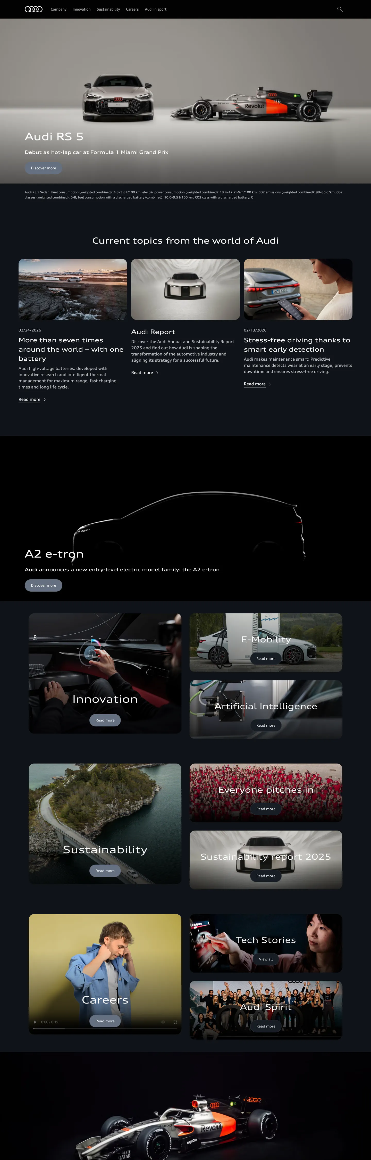
Audi's corporate surface is the inverse of Porsche's. Where Stuttgart runs a near-pure white canvas with deep-black display type and 32px softened photo tiles, Ingolstadt inverts to a near-black #181d25 backdrop holding white "#fcfcfd" type on every captured role — h1 hero, h2 section headline, body paragraph, nav link, footer caption. AudiType is the licensed single sans family, declared in CSS as `AudiType, sans-serif`, and it runs at weight 400 across an 8-step ladder from 12px caption through 40px h1. The four-ring wordmark and full-bleed cinema photography handle the brand voltage — the extracted palette holds no saturated accent, no chromatic CTA fill, no inline link color overridden from the browser default.
This page packages the system into a single DESIGN.md file using the Google Labs open spec. Inside: 18 colors tokens grouped into canvas, ink-on-dark, hairline, shadow, and inverted-surface roles; 9 typography tokens at AudiType weight 400 spanning the captured 12px-through-40px ladder; 4 corner-radius values dominated by a 999px pill (18 of 35 captures) and a 20px photo tile (16 of 35); 9 spacing tokens on Audi's fixed `--spacing-relative-*` ladder anchored at a 96px `--page-margin` and a 1440px `--page-width`; and 18 components covering the dark top nav, pill CTA, 20px photo tile, mosaic editorial grid, locator card, and the inverted-on-dark footer pattern.
Feed the file to Claude, Cursor, or GitHub Copilot and the agent writes React surfaces that read as Audi corporate — AudiType at 400 over a #181d25 canvas, 999px pill CTAs, 20px photo tiles, the four-ring wordmark left of a horizontal menu — rather than a generic dark-luxury template. Reference the `{token.refs}` directly in Tailwind config, or use the spec as an audit lens: most luxury-auto sites copy the dark-canvas move but miss the binary 999/20 radius vocabulary and the held-at-400 typographic restraint that distinguishes Audi from Mercedes' Daimler-Sans medium-weight ladder and BMW's 700/300 split.
What makes it distinct
5
- Held-at-400 type ladderAudiType carries every captured role from 12px caption to 40px h1 at a single weight; the four-ring wordmark stands in for typographic muscle
- Binary radius vocabularyevery interactive surface is either 999px pill (CTAs, chips, 18 of 35 captured shapes) or 20px softened photo tile (16 of 35); 10px shows up exactly once
- Dark-canvas inversion#181d25 backdrop with #fcfcfd type on every captured role; where BMW corporate runs cream-white and Porsche runs near-pure white, Audi inverts to near-black
- Photography-driven chromatic depththe extracted palette holds no brand accent; the page renders zero saturated hex codes, leaving model renders to carry every color moment
- 1440px page width on a 1920px max-content shell`--page-margin` at 96px, `--spacing-relative-7xl` at 160px, the ladder breathes in fixed pixel steps rather than fluid clamp()
audi.com
Live at audi.com
A snapshot of the brand in production. Scroll the frame to see the whole page.
Colors
18 colors
Audi's system anchors on #181d25 (primary) as its primary color. Type is set in AudiType across 9 tokens from 12px to 40px, weights 400–400. Shape language is soft — components average 14px corner radius, with no sharp interactive edges.
Brand & Accent
Sparing, CTA-only voltage · 1
Surface
Page and card backgrounds · 4
Text
Headlines, body, captions · 9
Borders & Hairlines
Dividers, outlines, rules · 2
Other
Specialty colors · 2
Typography
9 type tokens
Set in AudiType across 9 tokens, from 12px to 40px, weights 400–400. Shown in its own stack: where the font isn't installed, the fallback the file names stands in.
- display-xl40px · weight 400 · lh 1.5The quick brown fox jumps over the lazy dog
- display-lg32px · weight 400 · lh 1.375The quick brown fox jumps over the lazy dog
- display-md24px · weight 400 · lh 1.5The quick brown fox jumps over the lazy dog
- body-lg18px · weight 400 · lh 1.555The quick brown fox jumps over the lazy dog
- body-md16px · weight 400 · lh 1.5The quick brown fox jumps over the lazy dog
- body-sm14px · weight 400 · lh 1.714The quick brown fox jumps over the lazy dog
- nav-link14px · weight 400 · lh 1.428The quick brown fox jumps over the lazy dog
- caption12px · weight 400 · lh 1.666The quick brown fox jumps over the lazy dog
- button14px · weight 400 · lh 1.428The quick brown fox jumps over the lazy dog
Layout
Radii and spacing
4 corner radii and 9 spacing values. Shape language: soft.
Radii
- none0px
- sm10px
- lg20px
- full9999px
Spacing
- 2xs4px
- xs8px
- sm12px
- md16px
- lg24px
- xl32px
- 2xl56px
- 3xl72px
- page-margin96px
Components
18 components
Each rendered from its tokens (color, type, radius, padding) on Audi's own canvas.
- Top Navtop-navTop Nav
- Nav Linknav-linkNav Link
- Hero Band Cinemahero-band-cinemaHero Band Cinema
- Hero Headlinehero-headlineHero Headline
- Section Headlinesection-headlineSection Headline
- Sub Headlinesub-headlineSub Headline
- Body Paragraphbody-paragraphBody Paragraph
- Photo Tilephoto-tilePhoto Tile
- Mosaic Tile Photomosaic-tile-photoMosaic Tile Photo
- Locator Cardlocator-cardLocator Card
- Button Primarybutton-primaryButton Primary
- Button Primary Hoverbutton-primary-hoverButton Primary Hover
- Button Secondarybutton-secondaryButton Secondary
- Badge Pillbadge-pillBadge Pill
- Type here…text-inputText Input
- Type here…text-input-focusText Input Focus
- FooterfooterFooter
- Footer Linkfooter-linkFooter Link
In use
The system, in use
Audi's tokens on the kind of product it builds.
Build something people actually use.
A short paragraph of marketing copy that previews how the brand's display tier and body tier read together. Two sentences is usually enough.
FAQ
Audi design system FAQ
Common questions about Audi's tokens, components, and how to use this DESIGN.md in your project.
Read next
Related reading
Specs, directories, and component libraries that pair with this design system.
- Browse all design systemsThe full directory of DESIGN.md files on shadcn.io, with live mockups for each.shadcn.io
- Audi.com — the international Audi websiteThe live corporate site — see the dark-canvas hero, AudiType, 999px pill CTAs, and 20px photo tiles in production.audi.com (opens in a new tab)
- The DESIGN.md specificationGoogle Labs' open spec for machine-readable design system files — the format this page is built on.github.com (opens in a new tab)
Use it
Use Audi in your project
One machine-readable file. Drop it into Claude, Cursor, or any AI tool that reads DESIGN.md.
Download the DESIGN.md
One machine-readable file: every color, type, radius, spacing, and component token of Audi.
Feed it to your AI tool
Drop it into Claude, Cursor, or GitHub Copilot. The agent writes React components and Tailwind classes that match Audi's visual language.
Reference the tokens directly
Or paste the values into your Tailwind config, CSS variables, or component library: every color, size and radius is a quoted, ready-to-copy value.
Read the full DESIGN.md: overview, rationale, do’s and don’ts
Overview
Audi's international corporate surface is the inverse of Porsche's. Where Stuttgart runs a near-pure white canvas with deep-black display type and softens every photo tile to 32px, Ingolstadt inverts the canvas to a near-black {colors.canvas} (#181d25) holding white {colors.on-canvas} ("#fcfcfd") on every captured text role — hero h1, h2 section headline, body paragraph, nav link, footer caption. AudiType is the licensed single sans family, and it carries every role at weight 400 from 12px caption through 40px h1.
Held-at-400: where BMW corporate runs a 700/300 weight split and Mercedes leans on Daimler-Sans medium weight, Audi holds every captured role — 40px h1, 32px h2, 24px h3, 18px body, 14px nav, 12px caption — at weight 400 with letter-spacing pinned at normal. The four-ring wordmark and full-bleed cinema photography stand in for typographic muscle. Display headlines do not bold; nav items do not promote weight on hover; the discipline reads as engineered restraint.
Binary radius vocabulary: of 35 captured corner-radius values, 18 are 999px pill ({rounded.full} — CTAs, badges, chips) and 16 are 20px ({rounded.lg} — photo tiles, mosaic cards, locator card). A 10px outlier shows up exactly once. Mid-step values like 4px / 8px / 12px / 16px that fill out a typical SaaS radius scale are absent — Audi runs pill on actions, 20px on photographic surfaces, sharp 0px on typographic bands, and nothing in between.
Key Characteristics:
- Single typeface: AudiType at weight 400 across every captured text role.
- Near-black canvas (
{colors.canvas}— "#181d25") with white type ({colors.on-canvas}— "#fcfcfd") on every role. - Binary radius — 999px pill (
{rounded.full}) on CTAs, 20px ({rounded.lg}) on photo tiles. - Fixed
--spacing-relative-*ladder — 4px through 216px in 13 steps, noclamp(). - 96px
--page-margininside a 1440px--page-widthon a 1920px--max-content-widthshell. - No saturated brand voltage in the extracted palette — photography carries every chromatic moment.
- Letter-spacing held at
normalacross the entire scale.
Colors
Canvas & Surface
- Audi Near-Black (
{colors.canvas}— "#181d25") — frequency 11. Used as bg (11). The dominant canvas across the hero band, section bodies, and footer — not pure black, slight cool tilt. - Canvas Soft (
{colors.canvas-soft}— "#2c343f") — frequency 10. Used as border (4), shadow (6). A lighter slate that surfaces on shadow tones and elevated card backdrops on the dark canvas. - Canvas Strong (
{colors.canvas-strong}— "#020203") — frequency 7. Used as bg (7). A near-pure black that anchors the deepest mosaic tiles and the lowest cinema band. - Canvas Deepest (
{colors.canvas-deepest}— "#101319") — frequency 1. Used as bg (1). The single occurrence of an even-deeper grade for the editorial mosaic.
Text on Dark
- On Canvas (
{colors.on-canvas}— "#fcfcfd") — frequency 421. Used as text (213), border (208). The dominant text color across every captured role — h1, h2, body, nav, footer. Not pure white; near-white with a faint cool tilt. - On Canvas Soft (
{colors.on-canvas-soft}— "#657081") — frequency 7. Used as bg (7). A desaturated slate-blue that paints the primary CTA fill before the white-on-hover inversion. - Pure Ink (
{colors.ink}— "#000000") — frequency 419. Used as text (204), border (204), gradient (11). Sourced from the document base style; surfaces on third-party widget chrome and as the gradient termination on cinema photography.
Hairlines & Borders
- Hairline (
{colors.hairline}— "#fcfcfd") — same hex cluster as on-canvas. 1px white divider on the dark canvas, also paints every captured border ring on pill CTAs and chips. - Hairline Soft (
{colors.hairline-soft}— "#657081") — same hex cluster as on-canvas-soft. Lower-contrast hairline reserved for form-input rest state.
Shadow & Glow
- Shadow Tint (
{colors.shadow-tint}— "#2c343f") — frequency 6 as shadow. The blue-slate shadow color that echoes the brand canvas; shadows add atmosphere on the dark surface rather than depth. - Shadow Glow (
{colors.shadow-glow}— "#dbdfe6") — frequency 1 as shadow. A rare near-white shadow used as a soft highlight glow beneath photo tiles.
Semantic
- Link Default (
{colors.link-default}— "#0000ee") — frequency 226. Used as text (113), border (113). The unstyled browser-default hyperlink blue — Audi does not override anchor color on the captured landing surface, leaving the user-agent default in place. - On Pill (
{colors.on-pill}— "#fcfcfd") — pill CTA text on rest state. - On Pill Inverted (
{colors.on-pill-inverted}— "#181d25") — pill CTA text on hover when the fill flips white. - Border on Dark (
{colors.border-on-dark}— "#fcfcfd") — same hex cluster as on-canvas. The 1px white ring on every captured pill CTA, chip, and secondary button.
Typography
Font Family
AudiType is the licensed single sans family across every text role. The CSS declaration is AudiType, sans-serif with no further fallback chain. There is no display/body family split — the four-ring wordmark sits in for any custom display moment.
Hierarchy
| Token | Size | Weight | Line Height | Letter Spacing | Use |
|---|---|---|---|---|---|
{typography.display-xl} | 40px | 400 | 1.5 | 0 | Hero h1 ("Audi RS 5") |
{typography.display-lg} | 32px | 400 | 1.375 | 0 | Section h2 ("Current topics from the world of Audi") |
{typography.display-md} | 24px | 400 | 1.5 | 0 | h3 sub-section, photo-tile labels |
{typography.body-lg} | 18px | 400 | 1.555 | 0 | Lead body paragraph, locator card body |
{typography.body-md} | 16px | 400 | 1.5 | 0 | Body, form input text |
{typography.body-sm} | 14px | 400 | 1.714 | 0 | Footer, secondary body |
{typography.nav-link} | 14px | 400 | 1.428 | 0 | Top nav links |
{typography.button} | 14px | 400 | 1.428 | 0 | Pill CTA labels |
{typography.caption} | 12px | 400 | 1.666 | 0 | Photo captions, badge pills |
Principles
- Every weight is 400. Display does not promote to 500 or 700 the way BMW corporate runs 700-display; emphasis comes from size and the four-ring wordmark rather than weight.
- Letter-spacing is
normaleverywhere. No tracking on display, no uppercase tracking on CTAs or nav. The system rejects the typographic-muscle move that BMW M and Bugatti use. - Fixed-pixel ladder. AudiType steps in pixel values rather than fluid
clamp()—--spacing-relative-*lives on:rootas absolute pixels, not viewport-relative units.
Note on Font Substitutes
AudiType is licensed to Audi AG through Monotype's corporate font program. Inter at weight 400 with tracking: 0 is the closest open-source approximation; Arial at weight 400 is the OS-level fallback.
Layout
Spacing System
- Base unit: the brand uses an 8px base rhythm —
--spacing-relative-xs8px,--spacing-relative-md16px,--spacing-relative-xl32px. - Tokens:
{spacing.2xs}4px ·{spacing.xs}8px ·{spacing.sm}12px ·{spacing.md}16px ·{spacing.lg}24px ·{spacing.xl}32px ·{spacing.2xl}56px ·{spacing.3xl}72px ·{spacing.page-margin}96px. - Section padding: 32px vertical / 96px horizontal is the captured dominant band rhythm (extracted as
32px 96pxand0px 96px 32px).
Grid & Container
--page-width: 1440pxinside--max-content-width: 1920px— the content shell breathes from 1440 to 1920 on wide displays.--page-margin: 96px— the gutter between the page width and the viewport edge.- Hero photography goes full-bleed; model grid runs 2-up at desktop on 20px-radius photo tiles.
Whitespace Philosophy
Editorial pacing on a fixed ladder. The cinema hero owns the top viewport, then the editorial mosaic runs photo tiles at 20px radius with 12-24px gaps. The 96px page margin and 32-160px section rhythm anchor the corporate cadence — where Porsche interpolates with clamp(), Audi steps in --spacing-relative-* pixels.
Elevation & Depth
The system uses photographic depth + canvas grade elevation. Drop shadows surface only as 0px 0px 2px, 0px 0px 8px, and 0px 0px 12px cool-slate {colors.shadow-tint} glows (extracted at frequencies 13, 6, and 12) — soft halos beneath photo tiles rather than directional shadows.
| Level | Treatment | Use |
|---|---|---|
| Flat (canvas) | {colors.canvas} ("#181d25") | Body bands, footer |
| Tile | {colors.canvas-soft} ("#2c343f") + 20px radius | Photo-tile backdrop |
| Mosaic | {colors.canvas-deepest} ("#101319") + 20px radius | Editorial mosaic |
| Cinema | {colors.canvas-strong} ("#020203") + full-bleed photo | Hero band, lowest mosaic |
| Hairline | 1px {colors.hairline} ("#fcfcfd") | Pill CTA rings, chip outlines, dividers |
| Soft halo | 0px 0px 12px {colors.shadow-tint} | Photo-tile glow |
Decorative Depth
- Full-bleed model photography is the brand's primary depth treatment — every model tile is a photograph framed at a 20px radius rather than a flat fill.
- White 1px ring on dark — pill CTAs and chips ride a 1px
{colors.border-on-dark}ring on the near-black canvas; the ring is the visual weight, not a fill.
Shapes
Border Radius Scale
| Token | Value | Use |
|---|---|---|
{rounded.none} | "0px" | Hero band edge-to-edge, typographic bands |
{rounded.sm} | "10px" | Form inputs (rare — appeared once) |
{rounded.lg} | "20px" | Dominant photographic radius — photo tile, mosaic tile, locator card |
{rounded.full} | "9999px" | Pill CTAs, badge chips, the four-ring wordmark spacing |
The radius vocabulary is binary by default. Of 35 captured shapes, 18 land at 999px pill and 16 at 20px softened photo tile. The single 10px outlier sits on a form input. Mid-step values like 4px / 8px / 12px / 16px that fill out a typical SaaS radius scale are absent — Audi commits to pill or 20px, nothing in between.
Components
Top Navigation
top-nav — Dark-canvas top nav, 64px tall, padded 0px × 96px (the page margin). Layout: four-ring wordmark left, primary horizontal menu (Company / Investor Relations / Innovation / Sustainability / Careers) center, search + locale right. Nav links render in {typography.nav-link} (14px / 400) — white text on the near-black canvas, never uppercase-tracked.
nav-link — Transparent background, text {colors.on-canvas}, typography {typography.nav-link}, padded 0px × 16px.
Hero Bands
hero-band-cinema — Full-bleed near-black cinema band. Background {colors.canvas} ("#181d25") holds the model photograph (Audi RS 5 in the captured surface); display h1 in {typography.display-xl} (40px / 400) renders white. Zero padding — photograph fills edge-to-edge.
hero-headline — Transparent overlay headline. Text {colors.on-canvas} ("#fcfcfd"), typography {typography.display-xl}.
section-headline — h2 below the cinema band. Background transparent, text {colors.on-canvas}, typography {typography.display-lg} (32px / 400), padded 32px top, 96px sides.
sub-headline — h3 for editorial mosaic tiles. Background transparent, text {colors.on-canvas}, typography {typography.display-md} (24px / 400).
body-paragraph — Lead body. Background transparent, text {colors.on-canvas}, typography {typography.body-lg} (18px / 400 / 1.555).
Tiles & Cards
photo-tile — The brand's signature photographic surface. {colors.canvas-soft} backdrop holds the model photograph; tile rounded at {rounded.lg} (20px); typography {typography.display-md} for the tile label. Zero padding — photograph fills the rounded frame.
mosaic-tile-photo — Editorial mosaic-grid tile. Background {colors.canvas-deepest} ("#101319") for the lowest grade, same 20px radius, typography {typography.display-md}.
locator-card — "Find Your Audi Dealer" card. Background {colors.canvas-soft}, text {colors.on-canvas}, body in {typography.body-lg}, 24px padding, 20px radius. Holds a CTA + map glyph.
Buttons
button-primary — Slate-fill pill on the dark canvas. Background {colors.on-canvas-soft} ("#657081"), text {colors.on-pill}, typography {typography.button} (14px / 400 / no tracking), padding 12px × 24px, height 48px, rounded {rounded.full} (pill), 1px {colors.border-on-dark} ring. Where BMW corporate's button is a sharp 0px Corporate Blue rectangle and Porsche's is a fully pilled white slug, Audi's is a slate-pill with a white outline on the near-black canvas.
button-primary-hover — Hover state. Fill inverts to {colors.on-canvas} ("#fcfcfd"), text inverts to {colors.on-pill-inverted} ("#181d25"), ring stays at 1px white.
button-secondary — Transparent pill with 1px white ring. Background transparent, text {colors.on-canvas}, 1px white border, pill radius.
badge-pill — Small caption pill. Background transparent, text {colors.on-canvas}, caption typography (12px / 400), pill radius, 4px × 12px padding, 1px white ring.
Forms
text-input — Background transparent, text {colors.on-canvas}, body-md typography, rounded {rounded.sm} (10px), padding 12px × 16px, height 48px, 1px {colors.hairline-soft} border.
text-input-focus — Focus state. Border promotes from {colors.hairline-soft} to 1px {colors.on-canvas} — the only chromatic shift in the form chrome, since the palette holds no saturated focus accent.
Footer
footer — Closing dark footer. Background {colors.canvas}, text {colors.on-canvas}, body-sm typography, 72px × 96px padding. Multi-column link list.
footer-link — Background transparent, text {colors.on-canvas-soft} ("#657081"), body-sm typography.
Do's and Don'ts
Do
- Hold every text role at weight 400. AudiType never promotes display to 500 or 700.
- Pin letter-spacing at
normalacross the full scale, including CTA labels and nav. - Render CTA buttons as fully-pilled
{rounded.full}rectangles with a 1px white ring on the dark canvas. - Round photo tiles, mosaic cards, and locator cards to
{rounded.lg}(20px) — the brand's photographic-surface signature. - Pad the page gutter at 96px (
{spacing.page-margin}) and step section rhythm in--spacing-relative-*pixels rather thanclamp(). - Let the model photograph and the four-ring wordmark carry every chromatic moment; the canvas holds zero saturated brand voltage.
Don't
- Don't fill the primary CTA with the browser-default link blue
{colors.link-default}("#0000ee"). It surfaces in the extraction at frequency 226 because Audi never overrides anchor color on the landing page — it is a user-agent default on unstyled inline links, not a brand voltage. For primary CTAs use the slate-pill / hover-inverts-white pattern. - Don't promote any text role to weight 500 or 700. Emphasis comes from size and from the four-ring wordmark — a 40px h1 at weight 700 reads as Mercedes Daimler-Sans, not Audi.
- Don't use a 4px / 8px / 12px / 16px mid-step radius on cards or tiles. The brand commits to 999px pill or 20px photo tile — mid-step values read as Stripe or Linear, not Audi corporate.
- Don't add uppercase tracking to nav links or CTAs. AudiType's CTA renders at 14px / 400 / no tracking — uppercase-tracked labels break the held-at-400 discipline that BMW M, Bugatti, and Ferrari rely on.
- Don't paint
{colors.canvas}("#181d25") as a button fill on a light page. The token is canvas-first; surfacing it as a CTA fill on a white page reads as a generic dark button rather than the inverted Audi corporate surface. - Don't ladder section rhythm at 48px or 64px. The captured rhythm steps from
{spacing.xl}32px to{spacing.2xl}56px to{spacing.3xl}72px —--spacing-relative-2xlskips 48px deliberately. - Don't extract a CTA fill from a third-party cookie banner widget. The brand's CTA color is what appears on actual product CTAs, not the consent overlay's button.
Known Gaps
- The extractor captured 9 base colors on the international landing page; the configurator surface (paint pickers, interior swatches, wheel options, S/RS-line accents) holds dozens of model-specific tokens not visible on the corporate marketing surface.
- AudiType is a licensed typeface from Monotype's corporate font program; Inter at weight 400 with
tracking: 0is the documented open-source fallback, with Arial as the OS-level fallback. - The system supports both light and dark contexts via the four-ring wordmark's color-swap and the corporate stylesheet's
prefers-color-schemequeries, but only the dark landing-page state was captured. - Animation easing and duration tokens are declared in the corporate stylesheet but not exercised on the captured landing surface.
- Form validation states beyond the captured text-input baseline (error, success, disabled) are out of scope.
- The my Audi account surface, the regional micro-sites (Audi USA, Audi UK, Audi DE), and the in-product car configurator are out of scope — this spec captures the international corporate marketing landing only.
- The M-equivalent S/RS-line motorsport sub-brand surfaces (which carry red accents and bolder display weight) are not covered by the corporate palette captured here.
Automotive
More systems like this
More DESIGN.md files in Automotive.
Pricing
Build it with Pro
The DESIGN.md files are free. Pro adds 6,000+ blocks, premium templates and the MCP server, so your AI editor builds in your system for you.
4.9/5 out of 5 · 150+ reviewsfrom 150+ founders and developers.
Billing
Billed once a year in USD. Cancel anytime.
- How many people can use the license.
- Client work, SaaS products and anything you charge for.
- Production-ready React sections: hero, pricing, features, dashboards and more.
- Complete multi-page sites you can ship as they are.
- React icons from every major library, installable with one command.
- Presets that restyle every block, in light and dark.
- Lets your AI editor search, preview and install blocks for you.
- Priority requests are answered first.
Individual
For personal projects & open source
$32instead of $49/mo
$389 billed yearly
- Seats: 1 seat
- Commercial use: Personal & open source only
- Pro blocks: 6,000+ blocks
- Templates: All 14 templates
- React icons: 294k+ icons
- Themes: All 59 themes
- MCP server: Basic usage
- Support: Standard
Team
Most popularFor freelancers, agencies & startups
$66instead of $99/mo
$789 billed yearly · ≈ $13/dev/mo
- Seats: Up to 5 seats
- Commercial use: Included
- Pro blocks: 6,000+ blocks
- Templates: All 14 templates
- React icons: 294k+ icons
- Themes: All 59 themes
- MCP server: High usage
- Support: Priority
Organization
For companies with larger teams
$132instead of $199/mo
$1,589 billed yearly
- Seats: Unlimited seats
- Commercial use: Included
- Pro blocks: 6,000+ blocks
- Templates: All 14 templates
- React icons: 294k+ icons
- Themes: All 59 themes
- MCP server: Unlimited usage
- Support: Priority
Billed once a year in USD. Cancel anytime.
Individual
For personal projects & open source
$32instead of $49/mo
$389 billed yearly
- How many people can use the license.Seats: 1 seat
- Client work, SaaS products and anything you charge for.Commercial use: Personal & open source only
- Production-ready React sections: hero, pricing, features, dashboards and more.Pro blocks: 6,000+ blocks
- Complete multi-page sites you can ship as they are.Templates: All 14 templates
- React icons from every major library, installable with one command.React icons: 294k+ icons
- Presets that restyle every block, in light and dark.Themes: All 59 themes
- Lets your AI editor search, preview and install blocks for you.MCP server: Basic usage
- Priority requests are answered first.Support: Standard
Team
Most popularFor freelancers, agencies & startups
$66instead of $99/mo
$789 billed yearly · ≈ $13/dev/mo
Everything in Individual, plus
- How many people can use the license.Seats: Up to 5 seats
- Client work, SaaS products and anything you charge for.Commercial use: Included
- Lets your AI editor search, preview and install blocks for you.MCP server: High usage
- Priority requests are answered first.Support: Priority
Organization
For companies with larger teams
$132instead of $199/mo
$1,589 billed yearly
Everything in Team, plus
- How many people can use the license.Seats: Unlimited seats
- Lets your AI editor search, preview and install blocks for you.MCP server: Unlimited usage
- Secure checkout via Stripe
- Code lives in your repo
- Keep what you've shipped if you cancel
- License terms
Your system, built for you
Every block, template and icon, installed by your AI agent in your design system. The DESIGN.md files stay free.