Buick Design System
Buick's marketing-site design system as a DESIGN.md file. Antique gold #cd9834 accent, Buick Headline weight-300 display, Buick Text body, 7 colors tokens, 17 components. For React, Next.js, and AI coding tools.
Add shadcn.io to your AI agent. · Pro It installs blocks, icons and templates in your design system from a prompt, with Pro.
Set up MCP- Primary
- #cd9834
- Typeface
- Buick Text
- Shape
- Soft
- Base radius
- 8px
- Colors
- 7
- Type tokens
- 13
- Components
- 17
- Spacing values
- 9
About
About Buick DESIGN.md
Curated by Dov Azencot · Updated May 19, 2026 · Source buick.com (opens in a new tab)
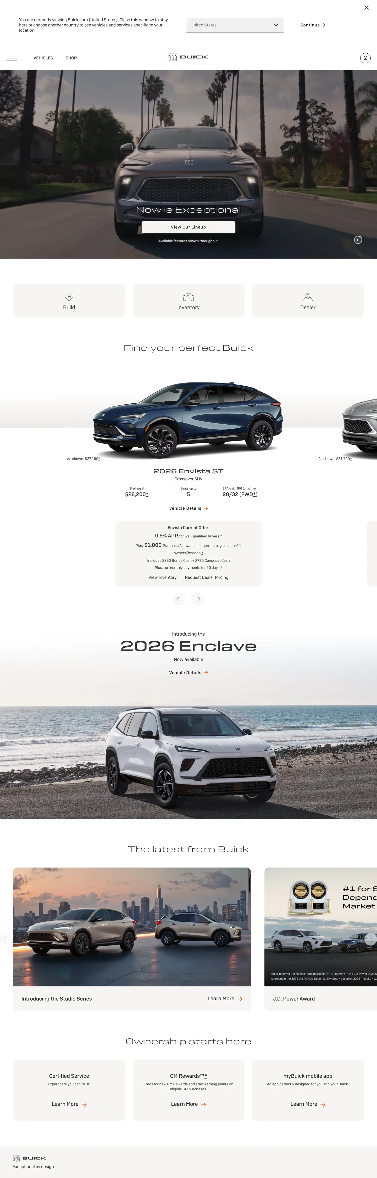
Buick's marketing site occupies an unusual slot in the GM portfolio: it aims for near-luxury aspiration without the full-black austerity of Cadillac or the working-truck hardness of GMC. The hero is a full-bleed vehicle photograph — the 2026 Enclave filling the viewport on a palm-lined boulevard — with a near-white text overlay and a search bar centered below. The headline runs Buick Headline at 56px in weight 500, but the dominant display treatment below the fold drops to weight 300 at 32px, the lightest typographic weight in the system. Where GMC pushes Stratum at weight 900 and Cadillac runs sharp black geometry, Buick lands on a warm-editorial register: antique gold accents, light headline weights, 16px card rounding, and photography that leans toward aspirational lifestyle rather than raw capability.
The DESIGN.md file packages 7 colors tokens, 13 typography tokens, and 17 components definitions drawn from Buick's captured marketing surface. The palette is effectively monochromatic — charcoal dark (#222222) and near-white (#f6f5f4) handle nearly every surface, with antique gold (#cd9834) as the single chromatic accent across 368 occurrences, split evenly between text and border roles. Typography spans two families: Buick Headline (display tier, weight 300–500) and Buick Text (body tier, weight 400–500), both proprietary GM fonts with Arial fallbacks. The spacing system exposes the GM shared --gb-spacing-* ladder from 4px to 240px; section padding runs at 96px vertical, card internal padding at 16px.
Feed this file to an AI coding tool and it will reproduce Buick's specific moves: full-bleed vehicle photography as the hero surface, antique gold reserved for link accents and card borders rather than CTA fills, light-weight display headlines (300) for editorial warmth, and 16px card rounding with pill CTAs at 100px. The one move worth studying is the gold's role: it does 368 jobs across the page as text and border color without ever filling a button — the discipline keeps the automotive chrome feeling luxurious rather than promotional.
What makes it distinct
5
- Antique gold as sole chromatic accent#cd9834 appears 368 times (189 text, 179 border), never as a background fill; the canvas stays charcoal or near-white
- Display at weight 300, not weight 700Buick Headline runs at 32–56px in light 300 rather than bold, signaling aspirational restraint rather than truck-segment dominance
- Two-typeface systemBuick Headline for all display and section titles, Buick Text for body, labels, and buttons; both proprietary with Arial fallback
- 16px default roundingcard tiles and modal surfaces all round at 16px, while pill CTA buttons reach 100px for a fully-rounded treatment
- GB spacing laddera GM shared --gb-spacing-* custom-property system runs from 4px to 240px at documented increments, shared across GMC, Chevy, and Buick
buick.com
Live at buick.com
A snapshot of the brand in production. Scroll the frame to see the whole page.
Colors
7 colors
Buick's system runs on #cd9834 as its primary voltage, used in 1 of 17 components. Type is set in Buick Text across 13 tokens from 12px to 56px, weights 300–500. Shape language is soft — components average 25px corner radius, with no sharp interactive edges.
Brand & Accent
Sparing, CTA-only voltage · 1
Surface
Page and card backgrounds · 2
Text
Headlines, body, captions · 3
Borders & Hairlines
Dividers, outlines, rules · 1
Typography
13 type tokens
Set in Buick Text across 13 tokens, from 12px to 56px, weights 300–500. Shown in its own stack: where the font isn't installed, the fallback the file names stands in.
- display-xl56px · weight 500 · lh 67.2pxThe quick brown fox jumps over the lazy dog
- display-lg32px · weight 300 · lh 38.4pxThe quick brown fox jumps over the lazy dog
- display-md24px · weight 500 · lh 28.8pxThe quick brown fox jumps over the lazy dog
- heading-md20px · weight 500 · lh 28pxThe quick brown fox jumps over the lazy dog
- heading-sm18px · weight 400 · lh 25.2pxThe quick brown fox jumps over the lazy dog
- body-lg20px · weight 400 · lh 28pxThe quick brown fox jumps over the lazy dog
- body-md16px · weight 400 · lh 22.4pxThe quick brown fox jumps over the lazy dog
- body-sm14px · weight 400 · lh 19.6pxThe quick brown fox jumps over the lazy dog
- label-md16px · weight 500 · lh 16px · tracking 1pxThe quick brown fox jumps over the lazy dog
- caption12px · weight 400 · lh 16.8pxThe quick brown fox jumps over the lazy dog
- button-md16px · weight 500 · lh 16px · tracking 1pxThe quick brown fox jumps over the lazy dog
- nav-link16px · weight 400 · lh 22.4pxThe quick brown fox jumps over the lazy dog
- body-md-medium16px · weight 500 · lh 22.4pxThe quick brown fox jumps over the lazy dog
Layout
Radii and spacing
6 corner radii and 9 spacing values. Shape language: soft.
Radii
- none0px
- sm4px
- md8px
- lg16px
- pill100px
- full9999px
Spacing
- xs4px
- sm8px
- md12px
- base16px
- lg24px
- xl32px
- 2xl48px
- 3xl64px
- 4xl96px
Components
17 components
Each rendered from its tokens (color, type, radius, padding) on Buick's own canvas.
- Button Primarybutton-primaryButton Primary
- Button Secondarybutton-secondaryButton Secondary
- Button Pillbutton-pillButton Pill
- Top Navtop-navTop Nav
- Nav Linknav-linkNav Link
- Hero Sectionhero-sectionHero Section
- Hero Headinghero-headingHero Heading
- Section Headingsection-headingSection Heading
- Body Paragraphbody-paragraphBody Paragraph
- Vehicle Cardvehicle-cardVehicle Card
- Vehicle Card Titlevehicle-card-titleVehicle Card Title
- Offer Labeloffer-labelOffer Label
- Card Gridcard-gridCard Grid
- Section Lightsection-lightSection Light
- Section Darksection-darkSection Dark
- Caption Fine Printcaption-fine-printCaption Fine Print
- FooterfooterFooter
In use
The system, in use
Buick's tokens on the kind of product it builds.
Build something people actually use.
A short paragraph of marketing copy that previews how the brand's display tier and body tier read together. Two sentences is usually enough.
FAQ
Buick design system FAQ
Common questions about Buick's tokens, components, and how to use this DESIGN.md in your project.
Read next
Related reading
Specs, directories, and component libraries that pair with this design system.
- Browse all design systemsThe full directory of DESIGN.md files on shadcn.io, with live mockups for each.shadcn.io
- Buick — official siteBuick's public marketing site — the source of truth for the live tokens captured in this file.buick.com (opens in a new tab)
- The DESIGN.md specificationGoogle Labs' open spec for machine-readable design system files — the format this page is built on.github.com (opens in a new tab)
Use it
Use Buick in your project
One machine-readable file. Drop it into Claude, Cursor, or any AI tool that reads DESIGN.md.
Download the DESIGN.md
One machine-readable file: every color, type, radius, spacing, and component token of Buick.
Feed it to your AI tool
Drop it into Claude, Cursor, or GitHub Copilot. The agent writes React components and Tailwind classes that match Buick's visual language.
Reference the tokens directly
Or paste the values into your Tailwind config, CSS variables, or component library: every color, size and radius is a quoted, ready-to-copy value.
Read the full DESIGN.md: overview, rationale, do’s and don’ts
Overview
Buick's marketing site occupies the aspirational-but-accessible tier of the GM portfolio — warmer than Cadillac's cold black precision, softer than GMC's industrial weight. Whispered gold: the antique gold (#cd9834) accent does not fill buttons or hero panels; it traces the edges — border rules on vehicle cards, link text in the offers strip, divider lines between sections. At 368 total occurrences it is omnipresent, yet always subordinate to the charcoal-and-cream base. Where Toyota and Honda deploy their brand colors as CTA fills that shout for attention, Buick's gold whispers from the margin.
The display typeface reinforces the register. Buick Headline at weight 300 and 32px — lighter than any competing truck or SUV brand in this directory — is the brand's editorial signal. GMC runs Stratum at weight 900; Buick counters with a featherweight 300 that reads closer to a Condé Nast caption than a horsepower spec. The hero h1 climbs to 56px / weight 500, the single bold moment, but the section-level display returns to 300 throughout. Buick Text handles body and CTA labels in weights 400–500, and both fonts share an Arial fallback.
Key Characteristics:
- Antique gold (#cd9834) as the sole chromatic token — 189 text occurrences and 179 border occurrences, zero background fills.
- Buick Headline at weight 300 for section display — the lightest display weight in the GM portfolio.
- Two-surface canvas: charcoal (#222222) for hero and footer, warm near-white (#f6f5f4) for lineup grids and editorial bands.
- 16px default card rounding, pill CTAs at 100px — a binary scale without a middle tier.
- Full-bleed vehicle photography carries every decorative job above the fold; no brand illustrations or gradient overlays.
- GM shared --gb-spacing-* custom-property ladder drives all spacing, 4px to 240px on an 8px base.
- Vehicle lineup grid renders trim names in Buick Text weight 500 at 20px with gold-colored offer labels above.
Colors
Brand
- Antique Gold (
#cd9834): frequency 368. Used as text (189) and border (179), never as background fill. Runs as vehicle-card border rules, offer-label text, link accents, and section divider lines. The single chromatic moment on a page that is otherwise charcoal and near-white. Not a warm yellow — the oklch hue sits at 79°, closer to a muted honey than to a saturated Buick-of-the-1970s gold.
Surface
- Canvas (
#f6f5f4): frequency 35 as background. The warm near-white that hosts the vehicle lineup grid, special-offers section, and editorial content bands. The extractor merged #ffffff, #f0f0f0, and #f6f5f4 into this single token — all three are near-identical in practice. - Canvas Dark (
#000000): frequency 7, primarily the hero band overlay and nav background on scroll. Absent from most surfaces but structurally important for the full-bleed photography treatment. - Hairline (
#f0f0f0): captured within the canvas cluster. Used as 1px card border rules on the vehicle trim cards, separating vehicle rows on the near-white canvas.
Text
- Ink (
#222222): frequency 601 total (301 text, 300 border). The dominant dark tone — nav labels, section headings, and all body text on the near-white canvas. Not pure black; at lightness 25% it reads slightly warmer. - Ink Secondary (
#333333): frequency 347 (173 text, 173 border, 1 shadow). The rendering tone for hero-overlay body text and most paragraph content — slightly lighter than ink, visually indistinguishable to most readers but consistently used across component extractions. - Ink Muted (
#6f6f6d): frequency 2. Reserved for fine-print captions, disclaimer text, and secondary metadata. A warm gray with a hint of sage (oklch hue 107°).
Typography
Font Families
The system runs two proprietary GM typefaces: Buick Headline for every display and section-heading surface, and Buick Text for body, label, button, and link text. Both fall back to Arial, sans-serif. There is no web-font stack beyond Arial — if Buick's fonts fail to load, the page degrades to system Arial rather than a web-safe fallback.
The pairing divides labor clearly: Buick Headline handles the three display sizes and section h3 titles; Buick Text handles the remaining ten token slots. Weight strategy is the distinctive move — Buick Headline at 300 is lighter than Cadillac (400), GMC (900), and Toyota (700) at their respective display tiers.
Hierarchy
| Token | Size | Weight | Line Height | Use |
|---|---|---|---|---|
{typography.display-xl} | 56px | 500 | 67.2px | Hero h1 ("2026 Enclave") |
{typography.display-lg} | 32px | 300 | 38.4px | Section headings, editorial bands |
{typography.display-md} | 24px | 500 | 28.8px | Vehicle category headings |
{typography.heading-md} | 20px | 500 | 28px | Vehicle trim names, card titles |
{typography.heading-sm} | 18px | 400 | 25.2px | Section sub-labels |
{typography.body-lg} | 20px | 400 | 28px | Lead paragraphs on section pages |
{typography.body-md} | 16px | 400 | 22.4px | Default running text |
{typography.body-sm} | 14px | 400 | 19.6px | Card body copy, fine-print rows |
{typography.label-md} | 16px | 500 | 16px | CTA labels, button text, 1px tracking |
{typography.caption} | 12px | 400 | 16.8px | Disclaimer text, footnote rows |
{typography.button-md} | 16px | 500 | 16px | Primary button ("View Our Lineup") |
{typography.nav-link} | 16px | 400 | 22.4px | Top-nav link labels |
{typography.body-md-medium} | 16px | 500 | 22.4px | Emphasized inline text |
Note on Font Substitutes
Buick Headline and Buick Text are proprietary GM fonts, not available via Google Fonts or open-source channels. For Buick Headline at weight 300, Outfit at weight 300 or Nunito at weight 300 replicates the light editorial feel at display sizes. For Buick Text body copy, Inter at weight 400 transfers cleanly at 14–16px. Preserve the 1px letter-spacing on label-md and button-md tokens — that tracked weight-500 treatment is the brand's CTA identity signal and cannot be dropped.
Layout
Spacing System
- Base unit: 8px, consistent with the exposed --gb-spacing-8 custom property.
- Tokens:
{spacing.xs}4px ·{spacing.sm}8px ·{spacing.md}12px ·{spacing.base}16px ·{spacing.lg}24px ·{spacing.xl}32px ·{spacing.2xl}48px ·{spacing.3xl}64px ·{spacing.4xl}96px. - Hero vertical padding: 96px top and bottom, giving the photography full breathing room.
- Card internal padding: 16px on all sides for vehicle trim cards; 32px for the Enclave feature-detail panel.
- Button padding: 16px × 32px (height 48px) — the primary CTA is notably tall for an automotive button, likely driven by touch-target accessibility on the mobile-first SUV buyer experience.
Grid and Container
- Hero: full-bleed at 1440px width with vehicle photography behind a centered text stack.
- Vehicle lineup grid: 3-column at desktop, showing trim-level cards for Encore GX, Envista, Envoy, Enclave. Each card carries a vehicle photograph, trim name, MSRP, and 2–3 CTA links in antique gold.
- Special offers strip: 3-column grid of offer cards, each in warm near-white with fine-print disclaimers.
- News / editorial section: 2-column or 3-column card grid showing editorial photography and article titles.
Rhythm
The page alternates between dark hero photography (charcoal canvas, white text) and light information architecture (near-white canvas, charcoal text). The transition is abrupt — no gradient transition band — which reads as deliberate sectional clarity. Section vertical padding anchors at 48px for light editorial sections and 96px for full-bleed dark moments.
Elevation
Buick's system uses no visible shadow tier. The 1px antique gold border rule on vehicle-trim cards does the elevation job: against the near-white (#f6f5f4) canvas, a hairline border in gold reads as a contained surface rather than a flat tile. The modal overlay (the market-selector drawer) uses a 16px-rounded white surface over a dark scrim — no shadow, just high surface-color contrast.
- Flat: hero, section bands, footer — no shadow rendered.
- Card surface: 1px gold hairline border at
{rounded.lg}on white canvas. The gold border is both the elevation signal and the brand accent simultaneously.
Shapes
The radius scale is binary with a pronounced jump:
{rounded.none}0px — hero band edges, section dividers, footer.{rounded.sm}4px — tag chips, fine-print badges.{rounded.md}8px — secondary buttons and form inputs.{rounded.lg}16px — the dominant surface rounding (24 occurrences). Vehicle trim cards, modal overlays, offer cards, news cards.{rounded.pill}100px — primary CTA buttons only ("View Our Lineup", "Explore Offers"). The pill jumps from 16px card rounding to full-pill at 100px with no middle tier.
The 16px-to-100px jump is the same binary pattern seen in GMC and Chevrolet within the GM portfolio. Consumer SUV buyers see cards at 16px and CTA buttons as pill-shaped interactive elements — the radius shift signals affordance.
Components
hero-section — Full-bleed vehicle photography canvas at charcoal/black (#000000 overlay on photo), 96×0px padding. Holds the hero heading, a search-bar module, and scroll-down indicators.
hero-heading — White text on the photography canvas, Buick Headline 56px / weight 500. "2026 Enclave" is the canonical instance, rendered at the center-bottom of the hero photograph.
section-heading — Ink-secondary (#333333) text in Buick Headline 32px / weight 300. Used for "Find your perfect Buick", "2026 Enclave", and editorial section titles on the near-white canvas.
body-paragraph — Ink-secondary text at Buick Text 16px / weight 400. Default running text for offer descriptions, editorial blurbs, and disclaimer paragraphs.
button-primary — Near-white (#f6f5f4) fill, ink-secondary text, 8px radius, 16×32px padding, 48px height. No border — the button sits against white canvas and relies on fill contrast alone.
button-pill — Same near-white fill, ink-secondary text, at 100px pill radius. The dominant CTA treatment on lineup pages: "View Our Lineup", "Explore Offers", "Build & Price".
button-secondary — Transparent fill, ink-secondary text, 1px ink border, 8px radius. Used for secondary actions like "Learn More" on vehicle detail cards.
top-nav — Transparent on the hero photograph; white on scroll. Holds the Buick tricolor shield at left, 5 top-level links center, and "Find a Dealer" + "Login" at right. Height 64px with 16px horizontal padding.
nav-link — Transparent background, charcoal ink text at 16px / weight 400. No hover background visible in the captured surface.
vehicle-card — Near-white canvas fill, 16px radius, 1px hairline (#f0f0f0) or gold (#cd9834) border, 16px internal padding. Holds vehicle photograph at top (no padding), trim name, MSRP, and 2–3 CTA links in antique gold.
vehicle-card-title — Ink-secondary text in Buick Text 20px / weight 500. The trim name label ("Encore GX", "Envoy") above the MSRP line.
offer-label — Antique gold (#cd9834) text in Buick Text 16px / weight 500 with 1px letter-spacing. The APR or financing teaser ("0.9% APR for well-qualified buyers") above offer card details.
card-grid — Near-white surface, 16px radius, 16px padding. Container for editorial news cards and ownership-benefit tiles below the vehicle lineup.
section-light — Near-white (#f6f5f4) surface, charcoal text, 48px vertical padding. Information-density sections for the lineup grid and offers band.
section-dark — Charcoal (#222222) surface, white text, 48px vertical padding. Used for footer and editorial "Latest from Buick" news band.
caption-fine-print — Muted ink (#6f6f6d) text at Buick Text 12px / weight 400. Disclaimer rows, MSRP footnotes, legal fine print below offer cards.
footer — Charcoal (#222222) surface, white text, Buick Text 14px, 48px vertical padding. Four-column link grid (Vehicles, Shopping Tools, Customer Support, My Buick) with the tricolor Buick shield at right.
Do's and Don'ts
Do treat antique gold as a border and text color, not a fill. The 368 occurrences of #cd9834 are split between text links and 1px card borders — placing it as a button fill or background panel would contradict the system's entire gold-as-edge discipline.
Do use Buick Headline at weight 300 for section-level display. The light weight is deliberate aspiration signaling — bumping to weight 500 on section h2s would push the page toward a GMC or Chevrolet register.
Do keep the hero at full-bleed vehicle photography width (1440px). The system's hero has no decorative layer between the brand and the product; adding a gradient overlay or brand illustration over the photography would break the compositional discipline.
Do maintain the 16px card radius throughout the lineup grid. The 16px rounding reads as approachable consumer-SUV warmth; dropping to 4px or 0px would read as truck-segment industrial.
Don't use #cd9834 as a button fill or hero-band background. Unlike competitors that use their brand color for primary CTAs, Buick's gold is reserved entirely for edges and links. A gold-filled CTA button would read as promotional rather than aspirational.
Don't drop the 1px letter-spacing from {typography.button-md} and {typography.label-md}. The tracked weight-500 treatment (1px spacing) is what distinguishes the button label from body text at the same 16px size; removing it collapses the visual hierarchy on the CTA.
Don't introduce a shadow tier. The card border (1px antique gold or hairline) is the elevation signal; adding a drop shadow would double-mark the card edge and feel inconsistent with the flat near-white canvas.
Don't use {colors.ink} (#222222) directly on the near-white canvas for display headlines — the captured extraction shows all section headings use ink-secondary (#333333). The #222222 token is the nav and border color; the slightly lighter #333333 is the display text color.
Known Gaps
- Bot-blocked on first extraction attempt: the acura.com extractor captured an Access Denied page; this note applies only to Buick — Buick.com extracted successfully.
- Hover states: documented for none of the button components; the marketing-surface extraction does not expose CSS :hover rendering. The gold border on vehicle cards is likely the hover signal for nav links.
- Dark mode: the marketing site appears light-mode-only; no dark-surface CSS custom properties were exposed in the extraction beyond the charcoal canvas variables.
- Mobile breakpoints: the --gb-spacing-* custom-property system has mobile variants not captured in the desktop extraction. The vehicle lineup likely shifts from 3-column to 1-column at mobile.
- Form components: no input, select, or form extraction was available from the marketing surface. The search bar in the hero uses undocumented internal components.
- Motion and animation: the hero has a scroll-triggered fade on the headline text overlay; easing values are not captured.
- Dealership-finder components: the map and filter surfaces on the dealer-locator page expose a richer component set not represented here.
Automotive
More systems like this
More DESIGN.md files in Automotive.
Pricing
Build it with Pro
The DESIGN.md files are free. Pro adds 6,000+ blocks, premium templates and the MCP server, so your AI editor builds in your system for you.
4.9/5 out of 5 · 150+ reviewsfrom 150+ founders and developers.
Billing
Billed once a year in USD. Cancel anytime.
- How many people can use the license.
- Client work, SaaS products and anything you charge for.
- Production-ready React sections: hero, pricing, features, dashboards and more.
- Complete multi-page sites you can ship as they are.
- React icons from every major library, installable with one command.
- Presets that restyle every block, in light and dark.
- Lets your AI editor search, preview and install blocks for you.
- Priority requests are answered first.
Individual
For personal projects & open source
$32instead of $49/mo
$389 billed yearly
- Seats: 1 seat
- Commercial use: Personal & open source only
- Pro blocks: 6,000+ blocks
- Templates: All 14 templates
- React icons: 294k+ icons
- Themes: All 59 themes
- MCP server: Basic usage
- Support: Standard
Team
Most popularFor freelancers, agencies & startups
$66instead of $99/mo
$789 billed yearly · ≈ $13/dev/mo
- Seats: Up to 5 seats
- Commercial use: Included
- Pro blocks: 6,000+ blocks
- Templates: All 14 templates
- React icons: 294k+ icons
- Themes: All 59 themes
- MCP server: High usage
- Support: Priority
Organization
For companies with larger teams
$132instead of $199/mo
$1,589 billed yearly
- Seats: Unlimited seats
- Commercial use: Included
- Pro blocks: 6,000+ blocks
- Templates: All 14 templates
- React icons: 294k+ icons
- Themes: All 59 themes
- MCP server: Unlimited usage
- Support: Priority
Billed once a year in USD. Cancel anytime.
Individual
For personal projects & open source
$32instead of $49/mo
$389 billed yearly
- How many people can use the license.Seats: 1 seat
- Client work, SaaS products and anything you charge for.Commercial use: Personal & open source only
- Production-ready React sections: hero, pricing, features, dashboards and more.Pro blocks: 6,000+ blocks
- Complete multi-page sites you can ship as they are.Templates: All 14 templates
- React icons from every major library, installable with one command.React icons: 294k+ icons
- Presets that restyle every block, in light and dark.Themes: All 59 themes
- Lets your AI editor search, preview and install blocks for you.MCP server: Basic usage
- Priority requests are answered first.Support: Standard
Team
Most popularFor freelancers, agencies & startups
$66instead of $99/mo
$789 billed yearly · ≈ $13/dev/mo
Everything in Individual, plus
- How many people can use the license.Seats: Up to 5 seats
- Client work, SaaS products and anything you charge for.Commercial use: Included
- Lets your AI editor search, preview and install blocks for you.MCP server: High usage
- Priority requests are answered first.Support: Priority
Organization
For companies with larger teams
$132instead of $199/mo
$1,589 billed yearly
Everything in Team, plus
- How many people can use the license.Seats: Unlimited seats
- Lets your AI editor search, preview and install blocks for you.MCP server: Unlimited usage
- Secure checkout via Stripe
- Code lives in your repo
- Keep what you've shipped if you cancel
- License terms
Your system, built for you
Every block, template and icon, installed by your AI agent in your design system. The DESIGN.md files stay free.