Bentley Design System
Bentley Motors' marketing design system as a DESIGN.md file. Near-black #040404 canvas, Bentley Race Green #394d45 CTA fill, Bentley typeface at weight 300, 16 components. For React, Next.js, and AI coding tools.
Add shadcn.io to your AI agent. · Pro It installs blocks, icons and templates in your design system from a prompt, with Pro.
Set up MCP- Primary
- #394d45
- Typeface
- Bentley
- Shape
- Sharp
- Base radius
- 0px
- Colors
- 8
- Type tokens
- 11
- Components
- 16
- Spacing values
- 9
About
About Bentley DESIGN.md
Curated by Dov Azencot · Updated May 19, 2026 · Source bentleymotors.com (opens in a new tab)
Bentley's marketing site uses weight 300 for everything. The 48px hero heading at weight 300. The 24px section headings at weight 300. The 16px body paragraphs at weight 300. The 11px navigation items at weight 400 — the single instance where the weight steps above featherweight. This is not a technical accident; it is the brand's most specific design decision, and it separates Bentley from every other automotive brand in this directory. Where Rolls-Royce uses a thin serif, Ferrari holds to weight 500, and Cadillac goes to weight 100 with extreme tracking, Bentley grounds everything in a single humanist sans at 300, and trusts the photography of quilted leather, engine-turned aluminum, and hand-stitched wool carpet to deliver the material luxury that the typeface refuses to shout about.
The DESIGN.md file packages the Bentley marketing design system into a machine-readable spec. Inside: 8 colors tokens from the extracted palette (near-black, Bentley Race Green, white, muted teal, and the blush and moss cream declared in CSS but absent from rendered surfaces), 11 typography tokens running the Bentley proprietary humanist sans at weights 300 and 400 across display through caption tiers, the brand's 0px button radius, 9 spacing tokens on an 8px base, and 16 components definitions covering the primary CTA, nav, hero heading, editorial cards, the Mulliner custom-configurator section, and the ownership-portal link. The CSS variable system (`--bm-spacer-*`, `--bm-primary-*`) reveals a structured token architecture not fully exposed by the marketing surface alone.
Feed this file to Claude or Cursor to reproduce Bentley's discipline: near-black #040404 canvas, Bentley humanist sans at weight 300 for every non-label tier, Race Green (#394d45) reserved exclusively for the primary CTA button fill and border, 0px sharp corners, and full-bleed vehicle photography filling the hero and Mulliner sections. The move worth borrowing only if your brand has comparable photographic assets is the confidence to let weight 300 text sit alone on a dark canvas — the typography does not carry the emotional weight; the photography of a hand-built Continental GT does.
What makes it distinct
5
- Weight 300 at every tierBentley's typeface runs from 48px display to 11px caption at the same featherweight, with no bold tier anywhere in the marketing surface
- Race Green CTA#394d45 (Bentley Race Green, wired as --bm-primary-living-green) is the sole chromatic brand accent; the entire hero and body canvas is monochrome dark
- Near-black canvas at #040404407 combined occurrences as text and border; a fractional step from pure black that prevents digital harshness
- Uppercase tracked labels at 1.3px13px / 400 / uppercase / 1.3px appears on nav and category chips, distinct from the light body weight
- Blush cream and moss palette#e7cfb9 (--bm-primary-blush) and #dcd8c0 (--bm-primary-moss) are declared in CSS as material-reference tokens but absent from the rendered marketing surface
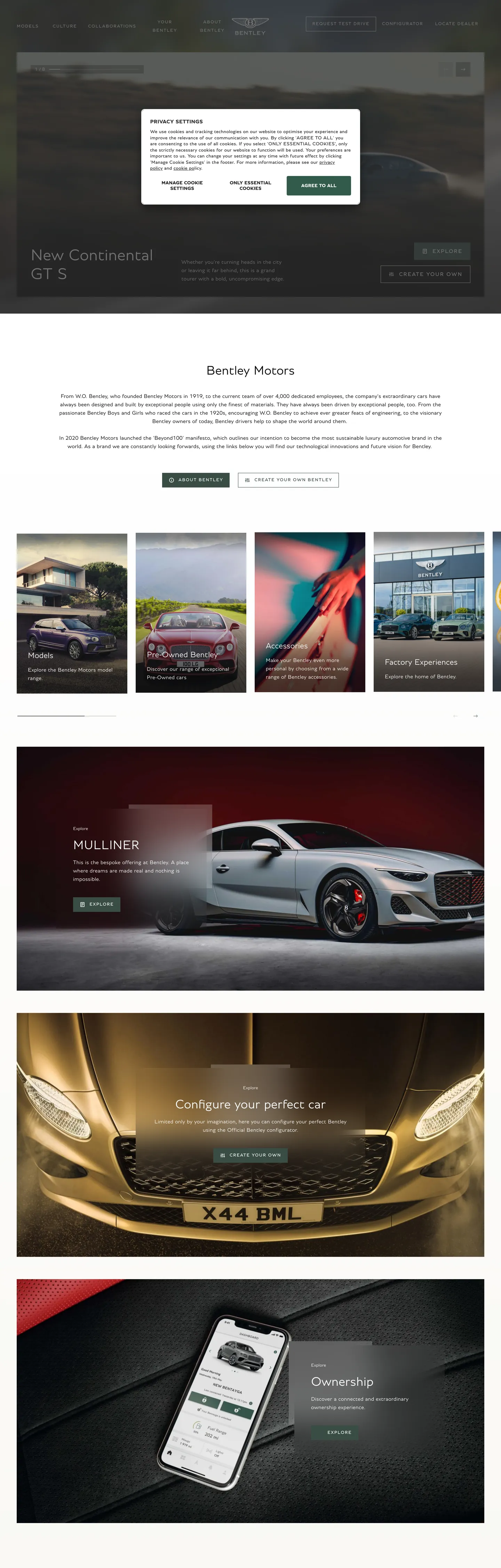
bentleymotors.com
Live at bentleymotors.com
A snapshot of the brand in production. Scroll the frame to see the whole page.
Colors
8 colors
Bentley's system runs on #394d45 as its primary voltage, used in 2 of 16 components. Type is set in Bentley across 11 tokens from 11px to 48px, weights 300–400. Shape language is sharp — components average 0px corner radius, favoring crisp rectangles.
Brand & Accent
Sparing, CTA-only voltage · 2
Surface
Page and card backgrounds · 2
Text
Headlines, body, captions · 2
Borders & Hairlines
Dividers, outlines, rules · 1
Other
Specialty colors · 1
Typography
11 type tokens
Set in Bentley across 11 tokens, from 11px to 48px, weights 300–400. Shown in its own stack: where the font isn't installed, the fallback the file names stands in.
- display-xl48px · weight 300 · lh 54px · tracking normalThe quick brown fox jumps over the lazy dog
- display-md38px · weight 300 · lh 44px · tracking normalThe quick brown fox jumps over the lazy dog
- heading-md24px · weight 300 · lh 28px · tracking normalThe quick brown fox jumps over the lazy dog
- heading-sm20px · weight 300 · lh 28px · tracking 0.16pxThe quick brown fox jumps over the lazy dog
- body-md16px · weight 300 · lh 24px · tracking 0.16pxThe quick brown fox jumps over the lazy dog
- body-sm13px · weight 300 · lh 18px · tracking 0.13pxThe quick brown fox jumps over the lazy dog
- button-md16px · weight 300 · lh 24px · tracking 0.16pxThe quick brown fox jumps over the lazy dog
- nav-link16px · weight 300 · lh 24px · tracking 0.16pxThe quick brown fox jumps over the lazy dog
- label-caps13px · weight 400 · lh 16px · tracking 1.3pxThe quick brown fox jumps over the lazy dog
- label-caps-wide16px · weight 400 · lh 16px · tracking 1.6pxThe quick brown fox jumps over the lazy dog
- caption11px · weight 400 · lh 16px · tracking 0.11pxThe quick brown fox jumps over the lazy dog
Layout
Radii and spacing
1 corner radii and 9 spacing values. Shape language: sharp.
Radii
- none0px
Spacing
- xs4px
- sm8px
- md12px
- base16px
- lg24px
- xl32px
- 2xl40px
- 3xl48px
- 4xl64px
Components
16 components
Each rendered from its tokens (color, type, radius, padding) on Bentley's own canvas.
- Button Primarybutton-primaryButton Primary
- Button Secondarybutton-secondaryButton Secondary
- Top Navtop-navTop Nav
- Nav Linknav-linkNav Link
- Hero Headinghero-headingHero Heading
- Section Headingsection-headingSection Heading
- Section Heading Darksection-heading-darkSection Heading Dark
- Body Paragraphbody-paragraphBody Paragraph
- Body Paragraph Lightbody-paragraph-lightBody Paragraph Light
- Label Capslabel-capsLabel Caps
- Editorial Cardeditorial-cardEditorial Card
- Model Cardmodel-cardModel Card
- Mulliner Sectionmulliner-sectionMulliner Section
- Editorial Light Sectioneditorial-light-sectionEditorial Light Section
- CardcardCard
- Type here…text-inputText Input
In use
The system, in use
Bentley's tokens on the kind of product it builds.
Build something people actually use.
A short paragraph of marketing copy that previews how the brand's display tier and body tier read together. Two sentences is usually enough.
FAQ
Bentley design system FAQ
Common questions about Bentley's tokens, components, and how to use this DESIGN.md in your project.
Read next
Related reading
Specs, directories, and component libraries that pair with this design system.
- Browse all design systemsThe full directory of DESIGN.md files on shadcn.io, with live mockups for each.shadcn.io
- Bentley Motors — official siteBentley's public marketing site — the source of truth for the live tokens captured in this file.bentleymotors.com (opens in a new tab)
- The DESIGN.md specificationGoogle Labs' open spec for machine-readable design system files — the format this page is built on.github.com (opens in a new tab)
Use it
Use Bentley in your project
One machine-readable file. Drop it into Claude, Cursor, or any AI tool that reads DESIGN.md.
Download the DESIGN.md
One machine-readable file: every color, type, radius, spacing, and component token of Bentley.
Feed it to your AI tool
Drop it into Claude, Cursor, or GitHub Copilot. The agent writes React components and Tailwind classes that match Bentley's visual language.
Reference the tokens directly
Or paste the values into your Tailwind config, CSS variables, or component library: every color, size and radius is a quoted, ready-to-copy value.
Read the full DESIGN.md: overview, rationale, do’s and don’ts
Overview
Bentley's marketing site is built on a single typographic conviction: weight as restraint. The Bentley proprietary humanist sans runs at weight 300 from the 48px hero heading down to the 16px body paragraph — the same featherweight regardless of scale. Where Rolls-Royce uses thin-stroke serif to signal old-money heritage, where Bentley's corporate sibling Porsche holds display at weight 700, and where Ferrari stops at weight 500, Bentley goes lighter than all of them. The logic is not minimalism for its own sake; it is the typographic equivalent of the hand-stitched leather and hand-beaten aluminum the brand builds into every vehicle — the restraint is the product.
The chromatic palette is near-monochrome. A near-black canvas at #040404 (407 combined occurrences) holds white text and photography. The single chromatic accent is Race Green at #394d45 — Bentley's historic Le Mans racing livery color, appearing in exactly 12 occurrences: 6 as the primary CTA fill, 6 as its border. Nothing else carries color. The CSS declares --bm-primary-blush (#e7cfb9) and --bm-primary-moss (#dcd8c0) — references to the interior material palette — but neither renders in the captured marketing surface. The marketing site stays monochrome and delegates material warmth entirely to photography.
The shape language is zero-radius sharp, consistent with the brand's architectural DNA: the Bentley grille is a strict rectilinear mesh, the Flying B mascot extends on a straight line. Every button, card, and editorial surface carries 0px corners.
Key Characteristics:
- Weight 300 at every typographic tier from 48px display to 16px body — the featherweight-as-authority move, unique in this directory at this scale.
- Race Green (#394d45) appears in exactly 12 occurrences — CTA fill and border only — making it the most color-restrained automotive brand in the directory.
- Near-black canvas at #040404 with 407 combined occurrences as the page's structural color.
- White canvas bands (#ffffff, 307 occurrences) appear inside the editorial Bentley Motors section and model-grid areas.
- Uppercase label tier at 13px / weight 400 / 1.3px tracking — the only weight-400 tier in the system, reserved for the smallest navigational labels.
- 0px border-radius universally.
- The CSS spacer system (
--bm-spacer--3through--bm-spacer--13) maps to 16–112px on an 8px base, revealing structured spacing discipline not visible from the marketing surface alone.
Colors
Brand
- Primary (
{colors.primary}— #394d45): frequency 12. Used as background (6), border (6). Bentley Race Green — the exact green of the 1920s Le Mans Bentley Boys team cars, wired as--bm-primary-living-green. Never as text; never as a section background. The single color in an otherwise monochrome system. - Primary Teal (
{colors.primary-teal}— #637a77): wired as--bm-primary-teal. A lighter, more muted version of the Race Green — declared but absent from the rendered marketing surface; likely reserved for the Mulliner personalization configurator. - Blush (
{colors.blush}— #e7cfb9): wired as--bm-primary-blushand--bm-primary-moss. A warm pale cream referencing the interior material palette — Bentley's hand-stitched leather and wool carpet. Absent from the rendered marketing surface; a material-reference token rather than a marketing-surface color.
Canvas & Surfaces
- Ink (
{colors.ink}— #040404): frequency 407. Used as text (201), border (201), background (5). The near-black page canvas — a fractional step from pure black that prevents photographic dark-area clipping. Wired across multiple--bm-*variables as the base structural tone. - Canvas (
{colors.canvas}— #ffffff): frequency 307. Used as text (149), border (143), background (10), gradient (5). The white editorial-band surface and the nav/label text on the dark canvas. Wired as--bm-basic-whiteand--bm-primary-moss--10. - Ink Black (
{colors.ink-black}— #000000): frequency 10. A pure-black accent layer for overlay gradients and scrim backgrounds, wired as--bm-basic-blackand--bm-transparent. - Surface-1 (
{colors.surface-1}— #f0f0f0): frequency 2. A near-white gradient stop — used in editorial transitions between dark and light bands. - Hairline (
{colors.hairline}— #ffffff): used at low opacity as the border tone on dark surfaces, 143 occurrences. White-with-alpha is the only hairline tone that reads against near-black.
Typography
Font Family
The system runs Bentley — a proprietary humanist sans that shares proportions with Gill Sans or Optima but at a clearly custom point of difference. Fallbacks walk to arial, helvetica, sans-serif. There is no secondary family; Bentley carries every tier from caption to display. The humanist construction (slightly modulated stroke widths, open apertures) is visible at 38–48px display sizes and is why the weight-300 setting reads as restrained craft rather than as hollow thinness.
Hierarchy
| Token | Size | Weight | Line Height | Letter Spacing | Use |
|---|---|---|---|---|---|
{typography.display-xl} | 48px | 300 | 54px | normal | Hero h1 / h3 ("New Continental GT S") |
{typography.display-md} | 38px | 300 | 44px | normal | Large section headings, Mulliner feature heading |
{typography.heading-md} | 24px | 300 | 28px | normal | Section h2 ("Models", "Bentley Motors") |
{typography.heading-sm} | 20px | 300 | 28px | 0.16px | Sub-heading / label surfaces |
{typography.body-md} | 16px | 300 | 24px | 0.16px | Default running body text; nav link size |
{typography.body-sm} | 13px | 300 | 18px | 0.13px | Fine print, model subtext |
{typography.button-md} | 16px | 300 | 24px | 0.16px | Primary CTA label |
{typography.nav-link} | 16px | 300 | 24px | 0.16px | Top-nav links |
{typography.label-caps} | 13px | 400 | 16px | 1.3px | Uppercase category and nav labels — only weight-400 tier |
{typography.label-caps-wide} | 16px | 400 | 16px | 1.6px | Wider uppercase caps for emphasis labels |
{typography.caption} | 11px | 400 | 16px | 0.11px | Metadata, fine print, footnotes |
Principles
Weight 300 is the single setting for every body, heading, button, and display tier — eight of the eleven typography tokens share this weight. The hierarchy is size-only. This is an intentionally difficult constraint: at small sizes, weight 300 requires precise rendering and good screen clarity; on substandard displays it reads as thin. The system accepts that risk because the ultra-luxury audience encounters the brand on high-resolution devices in contexts where the rendering quality is reliable.
Font Substitutes
Bentley is proprietary. Raleway at weight 300 is the closest open-source humanist substitute — the moderate-contrast stroke structure and open apertures carry over. Jost Light (300) is slightly more geometric but works at body sizes. Avoid weight 300 of mechanically neutral fonts like Inter at small sizes — the lack of stroke modulation makes ultra-light text read as a rendering artifact rather than a typographic decision.
Layout
Spacing System
- Base unit: 8px. The CSS declares
--bm-spacer--3(16px) through--bm-spacer--13(112px) on a structured ladder. - Tokens:
{spacing.xs}4px ·{spacing.sm}8px ·{spacing.md}12px ·{spacing.base}16px ·{spacing.lg}24px ·{spacing.xl}32px ·{spacing.2xl}40px ·{spacing.3xl}48px ·{spacing.4xl}64px. - Grid margin:
--bm-grid-margin48px — the outer page margin on desktop. - Grid gutter:
--bm-grid-gutter24px — the column gutter between editorial grid cells. - Section padding: 40px on the Mulliner and editorial-light sections; 48px on the model grid.
Grid & Container
- Hero: full-bleed vehicle photography at 1440px, with the headline and CTA positioned at the lower-left of the image (not centered) — a compositional preference that reads as editorial magazine rather than standard SaaS hero.
- Model grid: 4-column editorial card grid on desktop, each card containing a vehicle photograph, name, and Race Green CTA button.
- Bentley Motors editorial: white canvas section with running body paragraph and then 4-column photo editorial strip.
- Mulliner section: Race Green (#394d45) full-bleed panel — the single large-surface application of the brand accent color.
Rhythm
The page alternates: near-black hero (photography-dominant) → white editorial band → near-black model grid → Race Green Mulliner panel → gold vehicle close-up photography → white ownership/app section. The rhythm is sparser than most automotive sites — fewer bands, more pause per band — consistent with the "hand-crafted takes time" brand positioning.
Elevation
No shadow tier appears in the captured surface. The near-black canvas creates depth through two mechanisms: photography (the vehicle images create the only spatial depth on the page) and the white editorial band's contrast with the surrounding dark canvas. There are no drop shadows on buttons, cards, or navs.
- Flat (no shadow): 100% of captured surfaces.
- Depth from photography: the hero and model photography provide the page's only spatial dimensionality.
- Hairline borders: the 1px white hairline (white-alpha) separates nav from hero on dark surfaces; it is the page's finest structural line.
Shapes
The radius scale is absolute zero, consistent with every ultra-luxury automotive brand in this directory. Every component — primary button, secondary button, model card, editorial card, Mulliner panel — carries 0px border-radius. The sharp geometry is the digital translation of the Bentley grille's rectilinear mesh: precision lines rather than softened curves. Unlike Cloudflare, which uses a pill for its primary CTA, Bentley applies the sharp rule even to the single most important action surface.
Components
button-primary — Race Green (#394d45) fill, white text, Bentley 16px / 300 / 0.16px tracking, 0px radius, 16×22px padding, 50px height. The single chromatic CTA in the system. "Explore" is the canonical label instance.
button-secondary — Transparent fill, white text, 1px white border, 0px radius, 12×18px padding, 44px height. Used for secondary navigation actions on dark-canvas surfaces.
top-nav — Transparent background over the hero photography, white text in nav-link (16px / 300), 48px horizontal page margin, 55px height. The Bentley winged-B mark centered above the nav; links flush right.
nav-link — Transparent background, white text, 16px / 300 / 0.16px, 8px top/bottom padding.
hero-heading — White text on photography overlay, Bentley 48px / 300 / normal tracking. Lower-left positioned rather than center-aligned — the editorial compositional move.
section-heading — White text at 24px / 300, used on dark-canvas sections ("Models").
section-heading-dark — Ink text at 24px / 300, used on white-canvas editorial sections ("Bentley Motors").
body-paragraph — Ink text at 16px / 300 / 0.16px — the editorial body in white-canvas sections.
body-paragraph-light — White text at 16px / 300 / 0.16px — the body on dark-canvas sections.
label-caps — The uppercase label tier: 13px / 400 / 1.3px tracking — the only weight-400 surface, used for category navigation and chip labels. Transparent background, white text on dark.
editorial-card — Near-black fill, white text, 0px radius, 24px padding. Model cards in the lineup grid.
model-card — Near-black fill, white body-sm text, 0px radius, 16px padding. The smaller tile format for secondary model links.
mulliner-section — Race Green (#394d45) fill, white text, 40px × 48px padding. The single large application of the brand accent color, used for the Mulliner custom-configurator section.
editorial-light-section — White canvas fill, ink text, 40px × 48px padding. The "Bentley Motors" editorial band between the model grid and the Mulliner section.
card — White canvas, ink text, 0px radius, 24px padding. The content card used on light-canvas surfaces.
text-input — White canvas, ink text, surface-1 (#f0f0f0) border, 0px radius, 12×16px padding, 48px height.
Do's and Don'ts
Do hold every typographic tier at weight 300. The move is indivisible — the moment a heading steps to weight 500 or 700, the discipline that distinguishes Bentley from other dark-canvas automotive brands disappears. Weight 300 at 48px reads as ultra-luxury precisely because it takes confidence in the photography to leave the heading so light.
Do keep Race Green (#394d45) off every surface except the primary CTA button and its border. The 12 total occurrences in the captured surface are not a bug — they are the entire chromatic statement. Using the color on section dividers, labels, or secondary buttons would dilute the single-voltage discipline.
Do use the lower-left headline positioning in hero sections rather than center-aligned. Bentley's hero typography sits at the bottom-left of the vehicle image, reading as editorial magazine rather than SaaS landing page — the vehicle composition fills the right two-thirds of the frame.
Do use the uppercase tracked label tier ({typography.label-caps} — 13px / 400 / 1.3px) for every navigation label and category chip. It is the only tier where the system breaks from weight 300, and its tracked uppercase provides the navigational legibility that the light-weight body would not at 13px.
Don't introduce the blush cream (#e7cfb9, wired as --bm-primary-blush) on the marketing surface. It is a material-reference token for the Mulliner configurator interior palette — deployed on digital surfaces outside the configurator context, it reads as a generic warm cream rather than as a reference to Bentley's hand-stitched leather.
Don't add drop shadows to the Race Green CTA button or any card surface. The system has zero shadow occurrences; the button reads as the sole elevated element purely through its Race Green fill against the near-black canvas. A shadow would add visual weight that contradicts the featherweight-text discipline.
Don't round the primary button corners above 0px. At 16px padding and 50px height, even 4px rounding softens the sharp geometry that echoes the Bentley grille's rectilinear matrix. The button is a precision object, not a tappable pill.
Don't run Bentley typeface below 11px at weight 300. The humanist construction's modulated stroke widths become ambiguous at very small sizes in weight 300; the system avoids this by stepping to weight 400 at the 11px caption tier, and you should maintain that floor.
Known Gaps
- Configurator surfaces: the Bentley configurator and Mulliner personalization tools at
bentleymotors.com/en/configuratorcarry their own token layer — material swatches, exterior color pickers, interior leather options — using the blush (#e7cfb9) and moss (#dcd8c0) tokens not present in the marketing capture. - Ownership portal / app: the
{component.ownership}section links to the Bentley Connect app, which likely carries a distinct mobile-surface token set. - Hover and focus states: no hover captures were present in the extracted components; the primary button hover state is not documented here.
- Dark-mode / light-mode toggle: the CSS declares no explicit dark/light toggle variable, suggesting the site is dark-by-default without a user preference API.
- EWB / Mulsanne model pages: individual model deep-dive pages (e.g., Bentayga EWB) may expose additional accent tones for trim and specification tables not present in the homepage capture.
- Motion: the hero photography transitions and the Mulliner section scroll reveal are not captured — the spec covers end-state values only.
Automotive
More systems like this
More DESIGN.md files in Automotive.
Pricing
Build it with Pro
The DESIGN.md files are free. Pro adds 6,000+ blocks, premium templates and the MCP server, so your AI editor builds in your system for you.
4.9/5 out of 5 · 150+ reviewsfrom 150+ founders and developers.
Billing
Billed once a year in USD. Cancel anytime.
- How many people can use the license.
- Client work, SaaS products and anything you charge for.
- Production-ready React sections: hero, pricing, features, dashboards and more.
- Complete multi-page sites you can ship as they are.
- React icons from every major library, installable with one command.
- Presets that restyle every block, in light and dark.
- Lets your AI editor search, preview and install blocks for you.
- Priority requests are answered first.
Individual
For personal projects & open source
$32instead of $49/mo
$389 billed yearly
- Seats: 1 seat
- Commercial use: Personal & open source only
- Pro blocks: 6,000+ blocks
- Templates: All 14 templates
- React icons: 294k+ icons
- Themes: All 59 themes
- MCP server: Basic usage
- Support: Standard
Team
Most popularFor freelancers, agencies & startups
$66instead of $99/mo
$789 billed yearly · ≈ $13/dev/mo
- Seats: Up to 5 seats
- Commercial use: Included
- Pro blocks: 6,000+ blocks
- Templates: All 14 templates
- React icons: 294k+ icons
- Themes: All 59 themes
- MCP server: High usage
- Support: Priority
Organization
For companies with larger teams
$132instead of $199/mo
$1,589 billed yearly
- Seats: Unlimited seats
- Commercial use: Included
- Pro blocks: 6,000+ blocks
- Templates: All 14 templates
- React icons: 294k+ icons
- Themes: All 59 themes
- MCP server: Unlimited usage
- Support: Priority
Billed once a year in USD. Cancel anytime.
Individual
For personal projects & open source
$32instead of $49/mo
$389 billed yearly
- How many people can use the license.Seats: 1 seat
- Client work, SaaS products and anything you charge for.Commercial use: Personal & open source only
- Production-ready React sections: hero, pricing, features, dashboards and more.Pro blocks: 6,000+ blocks
- Complete multi-page sites you can ship as they are.Templates: All 14 templates
- React icons from every major library, installable with one command.React icons: 294k+ icons
- Presets that restyle every block, in light and dark.Themes: All 59 themes
- Lets your AI editor search, preview and install blocks for you.MCP server: Basic usage
- Priority requests are answered first.Support: Standard
Team
Most popularFor freelancers, agencies & startups
$66instead of $99/mo
$789 billed yearly · ≈ $13/dev/mo
Everything in Individual, plus
- How many people can use the license.Seats: Up to 5 seats
- Client work, SaaS products and anything you charge for.Commercial use: Included
- Lets your AI editor search, preview and install blocks for you.MCP server: High usage
- Priority requests are answered first.Support: Priority
Organization
For companies with larger teams
$132instead of $199/mo
$1,589 billed yearly
Everything in Team, plus
- How many people can use the license.Seats: Unlimited seats
- Lets your AI editor search, preview and install blocks for you.MCP server: Unlimited usage
- Secure checkout via Stripe
- Code lives in your repo
- Keep what you've shipped if you cancel
- License terms
Your system, built for you
Every block, template and icon, installed by your AI agent in your design system. The DESIGN.md files stay free.