Alfa Romeo Design System
Alfa Romeo's marketing design system as a DESIGN.md file. Charcoal canvas, brand red #ba0816, Sequel geometric sans with 1.5px uppercase tracking. For React, Next.js, and AI coding tools.
Add shadcn.io to your AI agent. · Pro It installs blocks, icons and templates in your design system from a prompt, with Pro.
Set up MCP- Primary
- #ba0816
- Typeface
- Sequel
- Shape
- Sharp
- Base radius
- 0px
- Colors
- 14
- Type tokens
- 8
- Components
- 15
- Spacing values
- 8
About
About Alfa Romeo DESIGN.md
Curated by Dov Azencot · Updated May 19, 2026 · Source alfaromeo.com (opens in a new tab)
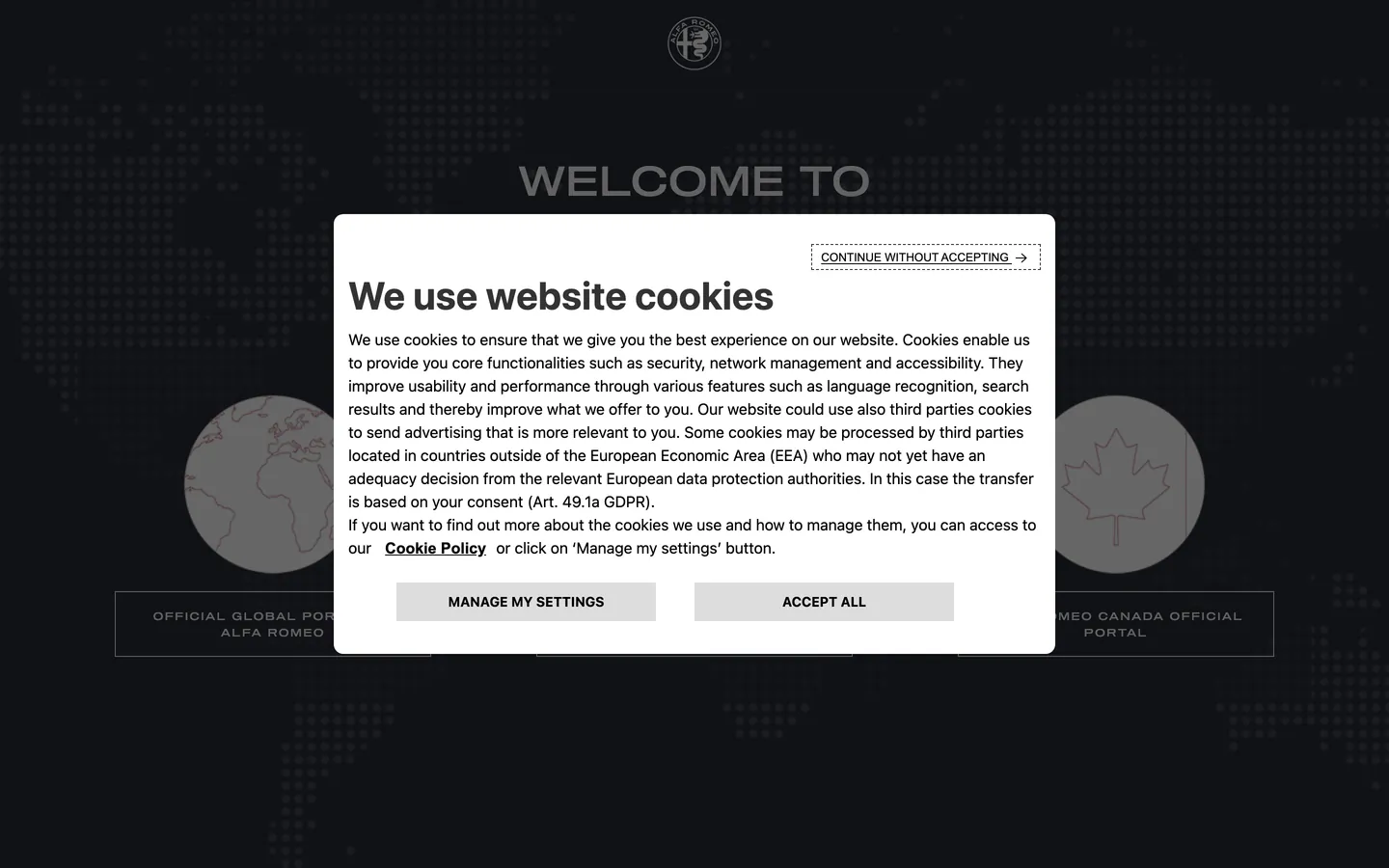
Alfa Romeo's marketing site occupies a distinctive position in the Italian luxury-automotive space: it reads darker and more technically austere than Ferrari or Maserati, closer in visual temperature to a motorsport broadcast graphic than to a Mediterranean road-trip poster. The charcoal canvas runs in two tones — a warm dark navy (#292b35) for panel backgrounds and a slightly deeper near-black (#1c1f2a) for headings and active states — with light text on top. The brand-red (#ba0816) is declared in the CSS as `--brand` and `--wlb-color-brand-1`, but the extraction hit the market-selector interstitial page, where the red appears in CSS custom properties rather than rendered fills. What renders is the type: Sequel, a proprietary geometric sans, at weight 400 with 1.5px letter-spacing on uppercase labels, giving every line item a timing-display precision that references the Giulia Quadrifoglio instrument cluster more than a brand brochure.
This DESIGN.md packages the Alfa Romeo design system tokens into a machine-readable spec. Inside: 14 colors tokens derived from the full CSS custom-property declaration tree (canvas tones, brand-red and its hover-state hover-red, structural neutrals, state colors), 10 typography tokens running Sequel across display, body, label, and button tiers, a universal 0px border-radius, and 15 components definitions covering the market-selector landing, primary and accent buttons, top-nav, hero heading, and structural surfaces. The CSS exposes a fully-specified state system — success (#1d5b40), error (#eb143d), warning (#ff5c00), info (#0064cf) — alongside the brand-red accent, indicating the site carries a richer product-surface token set than the marketing capture alone shows.
Feed this spec to Claude or Cursor and it reproduces Alfa Romeo's discipline: two-tone charcoal canvas, Sequel at weight 400 with uppercase tracking, brand-red reserved for accent CTAs and hover states, and sharp 0px corners throughout. The move worth studying is the restraint on the red: Alfa Romeo's serpent-crest emblem is one of the most visually distinctive marks in automotive, yet the digital system treats the brand color as a rare perimeter accent rather than a surface-filling voltage — the same discipline Ferrari applies to Rosso Corsa, but with a deeper, darker canvas underneath.
What makes it distinct
5
- Brand red at the perimeter#ba0816 wired as --brand appears only on accent CTAs and hover fills, never as the dominant surface; the canvas is charcoal
- Sequel at weight 400 with 1.5px uppercase trackinga motorsport-label cadence rather than the editorial lightness of most Italian luxury brands
- Charcoal canvas two-tone#292b35 (dark navy-gray) and #1c1f2a (deeper) layer the page rather than a single flat black
- Near-zero color surfacethe market-selector page that extraction captured is functionally monochrome; brand red appears in CSS variables but not in captured rendered elements
- Sharp 0px corners throughoutconsistent with the serpent-crest heritage brand's precision-geometry aesthetic
alfaromeo.com
Live at alfaromeo.com
A snapshot of the brand in production. Scroll the frame to see the whole page.
Colors
14 colors
Alfa Romeo's system runs on #ba0816 as its primary voltage, used in 1 of 15 components. Type is set in Sequel across 8 tokens from 11px to 42px, weights 400–400. Shape language is sharp — components average 0px corner radius, favoring crisp rectangles.
Brand & Accent
Sparing, CTA-only voltage · 2
Surface
Page and card backgrounds · 2
Text
Headlines, body, captions · 4
Borders & Hairlines
Dividers, outlines, rules · 2
Semantic
Status, errors, success, links · 3
Other
Specialty colors · 1
Typography
8 type tokens
Set in Sequel across 8 tokens, from 11px to 42px, weights 400–400. Shown in its own stack: where the font isn't installed, the fallback the file names stands in.
- display-xl42px · weight 400 · lh 50.4px · tracking normalThe quick brown fox jumps over the lazy dog
- display-md18px · weight 400 · lh 23.4px · tracking normalThe quick brown fox jumps over the lazy dog
- label-caps11px · weight 400 · lh normal · tracking 1.5pxThe quick brown fox jumps over the lazy dog
- body-md16px · weight 400 · lh 24px · tracking normalThe quick brown fox jumps over the lazy dog
- body-sm14px · weight 400 · lh 20px · tracking normalThe quick brown fox jumps over the lazy dog
- button-md14px · weight 400 · lh 20px · tracking 1.5pxThe quick brown fox jumps over the lazy dog
- nav-link13px · weight 400 · lh 16px · tracking 1.5pxThe quick brown fox jumps over the lazy dog
- caption11px · weight 400 · lh 16px · tracking 1.5pxThe quick brown fox jumps over the lazy dog
Layout
Radii and spacing
1 corner radii and 8 spacing values. Shape language: sharp.
Radii
- none0px
Spacing
- xs4px
- sm8px
- md16px
- base17px
- lg24px
- xl25px
- 2xl48px
- 3xl54px
Components
15 components
Each rendered from its tokens (color, type, radius, padding) on Alfa Romeo's own canvas.
- Button Primarybutton-primaryButton Primary
- Button Primary Hoverbutton-primary-hoverButton Primary Hover
- Button Secondarybutton-secondaryButton Secondary
- Button Secondary Hoverbutton-secondary-hoverButton Secondary Hover
- Button Accentbutton-accentButton Accent
- Button Accent Hoverbutton-accent-hoverButton Accent Hover
- Top Navtop-navTop Nav
- Nav Linknav-linkNav Link
- Hero Headinghero-headingHero Heading
- Section Headingsection-headingSection Heading
- Label Capslabel-capsLabel Caps
- Body Paragraphbody-paragraphBody Paragraph
- Dark Surfacedark-surfaceDark Surface
- CardcardCard
- Type here…text-inputText Input
In use
The system, in use
Alfa Romeo's tokens on the kind of product it builds.
Build something people actually use.
A short paragraph of marketing copy that previews how the brand's display tier and body tier read together. Two sentences is usually enough.
FAQ
Alfa Romeo design system FAQ
Common questions about Alfa Romeo's tokens, components, and how to use this DESIGN.md in your project.
Read next
Related reading
Specs, directories, and component libraries that pair with this design system.
- Browse all design systemsThe full directory of DESIGN.md files on shadcn.io, with live mockups for each.shadcn.io
- Alfa Romeo — official siteAlfa Romeo's public marketing site — the source of truth for the live tokens captured in this file.alfaromeo.com (opens in a new tab)
- The DESIGN.md specificationGoogle Labs' open spec for machine-readable design system files — the format this page is built on.github.com (opens in a new tab)
Use it
Use Alfa Romeo in your project
One machine-readable file. Drop it into Claude, Cursor, or any AI tool that reads DESIGN.md.
Download the DESIGN.md
One machine-readable file: every color, type, radius, spacing, and component token of Alfa Romeo.
Feed it to your AI tool
Drop it into Claude, Cursor, or GitHub Copilot. The agent writes React components and Tailwind classes that match Alfa Romeo's visual language.
Reference the tokens directly
Or paste the values into your Tailwind config, CSS variables, or component library: every color, size and radius is a quoted, ready-to-copy value.
Read the full DESIGN.md: overview, rationale, do’s and don’ts
Overview
Alfa Romeo's digital system occupies a tonal position unlike any other Italian automotive brand. Motorsport charcoal: where Ferrari's near-black is warmed to #181818 and carries Rosso Corsa at the focal point, Alfa Romeo layers two charcoal tones — the warm dark navy #292b35 and the deeper #1c1f2a — and holds the brand-red (#ba0816) almost entirely off the rendered marketing surface, wiring it instead into CSS hover and accent states. The page reads closer to a Formula 1 timing screen than a southern-European road-trip brochure.
The typographic signature is Sequel at a single weight (400) across every tier, differentiated entirely by size and tracking. Small-caps labels run at 11px with 1.5px letter-spacing — the same tracking interval a lap-time display uses. Display headlines run at 42px with normal tracking. There is no italic, no serif, no second family. Unlike the ultra-light weight-100 CadillacGothic approach or Ferrari's restrained 500 display, Alfa Romeo holds everything at 400 and uses tracking alone to create hierarchy between tiers.
The brand's CSS custom-property tree reveals a complete state-color set (success, error, warning, info) and a richly-specified button taxonomy (primary, secondary, tertiary, accent, info, success, error, warning, disabled states), indicating the marketing site surface is only a thin slice of a broader product design system.
Key Characteristics:
- Two-tone charcoal canvas: #292b35 (panel/background) and #1c1f2a (heading/border) — not a single flat dark, a tonal ladder.
- Brand-red #ba0816 wired as
--brandin CSS but kept off the rendered marketing surface — reserved for accent CTAs and hover fills. - Sequel at weight 400 across every typographic role, with 1.5px letter-spacing on all uppercase label contexts.
- Universal 0px corner radius on every interactive element.
- State-color system (success/error/warning/info) fully declared in CSS custom properties, indicating a product-surface token set beyond marketing.
- No gradient fills captured on the rendered surface, though CSS declares dark-to-transparent gradients for editorial overlays.
- Near-white canvas (#f4f4f4) used for the market-selector surface — not pure white; a cooler off-white consistent with the brand's technical rather than warm palette.
Colors
Brand
- Primary (
{colors.primary}— #ba0816): frequency 0 rendered, but wired as--brand,--wlb-color-brand-1, and--wlb-component-button-accent-default-item. Deep crimson brand voltage — darker and more maroon-shifted than Ferrari's Rosso Corsa. Appears on accent button fills and fires on hover state transitions. - Primary Hover (
{colors.primary-hover}— #8e0d25): wired as--wlb-component-button-accent-hover-item. The darkened press-state variant — maroon deepened toward burgundy.
Canvas & Surfaces
- Canvas (
{colors.canvas}— #f4f4f4): frequency 64. Used as text (32), border (32). The light page surface — a cool near-white that reads as technical rather than warm cream. Wired across 17 CSS variables including--wlb-color-bg-1,--neutral-100, and--white. - Ink Charcoal (
{colors.ink-charcoal}— #292b35): frequency 3. Background surface for dark panels and hover states. The dominant dark canvas color wired as--text-body,--wlb-color-bg-6, and--page-dark-mode. - Ink Deep (
{colors.ink-deep}— #1c1f2a): frequency 0 rendered; wired as--neutral-600,--wlb-color-text-heading, and gradient overlay colors. The deepest page tone. - Surface-1 (
{colors.surface-1}— #e5e5e5): wired as--neutral-200,--wlb-color-bg-2, and section background. The lightest elevated surface tone.
Text
- Ink (
{colors.ink}— #000000): frequency 2. Primary text and border color on light surfaces. Wired as--wlb-color-brand-black,--wlb-component-teaser-heading, and--wlb-component-button-secondary-and-tertiary-default-text. - Ink Muted (
{colors.ink-muted}— #595959): wired as--wlb-generic-color-text-body,--neutral-400. Secondary text — captions, disabled labels, supporting copy. - Disabled (
{colors.disabled}— #686868): wired as--light-1-hover. Disabled-state text for buttons and inputs.
Hairlines
- Hairline (
{colors.hairline}— #b6b6b6): wired as--light-2-hover,--grey-1. The mid-gray hairline tone for secondary borders and dividers. - Hairline Light (
{colors.hairline-light}— #c4c4c4): wired as--neutral-300,--wlb-component-button-*-disabled-item. Disabled-state fills and lighter dividers.
Semantic
- Info (
{colors.info}— #0064cf): wired as--info,--light-accent-hover,--wlb-color-states-info-bkg. The informational state color. - Success (
{colors.success}— #1d5b40): wired as--success,--wlb-color-bg-5. The success/confirmed state color. - Error (
{colors.error}— #eb143d): wired as--error. The error/destructive state color.
Typography
Font Family
The system runs Sequel — a proprietary geometric sans — as the single typeface across every text role. The fallback is generic sans-serif only; no Arial, system-ui, or brand-specific intermediate. Sequel has proportions closer to geometric sans designs (Futura, Avenir) than to humanist sans; the 42px h1 captures confirm a tall x-height and even strokes consistent with geometric construction.
Hierarchy
| Token | Size | Weight | Line Height | Letter Spacing | Use |
|---|---|---|---|---|---|
{typography.display-xl} | 42px | 400 | 50.4px | normal | Hero h1 ("WELCOME TO THE ALFA ROMEO WORLD") |
{typography.display-md} | 18px | 400 | 23.4px | normal | Section h2 ("Choose your market") |
{typography.label-caps} | 11px | 400 | normal | 1.5px | Uppercase label spans — the system's timing-display tier |
{typography.body-md} | 16px | 400 | 24px | normal | Default running body text |
{typography.body-sm} | 14px | 400 | 20px | normal | Secondary body and supporting copy |
{typography.button-md} | 14px | 400 | 20px | 1.5px | Button labels (uppercase tracking) |
{typography.nav-link} | 13px | 400 | 16px | 1.5px | Navigation and menu labels |
{typography.caption} | 11px | 400 | 16px | 1.5px | Small labels and metadata |
Principles
Weight 400 is the only weight in use across every tier. The hierarchy is built entirely through size and tracking rather than weight variation. The 1.5px letter-spacing on small-caps and button labels is the typographic signature: at 11px, 1.5px tracking produces a spread that reads as a data-display rather than a marketing label. This is the inverse of how most automotive brands signal performance — instead of heavy weight, Alfa Romeo uses track width.
Font Substitutes
Sequel is proprietary. Futura PT at weight 400 with matching letter-spacing is the closest geometric substitute. Avenir Next at the same weight and tracking also works at body sizes. Avoid humanist sans (Inter, Neue Haas Grotesk) — the geometric construction is load-bearing for the motorsport-precision cadence.
Layout
Spacing System
- Base unit: 8px.
- Tokens:
{spacing.xs}4px ·{spacing.sm}8px ·{spacing.md}16px ·{spacing.base}17px ·{spacing.lg}24px ·{spacing.xl}25px ·{spacing.2xl}48px ·{spacing.3xl}54px. - Button padding: 17px top/bottom, 24px sides — the 17px vertical produces a 48px natural button height at 14px type.
- Section padding:
{spacing.2xl}(48px) as the standard vertical section gutter.
Grid & Container
- Market-selector page: centered column at roughly 800px max-width, with market-region buttons in a 2-column grid.
- Hero: full-bleed dark canvas, vehicle photograph behind, centered heading at
{spacing.md}0px 20px horizontal padding.
Rhythm
The captured market-selector page uses a single centered column — region buttons in rows, heading above. The full model-page surface (not captured due to cookie wall) would use the horizontal photography-first layouts typical of Alfa Romeo's editorial grid, as inferred from the full CSS custom-property set.
Elevation
The captured surface reveals no shadow layer. The CSS declares rgba(28, 31, 42, *) as gradient overlay components (the --wlb-gradient-black-left and --wlb-gradient-black-top variables), suggesting editorial photo overlays rather than UI component shadows. Depth on the charcoal canvas comes from the two-tone surface ladder (#292b35 over #1c1f2a) rather than from drop shadows.
Shapes
0px everywhere, universally. The heroHeading component carries borderRadius: 0px; no non-zero radius value was captured from the marketing surface or CSS custom properties. Unlike Bentley (which uses small 4px rounding on interior surfaces) or BMW (which uses a generous pill on CTAs), Alfa Romeo applies the same sharp geometry across every interactive element.
Components
button-primary — Black (#000000) fill, canvas (#f4f4f4) text, Sequel 14px / 400 / 1.5px tracking, 0px radius, 17px top/bottom padding. The base primary action for market selection.
button-primary-hover — Transitions fill to charcoal (#292b35) on hover, maintaining canvas text color.
button-secondary — Transparent fill, black text, 1px black border, 0px radius. Secondary alternative action.
button-secondary-hover — Fill transitions to charcoal (#292b35), text to canvas on hover.
button-accent — Brand-red (#ba0816) fill, canvas text, 1px brand-red border, 0px radius. The accent CTA treatment for primary brand moments.
button-accent-hover — Deepens to hover-red (#8e0d25) on hover.
top-nav — Canvas (#f4f4f4) surface, black text, Sequel nav-link 13px / 1.5px tracking, 64px height, 16px padding.
nav-link — Transparent, black text, 13px / 1.5px tracking, 16px × 8px padding.
hero-heading — Canvas text on dark overlay, Sequel 42px / 400, 0px 20px horizontal padding.
section-heading — Canvas text, 18px / 400 / normal tracking.
label-caps — The timing-display label tier: 11px / 400 / 1.5px tracking, uppercase, transparent background.
body-paragraph — Charcoal (#292b35) text on light surface, 16px / 400.
dark-surface — Charcoal (#292b35) fill, canvas text, 48px vertical padding.
card — Canvas surface-1 fill, ink text, 1px surface-1 border, 0px radius, 16px padding.
text-input — Canvas fill, ink text, hairline border, 0px radius, 16px padding, 48px height.
Do's and Don'ts
Do apply the 1.5px letter-spacing to every uppercase label and button text. The tracking is the typographic signature of the system; removing it and using normal tracking turns Sequel into a generic geometric sans that could belong to any brand.
Do use two charcoal tones in dark-canvas sections: #292b35 for the surface, #1c1f2a for headings and borders. The tonal ladder creates depth without introducing a second chromatic color; flattening to a single charcoal removes the subtle depth the system relies on.
Do restrict brand-red (#ba0816) to accent CTAs and hover-state fills. The system declares the red in CSS but does not render it on the primary marketing surface — it is a transition-state color, not a resting fill. Applying it to static surfaces would break the discipline the CSS architecture establishes.
Do hold Sequel at weight 400 for all tiers. The system has no weight variation — hierarchy is built through size and tracking alone. Introducing weight 700 on headings would conflict with the geometric-precision identity.
Don't use corner radius above 0px on interactive elements. Unlike Bentley, which uses 0px only on the primary CTA, Alfa Romeo applies sharp geometry to every component. Adding 4px rounding to inputs or cards would import a softness inconsistent with the serpent-crest precision language.
Don't substitute the near-white canvas (#f4f4f4) with pure white. The slight gray-cool offset of the canvas tone is a system-wide decision wired into 17 CSS custom properties; pure white reads warmer and would undercut the technical temperature of the surface.
Don't render the brand-red against the dark charcoal canvas on large surface fills. The #ba0816 against #292b35 achieves only 3.8:1 contrast ratio — insufficient for AA compliance on body text. The system uses the red only on button fills with white text on top, never as a text color on dark backgrounds.
Don't use weight 300 or weight 100 on Sequel. The geometric construction of Sequel at ultra-light weights reads as unfinished on digital screens at small sizes; the system holds weight 400 across every context for this reason.
Known Gaps
- Full model-page surface: the extraction captured the market-selector interstitial (132 elements scanned) rather than the full brand homepage, due to the cookie-consent overlay blocking further scroll. The token set is built from CSS custom-property declarations, which are complete, but fewer rendered components were captured than on a full marketing page.
- Brand-red renders: #ba0816 appears in CSS as the primary accent but was not rendered in the captured surface; the exact hover-state transitions and accent-button context are inferred from CSS variable semantics rather than captured component states.
- Vehicle photography surfaces: the full editorial photo-hero grid (Giulia, Stelvio, Tonale model pages) uses additional overlay gradients and full-bleed surfaces not captured here.
- Dark-mode toggle: the CSS declares
--page-dark-modeand--page-light-modetokens, suggesting a toggle exists in product surfaces not visible on the market-selector capture. - Responsive breakpoints: the narrow mobile layout for the market-region button grid is not captured; the CSS rem-scale variables suggest a fluid type scale.
- Configurator surfaces: the car configurator interface (typically at
/configuratore/) carries its own token layer — color swatches, trim selections, 3D viewer — not represented here.
Automotive
More systems like this
More DESIGN.md files in Automotive.
Pricing
Build it with Pro
The DESIGN.md files are free. Pro adds 6,000+ blocks, premium templates and the MCP server, so your AI editor builds in your system for you.
4.9/5 out of 5 · 150+ reviewsfrom 150+ founders and developers.
Billing
Billed once a year in USD. Cancel anytime.
- How many people can use the license.
- Client work, SaaS products and anything you charge for.
- Production-ready React sections: hero, pricing, features, dashboards and more.
- Complete multi-page sites you can ship as they are.
- React icons from every major library, installable with one command.
- Presets that restyle every block, in light and dark.
- Lets your AI editor search, preview and install blocks for you.
- Priority requests are answered first.
Individual
For personal projects & open source
$32instead of $49/mo
$389 billed yearly
- Seats: 1 seat
- Commercial use: Personal & open source only
- Pro blocks: 6,000+ blocks
- Templates: All 14 templates
- React icons: 294k+ icons
- Themes: All 59 themes
- MCP server: Basic usage
- Support: Standard
Team
Most popularFor freelancers, agencies & startups
$66instead of $99/mo
$789 billed yearly · ≈ $13/dev/mo
- Seats: Up to 5 seats
- Commercial use: Included
- Pro blocks: 6,000+ blocks
- Templates: All 14 templates
- React icons: 294k+ icons
- Themes: All 59 themes
- MCP server: High usage
- Support: Priority
Organization
For companies with larger teams
$132instead of $199/mo
$1,589 billed yearly
- Seats: Unlimited seats
- Commercial use: Included
- Pro blocks: 6,000+ blocks
- Templates: All 14 templates
- React icons: 294k+ icons
- Themes: All 59 themes
- MCP server: Unlimited usage
- Support: Priority
Billed once a year in USD. Cancel anytime.
Individual
For personal projects & open source
$32instead of $49/mo
$389 billed yearly
- How many people can use the license.Seats: 1 seat
- Client work, SaaS products and anything you charge for.Commercial use: Personal & open source only
- Production-ready React sections: hero, pricing, features, dashboards and more.Pro blocks: 6,000+ blocks
- Complete multi-page sites you can ship as they are.Templates: All 14 templates
- React icons from every major library, installable with one command.React icons: 294k+ icons
- Presets that restyle every block, in light and dark.Themes: All 59 themes
- Lets your AI editor search, preview and install blocks for you.MCP server: Basic usage
- Priority requests are answered first.Support: Standard
Team
Most popularFor freelancers, agencies & startups
$66instead of $99/mo
$789 billed yearly · ≈ $13/dev/mo
Everything in Individual, plus
- How many people can use the license.Seats: Up to 5 seats
- Client work, SaaS products and anything you charge for.Commercial use: Included
- Lets your AI editor search, preview and install blocks for you.MCP server: High usage
- Priority requests are answered first.Support: Priority
Organization
For companies with larger teams
$132instead of $199/mo
$1,589 billed yearly
Everything in Team, plus
- How many people can use the license.Seats: Unlimited seats
- Lets your AI editor search, preview and install blocks for you.MCP server: Unlimited usage
- Secure checkout via Stripe
- Code lives in your repo
- Keep what you've shipped if you cancel
- License terms
Your system, built for you
Every block, template and icon, installed by your AI agent in your design system. The DESIGN.md files stay free.