Skip to content

Aston Martin Design System

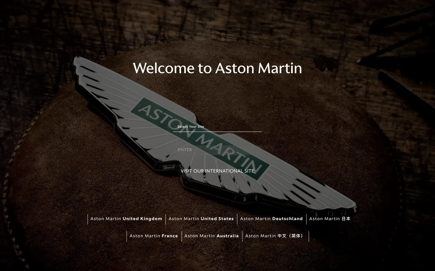
Aston Martin's country-selector splash captured as a DESIGN.md file. Photographic leather canvas, racing-green wings emblem, AstonMartinFlare display at weight 300, AstonMartinSans for body and emphasis.

Add shadcn.io to your AI agent. · Pro It installs blocks, icons and templates in your design system from a prompt, with Pro.

Set up MCP
Primary
#1b6157
Typeface
AstonMartinSans
Shape
Soft
Base radius
0px
Colors
14
Type tokens
10
Components
14
Spacing values
8

About

About Aston Martin DESIGN.md

Curated by Dov Azencot · Updated May 18, 2026 · Source astonmartin.com (opens in a new tab)

Aston Martin's first marketing surface is not a vehicle hero, not a configurator, not a video reel — it is a country-selector. A high-resolution photograph of the brand's winged emblem rests on a warm saddle-leather surface, dust grain and stitch detail visible at full size, and the 48px display headline "Welcome to Aston Martin" sits over it in white at weight 300. The only interactive elements are a thin white underline input field labelled "Select Your Site," a 30px-radius dark grey pill that reads ENTER, and a hairline-separated row of seven country links below. There is no nav, no logo lockup, no secondary CTA, no marketing copy. The brand trusts the photograph and the wing emblem to do every bit of work a typical luxury-auto hero would assign to a chrome video header.

The DESIGN.md file packages the system into a machine-readable spec for React tooling. Inside: fourteen color tokens drawn from the photographic surface (the deep racing-green centerpiece of the wings emblem, the warm leather browns, the gold trim accent, three near-blacks used for footer chrome, a chromatic-gold for an unrendered hover state); five typography tokens spanning AstonMartinFlare at display, button-label, and small-caps tiers, and AstonMartinSans at body running text and bold emphasis; two radii — a 30px pill for the ENTER button and a 2px corner reserved for form chrome; eight spacing values clustered around 20-45px; and fourteen component definitions covering the underline input, the squat ENTER pill, the country-link row, the display heading, and the two label tiers.

Feed this file to an AI coding tool and it reproduces Aston Martin's specific moves: a photograph as the page floor (not a gradient, not a flat fill), a light-weight 300 display tier (the marque never shouts), a single pill radius reserved for the one tappable action, tracked uppercase Flare labels for chrome, and the hairline-separated country list pattern. The one thing worth borrowing only if your brand has the photographic budget to back it: the willingness to ship a splash with no marketing copy whatsoever. Aston Martin gets away with it because the wing emblem and the leather grain do the entire job of brand assertion. Most teams need an interstitial sentence.

What makes it distinct

5

  1. Photograph as canvasthe brand emblem rests on a warm saddle-leather backdrop with no chrome panel framing it, no gradient overlay, no second surface
  2. Two-family typographic splitAstonMartinFlare carries display and tracked uppercase labels, AstonMartinSans carries body and bold emphasis at weight 400/800
  3. Display weight 300the 48px hero h1 sits at light, not bold; the marque trusts the photograph and the wing emblem to carry the visual force
  4. Pill plus ruleonly two radii exist on the page, a 30px ENTER pill and a 2px corner used inside form chrome; everything else is squared
  5. Hairline-separated country listseven market entries sit on a single row, divided by 1px vertical rules, type-only, no flags or badges

astonmartin.com

Live at astonmartin.com

A snapshot of the brand in production. Scroll the frame to see the whole page.

Aston Martin's website at astonmartin.com

Colors

14 colors

Aston Martin's system anchors on #1b6157 (racing-green) as its primary color. Type is set in AstonMartinSans across 10 tokens from 12px to 48px, weights 300–800. Shape language is soft — components average 12px corner radius, with no sharp interactive edges.

Surface

Page and card backgrounds · 4

Text

Headlines, body, captions · 5

Borders & Hairlines

Dividers, outlines, rules · 2

Other

Specialty colors · 3

Typography

10 type tokens

Set in AstonMartinSans across 10 tokens, from 12px to 48px, weights 300–800. Shown in its own stack: where the font isn't installed, the fallback the file names stands in.

  • display-xl48px · weight 300 · lh 72pxThe quick brown fox jumps over the lazy dog
  • button-label14px · weight 500 · lh 20px · tracking 0.55pxThe quick brown fox jumps over the lazy dog
  • small-caps15px · weight 300 · lh 15px · tracking 0.55pxThe quick brown fox jumps over the lazy dog
  • nav-link14px · weight 400 · lh 39.4px · tracking 1.4pxThe quick brown fox jumps over the lazy dog
  • emphasis14px · weight 800 · lh 39.4px · tracking 1.4pxThe quick brown fox jumps over the lazy dog
  • body-md14px · weight 400 · lh 21pxThe quick brown fox jumps over the lazy dog
  • caption12px · weight 500 · lh 12px · tracking 0.55pxThe quick brown fox jumps over the lazy dog
  • body-sm12px · weight 400 · lh 18pxThe quick brown fox jumps over the lazy dog
  • heading-md32px · weight 300 · lh 48pxThe quick brown fox jumps over the lazy dog
  • heading-sm16px · weight 500 · lh 16px · tracking 0.55pxThe quick brown fox jumps over the lazy dog

Layout

Radii and spacing

4 corner radii and 8 spacing values. Shape language: soft.

Radii

  • none0px
  • xs2px
  • pill30px
  • full9999px

Spacing

  • xs4px
  • sm8px
  • base16px
  • md20px
  • lg25px
  • xl35px
  • 2xl45px
  • 3xl100px

Components

14 components

Each rendered from its tokens (color, type, radius, padding) on Aston Martin's own canvas.

  • Button Primary
    button-primaryButton Primary
  • Button Secondary
    button-secondaryButton Secondary
  • Top Nav
    top-navTop Nav
  • Nav Link
    nav-linkNav Link
  • Hero Heading
    hero-headingHero Heading
  • Section Heading
    section-headingSection Heading
  • Body Paragraph
    body-paragraphBody Paragraph
  • Small Caps Prompt
    small-caps-promptSmall Caps Prompt
  • Type here…
    text-inputText Input
  • Card
    cardCard
  • Country Link
    country-linkCountry Link
  • Country Link Emphasis
    country-link-emphasisCountry Link Emphasis
  • Footer
    footerFooter
  • Divider
    dividerDivider

In use

The system, in use

Aston Martin's tokens on the kind of product it builds.

Build something people actually use.

A short paragraph of marketing copy that previews how the brand's display tier and body tier read together. Two sentences is usually enough.

Get startedLearn more
Marketing heroHeadline, sub-copy, primary CTA — the universal homepage opener.
Reporting · 14 min read

The quiet collapse of an old idea

For decades the consensus held that the system would correct itself. Then it didn't. This is the inside story of what changed, told by the people who watched it unravel.

"Nobody noticed because the failure was indistinguishable from progress."

By Sam Reporter · Updated 2 hours ago

Editorial articleMagazine-style longform with display headline.

FAQ

Aston Martin design system FAQ

Common questions about Aston Martin's tokens, components, and how to use this DESIGN.md in your project.

Read next

Specs, directories, and component libraries that pair with this design system.

Use it

Use Aston Martin in your project

One machine-readable file. Drop it into Claude, Cursor, or any AI tool that reads DESIGN.md.

Download DESIGN.md
  1. Download the DESIGN.md

    One machine-readable file: every color, type, radius, spacing, and component token of Aston Martin.

  2. Feed it to your AI tool

    Drop it into Claude, Cursor, or GitHub Copilot. The agent writes React components and Tailwind classes that match Aston Martin's visual language.

  3. Reference the tokens directly

    Or paste the values into your Tailwind config, CSS variables, or component library: every color, size and radius is a quoted, ready-to-copy value.

Read the full DESIGN.md: overview, rationale, do’s and don’ts

Overview

Aston Martin's first marketing surface is not a configurator and not a hero film. Photograph as canvas. The page floor is a high-resolution shot of the winged emblem resting on warm saddle leather — dust grain, stitch detail, and the dark racing-green centerpiece of the wings are the entire chromatic load. Where Ferrari opens on a video reel of a vehicle in motion and Bentley opens on a chrome-paneled product hero, Aston Martin opens on a still photograph of the badge itself, framed in nothing, surrounded by no marketing copy. The 48px "Welcome to Aston Martin" display sits over the photograph in white weight 300 — the lightest display tier in the luxury-auto category — and the only chromatic interactive element is a 30px-radius dark grey pill labelled ENTER.

The system runs two licensed type families that split labor cleanly. AstonMartinFlare handles every display, button label, and small-caps form prompt; AstonMartinSans handles every body paragraph and tracked uppercase chrome label at weight 400 or 800. There is no third family and no system mono. The display weight tops out at 300 — the same restraint that distinguishes Stripe's Sohne-var 300 in fintech, but here the choice is editorial rather than technical: Flare at 48px / 300 reads like the foreword of a coffee-table monograph, not a SaaS hero.

The chromatic palette in the rendered chrome is almost entirely structural. Racing green ({colors.racing-green} — #1b6157) lives inside the photograph and as the browser-reported theme color, but never renders as a CSS fill on the captured surface. The chrome-gold trim ({colors.gold} — #b58c67) is declared as --gold but absent from the rendered page. The page text is white on the photograph; the footer band steps down to a near-black {colors.ink-deep} (#080b11) for chrome continuity. Every accent the marque could have used — gold, green, brushed-bronze — is held in reserve for product pages elsewhere in the site.

Key Characteristics:

  • Photograph as the page floor (warm saddle-leather backdrop, wing emblem centered) — no gradient overlay, no chrome panel, no second surface.
  • Racing green ({colors.racing-green} — #1b6157) is the brand voltage but lives inside the photographic wing emblem, never rendered as a CSS fill on the captured chrome.
  • Two licensed families split cleanly: AstonMartinFlare for display / labels / small-caps; AstonMartinSans for body running text and weight-800 emphasis.
  • Display weight 300 at 48px — the lightest display tier in the luxury-auto category, well below Bentley's 500 and Rolls-Royce's 600.
  • Binary radius scale: a single 30px pill for the ENTER button, a 2px corner inside form chrome, everything else squared at 0px.
  • Hairline-separated country-link row at the page bottom — seven market entries divided by 1px vertical rules, type-only, no flags or badges.
  • Footer chrome steps down to near-black {colors.ink-deep} (#080b11) wired as --blackFooter — the only sub-fold chromatic shift in the captured page.
  • 14 declared color tokens drawn entirely from photographic browns, structural near-blacks, and chrome whites; the chromatic accent lives in the photograph, not in the token list.

Colors

Brand

  • Racing Green ({colors.racing-green} — #1b6157): the browser-reported themeColor from the page meta tags. Lives inside the photographic wing emblem at the center of the splash and across every vehicle badge the marque ships. Never rendered as a CSS fill on the captured chrome; the racing green you see on the page is photographic, not painted. The single brand voltage in the system.
  • Gold ({colors.gold} — #b58c67): declared as --gold in the CSS but absent from the rendered splash. Reserved for trim accents on product pages elsewhere in the site.

Text & Chrome

  • Ink ({colors.ink} — #111111): frequency 66 — used as text (33) and border (33). Wired as --blackFooter, --black-pearl, --text-dark. The footer chrome and dark-on-light text color used outside the splash photograph.
  • Ink Soft ({colors.ink-soft} — #161718): paired with --text-dark and --black-pearl as the slightly warmer footer text tone. Distinct from pure black by a couple of luminance points.
  • Ink Deep ({colors.ink-deep} — #080b11): wired as --almostBlack, --almostBlack20, --almostBlack12. The deep near-black used for the footer band — the only chromatic shift between the photograph and the page bottom.
  • Cream ({colors.cream} — #ffffff): frequency 55 — used as text (27) and border (27). Pure white on the photograph, no muted variant for body copy. The contrast against the dark leather backdrop is intentional.

Surface

  • Canvas ({colors.canvas} — #161a11): wired as --black. The near-black warm-green-tinted surface used as a configurator background tone on product pages; not rendered on the splash.
  • Surface-1 ({colors.surface-1} — #161a21): wired as --configuratorDarkGray, --darkGrey. The dominant configurator surface tone used elsewhere in the site for dark UI cards.
  • Surface-2 ({colors.surface-2} — #262626): wired as --darkGray. The secondary configurator chrome tone.
  • Surface-3 ({colors.surface-3} — #3c4049): wired as --configuratorDarkenGray. The third configurator chrome step.

Neutrals

  • Muted ({colors.muted} — #606060): frequency 1 — used as the ENTER button background fill. The single rendered grey on the splash; the only chromatic decision the page chrome makes outside the photograph.
  • Muted Soft ({colors.muted-soft} — #7b8086): wired as --configuratorLightGray. Reserved for configurator-panel text on product pages.
  • Hairline ({colors.hairline} — #c4c4c4): wired as --greyLight, --gray. The country-link row separator rule and form chrome border tone.
  • Hairline Soft ({colors.hairline-soft} — #e5e5e5): wired as --whisperGrey. The lightest hairline tier, reserved for dropdown chrome on product pages.

Typography

Font Families

The system runs two licensed families. AstonMartinFlare is the Flare variant — used for the display tier (48px / 300 hero h1), button labels (14px / 500 tracked uppercase), small-caps form prompts (the "Select Your Site" label is Flare-equivalent at 15px), and the tracked uppercase footer chrome. AstonMartinSans handles body running text and bold emphasis — country-link labels render in Sans 14px / 400 with 1.4px tracking, and the in-line bold "United Kingdom / United States / Deutschland / Australia / France" emphasis renders in Sans 14px / 800 at the same tracking. Fallbacks walk to Georgia, serif for Flare and Helvetica Neue, sans-serif for Sans.

The pairing is the typographic signature: a contemporary Flare-style display in tracked uppercase for chrome, paired with a contemporary humanist sans for running text and emphasis. There is no third family and no system mono.

Hierarchy

TokenSizeWeightLine HeightLetter SpacingUse
{typography.display-xl}48px30072px0Hero h1 ("Welcome to Aston Martin")
{typography.heading-md}32px30048px0Inferred h2 tier (declared as --fs-h3 in CSS, not rendered on the splash)
{typography.heading-sm}16px50016px0.55pxSub-heading / accordion title tier (declared, not rendered on the splash)
{typography.small-caps}15px30015px0.55pxSmall-caps form prompt ("Select Your Site")
{typography.button-label}14px50020px0.55pxENTER pill label and tracked uppercase chrome
{typography.nav-link}14px40039.4px1.4pxCountry-link labels
{typography.emphasis}14px80039.4px1.4pxBold market-name emphasis inside country links
{typography.body-md}14px40021px0Default body running text
{typography.body-sm}12px40018px0Footer chrome and metadata
{typography.caption}12px50012px0.55pxEyebrow / footnote captions

Principles

Display weight tops out at 300. The 48px hero h1 at weight 300 is the entire typographic statement of the splash — the lightest display tier in the luxury-auto category, well below Bentley's 500 and Rolls-Royce's 600. The lightness is the brand confidence signal: the marque does not need typographic muscle when the photograph and the wing emblem are doing the work.

Button labels and small-caps prompts both use 0.55px tracking — a quiet measured space that reads more print-magazine than SaaS. Body emphasis jumps to weight 800 with 1.4px tracking on the country-link row, the single use of the heavy weight on the captured page; the contrast between regular and bold sits at six weight steps rather than the usual three, which lets the bold market-names register clearly without the row needing color or background separation.

Note on Font Substitutes

AstonMartinFlare and AstonMartinSans are licensed proprietary families. The closest open-source substitutes for Flare are Cormorant Garamond or Spectral at weight 300 for display, and a tracked EB Garamond Small Caps for the chrome labels. For AstonMartinSans, Inter or Söhne at the same weights transfers cleanly; the 800-weight emphasis tier maps to Inter's ExtraBold. The preserved move is the weight-300 display — substituting in weight 400 or 500 turns the marque foreword into a generic editorial header.

Layout

Spacing System

  • Base unit: 5px — the spacing values cluster at 20 / 25 / 35 / 45px, all multiples of 5.
  • Tokens: {spacing.xs} 4px · {spacing.sm} 8px · {spacing.base} 16px · {spacing.md} 20px · {spacing.lg} 25px · {spacing.xl} 35px · {spacing.2xl} 45px · {spacing.3xl} 100px.
  • Section padding (vertical): the splash uses the full viewport — the hero stack sits centered, the country-link row sits ~100px from the page bottom.
  • Header height: 65px (wired as --headerHeight), reserved for site chrome on product pages.
  • Footer height: 204px (wired as --footerHeight).
  • Card internal padding: {spacing.lg} (25px) on the configurator surfaces; the splash itself uses no cards.

Grid & Container

  • Max content width: ~720px on the centered hero stack (display heading + input + ENTER button), unconstrained on the country-link row.
  • Hero: the hero stack (heading, input, ENTER pill, visit-international link) sits in a centered ~720px column over the full-bleed photograph.
  • Country-link row: flush-bottom horizontal row of seven country entries divided by 1px {colors.hairline} vertical rules, type-only, no flags or badges.
  • Footer band: 204px-tall near-black {colors.ink-deep} band that holds the legal / corporate links on product pages (absent from the splash, declared in the system).

Rhythm

The splash holds a single tempo — the photograph is the entire page floor, the hero stack is the only chrome element above the country-link row, and the footer is the only chromatic shift. There is no second editorial band, no scroll-revealed section, no logo wall. The page is the splash, and the splash is the brand assertion.

Elevation

The system has essentially no shadow tier on the captured surface. The ENTER pill sits flat against the photograph with no drop shadow; the underline input has no inset shadow. Depth on the splash comes entirely from the photographic backdrop — the wing emblem casts its own shadow into the leather, and the leather grain provides surface texture. No CSS-rendered shadow is part of the captured chrome.

  • Flat (no shadow): hero stack, ENTER pill, underline input, country-link row, footer — every rendered surface.
  • Photographic depth: the wing-emblem-on-leather backdrop provides every bit of visual depth the page carries. The dust grain and stitch detail are the texture layer.
  • No hairline-on-photograph: the underline input field uses a 1px white rule that reads as photographic detail rather than as a UI border — the photograph and the chrome blur into a single surface.

Shapes

The radius scale is binary: a single pill plus a 2px form-chrome corner.

  • {rounded.none} 0px — the country-link row cells, the footer band, the hero heading bounding box, every surface that isn't the ENTER button or a form input corner.
  • {rounded.xs} 2px — reserved for the inner corners of form chrome on configurator pages (declared, not rendered on the splash).
  • {rounded.pill} 30px — the ENTER button. A squat 32px-tall capsule that reads as the warmest, most-tappable surface on an otherwise type-only page.
  • {rounded.full} 9999px — declared in the system for fully circular treatment on avatar / icon-button chips that appear on product pages.

There is no 4 / 8 / 12 / 16px middle tier. The scale is deliberately binary — pill versus right-angle — and the pill is reserved for the one action that needs warmth. Adding a soft-rounded middle tier would dilute the discipline that makes the ENTER pill register as the single tappable affordance.

Components

hero-heading — White {colors.cream} text on the photographic backdrop, {typography.display-xl} (48px / 300). The entire typographic load of the splash sits here. 0 padding because the photograph extends edge-to-edge.

small-caps-prompt — White text in {typography.small-caps} (15px / 300 / 0.55px tracking). The "Select Your Site" label that sits above the underline input — Flare-equivalent rendering, the only small-caps prompt on the page.

text-input — Transparent fill, white text in {typography.body-md}, 1px white bottom border, {rounded.xs} 2px corner, 32px height. The underline input field — no rounded box, no inset shadow, just a thin white rule that reads as a photographic detail.

button-primary — The ENTER pill. Muted grey {colors.muted} (#606060) fill, white text in {typography.button-label} (14px / 500 / 0.55px tracking, uppercase), {rounded.pill} 30px radius, 4 / 16 / 8px padding, 32px height. The squat capsule sits below the underline input and reads as the single tappable affordance on the page.

button-secondary — Transparent fill, white text in the same button-label typography, white-stroked pill border. Used for the "VISIT OUR INTERNATIONAL SITE" link that sits below the ENTER button (rendered as text link on the captured surface, declared as a secondary pill variant for product pages).

country-link — Transparent fill, white text in {typography.nav-link} (14px / 400 / 1.4px tracking, capitalize). The seven country entries that sit in a horizontal row at the page bottom — each cell separated from its sibling by a 1px {colors.hairline} vertical rule.

country-link-emphasis — White text in {typography.emphasis} (14px / 800 / 1.4px tracking). The bold market-name segment inside each country link ("Aston Martin United Kingdom", "Aston Martin United States", etc.) — the six-step weight jump from regular to ExtraBold is the page's only typographic emphasis pattern.

divider — 1px {colors.hairline} rule used as the vertical separator between country links and as form-chrome borders. The only line element rendered on the page.

top-nav — Declared as a 65px-tall transparent band over the photograph; not rendered on the captured splash (the splash has no nav). Reserved for product pages with a {typography.nav-link} link cluster.

nav-link — White text in {typography.nav-link}, transparent fill, 0 / 12px padding. The declared top-nav link style for product pages.

section-heading — White text in {typography.heading-md} (32px / 300). Declared as the h2 tier; not rendered on the splash, used on product pages for section displays.

body-paragraph — Default white text at {typography.body-md}. Declared as the running-text style; not rendered on the splash.

card — {colors.surface-1} (#161a21) fill, white text, 0 radius, 25px padding. Declared as the configurator card surface; absent from the splash.

footer — {colors.ink-deep} (#080b11) fill, white text in {typography.body-sm}, 45 / 24px padding. 204px tall on product pages; not rendered on the splash, but the only chromatic step-down declared in the system.

Do's and Don'ts

Do let the photograph be the page floor. The single move that defines this system is the willingness to ship a splash where the photograph carries every bit of visual decoration. Painting a chrome overlay or a gradient mesh on top would compete with the wing emblem and undercut the brand assertion.

Do hold display weight at 300. The 48px hero h1 at weight 300 is the entire typographic moment on the page; bumping to weight 500 turns the marque foreword into a generic editorial header and loses the print-monograph treatment.

Do keep the country-link row as type-only with hairline separators. No flags, no badges, no surface fills — the row reads as a measured editorial credit line, not as a market chooser.

Do reserve the 30px pill radius for the one tappable action. The ENTER pill is the single warm surface on the page; multiplying it to other CTAs would dilute the binary radius discipline.

Don't render the racing green ({colors.racing-green} — #1b6157) as a CSS background fill on the splash. The brand voltage lives inside the photographic wing emblem; painting it as a chrome surface flattens the photograph-as-canvas move into a typical luxury-auto green-block hero.

Don't use {colors.gold} (#b58c67) as a button or link accent. The token is declared as --gold but absent from the captured render — it is reserved for trim treatments on product pages and reads as decorative bling outside those contexts.

Don't introduce a soft-rounded middle radius (8 / 12 / 16px). The scale is binary — pill versus right-angle — and adding a softened middle tier breaks the contrast between the single tappable affordance and the squared editorial chrome around it.

Don't add a drop shadow under the ENTER pill or the underline input. The captured chrome carries zero CSS shadows; depth comes from the photograph. A rendered shadow on top of the photographic surface would read as a foreign UI layer and disrupt the single-surface treatment.

Known Gaps

  • Vehicle hero, configurator chrome, and dealer-locator UI are not represented — the captured surface is the global country-selector splash only. Product pages, configurator panels, and the dealer locator carry a richer surface ladder using {colors.surface-1} through {colors.surface-3} that is declared but not rendered on the splash.
  • Hover and focus states: documented for none of the captured components. The full state matrix (focus rings, active press, hover tints) lives in the configurator surfaces and is not exposed on the splash.
  • Dark / light mode: the splash is photograph-only; no light variant exists. Configurator pages run a darker chrome that uses {colors.surface-1} and {colors.surface-2} as the page floor.
  • Motion: the splash is a static photograph; no scroll-revealed motion or hero animation is rendered. Product pages carry parallax and reveal motion that is not represented in the spec.
  • Marketing nav and product-category chrome: the splash has no top-nav, no logo lockup, no secondary CTA. The full nav system (Products / Models / Configurator / Owners / About) lives behind the ENTER pill and is declared via --zi-header-buttons and --zi-models-header-text but not rendered.
  • Form input error states: {component.text-input} carries the resting state only; error / validation styling is not exposed on the splash.
  • Chromatic accent ladder: the declared {colors.gold} and {colors.racing-green} are absent from the captured render; both are reserved for product-page surfaces.

Automotive

More systems like this

More DESIGN.md files in Automotive.

Pricing

Build it with Pro

The DESIGN.md files are free. Pro adds 6,000+ blocks, premium templates and the MCP server, so your AI editor builds in your system for you.

4.9/5 out of 5 · 150+ reviewsfrom 150+ founders and developers.

Billed once a year in USD. Cancel anytime.

Individual

For personal projects & open source

$32instead of $49/mo

$389 billed yearly

  • How many people can use the license.Seats: 1 seat
  • Client work, SaaS products and anything you charge for.Commercial use: Personal & open source only
  • Production-ready React sections: hero, pricing, features, dashboards and more.Pro blocks: 6,000+ blocks
  • Complete multi-page sites you can ship as they are.Templates: All 14 templates
  • React icons from every major library, installable with one command.React icons: 294k+ icons
  • Presets that restyle every block, in light and dark.Themes: All 59 themes
  • Lets your AI editor search, preview and install blocks for you.MCP server: Basic usage
  • Priority requests are answered first.Support: Standard

Team

Most popular

For freelancers, agencies & startups

$66instead of $99/mo

$789 billed yearly · ≈ $13/dev/mo

Everything in Individual, plus

  • How many people can use the license.Seats: Up to 5 seats
  • Client work, SaaS products and anything you charge for.Commercial use: Included
  • Lets your AI editor search, preview and install blocks for you.MCP server: High usage
  • Priority requests are answered first.Support: Priority

Organization

For companies with larger teams

$132instead of $199/mo

$1,589 billed yearly

Everything in Team, plus

  • How many people can use the license.Seats: Unlimited seats
  • Lets your AI editor search, preview and install blocks for you.MCP server: Unlimited usage
  • Secure checkout via Stripe
  • Code lives in your repo
  • Keep what you've shipped if you cancel
  • License terms

Your system, built for you

Every block, template and icon, installed by your AI agent in your design system. The DESIGN.md files stay free.

Get Pro