Best Buy Design System
Best Buy's marketing chrome packaged as a DESIGN.md file. Cobalt #0457c8 nav, blue-to-teal gradient promo banners, highlighter-yellow price-tag accents, Human BBY Digital, 17 colors, 18 components. For React, Next.js, and AI tools.
Add shadcn.io to your AI agent. · Pro It installs blocks, icons and templates in your design system from a prompt, with Pro.
Set up MCP- Primary
- #0457c8
- Typeface
- Human BBY Digital
- Shape
- Mixed
- Base radius
- 8px
- Colors
- 17
- Type tokens
- 11
- Components
- 18
- Spacing values
- 8
About
About Best Buy DESIGN.md
Curated by Dov Azencot · Updated May 19, 2026 · Source bestbuy.com (opens in a new tab)
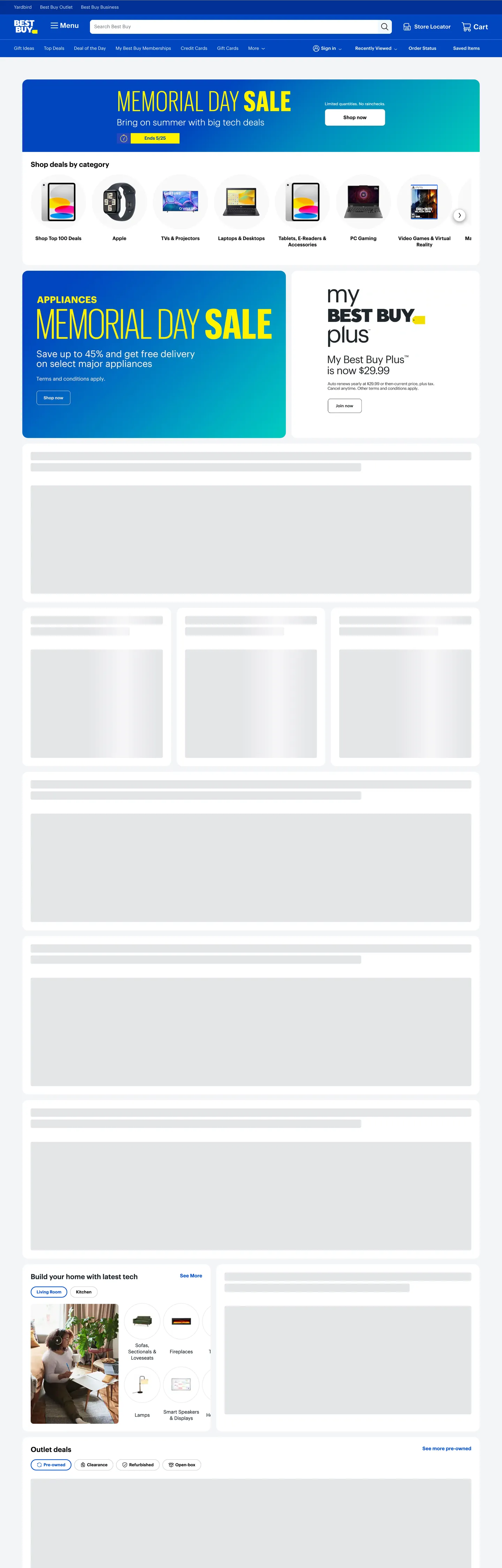
Best Buy's homepage is what happens when a 50-year-old big-box retailer commits to a single physical-world primitive and runs the entire chrome on it. The brand mark is a yellow rectangular price tag with "BEST BUY" stamped across it; the top-nav is a flat cobalt band the same hue as the logo's background; the above-fold promotional billboard is a blue-to-teal gradient block carrying an 80px condensed yellow display headline that reads "MEMORIAL DAY SALE" with a tag-shaped "Ends 5/25" date chip beneath. The yellow tag is everywhere or nowhere — never a generic accent, always price-coded. Where Amazon trusts a smile-arrow icon to do almost no decorative work and Walmart leans on a spark and pure white, Best Buy paints the chrome in retail-banner saturation and lets the typography shout.
The DESIGN.md file packages the marketing surface into a machine-readable spec. Inside: 17 colors tokens drawn from a structural near-black ink, a cobalt link voltage, three tiers of grey, a scarcity yellow, and the promotional gradient end-stops; 12 typography tokens running Human BBY Digital (the proprietary brand sans) at 11-20px for chrome and Human BBY Digital Condensed at 80px / weight 300 for the promotional headline; 5 corner-radius tokens centered on 4px with full pills for action buttons; 8 spacing values on an 8px base; and 18 components definitions covering the cobalt nav band, the gradient promo card, the tag-shaped date chip, the circular category-puck rail, skeleton placeholders, and the standard ecommerce inventory.
Feed this file to an AI coding tool and it reproduces Best Buy's specific moves: cobalt-blue nav rather than charcoal, a blue-to-teal gradient promotional band instead of flat brand-color blocks, condensed display at weight 300 for in-page billboards, and the scarcity yellow scoped to in-banner price tags only. The one move worth borrowing only if your retail mark has a physical-world referent: the tag-as-logomark coherence. Most marks are abstract symbols; the Best Buy tag works because every yellow rectangle on the page reads as "this is a price."
What makes it distinct
5
- Price-tag as logomarkthe yellow tag in the wordmark, the tag-shaped sale chip, and the promotional yellow on blue all derive from the same physical retail prop
- Cobalt nav, gradient billboardsthe top-nav is flat #0457c8 cobalt, the in-page promo cards run a blue-to-teal gradient that no peer big-box retailer uses
- Condensed display, weight 30080px Human BBY Digital Condensed at weight 300 is the promotional shout; the rest of the page sits at 11-20px / weight 400-600
- Highlighter yellow as price-tag voltage#fff200 appears only inside Memorial Day Sale chips and the date-pill, scoped tightly and never as body text
- Skeleton-first lazy loadthe captured page shows greyed-out placeholder blocks below the fold where product modules hydrate; the structure narrates the lazy-load pattern
bestbuy.com
Live at bestbuy.com
A snapshot of the brand in production. Scroll the frame to see the whole page.
Colors
17 colors
Best Buy's system runs on #0457c8 as its primary voltage, used in 5 of 18 components. Type is set in Human BBY Digital across 11 tokens from 11px to 80px, weights 300–600. Shape language is mixed across 18 components, blending pills, soft rounds, and squarer corners.
Brand & Accent
Sparing, CTA-only voltage · 3
Surface
Page and card backgrounds · 3
Text
Headlines, body, captions · 5
Borders & Hairlines
Dividers, outlines, rules · 2
Other
Specialty colors · 4
Typography
11 type tokens
Set in Human BBY Digital across 11 tokens, from 11px to 80px, weights 300–600. Shown in its own stack: where the font isn't installed, the fallback the file names stands in.
- display-xl80px · weight 300 · lh 76pxThe quick brown fox jumps over the lazy dog
- display-md25px · weight 300 · lh 30pxThe quick brown fox jumps over the lazy dog
- heading-lg20px · weight 500 · lh 24pxThe quick brown fox jumps over the lazy dog
- heading-md17px · weight 600 · lh 20.4pxThe quick brown fox jumps over the lazy dog
- heading-sm15px · weight 600 · lh 30pxThe quick brown fox jumps over the lazy dog
- body-md14px · weight 500 · lh 18pxThe quick brown fox jumps over the lazy dog
- body-sm13px · weight 400 · lh 15.6pxThe quick brown fox jumps over the lazy dog
- body-xs11px · weight 400 · lh 13.2pxThe quick brown fox jumps over the lazy dog
- label-md12px · weight 500 · lh 16pxThe quick brown fox jumps over the lazy dog
- nav-link13px · weight 400 · lh 30pxThe quick brown fox jumps over the lazy dog
- button-md13px · weight 600 · lh 15.6pxThe quick brown fox jumps over the lazy dog
Layout
Radii and spacing
6 corner radii and 8 spacing values. Shape language: mixed.
Radii
- none0px
- sm4px
- md8px
- lg16px
- full9999px
- circle50%
Spacing
- xs2px
- sm4px
- base8px
- md12px
- lg16px
- xl24px
- 2xl32px
- 3xl40px
Components
18 components
Each rendered from its tokens (color, type, radius, padding) on Best Buy's own canvas.
- Top Navtop-navTop Nav
- Utility Navutility-navUtility Nav
- Nav Linknav-linkNav Link
- Search Inputsearch-inputSearch Input
- Promo Card Gradientpromo-card-gradientPromo Card Gradient
- Promo Card Lightpromo-card-lightPromo Card Light
- Hero Headinghero-headingHero Heading
- Section Headingsection-headingSection Heading
- Body Paragraphbody-paragraphBody Paragraph
- Body Paragraph Mutedbody-paragraph-mutedBody Paragraph Muted
- Button Primarybutton-primaryButton Primary
- Button Secondarybutton-secondaryButton Secondary
- Button Text Linkbutton-text-linkButton Text Link
- Date Tagdate-tagDate Tag
- Category Puckcategory-puckCategory Puck
- CardcardCard
- Skeleton Blockskeleton-blockSkeleton Block
- Type here…text-inputText Input
In use
The system, in use
Best Buy's tokens on the kind of product it builds.
Build something people actually use.
A short paragraph of marketing copy that previews how the brand's display tier and body tier read together. Two sentences is usually enough.
FAQ
Best Buy design system FAQ
Common questions about Best Buy's tokens, components, and how to use this DESIGN.md in your project.
Read next
Related reading
Specs, directories, and component libraries that pair with this design system.
- Browse all design systemsThe full directory of DESIGN.md files on shadcn.io, with live mockups for each.shadcn.io
- Best Buy — official siteBest Buy's public marketing site — the source of truth for the live tokens captured in this file.bestbuy.com (opens in a new tab)
- The DESIGN.md specificationGoogle Labs' open spec for machine-readable design system files — the format this page is built on.github.com (opens in a new tab)
Use it
Use Best Buy in your project
One machine-readable file. Drop it into Claude, Cursor, or any AI tool that reads DESIGN.md.
Download the DESIGN.md
One machine-readable file: every color, type, radius, spacing, and component token of Best Buy.
Feed it to your AI tool
Drop it into Claude, Cursor, or GitHub Copilot. The agent writes React components and Tailwind classes that match Best Buy's visual language.
Reference the tokens directly
Or paste the values into your Tailwind config, CSS variables, or component library: every color, size and radius is a quoted, ready-to-copy value.
Read the full DESIGN.md: overview, rationale, do’s and don’ts
Overview
Best Buy's homepage runs the entire chrome on a single physical-world primitive. Tag-as-system: the brand mark is a yellow rectangular price tag, the top-nav is the same cobalt blue that fills the tag's background, the promotional banners stamp condensed yellow display on a blue-to-teal gradient, and the "Ends 5/25" date chip is a tag-shaped yellow pill — every yellow rectangle on the page reads as a price label. Where Amazon trusts a tiny smile-arrow and Walmart leans on a spark mark over pure white, Best Buy paints the chrome in retail-banner saturation and treats the logo geometry as a recurring component.
The brand voltage is cobalt blue ({colors.primary} — #0457c8). It fills the top-nav band, carries every link and price label as text (108 occurrences), and forms the left end-stop of every promotional gradient. Above the fold the page exposes two flat-band devices stacked vertically: a cobalt utility-nav strip at 30px tall ("Yardbird · Best Buy Outlet · Best Buy Business"), and the main 80px-tall cobalt nav holding the wordmark, hamburger menu, store-wide search, store locator, and cart. Below those two bands the cobalt steps aside for white surfaces, and the brand voltage becomes a link color rather than a fill.
Condensed weight 300 as the shout: the in-page promotional banner runs Human BBY Digital Condensed at 80px / weight 300 in highlighter yellow. Where most big-box retailers reach for weight 700+ condensed for sale headlines, Best Buy renders the loudest moment in the lightest condensed weight available. The result reads as confident retail muscle rather than panicked clearance. Body and chrome sit at 11-20px in Human BBY Digital at weights 400-600; there is no second display family below 80px.
Key Characteristics:
- Single brand voltage
{colors.primary}(#0457c8) — 211 occurrences, fills the nav band and carries every link as text. Wired into 17 CSS custom-property aliases including--colorRolePrimary600and--color-unstable-link-blue. - Highlighter-yellow scarcity voltage
{colors.scarcity-yellow}(#fff200) — 5 occurrences total, all inside promotional banners as price-tag chips, condensed display fill, or the wordmark interior. Never used as hover state, focus ring, or structural badge. - Blue-to-teal promotional gradient — left end-stop
{colors.primary}, mid{colors.promo-gradient-mid}(#2b4cb6), right end-stop{colors.promo-gradient-teal}(#7fd8ff) and a cyan top-right corner{colors.promo-gradient-cyan}(#a6e4ff). Reserved for the in-page promo billboards. - Condensed display in light weight —
{typography.display-xl}is 80px / weight 300 in{colors.scarcity-yellow}, a deliberately understated condensed treatment. - Skeleton-first hydration — grey placeholder blocks at
{colors.surface-2}(#e4e5e8) render before product modules resolve and form a captured part of the marketing chrome. - Tag-shaped date chip —
{component.date-tag}is a{rounded.sm}4px yellow rectangle with 2x8 padding, holding "Ends 5/25" text in ink. It is the smallest instance of the tag motif on the page. - Circular category pucks — the "Shop deals by category" rail uses
{rounded.circle}50% surfaces holding product photography over a grey backplate; the rail is the only place circular geometry appears. - 8px base spacing unit with major tokens at 16 / 24 / 32px; the system has no 6px or 10px intermediates.
- White-pill primary CTA on cobalt — the hero "Shop now" button inverts the standard pattern by using
{colors.canvas}fill with{colors.primary}text inside{rounded.full}rounding.
Colors
Brand
- Cobalt Primary (
{colors.primary}— #0457c8): frequency 211. Used as text (108), border (103), background fill on the top-nav and inside promotional gradient end-stops. Wired in CSS as--colorRolePrimary600,--color-unstable-link-blue,--colorBgPrimary,--colorFgPrimary, and 13 other aliases. The single brand voltage — the load-bearing color for every link, price label, and the cobalt nav band. - Cobalt Deep (
{colors.primary-deep}— #013196): frequency 1 (in-page as a gradient stop). Wired as--color-bg-button-primary-dark. Reserved for hover and pressed states on the primary surface. - Cobalt On-Nav (
{colors.primary-on-nav}— #0046be): frequency 8 — 5 as background, 1 as text, 1 as border, 1 inside a gradient. Wired as--colorBgPrimaryHighlight. Used as the subtle hover and selection fill on items sitting on the cobalt nav band.
Promotional Gradient
- Promo Mid (
{colors.promo-gradient-mid}— #2b4cb6): frequency 1. The middle stop of the blue-to-teal sale banner gradient — a slightly violet blue that bridges the cobalt left edge into the teal right edge. - Promo Teal (
{colors.promo-gradient-teal}— #7fd8ff): frequency 1. The right-end stop of the promotional gradient — a fresh aqua that reads as "summer tech" rather than as a secondary brand accent. - Promo Cyan (
{colors.promo-gradient-cyan}— #a6e4ff): frequency 1. The upper-right gradient corner — slightly lighter than the teal end-stop, only visible inside the largest promo card.
Scarcity
- Scarcity Yellow (
{colors.scarcity-yellow}— #fff200): frequency 5 — 2 as text, 1 as background, 2 as border. Used only inside promotional contexts: the 80px condensed display headline ("MEMORIAL DAY SALE"), the tag-shaped date chip, and the yellow interior of the wordmark itself. Wired as--colorPaletteGold500/--colorRoleHighlight500. The retail-banner voltage; never a structural color.
Text
- Ink (
{colors.ink}— #040c13): frequency 1339 — 677 as text, 662 as border. The dominant text color across body paragraphs, h3 product titles, and price labels. Wired as--color-fg-baseand--color-fg-dark. - Ink Default (
{colors.ink-default}— #030303): frequency 74 — 37 as text, 37 as border. The h2 section-heading and primary-button-text color. Wired as--colorFgDefaultand--colorPaletteCharcoal900. - Ink Soft (
{colors.ink-soft}— #1d252c): frequency 28 — used for secondary text and input borders. Wired as--colorBrandTechBlack— the proprietary "Tech Black" rather than pure black. - Ink Muted (
{colors.ink-muted}— #3d3d3d): frequency 30, all as background fill on dark-mode footer surfaces. - Muted (
{colors.muted}— #70757d): frequency 2 — secondary metadata text under product titles.
Surface
- Canvas (
{colors.canvas}— #ffffff): frequency 120 — 38 as background, 43 inside gradients (the white surface on which the cobalt nav and grey skeleton blocks sit). Wired into 50+ aliases as the default body floor. - Surface-1 (
{colors.surface-1}— #f3f4f6): frequency 23, all as background. The neutral grey backplate behind category-puck photography and the "Build your home" content cards. - Surface-2 (
{colors.surface-2}— #e4e5e8): frequency 145 — 43 as background, 13 as border, 86 inside gradients. The skeleton-placeholder color and the divider tone around product cards. Wired as--colorBgSurfaceMuted.
Hairline
- Hairline (
{colors.hairline}— #c4c8cf): frequency 6, all as border. The thin rule above the footer and around the search input. - Hairline Soft (
{colors.hairline-soft}— #90959e): frequency 1 as border. The form-field outline color used on the search input and footer email signup.
Typography
Font Families
The system runs two proprietary families: Human BBY Digital for all chrome surfaces (nav links, body paragraphs, headings, buttons, captions), and Human BBY Digital Condensed for the single promotional shout — the 80px / weight 300 sale banner headline. Fallback stack walks "Human Fallback", Arial, Helvetica, sans-serif for the body family and "Human BBY Digital", sans-serif for the condensed.
The pairing is unusual for the retail category. Most big-box retailers (Walmart, Target, Costco) ship a single sans for everything; Best Buy isolates the condensed display to the promotional moment and lets the regular family carry the dense product catalog underneath. The result is a typographic gear-shift between editorial sale banner and dense inventory grid.
Hierarchy
| Token | Size | Weight | Line Height | Use |
|---|---|---|---|---|
{typography.display-xl} | 80px | 300 | 76px | Promotional banner headline ("MEMORIAL DAY SALE") — condensed, yellow on gradient |
{typography.display-md} | 25px | 300 | 30px | Secondary promo display, "$175" style price billboards |
{typography.heading-lg} | 20px | 500 | 24px | h2 section heads ("Shop deals by category"), promo card headlines |
{typography.heading-md} | 17px | 600 | 20.4px | h3 product titles inside cards |
{typography.heading-sm} | 15px | 600 | 30px | Sub-section titles, deal-category headers |
{typography.body-md} | 14px | 500 | 18px | Default body running text, product descriptions, button labels |
{typography.body-sm} | 13px | 400 | 15.6px | Secondary body and inline links |
{typography.body-xs} | 11px | 400 | 13.2px | Fine-print disclaimers ("Limited quantities. No rainchecks.") |
{typography.label-md} | 12px | 500 | 16px | Tag labels, category chips, status badges |
{typography.nav-link} | 13px | 400 | 30px | Top-nav link labels |
{typography.button-md} | 13px | 600 | 15.6px | Primary and secondary button labels |
Principles
Promotional display weight is 300. The 80px condensed headline at weight 300 is the editorial-confidence move — heavier condensed weights would read as panicked clearance. Body and chrome max out at weight 600 on h3 product titles; there is no 700+ tier on the captured page. Line-heights run tight (1.0-1.2x) on display and headings, looser (1.3-1.4x) on body — the chrome is dense by design, since the page sells inventory and every pixel that does not show a product photo is overhead.
Note on Font Substitutes
Human BBY Digital and Human BBY Digital Condensed are proprietary brand families. The closest open-source substitute for the body family is Inter at the same weights — its slightly looser counters read close to Human BBY at 13-14px chrome sizes. For the condensed display, Oswald at weight 300 or Barlow Condensed at weight 300 transfer cleanly to the 80px promotional treatment; Bebas Neue is closer in feel but sits at a single weight only.
Layout
Spacing System
- Base unit: 8px — appears 84 times in the captured page, the dominant gap value.
- Tokens:
{spacing.xs}2px ·{spacing.sm}4px ·{spacing.base}8px ·{spacing.md}12px ·{spacing.lg}16px ·{spacing.xl}24px ·{spacing.2xl}32px ·{spacing.3xl}40px. - Top-nav padding: 8x16 on the main cobalt band (80px tall); 4x16 on the utility strip above (30px tall).
- Promo card padding:
{spacing.xl}(24px) horizontal with 16px bottom; the headline sits at the optical center, the CTA pill floats right. - Date-tag padding: 2x8 — the tightest spacing token on the page, used to keep the yellow chip compact enough to read as a tag.
Grid & Container
- Page max-width: ~1280px — the page is desktop-first, with promotional banners and product grids extending to the full container width.
- Promo cards above the fold: a 60/40 split — Memorial Day Sale on the left, a smaller Best Buy Plus subscription card on the right (~430px wide).
- Category puck rail: 7 visible circular pucks in a single horizontal row with a right-arrow scroller, each 80px circle on
{colors.surface-1}backplate. - Product card grids below: 3-up rows on desktop, each card on a white
{colors.canvas}surface with a thin{colors.surface-2}border. - Skeleton placeholders: render as horizontal grey blocks at the same width as the resolved cards — the layout is reserved before content arrives.
Rhythm
The page is structured as chrome → promo → category → inventory, with the cobalt nav stack accounting for ~110px of vertical space before any product content. Below the nav, two promotional bands sit at ~250px and ~270px tall respectively, then a category-puck rail at ~140px, then a dense inventory grid of product cards. The promotional bands are the only place the brand voltage carries the surface; everywhere else cobalt is reserved for links and the navigation chrome.
Elevation
The system has essentially no shadow tier. The captured page shows zero shadow occurrences for the brand color, and only sparing use of pure black at low opacity on the cobalt-nav drop. Cards lift from the canvas by {colors.surface-2} 1px borders rather than shadow halos; the promo banners sit flush against the white floor with no elevation effect.
- Flat (no shadow): every nav, promo card, category puck, product card, and footer band — 99% of surfaces.
- Border-as-elevation:
{colors.surface-2}(#e4e5e8) carries the cell-divider role around product cards. - Nav drop: the cobalt nav band sits flush at the page top with no shadow underneath — depth comes from the saturation contrast against the white body floor.
Shapes
The radius scale is small + pill + circle.
{rounded.sm}4px — the dominant radius (45 occurrences). Search input, date-tag, secondary buttons.{rounded.md}8px — promotional cards and product cards (4 occurrences).{rounded.lg}16px — larger feature blocks (19 occurrences).{rounded.full}9999px — primary action buttons ("Shop now", "Join now") render as full pills (15 occurrences).{rounded.circle}50% — the category-puck rail uses fully circular surfaces (31 occurrences).
There is no 12px or 20px middle tier. The scale skips from 8px straight to 16px, and the pill / circle treatment is reserved for tappable actions and category navigation. The radius binary signals interactivity: anything circular or pill-shaped is clickable, anything else is content.
Components
top-nav — The cobalt {colors.primary} band carrying the wordmark, hamburger menu, store-wide search, sign-in cluster, store locator, and cart. 80px tall, 8x16 padding, no border-radius. The single largest brand-voltage surface on the page.
utility-nav — A narrower cobalt strip sitting above the main nav, 30px tall with 4x16 padding. Holds the "Yardbird · Best Buy Outlet · Best Buy Business" sub-brand link cluster in white at {typography.body-sm}.
nav-link — Transparent fill, white text in {typography.nav-link} (13px / 400), 0x8 padding. The hamburger menu, store locator, cart label, and category links all use this baseline.
search-input — White {colors.canvas} fill with {colors.hairline-soft} 1px border, {rounded.sm} 4px radius, 0x12 padding, 44px tall. Sits in the center of the cobalt nav band, with a magnifying-glass icon button on the right edge.
promo-card-gradient — The signature in-page promo card. Blue-to-teal gradient fill ({colors.primary} → {colors.promo-gradient-mid} → {colors.promo-gradient-teal}), highlighter-yellow display text, {rounded.md} 8px radius, 24x24x16 padding. Holds the 80px condensed headline, a 1-line lead paragraph beneath, and a white-pill CTA centered on the right.
promo-card-light — The white companion card to the gradient promo. {colors.canvas} fill, {colors.surface-2} 1px border, {rounded.md} 8px radius, 24px padding. Holds the "my BEST BUY plus" subscription promo with a white-stroke "Join now" CTA.
hero-heading — The 80px condensed yellow display. Transparent background (sits on the promo card surface), {colors.scarcity-yellow} text, {typography.display-xl} (80px / weight 300 condensed). Width-capped at ~500px so the yellow runs at most across half the gradient.
section-heading — {typography.heading-lg} (20px / 500) in {colors.ink-default} (#030303). Used for "Shop deals by category" and other below-fold section heads.
body-paragraph — Default {colors.ink-default} running text at {typography.body-md}. The workhorse copy style.
body-paragraph-muted — {colors.ink-muted} variant at {typography.body-sm} for secondary captions.
button-primary — Inverted from convention: white {colors.canvas} fill, cobalt {colors.primary} text, full pill {rounded.full}, 8x24 padding, 36px height. "Shop now" on the gradient promo and "Join now" on the secondary promo. The white pill on cobalt is the most visually-dense element on the page.
button-secondary — Transparent fill with white text and a 1px white border. Same pill rounding and dimensions as the primary, used for nav-level secondary actions when on a cobalt surface.
button-text-link — Transparent background, {colors.primary} text at {typography.body-md} weight 500. The default in-body link style.
date-tag — The tag-shaped scarcity chip. {colors.scarcity-yellow} fill, {colors.ink-default} text at {typography.body-md}, {rounded.sm} 4px radius, 2x8 padding, 22px height. "Ends 5/25" is the canonical instance — the smallest tag-motif on the page.
category-puck — Fully circular {colors.surface-1} backplate, 80px wide, holding a product photo center-aligned. Sits in a horizontal scroll rail; the rail is the only place {rounded.circle} geometry appears.
card — White {colors.canvas} fill, {colors.surface-2} 1px border, {rounded.md} 8px radius, 16px padding. The default product-card surface, holding photo top, title middle, price bottom.
skeleton-block — {colors.surface-2} (#e4e5e8) fill rectangle at the layout-reserved width of the post-hydration component. No text, no border. Visible on every cold load; the system treats this as first-class chrome rather than a loading edge case.
text-input — White fill, ink text, 1px {colors.hairline-soft} border, {rounded.sm} 4px radius, 0x12 padding, 32px tall. Used for the footer email-signup form.
Do's and Don'ts
Do treat the {colors.scarcity-yellow} (#fff200) as exclusively price-tag-coded. The yellow appears only inside promotional contexts — the wordmark interior, the condensed sale headline, the date-tag chip. Using it as a hover state or focus ring breaks the "yellow means price" reading the entire system depends on.
Do run the cobalt-to-teal gradient ({colors.primary} → {colors.promo-gradient-teal}) only on in-page promotional cards. The structural chrome stays on flat surfaces — cobalt nav, white body, grey skeleton blocks. Gradient on the nav band would dilute the promo-card signal.
Do keep {typography.display-xl} at weight 300. The 80px condensed at the lightest available weight reads as confident retail muscle. Bumping to weight 700 turns the editorial sale headline into a panicked clearance shout.
Do render the skeleton placeholders at {colors.surface-2} (#e4e5e8) at full component-width. The grey block reserves the layout so the page does not reflow when product modules hydrate; rendering skeletons at a smaller width creates a visual jump on data arrival.
Don't use {colors.surface-2} (#e4e5e8) as a hairline border or for body text. It is a background-and-skeleton token (43 of 145 occurrences as background, 86 as gradient stops); the closest border-only token is {colors.hairline} (#c4c8cf). Mixing them creates an inconsistent visual weight on card edges.
Don't introduce a 12px or 20px middle radius tier. The system is small (4-8-16px) plus pill plus circle. A 12px corner reads as borrowed from a SaaS dashboard rather than from Best Buy's retail chrome.
Don't render the primary CTA as a filled cobalt pill. The hero pattern inverts the convention — {component.button-primary} is white fill with cobalt text on a cobalt or gradient surface. Filling the CTA with the same cobalt as its surface kills the contrast.
Don't use Human BBY Digital Condensed for any non-promotional surface. The condensed family is reserved for the 80px sale banner moment; running it at smaller sizes (24-40px) for sub-section heads turns the chrome cluttered and loses the gear-shift between editorial sale and dense inventory grid.
Known Gaps
- Hover and focus states: documented only for the primary CTA. Focus rings, active press tints, disabled fills, and validation glow are not exposed on the captured marketing surface.
- Dark mode: the captured page is light-only. A dark-mode token chain is declared in CSS (
--colorBgSurfaceInverse,--colorBrandTechBlack) but does not render on the public homepage. - Form input error states: the footer email-signup carries a resting state only. Error / validation styling lives inside the checkout flow and is not represented here.
- Sub-brand chrome: the utility nav names Yardbird, Best Buy Outlet, and Best Buy Business — each is a separate retail surface with its own token system that is not captured by this file.
- Motion: the category-puck rail scrolls horizontally with an arrow control, but the captured spec records the resting state only. Easing curves and snap behavior live in the live page runtime.
- Hydration timing: the skeleton-block tokens reflect the post-load steady state; the actual transition timing between skeleton and content is not part of this DESIGN.md.
- Promotional gradient direction: the captured gradient renders left-to-right; mobile and tablet breakpoints may flip to top-to-bottom but are not reflected in this spec.
E-commerce & Retail
More systems like this
More DESIGN.md files in E-commerce & Retail.
Pricing
Build it with Pro
The DESIGN.md files are free. Pro adds 6,000+ blocks, premium templates and the MCP server, so your AI editor builds in your system for you.
4.9/5 out of 5 · 150+ reviewsfrom 150+ founders and developers.
Billing
Billed once a year in USD. Cancel anytime.
- How many people can use the license.
- Client work, SaaS products and anything you charge for.
- Production-ready React sections: hero, pricing, features, dashboards and more.
- Complete multi-page sites you can ship as they are.
- React icons from every major library, installable with one command.
- Presets that restyle every block, in light and dark.
- Lets your AI editor search, preview and install blocks for you.
- Priority requests are answered first.
Individual
For personal projects & open source
$32instead of $49/mo
$389 billed yearly
- Seats: 1 seat
- Commercial use: Personal & open source only
- Pro blocks: 6,000+ blocks
- Templates: All 14 templates
- React icons: 294k+ icons
- Themes: All 59 themes
- MCP server: Basic usage
- Support: Standard
Team
Most popularFor freelancers, agencies & startups
$66instead of $99/mo
$789 billed yearly · ≈ $13/dev/mo
- Seats: Up to 5 seats
- Commercial use: Included
- Pro blocks: 6,000+ blocks
- Templates: All 14 templates
- React icons: 294k+ icons
- Themes: All 59 themes
- MCP server: High usage
- Support: Priority
Organization
For companies with larger teams
$132instead of $199/mo
$1,589 billed yearly
- Seats: Unlimited seats
- Commercial use: Included
- Pro blocks: 6,000+ blocks
- Templates: All 14 templates
- React icons: 294k+ icons
- Themes: All 59 themes
- MCP server: Unlimited usage
- Support: Priority
Billed once a year in USD. Cancel anytime.
Individual
For personal projects & open source
$32instead of $49/mo
$389 billed yearly
- How many people can use the license.Seats: 1 seat
- Client work, SaaS products and anything you charge for.Commercial use: Personal & open source only
- Production-ready React sections: hero, pricing, features, dashboards and more.Pro blocks: 6,000+ blocks
- Complete multi-page sites you can ship as they are.Templates: All 14 templates
- React icons from every major library, installable with one command.React icons: 294k+ icons
- Presets that restyle every block, in light and dark.Themes: All 59 themes
- Lets your AI editor search, preview and install blocks for you.MCP server: Basic usage
- Priority requests are answered first.Support: Standard
Team
Most popularFor freelancers, agencies & startups
$66instead of $99/mo
$789 billed yearly · ≈ $13/dev/mo
Everything in Individual, plus
- How many people can use the license.Seats: Up to 5 seats
- Client work, SaaS products and anything you charge for.Commercial use: Included
- Lets your AI editor search, preview and install blocks for you.MCP server: High usage
- Priority requests are answered first.Support: Priority
Organization
For companies with larger teams
$132instead of $199/mo
$1,589 billed yearly
Everything in Team, plus
- How many people can use the license.Seats: Unlimited seats
- Lets your AI editor search, preview and install blocks for you.MCP server: Unlimited usage
- Secure checkout via Stripe
- Code lives in your repo
- Keep what you've shipped if you cancel
- License terms
Your system, built for you
Every block, template and icon, installed by your AI agent in your design system. The DESIGN.md files stay free.