Alo Yoga Design System
Alo Yoga's marketing site is a magazine grid where every band is a photograph. Black-on-white chrome, Proxima Nova 400-900, hot pink only in product imagery. Tokens for React, Next.js, and AI coding tools.
Add shadcn.io to your AI agent. · Pro It installs blocks, icons and templates in your design system from a prompt, with Pro.
Set up MCP- Primary
- #605e5c
- Typeface
- proxima-nova
- Shape
- Sharp
- Base radius
- 4px
- Colors
- 18
- Type tokens
- 11
- Components
- 16
- Spacing values
- 9
About
About Alo Yoga DESIGN.md
Curated by Dov Azencot · Updated May 18, 2026 · Source aloyoga.com (opens in a new tab)
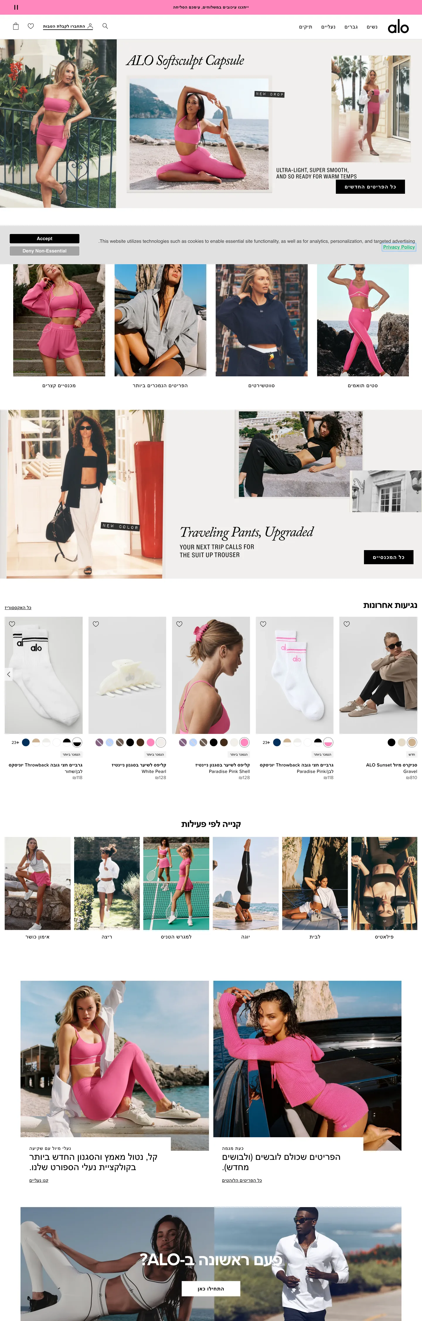
Alo Yoga's marketing site does what most athleisure brands hint at but never commit to: every band on the page is a photograph that bleeds to the viewport edge, and the brand chrome surrounding those photographs is monochrome. Black text on white canvas, a single rectangular black CTA, thin uppercase Proxima Nova category labels, and product cards that are themselves nothing more than a cropped model shot with a price strip beneath. Where Lululemon decorates its hero with a gradient overlay and an oversized serif headline, and where Outdoor Voices paints rounded color blocks behind its lifestyle imagery, Alo trusts the photograph to carry the entire emotional register. The chrome stays out of the way.
The DESIGN.md file packages the system into a machine-readable spec for React tooling. Inside: 18 colors tokens drawn from the 49 distinct values the page renders — almost all of them either pure black (#000000, the dominant text and border at 2075 occurrences), pure white, or warm-neutral greys, with a small set of brand accents (hot pink, dusty rose, sage cream, denim navy) that appear only inside in-image overlays. 11 typography tokens running Proxima Nova in three weights (400, 500, 600, 700, 900) across an editorial display tier at 32-60px in uppercase and a body tier at 12-16px with 0.3-0.9px tracking. 4 corner-radius tokens centered on 0px (everything is rectangular) plus 50% for the 123 circular swatches. 16 components definitions covering the rectangular black CTA, the italic editorial card, hero photography panels, category strips, and the dotted color-swatch selector beneath every product tile.
Feed this file to Claude or Cursor and it will reproduce Alo's specific moves: full-bleed photography per section, rectangular not pill-rounded CTAs, uppercase 18px / weight-900 button labels, tight italic Proxima Nova on the single editorial moment, and the strict discipline of keeping brand color out of the chrome entirely. Treat it as a reference rather than a clone target. The one move worth borrowing only if you sell visual product is the photography-as-voltage rule — strip the brand chrome to monochrome and let the imagery do every chromatic job. Most SaaS products lack imagery rich enough to carry the system this way; for fashion and lifestyle, it is the move.
What makes it distinct
5
- Photography-as-voltageevery brand color (hot pink, sage, cream, sand) lives inside model imagery rather than in chrome; the system itself uses only black, white, and warm grey
- Rectangular black CTAthe 256px-wide black-fill button with 18px / 900-weight uppercase text and zero corner-radius is the single typographic shout on the page
- Italic editorial displayProxima Nova italic at 32px / 400 on the Softcraft Capsule card breaks the otherwise all-uppercase display tier with a magazine pull-quote
- Two type tracksrunning text at 16px / 400 with 0.352px tracking, display tracked tight at -0.96px and shouted in 18-60px uppercase weight 500-700
- Pill-or-circle radius123 of the 125 captured radii are 50% (avatars, swatches, color dots); the remaining 2 are 4px on form fields. Everything else is square
aloyoga.com
Live at aloyoga.com
A snapshot of the brand in production. Scroll the frame to see the whole page.
Colors
18 colors
Alo Yoga's system runs on #605e5c as its primary voltage, used in 1 of 16 components. Type is set in proxima-nova across 11 tokens from 12px to 60px, weights 400–900. Shape language is sharp — components average 1px corner radius, favoring crisp rectangles.
Brand & Accent
Sparing, CTA-only voltage · 6
Surface
Page and card backgrounds · 2
Text
Headlines, body, captions · 5
Borders & Hairlines
Dividers, outlines, rules · 1
Other
Specialty colors · 4
Typography
11 type tokens
Set in proxima-nova across 11 tokens, from 12px to 60px, weights 400–900. Shown in its own stack: where the font isn't installed, the fallback the file names stands in.
- display-xl60px · weight 700 · lh 72px · tracking -1.8pxThe quick brown fox jumps over the lazy dog
- display-lg32px · weight 600 · lh 40px · tracking -0.96pxThe quick brown fox jumps over the lazy dog
- display-italic32px · weight 400 · lh 35.2pxThe quick brown fox jumps over the lazy dog
- label-lg18px · weight 500 · lh 23.94px · tracking 0.9pxThe quick brown fox jumps over the lazy dog
- label-md14px · weight 600 · lh 19.6px · tracking 0.7pxThe quick brown fox jumps over the lazy dog
- body-md16px · weight 400 · lh 22.4px · tracking 0.352pxThe quick brown fox jumps over the lazy dog
- body-md-bold16px · weight 600 · lh 22.4px · tracking 0.352pxThe quick brown fox jumps over the lazy dog
- body-sm14px · weight 400 · lh 19.6px · tracking 0.308pxThe quick brown fox jumps over the lazy dog
- caption12px · weight 400 · lh 16.8px · tracking 0.48pxThe quick brown fox jumps over the lazy dog
- caption-upper12px · weight 400 · lh 16pxThe quick brown fox jumps over the lazy dog
- button-md18px · weight 900 · lh 18px · tracking 1.5pxThe quick brown fox jumps over the lazy dog
Layout
Radii and spacing
4 corner radii and 9 spacing values. Shape language: sharp.
Radii
- none0px
- sm4px
- full9999px
- circle50%
Spacing
- xxs4px
- xs8px
- sm9px
- base12px
- md16px
- lg24px
- xl32px
- 2xl40px
- 3xl70px
Components
16 components
Each rendered from its tokens (color, type, radius, padding) on Alo Yoga's own canvas.
- Button Primarybutton-primaryButton Primary
- Button Secondarybutton-secondaryButton Secondary
- Top Navtop-navTop Nav
- Nav Linknav-linkNav Link
- Hero Headinghero-headingHero Heading
- Section Headingsection-headingSection Heading
- Editorial Cardeditorial-cardEditorial Card
- Body Paragraphbody-paragraphBody Paragraph
- Body Paragraph Inversebody-paragraph-inverseBody Paragraph Inverse
- Caption Stripcaption-stripCaption Strip
- Category Labelcategory-labelCategory Label
- Product Tileproduct-tileProduct Tile
- Hero Bandhero-bandHero Band
- Color Swatchcolor-swatchColor Swatch
- Type here…text-inputText Input
- Promo Bannerpromo-bannerPromo Banner
In use
The system, in use
Alo Yoga's tokens on the kind of product it builds.
Build something people actually use.
A short paragraph of marketing copy that previews how the brand's display tier and body tier read together. Two sentences is usually enough.
FAQ
Alo Yoga design system FAQ
Common questions about Alo Yoga's tokens, components, and how to use this DESIGN.md in your project.
Read next
Related reading
Specs, directories, and component libraries that pair with this design system.
- Browse all design systemsThe full directory of DESIGN.md files on shadcn.io, with live mockups for each.shadcn.io
- Alo Yoga — official siteAlo Yoga's public marketing site — the source of truth for the live tokens captured in this file.aloyoga.com (opens in a new tab)
- The DESIGN.md specificationGoogle Labs' open spec for machine-readable design system files — the format this page is built on.github.com (opens in a new tab)
Use it
Use Alo Yoga in your project
One machine-readable file. Drop it into Claude, Cursor, or any AI tool that reads DESIGN.md.
Download the DESIGN.md
One machine-readable file: every color, type, radius, spacing, and component token of Alo Yoga.
Feed it to your AI tool
Drop it into Claude, Cursor, or GitHub Copilot. The agent writes React components and Tailwind classes that match Alo Yoga's visual language.
Reference the tokens directly
Or paste the values into your Tailwind config, CSS variables, or component library: every color, size and radius is a quoted, ready-to-copy value.
Read the full DESIGN.md: overview, rationale, do’s and don’ts
Overview
Alo Yoga's marketing site inverts the activewear convention. Photography as voltage: where Lululemon overlays gradient washes on its hero imagery and where Outdoor Voices paints colored blocks behind its lifestyle shots, Alo runs each band as a full-bleed photograph against a pure white canvas ({colors.canvas} — #ffffff) with the surrounding chrome stripped to monochrome. The brand voltage — hot pink ({colors.highlight-pink} — #fe87bc), dusty rose ({colors.highlight-rose} — #ebbfc7), sage cream ({colors.highlight-medium} — #ceb18f), denim navy ({colors.accent-navy} — #01305c) — appears only inside the photographs themselves and inside product-tile color swatches. Outside those two contexts the system uses only black, white, and warm grey. The chrome trusts the imagery to do every chromatic job.
The single non-photographic typographic shout is the rectangular black CTA: 256px wide, 48px tall, 0px border-radius, filled with {colors.ink} (#000000) and carrying 18px / weight-900 uppercase Proxima Nova at 1.5px tracking. Where most DTC apparel brands wrap their primary CTA in a soft pill — capsule corners, rounded warmth, tactile bubble — Alo runs a perfect rectangle that reads more like a magazine caption-block than a tap target. Of 125 captured corner-radii in the page, only 2 are 4px (the search input field) and 123 are 50% (the color swatches and avatar circles); the remaining UI sits at 0px corners, which is the system's structural posture: editorial, not app-like.
The typography is Proxima Nova across every tier, used at five distinct weights (400, 500, 600, 700, 900). The display tier is dual-track: an editorial all-uppercase 60px / 700 / -1.8px tracking hero, and a single italic moment at 32px / 400 on the Softcraft Capsule card that breaks the otherwise tracked-out uppercase rhythm with a magazine pull-quote treatment. Body sits at 16px / 400 with 0.352px positive tracking; category labels run 18px uppercase / 500 with 0.9px tracking. There is no serif tier, no second font family, no system-ui escape hatch — Proxima Nova does every job, with weight and tracking carrying the hierarchy.
Key Characteristics:
- Pure white canvas (
{colors.canvas}— #ffffff) with full-bleed photography per band; the chrome around the imagery is strictly monochrome ({colors.ink}and grey-tone neutrals). - Rectangular black CTA (
{component.button-primary}) at 0px border-radius, 256x48px, 18px / 900-weight uppercase Proxima Nova with 1.5px tracking — the single typographic shout on the page. - Proxima Nova across every tier in five weights (400/500/600/700/900). No second family, no serif, no system-ui fallback in the chrome.
- Italic editorial card moment (
{component.editorial-card}) at 32px / 400 italic on warm cream — the only italic in the system, reserved for product-capsule pull-quotes ("Alo Softcraft Capsule", "Traveling Pants, Upgraded"). - Tracked-out uppercase labels (
{typography.label-lg}at 18px / 500 / 0.9px tracking;{typography.label-md}at 14px / 600 / 0.7px tracking) for every category strip, navigation chip, and product-collection title. - Pill-or-circle radius scale — 123 of 125 captured radii are 50% (color swatches, avatars), 2 are 4px (form inputs). Every other surface sits at 0px.
- Hot pink (
{colors.highlight-pink}— #fe87bc) and sage cream ({colors.highlight-medium}— #ceb18f) appear only inside photography and color-swatch dots, never as button fills or chrome surfaces. - 8/9/16/24/32px spacing module — base unit of 8-9px, with 70px and 408px outliers used for hero overlays and section padding.
Colors
Structural
- Ink (
{colors.ink}— #000000): frequency 2075. Used as text (1084), border (958), background (24), gradient (9). The dominant tone in the system — every line of body copy, every product caption, every nav link, every hairline divider. Wired in CSS as--primary. The system has no near-black variant; #000000 is the single ink color. - Ink Soft (
{colors.ink-soft}— #404040): frequency 8. Used as text and border on Osano cookie-banner controls. Wired as--mine. Reserved for the consent overlay and accessibility chrome. - Ink Warm (
{colors.ink-warm}— #605e5c): frequency 54. Used as text (25), border (25), background (3). The secondary text tone — caption rows, product metadata, "View all" link strips. Wired as--chicago. - Canvas (
{colors.canvas}— #ffffff): frequency 360. Used as background (57), border (141), text (140), gradient (22). The page floor and the inverse text color on photography overlays.
Surface and hairline
- Surface-1 / Hairline (
{colors.surface-1}— #ececec): frequency 156. Used as border (123) and background (28). The single hairline tone for product-card dividers, swatch outlines, and the muted cream surfaces beneath promotional bands. Wired as--smoke,--alert-light,--highlight-light. - Muted (
{colors.muted}— #767676): frequency 1, used as the search-input border. The form-field outline tone. - Disabled (
{colors.disabled}— #a3a3a3): frequency 2. Used as background (1) and border (1). Wired as--dawn— the disabled-toggle surface.
Brand (in-photography only)
- Highlight Pink (
{colors.highlight-pink}— #fe87bc): frequency 9, all as background within image overlays. The hot pink of the Softcraft Capsule and the lead activewear shots. Not a chrome color — appears only inside photography frames and as a color-swatch dot beneath the matching product tile. - Highlight Rose (
{colors.highlight-rose}— #ebbfc7): frequency 3 background. The dusty rose used on softer product shots and swatch dots. - Highlight Medium (
{colors.highlight-medium}— #ceb18f): frequency 13. Used as background (8), gradient (5). The sage cream wired as--highlight-medium— used on the "Alo Softcraft Capsule" editorial card as a warm-tinted overlay behind the italic display text. - Highlight Cream (
{colors.highlight-cream}— #e5dac6): frequency 4. Used as background. Wired as--sand,--success-light— the soft-beige tone behind editorial pull-quotes.
Accent
- Accent Navy (
{colors.accent-navy}— #01305c): frequency 7, all as background. A deep denim navy used inside specific product imagery (denim capsule, men's outerwear shots). Not declared as a CSS variable; reads as the deepest non-black tone the page exposes. - Accent Medium (
{colors.accent-medium}— #7183b0): frequency 0 in the captured render but declared as--accent-medium. Reserved for in-imagery overlays and out-of-stock badge variants. - Accent Soft (
{colors.accent-soft}— #a8b6d1): frequency 4 background. The pale blue-grey used on cooler-toned product photography. - Accent Dark (
{colors.accent-dark}— #384669): frequency 0 in capture but declared as--accent-dark. Reserved for in-imagery dark-tone variants.
Photo-derived warm tones
- Brand Clay (
{colors.brand-clay}— #442b19): frequency 3 background. The brown-clay tone of leather-detail product imagery. - Brand Mauve (
{colors.brand-mauve}— #846080): frequency 3 background. The dusty mauve of the wellness-band photography.
Typography
Font Family
The system runs Proxima Nova for every typographic tier — display, heading, body, button, label, caption. Wired in CSS as --primary-font: "proxima-nova", Helvetica, sans-serif. There is no second family, no serif tier, no monospace voice. Five weights carry the entire hierarchy: 400 for body text and the single italic display moment, 500 for tracked-out uppercase labels, 600 for product-tile emphasis and h3 displays, 700 for the hero h2 at 60px, and 900 for the single rectangular black CTA at 18px uppercase.
Hierarchy
| Token | Size | Weight | Line Height | Letter Spacing | Use |
|---|---|---|---|---|---|
{typography.display-xl} | 60px | 700 | 72px | -1.8px | Hero h2 ("First time at ALO?") on photography overlay |
{typography.display-lg} | 32px | 600 | 40px | -0.96px | Section h3 uppercase ("THE PIECES EVERYONE WEARS") |
{typography.display-italic} | 32px | 400 | 35.2px | 0 | Editorial card italic ("Alo Softcraft Capsule") — only italic in the system |
{typography.label-lg} | 18px | 500 | 23.94px | 0.9px | Uppercase category labels (h6 / span) |
{typography.label-md} | 14px | 600 | 19.6px | 0.7px | Uppercase sub-section labels |
{typography.body-md} | 16px | 400 | 22.4px | 0.352px | Default running text |
{typography.body-md-bold} | 16px | 600 | 22.4px | 0.352px | Body emphasis, product titles |
{typography.body-sm} | 14px | 400 | 19.6px | 0.308px | Caption rows, secondary copy |
{typography.caption} | 12px | 400 | 16.8px | 0.48px | Footnote and legal strips |
{typography.caption-upper} | 12px | 400 | 16px | 0 | Promo-banner top strip, uppercase metadata |
{typography.button-md} | 18px | 900 | 18px | 1.5px | The single rectangular CTA label, uppercase tracked |
Principles
The display tier is dual-track: a tracked-tight hero at 60px / weight 700 / -1.8px tracking on photography overlays, and a single italic moment at 32px / weight 400 / 0 tracking on the editorial card. Everything else in the display tier is uppercase. Body text runs at 16px / 400 with 0.352px positive tracking — wider than typical web body copy, which carries the editorial-magazine voice through into running prose. The 18px / 500 / 0.9px tracked uppercase label tier does the work that a small-caps treatment would do in a print-magazine layout.
The button-md token at 18px / weight 900 / 1.5px tracking is the heaviest typographic moment in the system — heavier than the hero display itself. The choice is intentional: the rectangular black CTA needs to read with maximum confidence against the photography it sits on top of, and weight 900 with extreme tracking is the loudest call-to-action treatment the brand uses anywhere.
Note on Font Substitutes
Proxima Nova is a licensed family. The closest open-source substitute is Montserrat at the same weights — the proportions transfer cleanly and Montserrat carries the same tracked-out uppercase character at 18px / 500. For body text, Inter at the same weights reads slightly tighter and may need +5% letter-spacing to match Proxima Nova's 0.352px tracking. The declared fallback is Helvetica.
Layout
Spacing System
- Base unit: 8-9px (the dominant gap value, appearing 28 and 41 times respectively in the captured render).
- Tokens:
{spacing.xxs}4px ·{spacing.xs}8px ·{spacing.sm}9px ·{spacing.base}12px ·{spacing.md}16px ·{spacing.lg}24px ·{spacing.xl}32px ·{spacing.2xl}40px ·{spacing.3xl}70px. - Section padding (vertical): ~70px between major bands, with 408px-tall hero overlays appearing 5 times in the captured page.
- Card internal padding: 0 on product tiles (the photograph fills edge-to-edge), 24px on editorial cards.
- Top-nav padding: ~16px vertical, with 53px total nav-link height.
Grid & Container
- Hero bands: full-bleed photography, edge-to-edge at viewport width.
- Product grid: 4-column at desktop showing model-photographed product tiles with a 9px gap between cells.
- Logo / category strips: typically 2-up to 4-up rows of full-bleed image cells with thin caption strips between them.
- Editorial overlay cards: centered within the photography band at ~668px width, with the italic display text plus a body paragraph.
Rhythm
The page is a vertical magazine grid — each band is either a single full-bleed photograph (lead capsule shots, lookbook bands, lifestyle stories) or a 2-to-4-up product grid where each cell is itself a cropped model shot. There are no atmospheric gradients between bands, no decorative dividers, no surface-color shifts. The transition between bands is a thin band of {colors.canvas} white space (typically 24-32px) and a small uppercase category label centered above the next photograph. The rhythm alternates between immersive (full-bleed lookbook) and dense (4-up product grid), but never sits in between.
Elevation
The system has essentially no shadow tier in the marketing chrome. Shadows declared in CSS (--shadow-level-1 through --shadow-level-4) carry small box-shadow definitions for the cookie banner and dropdown surfaces, but the captured page renders with 0 shadow occurrences across all rendered colors. Hierarchy comes from photography contrast — a model on a white floor pops against the canvas; a dark-background product shot sits adjacent to a light one with a thin hairline between them.
- Flat (no shadow): every product tile, every hero, every editorial card, every nav surface — 100% of the page.
- Photography contrast: depth is created by the imagery itself; the chrome around the photography is flat.
- Hairline outlines:
{colors.surface-1}(#ececec) marks dividers between product cells and outlines color swatches.
Shapes
The radius scale is rectangle-or-circle, with almost nothing in between:
{rounded.none}0px — the dominant surface treatment. Every button, every card, every hero, every editorial overlay. The rectangle is the system's structural posture.{rounded.sm}4px — appears exactly 2 times in the captured render, on the search input field corners.{rounded.circle}50% — 123 of 125 captured radii. Used on color swatches beneath every product tile, on avatar dots in the customer-photo carousel, and on circular icon buttons in the top nav.{rounded.full}9999px — declared for any pill-shaped chip variants but not visible in the captured marketing chrome.
There is no 8 / 12 / 16 / 24px middle tier. The system is binary: surfaces are rectangles, decorative dots are circles. The choice keeps the brand voice editorial — a soft pill on the CTA would tip the page toward app-like warmth and away from the magazine-grid posture.
Components
button-primary — The signature CTA. Black {colors.ink} fill, white text, {rounded.none} 0px radius, 15x30 padding, 48px height, 256px wide. 18px / weight 900 uppercase Proxima Nova at 1.5px tracking. The single most assertive element on the page, sitting at the foot of hero photography overlays.
button-secondary — White {colors.canvas} fill, black text, 1px {colors.ink} border. Same 48px height and rectangular {rounded.none} shape as the primary. Used for "Sign In" / secondary actions in modals.
top-nav — White {colors.canvas} surface, 53px height, ~16px horizontal padding. The Alo wordmark flush left, category links (NEW, MEN, WOMEN, ACCESSORIES, ABOUT) horizontally centered, and the account / cart icons flush right. No bottom hairline divider — the nav sits flush against the photography band beneath.
nav-link — Transparent background, black text at {typography.body-md} (16px / 400). 16px horizontal padding. No hover-state fill visible in the captured chrome.
hero-heading — White text on photography overlay, {typography.display-xl} (60px / 700 / -1.8px tracking). 0 padding — sits as text directly on the photograph rather than inside a contained box.
section-heading — Black {colors.ink} text, {typography.display-lg} (32px / 600 / -0.96px tracking, uppercase). Used for "THE PIECES EVERYONE WEARS", "POPULAR WITH NEW ARRIVALS", "SHOP THE LOOK" category headings.
editorial-card — Cream {colors.highlight-cream} (#e5dac6) or pink-tinted fill overlaid on photography, with {typography.display-italic} (32px / 400 italic) display text and {typography.body-md} body paragraph. The single italic moment in the system. Used twice: the Softcraft Capsule card and the "Traveling Pants, Upgraded" band.
body-paragraph — Black {colors.ink} text at {typography.body-md} — the workhorse running-text style.
body-paragraph-inverse — White {colors.canvas} text variant used on photography overlays and the black promo-banner strip.
caption-strip — Black text at {typography.label-md} (14px / 600 uppercase / 0.7px tracking). 9px vertical padding. Used beneath product photography for category labels ("WOMEN'S", "MEN'S", "BESTSELLER").
category-label — Black text at {typography.label-lg} (18px / 500 uppercase / 0.9px tracking). The larger category-header treatment used as section dividers.
product-tile — White {colors.canvas} background, 0 padding, {rounded.none} 0px radius. The product imagery fills the tile edge-to-edge with a single thin caption row below (product title at {typography.body-sm}, price at {typography.body-md-bold}, color swatches at {component.color-swatch} below that).
hero-band — Full-bleed {colors.canvas} background that hosts edge-to-edge photography. 0 padding, 0 border-radius. The structural container for every immersive image band.
color-swatch — Circular {rounded.circle} (50%) dot, ~18px diameter, with a 1px {colors.muted} border. Fills with the product-variant color (which lives outside the brand palette — pulled from the actual garment color). Appears in horizontal rows of 3-5 swatches beneath each product tile.
text-input — White {colors.canvas} fill, black text, {rounded.sm} 4px radius (the only non-zero rectangular radius in the system), 1px {colors.muted} border, 4x8 padding, 26px height. The search input is the canonical instance.
promo-banner — Black {colors.ink} fill, white text in {typography.caption-upper} (12px / 400 uppercase). 9x16 padding. The persistent top-of-page strip carrying free-shipping and rewards-program callouts.
Do's and Don'ts
Do keep every brand color inside photography or color-swatch dots. The chrome around the imagery is strictly monochrome — black, white, warm grey. Reaching for {colors.highlight-pink} (#fe87bc) as a CTA fill or {colors.accent-navy} (#01305c) as a nav background would break the photography-as-voltage rule that defines the system.
Do render the primary CTA as a perfect rectangle. {rounded.none} 0px corners on a 256x48 black block with 18px / weight 900 uppercase text is the canonical signature. Softening the corners to even a 4px radius shifts the read from editorial-magazine to consumer-app and weakens the brand's fashion-adjacent positioning.
Do use the italic display moment ({typography.display-italic}) only on editorial-capsule pull-quotes. The italic is the single non-uppercase display treatment in the system; using it for product titles or section headers dilutes the magazine-card effect.
Do track out every uppercase label with positive letter-spacing — 0.9px on 18px labels, 0.7px on 14px labels. The tracked-out uppercase is the system's signature for navigation and category strips; tight-set uppercase reads as a different brand voice entirely.
Don't use {colors.surface-1} (#ececec) as a button background or text color — it is a border-only token (123 of 156 occurrences are borders). For light surfaces use pure {colors.canvas} white; the system has no muted-surface tier.
Don't introduce an 8 / 12 / 16 / 24px middle radius tier. The system is binary — rectangles (0px) and circles (50%). Adding a soft-pill radius for buttons makes the page feel like an app rather than a magazine, which is the opposite of the brand's typographic intent.
Don't layer atmospheric gradients between bands. Every section terminates on the same {colors.canvas} white floor; depth comes from photography contrast and from the hairline divider between cells, not from background-color shifts.
Don't mix Helvetica or Arial weights with Proxima Nova in the running chrome. The system declares Helvetica as the fallback only — every visible body, label, button, and display in the captured page renders Proxima Nova. Mixing typefaces would break the single-family discipline that carries the entire hierarchy.
Known Gaps
- Hover and focus states: the captured marketing chrome documents resting states only. Hover fills, focus rings, active-press tints, and disabled treatments for
{component.button-primary}and{component.nav-link}are not captured. - Form input error states:
{component.text-input}carries the resting state. Validation, error, and success styling lives inside the product checkout flow which is not exposed in the captured marketing page. - Dark mode: the captured surfaces are light-only. The Osano consent overlay uses a dark deep-violet variant for its background, but a brand dark mode is not represented in the chrome itself.
- Motion: product carousels and lookbook bands ship with horizontal-scroll transitions; the spec captures end-state values only. Easing curves, autoplay timing, and parallax depth on hero photography live in the live page runtime.
- Localized variants: the captured page is the Hebrew (he-il) locale, which renders right-to-left. Direction-sensitive components (top-nav, product tiles, caption strips) carry locale-specific layout adjustments not exposed in the token spec.
- Product surfaces: this DESIGN.md captures the marketing site only. The PDP (product-detail page), checkout, account, and rewards-program surfaces carry richer state matrices, filter UI, and form chrome that are not represented here.
- In-photography typography: lookbook bands include in-image typography (model-quote overlays, lookbook-name captions baked into the photograph) — these are illustrator-set rather than rendered HTML and live outside the token system.
E-commerce & Retail
More systems like this
More DESIGN.md files in E-commerce & Retail.
Pricing
Build it with Pro
The DESIGN.md files are free. Pro adds 6,000+ blocks, premium templates and the MCP server, so your AI editor builds in your system for you.
4.9/5 out of 5 · 150+ reviewsfrom 150+ founders and developers.
Billing
Billed once a year in USD. Cancel anytime.
- How many people can use the license.
- Client work, SaaS products and anything you charge for.
- Production-ready React sections: hero, pricing, features, dashboards and more.
- Complete multi-page sites you can ship as they are.
- React icons from every major library, installable with one command.
- Presets that restyle every block, in light and dark.
- Lets your AI editor search, preview and install blocks for you.
- Priority requests are answered first.
Individual
For personal projects & open source
$32instead of $49/mo
$389 billed yearly
- Seats: 1 seat
- Commercial use: Personal & open source only
- Pro blocks: 6,000+ blocks
- Templates: All 14 templates
- React icons: 294k+ icons
- Themes: All 59 themes
- MCP server: Basic usage
- Support: Standard
Team
Most popularFor freelancers, agencies & startups
$66instead of $99/mo
$789 billed yearly · ≈ $13/dev/mo
- Seats: Up to 5 seats
- Commercial use: Included
- Pro blocks: 6,000+ blocks
- Templates: All 14 templates
- React icons: 294k+ icons
- Themes: All 59 themes
- MCP server: High usage
- Support: Priority
Organization
For companies with larger teams
$132instead of $199/mo
$1,589 billed yearly
- Seats: Unlimited seats
- Commercial use: Included
- Pro blocks: 6,000+ blocks
- Templates: All 14 templates
- React icons: 294k+ icons
- Themes: All 59 themes
- MCP server: Unlimited usage
- Support: Priority
Billed once a year in USD. Cancel anytime.
Individual
For personal projects & open source
$32instead of $49/mo
$389 billed yearly
- How many people can use the license.Seats: 1 seat
- Client work, SaaS products and anything you charge for.Commercial use: Personal & open source only
- Production-ready React sections: hero, pricing, features, dashboards and more.Pro blocks: 6,000+ blocks
- Complete multi-page sites you can ship as they are.Templates: All 14 templates
- React icons from every major library, installable with one command.React icons: 294k+ icons
- Presets that restyle every block, in light and dark.Themes: All 59 themes
- Lets your AI editor search, preview and install blocks for you.MCP server: Basic usage
- Priority requests are answered first.Support: Standard
Team
Most popularFor freelancers, agencies & startups
$66instead of $99/mo
$789 billed yearly · ≈ $13/dev/mo
Everything in Individual, plus
- How many people can use the license.Seats: Up to 5 seats
- Client work, SaaS products and anything you charge for.Commercial use: Included
- Lets your AI editor search, preview and install blocks for you.MCP server: High usage
- Priority requests are answered first.Support: Priority
Organization
For companies with larger teams
$132instead of $199/mo
$1,589 billed yearly
Everything in Team, plus
- How many people can use the license.Seats: Unlimited seats
- Lets your AI editor search, preview and install blocks for you.MCP server: Unlimited usage
- Secure checkout via Stripe
- Code lives in your repo
- Keep what you've shipped if you cancel
- License terms
Your system, built for you
Every block, template and icon, installed by your AI agent in your design system. The DESIGN.md files stay free.