Skip to content

Aimé Leon Dore Design System

Aimé Leon Dore's menswear storefront as a DESIGN.md file. Near-black ink #181818, Financier Display serif, Sohne grotesque, 1.4px uppercase tracking, 5 colors, 16 components. For React and AI tools.

Add shadcn.io to your AI agent. · Pro It installs blocks, icons and templates in your design system from a prompt, with Pro.

Set up MCP
Primary
#000000
Typeface
Sohne
Shape
Sharp
Base radius
0px
Colors
5
Type tokens
10
Components
16
Spacing values
8

About

About Aimé Leon Dore DESIGN.md

Curated by Dov Azencot · Updated May 18, 2026 · Source aimeleondore.com (opens in a new tab)

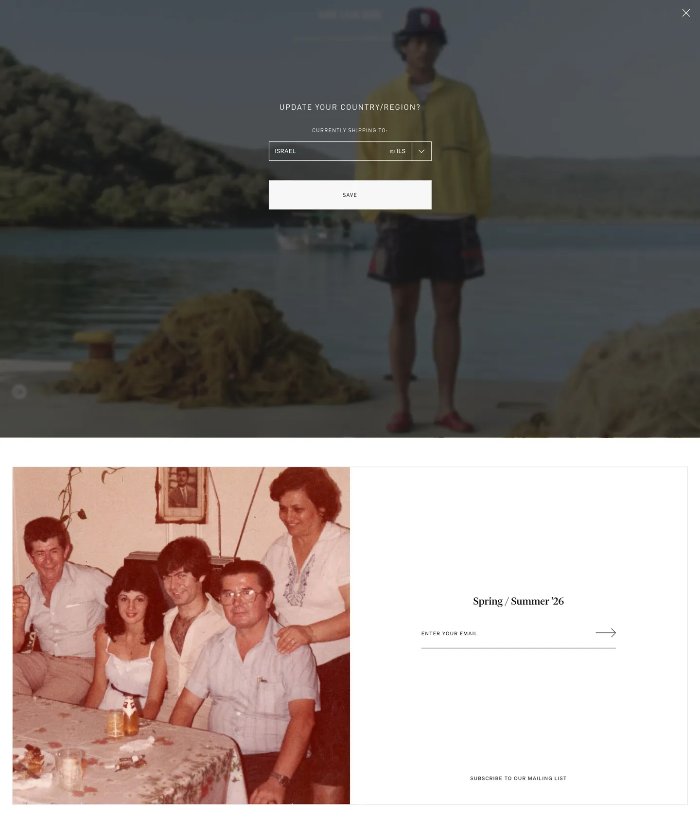
Aimé Leon Dore's website is one of the few menswear storefronts that treats the browser as a gallery wall. The hero is a full-bleed film photograph — shot on analog, processed with a sepia wash that gives the image a 1970s archival quality. Below the fold the layout is two-column: a large warm-toned vintage photograph fills the left panel, and the right panel holds a season identifier ("Spring / Summer '26") in Financier Display and an email capture field. The chrome around these photographs is so minimal it nearly disappears: a near-black (#181818) ink against pure white, a silver-gray (#c4c4c4) for nav labels at 10px with 1.4px uppercase tracking, and no accent color anywhere. Where Kith runs a black-on-white storefront with occasional red accent moments, and where Noah NYC leans on a navy-on-white prep aesthetic, ALD holds a complete chromatic vacancy in the chrome and trusts the photography to carry every brand signal.

The DESIGN.md file packages this system into a machine-readable spec for React and AI tools. Inside: 5 colors tokens drawn directly from the extraction's 1012-element scan — near-black ink (#181818) at 87 total occurrences, white canvas (#ffffff) at 62 total occurrences, silver-gray mid-tone (#c4c4c4) at 34 total occurrences, deep black accent (#000000) at 6 occurrences, and a light hairline gray (#e5e5e5) at 2 occurrences; 10 typography tokens spanning Financier Display at the seasonal headline tier and Sohne at six operational sizes from 10px nav caps to 12px span labels; a 2-step radius vocabulary that is effectively all zeros except for a single 15px pill on the newsletter sign-up; and 16 components entries covering the full-bleed film-photo hero, the flat monochrome nav, the season-header editorial panel, the email capture field, and the product grid.

Feed this file to Claude or Cursor and the agent reproduces ALD's downtown-gallery discipline: near-black rather than pure-black ink, Financier Display for the seasonal season marker, Sohne at 10px with 1.4px tracking for every nav cap and label, no accent, no rounded CTAs, photography-first hierarchy. The system is a useful reference for any brand that wants the aesthetic weight of luxury chrome without the conventional luxury signals — no serif-heavy type ladder, no champagne accent, no pill-button warmth. ALD achieves authority through reduction: the fewer chromatic and geometric decisions the chrome makes, the more the photograph has to say.

What makes it distinct

5

  1. Financier Display at the editorial tiera contemporary serif (Frank Ruhl Libre-adjacent) reserved for seasonal campaign headlines; Sohne covers every operational role from 10px nav caps to button labels
  2. Near-black ink (#181818) rather than pure black87 total occurrences split 44 text / 42 border; the slight lift from pure black gives the system warmth without introducing a second color
  3. 1.4px uppercase tracking at 10pxevery nav link and operational label runs at this tracking, giving the chrome the measured authority of a luxury house without the weight of a bold tier
  4. Sepia-toned analog-film photography as the brand's chromatic vocabularyeditorial images carry all warm tones; the chrome stays rigorously monochrome
  5. No declared brand voltageno accent, no brand color, no hover-state tint; the system's aesthetic weight comes from photography and typographic restraint rather than from a declared hex

aimeleondore.com

Live at aimeleondore.com

A snapshot of the brand in production. Scroll the frame to see the whole page.

Aimé Leon Dore's website at aimeleondore.com

Colors

5 colors

Aimé Leon Dore's system runs on #000000 as its primary voltage, used in 3 of 16 components. Type is set in Sohne across 10 tokens from 10px to 24px, weights 400–500. Shape language is sharp — components average 2px corner radius, favoring crisp rectangles.

Surface

Page and card backgrounds · 1

Text

Headlines, body, captions · 3

Borders & Hairlines

Dividers, outlines, rules · 1

Typography

10 type tokens

Set in Sohne across 10 tokens, from 10px to 24px, weights 400–500. Shown in its own stack: where the font isn't installed, the fallback the file names stands in.

  • display-md24px · weight 500 · lh 24pxThe quick brown fox jumps over the lazy dog
  • nav-link10px · weight 400 · lh 10px · tracking 1.4pxThe quick brown fox jumps over the lazy dog
  • nav-link-span12px · weight 400 · lh 38px · tracking 0.6pxThe quick brown fox jumps over the lazy dog
  • label-sm10px · weight 400 · lh 10px · tracking 0.6pxThe quick brown fox jumps over the lazy dog
  • label-xs10px · weight 400 · lh 14px · tracking 1.5pxThe quick brown fox jumps over the lazy dog
  • button-md11px · weight 400 · lh 13px · tracking 1.1pxThe quick brown fox jumps over the lazy dog
  • heading-sm16px · weight 400 · lh 23px · tracking 1.6pxThe quick brown fox jumps over the lazy dog
  • category-label11px · weight 400 · lh 16px · tracking 1.1pxThe quick brown fox jumps over the lazy dog
  • caption12px · weight 400 · lh 17px · tracking 0.6pxThe quick brown fox jumps over the lazy dog
  • input-label10px · weight 400 · lh 10px · tracking 1.5pxThe quick brown fox jumps over the lazy dog

Layout

Radii and spacing

2 corner radii and 8 spacing values. Shape language: sharp.

Radii

  • none0px
  • pill15px

Spacing

  • xs5px
  • sm10px
  • md15px
  • lg20px
  • xl25px
  • 2xl30px
  • 3xl40px
  • 4xl50px

Components

16 components

Each rendered from its tokens (color, type, radius, padding) on Aimé Leon Dore's own canvas.

  • Button Primary
    button-primaryButton Primary
  • Button Secondary
    button-secondaryButton Secondary
  • Top Nav
    top-navTop Nav
  • Nav Link
    nav-linkNav Link
  • Hero Heading
    hero-headingHero Heading
  • Hero Section
    hero-sectionHero Section
  • Editorial Panel
    editorial-panelEditorial Panel
  • Body Paragraph
    body-paragraphBody Paragraph
  • Card
    cardCard
  • Product Tile
    product-tileProduct Tile
  • Type here…
    text-inputText Input
  • Newsletter Pill
    newsletter-pillNewsletter Pill
  • Region Selector
    region-selectorRegion Selector
  • Modal Overlay
    modal-overlayModal Overlay
  • Footer
    footerFooter
  • Category Nav
    category-navCategory Nav

In use

The system, in use

Aimé Leon Dore's tokens on the kind of product it builds.

Build something people actually use.

A short paragraph of marketing copy that previews how the brand's display tier and body tier read together. Two sentences is usually enough.

Get startedLearn more
Marketing heroHeadline, sub-copy, primary CTA — the universal homepage opener.
Reporting · 14 min read

The quiet collapse of an old idea

For decades the consensus held that the system would correct itself. Then it didn't. This is the inside story of what changed, told by the people who watched it unravel.

"Nobody noticed because the failure was indistinguishable from progress."

By Sam Reporter · Updated 2 hours ago

Editorial articleMagazine-style longform with display headline.

FAQ

Aimé Leon Dore design system FAQ

Common questions about Aimé Leon Dore's tokens, components, and how to use this DESIGN.md in your project.

Read next

Specs, directories, and component libraries that pair with this design system.

Use it

Use Aimé Leon Dore in your project

One machine-readable file. Drop it into Claude, Cursor, or any AI tool that reads DESIGN.md.

Download DESIGN.md
  1. Download the DESIGN.md

    One machine-readable file: every color, type, radius, spacing, and component token of Aimé Leon Dore.

  2. Feed it to your AI tool

    Drop it into Claude, Cursor, or GitHub Copilot. The agent writes React components and Tailwind classes that match Aimé Leon Dore's visual language.

  3. Reference the tokens directly

    Or paste the values into your Tailwind config, CSS variables, or component library: every color, size and radius is a quoted, ready-to-copy value.

Read the full DESIGN.md: overview, rationale, do’s and don’ts

Overview

Aimé Leon Dore's chrome is so minimal it reads as a deliberate act of restraint. Photographed silence. Where Supreme runs a red-on-white brand block, and where Kith toggles a black-and-red accent system, ALD gives the chrome nothing to say — near-black ink (#181818), pure white canvas, a silver-gray (#c4c4c4) for nav labels, and zero chromatic accent anywhere in the UI. The design vocabulary delegates entirely to photography: sepia-toned analog-film images carry every warm tone, every brand signal, every emotional content. The chrome is a white gallery wall that holds the photographs without competing with them.

The typographic system divides into two precise voices. Financier Display (a contemporary serif from Commercial Type) surfaces exactly once in the captured page: the seasonal identifier "Spring / Summer '26" at 24px / weight 500 / tight 24px leading — placed in the right-column editorial panel beside a warm vintage family photograph. Sohne (Klim Type Foundry) handles every other role: nav links at 10px uppercase with 1.4px tracking, span labels at 12px with 0.6px tracking, input text at 10px. The 1.4px uppercase tracking at 10px is the system's most distinctive tonal choice — the letters sit apart with the measured air of a luxury label, not the compressed efficiency of an e-commerce UI.

The radius vocabulary is nearly absent. {rounded.none} (0px) governs every interactive surface — button, input, region selector, product tile. One exception: the newsletter sign-up sits inside a 15px-radius pill ({rounded.pill}), and it is the only rounded element in the system. Every other surface holds hard right angles.

Key Characteristics:

  • Five total color tokens, all achromatic: near-black ink ({colors.ink} — #181818), white canvas ({colors.canvas} — #ffffff), silver-gray muted ({colors.ink-muted} — #c4c4c4), deep black accent ({colors.ink-deep} — #000000), and a light hairline gray ({colors.hairline} — #e5e5e5).
  • Financier Display serif at the single editorial headline tier (24px / 500 / 24px leading) — reserved exclusively for the seasonal campaign identifier.
  • Sohne grotesque at 10px / uppercase / 1.4px tracking for every nav link — the system's most legible typographic brand signature.
  • 0px radius on every interactive surface except one 15px newsletter pill — the hard-angle geometry holds authority without a serif brand convention.
  • Sepia-toned analog-film photography carries all chromatic identity; the chrome withholds color to maximize the photography's tonal authority.
  • 1012 elements scanned in extraction — the richest data set of the three brands — confirming the monochrome discipline holds across the full DOM.
  • DIN W01 Regular as the third typeface for heading and button roles — a compressed, functional grotesk that handles mid-hierarchy labels between Financier Display headlines and Sohne nav caps.

Colors

Structural

  • Ink ({colors.ink} — #181818): frequency 87. Used as text (44), border (42), background (1). The dominant structural tone — text, hairlines, interactive outlines. Not pure black; the near-black sits at approximately lightness 0.209 in OKLCH, which softens the ink's severity against the pure white canvas and gives the system a quality of depth that pure black-on-white would not achieve.
  • Canvas ({colors.canvas} — #ffffff): frequency 62. Used as text-on-dark (30) and border (31). The page floor and every light surface. Wired as the site's themeColor. Pure white with no warmth offset — the photography provides all temperature.

Mid-tone

  • Ink Muted ({colors.ink-muted} — #c4c4c4): frequency 34. Used as text (17) and border (17). The sole mid-tone in the system — wired exclusively to nav-link labels in their resting state. At 10px with 1.4px uppercase tracking, the silver-gray reads as a deliberate quieting: the nav is present but not insistent. On hover or active state, links would conventionally shift to {colors.ink} — the color change acts as the interaction signal in a system with no fill-based hover states.

Accent + Hairline

  • Ink Deep ({colors.ink-deep} — #000000): frequency 6. Used as text (3), background (1), border (2). Pure black appears in limited contexts — the "skip to content" accessibility button and certain structural borders where the near-black ink isn't assertive enough. Not a brand accent; a structural override.
  • Hairline ({colors.hairline} — #e5e5e5): frequency 2. Used as border (2). The lightest surface separator — appears on secondary dividers and the email-capture field's bottom rule. Not the dominant border tone (that's {colors.ink} at 42 occurrences); a rare softer-edge moment.

Typography

Font Families

The system runs three families with rigorously assigned roles. Financier Display (Commercial Type) at the editorial display tier — a contemporary serif with high contrast and a slightly bracketed stroke that reads as considered rather than institutional. Sohne (Klim Type Foundry) as the operational grotesque — tight, geometric, precise — running every nav link, label, and input role. DIN W01 Regular as the mid-hierarchy industrial grotesk — slightly compressed, less optically precise than Sohne, used for heading-sm and button-md roles where a utilitarian register is appropriate. The three-family system is a signal in itself: the brand has enough typographic intentionality to assign a distinct voice to display, operational, and functional tiers.

Hierarchy

TokenSizeWeightLine HeightTrackingUse
{typography.display-md}24px50024px0Financier Display — seasonal campaign headline
{typography.heading-sm}16px40023px1.6pxDIN W01 — section heading, region selector label
{typography.nav-link}10px40010px1.4pxSohne — nav caps, primary navigation (uppercase)
{typography.nav-link-span}12px40038px0.6pxSohne — secondary nav span labels (uppercase)
{typography.button-md}11px40013px1.1pxDIN W01 — button labels (uppercase)
{typography.category-label}11px40016px1.1pxDIN W01 — product category sub-labels
{typography.label-sm}10px40010px0.6pxSohne — general UI labels, metadata
{typography.label-xs}10px40014px1.5pxSohne — footer micro-labels, subscription labels
{typography.caption}12px40017px0.6pxSohne — body copy, editorial captions
{typography.input-label}10px40010px1.5pxSohne — email input placeholder

The 1.4px tracking at 10px

The nav-link setting deserves its own note. 1.4px at 10px is a tracking ratio of 140 per-mille — most luxury brands sit at 50–100 per-mille at small sizes, and most DTC brands run 20–40. ALD's 1.4px tracking at 10px places letters into a separation that reads as deliberate space, not as a technical default. Seventeen nav-link instances extracted at this exact specification across the captured DOM confirm that the value holds consistently. The tracking makes the 10px Sohne labels feel larger and more intentional than their point size would suggest.

Substitutes

Financier Display is licensed. ABC Arizona Serif or Tiempos Headline at weight 500 approximate the high-contrast contemporary serif voice. For Sohne at the nav-link tier, ABC Diatype is the closest optical match; Inter at the same tracking values is the accessible substitute. DIN W01 Regular maps cleanly to Input Sans or the free DIN Alternate.

Layout

Spacing System

The dominant spacing unit is 15px — extracted at count 19 across padding and gap applications. The scale follows a 5px base: {spacing.xs} 5px · {spacing.sm} 10px · {spacing.md} 15px · {spacing.lg} 20px · {spacing.xl} 25px · {spacing.2xl} 30px · {spacing.3xl} 40px · {spacing.4xl} 50px. This 5px base is unusual — most apparel brands anchor on 4px or 8px. The 5px unit gives the layout a slightly non-standard feeling: product-grid gutters don't snap to the 8px grid convention, and nav padding runs 5px vertical / 0 horizontal on nav links.

Grid & Container

The hero section is full-bleed (1424px wide, matching the extracted component width). Below the fold the layout is two-column at desktop: the left column holds a large editorial photograph (approximately 50% viewport width), and the right column holds the season identifier, email capture, and mailing list CTA. This two-column format is not a product grid — it is an editorial split — which places ALD's homepage format closer to a fashion magazine layout than to a standard e-commerce product-first homepage.

Rhythm

Section padding is generous at the editorial level — 50px at the footer, 36px in the region-modal, 20–25px in the editorial panel. The 5px base spacing unit and the 1.4px uppercase tracking combine to give the layout more air per pixel than the numbers suggest; the effect is an unhurried cadence that differs from the compressed inventory-density of most e-commerce homepages.

Elevation

The system has no shadow tier. The 1012-element extraction records zero shadow values. Depth in the system comes from the monochrome photography — the film grain, the tonal depth of the sepia-processed images — rather than from any UI-layer drop shadow or surface-ladder elevation. The region-selector modal overlays the hero using an ink-black scrim rather than a gray shadow; the scrim connects the modal to the same pure-black vocabulary as the site's darkest surface rather than introducing a shadow-color convention.

Shapes

The radius scale is near-zero. {rounded.none} (0px) governs every interactive surface in the operational chrome: button, input, region-selector, product tile, and every card surface. The single exception is {rounded.pill} (15px), which appears once — on the newsletter sign-up element. The 15px value is modest as pills go (not 9999px full-pill), which keeps the rounded element from reading as a soft or approachable surface and instead reads as a field boundary. The hard-angle discipline is consistent with the brand's editorial austerity: right angles don't apologize for taking up space.

Components

button-primary — Deep black {colors.ink-deep} fill, white text in DIN W01 at {typography.button-md} (11px / 1.1px tracking / uppercase), {rounded.none} 0px radius, 10×20px padding, 37px height. Captured as the "skip to content" accessibility button — the only button with a background fill. Production use: "Add to bag" and primary checkout CTAs would inherit this treatment.

button-secondary — Transparent fill, ink text, 1px ink border, {rounded.none} 0px radius. Used for the "Save" button in the region-selector modal. The ghost treatment gives secondary actions presence without fill-weight.

top-nav — Transparent surface over the hero image, nav links in silver-gray {colors.ink-muted} at {typography.nav-link} (10px / 1.4px tracking / uppercase). No height declared as a fixed bar — the nav sits over the full-bleed hero as a typographic layer.

nav-link — Silver-gray {colors.ink-muted} text at {typography.nav-link} (10px / uppercase / 1.4px tracking), 5×0px padding. "ALL PRODUCTS" is the extracted canonical instance. 17 nav-link instances in the DOM at this exact specification.

hero-section — Full-bleed ink-deep {colors.ink-deep} canvas carrying the analog-film hero photograph. Zero padding on the image frame; the photograph fills the section edge-to-edge. The darkened state (seen in the screenshot when the region-selector modal is open) shows the hero at reduced opacity beneath the scrim.

hero-heading — Ink {colors.ink} text at {typography.display-md} (Financier Display, 24px / weight 500 / 24px leading). The captured instance: "Spring / Summer '26" — a season identifier, not a marketing headline. Located in the right-column editorial panel rather than over the hero photograph.

editorial-panel — White {colors.canvas} surface, 20×25×25px padding. The right column below the fold: holds the Financier Display season identifier, the email capture field, and the mailing list CTA. No border, no surface contrast against the page canvas — the panel lives against the canvas without a card frame.

body-paragraph — Ink text at {typography.caption} (Sohne, 12px / 0.6px tracking), used for editorial body copy in the two-column section and any in-page descriptive content.

card — White canvas surface, near-black ink text at {typography.label-sm}, {rounded.none} 0px radius, 15px padding. No declared border in the base state; hairline border may appear on hover.

product-tile — White canvas surface, photography fills the tile edge-to-edge without overlay; DIN W01 category label appears below at {typography.category-label} (11px / 1.1px tracking / uppercase) in near-black ink.

text-input — Transparent background, near-black ink text at {typography.input-label} (10px / 1.5px tracking), {rounded.none} 0px radius, 0 horizontal / 52px right (arrow button space) padding, 1px ink border on the bottom only — an underline-style input rather than a full-border box.

newsletter-pill — Transparent fill with 15px radius ({rounded.pill}), near-black ink border, DIN W01 button label at {typography.button-md} (11px / 1.1px tracking / uppercase). The only rounded element in the operational chrome.

region-selector — White canvas fill, near-black ink text, 1px ink border, {rounded.none} 0px radius, 10×20px padding, 37px height. The dropdown for country selection in the region modal — a standard select styled to the system's flat, hard-edge convention.

modal-overlay — Deep black {colors.ink-deep} scrim, 36px padding, no radius. The region-selector modal uses a full-page ink scrim rather than a centered card with drop shadow. The scrim background connects the modal to the darkest surface in the system.

footer — White canvas, silver-gray {colors.ink-muted} text at {typography.nav-link} (10px / 1.4px tracking / uppercase), 50×15px padding. The footer's typographic treatment is identical to the nav — the same Sohne caps at the same tracking — which makes the footer feel like an extension of the navigation rather than a separate information tier.

category-nav — Transparent surface, near-black ink text at {typography.nav-link-span} (Sohne, 12px / 38px leading / 0.6px tracking / uppercase). The secondary category navigation band below the primary nav, used for product-type browsing.

Do's and Don'ts

Do hold the chrome at zero chromatic accent. The system's authority comes precisely from withholding — no hover tint, no CTA highlight, no seasonal accent. The moment a brand accent color appears in the chrome, the photography's tonal identity has to compete with it. The monochrome discipline only works if it is total.

Do use {colors.ink} (#181818) — not pure #000000 — for the dominant ink. The near-black sits 0.209 in OKLCH lightness above pure black; this slight lift is what separates the ink from the photographic shadows in the editorial images, giving text a presence distinct from the darkest tones in the photography. Pure black (#000000) should be reserved for the scrim and specific structural overrides.

Do run Sohne nav links at exactly {typography.nav-link} — 10px / uppercase / 1.4px tracking. Any reduction in tracking (say, 0.8px) shifts the register from luxury-measured to standard-compact. The 1.4px tracking at 10px is legible at desktop viewing distance and illegible on mobile — which is why the mobile nav collapses to a burger or larger type.

Do constrain Financier Display to the seasonal headline role. The serif appears once in the extracted DOM; using it across headings, sub-headings, or product names would dilute the deliberate contrast between the operational Sohne voice and the editorial serif moment.

Don't introduce a hover background fill on nav links or buttons. The system has no declared hover-state fill colors — the only hover signal is a text-color shift from {colors.ink-muted} to {colors.ink} on nav links. Adding a gray or cream fill on hover would introduce a third surface color into a system that runs on two.

Don't use {colors.hairline} (#e5e5e5) as a text color. It appears only 2 times in the extraction, both as a border value. At 10-16px body sizes it falls below the WCAG AA contrast threshold against both the white canvas and the near-black ink surfaces. Reserve it for the softest possible structural separator only.

Don't apply {rounded.pill} (15px) beyond the newsletter sign-up element. The system has one rounded surface; expanding that vocabulary to buttons, inputs, or product tiles would make the geometric language ambiguous. Right angles are the system's default; the single 15px pill is the exception that makes the rule legible.

Don't use weights above 500 in any typographic role. The system's heaviest weight is 500 on the Financier Display headline. DIN W01 and Sohne both run at weight 400 everywhere. Introducing a 600 or 700 weight for emphasis — even on a product name or CTA — would assert a hierarchical forcefulness the system deliberately avoids.

Known Gaps

  • Product detail page: the PDP variant selector, size grid, fit details, and add-to-bag CTA are not captured in the homepage extraction. The add-to-bag CTA likely follows the button-primary treatment but this is inferred, not extracted.
  • Cart and checkout surfaces: drawer cart, checkout form, payment fields, and order confirmation are absent. These surfaces may introduce form-specific affordances (floating labels, validation states) not visible in the marketing extraction.
  • Hover and active states: the only documented state transition is the inferred nav-link color shift from silver-gray to near-black. Full interactive state matrices are not captured from the static marketing page extraction.
  • Mobile breakpoints: the desktop-first extraction does not capture the collapsed nav, mobile hero format, or single-column product grid. The 10px / 1.4px tracking nav caps are likely replaced with larger type or a burger menu at mobile widths.
  • Product photography conventions: the editorial sepia-processing and analog-film grading visible in the screenshot are not formally specified as image treatment tokens; this is an art-direction convention rather than a CSS system.
  • Drop-shadow on modal: the region-selector modal uses an ink-black scrim; the presence or absence of a box-shadow on the modal panel itself is not confirmed in the extraction.

E-commerce & Retail

More systems like this

More DESIGN.md files in E-commerce & Retail.

Pricing

Build it with Pro

The DESIGN.md files are free. Pro adds 6,000+ blocks, premium templates and the MCP server, so your AI editor builds in your system for you.

4.9/5 out of 5 · 150+ reviewsfrom 150+ founders and developers.

Billed once a year in USD. Cancel anytime.

Individual

For personal projects & open source

$32instead of $49/mo

$389 billed yearly

  • How many people can use the license.Seats: 1 seat
  • Client work, SaaS products and anything you charge for.Commercial use: Personal & open source only
  • Production-ready React sections: hero, pricing, features, dashboards and more.Pro blocks: 6,000+ blocks
  • Complete multi-page sites you can ship as they are.Templates: All 14 templates
  • React icons from every major library, installable with one command.React icons: 294k+ icons
  • Presets that restyle every block, in light and dark.Themes: All 59 themes
  • Lets your AI editor search, preview and install blocks for you.MCP server: Basic usage
  • Priority requests are answered first.Support: Standard

Team

Most popular

For freelancers, agencies & startups

$66instead of $99/mo

$789 billed yearly · ≈ $13/dev/mo

Everything in Individual, plus

  • How many people can use the license.Seats: Up to 5 seats
  • Client work, SaaS products and anything you charge for.Commercial use: Included
  • Lets your AI editor search, preview and install blocks for you.MCP server: High usage
  • Priority requests are answered first.Support: Priority

Organization

For companies with larger teams

$132instead of $199/mo

$1,589 billed yearly

Everything in Team, plus

  • How many people can use the license.Seats: Unlimited seats
  • Lets your AI editor search, preview and install blocks for you.MCP server: Unlimited usage
  • Secure checkout via Stripe
  • Code lives in your repo
  • Keep what you've shipped if you cancel
  • License terms

Your system, built for you

Every block, template and icon, installed by your AI agent in your design system. The DESIGN.md files stay free.

Get Pro