Skip to content

Arc'teryx Design System

Arc'teryx's marketing system runs as a cinematic editorial spread — Elan ITC Pro display headlines on full-bleed photography, Helvetica Now body, zero corner-radius geometry. Tokens for React, Next.js, and AI tools.

Add shadcn.io to your AI agent. · Pro It installs blocks, icons and templates in your design system from a prompt, with Pro.

Set up MCP
Primary
#000000
Typeface
helvetica-now-display
Shape
Sharp
Base radius
0px
Colors
14
Type tokens
10
Components
16
Spacing values
9

About

About Arc'teryx DESIGN.md

Curated by Dov Azencot · Updated May 18, 2026 · Source arcteryx.com (opens in a new tab)

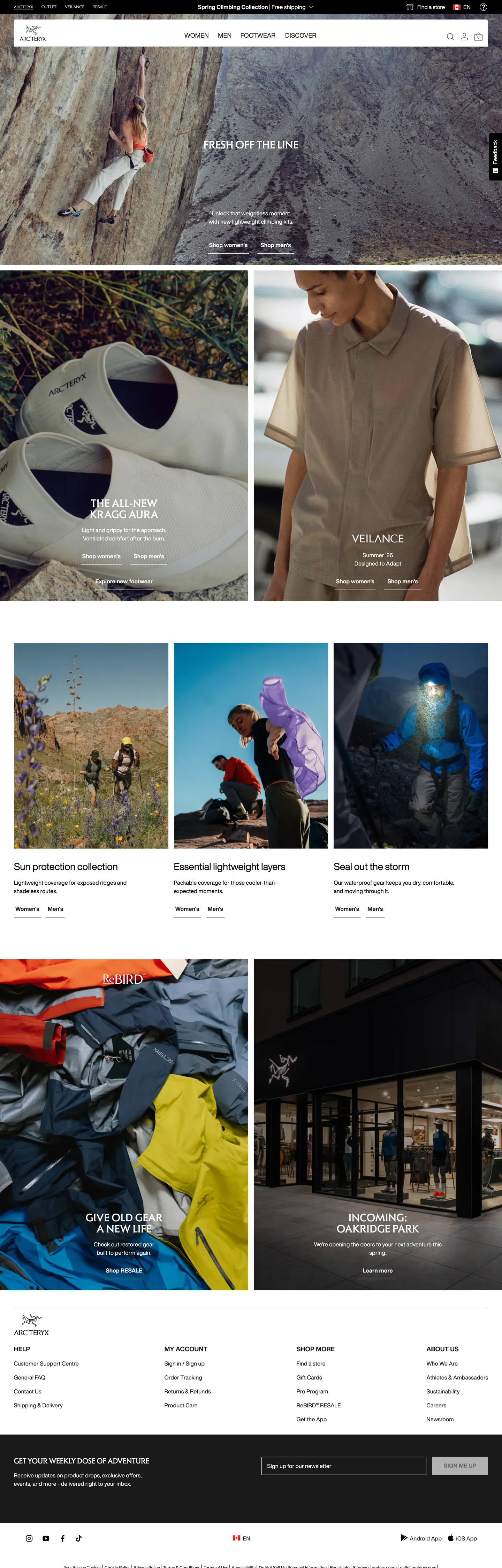
Arc'teryx's marketing site reads like an outdoor-gear magazine, not an apparel store. The above-fold opens on a cinematic photograph — a climber rappelling a sun-bleached granite wall, the "ESSAY OFF THE LINE" caption set in white Elan ITC Pro uppercase weight 400 at 32px floating over the image in the lower-left safe zone — with no surrounding chrome of any kind. The second band drops to a split: on the left, a folded jacket detail caught at the seam with "THE ALL-NEW Kragg Aura" in the same uppercase typeface; on the right, a model in muted earth-tone fieldwear with "RELIANCE" overlaid in the same treatment. Where Patagonia stops at the photograph and lets the navigation handle every chromatic moment, and where The North Face floats white sans-serif at modest weights, Arc'teryx commits to display-serif-like uppercase that reads as a heritage-outdoor-magazine masthead.

Beneath the editorial bands the page returns to a quieter retail rhythm — a 3-up "Our protection collection / Essential lightweight layers / Send out the worm" product-category grid against white, a left/right split of "Give outerwear a new life" (a folded color-block of garments hanging in a shop) and "Inchwing Vancouver Park" (a dark interior shot of a heritage Arc'teryx storefront), and a footer band that flips the canvas to a charcoal `#1a1a1a` surface with a newsletter input rendered white-on-charcoal. The page is unusually committed to layered surface-color storytelling — every band carries its own photograph or its own surface tone, and the chrome between them recedes to a near-invisible white floor.

The DESIGN.md file packages the system into a machine-readable spec. Inside: 14 colors tokens (charcoal-copy as the running ink, pure white as the canvas, a small set of system blues / greens / reds reserved for validation states); 11 typography tokens splitting Elan ITC Pro uppercase display from Helvetica Now Display running text; a near-zero radius scale (one 5px occurrence on the entire captured page); a generous 16px-base spacing system; and 16 components definitions covering the photograph-led hero, the editorial split panel, the white-on-charcoal footer input, and the dense top-nav category band. The single move worth reproducing is the magazine layout — large photography with small uppercase display copy in the safe zone, no decorative chrome between bands.

What makes it distinct

5

  1. Editorial-magazine layoutevery above-fold band is a full-bleed photograph with display copy positioned in the lower-left safe zone, not a typical SaaS hero composition
  2. Two-typeface splitElan ITC Pro uppercase 32px for display (3 occurrences on the page), Helvetica Now Display for every running-text tier
  3. Charcoal-not-black inkthe running text color is --colour-copy #1a1a1a, lifted just enough from pure black to read warm against expedition photography
  4. Sharp-corner geometrythe entire captured page has just one 5px border-radius occurrence; every card, every chip, every input sits at 0px corners
  5. Footer flips to charcoala `{colors.surface-dark}` (#1a1a1a) footer band closes the page with a white-on-charcoal newsletter input; the only major surface-color shift on the captured page

arcteryx.com

Live at arcteryx.com

A snapshot of the brand in production. Scroll the frame to see the whole page.

Arc'teryx's website at arcteryx.com

Colors

14 colors

Arc'teryx's system anchors on #000000 (ink-pure) as its primary color. Type is set in helvetica-now-display across 10 tokens from 12px to 32px, weights 400–700. Shape language is sharp — components average 0px corner radius, favoring crisp rectangles.

Surface

Page and card backgrounds · 3

Text

Headlines, body, captions · 5

Borders & Hairlines

Dividers, outlines, rules · 2

Semantic

Status, errors, success, links · 3

Other

Specialty colors · 1

Typography

10 type tokens

Set in helvetica-now-display across 10 tokens, from 12px to 32px, weights 400–700. Shown in its own stack: where the font isn't installed, the fallback the file names stands in.

  • display-xl32px · weight 400 · lh 32px · tracking 0.32pxThe quick brown fox jumps over the lazy dog
  • display-lg22px · weight 400 · lh 25pxThe quick brown fox jumps over the lazy dog
  • heading-md28px · weight 400 · lh 38pxThe quick brown fox jumps over the lazy dog
  • body-lg18px · weight 400 · lh 27px · tracking 0.36pxThe quick brown fox jumps over the lazy dog
  • body-md16px · weight 400 · lh 24px · tracking 0.32pxThe quick brown fox jumps over the lazy dog
  • body-sm12px · weight 400 · lh 18px · tracking 0.32pxThe quick brown fox jumps over the lazy dog
  • label-emph16px · weight 700 · lh 24px · tracking 0.32pxThe quick brown fox jumps over the lazy dog
  • caption-emph18px · weight 700 · lh 27px · tracking 0.36pxThe quick brown fox jumps over the lazy dog
  • button-md12px · weight 400 · lh 14pxThe quick brown fox jumps over the lazy dog
  • nav-link16px · weight 400 · lh 24pxThe quick brown fox jumps over the lazy dog

Layout

Radii and spacing

2 corner radii and 9 spacing values. Shape language: sharp.

Radii

  • none0px
  • xs5px

Spacing

  • xs4px
  • sm8px
  • md10px
  • base12px
  • lg16px
  • xl24px
  • 2xl32px
  • 3xl38px
  • 4xl64px

Components

16 components

Each rendered from its tokens (color, type, radius, padding) on Arc'teryx's own canvas.

  • Hero Section
    hero-sectionHero Section
  • Hero Heading
    hero-headingHero Heading
  • Section Heading
    section-headingSection Heading
  • Display Overlay
    display-overlayDisplay Overlay
  • Body Paragraph
    body-paragraphBody Paragraph
  • Body Paragraph Light
    body-paragraph-lightBody Paragraph Light
  • Caption Overline
    caption-overlineCaption Overline
  • Button Primary
    button-primaryButton Primary
  • Button Secondary
    button-secondaryButton Secondary
  • Top Nav
    top-navTop Nav
  • Nav Link
    nav-linkNav Link
  • Category Tile
    category-tileCategory Tile
  • Editorial Panel
    editorial-panelEditorial Panel
  • Type here…
    text-inputText Input
  • Newsletter Bar
    newsletter-barNewsletter Bar
  • Footer
    footerFooter

In use

The system, in use

Arc'teryx's tokens on the kind of product it builds.

Build something people actually use.

A short paragraph of marketing copy that previews how the brand's display tier and body tier read together. Two sentences is usually enough.

Get startedLearn more
Marketing heroHeadline, sub-copy, primary CTA — the universal homepage opener.
Reporting · 14 min read

The quiet collapse of an old idea

For decades the consensus held that the system would correct itself. Then it didn't. This is the inside story of what changed, told by the people who watched it unravel.

"Nobody noticed because the failure was indistinguishable from progress."

By Sam Reporter · Updated 2 hours ago

Editorial articleMagazine-style longform with display headline.

FAQ

Arc'teryx design system FAQ

Common questions about Arc'teryx's tokens, components, and how to use this DESIGN.md in your project.

Read next

Specs, directories, and component libraries that pair with this design system.

Use it

Use Arc'teryx in your project

One machine-readable file. Drop it into Claude, Cursor, or any AI tool that reads DESIGN.md.

Download DESIGN.md
  1. Download the DESIGN.md

    One machine-readable file: every color, type, radius, spacing, and component token of Arc'teryx.

  2. Feed it to your AI tool

    Drop it into Claude, Cursor, or GitHub Copilot. The agent writes React components and Tailwind classes that match Arc'teryx's visual language.

  3. Reference the tokens directly

    Or paste the values into your Tailwind config, CSS variables, or component library: every color, size and radius is a quoted, ready-to-copy value.

Read the full DESIGN.md: overview, rationale, do’s and don’ts

Overview

Arc'teryx's marketing site reads as an editorial-magazine spread, not a typical apparel store. Magazine-layout chrome. Every above-fold band is a full-bleed cinematic photograph — a climber rappelling a granite face, a folded jacket caught at the seam, a model in muted earth-tone fieldwear, a heritage Arc'teryx storefront in dim interior light — with the display headline set in Elan ITC Pro uppercase weight 400 at 32px and floated directly on the image in the lower-left safe zone. Where Patagonia stops at the photograph and lets the top-nav carry every chromatic moment, and where The North Face overlays modest HelveticaNeue at weight 500, Arc'teryx commits to an uppercase display-serif voice that reads as a heritage-outdoor-magazine masthead.

The chromatic discipline is unusually severe even by outdoor-retail standards. The captured page renders only 6 raw rendered colors. The running ink is charcoal {colors.ink} (#1a1a1a, wired as --colour-copy, --colour-black, --black) — slightly lifted from pure black so it reads warm against expedition photography rather than industrial. The body canvas is pure white {colors.canvas} (#ffffff). The major surface-color shift on the captured page is the footer band, which flips to the same charcoal tone ({colors.surface-dark}) and carries a white-on-charcoal newsletter signup with a 52px-tall white-bordered input. No saturated color appears in marketing chrome; the system blues, greens, and reds declared in CSS ({colors.info-blue}, {colors.success-green}, {colors.warning-red}) are reserved for validation states inside checkout and PDP surfaces.

The shape language is sharp-corner geometry. The captured page records exactly one 5px border-radius occurrence on the entire surface — every card, every chip, every CTA button, every input sits at 0px corners. The decision is the inverse of The North Face's pill-or-nothing system: where TNF rounds every interactive element to read tappable, Arc'teryx leaves every interactive element at hard right-angle corners to read editorial. The combination of sharp corners, uppercase display, and charcoal-not-black ink is the system's silhouette signature.

Key Characteristics:

  • Editorial-magazine layout — every above-fold band is a full-bleed photograph with the display caption positioned in the lower-left safe zone, not a typical headline-above-sub-paragraph SaaS composition.
  • Two-typeface split — Elan ITC Pro uppercase 32px for display (3 occurrences on the page), Helvetica Now Display for every running-text tier from 12px to 28px.
  • Charcoal-not-black ink — {colors.ink} (#1a1a1a) is the running-text color (243 text occurrences, 242 border occurrences); pure black exists in CSS but reads as a structural divergence when used.
  • Near-zero radius — the entire captured page has just one 5px corner-radius occurrence; every card, CTA, chip, and input sits at 0px ({rounded.none}).
  • Footer flips to charcoal — a {colors.surface-dark} (#1a1a1a) band closes the page with a white-on-dark newsletter input; the only major surface-color shift in the body chrome.
  • Top-nav at 72px height, white surface, dense single-row category strip (Men / Women / Equipment / Used Gear) with the wordmark flush left.
  • 16px-base spacing system with 32px / 38px as the dominant section-padding tier.
  • The link blue ({colors.link} — #0000ee) is the unstyled browser default — appears on 12 inline links that haven't been color-overridden, which signals that the brand trusts the link semantic to do its own work rather than coding every link with a custom hover.

Colors

Surface

  • Canvas ({colors.canvas} — #ffffff): frequency 189 (92 text, 5 bg, 92 border). Pure white — the body floor between photograph bands, the top-nav surface, the newsletter input outline. Wired as --white, --colour-white, and --colour-grey-item-background.
  • Surface Dark ({colors.surface-dark} — same value as {colors.ink}): the dark surface fill used by the footer band and the newsletter input. Reuses the running-text charcoal tone — there is no separate dark-surface token in CSS.

Text

  • Ink ({colors.ink} — #1a1a1a): frequency 527 (243 text, 4 bg, 242 border, 38 gradient). The running-ink color across every tier, wired as --colour-copy, --colour-black, --black. The dominant text tone on the page and the load-bearing chrome value — slightly lifted from pure black to read warm against photography.
  • Ink Pure ({colors.ink-pure} — #000000): frequency 101 (37 text, 1 bg, 37 border, 26 gradient). Pure black — appears in CSS gradients and in a small set of borders, but is structurally a backup to {colors.ink} rather than a primary token.
  • Ink Secondary ({colors.ink-secondary} — #333333): wired as --colour-grey-dark / --dark-grey. Reserved for body copy that needs to feel slightly softer than {colors.ink}; rare on the captured page.
  • Ink Muted ({colors.ink-muted} — #666666): frequency 8 (4 text, 4 border). Wired as --colour-grey-medium, --medium-grey, --background-gradient. The secondary-text tone used in footer-metadata and inactive states.

Hairline

  • Divider ({colors.divider} — #cccccc): wired as --colour-grey-pinline and --pinline-grey. The single declared pinline-divider color in CSS; rare on the captured surface because the layout uses negative space rather than rules to separate bands.
  • Hairline ({colors.hairline} — #b2b2b2): frequency 1 (1 bg). Wired as --colour-grey-inactive and --inactive-state-grey. Used as the inactive-state border tone on form controls.

Background

  • Surface Grey ({colors.surface-grey} — #e3edf2): wired as --colour-blue-1, --background-blue, --colour-grey-background, --background-grey. A cool-tinted off-white reserved for elevated chrome inside the product surface; absent from the captured marketing page but declared for system completeness.

Link

  • Link ({colors.link} — #0000ee): frequency 24 (12 text, 12 border). The unstyled browser-default link blue — appears on 12 inline links that the system deliberately leaves un-color-coded, signaling that the brand trusts the semantic-link-color convention rather than custom-styling every anchor.

State (declared, reserved)

  • Focus Blue ({colors.focus-blue} — #5b9dd9): wired as --focus-blue and --colour-blue-2, used as the keyboard-focus outline color across form controls (--focus-visible: 0.2rem solid #5b9dd9).
  • Info Blue ({colors.info-blue} — #31668f): wired as --info-blue / --colour-blue-3. Reserved for informational banner chrome; not rendered on the captured page.
  • Success Green ({colors.success-green} — #227733): wired as --success-green / --colour-green-3. Reserved for validation success states.
  • Warning Red ({colors.warning-red} — #990000): wired as --warning-red / --colour-red-3. Reserved for validation error states; not rendered in marketing chrome.

Typography

Font Families

The system splits two licensed families. Elan ITC Pro carries every uppercase display moment (the band caption, the product-callout overlay, the editorial-panel label). Helvetica Now Display carries every running-text tier from 12px caption to 28px lead-paragraph. Both are declared as --font-elan and --font-helvetica in CSS, with --font-urw as an alias for Helvetica.

The split is the brand's distinguishing typographic move. Elan ITC Pro is a 1980s ITC sans-serif with a slightly archaic feel — its uppercase forms read as heritage-outdoor-magazine masthead rather than as a contemporary SaaS display tier. Pairing it with Helvetica Now Display (a contemporary utility sans) gives the page two distinct voices: editorial-uppercase for naming, neutral-running for everything else.

Hierarchy

TokenSizeWeightLine HeightUse
{typography.display-xl}32px40032pxElan ITC Pro uppercase — band caption ("ESSAY OFF THE LINE", "RELIANCE", "THE ALL-NEW Kragg Aura")
{typography.display-lg}22px40025pxElan ITC Pro uppercase smaller display variant (h4 tier inside editorial panels)
{typography.heading-md}28px40038pxHelvetica Now Display section h3 ("Our protection collection", "Essential lightweight layers", "Send out the worm")
{typography.body-lg}18px40027pxLead paragraph copy (uppercase variant exists at the same size for inline labels)
{typography.body-md}16px40024pxDefault running text
{typography.body-sm}12px40018pxCaption, footer-metadata, small chip text
{typography.label-emph}16px70024pxInline emphasis within body copy (the only 700 weight in the system)
{typography.caption-emph}18px70027pxBold uppercase label (1px-tracked variant for inline emphasis)
{typography.button-md}12px40014pxCTA label — small, weight 400 (the system does not bold its buttons)
{typography.nav-link}16px40024pxTop-nav link labels

Principles

Display weight stays at 400. Elan ITC Pro at 32px uppercase weight 400 is the loudest typographic moment on the page; there is no 700+ display tier. Combined with the uppercase text-transform and the 0.32-0.36px letter-spacing, the result reads as heritage-magazine masthead — confidence by tracking and treatment, not by weight.

Helvetica Now Display body sits at weight 400 with 700 reserved for inline emphasis. The system has no semibold ladder. Body letter-spacing is 0.32px (positive, not the negative-tracking that contemporary grotesks like FT Kunst Grotesk use) — the spacing decision tilts the body voice toward technical-spec rather than editorial-flow.

Note on Font Substitutes

Elan ITC Pro is a licensed ITC display family. For uppercase editorial display, Cinzel (open-source serif), Cormorant SC, or Trajan Pro (licensed) carry similar heritage-masthead voice — though Elan itself is a sans, so a closer match is Optima at uppercase or Albertus. For Helvetica Now Display, Inter at the same weights is the closest open-source substitute; the proportions track within ~1% at body sizes. Helvetica Now itself (Monotype) is the licensed contemporary match if budget allows.

Layout

Spacing System

  • Base unit: 16px — the dominant gap value (21 occurrences); secondary modules at 10px (17) and 8px (16) and 4px (15).
  • Tokens: {spacing.xs} 4px · {spacing.sm} 8px · {spacing.md} 10px · {spacing.base} 12px · {spacing.lg} 16px · {spacing.xl} 24px · {spacing.2xl} 32px · {spacing.3xl} 38px · {spacing.4xl} 64px.
  • Hero band padding: 0 — every above-fold photograph is full-bleed edge-to-edge; the display headline floats in the lower-left safe zone with internal positioning rather than padding.
  • Editorial panel padding: 32x38px — the only consistent two-axis padding combo in the spacing extraction (used 4 times).
  • Newsletter / footer padding: 32x32px on the newsletter band, 64x32px on the footer link grid.
  • Section padding: 64px vertical between major content sections on the white body.

Grid & Container

  • Max content width: full-bleed on hero photograph bands and editorial split panels; ~1280px on the 3-up category grid and the footer link grid.
  • Hero band: 100vw photograph with the headline pinned to the lower-left safe zone.
  • Editorial split: 2-column 50/50 grid pairing two cinematic photographs side by side (folded jacket detail on the left, model in fieldwear on the right) with display captions overlaid on each.
  • 3-up category grid: equal-column band against white with one photograph per cell ("Our protection collection" / "Essential lightweight layers" / "Send out the worm") and a small overline label beneath each image.
  • Heritage split: a 2-column 50/50 grid pairing a color-block of hanging garments (left) with a dark interior shop photograph (right).
  • Footer: 4-column link grid on the charcoal band with a wide-input newsletter signup spanning the top.

Rhythm

The page alternates between full-bleed photograph and split-photograph bands above the fold, then drops into a 3-up category-grid band that breathes, then returns to a split-photograph band, then closes on the charcoal footer. The rhythm is editorial — image, image-pair, breathing band, image-pair, dark close. There is no editorial-text-only band on the captured page; every section is anchored on photography.

Elevation

The system has essentially no shadow tier. The captured page records zero box-shadow occurrences in the rendered chrome (the CSS exposes an Algolia autocomplete-panel shadow --aa-panel-shadow but it doesn't appear in marketing chrome). Hierarchy comes entirely from the photography itself and from the footer-band surface-color flip.

  • Flat (no shadow): every photograph band, the 3-up grid, the top-nav, the newsletter band, the footer — 100% of marketing surfaces.
  • Surface flip: the footer's charcoal {colors.surface-dark} (#1a1a1a) fill is the single elevation move on the page — read as the bottom of the magazine spread.
  • No hairline-on-card: the category-grid tiles have no border, no shadow, no separator rule between them; the negative space between images does the entire dividing work.

Shapes

The radius scale collapses to near-zero:

  • {rounded.none} 0px — every CTA, every chip, every input, every product tile, every editorial panel, every photograph frame.
  • {rounded.xs} 5px — exactly one occurrence on the entire captured page, on a single small chip.

There is no 4 / 8 / 12 / 16 / 24px tier. The decision is the inverse of The North Face's pill-or-nothing system: where TNF reads as catalogue-grade by rounding every interactive element, Arc'teryx reads as editorial-grade by terminating every interactive element in a hard right-angle corner. Combined with the uppercase Elan ITC Pro display and the charcoal-not-black ink, the sharp-corner geometry is the third leg of the brand's typographic identity.

Components

hero-section — Full-bleed photograph canvas with 0 padding. The display headline floats over the lower-left safe zone in {typography.display-xl}. No surrounding chrome — the photograph extends edge-to-edge.

hero-heading — White {colors.canvas} text on photography, Elan ITC Pro 32px / 400 uppercase. The "ESSAY OFF THE LINE" caption is the canonical instance.

section-heading — Charcoal {colors.ink} text on white at {typography.heading-md} (28px / 400 Helvetica Now Display). Used on the 3-up category grid ("Our protection collection", "Essential lightweight layers", "Send out the worm").

display-overlay — Same Elan ITC Pro 32px tier rendered as text overlaid on photographs in the editorial split panels (e.g., "THE ALL-NEW Kragg Aura", "RELIANCE"). Always in white over photograph.

body-paragraph — Default charcoal running text at {typography.body-md} (16px / 400) — the workhorse paragraph style on white surfaces.

body-paragraph-light — White running text at {typography.body-lg} (18px / 400) over photography or charcoal surfaces — uppercase variant for inline labels and lead paragraphs.

caption-overline — Helvetica Now Display 18px / 700 uppercase at 0.36px tracking — used as a small overline above editorial-panel display headlines.

button-primary — Charcoal {colors.ink} fill, white text, {rounded.none} 0px radius, 12x16 padding, 40px height. Border 0. CTA labels sit at {typography.button-md} (12px / 400) — unusually small for a primary button, which keeps the magazine voice intact.

button-secondary — White {colors.canvas} fill, charcoal text, 1px {colors.ink} border, same {rounded.none} corners and dimensions as the primary. Used as the inverse on dark-photograph contexts.

top-nav — White {colors.canvas} surface, 72px height, 16x32 padding. Houses the Arc'teryx wordmark (with the mountain-dragon logo glyph) flush left, the dense category-strip (Men / Women / Equipment / Used Gear) center, and the right-aligned utility cluster (Search / Account / Bag).

nav-link — Transparent background, charcoal text at {typography.nav-link} (16px / 400), 0x8 horizontal padding. No hover surface visible in the captured frame.

category-tile — White {colors.canvas} surface, charcoal text, {rounded.none} 0px radius, 0 padding. The product-photograph fills the tile edge-to-edge; the overline label sits beneath in {typography.body-md}.

editorial-panel — Charcoal {colors.surface-dark} fill, white text overlaid on a photograph (the inverse case is white text on a half-and-half photograph-and-color block). 32x38 padding. The 50/50 split panels in the heritage-shop band use this component.

text-input — Charcoal {colors.surface-dark} fill, white text, 1px {colors.canvas} white border, {rounded.none} 0px radius, padding 0x45x0x15 (asymmetric — extra right padding for a submit affordance), 52px height. The newsletter signup input is the canonical instance — white-on-charcoal is unusual for a form control and signals the editorial inversion.

newsletter-bar — Charcoal {colors.surface-dark} fill, white text at {typography.body-md}, 32x32 padding. Sits between the body and the footer link grid; carries "Sign up for more product drops & content" copy and the white-bordered email input.

footer — Charcoal {colors.surface-dark} fill, white text at {typography.body-sm} (12px / 400), 64x32 padding. Houses the 4-column link grid (Help / My Account / Brand / About Us), the social-icon strip, the language toggle, and the "Less landfill. More Mother Nature." sustainability line at the very bottom.

Do's and Don'ts

Do lean on full-bleed cinematic photography. The chrome only works because every band is anchored on a strong image; replacing the photograph with a flat color or a hero illustration removes the only chromatic engine the system has.

Do use Elan ITC Pro uppercase as the display tier, kept at 32px / weight 400. The heritage-magazine voice depends on the uppercase treatment and the modest weight; bumping to 48px or to weight 700 turns the editorial caption into a generic SaaS hero and destroys the masthead feel.

Do keep every interactive element at {rounded.none} 0px corners. The sharp-corner geometry is half of the brand's silhouette signature (the other half being uppercase display). Rounding even one CTA to 4px breaks the consistency that makes the editorial reading hold.

Do flip the footer canvas to {colors.surface-dark} (#1a1a1a). The dark close-of-spread is structural — the footer reads as the bottom of the magazine page; a white footer reads as a missing section of chrome.

Don't swap the running ink from {colors.ink} (#1a1a1a) to pure {colors.ink-pure} (#000000). The 10-point warmth lift is the difference between heritage-warm and industrial-cold. The brand commits to charcoal-not-black across every text occurrence and every border; using pure black on a single component breaks the warmth consistency.

Don't introduce a pill or rounded-corner tier (4 / 8 / 12 / 16 / 24px) on CTAs or chips. The system commits to 0px corners; adding pills imports a SaaS-product voice that doesn't fit the magazine layout. The single 5px occurrence on the captured page is a known exception, not a precedent.

Don't add a saturated CTA color (a brand-orange, a brand-blue, a brand-red). The captured marketing chrome runs without a chromatic voltage; introducing one would compete with the photography for visual attention and weaken the editorial reading. The system blues ({colors.info-blue}, {colors.focus-blue}) and greens ({colors.success-green}) are reserved for state and accessibility chrome only.

Don't style the unstyled {colors.link} (#0000ee) inline links. The brand deliberately leaves 12 inline links at the browser default blue rather than overriding them; the decision signals trust in the semantic-link convention. Custom-coloring those links to charcoal removes a small but consistent semantic affordance.

Known Gaps

  • Hover and focus states: the captured surface exposes resting states only. The CSS exposes --focus-visible: 0.2rem solid #5b9dd9 (focus-blue outline) but the rendered chrome does not include focused elements.
  • Form input states: {component.text-input} carries the resting newsletter-signup state; error / success / disabled styling for the broader form-control system (PDP, checkout) is not exposed on the marketing capture.
  • Mega-menu surface: the top-nav uses a hover-triggered mega-menu (Men > Jackets > Hardshell) that doesn't appear in the static capture.
  • Product detail page: the captured surface is the homepage marketing band only. The PDP carries size-chip and color-swatch components, image-zoom controls, and a richer typographic ladder for spec rows; not represented here.
  • Used Gear (re-commerce) surface: Arc'teryx's used-gear store has a partially distinct visual treatment (a recycled-content overline tag, a green sustainability badge using {colors.success-green}) that doesn't appear in the captured homepage.
  • Mobile breakpoint: the captured render is desktop-1440. The mobile layout collapses the 2-column editorial splits into stacked single-column photographs and uses a hamburger nav; only the desktop ladder is represented here.
  • Authenticated dashboard: order history, wishlist, and account-management surfaces are not represented in the marketing capture.
  • System-state palette: the broader CSS exposes --colour-yellow-1/2/3, --colour-red-1/2/3, --colour-green-1/2/3, --colour-blue-1/2/3 ladders for validation and informational chrome that don't appear in marketing surfaces.

E-commerce & Retail

More systems like this

More DESIGN.md files in E-commerce & Retail.

Pricing

Build it with Pro

The DESIGN.md files are free. Pro adds 6,000+ blocks, premium templates and the MCP server, so your AI editor builds in your system for you.

4.9/5 out of 5 · 150+ reviewsfrom 150+ founders and developers.

Billed once a year in USD. Cancel anytime.

Individual

For personal projects & open source

$32instead of $49/mo

$389 billed yearly

  • How many people can use the license.Seats: 1 seat
  • Client work, SaaS products and anything you charge for.Commercial use: Personal & open source only
  • Production-ready React sections: hero, pricing, features, dashboards and more.Pro blocks: 6,000+ blocks
  • Complete multi-page sites you can ship as they are.Templates: All 14 templates
  • React icons from every major library, installable with one command.React icons: 294k+ icons
  • Presets that restyle every block, in light and dark.Themes: All 59 themes
  • Lets your AI editor search, preview and install blocks for you.MCP server: Basic usage
  • Priority requests are answered first.Support: Standard

Team

Most popular

For freelancers, agencies & startups

$66instead of $99/mo

$789 billed yearly · ≈ $13/dev/mo

Everything in Individual, plus

  • How many people can use the license.Seats: Up to 5 seats
  • Client work, SaaS products and anything you charge for.Commercial use: Included
  • Lets your AI editor search, preview and install blocks for you.MCP server: High usage
  • Priority requests are answered first.Support: Priority

Organization

For companies with larger teams

$132instead of $199/mo

$1,589 billed yearly

Everything in Team, plus

  • How many people can use the license.Seats: Unlimited seats
  • Lets your AI editor search, preview and install blocks for you.MCP server: Unlimited usage
  • Secure checkout via Stripe
  • Code lives in your repo
  • Keep what you've shipped if you cancel
  • License terms

Your system, built for you

Every block, template and icon, installed by your AI agent in your design system. The DESIGN.md files stay free.

Get Pro