Aritzia Design System
Aritzia's storefront as a DESIGN.md file. Non-Seasonal Geo grotesque, ink #000000, white #ffffff, single 24px pill, 20 components. For React, Next.js, and AI tools.
Add shadcn.io to your AI agent. · Pro It installs blocks, icons and templates in your design system from a prompt, with Pro.
Set up MCP- Primary
- #cccccc
- Typeface
- Non-Seasonal Geo
- Shape
- Sharp
- Base radius
- 0px
- Colors
- 20
- Type tokens
- 9
- Components
- 20
- Spacing values
- 12
About
About Aritzia DESIGN.md
Curated by Dov Azencot · Updated May 13, 2026 · Source aritzia.com (opens in a new tab)
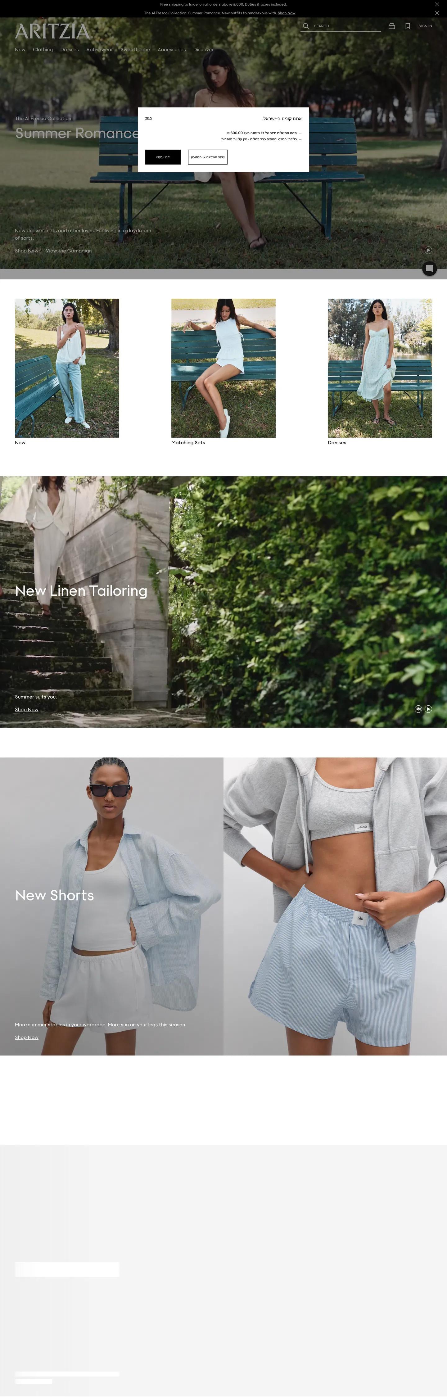
Aritzia's storefront reads as a print fashion editorial rendered for the browser. The canvas is pure `#ffffff`, the ink is pure `#000000` (523 occurrences split exactly 258 text / 258 border / 6 background / 1 shadow), and the only chromatic moment in the entire `:root` cascade is the `#db1215` error red declared in `--gle-red` — a token that doesn't appear once in the captured homepage chrome at rest. Type runs a single proprietary grotesque, Non-Seasonal Geo, declared in `--gle-font-family` and reused across every role from 12px nav caps to a 48px / 56px display tier; the only tracking value in the system is the `-0.48px` negative kerning on the hero display. The right-angle geometry is broken exactly once: a 24px-radius pill on the announcement-bar element.
This page packages the storefront into a DESIGN.md file written to the Google Labs open spec. Inside: 20 colors tokens grouped into ink, surface, hairline, grade, and semantic layers; 9 Non-Seasonal Geo typography roles spanning 12px caps to 48px display; a 4-step radius vocabulary that's effectively `0px` everywhere and `24px` on one pill; an 8-step spacing scale anchored on the observed `--q438jj0` through `--q438jjd` cascade (`0`, `4px`, `8px`, `12px`, `24px`, `32px`, `40px`, `48px`, `64px`, `80px`, `96px`, `128px`, `192px`); and 20 components entries covering the announcement bar, the top nav, the mega-menu drawer, the hero overlay band, the editorial 3-up, the product tile, the newsletter input, and the footer link column.
Feed the file to Claude, Cursor, or GitHub Copilot and the agent reproduces Aritzia's editorial discipline — pure-white canvas, pure-black ink, hard-cornered CTAs, the single Non-Seasonal Geo grotesque across every tier, the `-0.48px` hero kerning — instead of inventing a pillowed apparel template with rounded chrome and a beige accent. Reference tokens directly in Tailwind config or CSS variables when you want a specific value; every hex, font, radius, and spacing literal is preserved verbatim from the extracted `--gle-*` and `--q438jj*` cascade. The reason this system rewards study is that most women's-fashion sites soften with pill geometry and a champagne or rose accent to signal warmth — Aritzia ships pure black on pure white, the lone red as a validation token only, and a single proprietary grotesque doing all the work.
What makes it distinct
5
- Mono-grotesque type stackNon-Seasonal Geo handles every role from 12px caps to 48px display, with `-0.48px` tracking reserved for the single hero tier
- Pure-black ink at 523 occurrences`#000000` carries 258 text and 258 border hits against 178 `#ffffff` surfaces, the load-bearing chrome contrast
- Single-radius vocabulary`24px` appears once on the announcement-bar pill; every CTA, input, product tile, and footer cell holds `0px` corners
- Red as escape hatch`#db1215` declared in `--gle-red` reserved entirely for validation errors and never appears in the homepage chrome at rest
- Atlas spacing cascadeeight `--q438jj*` tokens (`0` through `192px`) lock the entire page to a multiples-of-four rhythm with no half-step exceptions
aritzia.com
Live at aritzia.com
A snapshot of the brand in production. Scroll the frame to see the whole page.
Colors
20 colors
Aritzia's system anchors on #cccccc (ink-mid) as its primary color. Type is set in Non-Seasonal Geo across 9 tokens from 12px to 48px, weights 400–500. Shape language is sharp — components average 1px corner radius, favoring crisp rectangles.
Surface
Page and card backgrounds · 5
Text
Headlines, body, captions · 7
Borders & Hairlines
Dividers, outlines, rules · 5
Semantic
Status, errors, success, links · 1
Other
Specialty colors · 2
Typography
9 type tokens
Set in Non-Seasonal Geo across 9 tokens, from 12px to 48px, weights 400–500. Shown in its own stack: where the font isn't installed, the fallback the file names stands in.
- display-xl48px · weight 400 · lh 1.17 · tracking -0.48pxThe quick brown fox jumps over the lazy dog
- display-md24px · weight 400 · lh 1.33The quick brown fox jumps over the lazy dog
- body-lg16px · weight 500 · lh 1.5The quick brown fox jumps over the lazy dog
- body-md16px · weight 400 · lh 1.5The quick brown fox jumps over the lazy dog
- nav-link16px · weight 400 · lh 1.25The quick brown fox jumps over the lazy dog
- caption-md12px · weight 500 · lh 1.67The quick brown fox jumps over the lazy dog
- caption-cap12px · weight 400 · lh 1.67The quick brown fox jumps over the lazy dog
- caption-sm12px · weight 400 · lh 1.67The quick brown fox jumps over the lazy dog
- input-md12px · weight 400 · lh 1.5The quick brown fox jumps over the lazy dog
Layout
Radii and spacing
3 corner radii and 12 spacing values. Shape language: sharp.
Radii
- none0px
- pill24px
- full9999px
Spacing
- zero0px
- xxs4px
- xs8px
- sm12px
- base16px
- lg24px
- xl32px
- 2xl48px
- 3xl64px
- 4xl96px
- 5xl128px
- 6xl192px
Components
20 components
Each rendered from its tokens (color, type, radius, padding) on Aritzia's own canvas.
- Button Primarybutton-primaryButton Primary
- Button Primary Activebutton-primary-activeButton Primary Active
- Button Secondarybutton-secondaryButton Secondary
- Button Textbutton-textButton Text
- Announcement Barannouncement-barAnnouncement Bar
- Announcement Pillannouncement-pillAnnouncement Pill
- Top Navtop-navTop Nav
- Nav Linknav-linkNav Link
- Nav Link Utilitynav-link-utilityNav Link Utility
- Hero Overlayhero-overlayHero Overlay
- Hero Subheadhero-subheadHero Subhead
- Editorial Tileeditorial-tileEditorial Tile
- Product Tileproduct-tileProduct Tile
- Product Metaproduct-metaProduct Meta
- Product Meta Muteproduct-meta-muteProduct Meta Mute
- Type here…text-inputText Input
- Type here…text-input-errorText Input Error
- Hairline Dividerhairline-dividerHairline Divider
- Band Dividerband-dividerBand Divider
- Footer Columnfooter-columnFooter Column
In use
The system, in use
Aritzia's tokens on the kind of product it builds.
Build something people actually use.
A short paragraph of marketing copy that previews how the brand's display tier and body tier read together. Two sentences is usually enough.
FAQ
Aritzia design system FAQ
Common questions about Aritzia's tokens, components, and how to use this DESIGN.md in your project.
Read next
Related reading
Specs, directories, and component libraries that pair with this design system.
- Browse all design systemsThe full directory of DESIGN.md files on shadcn.io, with live mockups for each.shadcn.io
- Aritzia — official siteThe Vancouver-based women's fashion storefront this DESIGN.md was extracted from on 2026-05-13.aritzia.com (opens in a new tab)
- The DESIGN.md specificationGoogle Labs' open spec for machine-readable design system files — the format this page is built on.github.com (opens in a new tab)
Use it
Use Aritzia in your project
One machine-readable file. Drop it into Claude, Cursor, or any AI tool that reads DESIGN.md.
Download the DESIGN.md
One machine-readable file: every color, type, radius, spacing, and component token of Aritzia.
Feed it to your AI tool
Drop it into Claude, Cursor, or GitHub Copilot. The agent writes React components and Tailwind classes that match Aritzia's visual language.
Reference the tokens directly
Or paste the values into your Tailwind config, CSS variables, or component library: every color, size and radius is a quoted, ready-to-copy value.
Read the full DESIGN.md: overview, rationale, do’s and don’ts
Overview
Aritzia's storefront is the most stripped women's-fashion interface in the category — a pure-white canvas ({colors.canvas} — #ffffff declared in --gle-white) carrying pure-black ink ({colors.ink} — #000000 declared in --gle-black) across 523 occurrences split exactly 258 text / 258 border / 6 background / 1 shadow. The mid-gray ({colors.ink-soft} — #767676 declared in --gle-grey) handles secondary labels and disabled states. The page grade band ({colors.surface-grade} — #f4f4f4 declared in --gle-background-grey) carries the editorial section breaks beneath the photography. There is no second brand color in the captured chrome.
Editorial-as-storefront: where most women's-fashion brands ship a champagne, rose-gold, or terracotta accent to signal a feminine register, Aritzia ships nothing — the brand voltage is the photography. The chrome is monochrome by design, and the warmth comes entirely from the cast (Hailey Bieber, the Super Puff campaigns, model styling against beige park benches) photographed against neutral studio walls. Unlike the convention of a 4px or 8px softened CTA on apparel sites, every interactive surface on Aritzia holds its right angles, and the only rounded element in the entire captured chrome is a single 24px-radius pill at the top of the announcement bar.
Type runs a single proprietary grotesque — Non-Seasonal Geo — declared in --gle-font-family and reused across every role from 12px caption caps to a 48px / 56px hero display tier. There is no display family, no serif, no monospace, no script. The system uses weight variation (400 vs. 500) and size variation (12, 16, 24, 48) and a single tracking value (-0.48px on the 48px hero) to differentiate hierarchy. Mono-grotesque discipline: Aritzia's typographic system inherits from print fashion editorial — one face, modest weight ramp, no italic. The brand's confidence signal is the absence of a second typeface where most fashion retailers reach for an Optima or Didone serif to mark luxury.
Key Characteristics:
- Pure-black ink:
{colors.ink}(#000000) at 523 occurrences, declared in--gle-black, split 258 text / 258 border / 6 background / 1 shadow — every body line and every 1px hairline sits on this exact hex, never a graphite or a warm gray. - Pure-white canvas:
{colors.canvas}(#ffffff) at 178 occurrences, declared in--gle-white— no warm tint, no off-white, no cream. - Single-typeface system:
{typography.body-md}through{typography.display-xl}all resolve to Non-Seasonal Geo declared in--gle-font-family; the only break is weight (400 vs. 500) and size. - Zero-radius CTA:
{component.button-primary}ships at{rounded.none}(0px) with#000000fill, white text, 46px height — a hard-cornered rectangle the brand uses as its default action. - Single rounded element:
{rounded.pill}(24px) appears exactly once on the announcement-bar pill at the top of the viewport. - Negative-tracking display: the 48px hero tier carries
letterSpacing: -0.48px— the only tracking value declared in the captured chrome. - Red as escape hatch:
{colors.status-error}(#db1215) declared in--gle-redappears 0 times in the captured chrome — reserved for validation errors only. - Atlas spacing cascade: eight
--q438jj*tokens lock the page to a multiples-of-four rhythm with no half-step exceptions; dominant rhythm is8px(28 occurrences) and48px(9).
Colors
Ink
- Pure Ink (
{colors.ink}— #000000): frequency 523. Used as text (258), border (258), background (6), shadow (1). Declared in--gle-black. The dominant token — every body paragraph, nav link, hairline border, CTA fill, and hero overlay sits on this exact hex. Not a graphite, not a warm gray — pure black, the load-bearing chrome voltage. - Soft Ink (
{colors.ink-soft}— #767676): frequency 22. Used as text (3), border (3), shadow (1), gradient (15). Declared in--gle-grey. The mid-gray used in secondary labels, disabled-state text, and the gradient stops on photo-fade overlays. - Mid Ink (
{colors.ink-mid}— #cccccc): frequency 2. Used as gradient (2). The lighter gray reserved for two specific gradient transitions in editorial photo overlays — not a chrome color elsewhere. - Ink Pure (alias) (
{colors.ink-pure}— #000000): same hex as{colors.ink}, narrated separately because the role is reserved for SVG icon strokes and the announcement-bar wordmark rather than running text.
Surface
- Canvas (
{colors.canvas}— #ffffff): frequency 178. Used as text (79 — on dark surfaces), border (79), background (20). Declared in--gle-white. The default page floor — pure white, no warm tint. - Surface Content (
{colors.surface-content}— #ffffff): same hex as{colors.canvas}, narrated separately because the role is the content-card fill inside editorial 3-up grids, distinct from the page floor in semantic intent. - Surface Grade (
{colors.surface-grade}— #f4f4f4): frequency 10. Used as background (10). Declared in--gle-background-grey. The light-gray section-break band between editorial rails — appears beneath product photography to mark vertical rhythm. - Surface On-Ink (
{colors.surface-on-ink}— #ffffff): same hex as{colors.canvas}, scoped to the announcement-pill background-on-black-bar role. - Surface Overlay (
{colors.surface-overlay}— #000000): same hex as{colors.ink}, scoped to the announcement-bar background and hero-overlay scrim role.
Hairline
- Hairline (
{colors.hairline}— #000000): the 1px black hairline tone — same hex asink, narrated separately because the role is a visible chrome line rather than text. Used on text-input outlines and product-meta dividers. - Hairline Soft (
{colors.hairline-soft}— #cccccc): the light-gray divider tone used between mega-menu columns and inside footer column splitters — same hex asink-midbut scoped to a structural role. - Hairline Grade (
{colors.hairline-grade}— #f4f4f4): the lightest divider tone, same hex assurface-grade, scoped to band-between-band separators where a full graded surface would be too heavy.
Inverse
- On Ink (
{colors.on-ink}— #ffffff): white text on the primary CTA, the announcement-bar wordmark, and the hero overlay — declared as the inverse-text role. - On Canvas (
{colors.on-canvas}— #000000): black text on the white canvas — the default body color, same hex asink.
Grade
- Grade Divider (
{colors.grade-divider}— #767676): same hex asink-soft, scoped to the mid-gray rule between mega-menu category columns and footer link blocks. - Grade Mute (
{colors.grade-mute}— #cccccc): same hex asink-mid, scoped to the muted-rule role inside dropdown menus and the cart-drawer line items. - Grade Band (
{colors.grade-band}— #f4f4f4): same hex assurface-grade, scoped to the section-band-fill role beneath product editorial tiles.
Semantic
- Error (
{colors.status-error}— #db1215): frequency 0 in the captured chrome, declared in--gle-red. The only saturated hex in the entire:rootcascade — reserved entirely for validation errors and out-of-stock badges. Never appears in the homepage chrome at rest. - Error Text (
{colors.status-error-text}— #db1215): same hex asstatus-error, scoped to inline form-validation copy. - Error Border (
{colors.status-error-border}— #db1215): same hex asstatus-error, scoped to the 1px outline around invalid text inputs.
Typography
Font Family
The system runs a single proprietary grotesque — Non-Seasonal Geo — declared in --gle-font-family (Non-Seasonal Geo, sans-serif) and reused across every text role. There is no display family, no serif, no monospace, no italic variant in the captured chrome. The variation comes from weight (400 vs. 500) and size (12, 16, 24, 48) plus a single tracking value (-0.48px) on the hero display.
If Non-Seasonal Geo is unavailable, Söhne (Klim Type Foundry) and Inter at weight 400/500 are the closest open-source-adjacent substitutes for the sans-serif role — geometry and x-height match within ~3% at body sizes. Preserve letterSpacing: -0.48px on the 48px hero tier verbatim; the negative kerning is the only typographic flourish in an otherwise neutral system, and it is the metric that signals fashion editorial rather than generic apparel.
Hierarchy
| Token | Size | Weight | Line Height | Letter Spacing | Use |
|---|---|---|---|---|---|
{typography.display-xl} | 48px | 400 | 1.17 | "-0.48px" | Hero display — the only role with negative tracking, used on the campaign overlay |
{typography.display-md} | 24px | 400 | 1.33 | 0 | Secondary section heads above editorial 3-up rails |
{typography.body-lg} | 16px | 500 | 1.5 | 0 | Emphasized body — product tile titles, editorial pull quotes |
{typography.body-md} | 16px | 400 | 1.5 | 0 | Default running text and announcement-bar copy |
{typography.nav-link} | 16px | 400 | 1.25 | 0 | Top-nav category links — tighter leading than body |
{typography.caption-md} | 12px | 500 | 1.67 | 0 | Announcement-bar text and emphasized caption rows |
{typography.caption-cap} | 12px | 400 | 1.67 | 0 | Uppercase nav utility labels — New, Sale, footer-column heads |
{typography.caption-sm} | 12px | 400 | 1.67 | 0 | Product-meta lines, prices, fine-print disclaimers |
{typography.input-md} | 12px | 400 | 1.5 | 0 | Newsletter input placeholder and value text |
Principles
The display tier tops out at 48px — smaller than the 96px or 120px hero type most apparel brands ship, and the only tracking move in the system is a -0.48px negative kerning that tightens the 48px glyphs without softening them. Negative tracking as signature: where most fashion-editorial sites reach for a wide-set positive-tracked display in Didone or Optima to mark luxury, Aritzia tightens the letters on a single grotesque — the editorial mood comes from the negative kerning, not from a serif. The remaining 8 roles run at letterSpacing: 0.
Line-height runs at 1.5 for body and 1.67 for 12px captions — looser than the 1.4 most SaaS designs use. The tall 12px leading is a deliberate readability move for product-meta rows where price, fit, and size descriptors stack three deep beneath a tile. The 16px body sits at 1.5 for paragraph rhythm, and the 16px nav role drops to 1.25 for tighter horizontal scanning across 8 menu items.
Layout
Spacing System
- Base unit: 4px, with
--q438jj1(4px) as the smallest token in the cascade. - Tokens:
{spacing.zero}0px ·{spacing.xxs}4px ·{spacing.xs}8px ·{spacing.sm}12px ·{spacing.base}16px ·{spacing.lg}24px ·{spacing.xl}32px ·{spacing.2xl}48px ·{spacing.3xl}64px ·{spacing.4xl}96px ·{spacing.5xl}128px ·{spacing.6xl}192px. - Atlas cascade: the page declares
--q438jj0(0px),--q438jj1(4px),--q438jj2(8px),--q438jj3(12px),--q438jj5(24px),--q438jj6(32px),--q438jj7(40px),--q438jj8(48px),--q438jj9(64px),--q438jja(80px),--q438jjb(96px),--q438jjc(128px),--q438jjd(192px) — a multiples-of-four scale with one40pxhalf-step. - Dominant rhythm:
8px(28 occurrences) and48px(9), followed by24px(8),16px(6),4px(6), and12px(5). - Button padding:
12px 24pxon the primary CTA — symmetric, anchored on the8px/24pxrhythm. - Input padding:
22px 8px 6pxon the newsletter capture — asymmetric vertical breathing room to accommodate the floating-label affordance above the value text. - Section padding:
0 48pxbetween major editorial rails at desktop — generous horizontal gutter, no vertical padding overhead.
Grid & Container
- Top-nav height: roughly
64px(extracted nav-link box at 16px height plus padding). Pinned to the top of every page, white canvas, no bottom shadow. - Announcement-bar height: approximately
32px. A pure-black strip carrying campaign copy in{typography.caption-md}white-on-black. - Page width: the homepage runs an effective
1440pxcontent frame with full-bleed editorial photography spilling to the viewport edge. - Editorial grid: 3-up at desktop with no visible gutter — adjacent tiles touch edge-to-edge, the photography carries the separation rather than whitespace.
- Hero band: full-bleed photograph spanning the entire viewport width with the 48px display burned in over the image at left-center.
Whitespace Philosophy
The system gives editorial bands generous vertical breathing room (48–96px between sections via the --q438jj8 and --q438jjb tokens) and compresses the merchandising grid to zero-gutter contact. The contrast is intentional: the page reads as "open editorial above, dense merchandising below," and the photography carries the visual weight rather than the chrome. Aritzia does not use whitespace to mark luxury — it uses photography composition and the negative-tracked display tier.
Elevation & Depth
The captured chrome runs entirely flat. The system declares no box-shadow variables in the captured :root cascade — the only shadow occurrence in the entire page is a single #767676 shadow instance on a transient overlay element. There is no card-shadow on product tiles, no popover shadow on the mega-menu, no toast shadow on the cart-add confirmation.
| Level | Treatment | Use |
|---|---|---|
| Flat | No shadow, no border | Body sections, top nav, editorial bands, every product tile |
| Hairline | 1px {colors.hairline} border | Text inputs and a small number of footer column rules |
| Inverse panel | {colors.ink} background on white | Announcement bar, hero scrim, footer-cta panels |
| Grade band | {colors.surface-grade} background | Section break between editorial bands |
Shadow absence as discipline: the homepage reads as editorial-flat because the chrome refuses elevation entirely. Where most e-commerce merchandising tiles gain a 0 2px 8px rgba(0,0,0,0.08) lift on hover, Aritzia's tiles hold flat at rest and on hover — depth comes from photography composition and the inverse-panel contrast between the white canvas and the black announcement bar. The product tile separation is achieved by edge-to-edge contact between adjacent photographs, not by gutter whitespace or shadow lift.
Shapes
The radius vocabulary is effectively two values.
{rounded.none}(0px) on every interactive surface: primary CTA, secondary CTA, text input, every product tile, hero overlay, top nav, footer cell, mega-menu drawer.{rounded.pill}(24px) on exactly one element: the announcement-bar pill at the top of the viewport — the system's single rounded moment.{rounded.full}(9999px) is declared as a fallback token but is not used in the captured chrome.
0px as identity: where most women's-fashion sites soften with a 4px or 8px corner radius to mark a feminine register, Aritzia overrides every interactive surface back to 0px and reserves the single 24px pill for the announcement bar alone. The right-angle geometry is a deliberate brand override on top of any softer component-library default — softening to a 4px or 8px corner anywhere on the merchandising chrome would push Aritzia toward the generic apparel-template aesthetic the system is built to refuse.
Components
Buttons
button-primary — Pure black fill ({colors.ink} — #000000) with white text ({colors.on-ink} — #ffffff) and no border. 0px radius, 12px 24px symmetric padding, 46px height. The default action across the storefront — used for Shop New, Add to bag, Subscribe.
button-primary-active — The press state. Background flips to {colors.ink-soft} (#767676). No transform, no shadow change, no radius change.
button-secondary — White fill ({colors.canvas}) with pure-black text and a 1px black border. Same 0px radius and 46px height as primary. Used for inverse CTAs on photography hero panels and the wishlist secondary action.
button-text — Plain ink text, no surface, no border. Underlined on hover. Used for editorial "Shop the look" links underneath product tiles.
Top Navigation
announcement-bar — A 32px-tall strip at the top of every page. Pure-black surface ({colors.surface-overlay}), white text ({colors.on-ink}) in {typography.caption-md} (Non-Seasonal Geo 12px weight 500).
announcement-pill — A white pill ({colors.canvas}) at {rounded.pill} (24px) sitting inside the black announcement bar. The single rounded element in the captured chrome, carrying campaign-microcopy like Free Shipping against the black strip.
top-nav — White surface ({colors.canvas}), 64px height, 0 48px horizontal padding. Aritzia wordmark flush left, category nav (New, Clothing, The Group, Sale) center, account + bag utilities flush right. No bottom shadow, no hairline separator at rest.
nav-link — Pure-ink text ({colors.ink} — #000000), 16px Non-Seasonal Geo with 1.25 line-height. No underline at rest, underline on hover.
nav-link-utility — The smaller utility row (account, bag, search). Uppercase 12px caption in {typography.caption-cap} — used for utility labels and the announcement-bar pill copy.
Hero & Editorial
hero-overlay — Hero display in {typography.display-xl} (Non-Seasonal Geo 48px / 1.17 / -0.48px tracking) burned into editorial campaign photography. Text color flips to {colors.on-ink} (white) over dark imagery. The single tracking-negative role in the system.
hero-subhead — Editorial subhead in {typography.body-md} (Non-Seasonal Geo 16px / 1.5 / 0 tracking), also rendered on the overlay against photography.
editorial-tile — A full-bleed editorial tile in the 3-up rail beneath the hero. White canvas, no border, no padding — the garment photograph fills the tile edge-to-edge, with {typography.body-lg} (Non-Seasonal Geo 16px weight 500) labels burned into the bottom-left corner.
Product Tiles
product-tile — White canvas card ({colors.canvas} — #ffffff) with 0px corners, no padding, no border. Contains a full-width garment photograph above a 2-line meta stack (product title in {typography.body-md}, price in {typography.caption-sm}).
product-meta — Pure-ink body line ({typography.caption-sm} — Non-Seasonal Geo 12px / 1.67 leading), used for product titles and prices.
product-meta-mute — Muted gray caption ({colors.ink-soft} — #767676) in {typography.caption-sm}, used for size or fit descriptors and out-of-stock messaging.
Forms
text-input — White surface ({colors.canvas}), 1px black outline ({colors.ink}), 0px radius, 46px height. Padding 22px 8px 6px — asymmetric vertical breathing room to accommodate the floating-label affordance above the value text. Placeholder text in {typography.input-md} (Non-Seasonal Geo 12px / 1.5).
text-input-error — The validation-error state. The 1px outline switches from black to {colors.status-error-border} (#db1215), and the value text flips to {colors.status-error-text} (#db1215). The only place red appears in the entire captured system.
Dividers & Footer
hairline-divider — A 1px line at {colors.hairline} (#000000) used between editorial bands and inside footer column splitters.
band-divider — A graded section break at {colors.surface-grade} (#f4f4f4), used between editorial rails where a full black hairline would be too heavy.
footer-column — Pure-ink uppercase label in {typography.caption-cap} (Non-Seasonal Geo 12px uppercase). White canvas, 48px 0 vertical padding, dense link rows beneath each column head.
Do's and Don'ts
Do
- Hold every interactive surface at
{rounded.none}(0px). The single exception is the announcement-bar pill at{rounded.pill}(24px); render any second rounded element and the editorial discipline collapses into generic apparel-template territory. - Preserve
letterSpacing: "-0.48px"on the 48px hero display tier verbatim. The negative kerning is the only typographic flourish in the system — rendering the 48px Non-Seasonal Geo at0tracking produces a different brand entirely. - Use
{colors.ink}(#000000) for the primary CTA, never a softer graphite. Aritzia ships pure black where most apothecary and apparel-editorial peers ship a warmer graphite — the pure-black voltage against the pure-white canvas is the brand signature. - Reserve
{colors.status-error}(#db1215) for inline validation errors only. Render it on input borders and error-text rows, never on a CTA, never on a heading, never as a hairline. - Use photography for warmth. The chrome is pure black, pure white, and one mid-gray; every chromatic moment lives in the garment photograph and the model styling.
Don't
- Don't soften the primary CTA to a
4pxor8pxcorner — the captured chrome holds every interactive surface at0pxon purpose. A softened CTA would push the brand toward generic apparel-template territory. - Don't introduce a second typeface. Aritzia ships a single proprietary grotesque (Non-Seasonal Geo) across every role — the absence of a serif display tier is the brand's editorial confidence signal. Adding an Optima or Didone serif at the hero level shifts the brand from fashion-editorial to luxury-publication.
- Don't drop the
-0.48pxtracking when substituting fonts. The system's typographic identity is the negative kerning on the 48px hero — rendering Inter 48px at0tracking loses the editorial signal entirely. - Don't use
{colors.status-error}(#db1215) for any role besides validation errors. It is a scoped accessibility-and-form token; the moment it spreads to a sale-badge or a heading color, the brand picks up a second voltage and the monochrome editorial signal dies. - Don't add a card-shadow to product tiles. The captured chrome ships
0px box-shadowon every merchandising surface. A0 2px 8px rgba(0,0,0,0.08)lift on hover reads as a generic Shopify theme. - Don't tint the canvas to off-white or cream. Aritzia ships pure
#ffffffdeclared in--gle-white— the absence of a warm tint is the difference between editorial-fashion and apothecary-skincare positioning.
Known Gaps
- Product detail pages (PDP): the homepage tile is captured, but the full PDP typography hierarchy (size selector, fit guide, model-height row, fabric composition, add-to-bag CTA placement) is out of scope.
- Cart drawer and checkout: the bag-count indicator in the top-nav utility row is captured, but the slide-in cart drawer and the full checkout flow are not.
- Mega-menu drawer: the top-nav category links are captured, but the full mega-menu hover drawer (4-column category split, photography in the right rail, sub-category typography) is not in the homepage extraction.
- Hover states: not documented per the global no-hover policy. The actual
:hoverstyling on nav links and product tiles is an underline-thicken; precise color extraction is unreliable. - Wordmark and logotype: the Aritzia wordmark is set in a custom logo file, not Non-Seasonal Geo — letterform proportions, weight, and tracking are bespoke and not represented in the typography tokens.
- Validation error surfaces: the
#db1215red token is declared in--gle-redbut appears 0 times in the captured chrome — the actual error toast, inline error text, and input-error border styling are inferred from the variable name only. - Sub-brand surfaces: Aritzia operates multiple in-house labels (Wilfred, Babaton, TNA, Super Puff campaigns). Each carries minor chrome variations not represented here.
- International currency picker and country switcher: the homepage runs the INTL English locale; the full locale-picker dropdown and the currency-formatting variations are not captured.
E-commerce & Retail
More systems like this
More DESIGN.md files in E-commerce & Retail.
Pricing
Build it with Pro
The DESIGN.md files are free. Pro adds 6,000+ blocks, premium templates and the MCP server, so your AI editor builds in your system for you.
4.9/5 out of 5 · 150+ reviewsfrom 150+ founders and developers.
Billing
Billed once a year in USD. Cancel anytime.
- How many people can use the license.
- Client work, SaaS products and anything you charge for.
- Production-ready React sections: hero, pricing, features, dashboards and more.
- Complete multi-page sites you can ship as they are.
- React icons from every major library, installable with one command.
- Presets that restyle every block, in light and dark.
- Lets your AI editor search, preview and install blocks for you.
- Priority requests are answered first.
Individual
For personal projects & open source
$32instead of $49/mo
$389 billed yearly
- Seats: 1 seat
- Commercial use: Personal & open source only
- Pro blocks: 6,000+ blocks
- Templates: All 14 templates
- React icons: 294k+ icons
- Themes: All 59 themes
- MCP server: Basic usage
- Support: Standard
Team
Most popularFor freelancers, agencies & startups
$66instead of $99/mo
$789 billed yearly · ≈ $13/dev/mo
- Seats: Up to 5 seats
- Commercial use: Included
- Pro blocks: 6,000+ blocks
- Templates: All 14 templates
- React icons: 294k+ icons
- Themes: All 59 themes
- MCP server: High usage
- Support: Priority
Organization
For companies with larger teams
$132instead of $199/mo
$1,589 billed yearly
- Seats: Unlimited seats
- Commercial use: Included
- Pro blocks: 6,000+ blocks
- Templates: All 14 templates
- React icons: 294k+ icons
- Themes: All 59 themes
- MCP server: Unlimited usage
- Support: Priority
Billed once a year in USD. Cancel anytime.
Individual
For personal projects & open source
$32instead of $49/mo
$389 billed yearly
- How many people can use the license.Seats: 1 seat
- Client work, SaaS products and anything you charge for.Commercial use: Personal & open source only
- Production-ready React sections: hero, pricing, features, dashboards and more.Pro blocks: 6,000+ blocks
- Complete multi-page sites you can ship as they are.Templates: All 14 templates
- React icons from every major library, installable with one command.React icons: 294k+ icons
- Presets that restyle every block, in light and dark.Themes: All 59 themes
- Lets your AI editor search, preview and install blocks for you.MCP server: Basic usage
- Priority requests are answered first.Support: Standard
Team
Most popularFor freelancers, agencies & startups
$66instead of $99/mo
$789 billed yearly · ≈ $13/dev/mo
Everything in Individual, plus
- How many people can use the license.Seats: Up to 5 seats
- Client work, SaaS products and anything you charge for.Commercial use: Included
- Lets your AI editor search, preview and install blocks for you.MCP server: High usage
- Priority requests are answered first.Support: Priority
Organization
For companies with larger teams
$132instead of $199/mo
$1,589 billed yearly
Everything in Team, plus
- How many people can use the license.Seats: Unlimited seats
- Lets your AI editor search, preview and install blocks for you.MCP server: Unlimited usage
- Secure checkout via Stripe
- Code lives in your repo
- Keep what you've shipped if you cancel
- License terms
Your system, built for you
Every block, template and icon, installed by your AI agent in your design system. The DESIGN.md files stay free.