Skip to content

adidas Design System

adidas's marketing chrome captured as a DESIGN.md spec. Pure black-on-white monochrome, adineue Pro display, 3px button radius, uppercase mantra typography. Tokens for React, Next.js, and AI coding tools.

Add shadcn.io to your AI agent. · Pro It installs blocks, icons and templates in your design system from a prompt, with Pro.

Set up MCP
Primary
#000000
Typeface
adineue
Shape
Sharp
Base radius
0px
Colors
4
Type tokens
7
Components
11
Spacing values
7

About

About adidas DESIGN.md

Curated by Dov Azencot · Updated May 18, 2026 · Source adidas.com (opens in a new tab)

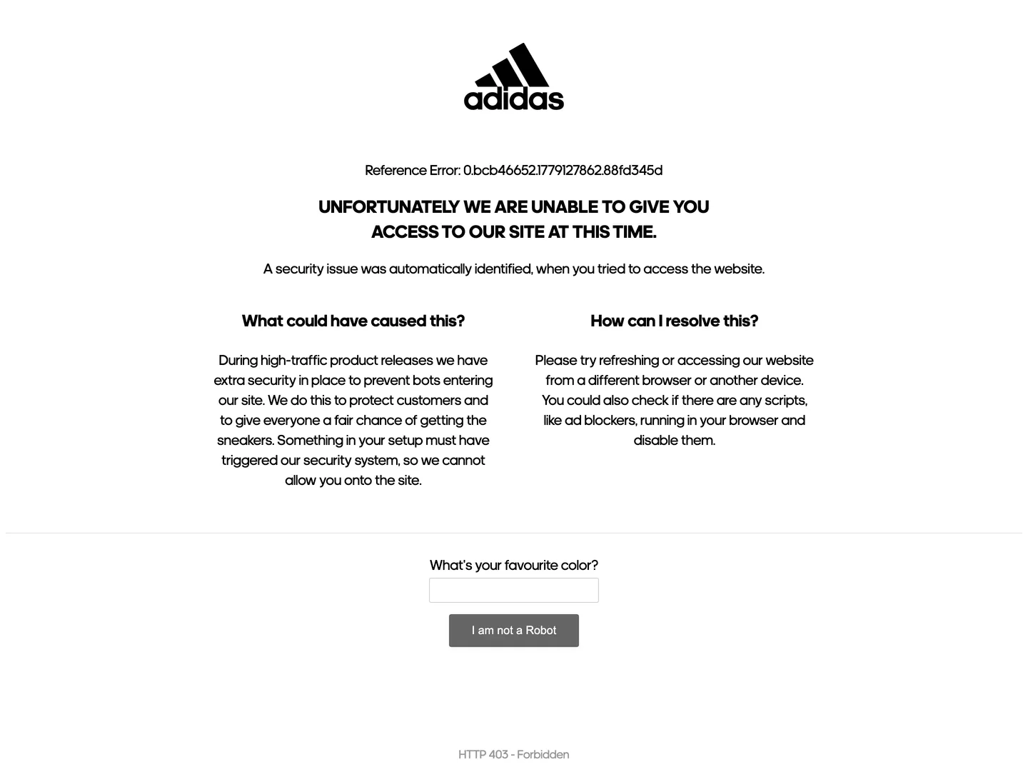
adidas's marketing chrome does something almost no other global apparel brand does: it refuses chromatic identity entirely. The captured surface renders the trefoil-and-wordmark in flat black at the top of a white canvas, with an uppercase display headline beneath it in adineue Pro at 25px / weight 700, and a single grey "I am not a Robot" button at the bottom — and there is no other color on the page. Not the heritage orange of the three-stripes anniversary palette, not the cobalt of the football kit, not the safety-yellow of running. Where Nike paints its marketing surfaces with photography-driven warmth and a confident orange-on-black voltage, and where Puma leans on red and the leaping cat as inline punctuation, adidas keeps its chrome austere: ink on paper, with the wordmark doing the chromatic work that another brand would assign to an accent.

The DESIGN.md file packages the captured surface into a machine-readable spec for React and AI tools. Inside: four color tokens drawn from the structural tier — black for ink and button chrome (frequency 40, used as text, border, and fill), white for the canvas, a 60%-grey for sub-labels, and an 80%-grey hairline reserved for the text-input outline. Six typography tokens span adineue at 16.67px (small / footnote), 20px (body / paragraph), 23.4px (h3 / section), and 25px (h1 / uppercase display), plus Arial at 16px for the primary-button label and Arial at 15px for the text-input value. One radius value — 3px — is used twice, on the button and the input. Spacing centers on 20px as the dominant module, with 8px and 40px as the secondary steps.

Feed this file to Claude or Cursor and it will reproduce adidas's specific moves: pure black-on-white monochrome with no accent, adineue Pro for every display and body tier, Arial only inside button chrome (the captured surface deliberately falls through the system stack on the CTA — a brutal-functional choice), 3px almost-square button corners, and uppercase weight-700 display mantras at 25px. The one move worth borrowing only if your brand has a wordmark this confident: the willingness to put NO chromatic accent on the page. adidas gets away with it because the trefoil does every chromatic job a hue would do. Most retail teams need at least one held-in-reserve voltage.

What makes it distinct

5

  1. Zero chromatic voltagethe captured surface uses only black, white, and two greys; no orange, no red, no signature shoebox color anywhere in the brand chrome
  2. adineue across every tierthe proprietary athletic grotesk does display, body, and label work at 16-25px, with Arial only inside button chrome
  3. Uppercase display mantrathe h1 sits in tracked uppercase weight 700 at 25px / 35px line height, a deliberate echo of the wordmark itself
  4. 3px button radiusalmost-square chrome at 14x32 padding and 46px height, with black fill and white text; no pill, no shadow
  5. Wordmark-as-herothe trefoil-plus-lowercase-wordmark sits centered above the headline at the same visual weight, treating the logo as the page's largest typographic element

adidas.com

Live at adidas.com

A snapshot of the brand in production. Scroll the frame to see the whole page.

adidas's website at adidas.com

Colors

4 colors

adidas's system runs on #000000 as its primary voltage, used in 10 of 11 components. Type is set in adineue across 7 tokens from 15px to 25px, weights 400–700. Shape language is sharp — components average 2px corner radius, favoring crisp rectangles.

Surface

Page and card backgrounds · 1

Text

Headlines, body, captions · 2

Borders & Hairlines

Dividers, outlines, rules · 1

Typography

7 type tokens

Set in adineue across 7 tokens, from 15px to 25px, weights 400–700. Shown in its own stack: where the font isn't installed, the fallback the file names stands in.

  • display-md25px · weight 700 · lh 35pxThe quick brown fox jumps over the lazy dog
  • heading-md23.4px · weight 700 · lh 32.76pxThe quick brown fox jumps over the lazy dog
  • body-md20px · weight 400 · lh 28pxThe quick brown fox jumps over the lazy dog
  • label-md20px · weight 500 · lh 28pxThe quick brown fox jumps over the lazy dog
  • caption16.67px · weight 400 · lh 23.33pxThe quick brown fox jumps over the lazy dog
  • button-md16px · weight 500 · lh 1The quick brown fox jumps over the lazy dog
  • input-md15px · weight 400 · lh 1The quick brown fox jumps over the lazy dog

Layout

Radii and spacing

2 corner radii and 7 spacing values. Shape language: sharp.

Radii

  • none0px
  • xs3px

Spacing

  • xs8px
  • sm14px
  • base16px
  • md20px
  • lg23.4px
  • xl30px
  • 2xl40px

Components

11 components

Each rendered from its tokens (color, type, radius, padding) on adidas's own canvas.

  • Button Primary
    button-primaryButton Primary
  • Button Secondary
    button-secondaryButton Secondary
  • Top Nav
    top-navTop Nav
  • Nav Link
    nav-linkNav Link
  • Hero Heading
    hero-headingHero Heading
  • Section Heading
    section-headingSection Heading
  • Body Paragraph
    body-paragraphBody Paragraph
  • Body Paragraph Muted
    body-paragraph-mutedBody Paragraph Muted
  • Card
    cardCard
  • Type here…
    text-inputText Input
  • Wordmark
    wordmarkWordmark

In use

The system, in use

adidas's tokens on the kind of product it builds.

Build something people actually use.

A short paragraph of marketing copy that previews how the brand's display tier and body tier read together. Two sentences is usually enough.

Get startedLearn more
Marketing heroHeadline, sub-copy, primary CTA — the universal homepage opener.
Reporting · 14 min read

The quiet collapse of an old idea

For decades the consensus held that the system would correct itself. Then it didn't. This is the inside story of what changed, told by the people who watched it unravel.

"Nobody noticed because the failure was indistinguishable from progress."

By Sam Reporter · Updated 2 hours ago

Editorial articleMagazine-style longform with display headline.

FAQ

adidas design system FAQ

Common questions about adidas's tokens, components, and how to use this DESIGN.md in your project.

Read next

Specs, directories, and component libraries that pair with this design system.

Use it

Use adidas in your project

One machine-readable file. Drop it into Claude, Cursor, or any AI tool that reads DESIGN.md.

Download DESIGN.md
  1. Download the DESIGN.md

    One machine-readable file: every color, type, radius, spacing, and component token of adidas.

  2. Feed it to your AI tool

    Drop it into Claude, Cursor, or GitHub Copilot. The agent writes React components and Tailwind classes that match adidas's visual language.

  3. Reference the tokens directly

    Or paste the values into your Tailwind config, CSS variables, or component library: every color, size and radius is a quoted, ready-to-copy value.

Read the full DESIGN.md: overview, rationale, do’s and don’ts

Overview

adidas's marketing chrome refuses chromatic identity entirely. Wordmark-over-voltage. The captured surface renders the trefoil-plus-wordmark in flat black at the top of a white canvas, with an uppercase display headline beneath in adineue Pro at 25px / weight 700, and a single grey "I am not a Robot" CTA at the bottom — and there is no other color on the page. Not the heritage three-stripes orange, not the football cobalt, not the safety-yellow of running. Where Nike paints its marketing surfaces with photography-driven warmth and a confident accent voltage, and where Puma uses brand red as a fill behind the leaping cat, adidas keeps its chrome austere: ink on paper, with the wordmark doing the chromatic work that another brand would assign to a hue.

The system's typographic restraint reinforces the move. adineue (the proprietary athletic grotesk) carries every display, body, and label tier — 25px / 700 for the uppercase hero mantra, 23.4px / 700 for h3 section titles, 20px / 400 for body paragraphs, 16.67px / 400 for footnote captions. The only break in the typeface ladder is the primary button label, which renders in Arial 16px / 500 — a deliberately brutalist functional choice that lets the CTA chrome read as system-default rather than as a styled brand element. This is closer to the editorial restraint of a fashion-house masthead (CDG, Y-3, Off-White) than to a typical athletic-retailer marketing kit.

The shape vocabulary is almost-square + nothing else. There is one radius value (3px), used twice (on the button and the input). The button is barely-rounded; 3px is visible at the corner only on close inspection and reads functionally as a hard rectangle softened just enough to avoid feeling printed. There is no pill, no rounded card, no fully-circular icon button. The scale respects the three-stripes geometry: parallel lines, right angles, and an admission that softness has limits.

Key Characteristics:

  • Zero chromatic voltage — the captured surface uses only black (frequency 40), white (frequency 4), and two greys ({colors.ink-muted} 60%, {colors.hairline} 80%) used once each.
  • Wordmark-as-hero — the trefoil-plus-lowercase-wordmark sits centered above the headline at the same visual weight, treating the logo as the page's largest typographic element.
  • adineue across every typographic tier, with weight 700 reserved for display (25px / 23.4px) and weight 400 for body and footnote (20px / 16.67px).
  • Arial only inside button chrome — the CTA label deliberately falls through the declared stack to system Arial, a brutalist functional choice.
  • Uppercase display mantra in normal tracking — the hero h1 sits in uppercase at 25px / 35px line-height, an echo of the wordmark itself.
  • 3px button radius across all interactive chrome — almost-square, no pill, no rounded card, no circular icon button on the captured surface.
  • 20px is the dominant spacing module (frequency 5), with 8px for tight gaps, 14x32 for button padding, and 30x20 for card padding.
  • Black fill with white text on the primary CTA chrome — no shadow, no gradient, no shimmer, no hover lift captured.

Colors

Structural

  • Ink ({colors.ink} — #000000): frequency 40. Used as text (20), border (18), background (1), shadow (1). The dominant tone across the entire surface — wordmark fill, headline text, body copy, button background, input text, and the divider rule between page sections. Pure black with no warmth adjustment.
  • Canvas ({colors.canvas} — #ffffff): frequency 4. Used as background (2), text (1 — the white button label), and border (1). The page floor and the CTA-label color. Pure white, no cream undertone.
  • Ink Muted ({colors.ink-muted} — #999999): frequency 2. Used as text (1) and border (1). The 60%-grey reserved for the disabled-state "I am not a Robot" button background — the only mid-tone in the system.
  • Hairline ({colors.hairline} — #cccccc): frequency 1, used as border only. The light-grey reserved for the text-input outline; the only place a non-black border tone appears on the captured surface.

What's absent

The captured chrome has no heritage three-stripes orange, no football cobalt, no safety-yellow running accent, no warm cream off-white, no semantic green-for-success or red-for-error. The chromatic budget is spent entirely inside product photography elsewhere on the site; the brand chrome refuses to compete.

Typography

Font Family

The system runs adineue (adidas's proprietary athletic grotesk, often labelled adineue Pro in design specs) for every display, heading, body, and label tier. The declared stack falls back to Arial, sans-serif. The primary button label is a deliberate exception — it renders in Arial directly, skipping the adineue tier. There is no second display family, no serif, no monospace anywhere on the captured surface. One typeface, one weight pair (400 / 700), one fallback.

Hierarchy

TokenSizeWeightLine HeightUse
{typography.display-md}25px70035pxHero h1 in uppercase ("UNFORTUNATELY WE ARE UNABLE TO GIVE YOU ACCESS…")
{typography.heading-md}23.4px70032.76pxh3 section titles ("What could have caused this?", "How can I resolve this?")
{typography.body-md}20px40028pxDefault running text — body paragraphs and label rows
{typography.label-md}20px50028pxField labels above text inputs
{typography.caption}16.67px40023.33pxFootnote text — error references, status codes
{typography.button-md}16px500normalPrimary button label — Arial fallback, not adineue
{typography.input-md}15px400normalText input value — Arial fallback

Principles

Display weight tops out at 700. The hero h1 at 25px / 700 in uppercase is the loudest typographic moment — and it is deliberately modest in size (25px is closer to a section heading on most marketing pages than to a hero display). The restraint is the brand's typographic signature: the wordmark above the headline is the real display tier, and the h1 stays small enough to read as supporting copy beneath it. There is no 36px / 48px / 56px display tier on the captured surface.

The 700 weight pairs with 400 only — there is no semibold 500 or medium 600 between them. The label-md token sits at 500 but only on field labels, and the button label drops to 500 inside the Arial fallback. The weight ladder is binary: regular for body, bold for display.

Note on Font Substitutes

adineue is a licensed proprietary family. Inter at weights 400 / 700 is the closest open-source substitute for the body and display tiers; the proportions transfer cleanly at 20px body sizes. For a tighter alternative with similar athletic proportions at the uppercase display tier, use Anton or Bebas Neue. For the Arial button-label tier, the system stack (Arial, sans-serif) is already what adidas ships and needs no substitute.

Layout

Spacing System

  • Base unit: 20px is the dominant module (frequency 5 in captured spacing values), with 8px for tight gaps and 40px for large between-section breathing room.
  • Tokens: {spacing.xs} 8px · {spacing.sm} 14px · {spacing.base} 16px · {spacing.md} 20px · {spacing.lg} 23.4px · {spacing.xl} 30px · {spacing.2xl} 40px.
  • Button padding: 14×32px on the primary CTA — wide horizontal, modest vertical.
  • Card padding: 30×20px on the help-content blocks — generous vertical, normal horizontal.
  • Section spacing: 40px between the headline block and the two-up explanation columns; another 40px between the columns and the input form below.

Grid & Container

  • Max content width: ~720px on the centered text columns; the wordmark, headline, body explanation columns, and CTA all sit on the same narrow editorial measure.
  • Hero block: centered single-column with the wordmark at the top, the uppercase headline beneath, and the body explanation in a two-up split below.
  • Two-up explanation: equal 50/50 columns at ~360px each, separated by ~40px gutter, with {typography.heading-md} titles and {typography.body-md} body copy.
  • CTA block: the text-input field at 238px width and the "I am not a Robot" button at 182px width, stacked vertically in the page's centered column.

Rhythm

The captured surface is a single tall column with no horizontal split, no aside, no sidebar — every element sits on the same centered measure. The rhythm is uniform: ~40px vertical breathing between every block, no atmospheric gradient, no rule, just whitespace. This is closer to a printed letter than to a typical web layout — the page reads top-to-bottom in a single steady tempo.

Elevation

The system has no shadow tier. The captured surface has one occurrence of {colors.ink} used as a shadow value — and even that is the browser-default outline on the button focus state, not a deliberately-designed elevation. There is no card lift, no dropdown halo, no modal scrim, no hover-elevation on the primary CTA.

  • Flat (no shadow): every surface — wordmark, headline, body columns, input field, button. 100% of the captured chrome.
  • Hairline outlines: {colors.hairline} (#cccccc) marks the text-input border at 1px; {colors.ink} marks the divider rule beneath the body columns. There is no second border tone.
  • No tonal lift: the system has no elevated surface color — every element sits on the same {colors.canvas} floor. Where Cloudflare uses a hairline-bordered card on white to suggest depth, adidas refuses even that.

Shapes

The radius scale is almost-square + nothing else:

  • {rounded.none} 0px — the implicit default for every uncalled-out surface (cards, dividers, the wordmark area).
  • {rounded.xs} 3px — the only declared radius, used twice (the primary button and the text input).

There is no {rounded.sm} 4px, no {rounded.md} 6-8px, no {rounded.lg} 12-16px, no pill, no fully-circular chip anywhere on the captured chrome. The 3px corner is barely visible — it reads as a hard rectangle softened just enough to avoid feeling printed. This is the most rectilinear radius scale in the entire directory; the three-stripes geometry of parallel lines and right angles is honored by the chrome itself.

Components

button-primary — The signature CTA. Black {colors.ink} fill, white {colors.canvas} text, {rounded.xs} 3px radius, 14×32px padding, 46px height. The label uses Arial 16px / 500 ({typography.button-md}), deliberately falling through the adineue stack — a brutalist functional choice that lets the chrome read as system-default. "I am not a Robot" is the captured canonical instance; on the main site the same component carries "Buy now" and "Find a store" labels.

button-secondary — White {colors.canvas} fill, black {colors.ink} text, 1px black border, {rounded.xs} 3px radius. Same 14×32 padding and 46px height as the primary. The inverse-fill variant used for non-primary actions in the broader site (the captured surface does not render this directly, but the inverse pairing is the standard adidas marketing chrome).

top-nav — White {colors.canvas} surface, 64px height, 20px horizontal padding. The captured surface does not render the full main-site navigation; the spec captures the bare floor color and height that the wordmark sits on.

nav-link — Black {colors.ink} text in {typography.label-md} (20px / 500), 8×16px padding, no rounded background. The standard top-nav label tone — uppercase tracking is added only on the wordmark itself, not on the link labels.

hero-heading — Black {colors.ink} text on the white canvas, {typography.display-md} (25px / 700) in uppercase. The 25px size is deliberately modest — the wordmark above the headline is the real display tier, and the h1 stays small enough to read as supporting copy beneath it.

section-heading — Black text at {typography.heading-md} (23.4px / 700). Used for the two-up explanation column titles ("What could have caused this?", "How can I resolve this?").

body-paragraph — Black text at {typography.body-md} (20px / 400). Default running copy — explanatory paragraphs, label rows, and help text.

body-paragraph-muted — {colors.ink-muted} (#999999) text at {typography.caption} (16.67px / 400). Used sparingly for footnote captions — error references, status codes, and disclaimer rows beneath the main copy.

card — Transparent or {colors.canvas} fill, black text, 0px radius, 30×20px padding. The two-up explanation columns render as cards in the layout sense but carry no border, no shadow, no rounded corners — pure typographic blocks on the white floor.

text-input — White {colors.canvas} fill, black text, {colors.hairline} (#cccccc) 1px border, {rounded.xs} 3px radius, 8px padding, 35px height. The "What's your favourite color?" field uses Arial 15px / 400 ({typography.input-md}) for the value, matching the button label's fallback-to-system treatment.

wordmark — The trefoil-plus-lowercase-wordmark rendered in flat black on the canvas. Centered horizontally at the top of every page. Treated as the largest typographic element on the surface — the headline beneath it deliberately stays smaller so the wordmark reads as the display tier.

Do's and Don'ts

Do keep the brand chrome monochrome. The system's signature move is refusing chromatic identity entirely — the wordmark does the chromatic work that an accent voltage would do. Adding even a single brand-orange or brand-blue accent breaks the editorial restraint that makes the chrome read as fashion-house masthead rather than as athletic-retailer marketing.

Do let Arial render the primary button label. The CTA chrome deliberately falls through the adineue stack to system Arial — the captured surface uses Arial 16px / 500. This is a brutalist functional choice, not an oversight; replacing it with adineue makes the button feel styled rather than functional.

Do treat the wordmark as the page's largest typographic element. The captured surface centers the trefoil-plus-wordmark above a 25px / 700 uppercase headline — the headline is deliberately modest in size so the wordmark reads as the display tier. Bumping the h1 to 48px or 56px would invert the relationship and demote the wordmark.

Do use {rounded.xs} (3px) on every rounded surface. The system has exactly one radius value used twice (button and input). Adding a 4px / 6px / 8px middle tier softens the chrome out of the three-stripes geometry that the brand identity respects.

Don't introduce a chromatic accent — orange, cobalt, safety-yellow, or otherwise — anywhere in the brand chrome. The captured surface has zero non-monochrome tones. Any colored hover state, focus ring, or link accent breaks the system's defining move. Color belongs inside product photography only.

Don't render the hero h1 at 48px or larger. The captured display sits at 25px / 700 — small by SaaS hero standards, deliberately so the wordmark above it stays dominant. Going larger turns the chrome into a generic athletic-retailer shout and undercuts the wordmark-over-voltage principle.

Don't swap {rounded.xs} (3px) for a pill or fully-rounded button. The almost-square corner is the brand's geometric signature — the three-stripes vocabulary is parallel lines and right angles, and the chrome respects that. A pill CTA reads as borrowed from a fintech or D2C wellness brand.

Don't add a tinted shadow or elevation halo. The system has zero captured shadow occurrences (the one black-shadow value is browser-default focus chrome). Cards sit flat, dropdowns are not exposed, modals carry no scrim. Adding even a subtle 4-pixel shadow turns the editorial chrome into a typical SaaS dashboard surface.

Known Gaps

  • Product surfaces: the captured chrome is from the security-block / "unable to access" page. The main shop surfaces (/us/shoes, /us/men, product detail pages, the bag and checkout flows) introduce product-color swatches, filter chips, and a fully-rounded selection chip that are not represented here.
  • Top navigation: the spec captures the bare top-nav floor color and the wordmark; the main-site mega-nav (Men / Women / Kids / Sale / Brands sub-menus with category pictograms) is not rendered on the captured surface.
  • Hover and focus states: documented for {component.button-primary} only; the full state matrix (hover lift, focus ring, active press, disabled tint) is not exposed on the captured surface.
  • Three product lines: adidas Originals, Performance, and Y-3 each carry their own sub-brand color logic (heritage orange, performance white, all-black designer chrome) that lives on dedicated landing pages and is not represented in the parent-brand chrome captured here.
  • Motion: the main site uses scroll-triggered photography reveals and product hover videos; the captured surface is a static error page and exposes no motion tokens.
  • Email and direct mail: adidas's email templates and direct-mail catalogs carry a richer typographic ladder (36px / 48px display tiers, two-column editorial layouts) than the web chrome and are not represented here.
  • Dark mode: the captured surface is light-only. The dark-mode variant exists on dedicated product launch pages (Y-3, Originals collaborations) but is not part of the parent-brand chrome.

E-commerce & Retail

More systems like this

More DESIGN.md files in E-commerce & Retail.

Pricing

Build it with Pro

The DESIGN.md files are free. Pro adds 6,000+ blocks, premium templates and the MCP server, so your AI editor builds in your system for you.

4.9/5 out of 5 · 150+ reviewsfrom 150+ founders and developers.

Billed once a year in USD. Cancel anytime.

Individual

For personal projects & open source

$32instead of $49/mo

$389 billed yearly

  • How many people can use the license.Seats: 1 seat
  • Client work, SaaS products and anything you charge for.Commercial use: Personal & open source only
  • Production-ready React sections: hero, pricing, features, dashboards and more.Pro blocks: 6,000+ blocks
  • Complete multi-page sites you can ship as they are.Templates: All 14 templates
  • React icons from every major library, installable with one command.React icons: 294k+ icons
  • Presets that restyle every block, in light and dark.Themes: All 59 themes
  • Lets your AI editor search, preview and install blocks for you.MCP server: Basic usage
  • Priority requests are answered first.Support: Standard

Team

Most popular

For freelancers, agencies & startups

$66instead of $99/mo

$789 billed yearly · ≈ $13/dev/mo

Everything in Individual, plus

  • How many people can use the license.Seats: Up to 5 seats
  • Client work, SaaS products and anything you charge for.Commercial use: Included
  • Lets your AI editor search, preview and install blocks for you.MCP server: High usage
  • Priority requests are answered first.Support: Priority

Organization

For companies with larger teams

$132instead of $199/mo

$1,589 billed yearly

Everything in Team, plus

  • How many people can use the license.Seats: Unlimited seats
  • Lets your AI editor search, preview and install blocks for you.MCP server: Unlimited usage
  • Secure checkout via Stripe
  • Code lives in your repo
  • Keep what you've shipped if you cancel
  • License terms

Your system, built for you

Every block, template and icon, installed by your AI agent in your design system. The DESIGN.md files stay free.

Get Pro