Allbirds Design System
Allbirds' natural-materials storefront as a DESIGN.md file. Geograph + Self Modern, ink #212121, canvas #ece9e2, pill CTA, 22 components. For React and AI tools.
Add shadcn.io to your AI agent. · Pro It installs blocks, icons and templates in your design system from a prompt, with Pro.
Set up MCP- Primary
- #000000
- Typeface
- Geograph
- Shape
- Mixed
- Base radius
- 16px
- Colors
- 19
- Type tokens
- 13
- Components
- 22
- Spacing values
- 10
About
About Allbirds DESIGN.md
Curated by Dov Azencot · Updated May 13, 2026 · Source allbirds.com (opens in a new tab)
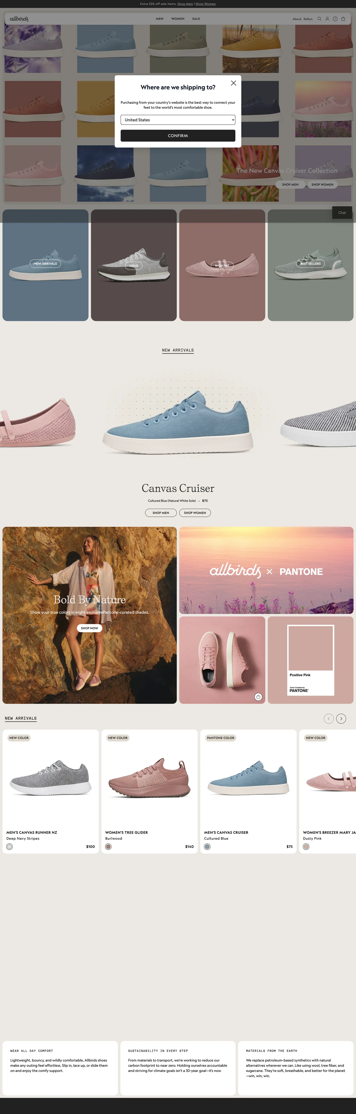
Allbirds' storefront is built on one observation: a footwear brand whose entire value proposition is natural materials (merino wool, eucalyptus tree fiber, sugarcane) cannot ship a chrome that contradicts the product. The canvas is a warm natural-white (`#ece9e2`) declared in `--color-natural-white-60` and used as the page background — one degree off pure white, tinted toward unbleached cotton fiber rather than screen pixels. Ink is a warm graphite (`#212121`) declared in `--color-black` and used 332 times as text and 323 times as 1px hairlines, never the pure `#000000` that would feel pharmaceutical against the natural canvas. The four brand voltages are material tones: dusty mauve `#a57e75`, muted sky `#879aab`, olive `#9e8949`, warm taupe `#d1b0a4` — each appearing in fewer than three component backgrounds, each pulled directly from the dye-lot the company runs on its wool.
This page packages the storefront into a DESIGN.md file written to the Google Labs open specification. Inside: 19 colors tokens grouped into ink, canvas, hairline, semantic, and material-voltage layers; 11 Geograph + Self Modern typography roles built around a 12px / 16px Geograph workhorse and one Self Modern serif moment at 40px reserved for product-name displays like "Canvas Cruiser"; a 5-step radius vocabulary that's effectively two values (full pill at 9999px on every interactive surface, 16px on cards); an 8-step spacing scale anchored on the page's observed 4px / 8px / 12px / 16px / 32px rhythm; and 22 components entries covering the announcement bar, the top nav, the region-modal lightbox, the 4-up product strip, the Pantone editorial collaboration card, the Self Modern product-name card, the newsletter capture pill, and the footer link cluster.
Feed the file to Claude, Cursor, or GitHub Copilot and the agent reproduces Allbirds' material-honesty discipline — the warm canvas, the pill-shaped CTA, the Geograph nav with `0.3px` uppercase tracking, the single Self Modern serif moment, the Akkurat Mono caption — rather than a generic footwear-template with rounded-rect buttons and saturated accents. Reference tokens directly in Tailwind config or CSS variables when you want one specific value; every hex, font, radius, and spacing entry is a quoted literal you can paste into a `theme.extend` block. The reason this system rewards study is that most direct-to-consumer footwear brands ship pill CTAs and call the work done — Allbirds inverts the convention twice: the pill is the only rounded element in a flat-shadow chrome, and the brand voltage is delegated to four material tones rather than one saturated accent, so the pigment narrates the shoe's composition instead of decorating the page.
What makes it distinct
5
- Full-pill CTA geometryprimary button ships at a 9999px radius (61 occurrences in the page) with `#212121` fill, white label, 33px height, and 8px 16px padding — never softened to a 4px or 8px corner
- Material-tone brand voltagedusty mauve (#a57e75), muted sky (#879aab), olive (#9e8949), and warm taupe (#d1b0a4) each appear in fewer than three component backgrounds; pigment mirrors the merino wool, eucalyptus fiber, and sugarcane the shoes are made from
- Two-family typographyGeograph sans-serif at 12px / 14px / 16px carries 90% of the chrome with uppercase tracking kicks of 0.3px, 0.6px, and 0.7px; Self Modern serif at 40px / 40px is reserved for the single product-name hero and one h2 category caption
- Warm graphite ink (#212121)declared in `--color-black` at text-count 332 and border-count 323, used in place of pure `#000000` so the ink reads warm against the natural-white canvas rather than pharmaceutical
- Akkurat Mono micro-labels12px / 16px monospace at uppercase with 1.2px tracking carries product-meta captions and technical descriptors, scoped to four occurrences across the captured chrome
allbirds.com
Live at allbirds.com
A snapshot of the brand in production. Scroll the frame to see the whole page.
Colors
19 colors
Allbirds's system runs on #000000 as its primary voltage, used in 2 of 22 components. Type is set in Geograph across 13 tokens from 12px to 40px, weights 400–500. Shape language is mixed across 22 components, blending pills, soft rounds, and squarer corners.
Brand & Accent
Sparing, CTA-only voltage · 4
Surface
Page and card backgrounds · 4
Text
Headlines, body, captions · 8
Borders & Hairlines
Dividers, outlines, rules · 1
Semantic
Status, errors, success, links · 2
Typography
13 type tokens
Set in Geograph across 13 tokens, from 12px to 40px, weights 400–500. Shown in its own stack: where the font isn't installed, the fallback the file names stands in.
- display-serif40px · weight 400 · lh 1 · tracking 0pxThe quick brown fox jumps over the lazy dog
- display-serif-h240px · weight 400 · lh 1.5 · tracking 0pxThe quick brown fox jumps over the lazy dog
- display-serif-editorial40px · weight 400 · lh 1.2 · tracking 0pxThe quick brown fox jumps over the lazy dog
- heading-md24px · weight 400 · lh 1.33 · tracking 0.6pxThe quick brown fox jumps over the lazy dog
- body-lg20px · weight 400 · lh 1.4 · tracking 0pxThe quick brown fox jumps over the lazy dog
- body-md16px · weight 400 · lh 1.5 · tracking 0pxThe quick brown fox jumps over the lazy dog
- body-sm14px · weight 400 · lh 1.5 · tracking 0.7pxThe quick brown fox jumps over the lazy dog
- body-xs12px · weight 400 · lh 1.33 · tracking 0.6pxThe quick brown fox jumps over the lazy dog
- label-uppercase-sm14px · weight 500 · lh 1.43 · tracking 0.7pxThe quick brown fox jumps over the lazy dog
- label-uppercase-xs12px · weight 500 · lh 1.25 · tracking 0.3pxThe quick brown fox jumps over the lazy dog
- button-cap12px · weight 500 · lh 1.25 · tracking 0.3pxThe quick brown fox jumps over the lazy dog
- button-mono16px · weight 500 · lh 1.5 · tracking 0.8pxThe quick brown fox jumps over the lazy dog
- caption-mono12px · weight 400 · lh 1.33 · tracking 1.2pxThe quick brown fox jumps over the lazy dog
Layout
Radii and spacing
6 corner radii and 10 spacing values. Shape language: mixed.
Radii
- none0px
- xs4px
- sm8px
- md16px
- lg20px
- full9999px
Spacing
- xxs2px
- xs4px
- sm8px
- md10px
- base12px
- lg16px
- xl20px
- 2xl24px
- 3xl32px
- 4xl40px
Components
22 components
Each rendered from its tokens (color, type, radius, padding) on Allbirds's own canvas.
- Button Primarybutton-primaryButton Primary
- Button Primary Hoverbutton-primary-hoverButton Primary Hover
- Button Secondarybutton-secondaryButton Secondary
- Button Mono Ctabutton-mono-ctaButton Mono Cta
- Announcement Barannouncement-barAnnouncement Bar
- Top Navtop-navTop Nav
- Nav Linknav-linkNav Link
- Region Modalregion-modalRegion Modal
- Product Tileproduct-tileProduct Tile
- Product Tile Mauveproduct-tile-mauveProduct Tile Mauve
- Product Tile Skyproduct-tile-skyProduct Tile Sky
- Product Tile Taupeproduct-tile-taupeProduct Tile Taupe
- Product Name Displayproduct-name-displayProduct Name Display
- Product Meta Capproduct-meta-capProduct Meta Cap
- Category Capcategory-capCategory Cap
- Pantone Cardpantone-cardPantone Card
- Type here…text-inputText Input
- Type here…text-input-focusText Input Focus
- Hairline Dividerhairline-dividerHairline Divider
- Footer Headerfooter-headerFooter Header
- Footer Linkfooter-linkFooter Link
- Cart Chipcart-chipCart Chip
In use
The system, in use
Allbirds's tokens on the kind of product it builds.
Build something people actually use.
A short paragraph of marketing copy that previews how the brand's display tier and body tier read together. Two sentences is usually enough.
FAQ
Allbirds design system FAQ
Common questions about Allbirds's tokens, components, and how to use this DESIGN.md in your project.
Read next
Related reading
Specs, directories, and component libraries that pair with this design system.
- Browse all design systemsThe full directory of DESIGN.md files on shadcn.io, with live mockups for each.shadcn.io
- Allbirds — official siteThe Allbirds storefront this DESIGN.md was extracted from on 2026-05-13.allbirds.com (opens in a new tab)
- The DESIGN.md specificationGoogle Labs' open spec for machine-readable design system files — the format this page is built on.github.com (opens in a new tab)
Use it
Use Allbirds in your project
One machine-readable file. Drop it into Claude, Cursor, or any AI tool that reads DESIGN.md.
Download the DESIGN.md
One machine-readable file: every color, type, radius, spacing, and component token of Allbirds.
Feed it to your AI tool
Drop it into Claude, Cursor, or GitHub Copilot. The agent writes React components and Tailwind classes that match Allbirds's visual language.
Reference the tokens directly
Or paste the values into your Tailwind config, CSS variables, or component library: every color, size and radius is a quoted, ready-to-copy value.
Read the full DESIGN.md: overview, rationale, do’s and don’ts
Overview
Allbirds' storefront is a material-honesty exercise rendered for the browser. The canvas runs warm natural-white ({colors.canvas} — #ece9e2 declared in --color-natural-white-60), the ink is warm graphite ({colors.ink} — #212121 declared in --color-black) at text-count 332 and border-count 323, and the brand voltage is delegated across four material tones — dusty mauve #a57e75, muted sky #879aab, warm taupe #d1b0a4, olive #9e8949 — each appearing in fewer than three component backgrounds and never as text or border.
Material-honesty pigment: where most direct-to-consumer footwear brands ship a saturated accent (the orange-red running shoe voltage, the cobalt-blue sneaker voltage), Allbirds delegates pigment to four desaturated material tones with OKLCH chroma between 0.033 and 0.087 — well below the 0.20+ chroma of fintech accents. The dye-lot of the actual merino wool, eucalyptus tree fiber, and sugarcane the shoes are made from gets to narrate the page rather than a brand color asserting itself over the product. The Pantone collaboration card in the editorial band leans into the move explicitly: the product hero ships against a Pantone-of-the-year card, not against a saturated brand background.
Pill geometry as identity: the radius vocabulary is effectively two values — full pill (9999px, extracted as 3.35544e+07px with 61 occurrences) on every interactive surface, and 16px (39 occurrences) on cards. Unlike the convention of a 4px or 8px rounded-rect CTA most apparel and footwear competitors ship, Allbirds holds the pill across every action — primary button, secondary button, newsletter input, region-modal dismiss, cart chip — because the soft full-radius mirrors the rounded toe of the actual shoes. The pill is the only rounded interactive geometry; everything else (cards, hero overlays, the announcement bar, the top nav) stays at 16px or 0px. Softening the pill anywhere would shift the chrome toward a generic footwear template.
Type runs Geograph (declared in --font-sans and --default-font-family) as the workhorse grotesque sans across 90% of the chrome, paired with Self Modern (--font-serif) reserved for the single product-name display tier and Akkurat Mono (--font-mono) for technical micro-labels. Geograph carries nav links, body, buttons, and product-meta at 12px / 14px / 16px with three deliberate tracking kicks — 0.3px on 12px button caps, 0.6px on 12px body, and 0.7px on 14px uppercase. Self Modern appears at 40px in nine total occurrences (five editorial paragraph, three h2, one product-name h3 — Canvas Cruiser). The mono family handles four 12px uppercase caption instances with 1.2px tracking. The typographic identity is the tension between the warm humanist serif moment and the neutral grotesque workhorse around it.
Key Characteristics:
- Full-pill CTA:
{component.button-primary}ships at{rounded.full}(9999px) with{colors.ink}(#212121) fill, white label, 33px height, 8px 16px padding — never softened to a rounded-rect. - Warm natural-white canvas:
{colors.canvas}(#ece9e2) declared in--color-natural-white-60; one degree off pure white, tinted toward unbleached cotton fiber. - Material-tone brand voltage: dusty mauve, muted sky, warm taupe, olive — four desaturated tones used only as product-tile backgrounds.
- Warm graphite ink, not black:
{colors.ink}(#212121) holds 332 text occurrences and 323 borders; pure{colors.ink-pure}(#000000) is reserved for two heading h2 captions. - Humanist serif moment:
{typography.display-serif}(Self Modern40px / 40px leading) appears only on product-name displays likeCanvas Cruiser— the single break from grotesque sans. - Two-radius vocabulary:
{rounded.full}(9999px) on every interactive surface;{rounded.md}(16px) on cards and hero panels;{rounded.none}(0px) on the announcement bar and footer. - Tracking as signature:
0.3pxon button caps,0.6pxon 12px body,0.7pxon 14px uppercase,1.2pxon 12px mono captions — uppercase rhythm built on letter-spacing rather than weight. - Akkurat Mono micro-labels: 12px / 16px uppercase mono carries product-meta captions and technical descriptors — scoped to four occurrences across the captured chrome.
Colors
Ink
- Warm Graphite (
{colors.ink}—#212121): frequency 76. Used as text (34), border (33), bg (9). Declared in--color-blackand--color-neutral-800. The dominant body and CTA color — a warm graphite that holds against the natural-white canvas without going pharmaceutical. Clustered with#222519from the eucalyptus-tinted neutral palette. - Pure Ink (
{colors.ink-pure}—#000000): frequency 675. Used as text (332), border (323), shadow (15), gradient (1), bg (4). Declared in--tw-gradient-from,--tw-gradient-to,--tw-gradient-via. The Tailwind-default gradient stop value — the raw count is high because ofrgba(0,0,0,0)gradient transparency declarations, not visible pure-black ink. Reserved for two h2 cart-caption instances in the captured chrome. - Charcoal (
{colors.ink-charcoal}—#575757): frequency 10. Used as shadow (8), border (1), text (1). Declared in--color-light-charcoal,--color-charcoal, and as a transparency-graded--color-light-charcoal-0.3and--color-light-charcoal-0.7. The secondary text grade and the single shadow tone in the system. - Mid Ink (
{colors.ink-mid}—#6a6767): frequency 1. Used as border (1). A neutral mid-gray that appears as a single 1px divider in the footer band. - Muted Ink (
{colors.ink-muted}—#a8a2a7): frequency 1. Used as bg (1). Declared in--color-gray-400. The placeholder color inside the search input and disabled-state CTA fill.
Canvas
- Natural White (
{colors.canvas}—#ece9e2): frequency 2. Used as bg (1), gradient (1). The warm natural-white page floor declared in--color-natural-white-60and--color-gray-200. One degree off pure white, tinted toward unbleached cotton — Allbirds' load-bearing canvas tone. - Canvas Warm (
{colors.canvas-warm}—#e0dacf): frequency 10. Used as bg (10). Declared in--color-natural-white. A warmer cream tone used as the product-tile photographic background and the editorial-band fill. - Canvas Lightest (
{colors.canvas-lightest}—#f5f4f1): frequency 0 raw but declared in--color-natural-white-25. The lightest neutral surface in the cascade, reserved for hover-state product-tile backgrounds. - Surface White (
{colors.surface-white}—#ffffff): frequency 438. Used as text (199), border (204), bg (35). Declared in--color-whiteand--color-yellow-50. The newsletter-input fill, the region-modal panel, and reverse-text color on the warm-graphite CTA.
Hairline
- Hairline Gray (
{colors.hairline}—#cdcdcd): declared in--color-stroke. The 1px divider tone between footer columns and editorial bands.
Brand Voltage (Material Tones)
- Dusty Mauve (
{colors.brand-mauve}—#a57e75): frequency 2. Used as bg (2). Layer "brand" per extraction. OKLCH (0.628 / 0.051 / 33.3). The merino-wool dye-tone — appears as the Pantone-collaboration card background and one product-tile background. The most-used material voltage in the chrome. - Muted Sky (
{colors.brand-sky}—#879aab): frequency 2. Used as bg (2). Layer "brand" per extraction. OKLCH (0.677 / 0.033 / 245.3). The sky-blue tree-fiber tone — appears as the runner-shoe product-tile background. Clustered with a paler sky-stone variant. - Warm Taupe (
{colors.brand-taupe}—#d1b0a4): frequency 1. Used as bg (1). Layer "brand" per extraction. OKLCH (0.783 / 0.042 / 41.0). The terracotta-leather tone — appears as the Canvas Cruiser product-tile background. - Olive (
{colors.brand-olive}—#9e8949): frequency 1. Used as bg (1). Layer "brand" per extraction. OKLCH (0.635 / 0.087 / 91.6). The eucalyptus-fiber olive tone — the highest-chroma brand voltage at0.087, still well below fintech accent chroma. Appears as one editorial gift-card background.
Semantic
- Midnight (
{colors.ink-midnight}—#03143b): declared in--color-midnight. Reserved for error-state hero overlays and the rare deep-blue accent on the carbon-footprint editorial band. - Khaki (
{colors.ink-khaki}—#443828): declared in--color-khaki. A warm dark brown — reserved for material-disclosure copy and the sustainability-tag chip. - Error (
{colors.status-error}—#9c0f0f): declared in--color-red. The form-validation error state. - Success (
{colors.status-success}—#10714e): declared in--color-green. The order-confirmation surface — a warm forest green that fits the natural-materials palette rather than the standard saturated-emerald web green.
Inverse
- On Ink (
{colors.on-ink}—#ffffff): white text on the primary CTA and the announcement bar.
Typography
Font Families
Allbirds runs three families:
- Geograph — the grotesque sans workhorse, declared in
--font-sansand--default-font-family. Carries 90% of the page across weights 400 and 500 (with weight 300 declared in--font-weight-lightand weights 600/700 declared but unused in the captured chrome). Sizes 12px / 14px / 16px / 20px / 24px. Self Modern— the humanist serif display, declared in--font-serif. Appears in nine total 40px occurrences across h3 product-names (Canvas Cruiser), three h2 category captions, and five editorial body paragraphs. The single typographic break from grotesque sans.- Akkurat Mono — the monospace caption family, declared in
--font-monoand--default-mono-font-family. Carries four 12px / 16px uppercase technical micro-labels with0.6pxto1.2pxtracking.
Hierarchy
| Token | Family | Size | Weight | Line Height | Letter Spacing | Use |
|---|---|---|---|---|---|---|
{typography.display-serif} | Self Modern | 40px | 400 | 1.0 | 0px | h3 product-name display (Canvas Cruiser) — the largest type in the chrome |
{typography.display-serif-h2} | Self Modern | 40px | 400 | 1.5 | 0px | h2 category caption — three occurrences |
{typography.display-serif-editorial} | Self Modern | 40px | 400 | 1.2 | 0px | Editorial paragraph display — five occurrences |
{typography.heading-md} | Geograph | 24px | 400 | 1.33 | 0.6px | h1 cart heading — single occurrence |
{typography.body-lg} | Geograph | 20px | 400 | 1.4 | 0px | Editorial body lead — single occurrence |
{typography.body-md} | Geograph | 16px | 400 | 1.5 | 0px | Default running text and nav link (count 5) |
{typography.body-sm} | Geograph | 14px | 400 | 1.5 | 0.7px | Footer body and uppercase nav band (count 8) |
{typography.body-xs} | Geograph | 12px | 400 | 1.33 | 0.6px | Product-meta caption and announcement-bar copy (count 38) |
{typography.label-uppercase-sm} | Geograph | 14px | 500 | 1.43 | 0.7px | Uppercase category label (count 16) |
{typography.label-uppercase-xs} | Geograph | 12px | 500 | 1.25 | 0.3px | Uppercase utility label (count 30) |
{typography.button-cap} | Geograph | 12px | 500 | 1.25 | 0.3px | Primary CTA label — same metric as the uppercase-xs label |
{typography.button-mono} | Akkurat Mono | 16px | 500 | 1.5 | 0.8px | Mono CTA label — appears on the editorial-collab CTA (count 2) |
{typography.caption-mono} | Akkurat Mono | 12px | 400 | 1.33 | 1.2px | Product-meta mono caption (count 4) |
Principles
Display tops out at 40px. The Self Modern serif h3 (Canvas Cruiser) at 40px / 40px leading is the single tallest type token in the captured chrome — smaller than the 64–96px display tier most apparel brands ship, but the humanist serif geometry against a 90%-grotesque page makes it the dominant typographic moment regardless of absolute size.
Tracking as signature: every uppercase role in Geograph carries a tracking kick that scales with size — 0.3px on 12px button caps (roughly 2.5% of the size), 0.6px on 12px body (5%), 0.7px on 14px uppercase (5%), and 1.2px on 12px mono captions (10%). The tracking values are the typographic muscle — Geograph stays at weight 400 or 500 across every role; the brand never reaches for weight 700 to assert hierarchy.
Font Substitutes
If Geograph is unavailable, Söhne (Klim Type Foundry) or Inter at weight 400/500 are the closest grotesque substitutes — geometry and x-height match within ~3% at body sizes. Preserve the tracking values exactly (0.3px on 12px caps, 0.6px on 12px body, 0.7px on 14px uppercase) — the uppercase rhythm depends on letter-spacing, not on the font choice. For Self Modern, Tiempos Headline (Klim) or Caslon Doric Display approximate the humanist serif tone; never substitute a slab-serif or transitional like Garamond, which would shift the brand from natural-materials to publication. For Akkurat Mono, JetBrains Mono or IBM Plex Mono are the closest open-source matches.
Layout
Spacing System
- Base unit: 4px, declared in
--spacingas.25rem. The full 4px grid is used. - Tokens:
{spacing.xxs}2px ·{spacing.xs}4px ·{spacing.sm}8px ·{spacing.md}10px ·{spacing.base}12px ·{spacing.lg}16px ·{spacing.xl}20px ·{spacing.2xl}24px ·{spacing.3xl}32px ·{spacing.4xl}40px. - Dominant rhythm: 8px (count 37),
8px 16pxbutton padding (count 31), 10px (count 26), 4px (count 25), 16px (count 24), 32px (count 12), 20px (count 10), 40px (count 7). - Button padding:
8px 16pxon the primary CTA — narrower than Everlane's 47px tall-rectangle and tighter than the typical 12px 24px footwear button. Keeps the pill compact at 33px height. - Input padding:
10px 80px 10px 12pxon the newsletter capture — asymmetric right-side for the submit-arrow affordance inside the pill. - Gutters:
8pxbetween product cells in the 4-up category strip — twice Everlane's 4px gutter, giving each shoe more breathing room against the natural-white canvas.
Grid & Container
- Announcement bar height:
32pxdeclared in--global-banner-heightand--global-banner-offset. A fixed top-of-viewport strip carrying promotion messaging (Extra 25% off sale items) in 12px Geograph 400 with0.6pxtracking. - Hero header offset:
4remdesktop (--hero-header-offset-desktop),5.25remdesktop-lg (--hero-header-offset-desktop-lg),6.25remmobile (--hero-header-offset-mobile),8.25remmobile-lg — the gap between the announcement bar and the hero band scales fluidly with breakpoint. - Container scale:
--container-sm24rem ·--container-md28rem ·--container-lg32rem ·--container-2xl42rem ·--container-3xl48rem ·--container-4xl56rem ·--container-5xl64rem ·--container-7xl80rem. The breakpoint xl is declared at80rem(1280px). - Product grid: 4-up at desktop with 8px gutters. Each product tile is a
16px-radius card with the photographic background tinted by one of the four material voltages.
Whitespace Philosophy
The system gives editorial bands generous vertical breathing room (40px section padding) and compresses product grids to 8px gutters. The contrast is intentional: editorial bands above breathe, product strips below compress so the photography carries visual weight rather than the chrome.
Elevation
The captured chrome runs almost entirely flat.
- Shadow tokens:
--tw-shadowand--tw-ring-shadoware declared as0 0zero-shadow defaults (the transparent-rgba reset). The system declares--tw-shadow-alpha: 100%and--tw-drop-shadow-alpha: 100%but the homepage chrome never resolves a visible shadow. - Flat (no shadow): body, hero, top nav, every editorial band, every product tile, the Pantone-collaboration card, the announcement bar, the footer — 100% of the captured homepage surfaces.
- The one shadow moment: the region-modal lightbox uses a backdrop overlay (
rgba(0,0,0,0.4)from the--z-background-overlaylayer), not a card shadow. The modal panel itself ships flat against the overlay. - No card-hover lift: product tiles do not gain a shadow on pointer hover; the tile is the visible-state and the photography handles depth via composition.
Shadow absence as discipline: where most footwear competitors lean on 0px 4px 12px rgba(0,0,0,0.08) lifts to suggest the product is sitting on a surface, Allbirds refuses the move. Depth comes from the photographic warm-taupe ground inside each product tile, not from a layered shadow under the card. The chrome reads flat because the photography is doing the depth work.
Shapes
The radius vocabulary is effectively three values.
{rounded.full}(9999px, extracted as3.35544e+07px— a CSS overflow value indicating full-pill): count 61. The dominant interactive radius — primary CTA, secondary CTA, newsletter input, region-modal dismiss, search field, cart chip. Every interactive surface in the captured chrome holds the pill.{rounded.md}(16px): count 39. The default card radius — product tiles, the Pantone-collaboration card, hero photographic panels, editorial gift-card surfaces.{rounded.lg}(20px): count 5. A slightly larger card radius reserved for the region-modal panel and one editorial campaign card.{rounded.xs}(4px): count 2. Reserved for the announcement-bar dismiss icon hit-target.{rounded.sm}(8px): count 1. A single declared instance that appears on the cart-quantity selector chip.
Pill-as-shoe-toe: where Everlane and Aesop hold every CTA at 0px corners (the catalog-and-apothecary stance), Allbirds inverts the move — the pill is the dominant interactive geometry because the soft full-radius mirrors the rounded toe of the actual shoes the company sells. The 16px card radius reads as a softer photographic frame around the product. Softening the pill to a 16px corner anywhere on a CTA, or hardening it to 0px, would unbalance the relationship between the chrome geometry and the product silhouette.
Components
Buttons
button-primary — Warm-graphite-ink fill ({colors.ink} — #212121) with white text ({colors.on-ink} — #ffffff) and a 1px same-color border. {rounded.full} (9999px) pill, 33px height, 8px 16px padding. The default action across the chrome — region-confirmation, "Shop Womens", newsletter submit. Where Everlane ships a 0px corner and Aesop ships a 13px 24px 12px rectangle, Allbirds holds the pill.
button-primary-hover — Press state. Background switches to {colors.ink-pure} (#000000) — the one place pure black appears as a visible surface. Border stays. No transform, no shadow change.
button-secondary — White fill ({colors.surface-white}) with ink text and a 1px ink border. Same pill radius and 33px height. Used for inverse CTAs over photographic hero panels.
button-mono-cta — A second CTA variant labeled in Akkurat Mono ({typography.button-mono} — 16px uppercase mono with 0.8px tracking). Appears on the Pantone-collaboration editorial card. 8px 32px padding — wider than the standard CTA to balance the wider mono glyphs.
Top Navigation
announcement-bar — A 32px-tall strip at the top of every page, declared in --global-banner-height. Ink-graphite fill with white text in {typography.body-xs} (Geograph 12px 400 with 0.6px tracking). Promotion copy reads Extra 25% off sale items. Shop Men | Shop Women.
top-nav — Natural-white canvas surface ({colors.canvas}), 60px effective height. Allbirds wordmark flush left, category nav center, account + bag + region utilities flush right. No bottom shadow, no hairline at rest.
nav-link — Pure-ink text ({colors.ink-pure} — #000000), 16px / 24px Geograph 400 with 0 tracking. The single non-uppercase nav role in the system. Underline on hover.
Hero / Region Modal
region-modal — White-surface ({colors.surface-white}) lightbox panel at 16px corners, declared with a 32px padding. Carries the Where are you shopping in? region-picker question in {typography.body-md} and a region-select pill ({component.text-input} ghost variant). The captured screenshot shows this modal in front of the product grid.
Product Tiles
product-tile — Canvas-warm card ({colors.canvas-warm} — #e0dacf) at 16px corners. Contains a full-width garment photograph above a 2-line meta stack (product title, price). The base tile uses the warm-cream ground; variants override the background to one of the four material voltages.
product-tile-mauve — Dusty-mauve background ({colors.brand-mauve} — #a57e75). Used on the runner-shoe hero photograph and the editorial Pantone-collaboration card.
product-tile-sky — Muted-sky background ({colors.brand-sky} — #879aab). Used on one sneaker-hero photograph.
product-tile-taupe — Warm-taupe background ({colors.brand-taupe} — #d1b0a4). Used on the Canvas Cruiser product-name display tile.
product-name-display — Self Modern serif headline in {typography.display-serif} (40px / 40px leading / 0px tracking). Reserved for the single product-name display moment per tile — the Canvas Cruiser h3 in the captured chrome. The one humanist serif tier in the system.
product-meta-cap — Akkurat Mono caption in {typography.caption-mono} (12px / 16px uppercase mono with 1.2px tracking) at {colors.ink-charcoal} (#575757). Used for technical descriptors beneath product names — fit, material, weight.
Editorial
category-cap — Ink uppercase label in {typography.label-uppercase-sm} (Geograph 14px / 500 uppercase with 0.7px tracking). Used as section markers above category strips like NEW ARRIVALS.
pantone-card — Dusty-mauve editorial collaboration card ({colors.brand-mauve}) at 16px corners with 24px padding. Carries a Pantone color-of-the-year display and the Allbirds + Pantone mono-CTA. The largest single brand-voltage moment in the captured chrome.
Forms
text-input — White surface ({colors.surface-white}), 1px warm-graphite ink outline ({colors.ink}), full-pill {rounded.full} (9999px), 42px height. Padding 10px 80px 10px 12px — asymmetric right-side for the submit-arrow affordance inside the pill. Placeholder text in {typography.body-md} at the muted ink ({colors.ink-muted} — #a8a2a7).
text-input-focus — Focused state. The 1px outline holds at warm graphite — no chromatic focus accent because the system does not allocate a brand-focus voltage. Outline weight is the only state change.
Dividers & Footer
hairline-divider — A 1px line at {colors.hairline} (#cdcdcd) used between editorial bands. Declared in --color-stroke.
footer-header — Ink uppercase label in {typography.label-uppercase-xs} (Geograph 12px / 500 uppercase with 0.3px tracking) — same metric as the primary-CTA label, reused for footer column headers.
footer-link — Charcoal-ink text in {typography.body-xs} (Geograph 12px 400 with 0.6px tracking). Underline on hover.
cart-chip — A small pill utility chip used on the cart-quantity indicator in the top-nav. Transparent fill with ink text in {typography.label-uppercase-xs} at {rounded.full} and 4px 8px padding.
Do's and Don'ts
Do
- Hold every interactive surface at
{rounded.full}(9999px). Allbirds ships the pill on 61 occurrences in the captured chrome; the geometry mirrors the rounded toe of the actual shoes. Softening to16pxor8pxwould push the brand toward a generic footwear template. - Preserve
letterSpacingon every uppercase Geograph role exactly —0.3pxon 12px button caps,0.6pxon 12px body,0.7pxon 14px uppercase,1.2pxon 12px mono. The tracking values are the typographic signature. - Use
{colors.ink}(#212121) for the primary CTA, never pure#000000. The warm graphite holds against the natural-white canvas; pure black goes pharmaceutical. - Reserve
{typography.display-serif}(Self Modern40px) for product-name displays only. It appears nine times in the entire captured chrome — that scarcity is what makes the serif moment readable as the product hero. - Delegate brand voltage to the four material tones (
{colors.brand-mauve},{colors.brand-sky},{colors.brand-taupe},{colors.brand-olive}). Use each only as a product-tile or editorial-card background, never as text, never as a CTA fill.
Don't
- Don't soften the primary CTA to a
16pxor4pxcorner — the homepage chrome runs the full-pill (9999px) across every action surface. A16pxrounded-rect button would unbalance the relationship between the chrome geometry and the rounded shoe-toe silhouette. - Don't use
{colors.ink-pure}(#000000) for body copy or CTAs at rest. The 332-text-count and 323-border-count for pure black come fromrgba(0,0,0,0)gradient declarations in--tw-gradient-fromand Tailwind reset values, not visible black text. Body copy and CTA fills sit at{colors.ink}(#212121), the warm graphite. Pure black is reserved for the button-hover state. - Don't use any of the four material voltages (
#a57e75,#879aab,#d1b0a4,#9e8949) for a CTA fill, a heading color, or a hairline. They are background-only tones — the moment one carries text or a 1px border, the material-narration disappears and the hex reads as a generic accent. - Don't substitute
Self Modernwith a slab-serif or transitional like Garamond. The humanist proportions ofSelf Modern(declared in--font-serif) are what makesCanvas Cruiserread as product-name and not magazine-headline. Tiempos Headline or Caslon Doric Display are the closest substitutes; never reach for a Didone or slab. - Don't drop the
1.2pxtracking on Akkurat Mono captions. The 12px uppercase mono with1.2pxletter-spacing is the technical-disclosure typographic register — at0tracking, the mono caption reads as code, not as a material-spec label. - Don't add a card-shadow to product tiles. The chrome ships flat — depth comes from the photographic warm-taupe ground inside each tile, not from a layered
rgba(0,0,0,0.08)lift. A drop-shadow under a product tile reads as a generic e-commerce theme.
Known Gaps
- Product detail pages (PDP): the homepage tile is captured, but the full PDP variant-picker grid, fit guide, fabric-composition disclosure, and add-to-bag CTA placement are out of scope.
- Cart drawer and checkout: the cart-chip indicator is captured, but the slide-in cart drawer and the full checkout flow are not.
- Sustainability / carbon-footprint editorial pages: Allbirds' signature carbon-disclosure pages run a separate horizontal-bar typographic treatment — not represented in this DESIGN.md.
- Loyalty / account area: out of scope; the authenticated chrome isn't captured.
- Hover-state colors: not documented per the global no-hover policy. The button-primary-hover state is the one documented hover behavior; product-tile hover is reported by users to be a subtle photographic crossfade, not captured in static extraction.
- Form-validation states: the newsletter input is documented at rest; error / success states are declared via
--color-red(#9c0f0f) and--color-green(#10714e) but not visible in the captured chrome. - Full Geograph weight ramp: the spec documents weights 400 and 500 — the lighter
--font-weight-light(300) and heavier 600 / 700 are declared in CSS variables but not visible in the captured chrome. - Region modal language list: the region-modal panel is captured at rest with one region pre-selected; the full country/language list inside the dropdown is partially captured.
- Mobile breakpoint: the extraction is desktop-only at 1440px; the mobile drawer-nav, condensed product strip, and breakpoint-specific hero-header offsets are documented via CSS variables but not visually captured.
E-commerce & Retail
More systems like this
More DESIGN.md files in E-commerce & Retail.
Pricing
Build it with Pro
The DESIGN.md files are free. Pro adds 6,000+ blocks, premium templates and the MCP server, so your AI editor builds in your system for you.
4.9/5 out of 5 · 150+ reviewsfrom 150+ founders and developers.
Billing
Billed once a year in USD. Cancel anytime.
- How many people can use the license.
- Client work, SaaS products and anything you charge for.
- Production-ready React sections: hero, pricing, features, dashboards and more.
- Complete multi-page sites you can ship as they are.
- React icons from every major library, installable with one command.
- Presets that restyle every block, in light and dark.
- Lets your AI editor search, preview and install blocks for you.
- Priority requests are answered first.
Individual
For personal projects & open source
$32instead of $49/mo
$389 billed yearly
- Seats: 1 seat
- Commercial use: Personal & open source only
- Pro blocks: 6,000+ blocks
- Templates: All 14 templates
- React icons: 294k+ icons
- Themes: All 59 themes
- MCP server: Basic usage
- Support: Standard
Team
Most popularFor freelancers, agencies & startups
$66instead of $99/mo
$789 billed yearly · ≈ $13/dev/mo
- Seats: Up to 5 seats
- Commercial use: Included
- Pro blocks: 6,000+ blocks
- Templates: All 14 templates
- React icons: 294k+ icons
- Themes: All 59 themes
- MCP server: High usage
- Support: Priority
Organization
For companies with larger teams
$132instead of $199/mo
$1,589 billed yearly
- Seats: Unlimited seats
- Commercial use: Included
- Pro blocks: 6,000+ blocks
- Templates: All 14 templates
- React icons: 294k+ icons
- Themes: All 59 themes
- MCP server: Unlimited usage
- Support: Priority
Billed once a year in USD. Cancel anytime.
Individual
For personal projects & open source
$32instead of $49/mo
$389 billed yearly
- How many people can use the license.Seats: 1 seat
- Client work, SaaS products and anything you charge for.Commercial use: Personal & open source only
- Production-ready React sections: hero, pricing, features, dashboards and more.Pro blocks: 6,000+ blocks
- Complete multi-page sites you can ship as they are.Templates: All 14 templates
- React icons from every major library, installable with one command.React icons: 294k+ icons
- Presets that restyle every block, in light and dark.Themes: All 59 themes
- Lets your AI editor search, preview and install blocks for you.MCP server: Basic usage
- Priority requests are answered first.Support: Standard
Team
Most popularFor freelancers, agencies & startups
$66instead of $99/mo
$789 billed yearly · ≈ $13/dev/mo
Everything in Individual, plus
- How many people can use the license.Seats: Up to 5 seats
- Client work, SaaS products and anything you charge for.Commercial use: Included
- Lets your AI editor search, preview and install blocks for you.MCP server: High usage
- Priority requests are answered first.Support: Priority
Organization
For companies with larger teams
$132instead of $199/mo
$1,589 billed yearly
Everything in Team, plus
- How many people can use the license.Seats: Unlimited seats
- Lets your AI editor search, preview and install blocks for you.MCP server: Unlimited usage
- Secure checkout via Stripe
- Code lives in your repo
- Keep what you've shipped if you cancel
- License terms
Your system, built for you
Every block, template and icon, installed by your AI agent in your design system. The DESIGN.md files stay free.