Peloton Design System
Peloton's design system as a DESIGN.md file. Peloton Red #df1c2f, Inter 32px, 18 colors, 17 components. For React, Next.js, and AI tools.
Add shadcn.io to your AI agent. · Pro It installs blocks, icons and templates in your design system from a prompt, with Pro.
Set up MCP- Primary
- #df1c2f
- Typeface
- Inter
- Shape
- Mixed
- Base radius
- 6px
- Colors
- 18
- Type tokens
- 11
- Components
- 17
- Spacing values
- 8
About
About Peloton DESIGN.md
Curated by Dov Azencot · Updated May 13, 2026 · Source onepeloton.com (opens in a new tab)
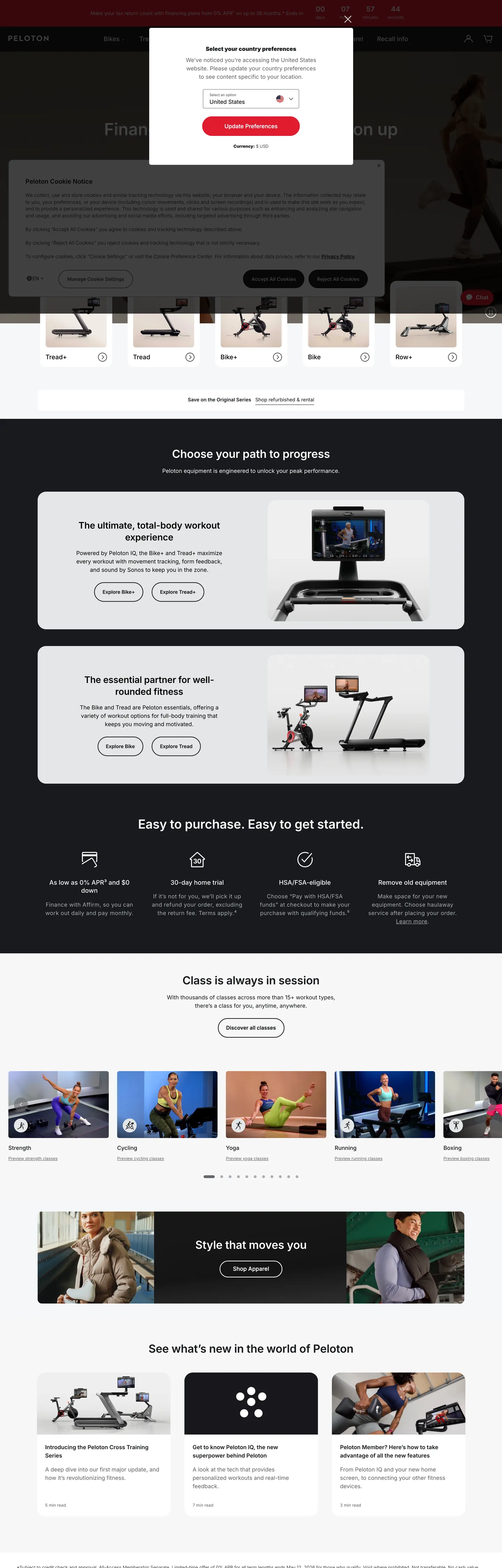
Peloton's storefront is a hardware-commerce surface dressed as an editorial fitness brand. The chrome is almost entirely near-black `#181a1d` typography on a pure white canvas — 780 elements use the ink as text, 778 as borders — interrupted in only one place by a single Peloton Red `#df1c2f` voltage that lights the primary purchase CTA. Everything else on the page is photography of the Bike+, Tread, Row, and Guide, captioned by Inter at modest 14–18px sizes. The page reads less like a typical fitness site (which leans on colorful gradient banners and motion) and more like an appliance store that happens to sell hardware you sweat on.
This file packages Peloton's home page chrome as a DESIGN.md — Google Labs' open spec for machine-readable design tokens. Inside: 18 colors tokens with one brand voltage (`#df1c2f` Peloton Red), one near-black ink (`#181a1d`), and a six-step neutral ladder; 11 typography tiers all running Inter at sizes 12 through 48 and weights 300 through 600, with a `-0.2px` letter-spacing reserved for the 26–48px display row; six radii from 4px to a full pill plus an 8px / 12px spacing scale lifted directly from the 1440px viewport's most-used values; and 17 components ranging from `button-primary` and `button-secondary` through `nav-link`, `product-tile`, `footer-email-input`, and a financing banner.
Drop the file into Claude, Cursor, GitHub Copilot, or any agent that reads design tokens. The result is a React surface that looks like Peloton: ink-on-white body, a single red 28px pill anchoring purchase flow, Inter at five weights with display tightened by `-0.2px`, and product tiles framed by 6px corners rather than rounded cards. Use it as a reference for hardware storefronts where the photography sells and the chrome stays out of the way — or as a study in how a single accent token plus a single near-black can carry an entire commerce page without a second brand color.
What makes it distinct
5
- Single-voltage red`#df1c2f` shows up 4 times on the page yet carries every primary purchase CTA, never a chip, never a hairline
- Two-radius geometryprimary CTA sits at a 28px pill, every other interactive surface lands at a 6px corner (66 occurrences)
- Inter at five weights300/400/500/600 across 14 typography tiers, with a `-0.2px` letter-spacing reserved for the 32–48px display row
- Ink as canvas voltage`#181a1d` text fills 780 elements vs. `#df1c2f` red at 4, putting 99% of the chrome on near-black against pure white
- Hardware-first photographythe 1440px viewport stacks Bike, Tread, Row, Guide tiles edge-to-edge, with copy held under 18px so the product stays the loudest object
onepeloton.com
Live at onepeloton.com
A snapshot of the brand in production. Scroll the frame to see the whole page.
Colors
18 colors
Peloton's system runs on #df1c2f as its primary voltage, used in 1 of 17 components. Type is set in Inter across 11 tokens from 12px to 48px, weights 300–600. Shape language is mixed across 17 components, blending pills, soft rounds, and squarer corners.
Brand & Accent
Sparing, CTA-only voltage · 1
Surface
Page and card backgrounds · 4
Text
Headlines, body, captions · 5
Borders & Hairlines
Dividers, outlines, rules · 1
Semantic
Status, errors, success, links · 2
Other
Specialty colors · 5
Typography
11 type tokens
Set in Inter across 11 tokens, from 12px to 48px, weights 300–600. Shown in its own stack: where the font isn't installed, the fallback the file names stands in.
- display-xl48px · weight 600 · lh 1.3 · tracking -0.2pxThe quick brown fox jumps over the lazy dog
- display-lg32px · weight 600 · lh 1.3 · tracking -0.2pxThe quick brown fox jumps over the lazy dog
- display-md26px · weight 600 · lh 1.3 · tracking -0.2pxThe quick brown fox jumps over the lazy dog
- heading-md20px · weight 600 · lh 1The quick brown fox jumps over the lazy dog
- heading-sm18px · weight 500 · lh 1.3The quick brown fox jumps over the lazy dog
- body-lg16px · weight 400 · lh 1.5The quick brown fox jumps over the lazy dog
- body-md14px · weight 400 · lh 1.43The quick brown fox jumps over the lazy dog
- body-strong14px · weight 600 · lh 1.43The quick brown fox jumps over the lazy dog
- caption12px · weight 400 · lh 1.33The quick brown fox jumps over the lazy dog
- button-md16px · weight 500 · lh 1.3The quick brown fox jumps over the lazy dog
- nav-link15px · weight 300 · lh 1.07The quick brown fox jumps over the lazy dog
Layout
Radii and spacing
7 corner radii and 8 spacing values. Shape language: mixed.
Radii
- none0px
- sm4px
- md6px
- lg12px
- xl24px
- pill28px
- full9999px
Spacing
- xxs4px
- xs6px
- sm8px
- md12px
- base16px
- lg24px
- xl40px
- xxl48px
Components
17 components
Each rendered from its tokens (color, type, radius, padding) on Peloton's own canvas.
- Button Primarybutton-primaryButton Primary
- Button Primary Hoverbutton-primary-hoverButton Primary Hover
- Button Secondarybutton-secondaryButton Secondary
- Button Ghostbutton-ghostButton Ghost
- Top Navtop-navTop Nav
- Nav Linknav-linkNav Link
- Hero Tilehero-tileHero Tile
- Hero Headinghero-headingHero Heading
- Financing Bannerfinancing-bannerFinancing Banner
- Product Tileproduct-tileProduct Tile
- Product Tile Imageproduct-tile-imageProduct Tile Image
- Price Labelprice-labelPrice Label
- Type here…text-inputText Input
- Footer Email Inputfooter-email-inputFooter Email Input
- Link Inlinelink-inlineLink Inline
- Badge Promobadge-promoBadge Promo
- FooterfooterFooter
In use
The system, in use
Peloton's tokens on the kind of product it builds.
Build something people actually use.
A short paragraph of marketing copy that previews how the brand's display tier and body tier read together. Two sentences is usually enough.
FAQ
Peloton design system FAQ
Common questions about Peloton's tokens, components, and how to use this DESIGN.md in your project.
Read next
Related reading
Specs, directories, and component libraries that pair with this design system.
- Browse all design systemsThe full directory of DESIGN.md files on shadcn.io, with live mockups for each.shadcn.io
- Peloton — official siteThe hardware and content storefront that this DESIGN.md file extracts from.onepeloton.com (opens in a new tab)
- The DESIGN.md specificationGoogle Labs' open spec for machine-readable design system files.github.com (opens in a new tab)
Use it
Use Peloton in your project
One machine-readable file. Drop it into Claude, Cursor, or any AI tool that reads DESIGN.md.
Download the DESIGN.md
One machine-readable file: every color, type, radius, spacing, and component token of Peloton.
Feed it to your AI tool
Drop it into Claude, Cursor, or GitHub Copilot. The agent writes React components and Tailwind classes that match Peloton's visual language.
Reference the tokens directly
Or paste the values into your Tailwind config, CSS variables, or component library: every color, size and radius is a quoted, ready-to-copy value.
Read the full DESIGN.md: overview, rationale, do’s and don’ts
Overview
Peloton's storefront chrome is built on a contradiction — the brand sells one of the most kinetic, motion-saturated experiences in consumer fitness, but the home page is almost entirely still: near-black #181a1d typography on a white canvas, photography of stationary hardware, and a single saturated red #df1c2f voltage that fires only on the four purchase CTAs. The kinetic energy lives in the product imagery and the video reel of class-in-session moments; the chrome stays out of the way.
Accent scarcity as discipline: Peloton uses #df1c2f exactly 4 times in the captured 1440×4500 surface, all as background fills on the Bike+, Tread, Row, and Guide primary CTAs. Where most fitness brands paint their entire chrome in gradients of red and orange — the category default since the Equinox-era SoulCycle moment — Peloton withholds. The red becomes a price-tag signal: if it is on the page, you are looking at a hardware buy moment. Body copy is #181a1d (780 text occurrences). Hairlines are #181a1d at low opacity (778 border occurrences). Secondary text drops to #65666a (411 occurrences). There is no third brand color.
Pill voltage vs. flat chrome: The system runs a two-radius geometry. The primary CTA — and only the primary CTA — uses a 28px full-pill ({rounded.pill}) at a 56px height. Every other interactive surface drops to a 6px corner ({rounded.md}, 66 occurrences in the extraction). The contrast is the visual lever that makes the red CTA escape the rest of the page without needing a shadow, glow, or scale jump. Unlike the convention of using a single radius across an entire surface for visual consistency, Peloton uses the radius switch itself as the hierarchy.
Colors
- Peloton Red (
#df1c2f) — frequency 4. Used as bg (3), border (1), text (0). The single brand voltage, reserved for primary purchase CTAs and financing flags; never appears on chrome, hairlines, or chips. - Ink (
#181a1d) — frequency 1565. Used as text (780), border (778), bg (7). The load-bearing typography and hairline color across the entire storefront; carries roughly 99% of the readable surface. - Graphite (
#65666a) — frequency 411. Used as text (204), border (205), bg (2). The secondary text and divider color, scoped to nav links, captions, and disclaimer copy. - Canvas (
#ffffff) — frequency 180. Used as text (56), bg (35), border (56), gradient (33). Pure white is the page background and on-ink inverse text; the gradient column is where it fades into hero photography. - Stone (
#a8acb1) — frequency 84. Used as border (9), text (9), gradient (66). The disabled-state border and the gradient fade color over product imagery. - Black (
#000000) — frequency 58. Used as text (12), border (11), bg (2), gradient (33). Reserved for image scrim overlays and a small number of disclosure text rows; not interchangeable with#181a1dink. - Ink-soft (
#222529) — frequency 8. Used as text (4), border (4). A near-duplicate of ink used in card hairlines that need a one-step lift from the body ink. - Link-ink (
#2d3748) — frequency 5. Used as text (3), border (2). The inline-link color in disclosure copy, lifted half a step warmer than the body ink.
The palette is structural with one brand exception. Ink at 1565 occurrences vs. red at 4 is the entire system — the red functions as scarce price signage, not as a category color. Where the cookie-overlay extraction surfaced #38a169 success green and #edf2f7 pale surface, those are Fides component defaults that leaked into the page, not Peloton brand tokens.
Typography
Inter runs the entire ladder — no second typeface. The weight strategy spans 300, 400, 500, and 600, with weight 700 deliberately absent. Display heads ({typography.display-xl} 48px / 600 with -0.2px tracking, {typography.display-lg} 32px, {typography.display-md} 26px) anchor the campaign tiles; the negative letter-spacing on this row is the only place tracking deviates from the default normal value. Headings ({typography.heading-md} 20px / 600 and {typography.heading-sm} 18px / 500) handle product card titles and section labels.
Body copy lands at three weight stops. {typography.body-lg} 16px / 400 (count 40 in the extraction) covers paragraph copy. {typography.body-md} 14px / 400 (count 32) handles cards, financing disclosures, and the footer. {typography.body-strong} 14px / 600 (count 5) marks price labels and emphasis runs. {typography.button-md} 16px / 500 is the primary CTA face. {typography.nav-link} 15px / 300 is the lightest stop on the page — a deliberate down-weight that lets the nav recede beneath the hero photography.
The absence of weight 700 is a discipline signal — Peloton trusts size and color, not bold weights, to build hierarchy.
Layout
The page stacks as a vertical column of edge-to-edge tiles inside a 1440px viewport. Spacing leans heavily on a 12 / 16 / 24 scale: 12px is the dominant token at 44 occurrences, followed by 10px (41), 6px (33), 16px (30), 24px (27), and 8px (15). Section dividers fall at 48px and 40px. The tile rhythm runs Bike, Tread, Row, Guide each in its own 560–640px tall band — photography centered, headline at 26–32px, two short body lines, and the red 28px pill CTA. Internal card padding lands at 0px 22px (the CTA's exact value, 9 occurrences) or 18px 24px (5 occurrences) for product tiles.
Elevation & Depth
Peloton uses zero drop shadows on chrome. Depth comes from three devices: photography weight (the hardware is rendered with its own studio lighting), surface contrast between the white page canvas and the occasional #181a1d financing band, and a single 1px ink hairline on cards and the top nav. The extraction returned 0 shadow occurrences on every color token. There is no neumorphic lift, no card glow, no hover elevation in the home-page capture.
Shapes
Two radii do all the work. {rounded.pill} 28px is exclusively the primary CTA shape — 56px tall, 280px wide, full red fill. {rounded.md} 6px (66 occurrences) is every other rounded surface: secondary buttons, product tiles, badges, the input field. The {rounded.lg} 12px appears in 2 places (likely the cookie modal). {rounded.sm} 4px (34 occurrences) is the input-field corner and the small badge. {rounded.full} is reserved for circular dots (13 occurrences at 50%). Square corners ({rounded.none} 0px) carry the financing banner and hero tile.
Components
button-primary— the red#df1c2f28px pill, 56px tall, Inter 16/500 white. The only place the brand voltage appears.button-primary-hover— collapses to#181a1dink fill on hover, keeping the pill shape. The hover state desaturates intentionally.button-secondary—#fffffffill with#181a1d1px hairline and 6px corners. Used for "Learn More" and category drill-in.button-ghost— softer secondary with#e4e6e7border, 40px tall. Used in dense nav and filter rows.top-nav— 48px white bar with a 1px hairline bottom, Inter 15/300 nav links in#65666a. Recedes beneath the hero.nav-link— the lightest typography stop on the page; weight 300 is what makes the nav read as quiet.hero-tile— full-bleed#181a1dbackground with white display type and a single red pill. No rounded corner.hero-heading— Inter 48/600 with-0.2pxtracking, white on ink. The display ceiling.financing-banner— full-width#181a1dband with 14px body and disclaimer footnotes, sitting above the hero.product-tile—#ffffff6px-corner card with a 1px hairline, holding a hardware photograph on{colors.canvas-soft}(#f5f7f9).product-tile-image— the soft-gray photography surface; never#ffffffbecause the products are mostly black.price-label— 14px/600 Inter, ink color. Pricing is typographic, not colored.text-input/footer-email-input— 50px tall, 4px corner,#888b93mute border, 14px Inter body.link-inline—#2d3748text in disclosure paragraphs, slightly warmer than body ink.badge-promo— ink-on-ink badge with 6px corners for "New," "Refurbished," "Financing" pills.footer— white background with#65666agraphite text, no top hairline beyond the section gap.
Do's and Don'ts
- Do reserve
#df1c2ffor primary purchase CTAs only. The red works because it appears 4 times — not 40. - Do pair the 28px pill (
{rounded.pill}) with the red fill and nothing else. The pill shape and the red voltage are a married pair. - Do use
#181a1dink for body text and 1px hairlines. Pure black#000000is reserved for image scrim overlays. - Do drop to weight 300 on nav links — the lightness is what lets the hero photography hold attention.
- Don't apply
-0.2pxletter-spacing to body or button copy. The tracking only fits sizes ≥26px; smaller text needsnormalto stay readable. - Don't use
#f5f7f9canvas-soft as a page background — it is the product-tile image surface only, lifted half a step from white to let dark hardware silhouette. - Don't introduce a secondary brand color (orange, green, blue) to differentiate Bike vs. Tread vs. Row. Peloton uses the photography and the headline to differentiate, never a chip color.
- Don't use
#a8acb1stone for body text — 9 of its 84 occurrences are text but the rest are gradient fades over imagery. Body copy belongs at#181a1d. - Don't wrap the red CTA in a shadow or glow. The extraction returned zero shadows on every color; depth here comes from typography weight, not lift.
Known Gaps
- Configurator flow not captured — the color picker, accessory bundles, and financing slider on the per-product PDP are not in this spec.
- Member app chrome excluded — workout library, leaderboards, profile, and live-class chrome live on a separate sub-domain and run a darker theme than the storefront documented here.
- Dark mode and motion tokens absent — the home page captures a single light theme; the brand's app and class video chrome use a dark canvas that is not represented.
- Cookie-consent overlay tokens excluded — the Fides consent component leaked four non-brand colors into the raw extraction (a dark slate link color, a pale surface, a GPC-applied green, and a GPC-overridden warning red); only the slate link survived in the token set as
link-ink.
Healthcare & Wellness
More systems like this
More DESIGN.md files in Healthcare & Wellness.
Pricing
Build it with Pro
The DESIGN.md files are free. Pro adds 6,000+ blocks, premium templates and the MCP server, so your AI editor builds in your system for you.
4.9/5 out of 5 · 150+ reviewsfrom 150+ founders and developers.
Billing
Billed once a year in USD. Cancel anytime.
- How many people can use the license.
- Client work, SaaS products and anything you charge for.
- Production-ready React sections: hero, pricing, features, dashboards and more.
- Complete multi-page sites you can ship as they are.
- React icons from every major library, installable with one command.
- Presets that restyle every block, in light and dark.
- Lets your AI editor search, preview and install blocks for you.
- Priority requests are answered first.
Individual
For personal projects & open source
$32instead of $49/mo
$389 billed yearly
- Seats: 1 seat
- Commercial use: Personal & open source only
- Pro blocks: 6,000+ blocks
- Templates: All 14 templates
- React icons: 294k+ icons
- Themes: All 59 themes
- MCP server: Basic usage
- Support: Standard
Team
Most popularFor freelancers, agencies & startups
$66instead of $99/mo
$789 billed yearly · ≈ $13/dev/mo
- Seats: Up to 5 seats
- Commercial use: Included
- Pro blocks: 6,000+ blocks
- Templates: All 14 templates
- React icons: 294k+ icons
- Themes: All 59 themes
- MCP server: High usage
- Support: Priority
Organization
For companies with larger teams
$132instead of $199/mo
$1,589 billed yearly
- Seats: Unlimited seats
- Commercial use: Included
- Pro blocks: 6,000+ blocks
- Templates: All 14 templates
- React icons: 294k+ icons
- Themes: All 59 themes
- MCP server: Unlimited usage
- Support: Priority
Billed once a year in USD. Cancel anytime.
Individual
For personal projects & open source
$32instead of $49/mo
$389 billed yearly
- How many people can use the license.Seats: 1 seat
- Client work, SaaS products and anything you charge for.Commercial use: Personal & open source only
- Production-ready React sections: hero, pricing, features, dashboards and more.Pro blocks: 6,000+ blocks
- Complete multi-page sites you can ship as they are.Templates: All 14 templates
- React icons from every major library, installable with one command.React icons: 294k+ icons
- Presets that restyle every block, in light and dark.Themes: All 59 themes
- Lets your AI editor search, preview and install blocks for you.MCP server: Basic usage
- Priority requests are answered first.Support: Standard
Team
Most popularFor freelancers, agencies & startups
$66instead of $99/mo
$789 billed yearly · ≈ $13/dev/mo
Everything in Individual, plus
- How many people can use the license.Seats: Up to 5 seats
- Client work, SaaS products and anything you charge for.Commercial use: Included
- Lets your AI editor search, preview and install blocks for you.MCP server: High usage
- Priority requests are answered first.Support: Priority
Organization
For companies with larger teams
$132instead of $199/mo
$1,589 billed yearly
Everything in Team, plus
- How many people can use the license.Seats: Unlimited seats
- Lets your AI editor search, preview and install blocks for you.MCP server: Unlimited usage
- Secure checkout via Stripe
- Code lives in your repo
- Keep what you've shipped if you cancel
- License terms
Your system, built for you
Every block, template and icon, installed by your AI agent in your design system. The DESIGN.md files stay free.