Drunk Elephant Design System
Drunk Elephant's marketing-site design system as a DESIGN.md file. Warm charcoal #45474a, Brown + Sentinel typefaces, electric lime and lavender pop accents, 15 components. For React, Next.js, and AI tools.
Add shadcn.io to your AI agent. · Pro It installs blocks, icons and templates in your design system from a prompt, with Pro.
Set up MCP- Primary
- #000000
- Typeface
- BrownRegular
- Shape
- Sharp
- Base radius
- 10px
- Colors
- 7
- Type tokens
- 13
- Components
- 15
- Spacing values
- 6
About
About Drunk Elephant DESIGN.md
Curated by Dov Azencot · Updated May 19, 2026 · Source drunkelephant.com (opens in a new tab)
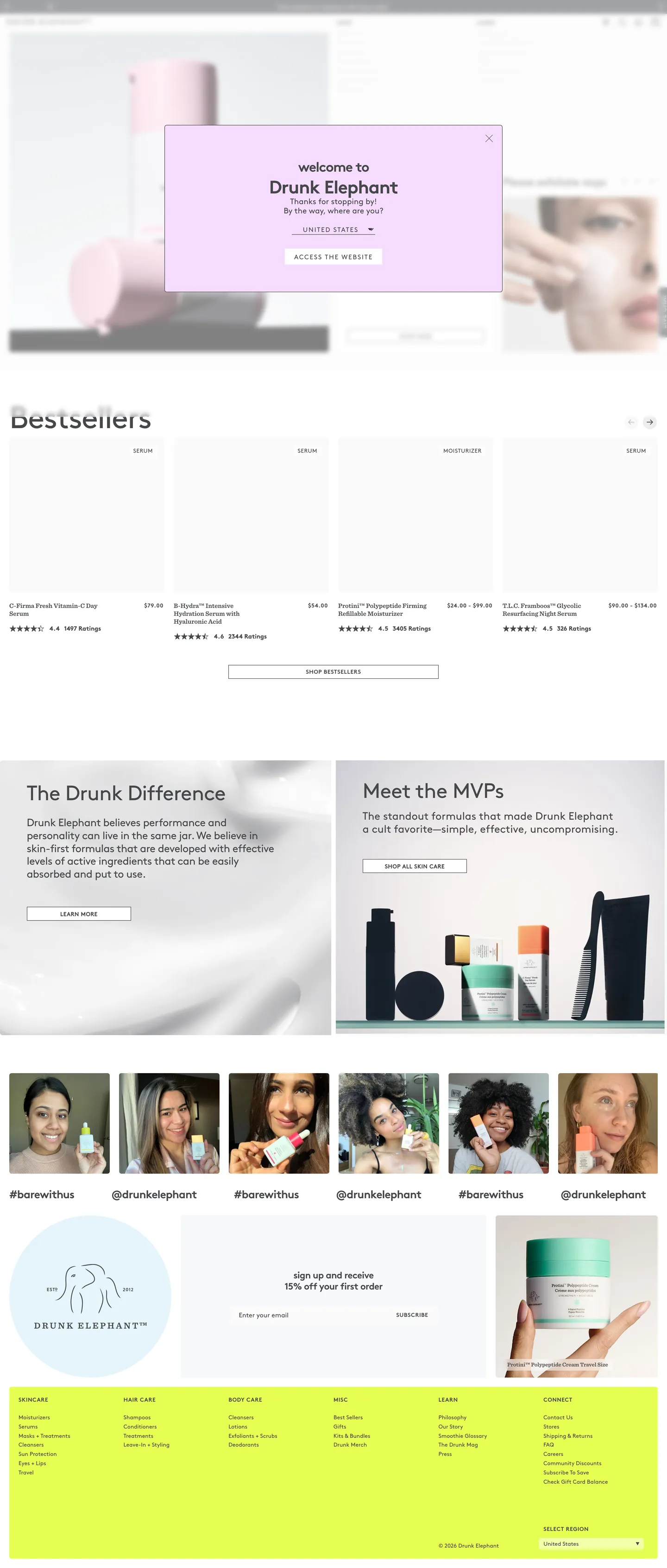
Drunk Elephant's marketing site is built around a typographic commitment almost no beauty brand makes: the primary display heading is lowercase. The hero overlay reads "welcome to Drunk Elephant" in BrownBold at 39px, with intentional extra whitespace and a lowercase w. Below the hero, the product grid runs in warm charcoal (#45474a) — not the pure black that Fenty Beauty or NARS use — against a flat white canvas. The effect is warmer, less authoritative, more like a brand talking to you than at you. Where The Ordinary uses clinical monochrome to signal no-nonsense formulation integrity, Drunk Elephant uses the lowercase + charcoal combination to signal approachable expertise — the brand knows the science but doesn't want to intimidate with it.
The DESIGN.md file packages the system into a machine-readable spec for React and AI tools. Inside: 7 colors tokens anchored on warm charcoal (#45474a) as the dominant structural ink, pure white (#ffffff) as canvas, and two pop accents — electric lime (#e6fe52) and soft lavender (#f6dcff) — each appearing exactly once in the captured page as single product-tile fills. Fourteen typography tokens span two families: BrownRegular and BrownBold (the dominant voice) with negative letter-spacing at display sizes, and SentinelSemiBold (a serif) at 14px weight 375 for editorial callout cards. Corner rounding centers on 5px for interactive surfaces and 3px for smaller chips. 15 components cover the lowercase hero heading, the pop-accent promotional tile, the charcoal product-card grid, and the electric-lime footer newsletter band.
Feed this file to Claude or Cursor and it reproduces Drunk Elephant's specific moves: warm charcoal ink instead of pure black, lowercase BrownBold display headings with tight negative tracking, pop-accent tiles at electric lime or soft lavender deployed sparingly, and SentinelSemiBold serif callouts as an editorial counterpoint. The system is worth studying for its accent discipline: two pop colors are declared but each appears only once in the captured marketing surface, giving the page visual surprise without chromatic noise. The art-direction move — "pop scarcity" — is the pattern worth borrowing.
What makes it distinct
5
- Warm charcoal as structural ink#45474a (not pure black) carries 1,332 element-uses across text and borders, giving the page warmth without a chromatic accent
- Lowercase branded headingsBrownBold display headings use text-transform lowercase ('welcome to drunk elephant'), a direct inversion of the beauty-brand uppercase convention
- Pop accent tileselectric lime (#e6fe52) and soft lavender (#f6dcff) appear as single-tile accent fills, isolated against the white grid; the accents are sparse by design
- SentinelSemiBold serif accenteditorial callout cards use a slab serif at 14px weight 375, the only departure from the Brown-only system
- 5px as the dominant radiusproduct thumbnails, chips, and interactive surfaces use 5px; the system skips anything above 10px
drunkelephant.com
Live at drunkelephant.com
A snapshot of the brand in production. Scroll the frame to see the whole page.
Colors
7 colors
Drunk Elephant's system anchors on #000000 (ink-dark) as its primary color. Type is set in BrownRegular across 13 tokens from 12px to 66px, weights 375–700. Shape language is sharp — components average 3px corner radius, favoring crisp rectangles.
Brand & Accent
Sparing, CTA-only voltage · 2
Surface
Page and card backgrounds · 2
Text
Headlines, body, captions · 2
Borders & Hairlines
Dividers, outlines, rules · 1
Typography
13 type tokens
Set in BrownRegular across 13 tokens, from 12px to 66px, weights 375–700. Shown in its own stack: where the font isn't installed, the fallback the file names stands in.
- display-xl66px · weight 400 · lh 66px · tracking -1.98pxThe quick brown fox jumps over the lazy dog
- display-lg45px · weight 400 · lh 54px · tracking -0.96pxThe quick brown fox jumps over the lazy dog
- display-md24px · weight 700 · lh 28.8px · tracking -0.72pxThe quick brown fox jumps over the lazy dog
- display-sm23px · weight 400 · lh 27.6px · tracking -0.6pxThe quick brown fox jumps over the lazy dog
- heading-md20px · weight 700 · lh 24px · tracking -0.6pxThe quick brown fox jumps over the lazy dog
- heading-sm20px · weight 400 · lh 24pxThe quick brown fox jumps over the lazy dog
- body-md14px · weight 400 · lh 19.6pxThe quick brown fox jumps over the lazy dog
- body-sm12px · weight 400 · lh 16.8pxThe quick brown fox jumps over the lazy dog
- label-caps12px · weight 700 · lh 14.4px · tracking 0.6pxThe quick brown fox jumps over the lazy dog
- caption12px · weight 400 · lh 12px · tracking 0.6pxThe quick brown fox jumps over the lazy dog
- button-md12px · weight 400 · lh 16.8pxThe quick brown fox jumps over the lazy dog
- nav-link14px · weight 400 · lh 19.6pxThe quick brown fox jumps over the lazy dog
- serif-callout14px · weight 375 · lh 16.8pxThe quick brown fox jumps over the lazy dog
Layout
Radii and spacing
5 corner radii and 6 spacing values. Shape language: sharp.
Radii
- none0px
- xs3px
- sm5px
- md10px
- full50%
Spacing
- xs5px
- sm10px
- base15px
- lg20px
- xl30px
- 2xl60px
Components
15 components
Each rendered from its tokens (color, type, radius, padding) on Drunk Elephant's own canvas.
- Hero Sectionhero-sectionHero Section
- Hero Headinghero-headingHero Heading
- Section Headingsection-headingSection Heading
- Body Paragraphbody-paragraphBody Paragraph
- Button Primarybutton-primaryButton Primary
- Button Secondarybutton-secondaryButton Secondary
- Top Navtop-navTop Nav
- Nav Linknav-linkNav Link
- Hero Modalhero-modalHero Modal
- Product Cardproduct-cardProduct Card
- Accent Tile Limeaccent-tile-limeAccent Tile Lime
- Accent Tile Lavenderaccent-tile-lavenderAccent Tile Lavender
- Editorial Callouteditorial-calloutEditorial Callout
- Label Chiplabel-chipLabel Chip
- FooterfooterFooter
In use
The system, in use
Drunk Elephant's tokens on the kind of product it builds.
Build something people actually use.
A short paragraph of marketing copy that previews how the brand's display tier and body tier read together. Two sentences is usually enough.
FAQ
Drunk Elephant design system FAQ
Common questions about Drunk Elephant's tokens, components, and how to use this DESIGN.md in your project.
Read next
Related reading
Specs, directories, and component libraries that pair with this design system.
- Browse all design systemsThe full directory of DESIGN.md files on shadcn.io, with live mockups for each.shadcn.io
- Drunk Elephant — official siteDrunk Elephant's public marketing site — the source of truth for the live tokens captured in this file.drunkelephant.com (opens in a new tab)
- The DESIGN.md specificationGoogle Labs' open spec for machine-readable design system files — the format this page is built on.github.com (opens in a new tab)
Use it
Use Drunk Elephant in your project
One machine-readable file. Drop it into Claude, Cursor, or any AI tool that reads DESIGN.md.
Download the DESIGN.md
One machine-readable file: every color, type, radius, spacing, and component token of Drunk Elephant.
Feed it to your AI tool
Drop it into Claude, Cursor, or GitHub Copilot. The agent writes React components and Tailwind classes that match Drunk Elephant's visual language.
Reference the tokens directly
Or paste the values into your Tailwind config, CSS variables, or component library: every color, size and radius is a quoted, ready-to-copy value.
Read the full DESIGN.md: overview, rationale, do’s and don’ts
Overview
Drunk Elephant's marketing site does something almost no prestige beauty brand attempts. Pop scarcity: two electric accent colors — a saturated lime and a soft lavender — each appear exactly once in the captured marketing surface, against a white-and-charcoal canvas that otherwise runs on pure structural monochrome. The lime does not appear in buttons, the lavender does not appear in headings; both show up as single promotional product-tile fills, isolated against the white grid, and then the page returns to charcoal and white. The contrast between the restrained structural layer and the sparse chromatic punctuation marks is the visual signature.
The typographic system is more unusual still. BrownBold display headings use text-transform: lowercase — the hero reads "welcome to Drunk Elephant," with intentional extra whitespace and a lowercase w. The display letter-spacing runs negative throughout the system: -1.98px at the 66px display tier, -0.72px at 24px, -1.2px at the 39px hero heading. Tight negative tracking on lowercase letterforms is the technical move that keeps the lowercase display from reading as casual — it adds editorial authority to the warmth. Unlike Fenty Beauty, which uses uppercase as its hierarchy signal, Drunk Elephant inverts the convention and builds hierarchy through tracking compression.
Key Characteristics:
- Warm charcoal (#45474a) as the structural ink — not pure black; 1,332 element-uses (664 text, 664 border). The warmth is deliberate: it softens the clinical association of a skincare brand that talks openly about "biocompatible" ingredients.
- Pop scarcity — electric lime and lavender each appear once; the ratio of neutral-to-accent is approximately 1,330:1.
- BrownBold display in lowercase with tight negative tracking (-0.72px to -1.98px at display sizes).
- SentinelSemiBold serif at 14px weight 375 in editorial callout cards — the only two-typeface moment in the system.
- 5px as the dominant radius (74 occurrences at ~5px); 3px for smaller chips.
- Electric lime footer newsletter band — the single recurring accent application across every page.
- Biocompatible philosophy expressed in the copy register ("The Drunk Difference," "Meet the MVPs," "biocompatible") rather than through ingredient-list clinical monochrome.
Colors
Ink
- Ink (
{colors.ink}— #45474a): frequency 1,332. Used as text (664), border (664), background (4). The page's structural backbone — every heading, body paragraph, nav link, card border, and CTA runs through this warm-charcoal token. Merges from two near-identical warm-charcoal values in the extraction cluster. Not pure black; the warmth is the brand's most consistent design decision. - Ink Dark (
{colors.ink-dark}— #000000): frequency 136. Used as text (68) and border (68). Pure black appears in secondary structural contexts — certain card borders and high-contrast text moments.
Canvas
- Canvas (
{colors.canvas}— #ffffff): frequency 65. Used as background (33), text (13), border (13), gradient (6). The page floor and every "light" surface. Merges from three near-identical off-white values in the extraction cluster — all close enough to read as a unified white canvas against the warm-charcoal ink.
Accents
- Accent Lime (
{colors.accent-lime}— #e6fe52): frequency 1, as background fill. Classified as brand-layer. Electric yellow-green — one product tile fill visible in the captured marketing page. Also used as the footer newsletter band background. The single most saturated color in the system. - Accent Lavender (
{colors.accent-lavender}— #f6dcff): frequency 1, as background fill. Classified as brand-layer. Soft violet-white — one product tile fill, and used as the hero modal/overlay background on the entry animation. The gentlest chromatic moment in the system.
Surface
- Surface Pale Blue (
{colors.surface-pale-blue}— #e5f5fc): frequency 1. A very faint sky-blue used in a single background fill, likely a product-editorial panel.
Hairline
- Hairline (
{colors.hairline}— #ffffff): used for ring-offset and icon fills in the review/rating widget CSS. At the canvas level, hairlines between product tiles are built from the contrast between the white canvas and the charcoal card borders.
Typography
Font Families
The system runs two families. BrownRegular and BrownBold (Lineto's licensed geometric sans) carry every structural role. SentinelSemiBold (Hoefler & Co's slab serif) appears specifically in editorial callout cards — the "The Drunk Difference" and "Meet the MVPs" two-column editorial strip.
The two-family system is the only one that appears in this category across the directory. Most beauty brands commit to a single sans; Drunk Elephant uses the serif to introduce a magazine-editorial register for the brand-story sections, then returns to Brown for product catalog and nav.
Hierarchy
| Token | Size | Weight | Line Height | Letter Spacing | Transform | Use |
|---|---|---|---|---|---|---|
{typography.display-xl} | 66px | 400 | 66px | -1.98px | none | Promotional CTA button or large accent element |
{typography.display-lg} | 45px | 400 | 54px | -0.96px | none | Full-page display editorial |
{typography.display-md} | 24px | 700 | 28.8px | -0.72px | lowercase | Section display ("biocompatible", "bestsellers") |
{typography.display-sm} | 23px | 400 | 27.6px | -0.6px | none | Body editorial dek |
{typography.heading-md} | 20px | 700 | 24px | -0.6px | lowercase | Product editorial titles |
{typography.heading-sm} | 20px | 400 | 24px | 0 | none | Section sub-heading |
{typography.body-md} | 14px | 400 | 19.6px | 0 | capitalize | Nav links, product meta, body text |
{typography.body-sm} | 12px | 400 | 16.8px | 0 | capitalize | Product card captions, footer links |
{typography.label-caps} | 12px | 700 | 14.4px | 0.6px | uppercase | Uppercase tracking labels, category chips |
{typography.caption} | 12px | 400 | 12px | 0.6px | uppercase | Small uppercase metadata captions |
{typography.button-md} | 12px | 400 | 16.8px | 0 | capitalize | Button labels |
{typography.nav-link} | 14px | 400 | 19.6px | 0 | capitalize | Top-nav link labels |
{typography.serif-callout} | 14px | 375 | 16.8px | 0 | none | SentinelSemiBold editorial callout cards |
Principles
Display letter-spacing is consistently negative — the tighter the display text, the more compressed the tracking. At 66px the tracking is -1.98px; at 24px it drops to -0.72px. This runs counter to most display type conventions (where tracking loosens at large sizes); the compression reads as editorial authority. Lowercase transform at display sizes is the brand's typographic signature. Weight 375 for the serif callout is unusual — Sentinel Semibold at below-normal semibold weight reads as a kind of "soft authority," matching the brand's tone.
Note on Font Substitutes
Brown is a Lineto commercial font. Use Inter at the same weights for a close substitute. Sentinel is a Hoefler & Co commercial font; use Playfair Display or Source Serif 4 in semibold at the same 14px size. The key thing to preserve is the negative letter-spacing at display sizes — without it, the lowercase display headings read as unfinished rather than intentionally designed.
Layout
Spacing System
- Base unit: 10px — the dominant single-value spacing (13 occurrences).
- Tokens:
{spacing.xs}5px ·{spacing.sm}10px ·{spacing.base}15px ·{spacing.lg}20px ·{spacing.xl}30px ·{spacing.2xl}60px. - Product grid gap: 10px between product tiles.
- Editorial strip padding: 20px internal padding on the "The Drunk Difference" two-column cards.
- Section vertical rhythm: 20px between major page bands.
Grid & Container
- Hero: full-bleed product photography with a centered modal overlay in soft lavender — the entry animation card that reads "welcome to Drunk Elephant" with a product-color selector and CTA.
- Product bestsellers grid: horizontal scroll row of product tiles at 5px card rounding.
- Editorial strip: 2-column layout — "The Drunk Difference" left with BrownRegular body copy, product photography right; "Meet the MVPs" right with Sentinel callout cards, product photography left.
- Social proof grid: 6-tile Instagram-style photo grid with user handles in BrownRegular 12px.
- Footer: electric lime (#e6fe52) full-width band with newsletter signup, then a dense link-column footer in charcoal.
Rhythm
The page alternates between product-catalog density (horizontal scroll bestsellers, tight product rows) and editorial breathing sections (the two-column "Drunk Difference" strip, the "MVPs" callout). The electric lime footer band closes the page as the strongest single chromatic moment in the entire scroll.
Elevation
The system uses minimal elevation. Product cards rest on the white canvas with no border visible at rest — card boundaries are implied by the spacing gap rather than drawn. The hero modal overlay uses a {colors.accent-lavender} fill with {rounded.sm} 5px rounding to float above the background photography. No shadow declarations appear in the extracted CSS variables.
Shapes
The radius scale is small-step:
{rounded.none}0px — nav, hero section edges, editorial strips.{rounded.xs}3px — small UI chips, rating dots, small interactive elements (37 occurrences).{rounded.sm}5px — product cards, buttons, the hero modal overlay (74 occurrences at ~5px — the dominant radius).{rounded.md}10px — larger feature tiles, secondary surfaces.{rounded.full}50% — swatch circles and avatar chips.
The system skips 12px, 16px, and any pill radius. 5px is the rounding of every meaningful interactive surface.
Components
hero-section — White canvas with a full-bleed product photo behind, centered. No aggressive background color; the photography provides all mood. The hero modal sits centered over the photo.
hero-heading — Charcoal ink text, {typography.display-md} (24px / 700 / lowercase / -0.72px tracking). The lowercase BrownBold heading is the hero's typographic identity signal.
section-heading — Charcoal ink text, {typography.display-sm} (23px / 400 / -0.6px tracking). Used for "The Drunk Difference" and "Meet the MVPs" editorial lead heads.
body-paragraph — Charcoal ink text, {typography.body-md} (14px / 400). Default body copy for product descriptions and editorial panels.
button-primary — Charcoal {colors.ink} fill, white text, {rounded.sm} 5px radius, 8×10px padding, 36px height. "FIND OUT MORE" and "LEARN MORE" are the canonical instances.
button-secondary — White canvas fill, charcoal text, 1px charcoal border, {rounded.sm} 5px. Used for secondary product actions.
top-nav — White canvas, charcoal text, 56px height. Houses the Drunk Elephant logo (an elephant illustration) flush left, product-category links (Skincare, Body & Hair, Collections, Blog), and cart/search flush right.
nav-link — Transparent fill, charcoal text, {typography.nav-link} (14px / 400 / capitalize).
hero-modal — Soft lavender {colors.accent-lavender} fill, {rounded.sm} 5px radius, 20px padding. The entry overlay that presents "welcome to Drunk Elephant" with a product-color selector.
product-card — White canvas, charcoal text, {rounded.sm} 5px radius, 10px padding. No border at rest. Holds product photography, Brown 12px name, star rating, and price.
accent-tile-lime — Electric lime {colors.accent-lime} fill, charcoal text, {rounded.sm} 5px radius, 20px padding. The single lime promotional tile in the product grid.
accent-tile-lavender — Soft lavender {colors.accent-lavender} fill, charcoal text, {rounded.sm} 5px radius, 20px padding. The single lavender promotional tile in the product grid.
editorial-callout — White canvas, charcoal text, {typography.serif-callout} (Sentinel 14px / weight 375), 20px padding. Used in the "Meet the MVPs" two-column editorial strip.
label-chip — Transparent fill, charcoal text, {typography.label-caps} (12px / 700 / uppercase / 0.6px tracking), {rounded.xs} 3px, 4×8px padding, 1px charcoal border. Category and attribute tags.
footer — Electric lime {colors.accent-lime} fill, charcoal text, {typography.body-sm}, 20px padding. The strongest single recurring accent application — the lime footer newsletter band appears on every page.
Do's and Don'ts
Do use {colors.ink} (#45474a) — not {colors.ink-dark} (#000000) — for all primary text and borders. The warm charcoal is the system's most consequential structural choice; swapping to pure black shifts the register from warm-approachable to clinical-austere.
Do maintain the lowercase text-transform on BrownBold display headings. The lowercase treatment at display sizes is the brand's typographic identity — applying sentence-case or uppercase to the same font makes the heading read like a generic subhead.
Do preserve the negative letter-spacing at display sizes. Without -0.72px at 24px and -1.98px at 66px, the lowercase Brown display headings lose their editorial authority and read as casual rather than designed.
Do deploy the accent colors (electric lime, lavender) at a maximum of one or two fills per page band. The "pop scarcity" effect depends on a high ratio of neutral chrome to accent — if lime appears in four tile fills on the same screen, the surprise is gone and it starts reading as an accent color, not a punctuation mark.
Don't use {typography.serif-callout} (SentinelSemiBold) outside the editorial brand-story sections. The serif is reserved for the "The Drunk Difference" / "Meet the MVPs" editorial strip; applying it to product-card titles or nav links introduces a voice inconsistency.
Don't apply {colors.accent-lime} to button fills, nav backgrounds, or section headings. The lime appears exclusively as a tile-fill and footer-band color in the captured system; using it as a button CTA color turns the pop-scarcity accent into a conventional brand color.
Don't use {rounded.full} (50%) on any surface other than swatch circles and avatar chips. The system has no pill-radius buttons or cards; introducing a fully-rounded primary CTA would read as borrowing from a beauty-competitor (Glossier, Drunk Elephant's closest arch-rival in the direct-to-consumer space) rather than from the brand's own language.
Don't use {typography.label-caps} (12px / 700 / uppercase / 0.6px tracking) for body paragraphs or product-name labels. The uppercase-tracked label is a chip and attribute tag pattern only; applied to running text at card scale, the 0.6px tracking creates unreadable density.
Known Gaps
- Dark mode: the captured marketing surface is light-only. No dark-mode variable set is exposed in the extracted CSS.
- Hover and focus states: no hover captures were taken in the static extraction. Button hover, product-card hover behavior, and nav-link underline states are not documented as token values.
- Mobile layout: the captured surface is desktop (1440px). The mobile layout likely collapses the bestsellers horizontal scroll to a 2-column product grid and replaces the nav with a hamburger drawer.
- Full accent palette: the brand's product line uses several additional accent colors in product photography (orange Umbra tint, coral Virgin Marula oil, yellow Protini Polypeptide Cream packaging). These product-packaging colors do not appear as CSS variables in the marketing chrome.
- Animation: the hero modal has an entry animation ("animate-delay: 1s," "animate-duration: 1s," "animate-repeat: 1" declared in CSS variables) but the easing curve and animation type are not captured as token values.
- Review and ratings surface: the PowerReviews widget (
--pr-*CSS variables) carries its own component system (ring colors, shadow values, scroll behavior) that is not represented in the main marketing tokens.
E-commerce & Retail
More systems like this
More DESIGN.md files in E-commerce & Retail.
Pricing
Build it with Pro
The DESIGN.md files are free. Pro adds 6,000+ blocks, premium templates and the MCP server, so your AI editor builds in your system for you.
4.9/5 out of 5 · 150+ reviewsfrom 150+ founders and developers.
Billing
Billed once a year in USD. Cancel anytime.
- How many people can use the license.
- Client work, SaaS products and anything you charge for.
- Production-ready React sections: hero, pricing, features, dashboards and more.
- Complete multi-page sites you can ship as they are.
- React icons from every major library, installable with one command.
- Presets that restyle every block, in light and dark.
- Lets your AI editor search, preview and install blocks for you.
- Priority requests are answered first.
Individual
For personal projects & open source
$32instead of $49/mo
$389 billed yearly
- Seats: 1 seat
- Commercial use: Personal & open source only
- Pro blocks: 6,000+ blocks
- Templates: All 14 templates
- React icons: 294k+ icons
- Themes: All 59 themes
- MCP server: Basic usage
- Support: Standard
Team
Most popularFor freelancers, agencies & startups
$66instead of $99/mo
$789 billed yearly · ≈ $13/dev/mo
- Seats: Up to 5 seats
- Commercial use: Included
- Pro blocks: 6,000+ blocks
- Templates: All 14 templates
- React icons: 294k+ icons
- Themes: All 59 themes
- MCP server: High usage
- Support: Priority
Organization
For companies with larger teams
$132instead of $199/mo
$1,589 billed yearly
- Seats: Unlimited seats
- Commercial use: Included
- Pro blocks: 6,000+ blocks
- Templates: All 14 templates
- React icons: 294k+ icons
- Themes: All 59 themes
- MCP server: Unlimited usage
- Support: Priority
Billed once a year in USD. Cancel anytime.
Individual
For personal projects & open source
$32instead of $49/mo
$389 billed yearly
- How many people can use the license.Seats: 1 seat
- Client work, SaaS products and anything you charge for.Commercial use: Personal & open source only
- Production-ready React sections: hero, pricing, features, dashboards and more.Pro blocks: 6,000+ blocks
- Complete multi-page sites you can ship as they are.Templates: All 14 templates
- React icons from every major library, installable with one command.React icons: 294k+ icons
- Presets that restyle every block, in light and dark.Themes: All 59 themes
- Lets your AI editor search, preview and install blocks for you.MCP server: Basic usage
- Priority requests are answered first.Support: Standard
Team
Most popularFor freelancers, agencies & startups
$66instead of $99/mo
$789 billed yearly · ≈ $13/dev/mo
Everything in Individual, plus
- How many people can use the license.Seats: Up to 5 seats
- Client work, SaaS products and anything you charge for.Commercial use: Included
- Lets your AI editor search, preview and install blocks for you.MCP server: High usage
- Priority requests are answered first.Support: Priority
Organization
For companies with larger teams
$132instead of $199/mo
$1,589 billed yearly
Everything in Team, plus
- How many people can use the license.Seats: Unlimited seats
- Lets your AI editor search, preview and install blocks for you.MCP server: Unlimited usage
- Secure checkout via Stripe
- Code lives in your repo
- Keep what you've shipped if you cancel
- License terms
Your system, built for you
Every block, template and icon, installed by your AI agent in your design system. The DESIGN.md files stay free.