Headspace Design System
Headspace's design system as a DESIGN.md file. Warm charcoal #2d2c2b, blue pill #0061ef, Apercu, character-orb mascots, 18 colors. For React, Next.js, and AI tools.
Add shadcn.io to your AI agent. · Pro It installs blocks, icons and templates in your design system from a prompt, with Pro.
Set up MCP- Primary
- #0061ef
- Typeface
- Headspace Apercu
- Shape
- Soft
- Base radius
- 16px
- Colors
- 18
- Type tokens
- 12
- Components
- 17
- Spacing values
- 8
About
About Headspace DESIGN.md
Curated by Dov Azencot · Updated May 13, 2026 · Source headspace.com (opens in a new tab)
Headspace's marketing surface reads as a children's storybook re-rendered with platform-grade UI scaffolding. The page floor is a warm off-white ("#f9f4f2") rather than the cold "#ffffff" most app marketing reaches for; the load-bearing text color is a warm charcoal ("#2d2c2b") that sits softer on the eye than pure black; and floating between every section is a cast of hand-drawn character orbs — saffron yellow, bubble pink, aqua, grass green, ultraviolet purple — each one a member of the brand's mascot taxonomy rather than a stock photograph or gradient background. The single saturated voltage is a blue ("#0061ef") that lives only on the primary CTA pill and a handful of inline accent dots. Where most meditation brands reach for sage greens or soft terracotta to signal serenity, Headspace argues — through its chrome — that wellness can be playful, even loud, as long as the type stays warm and the canvas stays cream.
This DESIGN.md packages the surface using the Google Labs spec: 18 colors tokens (5 character-orb mascots, the blue CTA voltage, warm charcoal ink, off-white canvas, plus structural hairlines and grays), 12 typography levels (all Headspace Apercu, weights 400 / 500 / 700, sizes ranging from 12px nav meta to a 64px / weight-700 / -1.92px-tracked hero h2), 5 corner radii anchored at 16px for cards and 32px for CTAs, 8 spacing values built around a 4 / 8 / 24 / 32 / 48px scale, and 17 components covering the blue CTA pill, secondary outline button, dark "chat with Ebb" pill, character-orb tile, testimonial card, FAQ row, the warm-charcoal-on-yellow feature panel, and the blue enterprise band that anchors the page below the fold. Every hex is grounded in the live extraction.
Feed this file to Claude, Cursor, or GitHub Copilot and the agent will reproduce Headspace's specific dialect — warm charcoal on cream, blue pill CTAs at 32px radius, character orbs in the margin, Apercu at three weights — rather than a generic wellness theme of pastel greens and Inter headings. Or use the spec as a reference: every hex, font weight, radius, and spacing value is a quoted token ready for Tailwind config or CSS variables. The result is a meditation-app surface that earns its warmth by refusing the visual shortcuts most peers depend on — no nature photography, no soft-serif gestures, no eucalyptus-green wash, no lotus illustration. Just cream canvas, warm charcoal ink, one blue pill, and a cast of character orbs.
What makes it distinct
5
- Warm charcoal monopoly#2d2c2b carries every h1, h2, h3, and body paragraph; pure black appears only in form-input text
- One CTA voltage#0061ef on a 32px-radius pill, 48px tall, weight 700 / 14px / uppercase-free; no second saturated fill anywhere in the chrome
- Character-orb mascotssaffron #ffce00, pink #ffa1cc, aqua #00a4ff, grass #02873e, ultraviolet #3b197f orbs replace photography, gradients, and mesh
- Cream-as-canvas#f9f4f2 off-white runs the full page floor where wellness peers reach for terracotta or sage
- House radii of 16/24/32pxsoft-rectangle cards, larger feature plates, fully-pill CTAs; no 4px, no 8px, no 12px in the visible chrome
headspace.com
Live at headspace.com
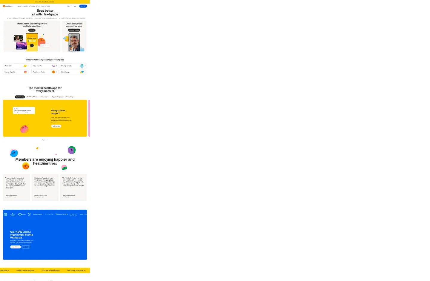
A snapshot of the brand in production. Scroll the frame to see the whole page.
Colors
18 colors
Headspace's system runs on #0061ef as its primary voltage, used in 2 of 17 components. Type is set in Headspace Apercu across 12 tokens from 12px to 64px, weights 400–700. Shape language is soft — components average 195px corner radius, with no sharp interactive edges.
Brand & Accent
Sparing, CTA-only voltage · 2
Surface
Page and card backgrounds · 2
Text
Headlines, body, captions · 8
Borders & Hairlines
Dividers, outlines, rules · 2
Other
Specialty colors · 4
Typography
12 type tokens
Set in Headspace Apercu across 12 tokens, from 12px to 64px, weights 400–700. Shown in its own stack: where the font isn't installed, the fallback the file names stands in.
- display-xl64px · weight 700 · lh 1 · tracking -1.92pxThe quick brown fox jumps over the lazy dog
- display-lg52px · weight 700 · lh 1.1 · tracking -1.56pxThe quick brown fox jumps over the lazy dog
- display-md40px · weight 700 · lh 1.15 · tracking -1.2pxThe quick brown fox jumps over the lazy dog
- display-sm32px · weight 700 · lh 1.2 · tracking -0.96pxThe quick brown fox jumps over the lazy dog
- heading-md32px · weight 500 · lh 1.2 · tracking -0.96pxThe quick brown fox jumps over the lazy dog
- heading-sm24px · weight 700 · lh 1.33 · tracking -0.6pxThe quick brown fox jumps over the lazy dog
- body-lg24px · weight 400 · lh 1.2 · tracking -0.72pxThe quick brown fox jumps over the lazy dog
- body-md20px · weight 400 · lh 1.5 · tracking -0.2pxThe quick brown fox jumps over the lazy dog
- body-sm18px · weight 500 · lh 1.44 · tracking -0.18pxThe quick brown fox jumps over the lazy dog
- body-xs16px · weight 400 · lh 1.5The quick brown fox jumps over the lazy dog
- button-md14px · weight 700 · lh 1.1The quick brown fox jumps over the lazy dog
- caption12px · weight 500 · lh 1.15 · tracking -0.12pxThe quick brown fox jumps over the lazy dog
Layout
Radii and spacing
5 corner radii and 8 spacing values. Shape language: soft.
Radii
- sm8px
- md16px
- lg24px
- xl32px
- full800px
Spacing
- xxs4px
- xs6px
- sm8px
- md12px
- base16px
- lg24px
- xl32px
- 2xl48px
Components
17 components
Each rendered from its tokens (color, type, radius, padding) on Headspace's own canvas.
- Button Primarybutton-primaryButton Primary
- Button Primary Hoverbutton-primary-hoverButton Primary Hover
- Button Secondarybutton-secondaryButton Secondary
- Button Dark Pillbutton-dark-pillButton Dark Pill
- Button Tertiary Textbutton-tertiary-textButton Tertiary Text
- Top Navtop-navTop Nav
- Nav Linknav-linkNav Link
- Hero Headlinehero-headlineHero Headline
- Hero Subheadhero-subheadHero Subhead
- Feature Chipfeature-chipFeature Chip
- Orb Tileorb-tileOrb Tile
- Testimonial Cardtestimonial-cardTestimonial Card
- Enterprise Bandenterprise-bandEnterprise Band
- Type here…text-inputText Input
- Faq Rowfaq-rowFaq Row
- Footer Bandfooter-bandFooter Band
- Banner Linkbanner-linkBanner Link
In use
The system, in use
Headspace's tokens on the kind of product it builds.
Build something people actually use.
A short paragraph of marketing copy that previews how the brand's display tier and body tier read together. Two sentences is usually enough.
FAQ
Headspace design system FAQ
Common questions about Headspace's tokens, components, and how to use this DESIGN.md in your project.
Read next
Related reading
Specs, directories, and component libraries that pair with this design system.
- Browse all design systemsThe full directory of DESIGN.md files on shadcn.io, with live mockups for each.shadcn.io
- Headspace — official siteThe mental-health app for meditation, sleep, and therapy — the live marketing surface this design system was extracted from.headspace.com (opens in a new tab)
- The DESIGN.md specificationGoogle Labs' open spec for machine-readable design system files.github.com (opens in a new tab)
Use it
Use Headspace in your project
One machine-readable file. Drop it into Claude, Cursor, or any AI tool that reads DESIGN.md.
Download the DESIGN.md
One machine-readable file: every color, type, radius, spacing, and component token of Headspace.
Feed it to your AI tool
Drop it into Claude, Cursor, or GitHub Copilot. The agent writes React components and Tailwind classes that match Headspace's visual language.
Reference the tokens directly
Or paste the values into your Tailwind config, CSS variables, or component library: every color, size and radius is a quoted, ready-to-copy value.
Read the full DESIGN.md: overview, rationale, do’s and don’ts
Overview
Headspace's marketing surface reads less like a meditation app and more like a children's storybook re-laid as a web product page. The base canvas is a warm off-white ({colors.canvas} — #f9f4f2), the load-bearing ink is a warm charcoal ({colors.ink} — #2d2c2b) running every h1, h2, h3, and body paragraph, and the single saturated voltage is a confident blue ({colors.primary} — #0061ef) on the "Try for free" CTA pill. Where most meditation brands reach for sage greens or terracotta to signal serenity, Headspace argues through its chrome that wellness can be playful — even loud — as long as the type stays warm and the canvas stays cream.
Mascot-as-decoration: The page has no stock photography of meditators in lotus pose, no gradient meshes, no atmospheric mountain scenes. Instead, hand-drawn character orbs — saffron yellow ({colors.orb-saffron} — #ffce00), bubble pink ({colors.orb-pink} — #ffa1cc), aqua ({colors.orb-aqua} — #00a4ff), grass green ({colors.orb-grass} — #02873e), ultraviolet ({colors.orb-ultraviolet} — #3b197f) — float between sections, cluster above section headings, and sit inside feature chips. Unlike the convention of wellness brands using nature photography as the emotional carrier, Headspace lets the mascots do that work, and reserves the chrome for warm, scarcely-decorated type.
Type runs Headspace Apercu alone — display, body, navigation, captions, button labels. There is no display serif, no italic, no monospace, no second family. The system pivots on three weights (400 / 500 / 700) and a size scale climbing from 12px caption ({typography.caption}) to a 64px / weight-700 / -1.92px-tracked hero ({typography.display-xl}). Shape language is equally restrained: 16px on cards ({rounded.md}), 24px on orb tiles and the enterprise band ({rounded.lg}), 32px on the primary CTA ({rounded.xl}), and the fully-pill 800px ({rounded.full}) on secondary outline buttons and the dark "Chat with Ebb" pill. There is no 4px, no 12px in the visible chrome — five radii cover the entire surface.
Key Characteristics:
- Single CTA voltage:
{colors.primary}(#0061ef) carries the "Try for free" pill, the enterprise band, and a few inline accent dots. No second saturated fill anywhere. - Warm-charcoal ink monopoly:
{colors.ink}(#2d2c2b, frequency 309) runs every h1, h2, h3, and body paragraph. Pure black appears only inside form-input value text. - Five-orb mascot taxonomy: saffron, pink, aqua, grass, ultraviolet — each a hand-drawn character that replaces stock photography, gradients, and mesh backgrounds.
- Cream-as-canvas:
{colors.canvas}(#f9f4f2) runs the page floor where pure white ({colors.surface}— #ffffff, frequency 197) is reserved for card surfaces and form inputs floating over it. - One typeface, three weights: Headspace Apercu at 400 / 500 / 700, sizes 12px caption to 64px hero. No serif, no italic.
- Five-radius geometry: 8 / 16 / 24 / 32 / 800px. The 32px primary CTA radius is the brand's signature — soft enough to read friendly without losing the UI button identity.
- Hero typography over open canvas: 64px / weight 700 / -1.92px letter-spacing h2 in warm charcoal — the page's loudest typographic moment.
- No box-shadow tier: every card, every nav surface, every button sits flat — depth comes from 1px
{colors.hairline}(#e2ded9) hairlines and 16px corner rounding.
Colors
Brand & Voltage
- Primary Blue (
{colors.primary}— #0061ef) — frequency 14. Used as bg (6), text (4), border (4). The single saturated voltage. Anchors the "Try for free" CTA pill, the enterprise "Over 4,000 leading organizations" band, and accent dots inside feature chips. Reserved as the only blue fill — never appears on cards, headlines, or section bands. - Primary Deep (
{colors.primary-deep}— #0000ee) — frequency 100. Used as text (50), border (50). A deeper indigo that surfaces on inline link text and the press state of the primary CTA pill. Despite the high raw count, it appears only on links inside body paragraphs — never as a fill.
Surface
- Canvas (
{colors.canvas}— #f9f4f2) — frequency 27. Used as bg (27). The warm off-white page floor. Carries every major section band; pure white is reserved for cards floating over it. - Surface (
{colors.surface}— #ffffff) — frequency 197. Used as text (91), bg (23), border (83). Pure white — reserved for feature chips, testimonial cards, the form input fill, and the "Try for free" button text. Never used as the page floor.
Ink & Body
- Ink (
{colors.ink}— #2d2c2b) — frequency 309. Used as text (151), bg (9), border (149). The signature warm charcoal. Every h1, h2, h3, and body paragraph renders in this tone — the dominant ink color on the page. - Ink Strong (
{colors.ink-strong}— #141313) — frequency 1. Used as shadow (1). The near-black used inside the rare drop-shadow stack on the "Chat with Ebb" pill. - Ink Soft (
{colors.ink-soft}— #44423f) — frequency 292. Used as text (148), bg (7), border (134). A slightly graphite charcoal for secondary running text — fine-print disclaimers and footer copy. - Ink Muted (
{colors.ink-muted}— #4b4c4d) — frequency 911. Used as text (459), border (452). The workhorse mid-gray that appears across nav links, body meta, and hairline borders — the highest-count token in the extraction. - Ink Meta (
{colors.ink-meta}— #63605d) — frequency 8. Used as text (4), border (4). The dimmest tier — reserved for tertiary meta labels like "Member on processing through their feelings".
Hairlines
- Hairline (
{colors.hairline}— #e2ded9) — frequency 6. Used as border (6). The default 1px warm-gray hairline on feature chips, testimonial cards, and FAQ row dividers. - Hairline Cool (
{colors.hairline-cool}— #d2d5de) — frequency 1. Used as border (1). The slightly cooler hairline reserved for the subscription form's text input — the only cool-spectrum border in the system.
Mascot Orbs
- Orb Saffron (
{colors.orb-saffron}— #ffce00) — frequency 4. Used as bg (4). The yellow character orb — anchors the "Always-there support" feature panel and the top-of-page banner ribbon. - Orb Pink (
{colors.orb-pink}— #ffa1cc) — frequency 1. Used as bg (1). The pink character orb — appears once in the hero mascot cluster. - Orb Aqua (
{colors.orb-aqua}— #00a4ff) — frequency 1. Used as bg (1). The aqua character orb — appears once in the feature-chip row ("Manage anxiety"). - Orb Grass (
{colors.orb-grass}— #02873e) — frequency 1. Used as bg (1). The grass-green character orb — appears once in the mascot constellation above the testimonial band. - Orb Ultraviolet (
{colors.orb-ultraviolet}— #3b197f) — frequency 1. Used as bg (1). The deep-purple character orb — the rarest of the five, appearing once as a contrasting weight in the top mascot cluster.
On-Color
- On Primary (
{colors.on-primary}— #ffffff) — white text inside the blue CTA pill and the dark "Chat with Ebb" pill. - On Canvas (
{colors.on-canvas}— #000000) — frequency 5. Used as text (3), border (2). Reserved exclusively for value text inside the email subscription input — the only place pure black appears in the system.
Typography
Font Family
The system runs Headspace Apercu for everything — display, body, navigation, captions, button labels, footer links. There is no separate display family, no italic family, and no monospace family. Apercu is a Swiss humanist sans by Colophon Foundry; Headspace's custom cut tightens the apertures and adds a slightly wider 'o' counter, which keeps the 64px hero from feeling architectural.
Hierarchy
| Token | Size | Weight | Line Height | Use |
|---|---|---|---|---|
{typography.display-xl} | 64px | 700 | 1 | Hero h2 ("Members are enjoying happier and healthier lives") |
{typography.display-lg} | 52px | 700 | 1.1 | Section h2 ("all with Headspace") |
{typography.display-md} | 40px | 700 | 1.15 | Mid-page h2 / h3 ("Over 4,000 leading organizations choose Headspace") |
{typography.display-sm} | 32px | 700 | 1.2 | Sub-section h2 / h5 ("Sleep better", "The mental health app for every moment") |
{typography.heading-md} | 32px | 500 | 1.2 | Heading sub-variant for softer section titles |
{typography.heading-sm} | 24px | 700 | 1.33 | Feature card titles ("Mental health app with expert-led meditations and tools") |
{typography.body-lg} | 24px | 400 | 1.2 | Lead paragraph beneath hero h2 |
{typography.body-md} | 20px | 400 | 1.5 | Default body — testimonial copy, feature descriptions |
{typography.body-sm} | 18px | 500 | 1.44 | Banner-link copy, secondary section labels |
{typography.body-xs} | 16px | 400 | 1.5 | Nav meta, form labels, footer running text |
{typography.button-md} | 14px | 700 | 1.1 | Primary CTA pill label ("Try for free"), secondary outline labels |
{typography.caption} | 12px | 500 | 1.15 | Top-bar meta links, copyright lines, fine-print disclaimers |
Principles
Weight-light display: Headspace's display hierarchy lives almost entirely at weight 700 — the 64px hero, the 52px section h2, the 40px enterprise band, and the 32px sub-section heads all run weight 700 with negative letter-spacing (-0.96px to -1.92px). Where most marketing systems use a 600 → 700 ladder to separate display tiers, Headspace flattens that to a single weight and lets size + tracking do the work. The slight tracking compression on the largest sizes (-1.92px on 64px ≈ -3% of em) keeps the heavy weight from blowing out the page's open rhythm.
The single sub-display moment at weight 500 is {typography.heading-md} (32px / 500) — a softer header treatment reserved for testimonial section titles where the weight 700 would feel evangelistic.
Note on Font Substitutes
If Headspace Apercu is unavailable, Inter is the closest open-source substitute. Bump line-heights up by ~5% and tighten letter-spacing slightly on display sizes (~-2% of em on 40px+) to approximate Apercu's wider counters and the brand's tracked-display feel.
Layout
Spacing System
- Base unit: 4px (with 6px and 8px modal steps).
- Tokens:
{spacing.xxs}4px ·{spacing.xs}6px ·{spacing.sm}8px ·{spacing.md}12px ·{spacing.base}16px ·{spacing.lg}24px ·{spacing.xl}32px ·{spacing.2xl}48px. - Section padding (vertical):
{spacing.2xl}(48px, frequency 5) between major bands — hero → feature chip row → orb-tile carousel → testimonial → enterprise band → FAQ rhythm. - Card internal padding:
{spacing.lg}(24px) on testimonial cards and FAQ rows; a 24px 19.2px 32px composite on orb tiles (frequency 7); 16px on feature chips. - Gutters:
{spacing.xxs}(4px, frequency 47) between inline icon and label pairs — the highest-frequency spacing in the extraction.
Grid & Container
- Max content width: ~1280px centered on the homepage.
- Hero band: centered single-column composition. A small saffron banner ribbon sits at the very top ("Take a Global Deep Breath on May 13th"); below it the Headspace wordmark and product menu sit flush left, account utilities flush right, with the "Try for free" pill anchoring the right edge.
- Feature-chip row: 3-column grid at desktop with each white-on-white chip housing a label ("Stress less", "Sleep soundly", "Manage anxiety", "Process thoughts", "Practice meditation", "Start therapy"), an orb icon, and a 1px hairline border.
- Orb-tile carousel: a horizontal scroll of large rounded tiles, the first one a saffron-yellow panel housing the "Always-there support" feature with a pink mascot orb and an inline "Chat with Ebb" dark pill.
- Testimonial grid: 3-column white card row with each card carrying a 5-star icon header, a multi-line review excerpt, and a member-name label in
{typography.caption}. - Enterprise band: single-column blue card-band (#0061ef on cream) carrying the 40px / weight-700 headline "Over 4,000 leading organizations choose Headspace" plus paired CTAs ("Request a demo", "Learn more").
Whitespace Philosophy
The system gives feature chip rows 4px-tight inline gutters but pads major bands at 48px vertical breathing room. The contrast reinforces the brand's voice: dense, friendly UI at the chip scale; generous, contemplative breathing room at the section scale. Headspace pads the page where the brand is most emotional, and compresses it where the page is most utilitarian.
Elevation
The system has no shadow tier in the body chrome — every card, every nav surface, every button sits flat against the cream canvas. Depth comes from color separation (white card on cream, blue band on cream, dark "Chat with Ebb" pill on saffron orb tile) and from 16/24px corner rounding.
- Flat (no shadow): ~99% of surfaces. Feature chips, testimonial cards, FAQ rows, top nav, footer — every component renders without a box-shadow.
- Single shadow exception: the "Chat with Ebb" dark pill on the saffron orb tile carries a single near-black drop shadow at
{colors.ink-strong}(#141313, frequency 1) — the only shadow token in the entire extraction. It reads as a press-state lift on a tactile button rather than as ambient elevation.
Flat-as-warmth: Where most wellness systems reach for soft drop-shadows to signal pillowy comfort, Headspace argues — through its chrome — that warmth comes from cream canvas and warm-charcoal type, not from softening every surface with a 12px shadow blur. The flatness lets the mascot orbs carry the brand's atmosphere instead.
Shapes
The corner-radius scale is narrow but the jumps between tiers are dramatic: five radii cover every interactive surface.
- 8px (
{rounded.sm}) — frequency 7. Reserved for the text input on the subscription form — the only small-radius surface in the system. - 16px (
{rounded.md}) — frequency 24. The house radius. Feature chips, testimonial cards, image plates, and FAQ surfaces. - 24px (
{rounded.lg}) — frequency 12. Larger feature plates and the enterprise band. The first geometric tier where rounding starts to read as "card with attitude" rather than "soft rectangle". - 32px (
{rounded.xl}) — frequency 18. The primary CTA radius. Soft enough to read friendly, sharp enough to keep its UI button identity. Reserved exclusively for the "Try for free" pill and a few inline orbs. - 800px (
{rounded.full}) — frequency 4. Fully-pill geometry. Reserved for secondary outline buttons ("Check your coverage", "Learn more") and the dark "Chat with Ebb" pill. The clearest CTA-hierarchy signal in the system: primary CTAs at 32px ({rounded.xl}), secondary CTAs at 800px ({rounded.full}).
There is no 4px radius, no 12px radius, and no 20px radius. The system collapses the conventional scale into five tiers where the jumps (8 → 16 → 24 → 32 → 800) are large enough that geometry alone signals component role.
Components
Buttons
button-primary — Blue pill ({colors.primary} — #0061ef), white text, 32px radius ({rounded.xl}), 14.3×24px padding, 48px height, weight 700, 14px label. The single voltage moment on the page — "Try for free", "Get started". No secondary blue exists.
button-primary-hover — Press state shifts the fill toward {colors.primary-deep} (#0000ee). No transform, no shadow change.
button-secondary — White fill, warm-charcoal text, 1px warm-charcoal hairline ({colors.ink} — #2d2c2b), 800px fully-pill radius. Used for inverse CTAs ("Check your coverage", "Learn more"). The radius difference ({rounded.full} vs. {rounded.xl}) is the system's clearest CTA-hierarchy signal.
button-dark-pill — Warm-charcoal fill ({colors.ink}), white text, 800px radius, 8×16×8×24px asymmetric padding. The signature inline pill ("Chat with Ebb") that anchors the saffron orb-tile feature panel — the only place a dark fill button appears.
button-tertiary-text — Plain warm-charcoal text in {typography.caption}, no surface, no border. Used for inline footer links and top-bar copyright meta.
Top Navigation
top-nav — Cream surface ({colors.canvas}), 64px height, 16×24px padding, no bottom hairline. The Headspace wordmark and orb logomark sit flush left; the product menu items ("For You", "For Business", "For Providers", "Our Plans", "Resources", "About") sit center; account utilities ("Log In", "Help", "Try for free") sit flush right.
nav-link — Plain warm-charcoal text in {typography.body-xs} (16px / 400). No pill background, no underline, no hover-surface fill on the static page — hover state is reserved to the live product, not the marketing scroll.
Hero
hero-headline — The 64px / weight-700 / -1.92px-tracked h2 ("Members are enjoying happier and healthier lives") in warm charcoal. Sits over the cream canvas with mascot orbs (pink, aqua, grass, ultraviolet) floating around it as a constellation rather than as a photograph.
hero-subhead — 18px / 500 / -0.18px-tracked paragraph in warm charcoal ("Take a Global Deep Breath on May 13th") sitting inside the top saffron banner ribbon as a date-specific event prompt.
Cards & Tiles
feature-chip — White surface, warm-charcoal text, 16px radius ({rounded.md}), 16px padding, 56px height, 1px hairline ({colors.hairline}) border. Houses a label + orb icon pair — six of them stack in a 3×2 grid above the orb-tile carousel.
orb-tile — Saffron-yellow surface ({colors.orb-saffron}), warm-charcoal text, 24px radius ({rounded.lg}), 24×19.2×32px composite padding. The signature feature panel — houses a chat-bubble illustration, a 24px / 700 title ("Always-there support"), a body paragraph in {typography.body-md}, and the inline dark "Chat with Ebb" pill. The page's only saturated-color surface band aside from the blue enterprise band.
testimonial-card — White surface, warm-charcoal text, 16px radius, 24px padding, 1px hairline ({colors.hairline}) border. Houses a member-quote in {typography.body-md} plus a member-name label in {typography.caption} ("Member on forming new helpful habits").
enterprise-band — Blue surface ({colors.primary} — #0061ef), white text, 24px radius ({rounded.lg}), 48px padding. The mid-scroll anchor: houses the 40px / weight-700 enterprise headline plus paired "Request a demo" and "Learn more" CTAs. The only band that uses the primary blue as a surface fill.
Forms
text-input — White surface, 1px cool hairline ({colors.hairline-cool} — #d2d5de), 8px radius ({rounded.sm}), 58px height, 24×16×8px asymmetric padding (extra top padding for the floating label). Placeholder and value text run pure black ({colors.on-canvas}) at 16px / weight 400 — the one place black appears in the system.
FAQ
faq-row — Cream surface (no card fill), 24px vertical padding, 24px / weight-700 question title in warm charcoal. Rows are separated by 1px {colors.hairline} dividers rather than card-rounded surfaces — the rhythm reads as editorial rather than as expandable accordion buttons.
Banner & Footer
banner-link — Saffron surface ({colors.orb-saffron}), warm-charcoal text in {typography.caption}, 32px height, 8×16px padding. The top-of-page ribbon ("Take a Global Deep Breath on May 13th") that anchors every scroll.
footer-band — Cream surface ({colors.canvas}), warm-charcoal text in {typography.body-xs} (16px / 400), 48×24px padding. The footer reuses the page-canvas color rather than dropping into a dark band — Headspace's restraint extends to the bottom of the scroll.
Responsive Behavior
| Name | Width | Key Changes |
|---|---|---|
| Mobile | < 744px | Top nav collapses to wordmark + hamburger; product menu hides behind a sheet; hero h2 drops to 40px / 700; feature chip grid stacks 1-up; orb-tile carousel becomes a horizontal swipe; enterprise band stacks the CTA pair vertically. |
| Tablet | 744–1128px | Top nav keeps wordmark + a 2-item menu (Plans, Try for free); hero h2 drops to 52px / 700; feature chips 2-up; testimonial cards 2-up. |
| Desktop | 1128–1440px | Full top nav with 6 menu items centered; hero h2 at full 64px / 700; feature chips 3×2 grid; testimonial cards 3-up; enterprise band horizontal CTAs. |
| Wide | > 1440px | Content width caps at 1280px; outer margins absorb the rest of the cream canvas. |
Touch Targets
- Primary CTA pill at 48px height — comfortably above WCAG AAA.
- Secondary outline pill at 48px height with 12.1×24px internal padding.
- Feature chip at 56px height — generous tap area for the 6-item grid above the orb carousel.
Collapsing Strategy
- Top product menu collapses into a hamburger sheet below 744px.
- Hero h2 scales 64 → 52 → 40px across breakpoints; weight stays at 700; letter-spacing scales linearly.
- Feature chip and testimonial grids drop column counts cleanly at each breakpoint — never reflow rows; always reduce columns.
- Orb-tile carousel transitions from a paginated horizontal track on desktop to a free-swipe scroll on mobile.
Do's and Don'ts
Do
- Use
{colors.ink}(#2d2c2b) for every h1, h2, h3, and body paragraph. The warm charcoal is the system's identity — pure black on headlines breaks the brand's warmth. - Reserve
{colors.primary}(#0061ef) for the primary CTA pill and the enterprise band only. The blue is the single voltage; a second blue band breaks the moment-per-scroll rhythm. - Use 32px radius (
{rounded.xl}) on the primary CTA, 800px ({rounded.full}) on secondary outline pills. The radius difference is the system's hierarchy signal. - Use the five mascot orbs (
{colors.orb-saffron}/{colors.orb-pink}/{colors.orb-aqua}/{colors.orb-grass}/{colors.orb-ultraviolet}) as the decoration layer. They replace stock photography, mesh, and atmospheric backgrounds entirely. - Stay inside three Apercu weights (400 / 500 / 700). Weight 600, weight 800, and italic are not part of the system.
Do not
- Do not use
{colors.surface}(#ffffff) as the page floor — pure white is reserved for cards and form inputs floating over the cream canvas. The page floor is{colors.canvas}(#f9f4f2). Swapping them flattens the warmth that defines the brand. - Do not use
{colors.on-canvas}(#000000) for body text or headlines. Despite its appearance in the palette, it is scoped exclusively to value text inside the subscription form input (5 occurrences total). Use{colors.ink}for everything readable. - Do not add a second saturated CTA color (orange, green, magenta). The blue voltage is the only saturated fill in the system; adding a second breaks the single-moment-per-page rule and dilutes the "Try for free" pill's identity.
- Do not add box-shadows to feature chips, testimonial cards, or the enterprise band. The system is flat-as-warmth — depth comes from color separation and 16/24px corner rounding, never from elevation. The single shadow exception is the "Chat with Ebb" pill on the saffron orb tile, and only there.
- Do not use the 800px fully-pill radius (
{rounded.full}) on the primary CTA. The 32px ({rounded.xl}) primary vs. 800px ({rounded.full}) secondary distinction is the brand's load-bearing hierarchy cue; collapsing them makes both pills read as the same role. - Do not use 12px or 20px corner radii anywhere. The system steps 8 → 16 → 24 → 32 → 800px; intermediate values read as off-brand. Pick the closest tier.
Known Gaps
- Hover state colors: the marketing surface has no visible nav-link hover or card-hover state in the static extraction; the live product carries those but they are not captured here.
- Loading states / skeleton screens: not visible on the extracted marketing surface.
- In-app product UI: the iOS, Android, and web meditation player, the sleep-story tracks, and the therapist-matching flow live inside the authenticated product; this spec captures the marketing site only.
- Form input error states: the subscription text-input outline (
{colors.hairline-cool}) is documented, but the helper-text + outline combination on validation failure was not visible in the captured surface. - Dark mode: the marketing site is light-only; a native dark mode exists in the iOS and Android apps but is not represented in this DESIGN.md.
- Motion: the saffron banner ticker, mascot-orb float easing, and orb-tile carousel transition curves are not captured as tokens.
Healthcare & Wellness
More systems like this
More DESIGN.md files in Healthcare & Wellness.
Pricing
Build it with Pro
The DESIGN.md files are free. Pro adds 6,000+ blocks, premium templates and the MCP server, so your AI editor builds in your system for you.
4.9/5 out of 5 · 150+ reviewsfrom 150+ founders and developers.
Billing
Billed once a year in USD. Cancel anytime.
- How many people can use the license.
- Client work, SaaS products and anything you charge for.
- Production-ready React sections: hero, pricing, features, dashboards and more.
- Complete multi-page sites you can ship as they are.
- React icons from every major library, installable with one command.
- Presets that restyle every block, in light and dark.
- Lets your AI editor search, preview and install blocks for you.
- Priority requests are answered first.
Individual
For personal projects & open source
$32instead of $49/mo
$389 billed yearly
- Seats: 1 seat
- Commercial use: Personal & open source only
- Pro blocks: 6,000+ blocks
- Templates: All 14 templates
- React icons: 294k+ icons
- Themes: All 59 themes
- MCP server: Basic usage
- Support: Standard
Team
Most popularFor freelancers, agencies & startups
$66instead of $99/mo
$789 billed yearly · ≈ $13/dev/mo
- Seats: Up to 5 seats
- Commercial use: Included
- Pro blocks: 6,000+ blocks
- Templates: All 14 templates
- React icons: 294k+ icons
- Themes: All 59 themes
- MCP server: High usage
- Support: Priority
Organization
For companies with larger teams
$132instead of $199/mo
$1,589 billed yearly
- Seats: Unlimited seats
- Commercial use: Included
- Pro blocks: 6,000+ blocks
- Templates: All 14 templates
- React icons: 294k+ icons
- Themes: All 59 themes
- MCP server: Unlimited usage
- Support: Priority
Billed once a year in USD. Cancel anytime.
Individual
For personal projects & open source
$32instead of $49/mo
$389 billed yearly
- How many people can use the license.Seats: 1 seat
- Client work, SaaS products and anything you charge for.Commercial use: Personal & open source only
- Production-ready React sections: hero, pricing, features, dashboards and more.Pro blocks: 6,000+ blocks
- Complete multi-page sites you can ship as they are.Templates: All 14 templates
- React icons from every major library, installable with one command.React icons: 294k+ icons
- Presets that restyle every block, in light and dark.Themes: All 59 themes
- Lets your AI editor search, preview and install blocks for you.MCP server: Basic usage
- Priority requests are answered first.Support: Standard
Team
Most popularFor freelancers, agencies & startups
$66instead of $99/mo
$789 billed yearly · ≈ $13/dev/mo
Everything in Individual, plus
- How many people can use the license.Seats: Up to 5 seats
- Client work, SaaS products and anything you charge for.Commercial use: Included
- Lets your AI editor search, preview and install blocks for you.MCP server: High usage
- Priority requests are answered first.Support: Priority
Organization
For companies with larger teams
$132instead of $199/mo
$1,589 billed yearly
Everything in Team, plus
- How many people can use the license.Seats: Unlimited seats
- Lets your AI editor search, preview and install blocks for you.MCP server: Unlimited usage
- Secure checkout via Stripe
- Code lives in your repo
- Keep what you've shipped if you cancel
- License terms
Your system, built for you
Every block, template and icon, installed by your AI agent in your design system. The DESIGN.md files stay free.