The Ordinary Design System
The Ordinary's design system as DESIGN.md: white canvas, Raleway geometric sans, hot magenta #dc049b badge accent, Geologica uppercase labels, 12 colors, 15 components. For React, Next.js, and AI tools.
Add shadcn.io to your AI agent. · Pro It installs blocks, icons and templates in your design system from a prompt, with Pro.
Set up MCP- Primary
- #000000
- Typeface
- Raleway
- Shape
- Mixed
- Base radius
- 5px
- Colors
- 12
- Type tokens
- 12
- Components
- 15
- Spacing values
- 8
About
About The Ordinary DESIGN.md
Curated by Dov Azencot · Updated May 19, 2026 · Source theordinary.com (opens in a new tab)
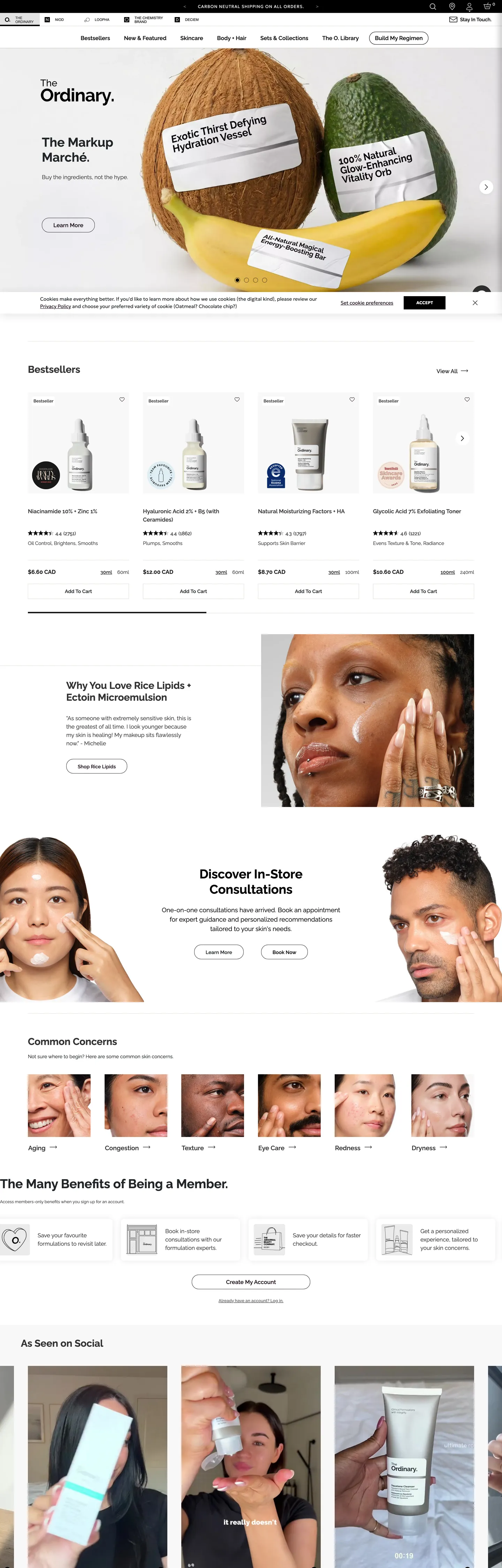
The Ordinary's marketing site communicates through deliberate visual silence. The hero is a white panel with a 36px bold Raleway headline, a product photograph, and a text sub-head — no gradient, no brand-colored CTA, no hero animation. The page continues this way below the fold: white cards with 20px border radius, product grids on white, editorial callout panels on white. The single moment of color is a hot magenta (#dc049b) that appears on promotional badges and price-chip borders — 33 occurrences in the extracted page, all on callout elements rather than primary interactive surfaces. Where most skincare brands build brand identity through color saturation (Tatcha's gold, Sunday Riley's sage, Youth to the People's sage-and-carbon), The Ordinary builds identity through its clinical absence of decoration.
The DESIGN.md file packages the system into a machine-readable spec for React and AI tooling. Inside: 12 colors tokens organized around three near-black ink tones (#212529 at 1020 occurrences, #333333 at 874, #22121f at 217) for text and borders, a pure-white canvas, a light beige (#e1ded9) hairline, and the hot magenta accent. Ten typography tokens span Raleway at 14-36px in weights 400/600/700 for display, body, and UI chrome, plus Geologica at 11-16px in weights 300/600/700 for uppercase labels. Five component groups cover the white-card grid, the black-border primary button, the monochrome top-nav, and the Raleway-driven hero heading.
Feed this file to Claude or Cursor to reproduce The Ordinary's specific moves: white canvas with no tint, near-black text at #212529 (not pure black), Raleway at 700 for the only bold moment in the hierarchy, 20px card rounding as the single expressive shape move, and hot magenta reserved exclusively for promotional badges. The system is worth studying as a counter-example to the beauty-brand norm: it demonstrates that a skincare product page can convey authority through restraint rather than through brand-color saturation.
What makes it distinct
5
- Clinical white canvasno hero gradient, no tinted section fill, no brand-colored button background; the design says nothing so the formulas can say everything
- Raleway at weight 700 for headings36px bold h2 headings anchor a system where the display tier is the only weight-contrast move in the typography stack
- Hot magenta #dc049b appears 33 times as a badge and borderthe single chromatic deviation in an otherwise monochrome page, reserved for promotional callouts and sale chips
- Geologica as secondary voiceuppercase small-caps labels and cookie-banner body text run a different geometric sans, giving the page two distinct geometric voices
- Near-black ink triothree dark tones (#212529, #333333, #22121f) carry the page without a single pure black (#000000) in the primary text flow
theordinary.com
Live at theordinary.com
A snapshot of the brand in production. Scroll the frame to see the whole page.
Colors
12 colors
The Ordinary's system runs on #000000 as its primary voltage, used in 2 of 15 components. Type is set in Raleway across 12 tokens from 11.2px to 36px, weights 300–700. Shape language is mixed across 15 components, blending pills, soft rounds, and squarer corners.
Brand & Accent
Sparing, CTA-only voltage · 1
Surface
Page and card backgrounds · 2
Text
Headlines, body, captions · 5
Borders & Hairlines
Dividers, outlines, rules · 2
Other
Specialty colors · 2
Typography
12 type tokens
Set in Raleway across 12 tokens, from 11.2px to 36px, weights 300–700. Shown in its own stack: where the font isn't installed, the fallback the file names stands in.
- display-xl36px · weight 700 · lh 43.2pxThe quick brown fox jumps over the lazy dog
- heading-md18px · weight 600 · lh 27pxThe quick brown fox jumps over the lazy dog
- heading-sm16px · weight 700 · lh 17pxThe quick brown fox jumps over the lazy dog
- body-lg18px · weight 400 · lh 27pxThe quick brown fox jumps over the lazy dog
- body-md16px · weight 400 · lh 24pxThe quick brown fox jumps over the lazy dog
- body-sm14px · weight 400 · lh 19.5pxThe quick brown fox jumps over the lazy dog
- nav-link16px · weight 400 · lh 24pxThe quick brown fox jumps over the lazy dog
- button-md16px · weight 600 · lh 42pxThe quick brown fox jumps over the lazy dog
- caption13px · weight 400 · lh 17pxThe quick brown fox jumps over the lazy dog
- label-caps11.2px · weight 700 · lh 23.8px · tracking 0.896pxThe quick brown fox jumps over the lazy dog
- label-geo16px · weight 600 · lh 22.4pxThe quick brown fox jumps over the lazy dog
- label-geo-sm12px · weight 300 · lh 14px · tracking 0.96pxThe quick brown fox jumps over the lazy dog
Layout
Radii and spacing
8 corner radii and 8 spacing values. Shape language: mixed.
Radii
- none0px
- xs2px
- sm4px
- md5px
- lg9px
- xl20px
- full50%
- pill110px
Spacing
- xxs3px
- xs4px
- sm8px
- md12px
- base16px
- lg20px
- xl32px
- 2xl40px
Components
15 components
Each rendered from its tokens (color, type, radius, padding) on The Ordinary's own canvas.
- Hero Headinghero-headingHero Heading
- Body Paragraphbody-paragraphBody Paragraph
- Body Paragraph Mutedbody-paragraph-mutedBody Paragraph Muted
- Button Primarybutton-primaryButton Primary
- Button Secondarybutton-secondaryButton Secondary
- Top Navtop-navTop Nav
- Nav Linknav-linkNav Link
- CardcardCard
- Badge Magentabadge-magentaBadge Magenta
- Section Headingsection-headingSection Heading
- Label Capslabel-capsLabel Caps
- Type here…text-inputText Input
- Product Nameproduct-nameProduct Name
- CaptioncaptionCaption
- Surface Tintedsurface-tintedSurface Tinted
In use
The system, in use
The Ordinary's tokens on the kind of product it builds.
Build something people actually use.
A short paragraph of marketing copy that previews how the brand's display tier and body tier read together. Two sentences is usually enough.
FAQ
The Ordinary design system FAQ
Common questions about The Ordinary's tokens, components, and how to use this DESIGN.md in your project.
Read next
Related reading
Specs, directories, and component libraries that pair with this design system.
- Browse all design systemsThe full directory of DESIGN.md files on shadcn.io, with live mockups for each.shadcn.io
- The Ordinary — official siteThe Ordinary's public marketing site — the source of truth for the live tokens captured in this file.theordinary.com (opens in a new tab)
- The DESIGN.md specificationGoogle Labs' open spec for machine-readable design system files — the format this page is built on.github.com (opens in a new tab)
Use it
Use The Ordinary in your project
One machine-readable file. Drop it into Claude, Cursor, or any AI tool that reads DESIGN.md.
Download the DESIGN.md
One machine-readable file: every color, type, radius, spacing, and component token of The Ordinary.
Feed it to your AI tool
Drop it into Claude, Cursor, or GitHub Copilot. The agent writes React components and Tailwind classes that match The Ordinary's visual language.
Reference the tokens directly
Or paste the values into your Tailwind config, CSS variables, or component library: every color, size and radius is a quoted, ready-to-copy value.
Read the full DESIGN.md: overview, rationale, do’s and don’ts
Overview
The Ordinary's site is not quiet by accident. Clinical restraint as brand language: the page is a white surface carrying Raleway text and product photographs, with the formulas themselves — Niacinamide 10% + Zinc 1%, Hyaluronic Acid 2% + B5 — doing the identity work that most beauty brands offload to hero gradients and colored CTAs. Where Tatcha layers gold tones and Sunday Riley builds warmth through amber, The Ordinary holds the canvas white and lets the ingredient percentages function as the typography's headline material.
The single chromatic departure is hot magenta (#dc049b) — a saturated fuchsia-adjacent pink that appears on promotional badges and percentage-off chip borders. At 33 total occurrences it is genuinely rare on the page, and its use is strictly semantic: it marks callout information (sale price, limited promotion) rather than brand accent. A developer who applies it to primary CTAs has misread the system.
Near-black trio, not pure black: the primary text color is #212529 (1020 occurrences), a very slightly warm near-black that sits just above pure black. Supporting text runs #333333 (874 occurrences) and the deep plum-black #22121f (217 occurrences). Pure black (#000000) appears 439 times but primarily in structural roles and the nav bar fill — not in body text.
Key Characteristics:
- White canvas throughout — no hero gradient, no section tints, no brand fills behind copy.
- Raleway at weight 700 is the single bold moment: 36px h2 / 43px line-height, used for section headlines only.
- Hot magenta (#dc049b) restricted to 33 occurrences: 11 as text, 22 as border — promotional badges only, never interactive CTAs.
- Two geometric-sans families: Raleway (primary hierarchy) and Geologica (uppercase-label secondary voice).
- 20px card radius is the system's most expressive shape decision — softer than the clinical typography suggests.
- Near-black ink at #212529, not pure #000000, in primary text — a warmth nuance that prevents the white canvas from feeling sterile.
- Primary button: pure black fill (#000000) with white text, sharp corners (0px radius) — the one surface where pure black appears as a fill.
Colors
Ink
- Ink (
{colors.ink}— #212529): frequency 1020. Used as text (519), border (501). The primary near-black, clustered from several very-dark near-charcoal values. Not pure black; the slight warmth prevents the white canvas from reading as a laboratory surface. - Ink Secondary (
{colors.ink-secondary}— #333333): frequency 874. Used as text (435), bg (1), border (438). The secondary near-black wired as--gray-darkand--dark. Fills the top navigation bar and secondary body text. - Ink Deep Plum (
{colors.ink-deep-plum}— #22121f): frequency 217. Used as text (113), border (104). A very dark plum-black used on the darkest UI chrome — modal backgrounds, strong borders, and header separators. - Ink Muted (
{colors.ink-muted}— #757575): frequency 37. Used as text (18), bg (1), border (18). Wired as--grayand--secondary. Secondary labels, price secondary lines, and de-emphasized captions. - Ink Dark (
{colors.ink-dark}— #090a0b): frequency 18. Used as text (9), border (9). The darkest structural ink — near-pure-black used on the strongest hairline borders and emphasis elements. - Primary (
{colors.primary}— #000000): frequency 439. Used as text (216), bg (8), border (203), shadow (12). Wired as--primary. Pure black drives the CTA button fill, some heading text, and shadow values.
Surface
- Canvas (
{colors.canvas}— #ffffff): frequency 336. Used as text (138), bg (68), border (130). The page floor — pure white drives the body canvas and nav text-on-dark surfaces. - Surface Pink (
{colors.surface-pink}— #fce9f5): frequency 11, all as background. A pale magenta-pink used on the light tinted panel that frames in-store consultation promotional cards. Adjacent to the brand magenta but significantly lighter.
Accent
- Magenta (
{colors.magenta}— #dc049b): frequency 33. Used as text (11), border (22). The single chromatic accent on the page — reserved for promotional badge text and sale chip borders.
Hairline
- Hairline (
{colors.hairline}— #e1ded9): frequency 15, all as border. A warm light beige clustered from two near-identical hairline values. Card borders, section dividers, and light separators — not grey, which keeps the white canvas feeling organic rather than clinical.
Typography
Font Families
The system runs two free Google Fonts families. Raleway handles the full primary hierarchy — display headlines at 36px / weight 700, headings at 16-18px / weight 600, running body at 14-18px / weight 400, nav links at 16px / weight 400, and button labels at 16px / weight 600. Geologica carries the secondary annotation layer: uppercase-tracked small-caps labels at 11.2px / weight 700 and cookie-banner body at 14px / weight 300. Unlike most clinical brands that commit to a single ultra-minimal sans (The Outset uses one family, Skinceuticals uses one), The Ordinary runs two sans voices and uses them to separate what is "primary content" (Raleway) from what is "technical annotation" (Geologica).
Hierarchy
| Token | Family | Size | Weight | Use |
|---|---|---|---|---|
{typography.display-xl} | Raleway | 36px | 700 | h2 section headlines |
{typography.heading-md} | Raleway | 18px | 600 | Product names, sub-heads |
{typography.heading-sm} | Raleway | 16px | 700 | Price emphasis, strong labels |
{typography.body-lg} | Raleway | 18px | 400 | Lead body paragraphs |
{typography.body-md} | Raleway | 16px | 400 | Default running text |
{typography.body-sm} | Raleway | 14px | 400 | Caption rows, small descriptions |
{typography.nav-link} | Raleway | 16px | 400 | Nav link labels |
{typography.button-md} | Raleway | 16px | 600 | Button labels |
{typography.caption} | Raleway | 13px | 400 | Meta captions |
{typography.label-caps} | Geologica | 11.2px | 700 | Uppercase small-caps labels, badges |
{typography.label-geo} | Geologica | 16px | 600 | Secondary badge text |
{typography.label-geo-sm} | Geologica | 12px | 300 | Email input placeholder |
Note on Font Substitutes
Both Raleway and Geologica are free on Google Fonts. No substitution is needed. Raleway at weight 700 is the key differentiator in the display tier — swapping to weight 600 loses the visual authority of the headline. Geologica at weight 700 with 0.9px tracking produces the uppercase-label voice; if Geologica is unavailable, DM Sans at 500 with text-transform: uppercase and letter-spacing: 0.08em is the closest available substitute.
Layout
Spacing System
- Base unit: 16px dominant (55 occurrences) and 4px (44 occurrences) as the micro module.
- Tokens:
{spacing.xxs}3px ·{spacing.xs}4px ·{spacing.sm}8px ·{spacing.md}12px ·{spacing.base}16px ·{spacing.lg}20px ·{spacing.xl}32px ·{spacing.2xl}40px. - Card internal padding:
{spacing.base}16px for product cards,{spacing.lg}20px for larger editorial panels. - Section rhythm: 40px between primary content sections.
Grid & Container
- Hero: two-column split at desktop — editorial text left, product photography right, white background both sides.
- Product grid: 4-column carousel at desktop, 20px radius cards on the white canvas.
- Below fold: alternating full-width editorial photography (Why You Love More Lipids, Discover In-Store Consultations) and 4-column product grid segments.
Rhythm
The page alternates between photography-led editorial panels and text-anchored product grids. Section breaks use white space rather than background-color changes — there are no tinted section bands on the page body except the pink {colors.surface-pink} panel for the consultation card.
Elevation
The system has a minimal shadow tier. Pure black (#000000) appears 12 times as shadow — very light 1px shadows used on card hover states. Cards in their resting state carry no shadow; the 20px border radius and the {colors.hairline} (#e1ded9) border provide all the visual separation needed on the white canvas.
Shapes
The radius scale spans two distinct tiers: small-step increments on UI chrome and 20px on content cards.
{rounded.none}0px — the primary CTA button (sharp-cornered black pill) and form input outlines.{rounded.xs}2px — smallest UI chips.{rounded.sm}4px — 10 occurrences on smaller interactive elements.{rounded.md}5px — 8 occurrences on secondary chips and badges.{rounded.lg}9px — 8 occurrences on mid-size card elements.{rounded.xl}20px — 22 occurrences, the dominant card radius. This is the system's expressive move: product cards sit on the white canvas with generous 20px rounding that softens the clinical type.{rounded.full}50% — 22 occurrences on circular icon buttons and profile elements.{rounded.pill}110px — 1 occurrence on a promotional chip.
The sharp primary button beside the 20px card radius is the shape tension in the system — the CTA is the one hard surface against otherwise soft card geometry.
Components
hero-heading — Raleway 36px / 700 at {typography.display-xl}, ink {colors.ink} on white. The system's only bold display moment.
body-paragraph — Raleway 16px / 400 at {typography.body-md}, ink text on white. Default running copy.
body-paragraph-muted — Raleway 14px / 400 at {typography.body-sm}, muted {colors.ink-muted} text. Used for price secondary lines and secondary descriptions.
button-primary — Pure black {colors.primary} fill, white text in Raleway 16px / 600, sharp corners {rounded.none}, 0×20px padding, 40px height. The signature CTA — the one surface in the system where pure black is used as a fill rather than as text.
button-secondary — White {colors.canvas} fill, ink text, 1px ink border, same sharp-corner geometry. Used for secondary actions like "Learn More."
top-nav — Dark {colors.ink-secondary} (#333333) fill, white text, 40px height. The top utility bar carrying the currency selector, location, and secondary links. The nav sits above the main product navigation.
nav-link — Transparent background, white text (on dark nav) or ink text (below nav), Raleway 16px / 400.
card — White canvas, ink text, Raleway 14px / 400, 20px radius {rounded.xl}, 16px padding, 1px {colors.hairline} beige border. The dominant content surface — product image above, name + description + price below.
badge-magenta — Transparent background, magenta {colors.magenta} text and 1px magenta border, Geologica 11.2px / 700 / 0.9px tracking, 4px radius, 2×8px padding. The sole chromatic element in the system — applied only to promotional tags and sale percentages.
section-heading — Raleway 36px / 700, ink text, transparent background. Same as {component.hero-heading} — one display token drives both hero and section heads.
label-caps — Geologica 11.2px / 700 / 0.896px tracking in uppercase, ink text, transparent background. Small-caps section labels and annotation chips.
text-input — White fill, pure black text {colors.primary}, Geologica 12px / 300 for placeholder, sharp corners {rounded.none}, 10px vertical / 40px horizontal padding, 40px height, ink bottom border only (no full-outline box).
product-name — Raleway 18px / 600, ink text. Product title below the product image in card grids.
caption — Raleway 13px / 400, muted {colors.ink-muted} text. Below images and beneath social proof elements.
surface-tinted — Light pink {colors.surface-pink} background, ink text, 20px radius, 16px padding. Used for the in-store consultation promotional panel — the only non-white section surface in the system.
Do's and Don'ts
Do use {colors.magenta} (#dc049b) only on promotional and callout badges — not on primary CTAs, nav links, or headings. The magenta is a semantic accent for "this is a promotion" and loses its signal if applied to interactive chrome.
Do keep the primary button with sharp corners ({rounded.none}) even though the card grid uses 20px rounding. The tension between the button's hard edge and the card's soft radius is a deliberate visual hierarchy — the CTA reads as decisive against the soft grid.
Do use #212529 as the primary text color, not pure {colors.primary} (#000000). The slight warmth in the near-black is what prevents the white-canvas system from reading as harsh or sterile; swapping to pure black shifts the page from clinical-warm to clinical-harsh.
Do let Raleway 700 appear only at 36px for display headlines. Applying bold 700 at body sizes or card labels breaks the weight hierarchy — the system's single bold moment is the h2 headline, and its scarcity is the source of its visual authority.
Don't introduce {colors.surface-pink} (#fce9f5) as a general section background. It appears in one location on the page (the in-store consultation card); using it as a general page-section tint creates a pink brand association the system does not intend.
Don't use {colors.hairline} (#e1ded9) for text or as a hover-state fill — it is a border-only token (15 occurrences, all as border). For a subtle hover background on cards, use a very light tint of {colors.canvas} or add opacity rather than the hairline beige.
Don't apply 20px radius ({rounded.xl}) to buttons or inputs. The 20px radius belongs to content cards; interactive elements use either sharp corners or smaller radii (4-9px). Using it on a button makes the CTA feel like a floating card rather than a tap target.
Don't apply the Geologica family to primary display headings or body paragraphs. Geologica is the annotation family (small-caps labels, badges, cookie-banner text); mixing it into the Raleway-led primary hierarchy undermines the two-voice separation the system is built on.
Known Gaps
- Dark mode: no dark-mode variant is exposed on the marketing surface or in the extracted CSS custom properties.
- Hover and focus states:
{component.button-primary}hover and focus ring styling are not captured; the full state matrix for inputs and interactive cards is absent. - Product detail page: this file captures the homepage only. The product detail page, ingredient glossary, and regimen-builder surfaces carry their own component instances not represented here.
- Mobile navigation: the mobile hamburger drawer and category-navigation tree are not captured in the extracted data.
- Motion: product carousel transitions, scroll-fade reveals on editorial sections, and modal transitions have no documented easing or duration values.
- Loyalty and account surfaces: the Mamboo loyalty program and account dashboard carry their own color accents (the loyalty program uses a purple tier system) not visible in the marketing-page extraction.
- Third-party tolstoy widget: the short-video shoppable widget (captured as
tolstoy-custom-font-family) uses its own typography and is not represented in the token spec.
Healthcare & Wellness
More systems like this
More DESIGN.md files in Healthcare & Wellness.
Pricing
Build it with Pro
The DESIGN.md files are free. Pro adds 6,000+ blocks, premium templates and the MCP server, so your AI editor builds in your system for you.
4.9/5 out of 5 · 150+ reviewsfrom 150+ founders and developers.
Billing
Billed once a year in USD. Cancel anytime.
- How many people can use the license.
- Client work, SaaS products and anything you charge for.
- Production-ready React sections: hero, pricing, features, dashboards and more.
- Complete multi-page sites you can ship as they are.
- React icons from every major library, installable with one command.
- Presets that restyle every block, in light and dark.
- Lets your AI editor search, preview and install blocks for you.
- Priority requests are answered first.
Individual
For personal projects & open source
$32instead of $49/mo
$389 billed yearly
- Seats: 1 seat
- Commercial use: Personal & open source only
- Pro blocks: 6,000+ blocks
- Templates: All 14 templates
- React icons: 294k+ icons
- Themes: All 59 themes
- MCP server: Basic usage
- Support: Standard
Team
Most popularFor freelancers, agencies & startups
$66instead of $99/mo
$789 billed yearly · ≈ $13/dev/mo
- Seats: Up to 5 seats
- Commercial use: Included
- Pro blocks: 6,000+ blocks
- Templates: All 14 templates
- React icons: 294k+ icons
- Themes: All 59 themes
- MCP server: High usage
- Support: Priority
Organization
For companies with larger teams
$132instead of $199/mo
$1,589 billed yearly
- Seats: Unlimited seats
- Commercial use: Included
- Pro blocks: 6,000+ blocks
- Templates: All 14 templates
- React icons: 294k+ icons
- Themes: All 59 themes
- MCP server: Unlimited usage
- Support: Priority
Billed once a year in USD. Cancel anytime.
Individual
For personal projects & open source
$32instead of $49/mo
$389 billed yearly
- How many people can use the license.Seats: 1 seat
- Client work, SaaS products and anything you charge for.Commercial use: Personal & open source only
- Production-ready React sections: hero, pricing, features, dashboards and more.Pro blocks: 6,000+ blocks
- Complete multi-page sites you can ship as they are.Templates: All 14 templates
- React icons from every major library, installable with one command.React icons: 294k+ icons
- Presets that restyle every block, in light and dark.Themes: All 59 themes
- Lets your AI editor search, preview and install blocks for you.MCP server: Basic usage
- Priority requests are answered first.Support: Standard
Team
Most popularFor freelancers, agencies & startups
$66instead of $99/mo
$789 billed yearly · ≈ $13/dev/mo
Everything in Individual, plus
- How many people can use the license.Seats: Up to 5 seats
- Client work, SaaS products and anything you charge for.Commercial use: Included
- Lets your AI editor search, preview and install blocks for you.MCP server: High usage
- Priority requests are answered first.Support: Priority
Organization
For companies with larger teams
$132instead of $199/mo
$1,589 billed yearly
Everything in Team, plus
- How many people can use the license.Seats: Unlimited seats
- Lets your AI editor search, preview and install blocks for you.MCP server: Unlimited usage
- Secure checkout via Stripe
- Code lives in your repo
- Keep what you've shipped if you cancel
- License terms
Your system, built for you
Every block, template and icon, installed by your AI agent in your design system. The DESIGN.md files stay free.