Electronic Arts Design System
EA's marketing system treats game key art as the canvas — a near-black charcoal floor, a single coral-red brand voltage on the EA Play strip, and ElectronicArtsText carrying body type. Tokens for React, Next.js, and AI coding tools.
Add shadcn.io to your AI agent. · Pro It installs blocks, icons and templates in your design system from a prompt, with Pro.
Set up MCP- Primary
- #ff4747
- Typeface
- ElectronicArtsText
- Shape
- Mixed
- Base radius
- 6px
- Colors
- 16
- Type tokens
- 10
- Components
- 16
- Spacing values
- 7
About
About Electronic Arts DESIGN.md
Curated by Dov Azencot · Updated May 19, 2026 · Source ea.com (opens in a new tab)
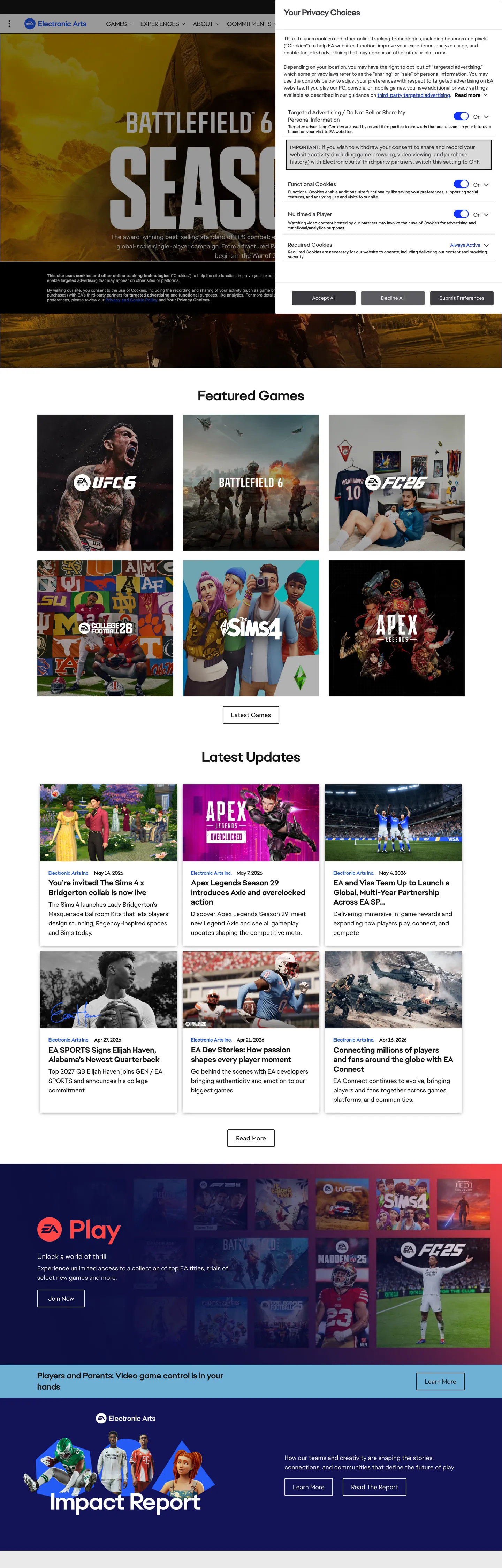
EA's marketing site does what almost no other consumer-software brand attempts at scale: it lets the product art win every above-fold composition. The hero on ea.com is a full-bleed Battlefield 6 screenshot — landscape rendered, in-game HUD intact, "SEASON" stenciled across the lower third — with a charcoal registration drawer floated over the right rail. Below it, the "Featured Games" strip is a 3-by-2 grid of square game-card tiles (UFC 6, EA Sports FC, F1 25, Apex Legends, The Sims) whose own marketing art carries the chromatic identity for each title. The brand chrome — the top nav, the section dividers, the typographic labels — sits back at charcoal #161616 and lets the artwork do the chromatic work. The coral-red EA Play promo band, two-thirds down the page, is the single act of brand voltage on the entire surface.
The DESIGN.md file packages the system into a machine-readable spec for React tooling. Inside: 16 colors tokens — a charcoal-and-bone structural ladder (charcoal #161616, near-black #000, bone #f3f3f3, pure white #ffffff for inverted surfaces), the 2020 coral-and-navy brand pair, a sky-blue hybrid-product accent at #0098ed, and per-platform identifiers for PlayStation deep-blue #003087, Xbox green #52b043, and Nintendo red #fe0016. 11 typography tokens running ElectronicArtsText as the primary sans (with Verdana, Helvetica, Arial as system fallbacks), plus a 12px / 700 Arial micro-label tier for card metadata. A 2-3px tight radius scale plus a 35px pill on standard CTAs. 16 components covering the EA Play promo block, game-card tiles, the registration drawer, the local-nav strip, and the per-platform store chips.
Feed this file to an AI coding tool and it reproduces EA's specific moves: charcoal canvas instead of softer near-black, single coral voltage held in reserve for one promotional band, ElectronicArtsText at modest 14-18px weights with no editorial 48px+ moment, tight 2-3px structural radii contrasted against a 35px pill on the primary CTA, and per-platform color tokens that let the store-shelf chips self-identify without competing with the brand chrome. The one move worth borrowing for any product-led marketing surface: the willingness to subordinate the brand to the artwork. EA gets away with it because the games are visually overwhelming on their own terms; most teams need an interstitial typographic layer the brand controls.
What makes it distinct
5
- Key-art as canvasthe above-fold hero is a full-bleed Battlefield 6 screenshot with the registration drawer overlaid; brand chrome holds back so the game can do the talking
- Single coral voltagecoral red appears as the EA Play promo strip and the --ea-app-brand-color token, the only chromatic brand moment that competes with the game artwork
- Two-token brand paircoral and deep navy together form the 2020 EA wordmark identity, wired as --ea-theme-ea-brand-2020-coral and --ea-theme-ea-brand-2020-deep-blue
- ElectronicArtsText at modest sizesproprietary sans at 14-18px / 400 carries body and captions; there is no 48px+ editorial display moment in the marketing chrome
- Per-platform palettePlayStation deep-blue, Xbox green, Nintendo red, EA Access blue each get their own brand-color CSS variable for store-shelf logo treatments
ea.com
Live at ea.com
A snapshot of the brand in production. Scroll the frame to see the whole page.
Colors
16 colors
Electronic Arts's system runs on #ff4747 as its primary voltage, used in 2 of 16 components. Type is set in ElectronicArtsText across 10 tokens from 12px to 32px, weights 400–700. Shape language is mixed across 16 components, blending pills, soft rounds, and squarer corners.
Brand & Accent
Sparing, CTA-only voltage · 3
Surface
Page and card backgrounds · 1
Text
Headlines, body, captions · 3
Borders & Hairlines
Dividers, outlines, rules · 1
Other
Specialty colors · 8
Typography
10 type tokens
Set in ElectronicArtsText across 10 tokens, from 12px to 32px, weights 400–700. Shown in its own stack: where the font isn't installed, the fallback the file names stands in.
- display-md32px · weight 700 · lh 38pxThe quick brown fox jumps over the lazy dog
- display-sm24px · weight 700 · lh 30pxThe quick brown fox jumps over the lazy dog
- heading-md20px · weight 700 · lh 26pxThe quick brown fox jumps over the lazy dog
- body-lg18px · weight 400 · lh 27pxThe quick brown fox jumps over the lazy dog
- body-md14px · weight 400 · lh 21pxThe quick brown fox jumps over the lazy dog
- body-sm14px · weight 400 · lh 20pxThe quick brown fox jumps over the lazy dog
- button-md16px · weight 700 · lh 24pxThe quick brown fox jumps over the lazy dog
- nav-link14px · weight 700 · lh 16pxThe quick brown fox jumps over the lazy dog
- label-allcaps12px · weight 700 · lh 14pxThe quick brown fox jumps over the lazy dog
- caption12px · weight 400 · lh 14pxThe quick brown fox jumps over the lazy dog
Layout
Radii and spacing
5 corner radii and 7 spacing values. Shape language: mixed.
Radii
- none0px
- xs2px
- sm3px
- md6px
- pill35px
Spacing
- xs5px
- sm6px
- base10px
- md12px
- lg16px
- xl18px
- 2xl32px
Components
16 components
Each rendered from its tokens (color, type, radius, padding) on Electronic Arts's own canvas.
- Hero Sectionhero-sectionHero Section
- Registration Drawerregistration-drawerRegistration Drawer
- Game Cardgame-cardGame Card
- Game Card Labelgame-card-labelGame Card Label
- Body Paragraphbody-paragraphBody Paragraph
- Body Paragraph Mutedbody-paragraph-mutedBody Paragraph Muted
- Button Primarybutton-primaryButton Primary
- Button Primary Disabledbutton-primary-disabledButton Primary Disabled
- Button Secondarybutton-secondaryButton Secondary
- Cta Squarecta-squareCta Square
- Top Navtop-navTop Nav
- Nav Linknav-linkNav Link
- Ea Play Bandea-play-bandEa Play Band
- Hero Headinghero-headingHero Heading
- Type here…text-inputText Input
- Platform Chipplatform-chipPlatform Chip
In use
The system, in use
Electronic Arts's tokens on the kind of product it builds.
Build something people actually use.
A short paragraph of marketing copy that previews how the brand's display tier and body tier read together. Two sentences is usually enough.
FAQ
Electronic Arts design system FAQ
Common questions about Electronic Arts's tokens, components, and how to use this DESIGN.md in your project.
Read next
Related reading
Specs, directories, and component libraries that pair with this design system.
- Browse all design systemsThe full directory of DESIGN.md files on shadcn.io, with live mockups for each.shadcn.io
- Electronic Arts — official siteElectronic Arts' public marketing site — the source of truth for the live tokens captured in this file.ea.com (opens in a new tab)
- The DESIGN.md specificationGoogle Labs' open spec for machine-readable design system files — the format this page is built on.github.com (opens in a new tab)
Use it
Use Electronic Arts in your project
One machine-readable file. Drop it into Claude, Cursor, or any AI tool that reads DESIGN.md.
Download the DESIGN.md
One machine-readable file: every color, type, radius, spacing, and component token of Electronic Arts.
Feed it to your AI tool
Drop it into Claude, Cursor, or GitHub Copilot. The agent writes React components and Tailwind classes that match Electronic Arts's visual language.
Reference the tokens directly
Or paste the values into your Tailwind config, CSS variables, or component library: every color, size and radius is a quoted, ready-to-copy value.
Read the full DESIGN.md: overview, rationale, do’s and don’ts
Overview
EA's marketing site inverts the consumer-software convention. Artwork as canvas: where Apple paints its product on a bone surface, Spotify wraps a brand-green block around the player, and most game-publisher pages run an editorial display headline over a still illustration, EA fills the above-fold with a live game key-art frame — Battlefield 6 in the captured render — and floats a charcoal registration drawer over its right rail. The brand chrome holds itself to a single coral-red voltage ({colors.primary} — #ff4747, wired as --ea-app-brand-color and --ea-theme-ea-brand-2020-coral) that appears exactly once with any presence on the page: the EA Play promo strip two-thirds down. Below the strip, the page returns to charcoal and lets the second wave of game-card tiles (UFC 6, EA Sports FC, The Sims, Apex Legends) carry their own chromatic identity.
Two-token brand pair: the 2020 wordmark identity pairs the coral red with a deep navy ({colors.primary-navy} — #0d1042, wired as --ea-theme-ea-brand-2020-deep-blue). The coral does CTA and emphasis duty on dark surfaces; the navy is the dark end-stop on the gradient pair, rarely visible on the marketing site but exposed in the CSS as the second half of the brand identity. A sky-blue product accent ({colors.product-blue} — #0098ed, wired as --ea-hybrid-brand-color-primary and --ea-hybrid-color-primary) lives in product UI surfaces (the storefront cart, account settings, the loader spinners) but never appears in the captured marketing chrome.
Typography is restrained to ElectronicArtsText at modest 14-18px sizes — there is no editorial display moment in the marketing chrome itself. The display work happens inside the screen-printed type on each game's key art: "SEASON" stenciled in white over the Battlefield landscape, the F1 25 wordmark across the F1 tile, the Apex Legends logotype on its purple card. Where Spline runs Spline Sans at 58px / 500 as its loudest typographic moment, EA's loudest type lives inside the artwork itself; the brand chrome stays at the body tier.
Key Characteristics:
- Charcoal canvas (
{colors.canvas}— #161616, not pure black) wired into 22+ CSS custom properties including--ea-dark-colorand--ea-theme-tile-color— the dominant structural background, used as text 66 times and border 66 times. - Single coral-red voltage (
{colors.primary}— #ff4747) reserved for the EA Play promo band and inline emphasis; the only chromatic moment in the brand chrome. - Two-token brand pair: coral plus deep navy
{colors.primary-navy}(#0d1042) form the 2020 EA wordmark identity gradient. - Per-platform color tokens (
{colors.playstation}deep blue,{colors.xbox}green,{colors.nintendo}red,{colors.ea-access}blue) for store-shelf chips and platform-availability labels. ElectronicArtsTextbody type at 14-18px / 400 with no display tier on the marketing chrome — the screen-printed game-title type inside the key art does that job.- Tight 2-3px structural radii on cards and forms (
{rounded.xs}/{rounded.sm}) contrasted against a 35px pill ({rounded.pill}) on the standard CTA — the system is binary, no middle tier. - Game-card tiles render with 0 radius (
{rounded.none}) so the artwork reads as a screen rather than as a UI element. - 700-weight Arial caption tier (
{typography.label-allcaps}) carries small label work (NEW, PRESALE, FEATURED) that the primary sans handles less crisply at 12px.
Colors
Brand
- Coral Primary (
{colors.primary}— #ff4747): wired as--ea-app-brand-colorand--ea-theme-ea-brand-2020-coral. The single brand voltage on the page — fills the EA Play promo band, inline emphasis tokens, and active-state indicators across product surfaces. Coral rather than fire-engine red: warm, just shy of orange, designed to sit beside the deep navy without clashing. - Coral Deep (
{colors.primary-deep}— #fc2442): wired as--ea-theme-ea-brand-2017-dark-gradient,--ea-theme-ea-brand-2017-light-gradient, and--ea-theme-ea-brand-2017-pink. A slightly hotter coral-pink holdover from the 2017 wordmark generation, still declared in CSS but not visible on the captured page. - Brand Navy (
{colors.primary-navy}— #0d1042): wired as--ea-theme-ea-brand-2020-deep-blueand--ea-theme-dark-gradient. The dark end-stop of the 2020 wordmark gradient pair — deep, near-violet navy that anchors the brand identity opposite the coral. - Product Sky (
{colors.product-blue}— #0098ed): wired as--ea-hybrid-brand-color-primary,--ea-hybrid-color-primary, and the brand-primary-500 stop. The product UI accent — storefront cart icons, settings checkboxes, loader spinners. Distinct from the marketing brand pair; lives behind the login wall.
Surface
- Canvas (
{colors.canvas}— #161616): frequency 134 — used as text 66 times and as border 66 times. Wired as--ea-dark-color,--ea-theme-tile-color, and--ea-hybrid-neutral-color-800. The dominant structural floor: registration drawer fills, game-card tile fills, top-nav backdrop. Not pure black — 9% lightness charcoal so true blacks inside game key art read as deeper. - Ink Black (
{colors.ink-black}— #000000): frequency 33. Wired as--eacom-color-blackand--ea-hybrid-theme-drawer-color. Reserved for inverted scrims, modal backdrops, and the absolute-darkest text on the bone tier. - Bone (
{colors.bone}— #f3f3f3): frequency 26 — used as text 12 times, border 12 times. Wired as--eacom-color-light-gray,--ea-light-color,--ea-hybrid-theme-light-text-color. The light-mode floor — appears on email-form inputs, "How our teams…" body copy beneath the Impact Report block. - Paper (
{colors.paper}— #ffffff): frequency 17. Pure white — used inside inverted surfaces where the bone's warmth would compete with form content.
Text
- Ink Muted (
{colors.ink-muted}— #7c7c7c): wired as--ea-hybrid-neutral-color-500and a small set of secondary-text variables. Caption rows, "Read more" links beneath card descriptions, metadata labels.
Link
- Link Blue (
{colors.link-blue}— #255af6): frequency 10 — used as text 5 times, border 5 times. Wired as--ea-theme-tabs-interface-color. The active-tab indicator and inline-link tone on light surfaces. Distinct from the product sky{colors.product-blue}; saturated cobalt rather than airy sky.
Platform
- PlayStation (
{colors.playstation}— #003087): wired as--playstation-brand-color. Reserved for PlayStation store-shelf chips and platform-availability labels. - Xbox (
{colors.xbox}— #52b043): wired as--xbox-brand-colorand--eacom-color-xbox-green. Reserved for Xbox platform chips. - Nintendo (
{colors.nintendo}— #fe0016): wired as--nintendo-brand-color. Reserved for Nintendo Switch platform chips — distinct from the brand coral; harder, fire-engine red. - EA Access (
{colors.ea-access}— #0089cd): wired as--ea-access-brand-color. The historic EA Access subscription product identifier, predating the EA Play rebrand.
Chrome
- Hairline (
{colors.hairline}— #e2e2e2): wired as--ea-hybrid-neutral-color-200. The 1px divider tone between cards on bone surfaces. - CTA Disabled (
{colors.cta-disabled}— #bababa): wired as--ea-theme-bracket-predictor-next-cta-bg-disabled. The grayed-out button fill for inactive primary CTAs.
Typography
Font Family
The system runs ElectronicArtsText as the proprietary primary sans across body, label, and caption surfaces. The CSS declaration is "ElectronicArtsText", "Verdana", "Helvetica", "Arial", sans-serif — Verdana sits first in the fallback chain because it carries wider counters at body sizes than Helvetica does, which the licensed-text fallback needs to preserve. A secondary Arial-only stack at 700 weight, 12px carries small-caps card labels (NEW, FEATURED, PRESALE) where ElectronicArtsText would render less crisply at the small size. There is no display-tier family declared in the captured CSS because the marketing chrome carries no 48px+ moment; the display work happens inside the screen-printed type on each game's key art.
Hierarchy
| Token | Size | Weight | Line Height | Use |
|---|---|---|---|---|
{typography.display-md} | 32px | 700 | 38px | Hero heading in the registration drawer ("Your Privacy Principles") |
{typography.display-sm} | 24px | 700 | 30px | EA Play promo band title, section-shelf titles |
{typography.heading-md} | 20px | 700 | 26px | Sub-section titles ("Featured Games", "Latest Updates") |
{typography.body-lg} | 18px | 400 | 27px | Body copy beneath the Impact Report block, story leads |
{typography.body-md} | 14px | 400 | 21px | Default running text, card descriptions |
{typography.body-sm} | 14px | 400 | 20px | Caption rows beneath game cards |
{typography.button-md} | 16px | 700 | 24px | Primary and secondary button labels |
{typography.nav-link} | 14px | 700 | 16px | Top-nav link labels |
{typography.label-allcaps} | 12px | 700 | 14px | Small-caps card labels (NEW, FEATURED, PRESALE) — rendered in Arial |
{typography.caption} | 12px | 400 | 14px | Metadata, dates, tertiary labels — also in Arial |
Principles
Body weight stays at 400; emphasis lives at weight 700 with no semibold middle. The system is binary on weight just as it is on radius. The 700-weight Arial micro-tier is the system's confession that ElectronicArtsText loses crispness below 14px — Arial holds up at 12px in a way the licensed family does not, and the swap is deliberate rather than accidental. Where Cloudflare uses a second monospace family for label duty and Stripe uses uppercase-tracked sans, EA simply switches to a stricter geometric sans for the small-cap tier.
Note on Font Substitutes
ElectronicArtsText is a proprietary licensed family. Inter at the same weights is the closest open-source substitute; the wide counters and modest weight ladder transfer cleanly. Verdana is already in the fallback stack and renders adequately on Windows targets. For the Arial caption tier, Helvetica or system-ui will work without compromise — Arial is already a system font and needs no substitute.
Layout
Spacing System
- Base unit: 10px is the dominant gap value in the captured page (frequency 10), with 16px (frequency 8) as the secondary module.
- Tokens:
{spacing.xs}5px ·{spacing.sm}6px ·{spacing.base}10px ·{spacing.md}12px ·{spacing.lg}16px ·{spacing.xl}18px ·{spacing.2xl}32px. - Section padding (vertical): ~32px between game-shelf bands; the hero key-art band runs edge-to-edge with no vertical padding above the next shelf.
- Card internal padding: the registration drawer carries
{spacing.2xl}(32px) of inner padding; game cards carry no padding at all because the artwork fills the tile edge-to-edge. - Top-nav padding:
{spacing.md}(12px) vertical,{spacing.2xl}(32px) horizontal.
Grid & Container
- Max content width: the registration drawer caps at ~528px on the right rail of the hero; below-fold game shelves run to ~1080px wide.
- Hero: full-bleed game key-art with the registration drawer overlaid on the right rail, no max-width on the artwork itself.
- Featured Games shelf: 3-column grid of square game tiles on desktop, collapsing to 2-column on tablet and 1-column on mobile.
- Latest Updates shelf: 3-column grid of editorial cards with key-art thumbnails on the left and headline copy stacked to the right.
- EA Play promo band: full-bleed, edge-to-edge coral fill spanning the entire page width.
Rhythm
The page alternates between full-bleed artwork bands and 3-column shelf bands. The hero is full-bleed (Battlefield 6 key art). The next two sections are shelves (Featured Games, Latest Updates). Then the EA Play band returns to full-bleed (coral fill). The Impact Report block at the bottom returns to a constrained centered composition. The rhythm is shelf-then-band, shelf-then-band — not a uniform tempo.
Elevation
The system has essentially no shadow tier. The captured page reports zero shadow occurrences across the structural color set; depth comes from charcoal-on-charcoal tile contrast and from key-art bleeding into the canvas at the tile edges. Where Stripe uses brand-tinted rgba shadows to add atmosphere and Linear uses a surface ladder of three near-black tones, EA simply layers tiles at the same {colors.canvas} value and lets the artwork inside each tile do the depth work.
- Flat (no shadow): every band on the page — hero, shelves, EA Play band, footer.
- Tonal lift: none. Tiles sit at the same
{colors.canvas}value as the floor; the visual lift comes from the key-art image bleeding to the tile edge. - Hairline borders: confined to the bone-surface band at the bottom of the page (
{colors.hairline}1px between cards). The dark canvas above has no border tone at all.
Shapes
The radius scale is binary: a tight structural tier plus a generous pill.
- Tight structural:
{rounded.xs}2px (platform chips, inline tag badges) and{rounded.sm}3px (registration drawer, form inputs, secondary cards) — these are the dominant card radii. - Pill:
{rounded.pill}35px — exclusively the standard CTA button, wired as--ea-theme-cta-standard-rounded-border-radius. The pill is the warmest-feeling element on every dark band. - Square (0px):
{rounded.none}— game-card tiles, hero key-art bleed, EA Play band edges. The artwork-bearing surfaces never round because the rounding would crop the in-game scene at the corners.
There is no 8 / 12 / 16px middle tier. A surface is either tight (2-3px), square (0px), or a full 35px pill — the contrast is the system's CTA-affordance signal.
Components
hero-section — Full-bleed game key-art bleeding to all four edges, no padding, no radius. Holds the registration drawer floated on the right rail and any in-game type baked into the artwork.
registration-drawer — Charcoal {colors.canvas} fill, white text, {rounded.sm} 3px radius, 32px internal padding, 1px hairline border. Holds the "Your Privacy Principles" headline, toggle switches for tracking permissions, and Accept All / Reject All CTAs.
game-card — Square tile rendering the game's key art edge-to-edge. No radius ({rounded.none}), no padding, no border. The artwork itself carries the chromatic identity and the in-tile logotype.
game-card-label — Small-caps Arial label at 12px / 700, white text on transparent. NEW / FEATURED / PRESALE indicators positioned absolute in the top-left corner of the game-card tile.
body-paragraph — Bone {colors.bone} text at {typography.body-lg} (18px / 400) on the charcoal canvas. The story-lead paragraph style.
body-paragraph-muted — Ink-muted {colors.ink-muted} variant for tertiary metadata.
button-primary — Coral {colors.primary} fill, white text, {rounded.pill} 35px pill, 12×32px padding, 44px height, weight 700. The signature CTA — "Accept All" in the registration drawer is the canonical instance.
button-primary-disabled — Disabled variant flips to {colors.cta-disabled} (#bababa) gray. Same dimensions, same pill rounding.
button-secondary — Transparent fill, white text, 1px white outline, {rounded.pill} pill, 12×32px padding. Used for "Learn More" tertiary actions on dark bands.
cta-square — Charcoal fill, white text, {rounded.sm} 3px radius, 10×16px padding, 40px height. The "Learn more" inline CTA beneath shelf headings — the only non-pill button shape on the page.
top-nav — Charcoal {colors.canvas} surface, 56px height, 12×32px padding. EA wordmark flush left, product links (Games, News, Help, About) center, sign-in flush right.
nav-link — Transparent background, white text in {typography.nav-link} (14px / 700), 10×12px padding. No hover background fill visible on the captured surface.
ea-play-band — Full-bleed coral {colors.primary} fill, white text, no radius, 32×16px padding. Holds the "EA Play" wordmark, the subscription pitch, and a paired primary CTA. The single chromatic brand moment in the page chrome.
hero-heading — White text on the charcoal registration drawer, {typography.display-md} (32px / 700). Smaller than typical SaaS hero headlines because the artwork outside the drawer is the visual headline.
text-input — Bone {colors.bone} fill, ink-black text, {rounded.sm} 3px radius, 10×12px padding, 40px height, 1px hairline border. Used inside the email signup form at the bottom of the page.
platform-chip — Charcoal fill, white small-caps text in {typography.label-allcaps}, {rounded.xs} 2px radius, 6×10px padding, 24px height. Platform-availability indicator chips (PS5, Xbox Series X, PC, Switch).
Do's and Don'ts
Do subordinate the brand chrome to the game key art. The single move that defines this system is the full-bleed Battlefield hero with the brand color held back to a single promo band 1500px down the page. Multiplying coral moments — coral nav links, coral card outlines, coral icons — would erase the "artwork wins" principle and reduce the system to generic SaaS chrome.
Do use {colors.canvas} (#161616) as the structural floor, never pure {colors.ink-black} (#000000). The 9% lightness charcoal keeps the surrounding chrome subordinate to the true blacks inside game key art; pure black on the canvas would compete with the in-game shadows and flatten the depth.
Do swap to {typography.label-allcaps} (Arial 12px / 700) for any small-caps label below 14px. ElectronicArtsText loses crispness at small sizes; Arial holds up. The swap is the system's deliberate confession about its proprietary family's small-size limits.
Do preserve the binary radius scale. Tight 2-3px structural rounding on cards and forms contrasted against a 35px pill on the CTA is the system's tap-affordance signal — a button at 8px radius would read as a card, and a card at 35px radius would read as a button.
Don't render game-card tiles with any corner radius. The artwork inside each tile is meant to read as a screen, not as a UI element; rounding the corners crops the in-game scene at the edges and shifts the metaphor from "window into the game" to "icon representing the game."
Don't use the per-platform colors ({colors.playstation} / {colors.xbox} / {colors.nintendo}) outside platform-availability chips. Each carries a single semantic role — store-shelf identifier — and using {colors.xbox} (#52b043) as a generic success-state green would create a brand-licensing problem and confuse the platform mapping.
Don't add a coral inline-link tone. Link work belongs to {colors.link-blue} (#255af6); the coral is reserved for the EA Play band and emphasis tokens. Coral underlines on body links would dilute the single-voltage discipline and read as a Cyber Monday treatment rather than as the EA brand.
Don't render a hero headline at 48px+ in the brand chrome. The system carries no editorial display tier on purpose — the screen-printed type inside each game's key art does that job. A 48px ElectronicArtsText display in the brand chrome would compete with the title typography inside the artwork and undermine the "artwork wins" composition.
Known Gaps
- Hover and focus states: the captured marketing surfaces show resting states only; the full state matrix (focus rings, active press, disabled tints beyond
{colors.cta-disabled}) is not exposed in the static render. - Form input error states:
{component.text-input}carries the resting state on bone surfaces; error and validation styling lives inside the storefront / account flow behind the login wall and is not represented here. - Display typography: no 48px+ editorial display token is declared in the captured CSS because the marketing chrome doesn't render one. Game-marketing sub-sites (battlefield.com, apexlegends.com) carry per-title display families that are not represented here.
- Motion: game key-art tiles auto-rotate through a small carousel on hover; the spec captures end-state values only. Easing, duration, and stagger live in the live runtime.
- Product surfaces: this DESIGN.md captures ea.com only. The EA App (desktop client), the Origin / EA storefront, and per-title game sites (FC, F1, Apex, Battlefield) each carry their own surface tokens that are not represented.
- Dark/light mode pair: the system exposes both
--ea-dark-colorand--ea-light-colorplus paired dark/light gradient tokens, but the captured marketing surface runs the dark variant exclusively. A light variant exists for storefront contexts and is not represented here. - Subscription tier styling: the EA Play / EA Play Pro tier accents (gold badges, tier-1 indicators) are exposed in CSS but do not appear in the captured marketing chrome above the EA Play band.
Gaming & Entertainment
More systems like this
More DESIGN.md files in Gaming & Entertainment.
Pricing
Build it with Pro
The DESIGN.md files are free. Pro adds 6,000+ blocks, premium templates and the MCP server, so your AI editor builds in your system for you.
4.9/5 out of 5 · 150+ reviewsfrom 150+ founders and developers.
Billing
Billed once a year in USD. Cancel anytime.
- How many people can use the license.
- Client work, SaaS products and anything you charge for.
- Production-ready React sections: hero, pricing, features, dashboards and more.
- Complete multi-page sites you can ship as they are.
- React icons from every major library, installable with one command.
- Presets that restyle every block, in light and dark.
- Lets your AI editor search, preview and install blocks for you.
- Priority requests are answered first.
Individual
For personal projects & open source
$32instead of $49/mo
$389 billed yearly
- Seats: 1 seat
- Commercial use: Personal & open source only
- Pro blocks: 6,000+ blocks
- Templates: All 14 templates
- React icons: 294k+ icons
- Themes: All 59 themes
- MCP server: Basic usage
- Support: Standard
Team
Most popularFor freelancers, agencies & startups
$66instead of $99/mo
$789 billed yearly · ≈ $13/dev/mo
- Seats: Up to 5 seats
- Commercial use: Included
- Pro blocks: 6,000+ blocks
- Templates: All 14 templates
- React icons: 294k+ icons
- Themes: All 59 themes
- MCP server: High usage
- Support: Priority
Organization
For companies with larger teams
$132instead of $199/mo
$1,589 billed yearly
- Seats: Unlimited seats
- Commercial use: Included
- Pro blocks: 6,000+ blocks
- Templates: All 14 templates
- React icons: 294k+ icons
- Themes: All 59 themes
- MCP server: Unlimited usage
- Support: Priority
Billed once a year in USD. Cancel anytime.
Individual
For personal projects & open source
$32instead of $49/mo
$389 billed yearly
- How many people can use the license.Seats: 1 seat
- Client work, SaaS products and anything you charge for.Commercial use: Personal & open source only
- Production-ready React sections: hero, pricing, features, dashboards and more.Pro blocks: 6,000+ blocks
- Complete multi-page sites you can ship as they are.Templates: All 14 templates
- React icons from every major library, installable with one command.React icons: 294k+ icons
- Presets that restyle every block, in light and dark.Themes: All 59 themes
- Lets your AI editor search, preview and install blocks for you.MCP server: Basic usage
- Priority requests are answered first.Support: Standard
Team
Most popularFor freelancers, agencies & startups
$66instead of $99/mo
$789 billed yearly · ≈ $13/dev/mo
Everything in Individual, plus
- How many people can use the license.Seats: Up to 5 seats
- Client work, SaaS products and anything you charge for.Commercial use: Included
- Lets your AI editor search, preview and install blocks for you.MCP server: High usage
- Priority requests are answered first.Support: Priority
Organization
For companies with larger teams
$132instead of $199/mo
$1,589 billed yearly
Everything in Team, plus
- How many people can use the license.Seats: Unlimited seats
- Lets your AI editor search, preview and install blocks for you.MCP server: Unlimited usage
- Secure checkout via Stripe
- Code lives in your repo
- Keep what you've shipped if you cancel
- License terms
Your system, built for you
Every block, template and icon, installed by your AI agent in your design system. The DESIGN.md files stay free.