Crunchyroll Design System
Crunchyroll's design system as a DESIGN.md file. Orange #ff5e00, Crunchyroll Atyp, 18 colors, 18 components. For React, Next.js, AI tools.
Add shadcn.io to your AI agent. · Pro It installs blocks, icons and templates in your design system from a prompt, with Pro.
Set up MCP- Primary
- #ff5e00
- Typeface
- DMSans
- Shape
- Soft
- Base radius
- 0px
- Colors
- 18
- Type tokens
- 9
- Components
- 18
- Spacing values
- 10
About
About Crunchyroll DESIGN.md
Curated by Dov Azencot · Updated May 13, 2026 · Source crunchyroll.com (opens in a new tab)
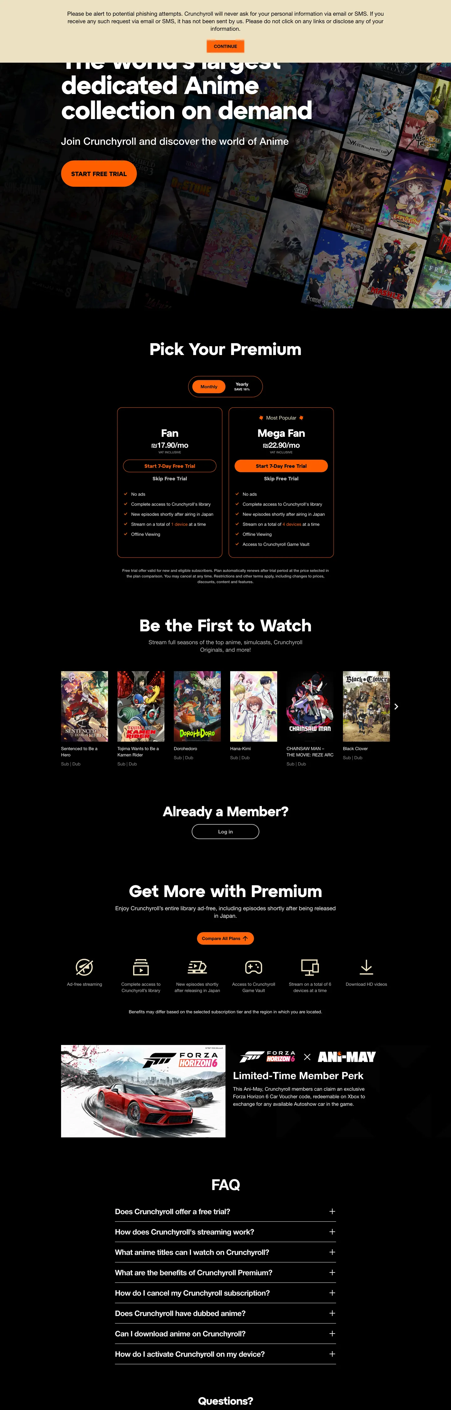
Crunchyroll's homepage runs a two-canvas page rather than a single dark theme. The hero band sits on near-black "#151515" so the "World's largest dedicated Anime collection on demand" headline reads at maximum contrast against the poster-grid wallpaper behind it, but every section below — the plan-picker section, the "Be the First to Watch" simulcast rail, the "Get More with Crunchyroll" benefits row, the FAQ accordion, the legal footer — flips to a "#ffffff" background with black text. Crunchyroll Orange ("#ff5e00") appears in exactly three places out of 9 extracted brand tones: the "Start free trial" CTA pill, the "Mega Fan" plan-card outline, and the FAQ row chevron. Where most streaming homepages run one continuous dark theme, Crunchyroll inverts the canvas at the fold — the hero is for atmosphere, the funnel below is for conversion.
This page packages the homepage chrome into a single DESIGN.md file built on the Google Labs spec. Inside: 18 colors tokens grouped into brand, ink, surface, and hairline roles built from 9 extracted hex values; 9 typography levels spanning a "10px"–"80px" range with the Atyp display and DMSans body stacks; 5 corner radii anchored on the "48px" capsule (8 occurrences) and a "100px" full-pill (5 occurrences) for the FAQ rows; a 10-step spacing scale running on the "10px"/"12px" double-base unit that drove 97 of 220 measurements; and 18 components recipes covering the orange pill CTA, the "Fan / Mega Fan" plan-card pair, the simulcast tile grid, the chevron-rotating FAQ row, and the limited-time promo banner. The extraction registered only 4 CSS variables on ":root" — every other value here is a render-time measurement.
Feed the file to Claude, Cursor, or GitHub Copilot and the agent writes funnel components that match Crunchyroll's vocabulary — the two-canvas hero/body inversion, the single-orange CTA discipline, the "48px" capsule shape — rather than a generic streaming template. Or reference the tokens directly: every hex, font stack, radius, and spacing value is a quoted DESIGN.md value ready for Tailwind config, CSS variables, or your own component library. The system is worth studying as a counter-example to the dark-theme orthodoxy — most anime and gaming streaming sites stay on charcoal end-to-end; Crunchyroll runs a dark hero on top of a light marketing page, treating the canvas switch as a section break rather than a mode.
What makes it distinct
5
- Single orange voltageCrunchyroll Orange ('#ff5e00') restricted to the 'Start free trial' pill, the FAQ chevron, and the 'Mega Fan' plan-card outline; never as hairline or body text
- Near-black hero, white funnel'#151515' on the 1440x900 hero band only, then '#ffffff' takes over for plans, watchlist tiles, FAQ, and footer — a two-canvas page, not one dark theme
- Capsule geometry at '48px'buttons, plan-card frames, and the promo banner all share the same long-pill rounding (8 of 16 measured corners); '100px' carries the FAQ accordion rows
- Two-typeface splitdisplay sits in Crunchyroll Atyp ('80px' hero, '54px' h2, weight '700'); body and nav run DMSans 14–18px / weight '400', no shared family
- Negative-margin overlap rail'-12px' appears 4 times as the row-stack offset that pulls the FAQ chevron rows into one continuous bar with no visible gap
crunchyroll.com
Live at crunchyroll.com
A snapshot of the brand in production. Scroll the frame to see the whole page.
Colors
18 colors
Crunchyroll's system runs on #ff5e00 as its primary voltage, used in 5 of 18 components. Type is set in DMSans across 9 tokens from 10px to 80px, weights 400–700. Shape language is soft — components average 52px corner radius, with no sharp interactive edges.
Brand & Accent
Sparing, CTA-only voltage · 4
Surface
Page and card backgrounds · 5
Text
Headlines, body, captions · 6
Borders & Hairlines
Dividers, outlines, rules · 3
Typography
9 type tokens
Set in DMSans across 9 tokens, from 10px to 80px, weights 400–700. Shown in its own stack: where the font isn't installed, the fallback the file names stands in.
- hero-display80px · weight 700 · lh 80px · tracking -2.24pxThe quick brown fox jumps over the lazy dog
- display-xl54px · weight 700 · lh 64px · tracking -0.5008pxThe quick brown fox jumps over the lazy dog
- display-lg44px · weight 700 · lh 48px · tracking -1.02pxThe quick brown fox jumps over the lazy dog
- display-md34px · weight 700 · lh 40px · tracking -1.02pxThe quick brown fox jumps over the lazy dog
- heading-sm24px · weight 700 · lh 32px · tracking -0.72pxThe quick brown fox jumps over the lazy dog
- body-lg18px · weight 400 · lh 22px · tracking normalThe quick brown fox jumps over the lazy dog
- body-md16px · weight 700 · lh 24px · tracking -0.72pxThe quick brown fox jumps over the lazy dog
- body-base14px · weight 400 · lh 20px · tracking normalThe quick brown fox jumps over the lazy dog
- caption-uppercase10px · weight 500 · lh 16px · tracking normalThe quick brown fox jumps over the lazy dog
Layout
Radii and spacing
5 corner radii and 10 spacing values. Shape language: soft.
Radii
- none0px
- badge8px
- chip16px
- capsule48px
- pill100px
Spacing
- xs4px
- sm10px
- base12px
- md16px
- lg20px
- xl24px
- 2xl32px
- 3xl56px
- 4xl96px
- cta-pad0px 32px
Components
18 components
Each rendered from its tokens (color, type, radius, padding) on Crunchyroll's own canvas.
- Button Cta Orangebutton-cta-orangeButton Cta Orange
- Button Cta Orange Hoverbutton-cta-orange-hoverButton Cta Orange Hover
- Button Secondarybutton-secondaryButton Secondary
- Hero Bandhero-bandHero Band
- Section Headersection-headerSection Header
- Plan Card Baseplan-card-basePlan Card Base
- Plan Card Featuredplan-card-featuredPlan Card Featured
- Plan Badge Popularplan-badge-popularPlan Badge Popular
- Plan Feature Chipplan-feature-chipPlan Feature Chip
- Poster Tileposter-tilePoster Tile
- Poster Tagposter-tagPoster Tag
- Benefit Icon Rowbenefit-icon-rowBenefit Icon Row
- Promo Bannerpromo-bannerPromo Banner
- Faq Rowfaq-rowFaq Row
- Faq Row Expandedfaq-row-expandedFaq Row Expanded
- Faq Chevronfaq-chevronFaq Chevron
- Top Navtop-navTop Nav
- Footer Bandfooter-bandFooter Band
In use
The system, in use
Crunchyroll's tokens on the kind of product it builds.
Build something people actually use.
A short paragraph of marketing copy that previews how the brand's display tier and body tier read together. Two sentences is usually enough.
FAQ
Crunchyroll design system FAQ
Common questions about Crunchyroll's tokens, components, and how to use this DESIGN.md in your project.
Read next
Related reading
Specs, directories, and component libraries that pair with this design system.
- Browse all design systemsThe full directory of DESIGN.md files on shadcn.io, with live mockups for each.shadcn.io
- Crunchyroll — official siteThe anime streaming homepage this DESIGN.md was extracted from.crunchyroll.com (opens in a new tab)
- The DESIGN.md specificationGoogle Labs' open spec for machine-readable design system files — the format this page is built on.github.com (opens in a new tab)
Use it
Use Crunchyroll in your project
One machine-readable file. Drop it into Claude, Cursor, or any AI tool that reads DESIGN.md.
Download the DESIGN.md
One machine-readable file: every color, type, radius, spacing, and component token of Crunchyroll.
Feed it to your AI tool
Drop it into Claude, Cursor, or GitHub Copilot. The agent writes React components and Tailwind classes that match Crunchyroll's visual language.
Reference the tokens directly
Or paste the values into your Tailwind config, CSS variables, or component library: every color, size and radius is a quoted, ready-to-copy value.
Read the full DESIGN.md: overview, rationale, do’s and don’ts
Overview
Crunchyroll's homepage is a two-canvas funnel rather than a single dark theme. The 900px hero band sits on near-black {colors.canvas-dark} ("#151515") so the "World's largest dedicated Anime collection" headline reads at maximum contrast against the poster-grid wallpaper behind it; every section below the fold inverts to {colors.canvas-light} ("#ffffff") with {colors.ink-base} ("#000000") body text. Canvas-switch as fold marker: where streaming peers run one continuous charcoal page top-to-bottom, Crunchyroll uses the light/dark inversion at the hero boundary as the visual cue that you have moved from atmosphere to conversion. The plan-picker section, simulcast rail, benefits row, FAQ accordion, and footer all live on white — only the top hero and the bottom "Limited Time Member Park" promo touch the dark tone.
Type splits across two families. Display runs Crunchyroll Atyp — a proprietary geometric sans — at "80px" / weight 700 / "-2.24px" letter-spacing for the hero (the system's only "80px" token, 1 occurrence), then steps through "54px" / "44px" / "34px" for section heads. Body and navigation run DMSans at 14–18px / weight 400 with a 'Helvetica Neue', helvetica, sans-serif fallback. There is no shared family across display and body — the typeface boundary tracks the canvas boundary. Two-typeface-as-section-marker: where Netflix and Spotify run a single proprietary family across every weight tier, Crunchyroll uses the family swap itself as the hierarchy signal. A reader can identify a "Crunchyroll heading" without seeing color or size — only by the Atyp glyph shapes versus the DMSans body.
The shape language is capsule-and-pill. "48px" appears on 8 of 16 measured corners — the dominant radius — and unifies the "Start free trial" CTA, the "Mega Fan" plan-card outline, and the "Limited Time Member Park" promo banner. The longer "100px" (5 occurrences) is scoped to the FAQ accordion rows, where a track-segment pill reads more clearly as a row affordance than a "48px" capsule would. The remaining radii are scoped: "16px" (2 occurrences) for the small plan-feature chips, "8px" (1 occurrence) for the inline "Most Popular" badge above the Mega Fan card. There is no square corner on any interactive surface, but there is also no full circle — the geometry refuses both extremes.
Key Characteristics:
- Two-canvas split:
{colors.canvas-dark}("#151515") on the hero band only,{colors.canvas-light}("#ffffff") for every section below — a section-break by inversion, not a theme. - Single-shot orange voltage:
{colors.brand-orange}("#ff5e00") used only in three roles — the{component.button-cta-orange}CTA pill, the{component.plan-card-featured}"Mega Fan" outline, and the{component.faq-chevron}expand glyph. Never on hairlines, never on body text. - Two-family type split: Crunchyroll Atyp ("80px"–"34px") for display, DMSans (14–18px) for body. No shared family, no shared weight ladder.
- Capsule geometry at "48px" (8 corners) for buttons and plan cards; "100px" (5) for FAQ accordion rows; "16px" (2) for feature chips; "8px" (1) for the popular badge.
- Negative-margin stacked FAQ: "-12px" appears 4 times as the row-stack offset that pulls accordion rows into one continuous bar.
- Compact "10px"/"12px" double-base spacing: 81 + 16 = 97 of 220 measurements use one of these two values, with "96px" (8 occurrences) reserved as the major section gutter.
Colors
Brand & Accent
- Crunchyroll Orange (
{colors.brand-orange}— "#ff5e00") — frequency 19. Used as background (6), border (8), text (5). The single voltage color, clustered from#ff5e00and#ff640a. Appears on the "Start free trial" CTA pill, the "Mega Fan" plan-card outline, the "Most Popular" badge, and the FAQ expand chevron. Never on hairlines, never on body running text. - Accent Teal (
{colors.accent-teal}— "#2abdbb") — frequency 380. Used as text (190), border (190). Despite the high count, this tone is scoped to link rails and hover-underline states inside DMSans body copy — a structural accent that masquerades as a brand color in the extraction but never carries a CTA or a fill.
Surface
- Canvas Light (
{colors.canvas-light}— "#ffffff") — frequency 618. Used as text (311), border (307). The dominant page surface — every section below the hero, every plan card, every FAQ row, the footer. White is structural here; it is the page, not an accent. - Canvas Dark (
{colors.canvas-dark}— "#151515") — frequency 28. Used as background (24), text (2), border (2). The hero band fill and the "Limited Time Member Park" promo banner. The only dark surface on the page. - Surface Muted (
{colors.surface-muted}— "#f2f2f2") — frequency 110. Used as text (55), border (55). The plan-feature chip fill and the divider tone between FAQ rows when collapsed. Reads as a "card-on-card" tone against the "#ffffff" canvas. - Surface Sand (
{colors.surface-sand}— "#ece1c2") — frequency 5. Used as background (1), text (2), border (2). A warm cream stop scoped to the "Limited Time Member Park" promo card frame — the single warm tone on the entire page, balancing the orange voltage.
Text & Ink
- Ink Base (
{colors.ink-base}— "#000000") — frequency 32. Used as text (13), background (6), border (13). The default body text color on the white funnel — every plan-card label, every FAQ row title, every benefit-row caption. The "background (6)" instances are the orange CTA text glyph color. - Ink Muted (
{colors.ink-muted}— "#8c8c8c") — frequency 468. Used as text (234), border (234). The dominant secondary text — footer legal copy, plan-card supporting copy, poster-tag captions. The single most-used color in the page after white. - Ink Subtle (
{colors.ink-subtle}— "#bbbbbb") — frequency 34. Used as text (16), border (16), shadow (2). The tertiary text color — used for disabled states and the "or" separator inside the email-capture row.
Hairlines
- Hairline Soft (
{colors.hairline-soft}— "#f2f2f2") — same hex as Surface Muted, applied as a 1px rule between collapsed FAQ rows and as the top edge of the footer band. - Hairline Mid (
{colors.hairline-mid}— "#bbbbbb") — same hex as Ink Subtle, used for the plan-feature divider lines inside the "Fan" and "Mega Fan" plan cards.
Typography
Font Families
The system runs Crunchyroll Atyp for every display tier, with fallback to arial, helvetica, sans-serif. Atyp is a proprietary geometric sans licensed only to Crunchyroll. Body, navigation, and form labels run DMSans with fallback to 'Helvetica Neue', helvetica, sans-serif — DMSans is the open-source Google Fonts release of DM Sans by Colophon Foundry. There is no shared family across display and body; the typeface boundary is the hierarchy signal.
Hierarchy
| Token | Size | Weight | Line Height | Letter Spacing | Use |
|---|---|---|---|---|---|
{typography.hero-display} | 80px | 700 | 80px | -2.24px | The single hero headline "The world's largest dedicated Anime collection on demand" |
{typography.display-xl} | 54px | 700 | 64px | -0.5008px | The plan-picker section header (3 occurrences) |
{typography.display-lg} | 44px | 700 | 48px | -1.02px | The "Limited Time Member Park" promo banner headline (1 occurrence) |
{typography.display-md} | 34px | 700 | 40px | -1.02px | "Be the First to Watch" and the benefits-row section heads (3 occurrences) |
{typography.heading-sm} | 24px | 700 | 32px | -0.72px | Plan-card titles "Fan" / "Mega Fan" and "Already a Member?" prompt (8 occurrences) |
{typography.body-lg} | 18px | 400 | 22px | normal | Plan-card supporting copy and the legal phishing notice (8 occurrences) |
{typography.body-md} | 16px | 700 | 24px | -0.72px | Card titles inside the simulcast rail and the FAQ row titles (7 occurrences) |
{typography.body-base} | 14px | 400 | 20px | normal | The dominant body running text — 142 occurrences across navigation, footer, and card copy |
{typography.caption-uppercase} | 10px | 500 | 16px | normal | Poster-tile episode tags and "Most Popular" badge label (2 occurrences) |
Principles
Two-family hierarchy: every display token runs Crunchyroll Atyp at weight 700, every body token runs DMSans at weight 400. Hierarchy is encoded by family and size, never by weight inside one family. The only weight-700 DMSans appearance is {typography.body-md} — used 7 times, scoped to simulcast-tile titles and FAQ row headlines.
Where most marketing systems run a four- or five-step weight ladder inside one family (300 → 400 → 500 → 600 → 700), Crunchyroll uses two families at a binary weight. Reading the page, a viewer can identify display versus body without measuring size — the glyph shapes do the work.
The full size range is 10px–80px — the widest gap of any streaming homepage in the directory. The hero at "80px" is twice as large as the next-largest token (display-xl at "54px"), and the smallest token (the "10px" caption-uppercase) is one-eighth that size. The compression in the 10–18px band is where 95% of the page's text actually lives.
Note on Font Substitutes
If Crunchyroll Atyp is unavailable, Inter at weight 700 with -0.025em letter-spacing is the closest open-source option for the display tier. For the body tier, DMSans is already open-source under the OFL — install the Google Fonts release directly. The key move is preserving the family gap — pick a geometric-sans display and a humanist-sans body and refuse to share weights between them, rather than running one family across all sizes.
Layout
Spacing System
- Base unit: "10px" / "12px" double-base (the two most frequent tokens at 81 + 16 = 97 of 220 measurements).
- Tokens:
{spacing.xs}"4px" ·{spacing.sm}"10px" ·{spacing.base}"12px" ·{spacing.md}"16px" ·{spacing.lg}"20px" ·{spacing.xl}"24px" ·{spacing.2xl}"32px" ·{spacing.3xl}"56px" ·{spacing.4xl}"96px" ·{spacing.cta-pad}"0px 32px" (CTA pill). - Card internal padding: "32px 24px" for plan cards, "20px 24px" for FAQ accordion rows, "24px 16px" for the four-icon benefits row.
- Section gutters:
{spacing.4xl}("96px") between major sections — the largest measured gap, appearing 8 times.{spacing.3xl}("56px") at the hero-to-funnel boundary. - Negative spacing: "-12px" appears 4 times as the row-stack offset between FAQ accordion rows, pulling them into one continuous bar with no visible vertical gap.
Grid & Container
- Hero band: full-bleed "#151515" surface 900px tall, headline left-aligned, "Start free trial" CTA inline below, poster-grid wallpaper covering the right two-thirds.
- Plan picker: two cards side-by-side at desktop — "Fan" (left, no border) and "Mega Fan" (right, orange-outlined with "Most Popular" badge overlapping the top edge).
- Simulcast rail: five horizontal poster tiles in a single row, 2:3 portrait aspect ratio, no carousel chrome.
- Benefits row: four-icon grid horizontal at desktop, stacking to 2×2 on tablet.
- FAQ accordion: six pill-rounded rows stacked vertically with "-12px" row overlap.
- Footer: single-row link strip at "24px 40px" padding, ink-muted text on white.
Whitespace Philosophy
The page favors dense scanning over editorial breathing room — "10px" and "12px" together drive nearly half of all spacing measurements. Cards sit close to each other, the FAQ rows literally overlap by "-12px", and the "96px" major-section gutter is the only generous vertical break. The horizontal page gutter is "40px" ("0px 40px" appears 10 times) — narrower than the "148px" Netflix uses at the same 1440 width. The page reads as efficient and packed, not as a magazine spread.
Elevation
| Level | Treatment | Use |
|---|---|---|
| Base (Level 0) | Flat {colors.canvas-light} ("#ffffff") | Page background for every section below the hero |
| Dark Band (Level 0) | Flat {colors.canvas-dark} ("#151515") | Hero band and "Limited Time Member Park" promo |
| Surface (Level 1) | Flat {colors.surface-muted} ("#f2f2f2") | Plan-feature chips |
| Outlined (Level 1) | {colors.brand-orange} ("#ff5e00") 2px border on {colors.canvas-light} | "Mega Fan" plan-card frame |
| Sand (Level 1) | Flat {colors.surface-sand} ("#ece1c2") | Promo-card warm frame |
Shadow Philosophy: the extracted page carries effectively zero box-shadow declarations across measured surfaces — only "#bbbbbb" registers a 2-instance shadow, scoped to the inline "or" separator inside the email-capture row. Depth is signaled by border (the "#ff5e00" outline on the "Mega Fan" card) or by surface tone (the "#f2f2f2" plan-feature chips against the "#ffffff" card surface). Where Netflix relies on tone steps and Spotify uses heavy opacity-0.5 shadows on dark, Crunchyroll uses outline-as-elevation — the upsell plan is elevated by being the only card with a colored border, not by being lifted off the page.
Components
Buttons
button-cta-orange — {colors.brand-orange} ("#ff5e00") fill, {colors.on-orange} ("#000000") text, "48px" capsule ({rounded.capsule}), "0px 32px" padding, "40px" tall. The signature "Start free trial" pill. Carries {typography.body-md} at "16px" / weight 700. The single orange-fill button on the page.
button-cta-orange-hover — Same fill, same shape, "0.92" opacity drop on hover. No fill shift, no border addition — just a small dim.
button-secondary — {colors.canvas-light} ("#ffffff") fill, {colors.ink-base} ("#000000") text, "48px" capsule radius, "6px 15px" padding, no visible border. Used for the "Already a Member? Sign In" affordance and other tertiary actions on the white funnel.
Hero & Sections
hero-band — {colors.canvas-dark} ("#151515") fill, white text in {typography.hero-display} ("80px" / 700), "96px 40px" padding. Houses the headline, CTA pill, and the poster-grid wallpaper.
section-header — {colors.canvas-light} fill, {colors.ink-base} text in {typography.display-md} ("34px" / 700), "56px 0px 24px" top-heavy padding. The header pattern for "Be the First to Watch", the benefits row, and the FAQ section.
Plan Picker
plan-card-base — {colors.canvas-light} fill, "48px" capsule radius, "32px 24px" padding, no visible border. The "Fan" card, the entry-level plan. The lack of border is what makes the "Mega Fan" card's orange outline read as upsell.
plan-card-featured — {colors.canvas-light} fill, "48px" capsule radius, "32px 24px" padding, {colors.brand-orange-border} ("#ff5e00") 2px border. The "Mega Fan" upsell card — same fill as the base card, with the orange outline as the single visual distinction. Outline-as-elevation.
plan-badge-popular — {colors.brand-orange} fill, black text in {typography.caption-uppercase} ("10px" / 500), "8px" radius ({rounded.badge}), "4px 12px" padding. The "Most Popular" pill that overlaps the top edge of the Mega Fan card. The only "8px" radius on the page.
plan-feature-chip — {colors.surface-muted} ("#f2f2f2") fill, black text in {typography.body-base}, "16px" radius ({rounded.chip}), "6px 15px" padding. Used inside both plan cards to list "Ad-free streaming", "Offline viewing", etc.
Simulcast & Benefits
poster-tile — {colors.canvas-light} fill, "8px" radius ({rounded.badge}) on the clipped artwork, no visible border. The five-tile horizontal rail row. Title beneath the artwork in DMSans "14px" / weight 400.
poster-tag — {colors.canvas-light} fill, {colors.ink-muted} text in {typography.caption-uppercase} ("10px" / 500 uppercase). The "Episode 12" / "New Season" tag below each poster title.
benefit-icon-row — {colors.canvas-light} fill, black text in {typography.body-base}, "24px 16px" padding per cell. The four-icon horizontal benefits row ("Ad-free", "Simulcasts", "Offline", "Exclusive").
Promo Banner
promo-banner — {colors.canvas-dark} ("#151515") fill, white text in {typography.display-md} ("34px" / 700), "48px" capsule radius, "32px 40px" padding. The "Limited Time Member Park" cross-promo at the bottom of the funnel — the only other dark surface besides the hero.
FAQ
faq-row — {colors.canvas-light} fill, black text in {typography.body-md} ("16px" / 700), "100px" pill radius ({rounded.pill}), "20px 24px" padding, {colors.hairline-soft} ("#f2f2f2") 1px border. One of six accordion rows. Title left, chevron right.
faq-row-expanded — Same fill, same shape, {colors.brand-orange} ("#ff5e00") 2px border on expand. The orange border is the only state change.
faq-chevron — {colors.brand-orange} fill, black icon glyph, "100px" pill radius, "10px" padding. The expand/collapse affordance at the right edge of each FAQ row — the only orange-fill element on the white funnel other than the CTA pill.
Navigation & Footer
top-nav — {colors.canvas-dark} fill, white text in {typography.body-base}, "0px 40px" padding, "64px" tall (from the --cr-header-height: 4rem CSS variable). Houses the Crunchyroll logo, primary nav links, and the Sign In affordance.
footer-band — {colors.canvas-light} fill, {colors.ink-muted} ("#8c8c8c") text in {typography.body-base}, "24px 40px" padding. The single-row link strip — Terms / Privacy / Cookies / About Us — that closes the page.
Responsive Behavior
| Name | Width | Key Changes |
|---|---|---|
| Mobile Small | < 425px | Hero scales from "80px" to "40px"; CTA stacks below the headline; plan cards stack 1-column |
| Mobile | 425–576px | Hero scales to "44px"; simulcast rail becomes 1-poster swipe; benefits row stacks to 2×2 |
| Tablet | 576–768px | Hero at "54px"; plan cards stack 1-column; simulcast rail shows 2 posters |
| Tablet Large | 768–1024px | Hero at "64px"; plan cards return to 2-column; simulcast rail shows 3 posters |
| Desktop Small | 1024–1280px | Hero at "72px"; full 2-column plan picker; simulcast rail shows 4 posters |
| Desktop | 1280–1440px | Standard layout — "80px" hero, 2-column plan cards, 5-poster simulcast rail, 4-icon benefits row |
| Large Desktop | > 1440px | Page max-width caps at 1440 with the "40px" horizontal gutter growing proportionally |
Touch Targets
- The "Start free trial" CTA sits at "40px" tall by "0px 32px" padding — borderline AAA at "40px", compensated by the "48px" capsule that visually enlarges the hit area.
- FAQ accordion rows are full-row tap targets at "56px+" tall (16px text + 20×2 padding).
- Plan cards are full-card tap targets, comfortably above 48px.
- Top-nav links are "64px" tall thanks to the header-height variable.
Collapsing Strategy
- Hero headline: "80px" → "64px" → "54px" → "44px" → "40px" across breakpoints; Atyp at weight 700 holds at every size.
- Plan picker: 2-column → 1-column at < 768px; the orange-outlined card stays first to preserve the upsell signal.
- Simulcast rail: 5 posters → 4 → 3 → 2 → 1 horizontal-scroll at every breakpoint.
- Benefits row: 4-column → 2×2 → 1-column.
- FAQ accordion: vertical stack preserved at every breakpoint; only the row padding compresses.
Do's and Don'ts
Do
- Reserve
{colors.brand-orange}("#ff5e00") for the three sanctioned uses — the{component.button-cta-orange}CTA pill, the{component.plan-card-featured}outline, and the{component.faq-chevron}glyph. A fourth orange surface (an orange hairline, an orange link, an orange badge fill outside the popular pill) breaks the single-voltage discipline. - Run the hero band at
{colors.canvas-dark}("#151515") and every section below at{colors.canvas-light}("#ffffff"). The canvas-switch is the fold marker. - Use
{rounded.capsule}("48px") on every primary surface — buttons, plan cards, the promo banner. One-radius continuity is the system's shape signature. - Split display and body across two families — Crunchyroll Atyp at weight 700 for display, DMSans at weight 400 for body. Family-as-hierarchy is the typographic identity.
- Use
{colors.accent-teal}("#2abdbb") for link rails and hover-underline states inside body copy. It looks like a brand color in the extraction but is structural here.
Don't
- Don't use
{colors.accent-teal}("#2abdbb") as a button fill, plan-card border, or CTA color. It is a text-and-border-only token (380 occurrences, 0 as background) used for link affordances. A teal button reads as a different brand entirely. - Don't use
{colors.surface-sand}("#ece1c2") for body text or surface panels outside the promo card. It is a single-component warm frame (5 occurrences total) and the only warm tone on the page — using it elsewhere collapses the orange-vs-achromatic discipline. - Don't use "100px" radius (
{rounded.pill}) on the CTA pill or plan cards. The longer pill is scoped to FAQ accordion rows where it reads as a track segment; a "100px" CTA reads as an over-rounded marketing pill that does not belong to the plan-card family. - Don't apply
{colors.brand-orange}as a fill on the FAQ row body — only on the chevron and the expanded row's border. An orange-fill FAQ row reads as a CTA, not as an expand affordance. - Don't share a font family across display and body. Running Crunchyroll Atyp at "16px" or DMSans at "80px" collapses the two-typeface hierarchy signal that lets readers identify a section header without measuring size.
- Don't add a shadow under the plan cards or FAQ rows. The page carries effectively zero shadow declarations; depth is signaled by the orange outline on the upsell card, not by a lift.
Known Gaps
- Motion and transitions: the FAQ accordion expands with a slide-down reveal and the chevron rotates from + to ×, but exact easing curves and durations are not captured in this DESIGN.md.
- Hover states beyond opacity: the "Start free trial" CTA dims from "1.0" to roughly "0.92" opacity on hover, and the plan cards lift very slightly, but the precise interpolated values are not extracted.
- Authenticated product UI: this spec covers only the signed-out homepage. The actual streaming product — the catalog browse, the player chrome, the watchlist, the simulcast queue — uses a parallel dark-canvas token set with a different surface treatment and lives at app.crunchyroll.com.
- Locale-specific hero variants: the hero copy ("The world's largest dedicated Anime collection on demand") changes per locale, and some markets carry a different CTA pill copy ("Watch Now", "Sign Up Free"); the localization framework is not part of this DESIGN.md.
- Poster-grid hero wallpaper: the artwork mosaic behind the hero headline is a CMS-driven asset that rotates with featured titles — the file documents the dark band but not the per-title artwork composition.
- Cookie consent and legal overlays: these live as separate components outside the homepage chrome and are not part of the captured surface.
Music, Video & Streaming
More systems like this
More DESIGN.md files in Music, Video & Streaming.
Pricing
Build it with Pro
The DESIGN.md files are free. Pro adds 6,000+ blocks, premium templates and the MCP server, so your AI editor builds in your system for you.
4.9/5 out of 5 · 150+ reviewsfrom 150+ founders and developers.
Billing
Billed once a year in USD. Cancel anytime.
- How many people can use the license.
- Client work, SaaS products and anything you charge for.
- Production-ready React sections: hero, pricing, features, dashboards and more.
- Complete multi-page sites you can ship as they are.
- React icons from every major library, installable with one command.
- Presets that restyle every block, in light and dark.
- Lets your AI editor search, preview and install blocks for you.
- Priority requests are answered first.
Individual
For personal projects & open source
$32instead of $49/mo
$389 billed yearly
- Seats: 1 seat
- Commercial use: Personal & open source only
- Pro blocks: 6,000+ blocks
- Templates: All 14 templates
- React icons: 294k+ icons
- Themes: All 59 themes
- MCP server: Basic usage
- Support: Standard
Team
Most popularFor freelancers, agencies & startups
$66instead of $99/mo
$789 billed yearly · ≈ $13/dev/mo
- Seats: Up to 5 seats
- Commercial use: Included
- Pro blocks: 6,000+ blocks
- Templates: All 14 templates
- React icons: 294k+ icons
- Themes: All 59 themes
- MCP server: High usage
- Support: Priority
Organization
For companies with larger teams
$132instead of $199/mo
$1,589 billed yearly
- Seats: Unlimited seats
- Commercial use: Included
- Pro blocks: 6,000+ blocks
- Templates: All 14 templates
- React icons: 294k+ icons
- Themes: All 59 themes
- MCP server: Unlimited usage
- Support: Priority
Billed once a year in USD. Cancel anytime.
Individual
For personal projects & open source
$32instead of $49/mo
$389 billed yearly
- How many people can use the license.Seats: 1 seat
- Client work, SaaS products and anything you charge for.Commercial use: Personal & open source only
- Production-ready React sections: hero, pricing, features, dashboards and more.Pro blocks: 6,000+ blocks
- Complete multi-page sites you can ship as they are.Templates: All 14 templates
- React icons from every major library, installable with one command.React icons: 294k+ icons
- Presets that restyle every block, in light and dark.Themes: All 59 themes
- Lets your AI editor search, preview and install blocks for you.MCP server: Basic usage
- Priority requests are answered first.Support: Standard
Team
Most popularFor freelancers, agencies & startups
$66instead of $99/mo
$789 billed yearly · ≈ $13/dev/mo
Everything in Individual, plus
- How many people can use the license.Seats: Up to 5 seats
- Client work, SaaS products and anything you charge for.Commercial use: Included
- Lets your AI editor search, preview and install blocks for you.MCP server: High usage
- Priority requests are answered first.Support: Priority
Organization
For companies with larger teams
$132instead of $199/mo
$1,589 billed yearly
Everything in Team, plus
- How many people can use the license.Seats: Unlimited seats
- Lets your AI editor search, preview and install blocks for you.MCP server: Unlimited usage
- Secure checkout via Stripe
- Code lives in your repo
- Keep what you've shipped if you cancel
- License terms
Your system, built for you
Every block, template and icon, installed by your AI agent in your design system. The DESIGN.md files stay free.