Audible Design System
Audible's marketing site as a DESIGN.md file — Amazon-orange CTA on a midnight-blue floor, Audible Sans across every tier, cover-art mosaics in 16px-rounded tiles with a 1px hairline border.
Add shadcn.io to your AI agent. · Pro It installs blocks, icons and templates in your design system from a prompt, with Pro.
Set up MCP- Primary
- #ff8909
- Typeface
- Audible Sans
- Shape
- Mixed
- Base radius
- 0px
- Colors
- 18
- Type tokens
- 11
- Components
- 18
- Spacing values
- 7
About
About Audible DESIGN.md
Curated by Dov Azencot · Updated May 19, 2026 · Source audible.com (opens in a new tab)
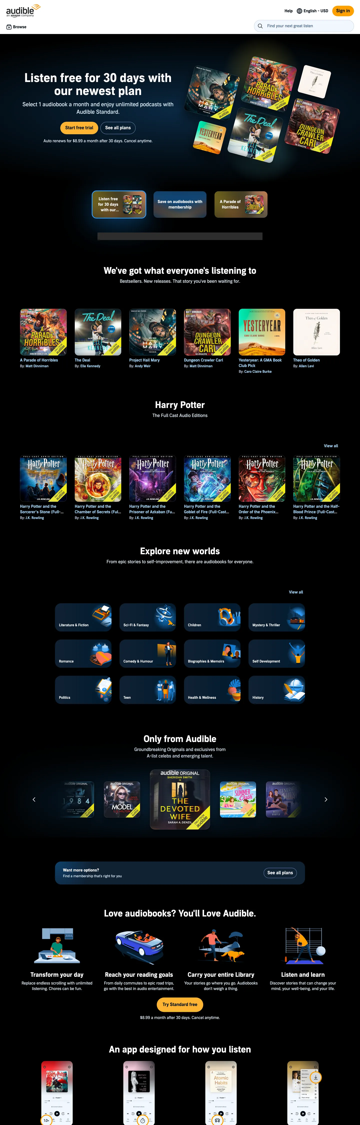
Audible's logged-out marketing site composes like a turntable display in a bookstore. The above-fold band sits on a near-black midnight floor with a 36px Audible Sans display headline in white ("Listen free for 30 days with our newest plan"), a single Amazon-orange CTA pill, and a 5-by-2 grid of audiobook cover-art tiles arrayed behind the copy. Below the fold the page alternates between the same midnight surface and a pale sky-blue band that holds the marketing pitches ("We've got what everyone's listening to"), and every band returns to the same cover-art mosaic as its visual proof. Where Spotify holds its lime-green to the Play button and Apple Music runs photography-led card grids on white, Audible commits fully to a "shelf full of audiobooks" composition — the product (the catalog) is also the marketing material.
The DESIGN.md file packages the system into a machine-readable spec. Inside: 18 colors tokens drawn from the 137-entry `--adbl-*` CSS custom-property palette (every brand token namespaces under the `--adbl-` prefix), 11 typography tokens spanning four Audible Sans weights — 400 body, 600 nav and sub-heading, 700 display, with a 14px / 400 metadata tier for cover-art captions — 4 radius tokens (16px on cover-art tiles, 9999px on the CTA pill, 1px on hairlines, plus a derived `0px`), 7 spacing values on a 4px / 8px base, and 18 components covering the orange CTA, the cover-art tile, the dark hero band, the sky-blue marketing band, the Audible Sans display headline, and the nav band.
Feed this file to an AI coding tool and it reproduces Audible's specific moves: midnight-blue marketing surface instead of pure black or white, single Amazon-orange voltage reserved for the trial CTA, alternating dark/sky-blue band rhythm to break up the cover-art mosaics, 16px-rounded rectangular audiobook tiles with 1px hairline outlines (not shadows), and Audible Sans across every tier with weight escalating from 400 body to 700 display. The move worth borrowing: the alternating band rhythm. Most streaming brands hold a single-canvas tone end-to-end; Audible toggles between midnight and sky-blue to give each section a different visual register without changing the cover-art grid that anchors every band.
What makes it distinct
5
- Midnight floor over whitethe marketing hero sits on #010e19 with white text, then sections alternate with pale sky-blue (#dae9f9) bands holding marketing copy
- Orange CTA voltageAmazon-orange #ff8909 reserved for the 'Start free trial' pill; declared as --adbl-accent-pressed and --adbl-progress-bar across the token system
- Audible Sans, four weights400 for body, 600 for nav/sub-heading, 700 for display, 800 reserved for the wordmark
- Cover-art mosaic as contentrectangular audiobook tiles in 16px-rounded frames anchor every band, each with a 1px hairline outline #d1d6d7 (513 border occurrences)
- 16px and pill radius onlyno 4-8px middle tier; tiles round at 16px, CTAs round at 9999px, hairlines render at 1px
audible.com
Live at audible.com
A snapshot of the brand in production. Scroll the frame to see the whole page.
Colors
18 colors
Audible's system runs on #ff8909 as its primary voltage, used in 1 of 18 components. Type is set in Audible Sans across 11 tokens from 14px to 48px, weights 400–700. Shape language is mixed across 18 components, blending pills, soft rounds, and squarer corners.
Brand & Accent
Sparing, CTA-only voltage · 4
Surface
Page and card backgrounds · 4
Text
Headlines, body, captions · 5
Borders & Hairlines
Dividers, outlines, rules · 2
Other
Specialty colors · 3
Typography
11 type tokens
Set in Audible Sans across 11 tokens, from 14px to 48px, weights 400–700. Shown in its own stack: where the font isn't installed, the fallback the file names stands in.
- display-xl48px · weight 700 · lh 52pxThe quick brown fox jumps over the lazy dog
- display-md36px · weight 700 · lh 42pxThe quick brown fox jumps over the lazy dog
- heading-md24px · weight 700 · lh 28pxThe quick brown fox jumps over the lazy dog
- heading-sm18px · weight 700 · lh 26pxThe quick brown fox jumps over the lazy dog
- body-lg16px · weight 600 · lh 22pxThe quick brown fox jumps over the lazy dog
- body-md16px · weight 400 · lh 22pxThe quick brown fox jumps over the lazy dog
- body-sm14px · weight 400 · lh 20pxThe quick brown fox jumps over the lazy dog
- caption14px · weight 400 · lh 18pxThe quick brown fox jumps over the lazy dog
- label-md14px · weight 600 · lh 18pxThe quick brown fox jumps over the lazy dog
- button-md16px · weight 600 · lh 22pxThe quick brown fox jumps over the lazy dog
- nav-link16px · weight 400 · lh 24pxThe quick brown fox jumps over the lazy dog
Layout
Radii and spacing
4 corner radii and 7 spacing values. Shape language: mixed.
Radii
- none0px
- hairline1px
- lg16px
- full9999px
Spacing
- xs4px
- sm8px
- md12px
- base16px
- lg24px
- xl40px
- 2xl48px
Components
18 components
Each rendered from its tokens (color, type, radius, padding) on Audible's own canvas.
- Button Primarybutton-primaryButton Primary
- Button Primary Hoverbutton-primary-hoverButton Primary Hover
- Button Secondarybutton-secondaryButton Secondary
- Top Navtop-navTop Nav
- Nav Linknav-linkNav Link
- Hero Sectionhero-sectionHero Section
- Hero Headinghero-headingHero Heading
- Section Heading Lightsection-heading-lightSection Heading Light
- Section Heading Darksection-heading-darkSection Heading Dark
- Body Paragraphbody-paragraphBody Paragraph
- Body Paragraph Mutedbody-paragraph-mutedBody Paragraph Muted
- Band Skyband-skyBand Sky
- Cover Tilecover-tileCover Tile
- CardcardCard
- Feature Cellfeature-cellFeature Cell
- Type here…text-inputText Input
- Link Textlink-textLink Text
- FooterfooterFooter
In use
The system, in use
Audible's tokens on the kind of product it builds.
Build something people actually use.
A short paragraph of marketing copy that previews how the brand's display tier and body tier read together. Two sentences is usually enough.
FAQ
Audible design system FAQ
Common questions about Audible's tokens, components, and how to use this DESIGN.md in your project.
Read next
Related reading
Specs, directories, and component libraries that pair with this design system.
- Browse all design systemsThe full directory of DESIGN.md files on shadcn.io, with live mockups for each.shadcn.io
- Audible — official siteAudible's public marketing site — the source of truth for the live tokens captured in this file.audible.com (opens in a new tab)
- The DESIGN.md specificationGoogle Labs' open spec for machine-readable design system files — the format this page is built on.github.com (opens in a new tab)
Use it
Use Audible in your project
One machine-readable file. Drop it into Claude, Cursor, or any AI tool that reads DESIGN.md.
Download the DESIGN.md
One machine-readable file: every color, type, radius, spacing, and component token of Audible.
Feed it to your AI tool
Drop it into Claude, Cursor, or GitHub Copilot. The agent writes React components and Tailwind classes that match Audible's visual language.
Reference the tokens directly
Or paste the values into your Tailwind config, CSS variables, or component library: every color, size and radius is a quoted, ready-to-copy value.
Read the full DESIGN.md: overview, rationale, do’s and don’ts
Overview
Audible's logged-out marketing site composes like a turntable display in a bookstore. Catalog-as-content. The above-fold band sits on the midnight floor {colors.midnight} (#010e19) with a 36px Audible Sans display headline in white ("Listen free for 30 days with our newest plan"), a single Amazon-orange CTA pill ({colors.primary} — #ff8909), and a 5-by-2 grid of audiobook cover-art tiles arrayed behind the copy. Below the fold, the page alternates between the same midnight surface and a pale sky-blue band {colors.surface-base} (#dae9f9) that holds marketing copy in dark text. Every band returns to the same cover-art mosaic as its visual proof. Where Spotify holds its lime-green voltage to the Play button against a near-black canvas and Apple Music runs photography-led card grids on white, Audible commits fully to the "shelf full of audiobooks" composition — the product catalog is also the marketing material.
The chromatic system reinforces the move. Midnight-not-black. The canvas is {colors.midnight} (#010e19), not pure #000000 — a deep blue-shifted near-black wired across nine separate CSS custom properties (--adbl-midnight-fill, --adbl-primary-fill, --adbl-on-accent, --adbl-scrim, --adbl-primary-overlay, and four more). The slight blue shift carries warmth into the dark surface; pure black would feel borrowed from Netflix or Spotify, both of which run flat blacks. Audible's #010e19 is closer to the navy a print publisher would use for hardcover bindings — the audiobook context wants a "library at night" surface, not a "streaming app in dark mode" surface. The single brand voltage is Amazon-orange {colors.primary} (#ff8909), declared as --adbl-accent-pressed and --adbl-progress-bar, and reserved for the "Start free trial" CTA pill and the progress-bar fill in the audiobook player.
Typography is Audible Sans across every tier with weight escalating from 400 body to 700 display. The proprietary Amazon-family sans does display at 36-48px / 700, sub-heading at 18-24px / 700, body at 16px / 400, nav and label at 14-16px / 600. There is no second face, no monospace tier, no serif voice on the captured surface. The display weight is unusually high for a media brand (Spotify Circular sits at 700 on display, Apple Music's SF Pro at 600); the heavy weight reinforces the "this is a confident retail catalog" voice rather than the "this is an editorial reading experience" voice that a serif display would suggest.
Key Characteristics:
- Midnight canvas (
{colors.midnight}— #010e19, frequency 74) — a deep blue-shifted near-black wired across nine CSS custom properties; not pure black. - Single Amazon-orange voltage (
{colors.primary}— #ff8909) reserved for the trial CTA pill and the player progress-bar; declared as--adbl-accent-pressedand--adbl-progress-bar. - Alternating band rhythm — midnight floor for cover-art mosaics with white text, pale sky-blue
{colors.surface-base}(#dae9f9) for marketing copy bands with dark text. - Audible Sans across every tier — 400 body, 600 nav and sub-heading, 700 display; no second typeface, no monospace tier.
- Cover-art tiles in
{rounded.lg}(16px) rectangles with 1px{colors.hairline}(#d1d6d7) outlines — 513 border occurrences make hairline the dominant border tone on the page. - 16px and pill radius only — no 4-8px middle tier; the cover-art tile (16px) and the CTA pill (9999px) are the only two rounded surface families.
- Cover-art photography is the dominant chromatic moment on the page — every audiobook cover renders in its native colors against the midnight floor.
- Pale sky-blue muted text (
{colors.ink-muted}— #a3d4ff, 187 occurrences as text) is the body color on the dark canvas — not pure white, slightly cooled.
Colors
Brand
- Audible Orange (
{colors.primary}— #ff8909): wired as--adbl-accent-pressedand--adbl-progress-bar. The single brand voltage on the page — the "Start free trial" CTA pill background, the progress-bar fill in the player, the orange "A" sound-wave logo mark. Reserved for one role per surface; multiplying it would dilute the trial-CTA signal. - Audible Orange Hover (
{colors.primary-hover}— #ffb333): wired as--adbl-accent-hoverand--adbl-border-brand. The hover variant — one shade brighter, used on CTA hover state and as the brand-border tone in product surfaces. - Audible Orange Pressed (
{colors.primary-pressed}— #ffa000): wired as--adbl-accent. The resting accent variant, slightly darker than the hover. Three orange shades cover the full press state matrix. - Brand Deep (
{colors.brand-deep}— #702b00): wired as--adbl-brand-fill. A deep burnt-orange / brown reserved for the brand-fill role on inverted accent surfaces. Not rendered on the captured marketing page.
Surface
- Midnight (
{colors.midnight}— #010e19): frequency 74 — text (41), border (33). Wired across nine CSS custom properties including--adbl-midnight-fill,--adbl-primary-fill,--adbl-on-accent,--adbl-scrim. The page floor, the top-nav surface, the cover-art tile background. Not pure black — blue-shifted. - Midnight Soft (
{colors.midnight-soft}— #061624): frequency 4 — text (2), border (2). A slightly elevated midnight tone for sub-surfaces inside the dark band. - Midnight Elevated (
{colors.midnight-elevated}— #141414): frequency 22 — text (11), border (11). A near-black neutral that appears on certain card surfaces within the dark band. - Surface Base (
{colors.surface-base}— #dae9f9): frequency 10 — all as text. Wired as--adbl-surface-base,--adbl-progress-bar-empty,--adbl-placeholder-background, and five more CSS variables. The pale sky-blue band tone that holds marketing-copy sections between the midnight bands. - Surface Info (
{colors.surface-info}— #e6f3ff): wired as--adbl-surface-info. A paler sky-blue for info-callout banners; not rendered on the captured marketing surface. - Surface Attention (
{colors.surface-attention}— #ffecec): wired as--adbl-surface-attention. A pink-tinted warning surface for attention banners; not rendered on captured surface. - Canvas (
{colors.canvas}— #ffffff): frequency 292 — text (284), bg (4), border (4). Wired across 16 CSS custom properties. The default light surface for inputs, modals, and the player-card background.
Text
- Ink (
{colors.ink}— #010e19): the midnight tone doubles as the default dark-text color on light surfaces. The same hex carries both surface and text duty in the system. - Ink on Dark (
{colors.ink-on-dark}— #ffffff): pure white on the midnight floor. Headlines and CTA labels in the dark band. - Ink Muted (
{colors.ink-muted}— #a3d4ff): frequency 187 — all as text. The dominant body-text color on the dark canvas. A pale sky-blue that softens the white-on-midnight contrast for longer body paragraphs; the captured page uses it more often than pure white for body copy. - Ink Soft (
{colors.ink-soft}— #c0d2e9): frequency 27 — all as text. Wired as--adbl-dividerand four more. A muted blue-gray for tertiary text, divider tones, and inactive states.
Hairline & Divider
- Hairline (
{colors.hairline}— #d1d6d7): frequency 513 — all as border. The dominant border tone on the entire page. Used on cover-art tile outlines, feature-cell dividers, and input borders. A cool gray that reads softly against both the midnight and the sky-blue band surfaces. - Divider (
{colors.divider}— #c0d2e9): wired as--adbl-dividerand--adbl-surface-outline. A pale blue-gray for internal dividers within feature cells.
Semantic
- Link (
{colors.link}— #0e5b9b): wired as--adbl-link,--adbl-info, and four more. The inline-link color and the info-message text color. A medium blue for "Learn more" links beneath the marketing copy.
Typography
Font Family
The system runs Audible Sans for every tier — a proprietary Amazon-family sans. Fallbacks walk to Arial, sans-serif for most tokens, with the nav tier escalating to ui-sans-serif, system-ui, -apple-system, "Segoe UI", Roboto, Ubuntu, Cantarell, "Noto Sans", sans-serif. There is no second typeface, no monospace tier on the captured surface, and no serif voice. One face, four weights (400 / 600 / 700, with an 800 reserved for the wordmark), every job.
Hierarchy
| Token | Size | Weight | Line Height | Use |
|---|---|---|---|---|
{typography.display-xl} | 48px | 700 | 52px | Largest display moment ("Listen free for 30 days…") |
{typography.display-md} | 36px | 700 | 42px | Section h2 ("We've got what everyone's listening to") |
{typography.heading-md} | 24px | 700 | 28px | h3 — feature-cell titles |
{typography.heading-sm} | 18px | 700 | 26px | h4 — cover-art row labels |
{typography.body-lg} | 16px | 600 | 22px | Sub-heading body / emphasized text |
{typography.body-md} | 16px | 400 | 22px | Default running text |
{typography.body-sm} | 14px | 400 | 20px | Captions, metadata under cover-art tiles |
{typography.caption} | 14px | 400 | 18px | Smaller metadata, byline labels |
{typography.label-md} | 14px | 600 | 18px | Nav labels, sub-section titles |
{typography.button-md} | 16px | 600 | 22px | "Start free trial" CTA, secondary button labels |
{typography.nav-link} | 16px | 400 | 24px | Top-nav category links (Explore, Best Sellers, Plans & pricing) |
Principles
Display weight stays at 700 across every tier — there is no light or modest-weight display moment. The 36-48px headlines at weight 700 read as catalog-confident rather than editorial-quiet, matching the "browse our shelf" composition. Body sits at weight 400 with one 600 emphasis tier for sub-headings and button labels; nav labels run 600 for legibility against the dark canvas.
The cover-art metadata tier — book titles and author bylines beneath each tile — sits at weight 400 in {typography.body-sm} (14px / 20px). The system never reaches for weight 700 on these captions because the cover-art image itself is doing the visual work; weight escalation on the caption would compete with the cover.
Note on Font Substitutes
Audible Sans is proprietary Amazon. The closest open-source substitutes are Inter at the same weights (proportions transfer cleanly at 16-36px display sizes), Public Sans for a more neutral feel, or Source Sans 3 for a slightly warmer alternative. Avoid pairing Audible Sans with a serif display family — the system is single-face by discipline and adding a Caslon or Tiempos for editorial moments would break the "retail catalog" voice.
Layout
Spacing System
- Base unit: 4px and 8px share the dominant gap value (each appearing 54 times in the captured extraction).
- Tokens:
{spacing.xs}4px ·{spacing.sm}8px ·{spacing.md}12px ·{spacing.base}16px ·{spacing.lg}24px ·{spacing.xl}40px ·{spacing.2xl}48px. - Section padding (vertical): 48px (
48px 0px, frequency 8) is the canonical band-to-band vertical rhythm. - Cover-tile gap: 8px between adjacent tiles in the mosaic, 24px between mosaic rows.
- Card padding: 24px on feature cells and the player-card surface.
Grid & Container
- Max content width: ~1280px on the cover-art mosaic, ~720px on the marketing-copy text block centered above the mosaic.
- Above-fold band: midnight canvas with hero copy left-aligned over a 5x2 cover-art grid filling the right two-thirds.
- Below-fold rhythm: alternating midnight and sky-blue bands, each holding a cover-art row (5-up at desktop) anchored by a section h2.
- Cover-art row: 5-column grid at desktop, collapsing to 3-column on tablet and 2-column on mobile.
- Feature-cell strip ("Love audiobooks? You'll love Audible."): 3-up grid with each cell containing a small icon, a heading-md title, and a body-md paragraph.
Rhythm
The page toggles between midnight and sky-blue bands every 480-560px of vertical scroll. The dark bands hold cover-art mosaics with white display text; the light bands hold marketing copy with dark text on a sky-blue floor. The alternation is the page's structural device — each band has its own visual register without changing the underlying cover-art grid. Single-canvas streaming brands hold one tone end-to-end; Audible's toggle is the rhythmic move that distinguishes the system.
Elevation
The system has two elevation strategies depending on which band the surface lives in.
- On midnight: cover-art tiles lift off the dark floor via 1px
{colors.hairline}(#d1d6d7) outlines plus the tile's own internal cover photography. No drop shadow on the dark band — shadows don't read on midnight. - On sky-blue: feature cells lift off the
{colors.surface-base}(#dae9f9) band via a soft elevation (CSS--adbl-elevation-2-1and--adbl-elevation-2-2define0 3px 5px rgba(0,0,0,.1)and0 2px 4px rgba(0,0,0,.02)respectively). - The token system declares 4 elevation tiers (
--adbl-elevation-1-1through--adbl-elevation-4-3) for cards inside the player and account flows, but the marketing surface uses only the 1-tier and 2-tier values.
Hierarchy on the dark band is hairline-driven; hierarchy on the light band uses both hairlines and subtle drop shadows. The system has no border / shadow opposition — both can coexist on the same surface.
Shapes
The radius scale is binary-plus-hairline:
{rounded.none}0px — used on the hero band and band-sky surfaces themselves (these are full-bleed; the band has no rounded corners).{rounded.hairline}1px — 1 occurrence in the captured extraction; minimum border-radius used by certain divider rules.{rounded.lg}16px — 10 occurrences; the cover-art tile, the feature cell, the card surface, and the marketing band's centered content card.{rounded.full}9999px — 6 occurrences; the "Start free trial" CTA pill, the nav-link hover pill, and the player progress-bar.
There is no 4-8px middle tier. Adding 6px or 8px corners would soften the cover-art mosaic into a generic SaaS card grid and lose the "physical media" feel the 16px tiles preserve.
Components
button-primary — The signature CTA. Orange {colors.primary} fill, midnight text, {rounded.full} 9999px pill, 12x24 padding, 44px height. "Start free trial" is the canonical instance, sitting on every band over the cover-art mosaic.
button-primary-hover — Background flips to {colors.primary-hover} (#ffb333) on hover — one shade brighter on the orange ladder.
button-secondary — Transparent fill on the midnight band, white text, 1px white border, {rounded.full} pill, same dimensions as primary. Used for "Sign in" and tertiary CTAs.
top-nav — Midnight {colors.midnight} surface, 56px height, 8x24 padding. Houses the orange "A" sound-wave logo flush left, category links (Audible Originals, Best Sellers, Plans & pricing) centered, and a "Hi, Sign in" / "Cart" cluster right.
nav-link — Transparent background, white text in {typography.nav-link} (16px / 400), 0x10 padding. Underline-on-hover is the only state cue.
hero-section — Midnight canvas, white text, 48x24 padding, 0px corners. Holds the display headline, the orange CTA pill, and the cover-art mosaic stacked horizontally.
hero-heading — White text on the midnight canvas, {typography.display-md} (36px Audible Sans / 700). 0 padding; left-aligned in the hero composition.
section-heading-light — Same {typography.display-md} token but rendered in white on the midnight band ("We've got what everyone's listening to").
section-heading-dark — Same token rendered in {colors.ink} on the sky-blue band ("Love audiobooks? You'll love Audible.").
body-paragraph — White text at {typography.body-md} (16px / 400). The hero sub-paragraph and section dek lines.
body-paragraph-muted — {colors.ink-soft} (#c0d2e9) variant for secondary copy on the dark band; reads softly without the white voltage.
band-sky — {colors.surface-base} (#dae9f9) full-bleed band, dark text, 48x24 padding, 0px corners. The pale sky-blue band that holds marketing copy between the midnight bands.
cover-tile — Midnight {colors.midnight} background with a 1px {colors.hairline} outline, {rounded.lg} 16px corners, 0 padding (the cover-art image fills the tile edge-to-edge). The atomic unit of the cover-art mosaic.
card — White {colors.canvas} fill, 1px {colors.hairline} border, {rounded.lg} 16px radius, 24px padding. The default content card on light surfaces (used in the player and account flows; not common on the captured marketing surface).
feature-cell — Sky-blue {colors.surface-base} fill, dark text, {rounded.lg} 16px corners, 24px padding. Used in the 3-up "Love audiobooks? You'll love Audible." strip — each cell holds an icon, a heading-md title, and a body paragraph.
text-input — White fill, dark text, {rounded.full} pill radius (the input is a fully-rounded pill rather than a sharp-cornered field), 8x16 padding, 40px height, 1px {colors.divider} border. Common in the email-capture rows beneath marketing bands.
link-text — {colors.link} (#0e5b9b) blue inline text. The "Learn more" affordance under marketing copy; not a button, just a colored inline link.
footer — Midnight {colors.midnight} canvas, white text in {typography.body-sm}, 48x24 padding. Houses the marketing footer link wall, app-store badges, social icons, and the legal copyright row.
Do's and Don'ts
Do treat the orange {colors.primary} (#ff8909) as a single-CTA voltage. The system reserves the orange for the "Start free trial" pill and the player progress-bar — two roles, both load-bearing. Multiplying it into every emphasized link or hover state would dilute the trial-CTA signal that drives subscription conversions.
Do alternate midnight and sky-blue bands as the page's structural rhythm. The captured page toggles between {colors.midnight} (#010e19) and {colors.surface-base} (#dae9f9) every 480-560px of scroll; holding a single canvas tone end-to-end loses the visual register change that lets each section's marketing copy land separately from the cover-art mosaic above it.
Do keep cover-art tiles at {rounded.lg} (16px) with a 1px {colors.hairline} (#d1d6d7) outline. The tile is the system's atomic content unit; lowering the radius to 4-8px would push the mosaic toward SaaS card geometry and lose the physical-media (book spine, vinyl sleeve) feel.
Do use {colors.ink-muted} (#a3d4ff) — not pure white — for body copy on the midnight canvas. The pale sky-blue softens the contrast on longer paragraphs and matches the system's existing 187 captured occurrences as text. Pure white is reserved for headlines and CTAs.
Don't swap {colors.midnight} (#010e19) for pure #000000. The blue-shifted near-black carries warmth into the dark surface; pure black would feel borrowed from Netflix or Spotify, both of which run flat blacks, and would lose the "library at night" feel that distinguishes Audible from other dark-canvas streaming brands.
Don't introduce a 4-8px corner radius anywhere. The system is binary: {rounded.lg} 16px on cover-art tiles and feature cells, {rounded.full} 9999px on CTAs and the progress-bar. Adding a middle tier (the universal "rounded SaaS card" radius) would soften the cover-art mosaic and break the catalog metaphor.
Don't use the Amazon-orange {colors.primary} as a body-text accent color. It is a load-bearing CTA voltage; rendering it on inline links or hover underlines would compete with the trial CTA pill and reduce its conversion signal.
Don't mix Audible Sans with a serif display family for editorial moments. The system is single-face by discipline; introducing a Caslon or Tiempos for "editorial reading experience" sections would contradict the "retail audiobook catalog" voice the heavy 700-weight sans is built to carry.
Known Gaps
- Hover and focus states: documented for
{component.button-primary-hover}only; the full state matrix (focus rings, disabled tints, error states) lives in the player and account-flow surfaces and is not captured here. - Audiobook player surface: this DESIGN.md captures the marketing site only. The actual audiobook player (waveform scrubber, chapter navigator, sleep-timer drawer, narrator-speed control) carries a richer token system not represented here.
- Light mode marketing alternative: the captured surface is dark-band-dominant. A light-only marketing variant exists for certain landing pages (gift-membership flow) but is not represented.
- Form input error states:
{component.text-input}carries the resting state; error and validation styling live inside the account flows. - Motion: the cover-art mosaic has subtle parallax on scroll-into-view, but the spec captures end-state values only. Easing curves and duration live in the live JavaScript.
- Mobile app surfaces: the iOS and Android Audible apps carry an extended token set (player gestures, tab-bar styling, system-integration colors) not exposed on the web marketing site.
- Originals branding sub-palette: Audible Originals titles carry per-show brand colors and typography on their dedicated landing pages, distinct from the catalog browse surface; these per-show sub-systems are not represented as primary tokens.
Music, Video & Streaming
More systems like this
More DESIGN.md files in Music, Video & Streaming.
Pricing
Build it with Pro
The DESIGN.md files are free. Pro adds 6,000+ blocks, premium templates and the MCP server, so your AI editor builds in your system for you.
4.9/5 out of 5 · 150+ reviewsfrom 150+ founders and developers.
Billing
Billed once a year in USD. Cancel anytime.
- How many people can use the license.
- Client work, SaaS products and anything you charge for.
- Production-ready React sections: hero, pricing, features, dashboards and more.
- Complete multi-page sites you can ship as they are.
- React icons from every major library, installable with one command.
- Presets that restyle every block, in light and dark.
- Lets your AI editor search, preview and install blocks for you.
- Priority requests are answered first.
Individual
For personal projects & open source
$32instead of $49/mo
$389 billed yearly
- Seats: 1 seat
- Commercial use: Personal & open source only
- Pro blocks: 6,000+ blocks
- Templates: All 14 templates
- React icons: 294k+ icons
- Themes: All 59 themes
- MCP server: Basic usage
- Support: Standard
Team
Most popularFor freelancers, agencies & startups
$66instead of $99/mo
$789 billed yearly · ≈ $13/dev/mo
- Seats: Up to 5 seats
- Commercial use: Included
- Pro blocks: 6,000+ blocks
- Templates: All 14 templates
- React icons: 294k+ icons
- Themes: All 59 themes
- MCP server: High usage
- Support: Priority
Organization
For companies with larger teams
$132instead of $199/mo
$1,589 billed yearly
- Seats: Unlimited seats
- Commercial use: Included
- Pro blocks: 6,000+ blocks
- Templates: All 14 templates
- React icons: 294k+ icons
- Themes: All 59 themes
- MCP server: Unlimited usage
- Support: Priority
Billed once a year in USD. Cancel anytime.
Individual
For personal projects & open source
$32instead of $49/mo
$389 billed yearly
- How many people can use the license.Seats: 1 seat
- Client work, SaaS products and anything you charge for.Commercial use: Personal & open source only
- Production-ready React sections: hero, pricing, features, dashboards and more.Pro blocks: 6,000+ blocks
- Complete multi-page sites you can ship as they are.Templates: All 14 templates
- React icons from every major library, installable with one command.React icons: 294k+ icons
- Presets that restyle every block, in light and dark.Themes: All 59 themes
- Lets your AI editor search, preview and install blocks for you.MCP server: Basic usage
- Priority requests are answered first.Support: Standard
Team
Most popularFor freelancers, agencies & startups
$66instead of $99/mo
$789 billed yearly · ≈ $13/dev/mo
Everything in Individual, plus
- How many people can use the license.Seats: Up to 5 seats
- Client work, SaaS products and anything you charge for.Commercial use: Included
- Lets your AI editor search, preview and install blocks for you.MCP server: High usage
- Priority requests are answered first.Support: Priority
Organization
For companies with larger teams
$132instead of $199/mo
$1,589 billed yearly
Everything in Team, plus
- How many people can use the license.Seats: Unlimited seats
- Lets your AI editor search, preview and install blocks for you.MCP server: Unlimited usage
- Secure checkout via Stripe
- Code lives in your repo
- Keep what you've shipped if you cancel
- License terms
Your system, built for you
Every block, template and icon, installed by your AI agent in your design system. The DESIGN.md files stay free.