ElevenLabs Design System
ElevenLabs' design system as a DESIGN.md file. Off-white #f5f5f5, ink #292524, Waldenburg 300, Inter, 20 components. For React, Next.js, and AI tools.
Add shadcn.io to your AI agent. · Pro It installs blocks, icons and templates in your design system from a prompt, with Pro.
Set up MCP- Primary
- #292524
- Typeface
- Inter
- Shape
- Soft
- Base radius
- 8px
- Colors
- 27
- Type tokens
- 14
- Components
- 20
- Spacing values
- 9
About
About ElevenLabs DESIGN.md
Curated by Dov Azencot · Updated May 12, 2026 · Source elevenlabs.io (opens in a new tab)
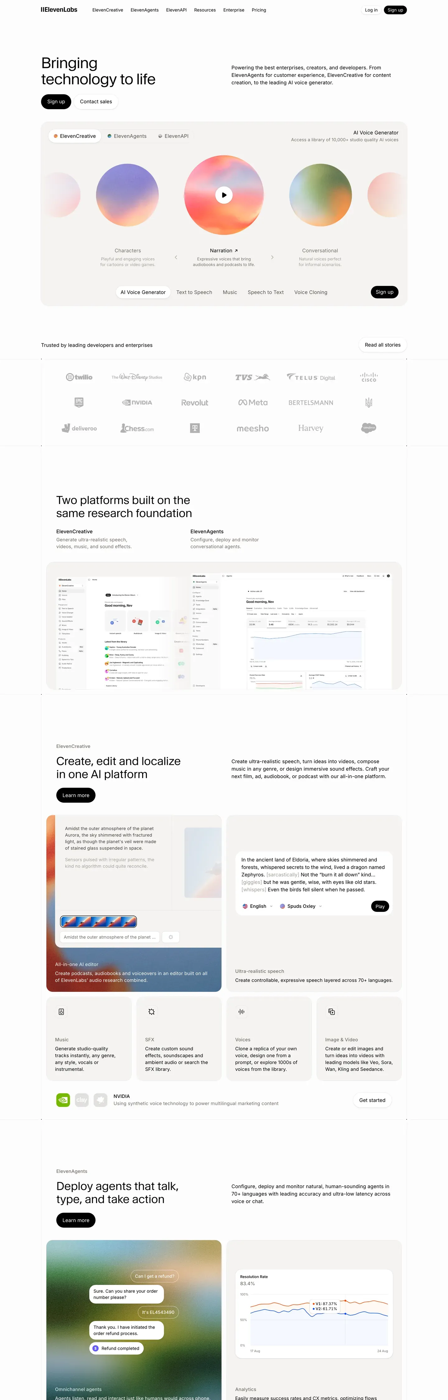
ElevenLabs reads like a quietly editorial print magazine that happens to be a voice-AI product. The base canvas is off-white #f5f5f5 carrying warm near-black ink #0c0a09. There is no neon accent, no saturated CTA color, and no developer-tools dark atmosphere — even the dark hero on the Agents page is a deliberate exception rather than the default. The brand voltage is photographic rather than chromatic: pastel atmospheric gradient orbs in mint, peach, lavender, sky, and rose drift through hero bands as pure decoration. Display runs Waldenburg Light at weight 300, paired with Inter at 400 for body. The 300-weight display is the editorial signature — bolding it would shift the voice from magazine to consumer-marketing, which the system never does.
This DESIGN.md packages the public marketing surfaces into a single machine-readable file. Inside: 27 colors tokens (split across ink, surface, hairline, text, and five atmospheric gradient stops), 15 type styles spanning display-mega at 64px / 300 down to a 12px uppercase caption, 9 corner-radius tokens including a 24px extra-soft for gradient-orb cards, 9 spacing values with a 96px section step, and 20 components from the ink pill primary to the dark-inverted featured pricing tier. The format is the Google Labs DESIGN.md spec — every value is a quoted token reference rather than an inline hex.
Feed the file to Claude, Cursor, or GitHub Copilot and the agent reproduces ElevenLabs' restraint — modest weights, pill CTAs, atmospheric orbs — rather than a generic AI-product theme. Reference the tokens directly to seed a Tailwind config or CSS variable layer; use the component spec as a design audit on existing surfaces. The system is worth studying because it refuses the defaults of its category: no saturated voltage, no dark canvas, no bold display. Editorial pacing carries the brand instead.
What makes it distinct
5
- No saturated brand colorthe only voltage is a warm near-black ink pill (#292524) for every primary CTA
- Display sits at weight 300Waldenburg Light is the editorial signature, never bolded across 5 display sizes
- Five pastel gradient orbs (mint, peach, lavender, sky, rose) carry brand atmospherenever used as fills or text
- Pill geometry for every CTA9999px radius CTAs, 16px feature cards, 24px gradient-orb cards
- 96px section rhythmprint-magazine pacing over typical SaaS density
elevenlabs.io
Live at elevenlabs.io
A snapshot of the brand in production. Scroll the frame to see the whole page.
Colors
27 colors
ElevenLabs's system runs on #292524 as its primary voltage, used in 1 of 20 components. Type is set in Inter across 14 tokens from 12px to 64px, weights 300–600. Shape language is soft — components average 16px corner radius, with no sharp interactive edges.
Brand & Accent
Sparing, CTA-only voltage · 2
Surface
Page and card backgrounds · 7
Text
Headlines, body, captions · 8
Borders & Hairlines
Dividers, outlines, rules · 3
Semantic
Status, errors, success, links · 2
Other
Specialty colors · 5
Typography
14 type tokens
Set in Inter across 14 tokens, from 12px to 64px, weights 300–600. Shown in its own stack: where the font isn't installed, the fallback the file names stands in.
- display-mega64px · weight 300 · lh 1.05 · tracking -1.92pxThe quick brown fox jumps over the lazy dog
- display-xl48px · weight 300 · lh 1.08 · tracking -0.96pxThe quick brown fox jumps over the lazy dog
- display-lg36px · weight 300 · lh 1.17 · tracking -0.36pxThe quick brown fox jumps over the lazy dog
- display-md32px · weight 300 · lh 1.13 · tracking -0.32pxThe quick brown fox jumps over the lazy dog
- display-sm24px · weight 300 · lh 1.2The quick brown fox jumps over the lazy dog
- title-md20px · weight 500 · lh 1.35The quick brown fox jumps over the lazy dog
- title-sm18px · weight 500 · lh 1.44 · tracking 0.18pxThe quick brown fox jumps over the lazy dog
- body-md16px · weight 400 · lh 1.5 · tracking 0.16pxThe quick brown fox jumps over the lazy dog
- body-strong16px · weight 500 · lh 1.5 · tracking 0.16pxThe quick brown fox jumps over the lazy dog
- body-sm15px · weight 400 · lh 1.47 · tracking 0.15pxThe quick brown fox jumps over the lazy dog
- caption14px · weight 400 · lh 1.5The quick brown fox jumps over the lazy dog
- caption-uppercase12px · weight 600 · lh 1.4 · tracking 0.96pxThe quick brown fox jumps over the lazy dog
- button15px · weight 500 · lh 1The quick brown fox jumps over the lazy dog
- nav-link15px · weight 500 · lh 1.4The quick brown fox jumps over the lazy dog
Layout
Radii and spacing
9 corner radii and 9 spacing values. Shape language: soft.
Radii
- none0px
- xs4px
- sm6px
- md8px
- lg12px
- xl16px
- xxl24px
- pill9999px
- full9999px
Spacing
- xxs4px
- xs8px
- sm12px
- base16px
- md20px
- lg24px
- xl32px
- xxl48px
- section96px
Components
20 components
Each rendered from its tokens (color, type, radius, padding) on ElevenLabs's own canvas.
- Top Navtop-navTop Nav
- Button Primarybutton-primaryButton Primary
- Button Primary Activebutton-primary-activeButton Primary Active
- Button Outlinebutton-outlineButton Outline
- Button Tertiary Textbutton-tertiary-textButton Tertiary Text
- Hero Bandhero-bandHero Band
- Gradient Orb Cardgradient-orb-cardGradient Orb Card
- Feature Cardfeature-cardFeature Card
- Product Card Stackproduct-card-stackProduct Card Stack
- Voice Rowvoice-rowVoice Row
- voice-icon-circularVoice Icon Circular
- Pricing Tier Cardpricing-tier-cardPricing Tier Card
- Pricing Tier Featuredpricing-tier-featuredPricing Tier Featured
- Type here…text-inputText Input
- Badge Pillbadge-pillBadge Pill
- Cta Bandcta-bandCta Band
- Testimonial Cardtestimonial-cardTestimonial Card
- Audio Waveform Cardaudio-waveform-cardAudio Waveform Card
- FooterfooterFooter
- Footer Linkfooter-linkFooter Link
In use
The system, in use
ElevenLabs's tokens on the kind of product it builds.
Build something people actually use.
A short paragraph of marketing copy that previews how the brand's display tier and body tier read together. Two sentences is usually enough.
FAQ
ElevenLabs design system FAQ
Common questions about ElevenLabs's tokens, components, and how to use this DESIGN.md in your project.
Read next
Related reading
Specs, directories, and component libraries that pair with this design system.
- Browse all design systemsThe full directory of DESIGN.md files on shadcn.io, with live mockups for each.shadcn.io
- ElevenLabsThe voice-AI product whose marketing surfaces this spec captures.elevenlabs.io (opens in a new tab)
- The DESIGN.md specificationGoogle Labs' open spec for machine-readable design system files — the format this page is built on.github.com (opens in a new tab)
Use it
Use ElevenLabs in your project
One machine-readable file. Drop it into Claude, Cursor, or any AI tool that reads DESIGN.md.
Download the DESIGN.md
One machine-readable file: every color, type, radius, spacing, and component token of ElevenLabs.
Feed it to your AI tool
Drop it into Claude, Cursor, or GitHub Copilot. The agent writes React components and Tailwind classes that match ElevenLabs's visual language.
Reference the tokens directly
Or paste the values into your Tailwind config, CSS variables, or component library: every color, size and radius is a quoted, ready-to-copy value.
Read the full DESIGN.md: overview, rationale, do’s and don’ts
Overview
ElevenLabs reads like a quietly editorial print magazine that happens to be a voice-AI product. The base canvas is off-white {colors.canvas} (#f5f5f5) holding warm near-black ink {colors.ink} (#0c0a09). The brand voltage is photographic, not chromatic: soft pastel atmospheric gradient orbs (mint, peach, lavender, sky, rose) drift through the page as the only "color" moments. There is no neon accent, no saturated CTA color, no dark-canvas dev-tools atmosphere.
Type pairs Waldenburg Light (custom serif at weight 300) for display with Inter for body, navigation, captions. The display weight at 300 is the editorial signature — never bold, never heavy.
CTAs are subtle: a near-black ink pill ({component.button-primary}) is the primary, a transparent outline ({component.button-outline}) is the secondary. The brand trusts atmospheric photography and modest type weights to carry brand work.
Key Characteristics:
- Off-white canvas, warm near-black ink. No saturated CTA color.
- Single primary action: ink pill at
{rounded.pill}. Atmospheric gradients carry visual brand voltage. - Display runs Waldenburg Light at weight 300 — editorial magazine voice.
- Body runs Inter at 400 with subtle letter-spacing (+0.15-0.18px).
- Pastel gradient orbs (5 tokens: mint, peach, lavender, sky, rose) used as atmospheric brand decoration only.
- Soft pill geometry (
{rounded.pill}for CTAs,{rounded.xl}for cards). - 96px section rhythm.
Colors
Brand & Accent
- Ink Primary (
{colors.primary}— #292524): The primary action color — warm near-black pill. Used scarcely. - Ink Primary Active (
{colors.primary-active}— #0c0a09): Press state.
Surface
- Canvas (
{colors.canvas}— #f5f5f5): Off-white page floor. - Canvas Soft (
{colors.canvas-soft}— #fafafa): Lighter band for subtle alternating sections. - Canvas Deep (
{colors.canvas-deep}— #0c0a09): Same as ink — used for the rare dark-mode hero (Agents page). - Surface Card (
{colors.surface-card}— #ffffff): Pure white card. - Surface Strong (
{colors.surface-strong}— #f0efed): Badges, voice-icon plates. - Surface Dark (
{colors.surface-dark}— #0c0a09): Dark hero/CTA band canvas. - Surface Dark Elevated (
{colors.surface-dark-elevated}— #1c1917): Cards on dark canvas.
Hairlines
- Hairline (
{colors.hairline}— #e7e5e4): Default 1px divider. - Hairline Soft (
{colors.hairline-soft}— #f0efed): Lighter divider. - Hairline Strong (
{colors.hairline-strong}— #d6d3d1): Stronger panel outline.
Text
- Ink (
{colors.ink}— #0c0a09): Display, primary text. - Body (
{colors.body}— #4e4e4e): Default running-text. - Body Strong (
{colors.body-strong}— #292524): Same as primary — emphasis. - Muted (
{colors.muted}— #777169): Sub-titles. - Muted Soft (
{colors.muted-soft}— #a8a29e): Disabled text. - On Primary (
{colors.on-primary}— #ffffff): White text on ink pill. - On Dark (
{colors.on-dark}— #ffffff): White text on dark hero. - On Dark Soft (
{colors.on-dark-soft}— #a8a29e): Muted off-white on dark.
Atmospheric Gradient Stops (signature)
- Gradient Mint (
{colors.gradient-mint}— #a7e5d3): Mint green orb. - Gradient Peach (
{colors.gradient-peach}— #f4c5a8): Peach orb. - Gradient Lavender (
{colors.gradient-lavender}— #c8b8e0): Lavender orb. - Gradient Sky (
{colors.gradient-sky}— #a8c8e8): Sky-blue orb. - Gradient Rose (
{colors.gradient-rose}— #e8b8c4): Rose orb.
These appear ONLY as soft radial-gradient atmospheric orbs inside {component.gradient-orb-card} and as background atmospheric blooms behind hero copy. Never as button fills, never as text colors.
Semantic
- Success (
{colors.semantic-success}— #16a34a): Confirmation. - Error (
{colors.semantic-error}— #dc2626): Validation errors.
Typography
Font Family
Waldenburg Light is the licensed display serif at weight 300. Inter carries body, navigation, captions, and buttons. Fallback: 'Times New Roman', serif for Waldenburg, sans-serif for Inter.
Hierarchy
| Token | Size | Weight | Line Height | Letter Spacing | Use |
|---|---|---|---|---|---|
{typography.display-mega} | 64px | 300 | 1.05 | -1.92px | Homepage hero h1 |
{typography.display-xl} | 48px | 300 | 1.08 | -0.96px | Subsidiary heroes |
{typography.display-lg} | 36px | 300 | 1.17 | -0.36px | Section heads |
{typography.display-md} | 32px | 300 | 1.13 | -0.32px | Sub-section heads |
{typography.display-sm} | 24px | 300 | 1.2 | 0 | Card group titles |
{typography.title-md} | 20px | 500 | 1.35 | 0 | Component titles — Inter |
{typography.title-sm} | 18px | 500 | 1.44 | 0.18px | List labels |
{typography.body-md} | 16px | 400 | 1.5 | 0.16px | Default body — Inter |
{typography.body-strong} | 16px | 500 | 1.5 | 0.16px | Emphasized body |
{typography.body-sm} | 15px | 400 | 1.47 | 0.15px | Footer body |
{typography.caption} | 14px | 400 | 1.5 | 0 | Photo captions |
{typography.caption-uppercase} | 12px | 600 | 1.4 | 0.96px | Section labels, badges |
{typography.button} | 15px | 500 | 1.0 | 0 | CTA pill |
{typography.nav-link} | 15px | 500 | 1.4 | 0 | Top-nav menu |
Principles
- Display weight stays at 300. Waldenburg Light is the editorial signature. Never bold display copy.
- Subtle letter-spacing on body. Inter at +0.15-0.18px tracking — slightly looser than default Inter for a more editorial feel.
- Negative letter-spacing on display. Waldenburg pulls -0.32px to -1.92px tighter on display sizes.
Note on Font Substitutes
Waldenburg is licensed. Open-source substitute: EB Garamond at weight 300 (slightly more humanist) or GT Sectra (closer to Waldenburg's modernity). Use Inter directly for body — it's the same family ElevenLabs uses.
Layout
Spacing System
- Base unit: 4px.
- Tokens:
{spacing.xxs}4px ·{spacing.xs}8px ·{spacing.sm}12px ·{spacing.base}16px ·{spacing.md}20px ·{spacing.lg}24px ·{spacing.xl}32px ·{spacing.xxl}48px ·{spacing.section}96px. - Section padding: 96px.
Grid & Container
- Max content width: ~1200px.
- Editorial body: 12-column grid.
- Feature card grids: 2-up at desktop for hero splits, 3-up for benefit grids.
- Footer: 5-column at desktop.
Whitespace Philosophy
Generous editorial pacing — print-magazine feel. 96px between bands; cards inside bands sit close (16-24px gap). The atmospheric gradient orbs occupy generous breathing space without competing with copy.
Elevation & Depth
The system uses hairline + soft drop. Cards float above the off-white canvas via 1px hairlines and a single subtle shadow tier. Atmospheric depth comes from gradient orbs.
| Level | Treatment | Use |
|---|---|---|
| Flat (canvas) | {colors.canvas} (#f5f5f5) | Body bands, footer |
| Card | {colors.surface-card} (#ffffff) | Content cards |
| Hairline border | 1px {colors.hairline} | Card outlines |
| Soft drop | 0 4px 16px rgba(0, 0, 0, 0.04) | Hovered cards (single shadow tier) |
| Gradient orb | Radial gradient with one of {colors.gradient-*} | Atmospheric depth — never a card surface |
Decorative Depth
- Pastel gradient orbs are the brand's strongest atmospheric pattern. Soft radial blooms in mint, peach, lavender, sky, or rose drift through hero bands and feature sections without containing any content — they are pure atmosphere.
Shapes
Border Radius Scale
| Token | Value | Use |
|---|---|---|
{rounded.none} | 0px | Reserved |
{rounded.xs} | 4px | Inline tags |
{rounded.sm} | 6px | Compact rows |
{rounded.md} | 8px | Form inputs |
{rounded.lg} | 12px | Compact cards |
{rounded.xl} | 16px | Feature cards, pricing tiers |
{rounded.xxl} | 24px | Gradient orb cards (extra-soft) |
{rounded.pill} | 9999px | All CTA buttons, badges |
{rounded.full} | 9999px | Voice icon circles, avatars |
Components
Top Navigation
top-nav — Background {colors.canvas}, text {colors.ink}, height 64px. Layout: ElevenLabs wordmark left, primary horizontal menu (Creative / Agents / Video / Pricing / Enterprise / Docs), Sign In + "Try free" primary CTA right.
Buttons
button-primary — Near-black ink pill. Background {colors.primary}, text {colors.on-primary}, type {typography.button} (15px / 500), padding 10px × 20px, height 40px, rounded {rounded.pill}.
button-primary-active — Press state. Background {colors.primary-active}.
button-outline — Transparent pill with 1px ink border. Background transparent, text {colors.ink}, 1px {colors.hairline-strong} border.
button-tertiary-text — Inline ink text link.
Hero & Atmospheric
hero-band — Background {colors.canvas}, full-width display headline in {typography.display-mega} (64px / 300 / -1.92px), subhead in {typography.body-md}, two CTAs, and an atmospheric gradient orb behind the centered headline.
gradient-orb-card — A large card with a soft radial-gradient orb behind centered display copy. Background {colors.canvas-soft}, rounded {rounded.xxl} (24px), padding 32px. Each variant uses one of the five gradient tokens (gradient-mint, gradient-peach, gradient-lavender, gradient-sky, gradient-rose).
audio-waveform-card — A waveform visualization card. Background {colors.surface-card}, rounded {rounded.xl}, padding 24px. Holds a play button + waveform glyph + voice metadata.
Cards
feature-card — 2-up or 3-up grids. Background {colors.surface-card}, text {colors.ink}, rounded {rounded.xl}, padding 24px, 1px hairline border.
product-card-stack — Stacked product preview cards. Background {colors.surface-card}, rounded {rounded.xl}, no padding (children fill the card edge-to-edge).
testimonial-card — Quote card. Background {colors.surface-card}, text {colors.body}, rounded {rounded.xl}, padding 32px.
Voice Library
voice-row — Horizontal row in voice list. Background transparent, 1px hairline divider. Layout: 32px circular voice icon ({component.voice-icon-circular}) left, voice name + accent stack, optional preview button right.
voice-icon-circular — Background {colors.surface-strong}, rounded {rounded.full}, 32px diameter. Holds initials or voice glyph.
Pricing
pricing-tier-card — Background {colors.surface-card}, rounded {rounded.xl}, padding 32px, 1px hairline border.
pricing-tier-featured — Featured tier inverts. Background {colors.surface-dark}, text {colors.on-dark}. Same shape, dark inversion.
Forms & Tags
text-input — Background {colors.surface-card}, text {colors.ink}, rounded {rounded.md} (8px), padding 12px × 16px, height 44px, 1px {colors.hairline-strong} border. On focus, border thickens to 2px ink.
badge-pill — Background {colors.surface-strong}, text {colors.ink}, type {typography.caption-uppercase}, rounded {rounded.pill}, padding 4px × 10px.
CTA / Footer
cta-band — Pre-footer. Background {colors.canvas}, centered display headline in {typography.display-lg}, single ink pill CTA. 96px padding.
footer — Closing footer. Background {colors.canvas}, text {colors.body}. 5-column link list. 64×48px padding.
footer-link — Background transparent, text {colors.body}, type {typography.body-sm}.
Do's and Don'ts
Do
- Reserve
{colors.primary}(ink pill) for primary CTAs. - Use Waldenburg Light at weight 300 for every display headline. Never bold.
- Use Inter at +0.15-0.18px tracking for body — the editorial dialect.
- Use atmospheric gradient orbs (mint/peach/lavender/sky/rose) as decoration only.
- Use the pill shape for every CTA and badge.
Don't
- Don't introduce a saturated brand action color. Ink pill is the only CTA color.
- Don't bold display copy. Display sits at weight 300 — bolding shifts the brand voice from editorial to consumer-marketing.
- Don't use gradient orbs as button fills, text colors, or component backgrounds. They are pure atmosphere.
- Don't use sharp
{rounded.none}(0px) on CTAs. Pill geometry is the brand button. - Don't drop body Inter to weight 300 to match Waldenburg — body stays at 400/500 for legibility.
- Don't extract a CTA color from a third-party widget (cookie consent, OneTrust). The brand's CTA color is what appears on actual product CTAs.
Responsive Behavior
Breakpoints
| Name | Width | Key Changes |
|---|---|---|
| Mobile | < 640px | Hero h1 64→32px; feature cards 1-up; nav hamburger; gradient orbs shrink. |
| Tablet | 640–1024px | Hero h1 48px; feature cards 2-up. |
| Desktop | 1024–1280px | Full hero h1 64px; feature cards 3-up. |
| Wide | > 1280px | Content caps at 1200px. |
Touch Targets
- Primary pill at 40px height — at WCAG AA, padded for AAA.
- Voice icon circles 32px — padded row creates effective 48px tap zone.
Collapsing Strategy
- Top nav switches to hamburger below 768px.
- Feature grid: 3-up → 2-up → 1-up.
- Gradient orbs reduce diameter at every breakpoint but never disappear.
Iteration Guide
- Focus on a single component at a time.
- CTAs default to
{rounded.pill}. Cards use{rounded.xl}(16px). - Variants live as separate entries.
- Use
{token.refs}everywhere — never inline hex. - Hover state never documented.
- Waldenburg 300 for display, Inter 400/500 for body.
- Gradient orbs scoped to atmospheric decoration.
Known Gaps
- Waldenburg is a licensed typeface; EB Garamond / GT Sectra are documented substitutes.
- Animation timings (orb drift, waveform pulse, hero entrance) out of scope.
- In-product surfaces (voice library editor, agent playground) only partially captured via marketing mockups.
- Form validation states beyond focus not visible on captured surfaces.
AI & LLM Platforms
More systems like this
More DESIGN.md files in AI & LLM Platforms.
Pricing
Build it with Pro
The DESIGN.md files are free. Pro adds 6,000+ blocks, premium templates and the MCP server, so your AI editor builds in your system for you.
4.9/5 out of 5 · 150+ reviewsfrom 150+ founders and developers.
Billing
Billed once a year in USD. Cancel anytime.
- How many people can use the license.
- Client work, SaaS products and anything you charge for.
- Production-ready React sections: hero, pricing, features, dashboards and more.
- Complete multi-page sites you can ship as they are.
- React icons from every major library, installable with one command.
- Presets that restyle every block, in light and dark.
- Lets your AI editor search, preview and install blocks for you.
- Priority requests are answered first.
Individual
For personal projects & open source
$32instead of $49/mo
$389 billed yearly
- Seats: 1 seat
- Commercial use: Personal & open source only
- Pro blocks: 6,000+ blocks
- Templates: All 14 templates
- React icons: 294k+ icons
- Themes: All 59 themes
- MCP server: Basic usage
- Support: Standard
Team
Most popularFor freelancers, agencies & startups
$66instead of $99/mo
$789 billed yearly · ≈ $13/dev/mo
- Seats: Up to 5 seats
- Commercial use: Included
- Pro blocks: 6,000+ blocks
- Templates: All 14 templates
- React icons: 294k+ icons
- Themes: All 59 themes
- MCP server: High usage
- Support: Priority
Organization
For companies with larger teams
$132instead of $199/mo
$1,589 billed yearly
- Seats: Unlimited seats
- Commercial use: Included
- Pro blocks: 6,000+ blocks
- Templates: All 14 templates
- React icons: 294k+ icons
- Themes: All 59 themes
- MCP server: Unlimited usage
- Support: Priority
Billed once a year in USD. Cancel anytime.
Individual
For personal projects & open source
$32instead of $49/mo
$389 billed yearly
- How many people can use the license.Seats: 1 seat
- Client work, SaaS products and anything you charge for.Commercial use: Personal & open source only
- Production-ready React sections: hero, pricing, features, dashboards and more.Pro blocks: 6,000+ blocks
- Complete multi-page sites you can ship as they are.Templates: All 14 templates
- React icons from every major library, installable with one command.React icons: 294k+ icons
- Presets that restyle every block, in light and dark.Themes: All 59 themes
- Lets your AI editor search, preview and install blocks for you.MCP server: Basic usage
- Priority requests are answered first.Support: Standard
Team
Most popularFor freelancers, agencies & startups
$66instead of $99/mo
$789 billed yearly · ≈ $13/dev/mo
Everything in Individual, plus
- How many people can use the license.Seats: Up to 5 seats
- Client work, SaaS products and anything you charge for.Commercial use: Included
- Lets your AI editor search, preview and install blocks for you.MCP server: High usage
- Priority requests are answered first.Support: Priority
Organization
For companies with larger teams
$132instead of $199/mo
$1,589 billed yearly
Everything in Team, plus
- How many people can use the license.Seats: Unlimited seats
- Lets your AI editor search, preview and install blocks for you.MCP server: Unlimited usage
- Secure checkout via Stripe
- Code lives in your repo
- Keep what you've shipped if you cancel
- License terms
Your system, built for you
Every block, template and icon, installed by your AI agent in your design system. The DESIGN.md files stay free.