HBO Max Design System
HBO Max's plan-picker and discovery surface as a DESIGN.md file. HBO blue #3d6a99, Max Sans, full-bleed poster grids over pure black, 7 colors, 18 components — for React, Next.js, and AI coding tools.
Add shadcn.io to your AI agent. · Pro It installs blocks, icons and templates in your design system from a prompt, with Pro.
Set up MCP- Primary
- #3d6a99
- Typeface
- Max Sans
- Shape
- Mixed
- Base radius
- 8px
- Colors
- 7
- Type tokens
- 13
- Components
- 18
- Spacing values
- 7
About
About HBO Max DESIGN.md
Curated by Dov Azencot · Updated May 18, 2026 · Source max.com (opens in a new tab)
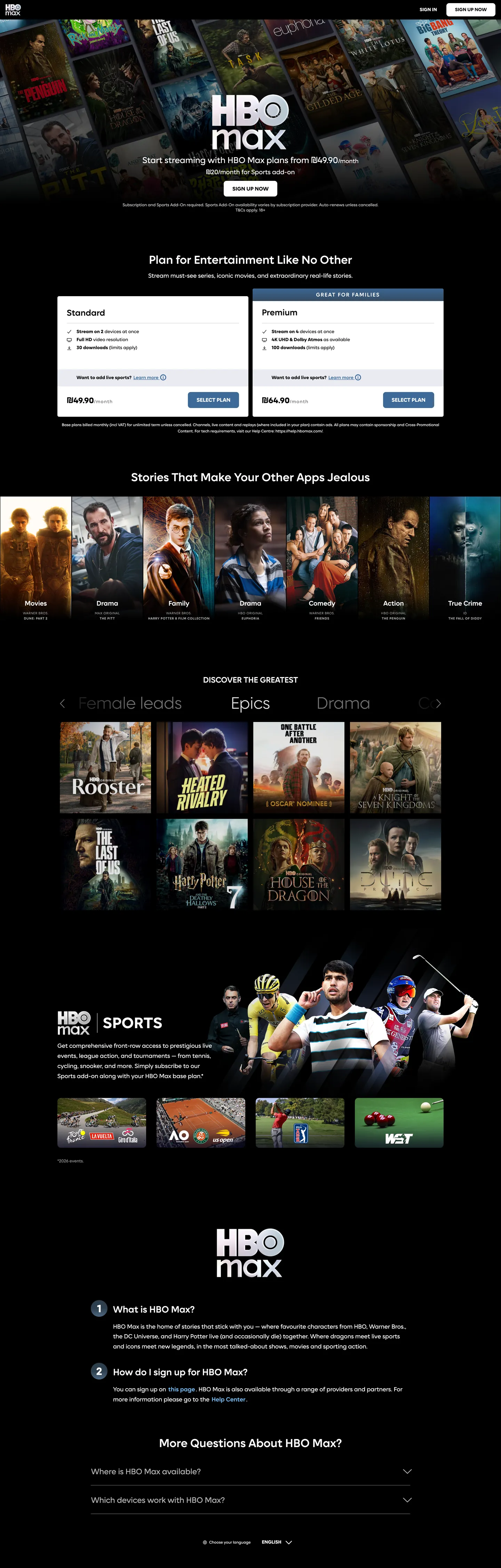
HBO Max's marketing page opens the way the product opens — full-bleed poster art across the top, with the white HBO Max wordmark sitting over a wall of show thumbnails (The Last of Us, House of the Dragon, The Penguin, A24 titles) before any nav, any tagline, any chrome. The poster wall IS the hero. Beneath it the page narrows into a two-column plan-picker captioned "Plan for Entertainment Like No Other" — a Standard column on the left and a Premium column on the right, both anchored by an HBO-blue Select Plan pill in the brand's signature deep blue. Where Netflix splits its hero into a single 56px / weight 900 typographic shout over a charcoal floor, HBO Max trusts the poster wall and lets the typography sit at a measured 35px / weight 600 — the editorial-magazine treatment, not the streaming-shout treatment.
The DESIGN.md file packages the system into a machine-readable spec for React tooling. Inside: 6 captured color tokens grouped into the HBO-blue voltage, a light-blue inline accent, a deep-purple section surface, and the cinema-black / white / hairline structural set; 14 Max Sans typography tokens spanning a 9.6px uppercase microcaption tier through a 56px display weight 100 carrier; 5 corner radii anchored on 8px with a 10px plan-picker pill variant and a 100% icon-button option; and 18 components recipes covering the Select Plan CTA, the plan-picker card stripe, the poster-grid tile, the FAQ accordion ("More Questions About HBO Max?"), the Sports surface band, and the section-heading scaffold.
Feed this file to Claude or Cursor and it reproduces HBO Max's specific moves: poster-grid hero instead of typographic hero, single HBO-blue Select Plan voltage held in reserve, Max Sans across every tier, and the 8px-on-cards / 10px-on-plan-pills radius split. The one move worth borrowing only if your product is itself visually rich: the willingness to put NO brand chrome above the content grid. HBO Max gets away with it because the catalog is the brand. A typical SaaS landing would need an interstitial typographic layer to fill the same vertical space.
What makes it distinct
5
- Poster-grid as canvasfull-bleed walls of show artwork carry the only chromatic load, identical to the move Netflix and Prime Video make
- Single HBO-blue voltage#3d6a99 fills the Select Plan CTA and nothing else above the fold; #71b8f2 carries inline plan-comparison accents
- Max Sans across every tierdisplay, heading, body, button, and the 9.6px uppercase microcaption strip all share one custom proprietary sans
- Mixed-radius scale8px on cards and CTAs, 10px on plan-picker pills, fully circular on icon affordances; no 12-16-20 middle tier
- Cinema-black floor#000000 anchors the body so poster art and the deep-purple #120c1d section behind sports content read as cinematic stage lighting
max.com
Live at max.com
A snapshot of the brand in production. Scroll the frame to see the whole page.
Colors
7 colors
HBO Max's system runs on #3d6a99 as its primary voltage, used in 2 of 18 components. Type is set in Max Sans across 13 tokens from 9.6px to 56px, weights 100–700. Shape language is mixed across 18 components, blending pills, soft rounds, and squarer corners.
Brand & Accent
Sparing, CTA-only voltage · 2
Surface
Page and card backgrounds · 2
Text
Headlines, body, captions · 2
Borders & Hairlines
Dividers, outlines, rules · 1
Typography
13 type tokens
Set in Max Sans across 13 tokens, from 9.6px to 56px, weights 100–700. Shown in its own stack: where the font isn't installed, the fallback the file names stands in.
- display-xl56px · weight 100 · lh 89.6pxThe quick brown fox jumps over the lazy dog
- display-md35px · weight 600 · lh 47.25pxThe quick brown fox jumps over the lazy dog
- heading-lg28px · weight 600 · lh 37.8pxThe quick brown fox jumps over the lazy dog
- heading-md25.6px · weight 600 · lh 34.56pxThe quick brown fox jumps over the lazy dog
- heading-sm24px · weight 700 · lh 32.4pxThe quick brown fox jumps over the lazy dog
- subheading-md20px · weight 600 · lh 27pxThe quick brown fox jumps over the lazy dog
- body-lg18px · weight 400 · lh 28.8pxThe quick brown fox jumps over the lazy dog
- body-md16px · weight 700 · lh 17.6pxThe quick brown fox jumps over the lazy dog
- body-sm14px · weight 400 · lh 16.8pxThe quick brown fox jumps over the lazy dog
- label-uppercase14px · weight 700 · lh 15.4pxThe quick brown fox jumps over the lazy dog
- microcaption9.6px · weight 300 · lh 15.36px · tracking 0.8pxThe quick brown fox jumps over the lazy dog
- nav-link20px · weight 400 · lh 20pxThe quick brown fox jumps over the lazy dog
- link-em14px · weight 400 · lh 18.9px · tracking 1.4pxThe quick brown fox jumps over the lazy dog
Layout
Radii and spacing
5 corner radii and 7 spacing values. Shape language: mixed.
Radii
- none0px
- xs4.5px
- md8px
- lg10px
- full9999px
Spacing
- xs4px
- sm8px
- base16px
- lg24px
- xl30px
- 2xl48px
- 3xl56px
Components
18 components
Each rendered from its tokens (color, type, radius, padding) on HBO Max's own canvas.
- Button Primarybutton-primaryButton Primary
- Button Primary Hoverbutton-primary-hoverButton Primary Hover
- Button Secondarybutton-secondaryButton Secondary
- Top Navtop-navTop Nav
- Nav Linknav-linkNav Link
- Hero Poster Gridhero-poster-gridHero Poster Grid
- Hero Headinghero-headingHero Heading
- Section Headingsection-headingSection Heading
- Body Paragraphbody-paragraphBody Paragraph
- MicrocaptionmicrocaptionMicrocaption
- CardcardCard
- Plan Picker Stripeplan-picker-stripePlan Picker Stripe
- Plan Columnplan-columnPlan Column
- Poster Tileposter-tilePoster Tile
- Sports Bandsports-bandSports Band
- Faq Rowfaq-rowFaq Row
- Type here…text-inputText Input
- icon-buttonIcon Button
In use
The system, in use
HBO Max's tokens on the kind of product it builds.
Build something people actually use.
A short paragraph of marketing copy that previews how the brand's display tier and body tier read together. Two sentences is usually enough.
FAQ
HBO Max design system FAQ
Common questions about HBO Max's tokens, components, and how to use this DESIGN.md in your project.
Read next
Related reading
Specs, directories, and component libraries that pair with this design system.
- Browse all design systemsThe full directory of DESIGN.md files on shadcn.io, with live mockups for each.shadcn.io
- HBO Max — official siteHBO Max's public marketing site — the source of truth for the live tokens captured in this file.max.com (opens in a new tab)
- The DESIGN.md specificationGoogle Labs' open spec for machine-readable design system files — the format this page is built on.github.com (opens in a new tab)
Use it
Use HBO Max in your project
One machine-readable file. Drop it into Claude, Cursor, or any AI tool that reads DESIGN.md.
Download the DESIGN.md
One machine-readable file: every color, type, radius, spacing, and component token of HBO Max.
Feed it to your AI tool
Drop it into Claude, Cursor, or GitHub Copilot. The agent writes React components and Tailwind classes that match HBO Max's visual language.
Reference the tokens directly
Or paste the values into your Tailwind config, CSS variables, or component library: every color, size and radius is a quoted, ready-to-copy value.
Read the full DESIGN.md: overview, rationale, do’s and don’ts
Overview
HBO Max's marketing page opens the way the product opens. Poster-grid as canvas. The hero is not a typographic shout — it is a full-bleed wall of show artwork with the white HBO Max wordmark sitting on top, no headline, no sub-copy, no CTA above the catalog. The brand makes its first claim through the catalog itself: The Last of Us next to House of the Dragon next to The Penguin, with A24 prestige titles stacked beneath. Where Netflix splits the hero into a single 56px / weight 900 typographic shout over a charcoal floor, and where Apple TV+ trusts a single 80px feature poster as the entire above-fold experience, HBO Max packs the canvas with twelve-plus posters and trusts the density to do the work.
The chromatic move reinforces the discipline. There is exactly one brand voltage — HBO blue ({colors.primary} — #3d6a99) — and it appears as a single role: the background fill of the Select Plan CTA pill on both plan-picker columns (the Standard and the higher-tier paid columns). A second light-blue accent ({colors.primary-accent} — #71b8f2) carries inline price-comparison highlights inside the same plan-picker but never escapes to other surfaces. Every other color the eye sees on the page belongs to show artwork, not to brand chrome. The deep-purple {colors.surface-sports} (#120c1d) handles a single section band behind the Sports content surface — a quiet sub-product signal that doesn't break the cinema-black discipline.
Typography is Max Sans across every tier — a custom proprietary sans Warner Bros Discovery ships with the rebrand. There is no secondary family. Display sits at {typography.display-md} (35px / weight 600) for "Plan for Entertainment Like No Other"; body at {typography.body-lg} (18px / weight 400) for the section paragraphs; and a distinctive {typography.microcaption} tier (9.6px / weight 300 / 0.8px tracking / uppercase) handles legal lines and metadata. The system also carries a 56px / weight 100 carrier inside poster-rail captions — the only weight-100 moment in the system, presumably reserved for cinematic framing copy.
Key Characteristics:
- Pure black canvas (
{colors.canvas}— #000000) anchors the page floor so poster artwork reads as cinematic stage lighting rather than flat tiles. - Single HBO-blue voltage (
{colors.primary}— #3d6a99) appears only as the Select Plan CTA fill — never on text, never on borders, never on hairlines. Frequency 4 across the captured page. - Max Sans across every typographic tier, with a 14-step ladder spanning 9.6px / weight 300 to 56px / weight 100.
- Mixed-step radius scale:
{rounded.md}(8px) on 17 of 31 captured surfaces,{rounded.lg}(10px) on the plan-picker stripe,{rounded.full}on icon affordances. No 12-16-20px middle tier. - Deep-purple
{colors.surface-sports}(#120c1d) handles the Sports band background — a single sub-product surface that signals category without leaving the cinema-black floor. - 9.6px uppercase microcaption tier (
{typography.microcaption}) does the work that a small-caps sans label tier would normally do — legal lines, metadata, footnote strips. - Poster-grid density is the brand's structural device: every major section ("Stories That Make Your Other Apps Jealous," "Discover the Biggest," "More Questions") opens with another wall of artwork rather than with marketing illustration.
- Plan-picker is a two-column comparison (a Standard tier on the left, a higher-tier paid column on the right), both anchored by an HBO-blue Select Plan pill — the page's only direct ask.
Colors
Brand
- HBO Blue (
{colors.primary}— #3d6a99): frequency 4. Used as text (2), background (2). Wired in CSS as--emea-plan-picker-button-colorand--emea-plan-picker-button-hover-color. The single brand voltage — the Select Plan CTA fill on both plan-picker columns. Never appears as a border or hairline; the role is strictly "press this." - HBO Light Blue (
{colors.primary-accent}— #71b8f2): frequency 2. Used as text only. Wired as--emea-plan-picker-accent-color. The inline price-comparison accent inside the plan-picker — highlights the cheaper monthly rate or the "save" label. Scoped to one component.
Surface
- Canvas (
{colors.canvas}— #000000): frequency 120 — the dominant page floor. Used as bg (3), text (59), border (58). Maximum contrast with poster artwork is the intent; softening to a slightly-blue near-black would muddy the cinematic stage-lighting effect. - Sports Surface (
{colors.surface-sports}— #120c1d): frequency 1 — background only. The deep-purple band behind the Sports content section. A single sub-product surface that signals category without leaving the cinema-black system.
Text
- Ink (
{colors.ink}— #ffffff): frequency 410 — the dominant typographic color. Used as text (220), bg (3), border (187). Wired as--emea-plan-picker-button-text-color. Pure white on pure black across every tier of running copy. - Ink Muted (
{colors.ink-muted}— #e7e7e7): frequency 14. Used as text (7), border (7). Wired as--emea-plan-picker-stripe-background. The secondary text tone for microcaption tier and the plan-picker stripe background.
Hairline
- Hairline (
{colors.hairline}— #e7e7e7): the dominant border tone. Card outlines, plan-column dividers, FAQ accordion rows. The same value as{colors.ink-muted}— the system reuses one off-white for both secondary text and hairlines.
Typography
Font Family
The system runs Max Sans for every tier — a custom proprietary sans Warner Bros Discovery commissioned for the post-merger rebrand. The fallback stack walks -apple-system, "system-ui", "Segoe UI", Roboto, "Helvetica Neue", Arial, "Noto Sans", sans-serif. There is no separate display family, no serif tier, no monospace voice. One variable-weight sans does display, heading, body, button, label, and the 9.6px microcaption strip.
Hierarchy
| Token | Size | Weight | Line Height | Letter Spacing | Use |
|---|---|---|---|---|---|
{typography.display-xl} | 56px | 100 | 89.6px | 0 | Poster-rail carrier captions ("Stories That Make…") |
{typography.display-md} | 35px | 600 | 47.25px | 0 | Hero h2 ("Plan for Entertainment Like No Other") |
{typography.heading-lg} | 28px | 600 | 37.8px | 0 | Section h3 ("More Questions About HBO Max?") |
{typography.heading-md} | 25.6px | 600 | 34.56px | 0 | Sub-section h3 (plan-picker column titles) |
{typography.heading-sm} | 24px | 700 | 32.4px | 0 | h4 headings inside plan-picker cards |
{typography.subheading-md} | 20px | 600 | 27px | 0 | h4 / feature-row titles |
{typography.body-lg} | 18px | 400 | 28.8px | 0 | Default running text, section paragraphs |
{typography.body-md} | 16px | 700 | 17.6px | 0 | Primary CTA label ("Select Plan") |
{typography.body-sm} | 14px | 400 | 16.8px | 0 | Secondary running text |
{typography.label-uppercase} | 14px | 700 | 15.4px | 0 | Uppercase span labels |
{typography.microcaption} | 9.6px | 300 | 15.36px | 0.8px | Legal lines, metadata, uppercase footnote strips |
{typography.nav-link} | 20px | 400 | 20px | 0 | Top-nav link labels |
{typography.link-em} | 14px | 400 | 18.9px | 1.4px | Emphasized inline link text |
Principles
The display tier tops out at 35px / weight 600, not at 56px / weight 900. The 56px appearance is a weight-100 carrier — airy, cinematic, scoped to poster-rail framing — not a typographic shout. The hierarchy depends on weight and tracking, not on a wide type-scale ratio. The 9.6px microcaption with 0.8px tracking and weight 300 is the system's quietest typographic moment — the work an uppercase-tracked sans label tier would normally do.
Note on Font Substitutes
Max Sans is proprietary. Inter at the same weights is the closest open-source substitute; for the 56px / weight 100 carrier, Helvetica Now Thin or Inter at weight 100 preserves the airy display feel. The 9.6px microcaption tier transfers cleanly to any sans at the same size and tracking — Inter's letterforms read close to Max Sans at sub-12px sizes.
Layout
Spacing System
- Base unit: 8px — the dominant gap value, with
{spacing.base}(16px) and{spacing.sm}(8px) carrying 57 of the captured padding values combined. - Tokens:
{spacing.xs}4px ·{spacing.sm}8px ·{spacing.base}16px ·{spacing.lg}24px ·{spacing.xl}30px ·{spacing.2xl}48px ·{spacing.3xl}56px. - Section padding (vertical): ~48px between major bands on the cinema-black canvas.
- Card internal padding: 22.5x27px on the standard
{component.card}, 30px on{component.plan-column}, 16x24px on{component.faq-row}. - Top-nav padding: 0 vertical, 56px horizontal — the nav sits flush at page top with no inset.
Grid & Container
- Hero poster grid: full-bleed, edge-to-edge, no max-width. Twelve-plus poster tiles arranged in a single horizontal band with no gutters between artwork.
- Plan-picker: two-column 50/50 grid, max-width ~1080px, separated by the
{colors.ink-muted}divider stripe. - Section grids: 4-column poster strips ("Stories That Make Your Other Apps Jealous," "Discover the Biggest") at max-width ~1280px, collapsing to 2-column on tablet.
- Sports band: full-bleed deep-purple block, with a centered content column at ~1080px max-width.
- FAQ accordion: centered single column at ~720px max-width.
Rhythm
The page alternates between edge-to-edge poster density (hero wall, mid-page show-grid bands) and constrained centered editorial (plan-picker, FAQ accordion). There is no atmospheric gradient between bands — every section terminates on the same pure-black floor, and depth comes from poster artwork rather than from background-color shifts. The single exception is the deep-purple Sports band, which signals "different sub-product" by surface color alone.
Elevation
The system has essentially no shadow tier. The canvas is too dark for traditional drop shadows to read — instead, hierarchy comes from poster artwork lifted off the {colors.canvas} floor by image content alone. Plan-picker cards and FAQ rows carry 1px {colors.hairline} borders rather than shadows.
- Flat (no shadow): body, hero poster wall, footer, every editorial band — 99% of surfaces.
- Hairline outlines:
{colors.hairline}(#e7e7e7) marks plan-column edges, FAQ row dividers, and card boundaries. The same off-white doubles as the muted text tone — the system reuses one value for both roles. - Poster-artwork lift: the only "elevation" the system declares is the visual weight of show artwork against the pure-black floor. No drop shadow is drawn; the contrast does the work.
Shapes
The radius scale is mixed-step, not a single linear ladder:
{rounded.none}0px — the hero poster wall, the top-nav, the Sports band.{rounded.xs}4.5px — a single off-system value used twice; appears on small inline chips.{rounded.md}8px — dominant on 17 of 31 captured surfaces. Cards, the Select Plan CTA, plan-picker columns, poster tiles, FAQ rows.{rounded.lg}10px — appears 4 times, scoped to the plan-picker outer card stripe. The 2px step from{rounded.md}reads as a deliberate elevation move between the inner CTA and the outer card.{rounded.full}9999px — icon affordances and avatar chips. Fully circular treatment for the most-tappable controls.
There is no 12 / 16 / 20px middle tier. The scale skips straight from 8-10px to fully circular — the same binary discipline Cloudflare runs, but with one extra step in the small-to-medium range.
Components
hero-poster-grid — Full-bleed wall of show artwork across the top of the page. Pure-black {colors.canvas} underneath but rarely visible through the dense poster wall. No padding, no border-radius — edge-to-edge. The white HBO Max wordmark sits on top of the wall as the only typographic element above the fold.
button-primary — The Select Plan CTA. HBO-blue {colors.primary} fill, white {colors.ink} text, {rounded.md} 8px radius, 13x24px padding, 46px height, {typography.body-md} (16px / weight 700) label. The single in-system instance of the brand voltage.
button-primary-hover — Same fill, dropped to 75% opacity. Wired in CSS as --emea-plan-picker-button-hover-color: rgba(61, 106, 153, .75) — the press state is opacity, not a color shift.
button-secondary — Transparent fill with white text and a 1px hairline border. Used for "Sign In" in the top nav and for tertiary CTAs.
top-nav — Pure-black surface, 64px height, 0x56px padding. Houses the HBO Max wordmark flush left, product-nav links (Movies, Shows, Sports, Originals) center, and a Sign In / Subscribe cluster flush right.
nav-link — Transparent background, white text in {typography.nav-link} (20px / 400), 4x0px padding, 40px height. No hover background visible in the captured surface.
hero-heading — White text, {typography.display-md} (35px / weight 600). Used for "Plan for Entertainment Like No Other" above the plan-picker.
section-heading — White text, {typography.heading-lg} (28px / weight 600). Used for "Stories That Make Your Other Apps Jealous," "Discover the Biggest," "More Questions About HBO Max?"
body-paragraph — Default white text at {typography.body-lg} (18px / 400). The hero sub-paragraph and section leads.
microcaption — {colors.ink-muted} (#e7e7e7) text at {typography.microcaption} (9.6px / weight 300 / 0.8px tracking / uppercase). Legal lines, metadata, footnote strips. The quietest typographic moment in the system.
card — Cinema-black fill, white text, {rounded.md} 8px radius, 22.5x27px padding, 1px hairline border. The default content card on the dark canvas.
plan-picker-stripe — {colors.ink-muted} (#e7e7e7) background, black text, {rounded.lg} 10px radius, 10x24px padding. The outer band that wraps the plan-picker columns and carries the comparison label.
plan-column — Transparent fill, white text, {rounded.md} 8px radius, 30px padding, 1px hairline border. The two paid-tier columns of the plan picker, each anchored by a Select Plan CTA.
poster-tile — Cinema-black underneath, white wordmark overlay, {rounded.md} 8px radius, 0 padding (the poster image fills the tile edge-to-edge). Used in the section-level show grids.
sports-band — Deep-purple {colors.surface-sports} (#120c1d) background, white text, full-bleed, 48x56px padding. The single sub-product surface band, signaling Sports content by surface color alone.
faq-row — Pure-black fill, white text, {rounded.md} 8px radius, 16x24px padding, 1px hairline border. The accordion rows in the "More Questions About HBO Max?" section at page bottom.
text-input — Pure-black surface, white text, {rounded.md} 8px radius, 8x16px padding, 44px height, 1px hairline border. The email-capture field in the sign-up band.
icon-button — Transparent fill, white icon, {rounded.full} (fully circular), 8px padding, 40px height. The play / info / mute icons that overlay poster tiles.
Do's and Don'ts
Do treat HBO blue {colors.primary} (#3d6a99) as a single, scarce CTA fill. The system has exactly one role for the brand voltage — the Select Plan pill — and multiplying it into nav links, accent borders, or section dividers would dilute the only direct ask on the page.
Do use {colors.canvas} (#000000) — not a slightly-blue near-black — for the page floor. The maximum contrast with poster artwork is intentional; softening it would make show thumbnails read as flat tiles rather than as cinematic stage lighting.
Do keep display weight at 600 max for typographic shouts, and reserve weight 100 for the 56px poster-rail carrier. The hero h2 at 35px / 600 is the loudest spoken moment; bumping to 900 would turn the editorial dek into a Netflix-style shout and undercut the poster-as-protagonist principle.
Do let the 9.6px {typography.microcaption} tier carry every legal line, metadata strip, and footnote. The system has no uppercase-tracked sans label tier; if you reach for one, you have broken the typographic split.
Don't introduce a third blue. The system has exactly two — {colors.primary} (#3d6a99) and {colors.primary-accent} (#71b8f2) — both scoped to the plan-picker. Adding a third for a link color or hover state would create a chromatic ladder the system explicitly avoids.
Don't use {colors.surface-sports} (#120c1d) outside the Sports content band. The deep-purple is a sub-product surface signal, not a secondary brand color. Painting another section with it would suggest a content category that does not exist.
Don't introduce a 12 / 16 / 20px middle radius tier. The system is binary in spirit — 8px on most surfaces, 10px on the plan-picker stripe, fully circular on icon controls. Adding a middle value softens the contrast between body chrome and the circular tap targets.
Don't add a tinted shadow or glow under the Select Plan CTA. The system has no shadow tier; lift comes from poster-artwork contrast against the black floor and from 1px hairline borders. A shadow would feel borrowed from a SaaS dashboard rather than from a cinema-marketing surface.
Known Gaps
- Hover and focus states: documented for
{component.button-primary-hover}only (75% opacity drop). The full state matrix — focus rings, disabled tints, error states — is not captured from the marketing surface. - Form input error states:
{component.text-input}carries the resting state; validation styling for the email-capture field is not exposed on the marketing site. - Light mode: the captured marketing surface is dark-only. A light variant exists in the product player's accessibility-preferences panel but is not represented here.
- Motion: the hero poster wall and the mid-page poster carousels animate on scroll (parallax, auto-rotation) but the spec captures end-state values only. Easing curves and rotation rate live in the product runtime.
- Product player surfaces: this DESIGN.md captures the marketing site only. The HBO Max video player carries a much richer token system — playback controls, subtitle styling, episode-list panels, parental-control surfaces — that is not represented here.
- Sub-brand color expansion: the captured page exposes only the deep-purple Sports band as a sub-product surface. The Originals, Movies, and Kids surfaces presumably carry their own band colors but are not exposed in the extracted CSS.
- Plan-picker gradient: CSS exposes
--emea-plan-picker-badge-backgroundas a 180-degree HBO-blue-to-deep-navy gradient on the "Recommended" plan-badge, but this gradient was not captured as a rendered fill in the live screenshot, so the gradient stops are documented as a known gap rather than as declared tokens.
Music, Video & Streaming
More systems like this
More DESIGN.md files in Music, Video & Streaming.
Pricing
Build it with Pro
The DESIGN.md files are free. Pro adds 6,000+ blocks, premium templates and the MCP server, so your AI editor builds in your system for you.
4.9/5 out of 5 · 150+ reviewsfrom 150+ founders and developers.
Billing
Billed once a year in USD. Cancel anytime.
- How many people can use the license.
- Client work, SaaS products and anything you charge for.
- Production-ready React sections: hero, pricing, features, dashboards and more.
- Complete multi-page sites you can ship as they are.
- React icons from every major library, installable with one command.
- Presets that restyle every block, in light and dark.
- Lets your AI editor search, preview and install blocks for you.
- Priority requests are answered first.
Individual
For personal projects & open source
$32instead of $49/mo
$389 billed yearly
- Seats: 1 seat
- Commercial use: Personal & open source only
- Pro blocks: 6,000+ blocks
- Templates: All 14 templates
- React icons: 294k+ icons
- Themes: All 59 themes
- MCP server: Basic usage
- Support: Standard
Team
Most popularFor freelancers, agencies & startups
$66instead of $99/mo
$789 billed yearly · ≈ $13/dev/mo
- Seats: Up to 5 seats
- Commercial use: Included
- Pro blocks: 6,000+ blocks
- Templates: All 14 templates
- React icons: 294k+ icons
- Themes: All 59 themes
- MCP server: High usage
- Support: Priority
Organization
For companies with larger teams
$132instead of $199/mo
$1,589 billed yearly
- Seats: Unlimited seats
- Commercial use: Included
- Pro blocks: 6,000+ blocks
- Templates: All 14 templates
- React icons: 294k+ icons
- Themes: All 59 themes
- MCP server: Unlimited usage
- Support: Priority
Billed once a year in USD. Cancel anytime.
Individual
For personal projects & open source
$32instead of $49/mo
$389 billed yearly
- How many people can use the license.Seats: 1 seat
- Client work, SaaS products and anything you charge for.Commercial use: Personal & open source only
- Production-ready React sections: hero, pricing, features, dashboards and more.Pro blocks: 6,000+ blocks
- Complete multi-page sites you can ship as they are.Templates: All 14 templates
- React icons from every major library, installable with one command.React icons: 294k+ icons
- Presets that restyle every block, in light and dark.Themes: All 59 themes
- Lets your AI editor search, preview and install blocks for you.MCP server: Basic usage
- Priority requests are answered first.Support: Standard
Team
Most popularFor freelancers, agencies & startups
$66instead of $99/mo
$789 billed yearly · ≈ $13/dev/mo
Everything in Individual, plus
- How many people can use the license.Seats: Up to 5 seats
- Client work, SaaS products and anything you charge for.Commercial use: Included
- Lets your AI editor search, preview and install blocks for you.MCP server: High usage
- Priority requests are answered first.Support: Priority
Organization
For companies with larger teams
$132instead of $199/mo
$1,589 billed yearly
Everything in Team, plus
- How many people can use the license.Seats: Unlimited seats
- Lets your AI editor search, preview and install blocks for you.MCP server: Unlimited usage
- Secure checkout via Stripe
- Code lives in your repo
- Keep what you've shipped if you cancel
- License terms
Your system, built for you
Every block, template and icon, installed by your AI agent in your design system. The DESIGN.md files stay free.