Apple Music Design System
Apple Music's design system as a DESIGN.md file. Music Red #fa243c, SF Pro Display 128px, 21 colors, 20 components. For React, Next.js, and AI tools.
Add shadcn.io to your AI agent. · Pro It installs blocks, icons and templates in your design system from a prompt, with Pro.
Set up MCP- Primary
- #fa243c
- Typeface
- SF Pro Display
- Shape
- Soft
- Base radius
- 18px
- Colors
- 21
- Type tokens
- 11
- Components
- 20
- Spacing values
- 9
About
About Apple Music DESIGN.md
Curated by Dov Azencot · Updated May 13, 2026 · Source apple.com (opens in a new tab)
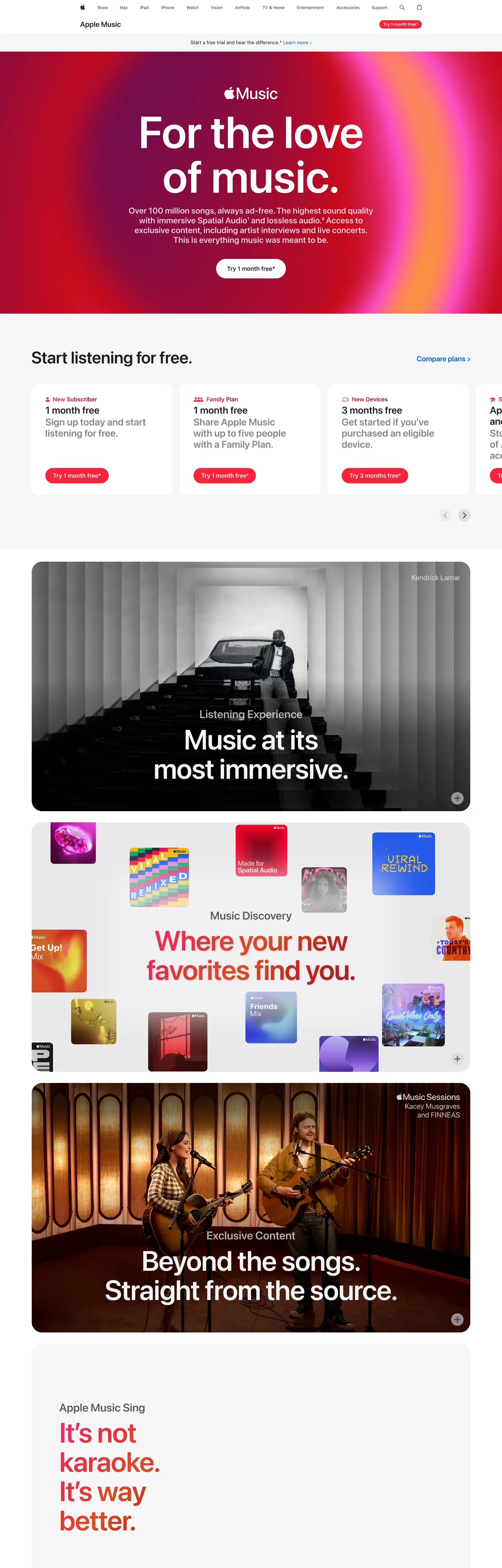
Apple Music's marketing page is the loudest surface in Apple's web property — the rare moment Apple lets chromatic gradient do the work its product photography usually carries. The hero is a radial wash of Music Red (#fa243c) bleeding into magenta (#ff4dc3) and aubergine (#591962), with SF Pro Display set at 128px / 600 and -0.256px tracking floating above it in pure white. Below the hero, the page reverts to Apple's house grammar — white parchment cards at 10px radius, near-black ink (#1d1d1f) for body, and Action Blue (#0066cc) for every pill CTA — then alternates into dark photographic tiles for "Listening Experience" and "Music Discovery", each anchored by another gradient panel. The system is restrained Apple chrome carrying a saturated music-product payload.
This page captures the system as a DESIGN.md file built on the Google Labs spec for machine-readable design tokens. Inside: 21 colors tokens covering the gradient ramp (Music Red, Crimson #c00020, Magenta #ff4dc3, Aubergine #591962, plus three coral-orange supporting stops), Apple's structural blacks and parchments, and the Action Blue interactive accent; 11 typography tokens running on SF Pro Display for the 21–128px display ladder and SF Pro Text for the 12–17px body ladder; six radius tokens centered on the 10px / 980px binary; an 8.4-step spacing scale anchored on 9.6px (78 occurrences) and 24px (15 occurrences); and 20 components recipes covering the gradient hero, dark immersion tile, discovery panel, blue pill CTA, parchment plan card, and the persistent global nav.
Drop the file into Claude, Cursor, GitHub Copilot, or any tool that reads structured design tokens. The agent produces React components that match Apple Music's actual voice — gradient hero on radial wash, dark photographic immersion, parchment plan card, blue pill CTA — rather than a generic music-app template. Use it as a reference when you need a streaming product page that breaks its parent brand's chrome restraint without abandoning it, a teaching artifact for chromatic discipline within a single-accent system, or a starting point for any subscription product whose marketing wants to feel emotional rather than catalog-grade.
What makes it distinct
5
- Radial gradient heroMusic Red (#fa243c) bleeds into magenta (#ff4dc3) and aubergine (#591962), a chromatic intensity Apple.com itself refuses
- Display headline at 128px / 600 / -0.256px trackingthe SF Pro Display ceiling, used once per surface
- Pill-and-radius binary10px (56 uses) for tiles, 980px (12 uses) for every CTA, nothing in between for interactive grammar
- Quiet pill CTA inside loud canvasAction Blue (#0066cc, 64 hits, all text and border) stays the same hex against the gradient roar
- Three-tile rhythmgradient hero, dark photographic immersion (#1d1d1f), then chromatic discovery panel, repeated as the page scrolls
apple.com
Live at apple.com
A snapshot of the brand in production. Scroll the frame to see the whole page.
Colors
21 colors
Apple Music's system runs on #fa243c as its primary voltage, used in 2 of 20 components. Type is set in SF Pro Display across 11 tokens from 12px to 128px, weights 400–600. Shape language is soft — components average 367px corner radius, with no sharp interactive edges.
Brand & Accent
Sparing, CTA-only voltage · 4
Surface
Page and card backgrounds · 6
Text
Headlines, body, captions · 4
Borders & Hairlines
Dividers, outlines, rules · 1
Other
Specialty colors · 6
Typography
11 type tokens
Set in SF Pro Display across 11 tokens, from 12px to 128px, weights 400–600. Shown in its own stack: where the font isn't installed, the fallback the file names stands in.
- hero-display128px · weight 600 · lh 1 · tracking -0.256pxThe quick brown fox jumps over the lazy dog
- display-xl80px · weight 600 · lh 1.05 · tracking -1.2pxThe quick brown fox jumps over the lazy dog
- display-lg72px · weight 600 · lh 1 · tracking -0.648pxThe quick brown fox jumps over the lazy dog
- display-md48px · weight 600 · lh 1.08 · tracking -0.144pxThe quick brown fox jumps over the lazy dog
- heading-lg32px · weight 600 · lh 1.13 · tracking 0.128pxThe quick brown fox jumps over the lazy dog
- heading-md28px · weight 600 · lh 1.14 · tracking 0.196pxThe quick brown fox jumps over the lazy dog
- lead24px · weight 600 · lh 1.17 · tracking 0.216pxThe quick brown fox jumps over the lazy dog
- subhead21px · weight 400 · lh 1.19 · tracking 0.231pxThe quick brown fox jumps over the lazy dog
- body17px · weight 400 · lh 1.47 · tracking -0.374pxThe quick brown fox jumps over the lazy dog
- body-strong17px · weight 600 · lh 1.24 · tracking -0.374pxThe quick brown fox jumps over the lazy dog
- caption12px · weight 400 · lh 1.33 · tracking -0.12pxThe quick brown fox jumps over the lazy dog
Layout
Radii and spacing
6 corner radii and 9 spacing values. Shape language: soft.
Radii
- none0px
- sm10px
- md18px
- lg30px
- xl36px
- pill980px
Spacing
- xxs2px
- xs8.4px
- sm9.6px
- md12.8px
- base20px
- lg24px
- xl25px
- xxl52px
- section80px
Components
20 components
Each rendered from its tokens (color, type, radius, padding) on Apple Music's own canvas.
- Global Navglobal-navGlobal Nav
- Apple Music Ribbonapple-music-ribbonApple Music Ribbon
- Ribbon Ctaribbon-ctaRibbon Cta
- Hero Gradient Bandhero-gradient-bandHero Gradient Band
- Hero Headlinehero-headlineHero Headline
- Hero Subcopyhero-subcopyHero Subcopy
- Button Primary Bluebutton-primary-blueButton Primary Blue
- Button Primary Blue Focusbutton-primary-blue-focusButton Primary Blue Focus
- Button Secondary Pillbutton-secondary-pillButton Secondary Pill
- Plan Cardplan-cardPlan Card
- Plan Card Eyebrowplan-card-eyebrowPlan Card Eyebrow
- Plan Card Titleplan-card-titlePlan Card Title
- Immersion Tile Darkimmersion-tile-darkImmersion Tile Dark
- Discovery Paneldiscovery-panelDiscovery Panel
- Exclusive Content Tileexclusive-content-tileExclusive Content Tile
- Karaoke Bandkaraoke-bandKaraoke Band
- Album Art Thumbalbum-art-thumbAlbum Art Thumb
- Text Linktext-linkText Link
- Fine Print Rowfine-print-rowFine Print Row
- FooterfooterFooter
In use
The system, in use
Apple Music's tokens on the kind of product it builds.
Build something people actually use.
A short paragraph of marketing copy that previews how the brand's display tier and body tier read together. Two sentences is usually enough.
FAQ
Apple Music design system FAQ
Common questions about Apple Music's tokens, components, and how to use this DESIGN.md in your project.
Read next
Related reading
Specs, directories, and component libraries that pair with this design system.
- Browse all design systemsThe full directory of DESIGN.md files on shadcn.io, with live mockups for each.shadcn.io
- Apple Music — official pageThe live marketing page this DESIGN.md extracts from.apple.com (opens in a new tab)
- The DESIGN.md specificationGoogle Labs' open spec for machine-readable design system files.github.com (opens in a new tab)
Use it
Use Apple Music in your project
One machine-readable file. Drop it into Claude, Cursor, or any AI tool that reads DESIGN.md.
Download the DESIGN.md
One machine-readable file: every color, type, radius, spacing, and component token of Apple Music.
Feed it to your AI tool
Drop it into Claude, Cursor, or GitHub Copilot. The agent writes React components and Tailwind classes that match Apple Music's visual language.
Reference the tokens directly
Or paste the values into your Tailwind config, CSS variables, or component library: every color, size and radius is a quoted, ready-to-copy value.
Read the full DESIGN.md: overview, rationale, do’s and don’ts
Overview
Apple Music's marketing page is the chromatic outlier in Apple's web property — the rare surface where Apple lets a radial gradient do the work product photography usually carries on apple.com proper. The hero is a saturated wash from Music Red (#fa243c) through Magenta (#ff4dc3) into Aubergine (#591962), with SF Pro Display at 128px / 600 floating above it. Where most subscription marketing leans on dark canvases and isolated product shots, Apple Music inverts the convention: gradient supplies the emotion, and the photographic product imagery (album art, microphone, theater seats) sits inside subsequent dark immersion tiles below the fold.
The page operates as a three-beat rhythm. Beat one: the gradient hero with massive display headline and Action Blue (#0066cc) pill CTA. Beat two: a parchment plan-card row at 10px radius — "1 Month Free" pills with blue secondary buttons — that grounds the chromatic intensity in Apple's familiar shop grammar. Beat three: edge-to-edge dark immersion tiles on near-black canvases (#1d1d1f, #0d161f) carrying photographic scenes with white display headlines at 80px / 600. The pattern then repeats with a Music Discovery panel on rose pink (#e83273), an Exclusive Content tile on deep navy, and a Karaoke band fully painted in Music Red.
Gradient-as-mood: Apple Music borrows the saturated radial gradient from Apple's accessibility, fitness, and services marketing — chromatic mood as section anchor, never as decoration. The gradient bands carry feeling; the parchment bands carry conversion; the dark bands carry product immersion. Each surface mode has one job, and the system never mixes their grammars on the same band.
Key Characteristics:
- Radial gradient hero (#fa243c → #ff4dc3 → #591962) at 700px height, the page's loudest chromatic moment.
- SF Pro Display 128px / 600 / -0.256px tracking — the ceiling of Apple's type ladder, used exactly once.
- Action Blue (#0066cc) carries every CTA on parchment cards; the brand-side Music Red carries the global Apple Music ribbon pill and the karaoke band.
- 10px radius (56 uses) for plan cards and inline tiles; 980px radius (12 uses) for every pill CTA — a binary radius grammar.
- Section padding at 80px vertical, card padding at 24px, internal gaps at 9.6px (78 occurrences — the page's atomic rhythm).
- Three surface modes alternate: chromatic gradient ↔ parchment plan card ↔ dark immersion tile.
- Body copy at 17px / 400 / -0.374px — the canonical Apple body setting, unchanged from apple.com.
- No drop shadows on chrome; the only depth signal is surface-color change between bands.
Colors
Source page analyzed: the Apple Music marketing page at /apple-music. Color system extracted from a 1440×4500 capture covering the hero, plan-card row, three dark immersion tiles, two chromatic discovery panels, and the parchment footer band.
Brand & Gradient
- Music Red (
{colors.brand-music-red}—#fa243c) — frequency 51. Used as text (16), background (10), border (16), gradient stop (9). The brand voltage. Carries the Apple Music wordmark ribbon pill, the karaoke band's flat-fill background, and the hero gradient's hottest stop. - Crimson (
{colors.gradient-crimson}—#c00020) — frequency 13, all gradient. The deepest red stop in the radial wash, sitting beneath Music Red to add chromatic weight to the hero's lower-left quadrant. - Magenta (
{colors.gradient-magenta}—#ff4dc3) — frequency 9, all gradient. The upper-right hero stop; produces the pink-violet shoulder of the radial wash. - Aubergine (
{colors.gradient-aubergine}—#591962) — frequency 5, all gradient. The cold violet anchor at the gradient's edge; introduces purple to the otherwise red-magenta hero. - Pink (
{colors.gradient-pink}—#e83273) — frequency 4, all gradient. The Music Discovery panel's flat rose tone; sits between Music Red and Magenta on the hue ramp. - Coral (
{colors.gradient-coral}—#dc4c24), Rose ({colors.gradient-rose}—#e43240), Burgundy ({colors.gradient-burgundy}—#991e2f) — each frequency 4, all gradient. Supporting stops on the hue ramp, each adding 4 gradient hits to fill the chromatic mid-range. - Music Red Deep (
{colors.brand-music-red-deep}—#d6143a) — frequency 1, background. A darker red used for one accent fill on the page; reserve for emphasis on chromatic surfaces.
Brand & Accent (Interactive)
- Action Blue (
{colors.primary-action-blue}—#0066cc) — frequency 64. Used as text (32) and border (32), never as background. The universal Apple click signal — every blue pill CTA on the plan-card row, every inline text link, every parchment-surface action. Stays unchanged from apple.com. - Focus Blue (
{colors.primary-action-blue-focus}—#0071e3) — declared in CSS variables (--sk-focus-color); reserved for the keyboard focus ring on buttons.
Surface
- Pure White (
{colors.canvas}—#ffffff) — frequency 245. Used as text (91), background (75), border (79). The dominant canvas; carries plan cards, the Apple Music ribbon, hero headline color, and most body text on dark tiles. - Parchment (
{colors.canvas-parchment}—#f5f5f7) — declared in CSS variables (--sk-fill-tertiary). The signature Apple off-white for the footer and fine-print row. - Pearl (
{colors.surface-pearl}—#fafafc) — declared in CSS variables (--sk-fill-secondary,--r-globalnav-background-opened). Near-white used as the open-state fill on the global nav. - Cool Gray (
{colors.surface-cool}—#e8e8ed) — frequency 1. The neutral album-art placeholder fill; sits behind missing or loading thumbnail imagery. - Hairline (
{colors.hairline}—#d2d2d7) — frequency 26. Used as background (11) and border (15). The 1px hairline tone on plan cards and inline dividers.
Ink (Text)
- Near-Black Ink (
{colors.ink}—#1d1d1f) — frequency 991. Used as text (500) and border (484). The most-used hex on the page. Body headline color on parchment cards, the dark immersion tile background fill, and every body paragraph on a light surface. - Ink Secondary (
{colors.ink-secondary}—#6e6e73) — frequency 2. Plan-card eyebrow text ("1 MONTH FREE", "3 MONTHS FREE") and footer column heads. - Ink Muted (
{colors.ink-muted}—#86868b) — frequency 42. Used as text (21) and border (21). Secondary copy: legal fine-print, footer body, disabled link tone.
Dark Surface
- Near-Black Deep (
{colors.surface-near-black}—#0d161f) — frequency 3. Used as background (1) and shadow (2). The "Exclusive Content. Straight from the source." tile's deep-navy canvas; cooler than Ink, used only on the editorial immersion bands. - Pure Black (
{colors.surface-black}—#000000) — frequency 604. Used as text (296) and border (296). The global nav strip background and the chromatic alpha overlay base — appears in 10 CSS variables (--sk-glyph,--sk-fill-gray-alphaat rgba(0,0,0,0.88), etc.).
Typography
Font Family
- Display:
SF Pro Display, system-ui, -apple-system, sans-serif— Apple's proprietary display face, optimized for sizes ≥ 19px. Defines the voice of every headline from 21px through 128px. - Body / UI:
SF Pro Text, system-ui, -apple-system, sans-serif— the text-optimized variant for body copy, captions, buttons, and ribbon labels below 20px.
Hierarchy
| Token | Size | Weight | Line Height | Letter Spacing | Use |
|---|---|---|---|---|---|
{typography.hero-display} | 128px | 600 | 1.00 | -0.256px | Hero "For the love of music."; the SF Pro Display ceiling |
{typography.display-xl} | 80px | 600 | 1.05 | -1.2px | Dark immersion tile headlines ("Music at its most immersive.") |
{typography.display-lg} | 72px | 600 | 1.00 | -0.648px | Secondary editorial headline on chromatic panels |
{typography.display-md} | 48px | 600 | 1.08 | -0.144px | Discovery panel headline ("Where your new favorites find you.") |
{typography.heading-lg} | 32px | 600 | 1.13 | 0.128px | Section headings inside parchment bands |
{typography.heading-md} | 28px | 600 | 1.14 | 0.196px | Sub-section heads and h3 tiers |
{typography.lead} | 24px | 600 | 1.17 | 0.216px | Plan-card titles and lead paragraphs (the 25-count tier) |
{typography.subhead} | 21px | 400 | 1.19 | 0.231px | Hero subcopy and parchment-band intro |
{typography.body} | 17px | 400 | 1.47 | -0.374px | Default paragraph — the canonical Apple body setting |
{typography.body-strong} | 17px | 600 | 1.24 | -0.374px | Plan-card labels, inline emphasis, ribbon link |
{typography.caption} | 12px | 400 | 1.33 | -0.12px | Footer body, fine-print, eyebrow labels, global-nav link |
Principles
- 128px is the ceiling, used exactly once. SF Pro Display at 128px / 600 / -0.256px is reserved for the hero headline. Where most marketing pages climb to 80px and stop, Apple Music goes 60% taller — the size IS the chromatic gesture.
- Negative tracking at every display size. From -0.144px at 48px through -1.2px at 80px and -0.648px at 72px, every headline carries tight tracking. The 21px subhead breaks pattern with +0.231px tracking — positive at the body-display boundary.
- Body still at 17px, not 16px. Apple's reading pace stays unchanged. SF Pro Text at 17px / 400 / 1.47 / -0.374px is the default paragraph, exactly as on apple.com.
- Weight 500 is absent. The ladder runs 400 / 600. Mid-weight emphasis always lands at 600.
Layout
Spacing System
- Base atom: 9.6px (78 occurrences) — the page's smallest rhythm unit, used for inline gaps between plan-card eyebrow and title, between body and CTA, between caption rows.
- Tokens:
{spacing.xxs}2px ·{spacing.xs}8.4px ·{spacing.sm}9.6px ·{spacing.md}12.8px ·{spacing.base}20px ·{spacing.lg}24px ·{spacing.xl}25px ·{spacing.xxl}52px ·{spacing.section}80px. - Section vertical padding:
{spacing.section}(80px, 7 occurrences) on dark immersion tiles. Chromatic panels use{spacing.xxl}(52px, 10 occurrences) for tighter editorial cadence. - Card padding:
{spacing.lg}(24px, 15 occurrences) inside plan cards, with 9.6px between internal elements. - Button padding: 11px × 21px (10 occurrences) — the canonical Apple pill-CTA padding.
Grid & Container
- Max content width: ~1440px on dark immersion tiles; ~980px on parchment text rows.
- Column patterns: 3-card row on plan-selector ("1 Month Free", "1 Month Free", "3 Months Free"); 2-column split inside immersion tiles (headline left, photography right); full-bleed on hero and karaoke band.
- Gutters: 9.6–24px between plan cards; 0 gap between tiles (the surface color change is the divider).
Whitespace Philosophy
The hero band runs 700px tall with the headline anchored center-vertical. Plan cards breathe with 24px internal padding and 9.6px element gaps — tight, scannable, three across at desktop. Dark immersion tiles use the most generous air on the page: 80px vertical padding, 52px horizontal, headline left-aligned with photographic asset right-aligned. The chromatic discovery panels collapse this to 52px / 25px for a punchier editorial beat.
Elevation & Depth
| Level | Treatment | Use |
|---|---|---|
| Flat | No shadow, no border | Hero gradient band, full-bleed chromatic panels, dark immersion tiles |
| Hairline | 1px {colors.hairline} border | Plan cards, fine-print row separator |
| Surface ladder | Background-color change between bands | The page's primary depth signal |
| Chromatic depth | Radial gradient inside hero band | Mood, not elevation |
Shadow philosophy. Apple Music carries zero declared shadows in the extracted CSS — the page uses surface-color change between bands (chromatic gradient ↔ parchment ↔ near-black) as the only depth cue. Even the album-art thumbnails sit on flat fills without drop shadow. The gradient itself supplies all atmospheric depth the page needs; adding a CSS shadow on top would compete with it.
Decorative Depth
- Radial chromatic wash inside the hero band creates depth without geometry — the brightness ramp from Music Red toward Aubergine reads as light direction.
- Edge-to-edge band alternation (gradient ↔ parchment ↔ dark) creates rhythm without borders.
- No
backdrop-filteron this page — the global nav stays opaque black; the ribbon stays opaque white. The page reserves blur for surfaces where translucent layering is functional (apple.com store sticky bar), not editorial.
Shapes
Border Radius Scale
| Token | Value | Use |
|---|---|---|
{rounded.none} | 0px | Hero gradient band (full-bleed, no corner rounding) |
{rounded.sm} | 10px | Plan cards, inline content tiles, the dominant radius (56 uses) |
{rounded.md} | 18px | Immersion tile rounding when inset inside a parchment band (9 uses) |
{rounded.lg} | 30px | Album-art thumbnails and larger inline imagery (7 uses) |
{rounded.xl} | 36px | Hero-adjacent oversized tile imagery (4 uses) |
{rounded.pill} | 980px | Every CTA — blue pill, ribbon pill, secondary pill (12 uses) |
Photography Geometry
- Hero imagery: the gradient IS the imagery — no overlaid photographic asset in the hero band.
- Immersion tile imagery: full-bleed photographic scenes (theater seats, recording booth, instruments) on near-black canvases, anchored right with the headline anchored left.
- Discovery panel imagery: a tile-grid of small album-art thumbnails at
{rounded.lg}(30px) radius arranged in a 4 × 2 mosaic inside a chromatic panel. - Album-art thumbnails: square 1:1 crops at 30px radius; the rounded square IS the cover-art geometry across the entire page.
Components
Top Navigation
global-nav — Apple's persistent global nav bar. Background {colors.surface-black} (#000000), height 44px, text in {typography.caption} (12px / 400 / -0.12px tracking). Links spaced ~20px apart. Unchanged from apple.com — the nav is the structural constant across every Apple property.
apple-music-ribbon — A second nav strip directly beneath the global nav, surface-specific to the Apple Music page. Background {colors.canvas} (white), height 52px, text {colors.ink} in {typography.body-strong}. Contains the Apple Music wordmark on the left and the {component.ribbon-cta} on the right.
ribbon-cta — The Apple Music brand-side pill CTA inside the ribbon. Background {colors.brand-music-red} (#fa243c), text {colors.canvas} in {typography.caption} (12px), rounded {rounded.pill} (980px), padding 8.4px × 12.8px. This is the only on-page CTA that uses Music Red — every other CTA uses Action Blue.
Hero
hero-gradient-band — The chromatic hero. Background a radial wash from {colors.brand-music-red} through {colors.gradient-magenta} into {colors.gradient-aubergine}, height 700px, padding 80px × 25px. Centered content stack: {component.hero-headline} → {component.hero-subcopy} → {component.button-primary-blue}.
hero-headline — "For the love of music." in {typography.hero-display} (128px / 600 / -0.256px), color {colors.canvas}. No drop shadow; contrast comes from the gradient's chromatic mid-tones.
hero-subcopy — Single-line tagline beneath the headline in {typography.lead} (24px / 600 / 0.216px), color {colors.canvas}. Sets the over-100-million-songs / Spatial Audio / ad-free promise.
Buttons
button-primary-blue — The page's signature pill CTA. Background {colors.primary-action-blue} (Action Blue #0066cc), text {colors.canvas} in {typography.body} (SF Pro Text 17px / 400), rounded {rounded.pill} (980px — full pill), padding 11px × 21px, height 44px. Appears on every parchment plan card and inside the hero band.
button-primary-blue-focus — Focus state. 2px {colors.primary-action-blue-focus} (#0071e3) outline ring; same fill, same shape.
button-secondary-pill — Used as the second CTA when two pills appear side by side. Background transparent, text {colors.primary-action-blue}, 1px {colors.primary-action-blue} border, rounded {rounded.pill}, padding 11px × 21px. Reads as a ghost pill against parchment.
text-link — Inline body links in {colors.primary-action-blue} (Action Blue). Used in fine-print rows and footer columns.
Cards & Bands
plan-card — Pricing-tier card inside the "Start listening for free" row. Background {colors.canvas}, 1px {colors.hairline} border, rounded {rounded.sm} (10px), padding {spacing.lg} (24px). Internal stack: {component.plan-card-eyebrow} → {component.plan-card-title} → {typography.body} description → {component.button-primary-blue}. Three cards in a row at desktop.
plan-card-eyebrow — All-caps tier label ("1 MONTH FREE", "3 MONTHS FREE") in {typography.caption} (12px / 400), color {colors.ink-secondary} (#6e6e73). Sits above the title with 9.6px gap.
plan-card-title — Card title ("Apple One", "Apple Music", "Eligible devices") in {typography.lead} (24px / 600 / 0.216px), color {colors.ink}.
immersion-tile-dark — Full-bleed dark photographic tile. Background {colors.ink} (#1d1d1f), text {colors.canvas}, rounded {rounded.md} (18px), padding 80px × 52px. Contains a headline in {typography.display-xl} (80px / 600 / -1.2px) left-aligned, with photographic asset right-aligned. Used for "Listening Experience" and "Exclusive Content" sections.
exclusive-content-tile — Variant on {colors.surface-near-black} (#0d161f) — a cooler navy than Ink, used to differentiate the editorial Exclusive Content band from the Listening Experience tile that precedes it.
discovery-panel — Chromatic editorial panel. Background {colors.gradient-pink} (#e83273 — flat rose, not gradient), text {colors.ink} (the headline reads dark on the saturated background), rounded {rounded.md} (18px), padding 52px × 25px. Contains the "Where your new favorites find you." headline in {typography.display-md} (48px / 600) with a 4 × 2 mosaic of {component.album-art-thumb} floating around it.
karaoke-band — The Apple Music Sing promotional band. Background {colors.brand-music-red} (#fa243c — Music Red, flat fill), text {colors.canvas}, rounded {rounded.md} (18px), padding 52px × 25px. Single bold copy line: "It's not karaoke. It's way better."
album-art-thumb — Square cover-art thumbnail at {rounded.lg} (30px) radius. Background {colors.surface-cool} placeholder for missing imagery; in production, hosts the cover-art photograph. Height 128px, no border.
Footer
fine-print-row — Light parchment row beneath the chromatic bands carrying legal disclosure ("Free trial offer only available to new and qualifying returning subscribers."). Background {colors.canvas-parchment} (#f5f5f7), text {colors.ink-muted} in {typography.caption} (12px / 400 / -0.12px), padding 24px × 52px.
footer — Apple's house parchment footer. Background {colors.canvas-parchment}, text {colors.ink-secondary} in {typography.caption}. Column links and legal row inherit apple.com footer behavior; this page reuses the global footer component without overrides.
Do's and Don'ts
Do
- Use
{colors.brand-music-red}(#fa243c) only in the gradient ramp, the ribbon CTA, and the karaoke band — never on the parchment plan cards. The brand-side red is reserved for chromatic surfaces. - Use
{colors.primary-action-blue}(#0066cc) for every CTA on parchment and white surfaces. Action Blue is the universal Apple click signal; do not substitute Music Red. - Set the hero headline at
{typography.hero-display}(128px / 600 / -0.256px). The page leans on this single oversized typographic gesture; dropping to 80px collapses the chromatic intensity. - Run body at
{typography.body}(17px / 400 / 1.47 / -0.374px). The 17px reading pace stays unchanged from apple.com. - Alternate chromatic gradient ↔ parchment plan-card row ↔ dark immersion tile for section rhythm. The surface mode change IS the divider — no borders between bands.
- Use
{rounded.pill}(980px) for every CTA, regardless of which surface it sits on. The full pill is the action signal. - Use
{rounded.sm}(10px) for plan cards and{rounded.md}(18px) for inline immersion tiles. The 10px / 980px binary is the page's geometric grammar.
Don't
- Don't apply CSS drop shadows to plan cards, buttons, or tile imagery — the page declares zero shadows. The gradient and surface ladder carry all depth.
- Don't render the primary CTA in Music Red on a parchment surface. Music Red is gradient-only and ribbon-only; Action Blue (#0066cc, 64 hits, all text and border) is the conversion color.
- Don't use
{colors.surface-near-black}(#0d161f) interchangeably with{colors.ink}(#1d1d1f). The cool navy is reserved for the Exclusive Content tile to distinguish it from the warmer Listening Experience tile. - Don't drop the hero headline below 128px — the SF Pro Display ceiling IS the chromatic gesture. Use
{typography.display-xl}(80px) on dark immersion tiles where the gradient isn't present. - Don't mix
{rounded.md}(18px) and{rounded.lg}(30px) on the same surface. Reserve 18px for tile rounding and 30px for album-art thumbnails — they live in different geometric registers. - Don't introduce a second interactive color. The page runs two color systems (chromatic for mood, Action Blue for clicks) and the discipline is non-negotiable.
- Don't tighten body line-height below 1.47 — the editorial leading is part of the Apple reading pace.
Known Gaps
- Hover and active states for the pill CTAs were not surfaced in the static capture; Apple's house behavior is
transform: scale(0.95)on press, which this spec inherits but doesn't formalize. - Motion and transition timings (the gradient subtle parallax on scroll, the album-art mosaic float) were not extracted.
- The full plan-comparison table beneath the hero plan-card row uses the same parchment-card chassis but its specific column layout wasn't surfaced in the extracted component set.
- Mobile breakpoint behavior follows apple.com's responsive grammar (1440 / 1068 / 833 / 640 / 419) but explicit per-breakpoint typographic step-downs weren't captured in this extraction.
- The Apple Music app's in-product UI (player chrome, library view, search panel) is a native platform widget — this DESIGN.md captures the marketing-page system only.
- Exact gradient-stop percentages and radial-position coordinates for the hero wash are not declared as CSS variables; reconstruction requires manual eyedropper sampling beyond what
cssVariablesexposed.
Music, Video & Streaming
More systems like this
More DESIGN.md files in Music, Video & Streaming.
Pricing
Build it with Pro
The DESIGN.md files are free. Pro adds 6,000+ blocks, premium templates and the MCP server, so your AI editor builds in your system for you.
4.9/5 out of 5 · 150+ reviewsfrom 150+ founders and developers.
Billing
Billed once a year in USD. Cancel anytime.
- How many people can use the license.
- Client work, SaaS products and anything you charge for.
- Production-ready React sections: hero, pricing, features, dashboards and more.
- Complete multi-page sites you can ship as they are.
- React icons from every major library, installable with one command.
- Presets that restyle every block, in light and dark.
- Lets your AI editor search, preview and install blocks for you.
- Priority requests are answered first.
Individual
For personal projects & open source
$32instead of $49/mo
$389 billed yearly
- Seats: 1 seat
- Commercial use: Personal & open source only
- Pro blocks: 6,000+ blocks
- Templates: All 14 templates
- React icons: 294k+ icons
- Themes: All 59 themes
- MCP server: Basic usage
- Support: Standard
Team
Most popularFor freelancers, agencies & startups
$66instead of $99/mo
$789 billed yearly · ≈ $13/dev/mo
- Seats: Up to 5 seats
- Commercial use: Included
- Pro blocks: 6,000+ blocks
- Templates: All 14 templates
- React icons: 294k+ icons
- Themes: All 59 themes
- MCP server: High usage
- Support: Priority
Organization
For companies with larger teams
$132instead of $199/mo
$1,589 billed yearly
- Seats: Unlimited seats
- Commercial use: Included
- Pro blocks: 6,000+ blocks
- Templates: All 14 templates
- React icons: 294k+ icons
- Themes: All 59 themes
- MCP server: Unlimited usage
- Support: Priority
Billed once a year in USD. Cancel anytime.
Individual
For personal projects & open source
$32instead of $49/mo
$389 billed yearly
- How many people can use the license.Seats: 1 seat
- Client work, SaaS products and anything you charge for.Commercial use: Personal & open source only
- Production-ready React sections: hero, pricing, features, dashboards and more.Pro blocks: 6,000+ blocks
- Complete multi-page sites you can ship as they are.Templates: All 14 templates
- React icons from every major library, installable with one command.React icons: 294k+ icons
- Presets that restyle every block, in light and dark.Themes: All 59 themes
- Lets your AI editor search, preview and install blocks for you.MCP server: Basic usage
- Priority requests are answered first.Support: Standard
Team
Most popularFor freelancers, agencies & startups
$66instead of $99/mo
$789 billed yearly · ≈ $13/dev/mo
Everything in Individual, plus
- How many people can use the license.Seats: Up to 5 seats
- Client work, SaaS products and anything you charge for.Commercial use: Included
- Lets your AI editor search, preview and install blocks for you.MCP server: High usage
- Priority requests are answered first.Support: Priority
Organization
For companies with larger teams
$132instead of $199/mo
$1,589 billed yearly
Everything in Team, plus
- How many people can use the license.Seats: Unlimited seats
- Lets your AI editor search, preview and install blocks for you.MCP server: Unlimited usage
- Secure checkout via Stripe
- Code lives in your repo
- Keep what you've shipped if you cancel
- License terms
Your system, built for you
Every block, template and icon, installed by your AI agent in your design system. The DESIGN.md files stay free.