Hulu (Disney+ surface) Design System
The Disney-owned streaming onboarding surface as a DESIGN.md file. Electric blue #095ae6, Inter, near-black #0f1014, content-tile-grid marketing, 15 colors, 16 components — for React, Next.js, and AI coding tools.
Add shadcn.io to your AI agent. · Pro It installs blocks, icons and templates in your design system from a prompt, with Pro.
Set up MCP- Primary
- #095ae6
- Typeface
- Inter
- Shape
- Mixed
- Base radius
- 8px
- Colors
- 15
- Type tokens
- 10
- Components
- 16
- Spacing values
- 10
About
About Hulu (Disney+ surface) DESIGN.md
Curated by Dov Azencot · Updated May 18, 2026 · Source hulu.com (opens in a new tab)
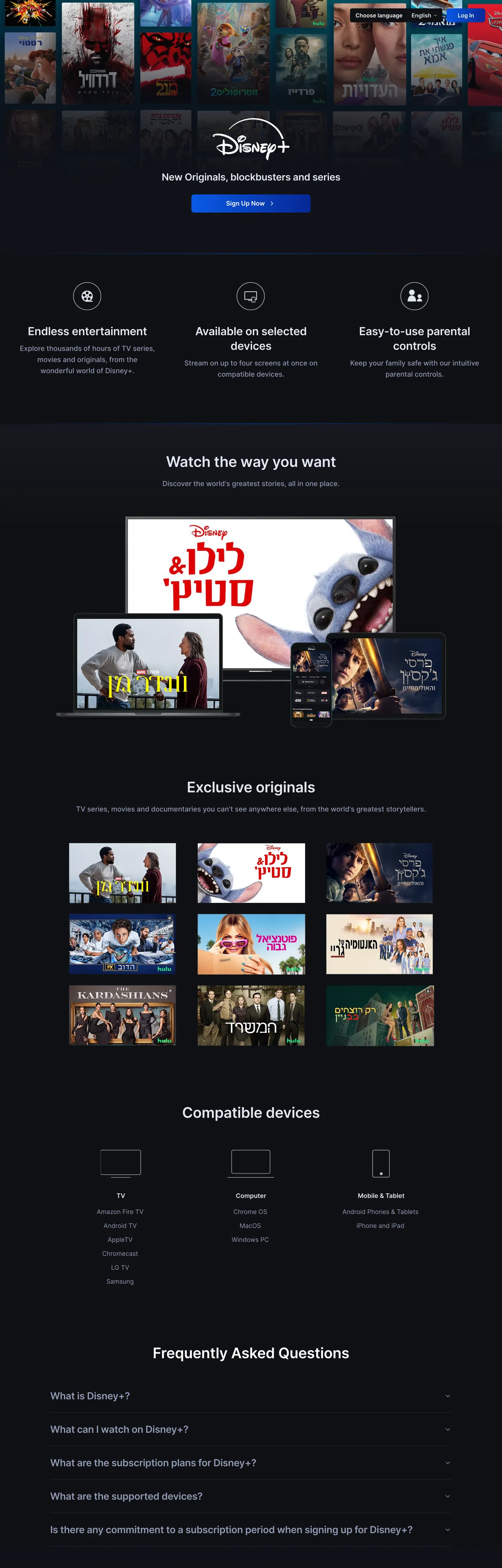
The page opens with a tile-grid wall of show artwork — Disney, Marvel, Star Wars, Pixar, and Hulu-style original-series posters arranged in a single horizontal band across the top, with the centered wordmark and the "New Originals, blockbusters and series" lead sitting beneath. There is no typographic hero shouting over a blank canvas; the catalog is the hero. Below the fold the page becomes a vertical stack of more tile grids — "Watch the way you want," "Exclusive originals" with a 3x3 artwork wall, "Compatible devices" with platform glyphs, "Frequently Asked Questions" with a quiet accordion. Where Netflix splits its hero into a single weight-900 typographic shout over a charcoal floor, this surface trusts the content density end-to-end and lets the typography sit at 42px / weight 600 with -0.4px tracking — the editorial-magazine treatment, not the streaming-shout treatment.
The DESIGN.md file packages the system into a machine-readable spec for React tooling. Inside: 13 captured color tokens grouped into a saturated electric blue voltage (with two darker navy gradient stops), a near-black canvas, a three-tier graded text ramp (#e5e7eb / #8f98b2 / #707a94), a hairline tone, and the Toastify toast-color set (orange / green / red / blue / purple) wired into CSS for status messaging; 10 Inter typography tokens spanning a 14px / weight 500 caption tier through a 42px / weight 600 display step; 3 corner radii anchored on 8px with a 6px input variant; and 16 components recipes covering the Sign Up CTA, the tile-grid card, the FAQ accordion, the compatible-devices glyph strip, the section-heading scaffold, and the muted-gray copyright footer.
Feed this file to Claude or Cursor and it reproduces the surface's specific moves: tile-grid hero instead of typographic hero, single electric-blue Sign Up voltage held in reserve, Inter across every tier, near-black-not-pure-black floor, and the three-tier graded text ramp. The one move worth borrowing only if your product is itself visually rich: the willingness to put NO brand chrome above the content grid. The page gets away with it because the Disney-owned catalog is the brand. A typical SaaS landing without that catalog would need an interstitial typographic layer to fill the same vertical space.
What makes it distinct
5
- Tile-grid as marketing canvasthe Exclusive Originals section is a 3x3 wall of show artwork, not a typographic argument
- Single electric-blue voltage#095ae6 carries the Sign Up CTA fill as the bright stop of a gradient that runs into #062794 and the deepest #021843 navy
- Inter across every tierdisplay, heading, body, button, and the muted-gray legal strip all share one variable sans
- Near-black floor #0f1014not pure black; the slightly-cool charcoal softens the tile-grid edges and lets the blue voltage read as warmer
- Three-tier text ramppure white never appears as the dominant ink; #e5e7eb carries running copy, #8f98b2 secondary, #707a94 legal
hulu.com
Live at hulu.com
A snapshot of the brand in production. Scroll the frame to see the whole page.
Colors
15 colors
Hulu (Disney+ surface)'s system runs on #095ae6 as its primary voltage, used in 1 of 16 components. Type is set in Inter across 10 tokens from 14px to 42px, weights 400–600. Shape language is mixed across 16 components, blending pills, soft rounds, and squarer corners.
Brand & Accent
Sparing, CTA-only voltage · 3
Surface
Page and card backgrounds · 2
Text
Headlines, body, captions · 3
Borders & Hairlines
Dividers, outlines, rules · 1
Semantic
Status, errors, success, links · 4
Other
Specialty colors · 2
Typography
10 type tokens
Set in Inter across 10 tokens, from 14px to 42px, weights 400–600. Shown in its own stack: where the font isn't installed, the fallback the file names stands in.
- display-xl42px · weight 600 · lh 54px · tracking -0.4pxThe quick brown fox jumps over the lazy dog
- display-md32px · weight 600 · lh 42px · tracking -0.4pxThe quick brown fox jumps over the lazy dog
- heading-lg28px · weight 600 · lh 36px · tracking -0.4pxThe quick brown fox jumps over the lazy dog
- heading-md20px · weight 500 · lh 32pxThe quick brown fox jumps over the lazy dog
- heading-sm18px · weight 600 · lh 28pxThe quick brown fox jumps over the lazy dog
- body-lg18px · weight 400 · lh 28pxThe quick brown fox jumps over the lazy dog
- body-md16px · weight 500 · lh 24pxThe quick brown fox jumps over the lazy dog
- body-md-strong16px · weight 600 · lh 24pxThe quick brown fox jumps over the lazy dog
- body-sm14px · weight 500 · lh 20pxThe quick brown fox jumps over the lazy dog
- h2-strong18px · weight 600 · lh 24pxThe quick brown fox jumps over the lazy dog
Layout
Radii and spacing
3 corner radii and 10 spacing values. Shape language: mixed.
Radii
- none0px
- sm6px
- md8px
Spacing
- xs4px
- sm8px
- base12px
- lg16px
- xl24px
- 2xl40px
- 3xl48px
- 4xl80px
- 5xl96px
- 6xl128px
Components
16 components
Each rendered from its tokens (color, type, radius, padding) on Hulu (Disney+ surface)'s own canvas.
- Button Primarybutton-primaryButton Primary
- Button Primary Hoverbutton-primary-hoverButton Primary Hover
- Button Secondarybutton-secondaryButton Secondary
- Top Navtop-navTop Nav
- Nav Linknav-linkNav Link
- Hero Headinghero-headingHero Heading
- Section Headingsection-headingSection Heading
- Body Paragraphbody-paragraphBody Paragraph
- Body Paragraph Mutedbody-paragraph-mutedBody Paragraph Muted
- Footer Textfooter-textFooter Text
- CardcardCard
- Tile Grid Cardtile-grid-cardTile Grid Card
- Faq Rowfaq-rowFaq Row
- Device Celldevice-cellDevice Cell
- Type here…text-inputText Input
- ToasttoastToast
In use
The system, in use
Hulu (Disney+ surface)'s tokens on the kind of product it builds.
Build something people actually use.
A short paragraph of marketing copy that previews how the brand's display tier and body tier read together. Two sentences is usually enough.
FAQ
Hulu (Disney+ surface) design system FAQ
Common questions about Hulu (Disney+ surface)'s tokens, components, and how to use this DESIGN.md in your project.
Read next
Related reading
Specs, directories, and component libraries that pair with this design system.
- Browse all design systemsThe full directory of DESIGN.md files on shadcn.io, with live mockups for each.shadcn.io
- Hulu — official siteThe Disney-owned streaming surface this DESIGN.md was extracted from.hulu.com (opens in a new tab)
- The DESIGN.md specificationGoogle Labs' open spec for machine-readable design system files — the format this page is built on.github.com (opens in a new tab)
Use it
Use Hulu (Disney+ surface) in your project
One machine-readable file. Drop it into Claude, Cursor, or any AI tool that reads DESIGN.md.
Download the DESIGN.md
One machine-readable file: every color, type, radius, spacing, and component token of Hulu (Disney+ surface).
Feed it to your AI tool
Drop it into Claude, Cursor, or GitHub Copilot. The agent writes React components and Tailwind classes that match Hulu (Disney+ surface)'s visual language.
Reference the tokens directly
Or paste the values into your Tailwind config, CSS variables, or component library: every color, size and radius is a quoted, ready-to-copy value.
Read the full DESIGN.md: overview, rationale, do’s and don’ts
Overview
The page opens the way the product opens. Tile-grid as canvas. The hero is not a typographic shout — it is a horizontal band of show artwork from the Disney-owned catalog, with the centered wordmark and a single-line lead sitting beneath. The brand makes its first claim through the catalog itself: Disney, Marvel, Star Wars, Pixar, and Hulu-style original series, arranged in a wall above any nav, any CTA, any chrome. Where Netflix splits the hero into a single 56px / weight 900 typographic shout over a charcoal floor, and where Apple TV+ trusts a single 80px feature poster as the entire above-fold experience, this surface packs the canvas with a dozen-plus thumbnails and trusts the density to do the work.
The chromatic move reinforces the discipline. There is exactly one brand voltage — electric blue ({colors.primary} — #095ae6) — and it appears as the bright stop of a three-color gradient that darkens through {colors.primary-dark} (#062794) and ends at {colors.primary-deepest} (#021843). The gradient carries the Sign Up CTA fill at the bright end and the depth / press state at the dark end. Every other color visible above the fold belongs to show artwork, not to brand chrome. A single highlight tone {colors.highlight} (#d1e8ff) handles inline link emphasis but never escapes to a fill role; the system reserves chromatic warmth for the single direct ask.
Typography is Inter across every tier — open-source, variable-weight, no second family. Display sits at {typography.display-xl} (42px / weight 600 / -0.4px tracking) for "Watch the way you want"; section h2 steps down to {typography.display-md} (32px / weight 600); h3 to {typography.heading-lg} (28px / weight 600); body at {typography.body-lg} (18px / weight 400). The text ramp is graded into three tones — {colors.ink} (#e5e7eb) for running copy, {colors.ink-muted} (#8f98b2) for secondary, {colors.ink-tertiary} (#707a94) for footer / legal. Pure white never appears as the dominant ink.
Key Characteristics:
- Near-black canvas (
{colors.canvas}— #0f1014), not pure black — the 17-point lightness gap from true black softens tile-grid edges and lets the electric blue read as warmer. - Single electric-blue voltage (
{colors.primary}— #095ae6) carries the Sign Up CTA as a gradient bright stop;{colors.primary-dark}and{colors.primary-deepest}handle the gradient mid and end stops. Frequency 5 total across the captured page. - Inter across every typographic tier, with a 10-step ladder spanning 14px / weight 500 to 42px / weight 600. No second family, no serif tier, no monospace voice.
- Three-tier graded text ramp —
{colors.ink}(#e5e7eb) for body,{colors.ink-muted}(#8f98b2) for secondary,{colors.ink-tertiary}(#707a94) for legal — instead of one universal off-white. - Binary radius scale:
{rounded.md}(8px) on cards and CTAs,{rounded.sm}(6px) on form controls. No pill, no fully-circular, no middle tier. - Tile-grid density carries the structural argument: "Endless entertainment," "Exclusive Originals" (3x3 wall), "Compatible devices" glyph strip, each opening with another wall of content rather than with marketing illustration.
- Toastify status-color set (info
{colors.toast-info}blue, success{colors.toast-success}green, warning{colors.toast-warning}yellow, error{colors.toast-error}red, dark-mode{colors.toast-purple}accent) wired into CSS for in-product toast messaging — declared but invisible on the onboarding surface.
Colors
Brand
- Electric Blue (
{colors.primary}— #095ae6): frequency 2, all inside gradients. The bright stop of the Sign Up CTA gradient. Saturated, chromatic, the only warm voltage in the system. - Brand Navy Mid (
{colors.primary-dark}— #062794): frequency 2, all inside gradients. The mid stop of the same gradient. Acts as the hover / press state on the Sign Up CTA. - Brand Navy Deep (
{colors.primary-deepest}— #021843): frequency 1, gradient end-stop. The deepest navy in the system — never appears as a fill on its own.
Surface
- Canvas (
{colors.canvas}— #0f1014): frequency 10 — the dominant page floor. Used as bg (5), gradient (5). Wired as--toastify-color-dark. A slightly-cool charcoal, not pure #000000; the warmth deficit is the deliberate move. - Surface Elevated (
{colors.surface-elevated}— #0d1628): frequency 2. The card surface that lifts off the canvas floor by a single shade of cool-gray. Used on toast surfaces and the FAQ accordion expanded state. - Highlight (
{colors.highlight}— #d1e8ff): frequency 5, all as text. The inline link / emphasis tone — pale powder-blue against the near-black floor.
Text
- Ink (
{colors.ink}— #e5e7eb): frequency 298 — the dominant text color. Used as text (19), border (279). Wired as--toastify-spinner-color-empty-area. The body running-text tone — never pure white, slightly cool, the system's workhorse ink. - Ink Muted (
{colors.ink-muted}— #8f98b2): frequency 87, all as text. Secondary text — feature-row sub-labels, microcopy under section headings. A gray-blue tone that holds the cool undertone of the canvas. - Ink Tertiary (
{colors.ink-tertiary}— #707a94): frequency 17, all as text. The legal / footer tone — copyright line, terms-of-service link. The quietest tier in the three-step graded ramp.
Hairline
- Hairline (
{colors.hairline}— #e5e7eb): the dominant border tone — the same value as{colors.ink}. Card outlines, input-field borders, FAQ row dividers. The system reuses one off-white for both running text and hairlines.
Status (in-product)
- Toast Info (
{colors.toast-info}— #3498db): wired as--toastify-color-info. The Toastify in-product info-toast color — declared but not rendered on the onboarding surface. - Toast Success (
{colors.toast-success}— #07bc0c): wired as--toastify-color-success. The success-toast green — declared, not rendered. - Toast Warning (
{colors.toast-warning}— #f1c40f): wired as--toastify-color-warning. The warning-toast yellow — declared, not rendered. - Toast Error (
{colors.toast-error}— #e74c3c): wired as--toastify-color-error. The error-toast red — declared, not rendered. - Toast Purple (
{colors.toast-purple}— #bb86fc): wired as--toastify-color-progress-dark. The dark-mode progress-bar tint — declared, not rendered.
Typography
Font Family
The system runs Inter for every tier — declared in CSS as --FONT-FAMILY: "Inter",sans-serif. Inter is open-source and variable-weight; one family does display, heading, body, button, label, and footer. There is no separate display family, no serif tier, no monospace voice. The fallback walks straight to sans-serif.
Hierarchy
| Token | Size | Weight | Line Height | Letter Spacing | Use |
|---|---|---|---|---|---|
{typography.display-xl} | 42px | 600 | 54px | -0.4px | Hero h2 ("Watch the way you want") |
{typography.display-md} | 32px | 600 | 42px | -0.4px | Section h2 ("Endless entertainment") |
{typography.heading-lg} | 28px | 600 | 36px | -0.4px | Section h3, sub-heading bands |
{typography.heading-md} | 20px | 500 | 32px | 0 | h3 / category-strip titles |
{typography.heading-sm} | 18px | 600 | 28px | 0 | h2 / FAQ question titles |
{typography.body-lg} | 18px | 400 | 28px | 0 | Section h3 default running text |
{typography.body-md} | 16px | 500 | 24px | 0 | Default body running text |
{typography.body-md-strong} | 16px | 600 | 24px | 0 | Button label ("Sign Up Now") |
{typography.body-sm} | 14px | 500 | 20px | 0 | Secondary copy, footer text |
{typography.h2-strong} | 18px | 600 | 24px | 0 | Inline h2 emphasis blocks |
Principles
The display tier tops out at 42px / weight 600 with -0.4px tracking — confidence by tracking, not by weight. Where Netflix runs weight 900 at 56px for the hero shout, this surface holds at weight 600 and lets the catalog tiles do the chromatic shouting. The negative letter-spacing on the display tier (-0.4px) is the only typographic tightening in the system; body and labels run at letter-spacing 0. There is no uppercase-tracked label tier — the system has no small-caps moment anywhere.
Note on Font Substitutes
Inter is open-source. Use it directly — no substitute needed. If a higher-tier alternative is required for the 42px display, General Sans or Geist at weight 600 with -0.4px tracking transfer cleanly; Inter's variable-axis support means the same family covers the full 400-600 ladder without falling back to a second font file.
Layout
Spacing System
- Base unit: 4px — the dominant gap value, with
{spacing.base}(12px) carrying 18 of the captured padding values. - Tokens:
{spacing.xs}4px ·{spacing.sm}8px ·{spacing.base}12px ·{spacing.lg}16px ·{spacing.xl}24px ·{spacing.2xl}40px ·{spacing.3xl}48px ·{spacing.4xl}80px ·{spacing.5xl}96px ·{spacing.6xl}128px. - Section padding (vertical): ~80-96px between major bands on the near-black canvas, stepping up to 128px between the hero and the Exclusive Originals wall.
- Card internal padding:
{spacing.xl}(24px) on standard cards, 0 on tile-grid tiles (the artwork fills the tile edge-to-edge). - Top-nav padding: 0 vertical,
{spacing.3xl}(48px) horizontal.
Grid & Container
- Hero tile-band: full-bleed horizontal grid, edge-to-edge, no max-width. Show artwork tiles arranged in a single band with minimal gutters.
- Exclusive Originals wall: 3x3 grid of show-artwork tiles at max-width ~1080px, collapsing to 2-column on tablet.
- Watch-the-way-you-want band: centered single column at max-width ~720px, with a composite device-mockup illustration on the right.
- Compatible devices strip: 3-column glyph row (TV, Computer, Mobile & Tablet) at max-width ~960px.
- FAQ accordion: centered single column at max-width ~720px.
Rhythm
The page alternates between edge-to-edge tile density (hero wall, Exclusive Originals 3x3) and constrained centered editorial (Watch-the-way-you-want band, FAQ accordion). There is no atmospheric gradient between bands — every section terminates on the same near-black floor, and depth comes from tile artwork rather than from background-color shifts. The single in-system gradient is the Sign Up CTA's three-stop brand-blue ramp.
Elevation
The system has essentially no shadow tier. The captured --tw-shadow and --tw-ring-shadow CSS variables are both wired to explicit zero shadow (a 4-digit transparent value). Hierarchy comes from {colors.surface-elevated} (#0d1628) cards lifted off the {colors.canvas} (#0f1014) floor by a single shade of cool-gray, plus 1px {colors.hairline} borders on form fields and FAQ rows.
- Flat (no shadow): body, hero tile wall, footer, every editorial band — 99% of surfaces.
- Tonal lift:
{colors.surface-elevated}(#0d1628) sits on{colors.canvas}(#0f1014) — a 3-point lightness step that reads as elevation without any shadow being drawn. - Hairline outlines:
{colors.hairline}(#e5e7eb) marks input-field borders, FAQ-row dividers, and toast surface edges.
Shapes
The radius scale is binary: small-step rounding on content surfaces, slightly tighter on form controls.
{rounded.none}0px — full-bleed tile bands, top-nav, hero artwork wall.{rounded.sm}6px — form controls (text inputs, dropdowns). Appears 2 times in the captured page.{rounded.md}8px — cards, the Sign Up CTA, tile-grid wrappers, FAQ rows. Dominant on 3 of 5 captured surfaces.
There is no 12 / 16 / 20px middle tier, no pill variant, no fully-circular treatment. The 2px difference between cards (8px) and inputs (6px) reads as a deliberate elevation step between content tiles and the controls the user types into.
Components
button-primary — The Sign Up CTA. Electric-blue {colors.primary} fill (rendered as a gradient stop in the live page), {colors.ink} text, {rounded.md} 8px radius, 12x24px padding, 44px height, {typography.body-md-strong} (16px / weight 600) label. The single in-system instance of the brand voltage.
button-primary-hover — Background flips to {colors.primary-dark} (#062794), a deeper navy stop on the same gradient ramp. The single state variant the system declares.
button-secondary — Transparent fill with off-white text and a 1px hairline border. Used for "Sign In" in the top nav and for tertiary CTAs.
top-nav — Near-black surface, 64px height, 0x48px padding. Houses the centered wordmark, with a Sign In / Subscribe cluster flush right.
nav-link — Transparent background, off-white text in {typography.body-sm} (14px / weight 500), 12x0px padding. No hover background visible in the captured surface.
hero-heading — Off-white text, {typography.display-xl} (42px / weight 600 / -0.4px tracking). Used for "Watch the way you want."
section-heading — Off-white text, {typography.display-md} (32px / weight 600 / -0.4px tracking). Used for "Endless entertainment," "Exclusive Originals," "Compatible devices," "Frequently Asked Questions."
body-paragraph — Default off-white text at {typography.body-lg} (18px / 400). Section lead paragraphs and FAQ answers.
body-paragraph-muted — {colors.ink-muted} (#8f98b2) text at {typography.body-md} for secondary copy under section headings.
footer-text — {colors.ink-tertiary} (#707a94) text at {typography.body-sm} (14px / weight 500) for the copyright strip and terms-of-service links. The quietest tier in the three-step graded ink ramp.
card — {colors.surface-elevated} (#0d1628) fill, off-white text, {rounded.md} 8px radius, 24px internal padding. The default content card lifted off the canvas floor by a single shade.
tile-grid-card — Near-black underneath, show-artwork overlay, {rounded.md} 8px radius, 0 padding (the poster image fills the tile edge-to-edge). Used in the hero band and the Exclusive Originals 3x3 wall.
faq-row — Transparent fill, off-white text, {rounded.md} 8px radius, 24x0px padding. The accordion rows in the "Frequently Asked Questions" section at page bottom — minimal chrome, the divider between rows is the 1px hairline.
device-cell — Transparent fill, {colors.ink-muted} text at {typography.body-sm}, 24x16x8px padding. The TV / Computer / Mobile & Tablet glyph cells in the Compatible Devices strip.
text-input — Near-black surface, off-white text, {rounded.sm} 6px radius, 12px padding, 44px height, 1px hairline border. The email-capture field in the Sign Up band.
toast — {colors.surface-elevated} fill, off-white text, {rounded.md} 8px radius, 16px padding. The Toastify in-product notification surface — declared in CSS but not rendered on the onboarding page.
Do's and Don'ts
Do treat electric blue {colors.primary} (#095ae6) as the single brand voltage and run it as a gradient. The CTA fill is a three-stop ramp — bright blue at top, mid navy {colors.primary-dark}, deepest navy {colors.primary-deepest} at bottom — and rendering it as a flat fill loses the depth-and-press signal the gradient carries.
Do use {colors.canvas} (#0f1014) — not pure #000000 — for the page floor. The 17-point lightness gap from true black is intentional and consistent across the entire system; mixing the two destroys the cool-charcoal warmth that lets the electric blue read as chromatic rather than alarmist.
Do keep the three-tier graded ink ramp intact: {colors.ink} (#e5e7eb) for body, {colors.ink-muted} (#8f98b2) for secondary, {colors.ink-tertiary} (#707a94) for legal. Collapsing them into one universal off-white loses the hierarchy that lets the eye scan the FAQ accordion and the footer without competing with the section headings.
Do let Inter carry every typographic tier. The system has no second family, no serif tier, no monospace voice. Reaching for a display serif or a mono caption strip would break the single-family discipline the brand commits to.
Don't introduce a second chromatic voltage. The system has exactly one — {colors.primary} (#095ae6) and its two darker gradient stops. Adding a green Hulu accent, a red emergency color, or a yellow promotional band would compete with the single Sign Up ask and dilute the only chromatic brand signal on the page.
Don't use {colors.hairline} (#e5e7eb) for background fills — it is a border-and-text-only token. The same value doubles as body ink; painting it as a surface would create an invisible-text contrast failure.
Don't introduce a pill or fully-circular radius. The system is binary — {rounded.md} 8px on cards and CTAs, {rounded.sm} 6px on form controls — and the absence of pill chrome is part of why the page reads as content-forward rather than promotional.
Don't render the in-product toast colors ({colors.toast-info} / {colors.toast-success} / {colors.toast-warning} / {colors.toast-error} / {colors.toast-purple}) on marketing surfaces. They are wired into CSS for the Toastify in-app notification component and using them outside that context creates a visual stutter between marketing and product.
Known Gaps
- Hover and focus states: documented for
{component.button-primary-hover}only (gradient stop swap). The full state matrix — focus rings, disabled tints, active press — is not captured from the onboarding surface. - Form input error states:
{component.text-input}carries the resting state; validation styling for the email-capture and password fields is not exposed on the marketing surface. - Light mode: the captured onboarding surface is dark-only. The Toastify CSS exposes both a pure-white light-mode variable and a near-black dark-mode variable (#0f1014), suggesting a light-mode variant exists in the in-product toast system but is not represented here.
- Motion: the Exclusive Originals wall and the hero tile band animate on scroll (parallax, fade-in via IntersectionObserver) but the spec captures end-state values only. Easing curves, stagger timing, and the active-card-scale transform variables (
--ACTIVE-CARD-SCALE-X,--CW-CARD-SCALE-FACTOR) live in the in-product runtime. - Product player surfaces: this DESIGN.md captures the onboarding surface only. The video player itself carries a much richer token system — playback controls, subtitle styling, episode-list panels, parental-control surfaces — that is not represented here.
- Themed-tray height variables: the CSS exposes
--THEMED-TRAY-HEIGHT-MOBILE(300px),--THEMED-TRAY-HEIGHT-TABLET(350px),--THEMED-TRAY-HEIGHT-NORMAL(416px),--THEMED-TRAY-HEIGHT-LG1(432px),--THEMED-TRAY-HEIGHT-LG2(520px),--THEMED-TRAY-HEIGHT-XL(600px) — a responsive tray-height ladder for content-browse surfaces that is not exposed on the onboarding page. - Swiper navigation theme: CSS exposes
--swiper-theme-coloras an iOS-style system blue and--swiper-navigation-sizeat 44px, declared for the in-product content-carousel but not rendered on the captured marketing surface.
Music, Video & Streaming
More systems like this
More DESIGN.md files in Music, Video & Streaming.
Pricing
Build it with Pro
The DESIGN.md files are free. Pro adds 6,000+ blocks, premium templates and the MCP server, so your AI editor builds in your system for you.
4.9/5 out of 5 · 150+ reviewsfrom 150+ founders and developers.
Billing
Billed once a year in USD. Cancel anytime.
- How many people can use the license.
- Client work, SaaS products and anything you charge for.
- Production-ready React sections: hero, pricing, features, dashboards and more.
- Complete multi-page sites you can ship as they are.
- React icons from every major library, installable with one command.
- Presets that restyle every block, in light and dark.
- Lets your AI editor search, preview and install blocks for you.
- Priority requests are answered first.
Individual
For personal projects & open source
$32instead of $49/mo
$389 billed yearly
- Seats: 1 seat
- Commercial use: Personal & open source only
- Pro blocks: 6,000+ blocks
- Templates: All 14 templates
- React icons: 294k+ icons
- Themes: All 59 themes
- MCP server: Basic usage
- Support: Standard
Team
Most popularFor freelancers, agencies & startups
$66instead of $99/mo
$789 billed yearly · ≈ $13/dev/mo
- Seats: Up to 5 seats
- Commercial use: Included
- Pro blocks: 6,000+ blocks
- Templates: All 14 templates
- React icons: 294k+ icons
- Themes: All 59 themes
- MCP server: High usage
- Support: Priority
Organization
For companies with larger teams
$132instead of $199/mo
$1,589 billed yearly
- Seats: Unlimited seats
- Commercial use: Included
- Pro blocks: 6,000+ blocks
- Templates: All 14 templates
- React icons: 294k+ icons
- Themes: All 59 themes
- MCP server: Unlimited usage
- Support: Priority
Billed once a year in USD. Cancel anytime.
Individual
For personal projects & open source
$32instead of $49/mo
$389 billed yearly
- How many people can use the license.Seats: 1 seat
- Client work, SaaS products and anything you charge for.Commercial use: Personal & open source only
- Production-ready React sections: hero, pricing, features, dashboards and more.Pro blocks: 6,000+ blocks
- Complete multi-page sites you can ship as they are.Templates: All 14 templates
- React icons from every major library, installable with one command.React icons: 294k+ icons
- Presets that restyle every block, in light and dark.Themes: All 59 themes
- Lets your AI editor search, preview and install blocks for you.MCP server: Basic usage
- Priority requests are answered first.Support: Standard
Team
Most popularFor freelancers, agencies & startups
$66instead of $99/mo
$789 billed yearly · ≈ $13/dev/mo
Everything in Individual, plus
- How many people can use the license.Seats: Up to 5 seats
- Client work, SaaS products and anything you charge for.Commercial use: Included
- Lets your AI editor search, preview and install blocks for you.MCP server: High usage
- Priority requests are answered first.Support: Priority
Organization
For companies with larger teams
$132instead of $199/mo
$1,589 billed yearly
Everything in Team, plus
- How many people can use the license.Seats: Unlimited seats
- Lets your AI editor search, preview and install blocks for you.MCP server: Unlimited usage
- Secure checkout via Stripe
- Code lives in your repo
- Keep what you've shipped if you cancel
- License terms
Your system, built for you
Every block, template and icon, installed by your AI agent in your design system. The DESIGN.md files stay free.