Descript Design System
Descript's design system as a DESIGN.md file. Maroon #651a39, Gamuth Display serif hero, Booton body, Brett eyebrow. For React, Next.js, and AI tools.
Add shadcn.io to your AI agent. · Pro It installs blocks, icons and templates in your design system from a prompt, with Pro.
Set up MCP- Primary
- #651a39
- Typeface
- Booton
- Shape
- Mixed
- Base radius
- 8px
- Colors
- 23
- Type tokens
- 11
- Components
- 18
- Spacing values
- 9
About
About Descript DESIGN.md
Curated by Dov Azencot · Updated May 13, 2026 · Source descript.com (opens in a new tab)
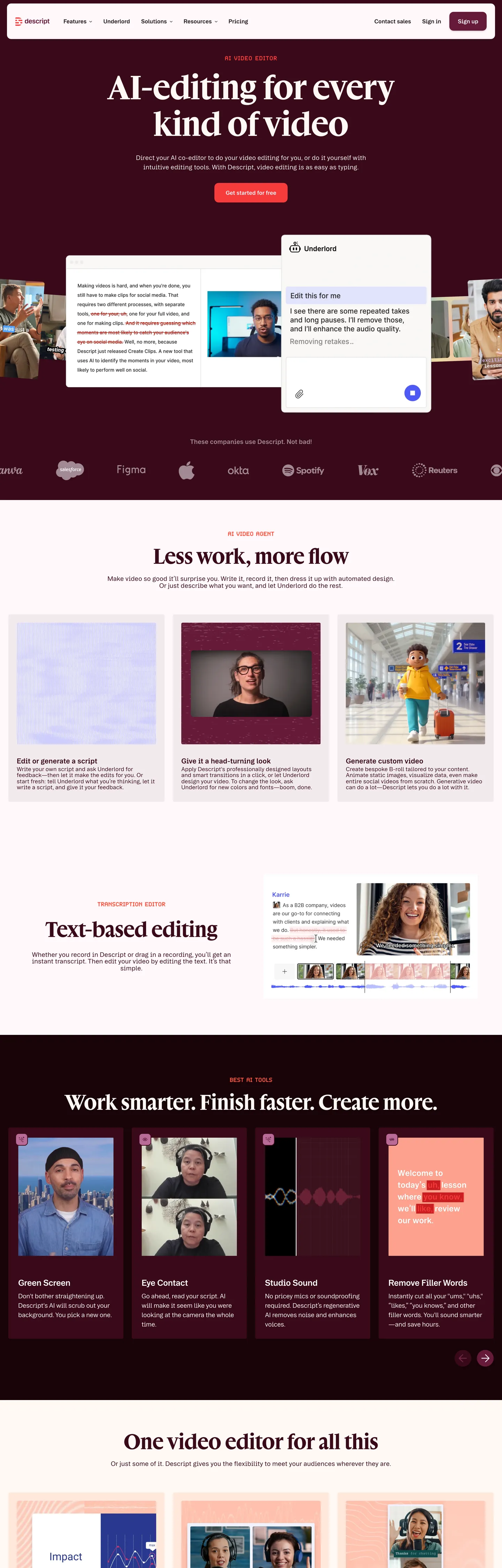
Descript's marketing surface is a warm-cream canvas (#fff8f4, mapped to `--Core-Canvas-White`) anchored on a single brand voltage — Descript Maroon (#651a39) — that carries the primary CTA and nothing else. Headings step to a deeper maroon ink (#390a1a, the Maroon-900 token) while body copy holds at #1a1a1a near-black and #26171d Neutral-900. The page is editorial in posture, not application-shell: a serif display family does the heavy hero lifting, the canvas is intentionally off-white, and the primary CTA is a 12px-rounded rectangle rather than the pill most video-editing competitors reach for. The eyebrow tag — "AI Video Agent" sitting above the hero — is set in Brett, a third typeface used exclusively for uppercase 18px micro-labels, and rendered in #ff5340 Red-400 for the only chromatic accent on the first viewport.
The DESIGN.md file packages 23 colors tokens, 11 typography roles, 6 corner radii, 9 spacing values, and 18 components. The 93 CSS custom properties on the live `:root` resolve to a much smaller perceptual palette: a Maroon ladder (50 → 950), a Neutral warm-gray ladder, plus a wider scaffold of Red, Lilac, and Green ladders that exist as declared tokens but never surface on the marketing page. Three custom families are declared — `--font-gamuth-display` (serif), `--font-booton` (sans), `--font-brett` (a third sans used uppercase) — and the format itself is the Google Labs DESIGN.md spec, with token references like `{colors.maroon}` and `{typography.display-hero}` that designers and AI agents can both parse.
Feed the file to Claude, Cursor, or GitHub Copilot and the agent will reproduce Descript's editorial restraint — serif headlines on warm cream, a single deep brand voltage, rectangles where the category defaults to pills — rather than a generic dark-theme video tool. Reference the tokens in Tailwind config, paste the component recipes into a design audit, or use the Maroon ladder directly as a CSS-variable scale. The discipline worth studying is the choice to look like a magazine spread for a category whose competitors look like editing software: Descript reads as content-first, the tool itself stays in the margin.
What makes it distinct
5
- Serif display in a video-editor categoryGamuth Display at weight 400 carries the 56px hero against the sans-default everyone else picks
- Three-family typographic stackBooton (sans body/UI), Gamuth Display (serif hero), Brett (uppercase eyebrow) each scoped to one role
- Warm cream canvas (#fff8f4) instead of pure whitethe page floor reads editorial, not application-shell
- Single brand voltageDescript Maroon (#651a39) reserved for the primary CTA, paired with deep maroon ink (#390a1a) on headings
- Bimodal radius scale60 occurrences of 4px chrome against 30 occurrences of 12px for primary controls, with zero 9999px pills
descript.com
Live at descript.com
A snapshot of the brand in production. Scroll the frame to see the whole page.
Colors
23 colors
Descript's system runs on #651a39 as its primary voltage, used in 3 of 18 components. Type is set in Booton across 11 tokens from 16px to 56px, weights 400–600. Shape language is mixed across 18 components, blending pills, soft rounds, and squarer corners.
Surface
Page and card backgrounds · 2
Text
Headlines, body, captions · 11
Borders & Hairlines
Dividers, outlines, rules · 1
Other
Specialty colors · 9
Typography
11 type tokens
Set in Booton across 11 tokens, from 16px to 56px, weights 400–600. Shown in its own stack: where the font isn't installed, the fallback the file names stands in.
- display-hero56px · weight 400 · lh 1.1The quick brown fox jumps over the lazy dog
- display-md40px · weight 400 · lh 1.1The quick brown fox jumps over the lazy dog
- heading-lg24px · weight 600 · lh 1.5The quick brown fox jumps over the lazy dog
- heading-md24px · weight 600 · lh 1.3 · tracking -0.48pxThe quick brown fox jumps over the lazy dog
- heading-sm20px · weight 600 · lh 1.5The quick brown fox jumps over the lazy dog
- body-lg18px · weight 400 · lh 1.4The quick brown fox jumps over the lazy dog
- body-md18px · weight 400 · lh 1.1The quick brown fox jumps over the lazy dog
- body-sm16px · weight 400 · lh 1.1The quick brown fox jumps over the lazy dog
- ui-md16px · weight 600 · lh 1.5The quick brown fox jumps over the lazy dog
- eyebrow18px · weight 400 · lh 1 · tracking 0.72pxThe quick brown fox jumps over the lazy dog
- button-md16px · weight 600 · lh 1.38The quick brown fox jumps over the lazy dog
Layout
Radii and spacing
6 corner radii and 9 spacing values. Shape language: mixed.
Radii
- none0px
- sm4px
- md8px
- lg12px
- pill9999px
- circle100%
Spacing
- xxs4px
- xs8px
- sm12px
- md16px
- base24px
- lg28px
- xl32px
- xxl88px
- section104px
Components
18 components
Each rendered from its tokens (color, type, radius, padding) on Descript's own canvas.
- Button Primarybutton-primaryButton Primary
- Button Primary Hoverbutton-primary-hoverButton Primary Hover
- Button Secondarybutton-secondaryButton Secondary
- Button Tertiarybutton-tertiaryButton Tertiary
- Eyebrow Labeleyebrow-labelEyebrow Label
- Feature Badgefeature-badgeFeature Badge
- Feature Cardfeature-cardFeature Card
- Hero Headinghero-headingHero Heading
- Hero Sectionhero-sectionHero Section
- Section Bandsection-bandSection Band
- Section Band Darksection-band-darkSection Band Dark
- Top Navtop-navTop Nav
- Nav Linknav-linkNav Link
- Type here…text-inputText Input
- Type here…text-input-focusText Input Focus
- Avatar Dotavatar-dotAvatar Dot
- Code Badgecode-badgeCode Badge
- FooterfooterFooter
In use
The system, in use
Descript's tokens on the kind of product it builds.
Build something people actually use.
A short paragraph of marketing copy that previews how the brand's display tier and body tier read together. Two sentences is usually enough.
FAQ
Descript design system FAQ
Common questions about Descript's tokens, components, and how to use this DESIGN.md in your project.
Read next
Related reading
Specs, directories, and component libraries that pair with this design system.
- Browse all design systemsThe full directory of DESIGN.md files on shadcn.io, with live mockups for each.shadcn.io
- Descript — official siteDescript's marketing site — AI video and podcast editing where text edits the timeline, with the design surface this file extracts.descript.com (opens in a new tab)
- The DESIGN.md specificationGoogle Labs' open spec for machine-readable design system files — the format this page is built on.github.com (opens in a new tab)
Use it
Use Descript in your project
One machine-readable file. Drop it into Claude, Cursor, or any AI tool that reads DESIGN.md.
Download the DESIGN.md
One machine-readable file: every color, type, radius, spacing, and component token of Descript.
Feed it to your AI tool
Drop it into Claude, Cursor, or GitHub Copilot. The agent writes React components and Tailwind classes that match Descript's visual language.
Reference the tokens directly
Or paste the values into your Tailwind config, CSS variables, or component library: every color, size and radius is a quoted, ready-to-copy value.
Read the full DESIGN.md: overview, rationale, do’s and don’ts
Overview
Descript's marketing canvas is warm cream ({colors.canvas} #fff8f4, mapped to --Core-Canvas-White) with a single deep brand voltage — Descript Maroon ({colors.maroon} #651a39, the --Maroon-750 token) — that carries the primary "Sign up" CTA and nothing else on the first viewport. Headings step into the deeper {colors.maroon-deep} #390a1a; body type holds at {colors.ink} #1a1a1a and {colors.ink-body} #26171d. The page reads as editorial — a magazine spread for a creator tool — rather than the application-shell most video-editing competitors render.
Serif as signature: where most video editors commit to a geometric sans across every text tier, Descript runs Gamuth Display — an actual serif — for the 56px hero h2 at weight 400 with zero negative tracking. Booton, the geometric sans, handles all body and UI roles; Brett, a third family, is reserved for the uppercase eyebrow label (#ff5340 Red-400) above each section. Three families, three roles, no overlap — the typographic discipline is the system's load-bearing identity move.
The corner-radius scale is bimodal: 60 captured 4px values against 30 captured 12px values, with 9 occurrences of 8px and only 4 each of 9999px and 100%. The primary CTA is a 12px rounded rectangle (54px tall, 16/24px padding) — explicitly not a pill. The 4px tier covers content chrome (feature badges, code tags); 12px is reserved for primary controls and feature cards. The pill geometry that competitors lean on is intentionally absent from primary actions.
Key Characteristics:
- Serif hero on a cream canvas —
{typography.display-hero}Gamuth Display 56px / 400 against{colors.canvas}#fff8f4. - Single brand voltage —
{colors.maroon}#651a39 reserved for the primary CTA; never decorative. - Three-family typographic stack — Gamuth Display (serif hero), Booton (sans body/UI), Brett (uppercase eyebrow), each scoped to one role.
- Rectangle-first geometry —
{rounded.lg}12px CTA, no pills on primary actions, with 100% reserved for avatar dots. - Eyebrow accent in Red-400 —
{colors.eyebrow-red}#ff5340 is the only chromatic emphasis apart from the maroon, scoped to uppercase Brett labels. - Maroon ladder — Maroon-750 to Maroon-950 (#651a39 → #390a1a → #2a0711 → #190308) covers the hover and pressed states.
Colors
- Maroon (
#651a39) — frequency 5. Used as background (3), text (2), border (0). The brand voltage, mapped to--Maroon-750. Reserved for the primary "Sign up" CTA on the marketing surface and a small set of text contrasts; never decorative. - Maroon Deep (
#390a1a) — frequency 72. Used as text (55), background (17), border (0). The--Maroon-900token; carries the dark hero band background and the heading-color role on light surfaces. - Maroon Deepest (
#190308) — frequency 2. Background-only. Mapped to--Maroon-950and--Red-950; the deepest pressed state in the maroon ladder, reserved for emphasis bands. - Canvas (
#fff8f4) — frequency 116. Used as text (106), background (10), border (0). The warm cream page floor, mapped to--Core-Canvas-White; clusters with Core-White #fffafc and Neutral-0. Used as inverse text on the dark hero band. - Ink (
#1a1a1a) — frequency 1688. Used as text (1663), border (24), background (1). The workhorse body color, mapped to--Core-Screen-Blackand--Neutral-900; carries every paragraph, nav link, and h3. - Ink Body (
#26171d) — frequency 1688 (clustered with Ink). The Neutral-900 variant; the resolver collapses both into the same perceptual token, but it surfaces in CSS as a slightly warmer near-black on body copy. - Ink Muted (
#8b6f7a) — frequency 12. Used as text (8), border (4). The--Neutral-500token; dimmed-body color for secondary copy and disabled labels. - Ink Subtle (
#a28993) — frequency 3. Text-only. The--Neutral-400token; the lightest text color used for tertiary metadata. - Ink Faint (
#c4b5bb) — frequency 46. Text-only. Cluster of light neutral-warms; used on the faintest disabled labels and timestamp metadata. - Ink Disabled (
#d1c7cb) — frequency 88. Text-only. The--Neutral-200token; reserved for disabled control labels. - Eyebrow Red (
#ff5340) — frequency 8. Text-only. Mapped to--Red-400; the section-eyebrow color set in Brett uppercase above each h2. The only chromatic accent on the first viewport apart from the maroon CTA. - Alert Red (
#f73b3b) — frequency 9. Used as text (7), background (2). The--Red-450token; reserved for alert states and the auxiliary record indicator. - Hairline (
#e5e7eb) — frequency 1967. Border-only (1959). The dominant border token by far —--Neutral-50clustered with--Lilac-50and--Neutral-100; carries every card outline, divider, and input border on the page. - Shadow Black (
#000000) — frequency 40. Used as background (35), shadow (5). The shadow-color base and the deep-band background on the "Work smarter" section. - Surface Warm (
#ffe8db) — frequency 3. Background-only. The--Red-50token; a warm peach tint used on code-badge surfaces and small attention chips. - Maroon Darker (
#2a0711) — frequency 0 declared. The--Maroon-800token; the hover step between #390a1a and #190308 in the maroon ladder. - Ink Charcoal (
#3f2a32) — frequency 6. Used as background (2), border (4). The--Neutral-800token; surfaces inside in-product editor mockups rendered on the marketing page. - Ink Warm (
#583f4a) — frequency 6. Background-only. The--Neutral-700token; another in-product mockup surface, never a marketing chrome color. - Lilac Deep (
#0c0b5f) — frequency 5. Text-only. The--Lilac-900token; surfaces inside one in-product mockup as a deep navy quote. - Lilac Light (
#cdcdfe) — frequency 2. Background-only. The--Lilac-200token; pale lilac tints inside in-product transcription mockups. - Lilac Mid (
#8787e0) — frequency 1. Background-only. The--Lilac-400token; a mid-lilac that surfaces once on a feature illustration. - Neutral Deep (
#110a0d) — frequency 1. Background-only. The--Neutral-950token; the deepest near-black, reserved for the heaviest dark bands. - Neutral Soft (
#4c343e) — frequency 1. Background-only. The--Neutral-750token; an in-product mockup surface, declared but rare.
Typography
Descript runs three custom families, each scoped to one role and never crossing into another. Gamuth Display is a serif — --font-gamuth-display resolves to __gamuthDisplay_a7185b with a Georgia fallback — and it carries the 56px hero h2 at weight 400 with line-height 1.1 and zero letter-spacing. The same family at 40px / 44px handles large display blockquotes. Booton, a geometric sans — --font-booton — covers every body and UI tier: 24px h3s at weight 600 with -0.48px tracking, 20px sub-heads at weight 600, 18px paragraphs at weight 400 with 1.4 line-height, 16px body and nav links at weight 600. Brett — --font-brett — is scoped strictly to the eyebrow label: 18px weight 400, uppercase, letter-spacing 0.72px.
Serif in the editor category is the system's most distinctive typographic decision. Where Loom, Riverside, and Adobe Premiere Rush all commit to geometric sans for every display tier, Descript pulls a serif into the hero. Gamuth Display reads as editorial — magazine paper, not application shell — and pairs with the warm cream canvas to push the page toward content-first composition rather than tool-first chrome.
There is no weight-700 anywhere in the captured typography. The heaviest weight is 600, reserved for h3s and UI labels at 16px and 20px. Display copy stays at 400, body stays at 400, emphasis steps to 600 — never further. The five-tier hierarchy is built on family switching (serif vs sans) and size (56 → 40 → 24 → 20 → 18 → 16), not on aggressive weight modulation.
Layout
Descript's marketing surface uses a centered single-column layout with {spacing.section} 104px between major bands and {spacing.xxl} 88px above each section title. The captured page spans 4500px tall against a 1440px viewport, so the page is roughly 3.1 viewports of scroll. Hero and feature copy sit on a 24px outer-container padding ({spacing.base}), with feature cards padded at 24px 24px 32px — the asymmetric bottom padding (32 instead of 24) gives card content extra breathing room above the bottom edge.
The grid is content-led rather than 12-column rigid. The hero copy sits centered at roughly 832px max-width (the captured hero h2 width), feature-card rows extend wider at three columns across a 1100px frame, and the dark "Work smarter" band stretches to full-bleed with internal content held to the same centered 832px column.
Spacing follows an 8px base with a 4px micro-step: {spacing.xxs} 4px (39 occurrences in extraction), {spacing.xs} 8px (39), {spacing.sm} 12px (22), {spacing.md} 16px (17), {spacing.base} 24px (15), {spacing.lg} 28px (16), {spacing.xl} 32px (23). The 28px tier is unusual — most 8px scales skip from 24 to 32 — and it surfaces specifically on internal padding inside feature cards and inline chip groups.
Elevation & Depth
The page is compositionally flat. Black ({colors.shadow-black} #000000) registers 5 shadow occurrences in the extraction, but the dominant elevation strategy is dark-band alternation — the page rotates between the cream canvas (#fff8f4), a deep maroon hero band (#390a1a {colors.maroon-deep}), and a near-black "Work smarter" band (#1a1a1a {colors.ink}) to signal new content sections without box-shadow.
Depth inside a single band comes from {colors.hairline} #e5e7eb 1px borders — the dominant border token by far at 1959 captured occurrences. Cards on the cream canvas carry hairline outlines rather than drop shadows; the in-product editor mockups embedded in feature sections use slightly heavier 1px borders at {colors.ink-faint} to distinguish app chrome from page chrome.
The warm peach {colors.surface-warm} #ffe8db (--Red-50) surfaces three times as a code-badge background — a small tint that lifts inline code references off the cream canvas without introducing a second chromatic accent. There are no progressive shadow tiers, no medium-elevation surfaces, no glow effects — section-to-section contrast does the work shadows would do in a more traditional SaaS system.
Shapes
The radius scale is bimodal and rectangular. The captured distribution: 4px appears 60 times, 12px appears 30 times, 8px appears 9 times, 9999px and 100% each appear roughly 4 times, and 100px appears 4 times. The system commits to two dominant tiers — {rounded.sm} 4px for content chrome and {rounded.lg} 12px for primary controls — with {rounded.md} 8px filling a narrow intermediate role.
The split is semantic: 4px handles feature badges, code tags, image-mask corners, and tiny chip indicators; 12px is reserved for the primary "Sign up" CTA (54px tall), secondary CTAs, and feature cards on the cream canvas. The 8px tier covers text inputs and a small set of interior surfaces. {rounded.pill} 9999px exists in the scale but is reserved for small indicator chips inside in-product mockups, never for primary actions. {rounded.circle} 100% is the avatar-dot and bullet shape, scoped to that one role.
The six-step scale: {rounded.none} 0px for full-bleed section bands, {rounded.sm} 4px for content chrome and badges, {rounded.md} 8px for text inputs, {rounded.lg} 12px for primary controls and feature cards, {rounded.pill} 9999px for in-product chip indicators, {rounded.circle} 100% for avatar dots.
Components
- button-primary —
{colors.maroon}#651a39 background, cream text, 54px tall, 12px radius, 16/24px padding. The "Sign up" CTA. - button-primary-hover — steps to
{colors.maroon-darker}#2a0711; everything else holds. - button-secondary — cream background with hairline 1px border and ink label; the same 12px radius and 54px height as primary.
- button-tertiary — cream background with
{colors.maroon}text label; the borderless ghost variant. - eyebrow-label —
{colors.eyebrow-red}#ff5340 text in Brett uppercase at 18px / 0.72px tracking; the section eyebrow above each h2. - feature-badge — cream surface, 4px radius, 4/8px padding; the small inline tag inside feature copy.
- feature-card — cream surface, 12px radius, hairline border, asymmetric 24/24/32 padding for breathing room.
- hero-heading —
{colors.maroon-deep}text in Gamuth Display 56px / 400; the hero h2. - hero-section —
{colors.maroon-deep}#390a1a band with cream text, 88/24/104 padding; the opening dark hero. - section-band — cream surface, 88/24/104 padding; the default content band.
- section-band-dark —
{colors.ink}#1a1a1a band with cream text; the "Work smarter. Finish faster" emphasis band. - top-nav — cream background, 64px tall, 16/32 padding, ink label color.
- nav-link —
{colors.ink}text in Booton 16px / 600; the workhorse nav role. - text-input — cream background, 8px radius, hairline border, 12/16 padding.
- text-input-focus — swaps border to a 2px
{colors.maroon}stroke; the focused state. - avatar-dot — maroon 32px circle (
{rounded.circle}); the small profile indicator inside in-product mockups. - code-badge —
{colors.surface-warm}#ffe8db background with{colors.maroon-deep}text, 4px radius; the inline code reference tag. - footer — cream surface, muted-ink labels, 88/24/104 padding; the page-floor footer band.
Do's and Don'ts
Do keep {colors.maroon} (#651a39) reserved for the primary CTA. Pair it with {colors.canvas} cream and {colors.maroon-deep} heading ink; do not introduce a second chromatic accent on the same viewport other than the eyebrow red.
Do set hero copy in {typography.display-hero} Gamuth Display at weight 400. Do not substitute a sans-serif into the hero — the serif-on-cream pairing is the system's editorial identity, and swapping it collapses the page into a generic SaaS layout.
Do use {rounded.lg} 12px for the primary CTA and feature cards. Match the 54px CTA height and 16/24px padding; the rectangle-first geometry is deliberate.
Don't use {colors.hairline} (#e5e7eb) as a text or background color — it is a border-only token (1959 of 1967 occurrences are borderColor). For light surfaces, use {colors.canvas} #fff8f4 cream instead; for muted text, use {colors.ink-muted} #8b6f7a.
Don't render the primary CTA as a pill (9999px). The radius scale puts only 4 pill occurrences against 30 occurrences of 12px on the captured surface, and the pill geometry is scoped to in-product chip indicators — using it on a marketing CTA breaks the rectangle-first identity.
Don't use {colors.eyebrow-red} (#ff5340) for body copy, button fills, or large surfaces. It is a text-only token scoped to uppercase Brett eyebrow labels at 18px; surfacing it elsewhere dilutes the one chromatic moment the first viewport carries.
Don't use Gamuth Display for body copy or UI labels. The family is scoped to the hero h2 and large display blockquotes — at 18px or 16px the serif sits awkwardly against the geometric Booton system text. Use Booton for everything at 24px and below except the uppercase eyebrow.
Don't introduce a 16px or 24px corner radius. The declared scale is 0 / 4 / 8 / 12 / 9999 / 100%; intermediate values like 16px dilute the bimodal 4-vs-12 split that gives the system its geometric clarity.
Don't drop a box-shadow on feature cards. The page is flat by design — depth comes from dark-band alternation between cream, maroon-deep, and near-black, with hairline borders inside each band. Adding shadows flattens the contrast the layout relies on.
Known Gaps
- The Lilac and Green ladders declared on
:root(--Lilac-50through--Lilac-950,--Green-0through--Green-900) surface only inside in-product editor mockups rendered on the marketing page — they are documented for completeness but are not brand surface colors. - Motion — Descript is a video editor; the marketing surface includes autoplay video previews, hover transitions on feature cards, and a scrub-through demo that are out of scope for a static token file.
- Form-field error and validation styling is not visible on the public marketing surface; the only input state captured is the focused border.
- Dark mode — the page alternates dark bands (#390a1a, #1a1a1a) with cream, but a true dark-mode treatment of the whole surface is not declared.
- Gamuth Display, Booton, and Brett are proprietary; Fraunces, Inter, and Geist Mono are acceptable open-source substitutes for the three roles.
- The in-product editor mockups embedded in feature sections render their own internal palette (Lilac-200 transcription highlights, Neutral-700 timeline backgrounds) that overlaps with marketing chrome only at the canvas and hairline tokens.
Music, Video & Streaming
More systems like this
More DESIGN.md files in Music, Video & Streaming.
Pricing
Build it with Pro
The DESIGN.md files are free. Pro adds 6,000+ blocks, premium templates and the MCP server, so your AI editor builds in your system for you.
4.9/5 out of 5 · 150+ reviewsfrom 150+ founders and developers.
Billing
Billed once a year in USD. Cancel anytime.
- How many people can use the license.
- Client work, SaaS products and anything you charge for.
- Production-ready React sections: hero, pricing, features, dashboards and more.
- Complete multi-page sites you can ship as they are.
- React icons from every major library, installable with one command.
- Presets that restyle every block, in light and dark.
- Lets your AI editor search, preview and install blocks for you.
- Priority requests are answered first.
Individual
For personal projects & open source
$32instead of $49/mo
$389 billed yearly
- Seats: 1 seat
- Commercial use: Personal & open source only
- Pro blocks: 6,000+ blocks
- Templates: All 14 templates
- React icons: 294k+ icons
- Themes: All 59 themes
- MCP server: Basic usage
- Support: Standard
Team
Most popularFor freelancers, agencies & startups
$66instead of $99/mo
$789 billed yearly · ≈ $13/dev/mo
- Seats: Up to 5 seats
- Commercial use: Included
- Pro blocks: 6,000+ blocks
- Templates: All 14 templates
- React icons: 294k+ icons
- Themes: All 59 themes
- MCP server: High usage
- Support: Priority
Organization
For companies with larger teams
$132instead of $199/mo
$1,589 billed yearly
- Seats: Unlimited seats
- Commercial use: Included
- Pro blocks: 6,000+ blocks
- Templates: All 14 templates
- React icons: 294k+ icons
- Themes: All 59 themes
- MCP server: Unlimited usage
- Support: Priority
Billed once a year in USD. Cancel anytime.
Individual
For personal projects & open source
$32instead of $49/mo
$389 billed yearly
- How many people can use the license.Seats: 1 seat
- Client work, SaaS products and anything you charge for.Commercial use: Personal & open source only
- Production-ready React sections: hero, pricing, features, dashboards and more.Pro blocks: 6,000+ blocks
- Complete multi-page sites you can ship as they are.Templates: All 14 templates
- React icons from every major library, installable with one command.React icons: 294k+ icons
- Presets that restyle every block, in light and dark.Themes: All 59 themes
- Lets your AI editor search, preview and install blocks for you.MCP server: Basic usage
- Priority requests are answered first.Support: Standard
Team
Most popularFor freelancers, agencies & startups
$66instead of $99/mo
$789 billed yearly · ≈ $13/dev/mo
Everything in Individual, plus
- How many people can use the license.Seats: Up to 5 seats
- Client work, SaaS products and anything you charge for.Commercial use: Included
- Lets your AI editor search, preview and install blocks for you.MCP server: High usage
- Priority requests are answered first.Support: Priority
Organization
For companies with larger teams
$132instead of $199/mo
$1,589 billed yearly
Everything in Team, plus
- How many people can use the license.Seats: Unlimited seats
- Lets your AI editor search, preview and install blocks for you.MCP server: Unlimited usage
- Secure checkout via Stripe
- Code lives in your repo
- Keep what you've shipped if you cancel
- License terms
Your system, built for you
Every block, template and icon, installed by your AI agent in your design system. The DESIGN.md files stay free.