Bandcamp Design System
Bandcamp's design system as a DESIGN.md file. Ink #222222, Bandcamp Blue #0cacd7, 22 colors, 11 type tokens, 22 components. For React, Next.js, and AI tools.
Add shadcn.io to your AI agent. · Pro It installs blocks, icons and templates in your design system from a prompt, with Pro.
Set up MCP- Primary
- #767676
- Typeface
- Helvetica Neue
- Shape
- Mixed
- Base radius
- 4px
- Colors
- 22
- Type tokens
- 11
- Components
- 22
- Spacing values
- 9
About
About Bandcamp DESIGN.md
Curated by Dov Azencot · Updated May 13, 2026 · Source bandcamp.com (opens in a new tab)
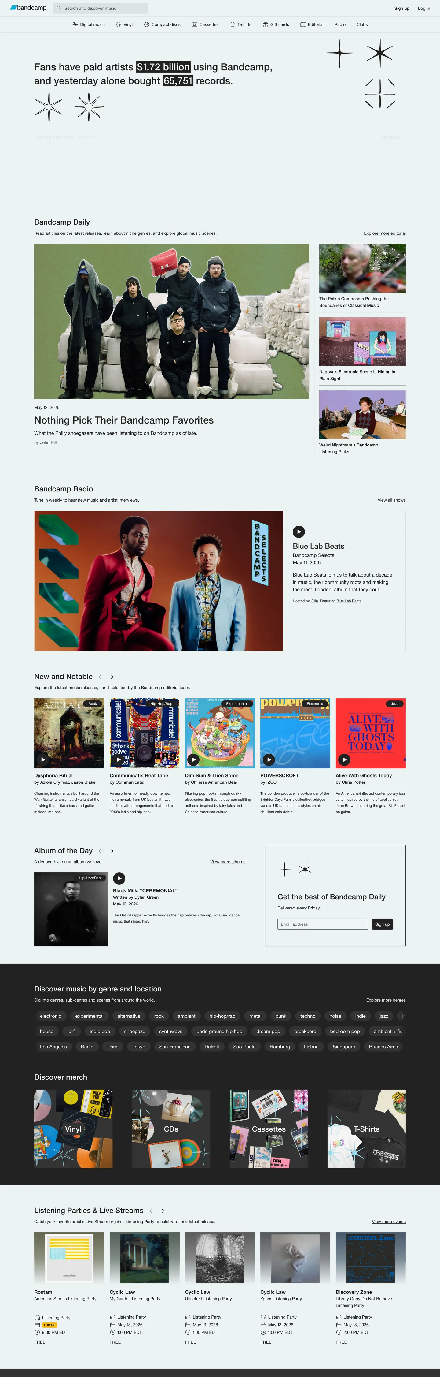
Bandcamp's homepage reads like a community bulletin board printed on a laser printer — white canvas, ink-black hairlines, system sans, almost no chrome between the visitor and the music. The default page background is #ffffff, the page text is #222222, and the same #222222 hex is the default border tone for every catalog tile, list rule, and form input. Where Spotify uses near-black surfaces to push album art forward, Bandcamp uses a bright white canvas and a 1px ink hairline. The single saturated brand color on the page is Yellow #ffba00, applied once to the support-the-artist mark — every other accent comes from album artwork inside the 16px-rounded catalog tiles. Bandcamp Blue #0cacd7 exists, but only as a link tone; it never fills a button.
This DESIGN.md file packages the system into a single machine-readable spec following the Google Labs DESIGN.md specification. Inside: 22 colors tokens organized into ink, surface, link, parchment, and semantic roles drawn from the 94 :root CSS variables Bandcamp exposes (gray100–gray700, parchment100–600, the bandcamp-blue and artist-blue, plus a six-step transparency-dark scale); 11 typography tokens covering display 32px down to micro 10px in Helvetica Neue at weights 400, 500, and 700; 6 corner radii (16px, 4px, 3px, 50%); a 9-step spacing scale from 1px hairline padding through 24px section gutters; and 22 components specifications covering catalog cards, link-styled buttons, search inputs, avatar circles, navigation, and the yellow support mark.
Feed the file to Claude, Cursor, or GitHub Copilot and the agent reproduces Bandcamp's hairline-marketplace voice — white canvas, ink-on-ink borders, links as the primary accent, Helvetica Neue at modest weights, and yellow used once. Reference the tokens directly to paste hex values into Tailwind config or CSS variables. The system is worth studying because it inverts the marketplace convention: where Etsy and Discogs reach for warm cards, fills, and shadows, Bandcamp commits to a printable-page aesthetic that has barely shifted in fifteen years — restraint as a deliberate position against streaming-platform polish.
What makes it distinct
5
- Hairline marketplaceink #222222 carries 632 border occurrences and 592 text occurrences, the same hex doing typographic and structural work
- Link-as-accentBandcamp Blue #0cacd7 lives only on text links and underlines, never on a button fill
- Single-yellow scarcityYellow #ffba00 appears exactly once on the page, reserved for the support-the-artist mark
- Three-radius shape language16px cards, 50% avatar circles, 3px input fields, with zero 8–12px middle ground
- Helvetica Neue onlyfive sizes, three weights, no italic, no custom display face anywhere in the catalog grid
bandcamp.com
Live at bandcamp.com
A snapshot of the brand in production. Scroll the frame to see the whole page.
Colors
22 colors
Bandcamp's system anchors on #767676 (ink-quiet) as its primary color. Type is set in Helvetica Neue across 11 tokens from 10px to 32px, weights 400–700. Shape language is mixed across 22 components, blending pills, soft rounds, and squarer corners.
Text
Headlines, body, captions · 8
Borders & Hairlines
Dividers, outlines, rules · 1
Semantic
Status, errors, success, links · 2
Other
Specialty colors · 11
Typography
11 type tokens
Set in Helvetica Neue across 11 tokens, from 10px to 32px, weights 400–700. Shown in its own stack: where the font isn't installed, the fallback the file names stands in.
- display-md32px · weight 500 · lh 1.4 · tracking normalThe quick brown fox jumps over the lazy dog
- heading-md24px · weight 500 · lh 1.5 · tracking normalThe quick brown fox jumps over the lazy dog
- body-emphasis16px · weight 700 · lh 1.375 · tracking normalThe quick brown fox jumps over the lazy dog
- body-link16px · weight 400 · lh 1 · tracking normalThe quick brown fox jumps over the lazy dog
- body-md14px · weight 400 · lh 1.5714 · tracking normalThe quick brown fox jumps over the lazy dog
- button-md14px · weight 500 · lh 1.5714 · tracking normalThe quick brown fox jumps over the lazy dog
- eyebrow-uppercase14px · weight 400 · lh 1.5714 · tracking 0.56pxThe quick brown fox jumps over the lazy dog
- caption-sm12px · weight 400 · lh 1.6667 · tracking normalThe quick brown fox jumps over the lazy dog
- caption-bold12px · weight 700 · lh 1.6667 · tracking normalThe quick brown fox jumps over the lazy dog
- micro11px · weight 400 · lh 1.818 · tracking normalThe quick brown fox jumps over the lazy dog
- micro-uppercase10px · weight 700 · lh 1 · tracking 0.4pxThe quick brown fox jumps over the lazy dog
Layout
Radii and spacing
6 corner radii and 9 spacing values. Shape language: mixed.
Radii
- none0px
- input3px
- sm4px
- card16px
- full9999px
- circle50%
Spacing
- hairline1px
- xs4px
- xs-plus6px
- sm8px
- md12px
- base16px
- lg24px
- asym-row1px 16px
- card-pad12px 0px
Components
22 components
Each rendered from its tokens (color, type, radius, padding) on Bandcamp's own canvas.
- Page Canvaspage-canvasPage Canvas
- Top Navtop-navTop Nav
- Nav Linknav-linkNav Link
- Search Inputsearch-inputSearch Input
- Search Input Quietsearch-input-quietSearch Input Quiet
- Button Primarybutton-primaryButton Primary
- Button Linkbutton-linkButton Link
- Catalog Cardcatalog-cardCatalog Card
- Card Covercard-coverCard Cover
- Avatar Circleavatar-circleAvatar Circle
- Play Button Circleplay-button-circlePlay Button Circle
- Support Marksupport-markSupport Mark
- Yellow Banneryellow-bannerYellow Banner
- Eyebrow Labeleyebrow-labelEyebrow Label
- Tag Pilltag-pillTag Pill
- List Rowlist-rowList Row
- List Row Dividerlist-row-dividerList Row Divider
- Dropdown Menudropdown-menuDropdown Menu
- Footer Stripfooter-stripFooter Strip
- Link Textlink-textLink Text
- Link Text Deeplink-text-deepLink Text Deep
- Error Texterror-textError Text
In use
The system, in use
Bandcamp's tokens on the kind of product it builds.
Build something people actually use.
A short paragraph of marketing copy that previews how the brand's display tier and body tier read together. Two sentences is usually enough.
FAQ
Bandcamp design system FAQ
Common questions about Bandcamp's tokens, components, and how to use this DESIGN.md in your project.
Read next
Related reading
Specs, directories, and component libraries that pair with this design system.
- Browse all design systemsThe full directory of DESIGN.md files on shadcn.io, with live mockups for each.shadcn.io
- Bandcamp — official siteThe independent-music marketplace where fans pay artists directly.bandcamp.com (opens in a new tab)
- The DESIGN.md specificationGoogle Labs' open spec for machine-readable design system files.github.com (opens in a new tab)
Use it
Use Bandcamp in your project
One machine-readable file. Drop it into Claude, Cursor, or any AI tool that reads DESIGN.md.
Download the DESIGN.md
One machine-readable file: every color, type, radius, spacing, and component token of Bandcamp.
Feed it to your AI tool
Drop it into Claude, Cursor, or GitHub Copilot. The agent writes React components and Tailwind classes that match Bandcamp's visual language.
Reference the tokens directly
Or paste the values into your Tailwind config, CSS variables, or component library: every color, size and radius is a quoted, ready-to-copy value.
Read the full DESIGN.md: overview, rationale, do’s and don’ts
Overview
Bandcamp's chrome is so utilitarian it borders on a position — a white canvas, an ink hairline border on every container, and a body face that has not changed since 2008. The default page background is {colors.page-white} (#f8f8f8 — the merged near-white cluster that also covers literal #ffffff), and the page text is {colors.ink} (#222222). The same #222222 hex carries 1312 occurrences across the page, broken down as 632 borders, 592 text glyphs, and 87 background fills — text duty and structural duty performed by a single tone. Hairline marketplace: where Spotify uses near-black surfaces to push album art forward, Bandcamp uses a bright canvas and a 1px ink rule. The catalog tile is not a card lifted by shadow; it is a rectangle outlined in ink.
Type runs Helvetica Neue exclusively, with Arial fallback. There is no custom display face, no italic, no second family. The size scale is compact at 10–32px across five tiers, and the weight range is just three values — 400 regular, 500 medium for headings and the support-the-artist mark, and 700 for body emphasis. One uppercase eyebrow variant runs 14px / 400 with 0.56px letter-spacing, a small typographic flourish that distinguishes section labels from running text. Where most marketplace systems would license a wordmark face and a display typeface (Etsy uses Graphik, Discogs uses Inter), Bandcamp commits to the system sans the page would have rendered in 2003.
The shape language is a three-tier set with no middle ground: 16px for catalog cards and tiles (68 occurrences), 50% for avatar and play-button circles (21 occurrences), and 3–4px for form inputs (19 combined). There is essentially no 6–12px rounding in the system. A 3px shape is a control, a 16px shape is content, a 50% shape is a person or play affordance. Unlike the convention of softening every corner to 8px for a friendly feel, Bandcamp uses the radius gap itself as a hierarchy signal — adding 8px rounding to a primary button would collapse the distinction.
Key Characteristics:
- Single-color structural duty:
{colors.ink}(#222222) carries 632 borders + 592 text occurrences. The hex doing typography and hairline geometry simultaneously is the system's tell. - Link-as-accent:
{colors.bandcamp-blue}(#0cacd7) appears only as a hyperlink tone in the--bandcamp-blueCSS variable. It never fills a button, never washes a banner. - Single-yellow scarcity:
{colors.yellow-support}(#ffba00) appears exactly once on the homepage — on the support-the-artist mark. Reserved as a brand voltage, used like a paper highlighter. - Three-radius shape language: 16px tiles, 50% circles, 3–4px inputs. The absence of an 8px middle radius is the move.
- Six-step transparency-dark scale:
--transparency-dark-8through--transparency-dark-72(rgb(34 34 34 / 8%–72%)) layered over white in place of drop shadows. - Helvetica Neue across the entire system: five sizes, three weights, one uppercase variant. No display face, no italic.
- Asymmetric 1px × 16px tile padding (68 occurrences): a 1px vertical inset combined with 16px horizontal gutters — the hairline-and-gutter rhythm of the homepage grid.
- Hairline divider stack:
{colors.hairline}(#e6e6e6 — the merged gray100/parchment100 cluster) at 1px between rows. List separation comes from rules, not gaps.
Colors
Ink & Structural
- Ink (
{colors.ink}—#222222) — frequency 1312. Used as text (592), border (632), background (87), shadow (1). The system's load-bearing tone — page text color, primary border tone on every catalog tile, default foreground in--page-text-colorand--default-foreground-color. The same hex doing typographic and structural work simultaneously is the move. - Ink Soft (
{colors.ink-soft}—#333333) — frequency 101. Used as background (53), border (48). The--gray600step; appears on the footer strip and on secondary container fills where ink would be too heavy. - Ink Muted (
{colors.ink-muted}—#5d5d5d) — frequency 32. Used as gradient (12), text (10), border (10). The--gray500step; metadata, timestamps, and the subtle gradient tones inside album-art lazy-load placeholders. - Ink Quiet (
{colors.ink-quiet}—#767676) — frequency 6. Used as text (3), border (3). The--gray400and--disabled-text-color-lightstep; placeholder text and disabled-state foregrounds. - Ink Disabled (
{colors.ink-disabled}—#949494) — frequency 0 on the homepage but declared in--disabled-graphical-color-lightand--disabled-text-color-dark. Disabled-state ink for icons and form labels. - Near White (
{colors.near-white}—#aaaaaa) — frequency 2. Used as text (1), border (1). The--gray300step; the lightest visible gray before reaching hairline tones.
Surface
- Page White (
{colors.page-white}—#f8f8f8) — frequency 371. Used as text (226), border (135), background (10). The merged near-white cluster covering literal#ffffffand#f8f8f8— declared as--white,--gray100,--default-background-color,--menubar-background-color, and--page-background-color. The page canvas everywhere. - Hairline (
{colors.hairline}—#e6e6e6) — frequency 0 on the homepage but declared in--gray200and--parchment100. The default 1px divider tone between list rows where ink would be too heavy.
Link
- Bandcamp Blue (
{colors.bandcamp-blue}—#0cacd7) — frequency 0 occurrences on the rendered homepage but declared as--bandcamp-blueand--blue400. The signature link tone — visible on artist names, album titles, and inline hyperlinks. Reserved for text-link duty only; never fills a CTA. - Artist Blue (
{colors.artist-blue}—#0687f5) — frequency 0. The--artist-bluevariable; reserved for artist-dashboard and editorial highlight contexts. - Link Deep (
{colors.link-deep}—#056277) — frequency 0. The--blue600step; visited link tone and deep-link emphasis. - Link Teal Dark (
{colors.link-tealdark}—#007c9e) — frequency 0. The--blue500step; mid-darkness link state.
Brand Accent
- Yellow Support (
{colors.yellow-support}—#ffba00) — frequency 1. Used as background (1). The--yellow500variable; appears exactly once on the homepage on the support-the-artist mark and on the persistent 42px header banner. The single saturated brand color in the system. - Yellow Mark BG (
{colors.yellow-mark-bg}—#fce097) — frequency 0 on the rendered page but declared as--mark-background-colorand--yellow200. The pale-yellow fill behind highlighted text in editorial copy ("Fans have paid artists $1.72 billion using Bandcamp").
Parchment
- Parchment Cream (
{colors.parchment-cream}—#ede3c2) — frequency 0. The--parchment200step; reserved for special editorial surfaces. - Parchment Amber (
{colors.parchment-amber}—#ddae4d) — frequency 0. The--parchment500mid-tone amber. - Parchment Bronze (
{colors.parchment-bronze}—#bc8a24) — frequency 0. The--parchment600deepest amber, for editorial accents.
Semantic
- Green Tag (
{colors.green-tag}—#2a8737) — frequency 0. The--green500step; success and price-paid tagging. - Red Error (
{colors.red-error}—#e50a0a) — frequency 0. The--red500and--text-color-errortone; form validation errors only. - Red Soft (
{colors.red-soft}—#fc675e) — frequency 0. The--red300step; softer error tone for inline warnings. - Orange Warning (
{colors.orange-warning}—#e65225) — frequency 0. The--orange500step; payment-issue and trial-warning text.
Shadow
- Shadow Ink (
{colors.shadow-ink}—#000000) — frequency 13. Used as shadow (10), text (1), background (1), border (1). The rare drop-shadow color, applied at low opacity on the few elevated overlays where a hairline border alone would not separate the surface.
Typography
Font Family
The system runs Helvetica Neue with a quoted family declaration: "Helvetica Neue", Arial, sans-serif. Every single typography signature extracted from the homepage uses the same family — there is no custom display face, no italic variant, no secondary family for headlines. Where Spotify licenses SpotifyMixUI and The Verge licenses Manuka 900, Bandcamp commits to system sans.
Hierarchy
| Token | Size | Weight | Line Height | Use |
|---|---|---|---|---|
{typography.display-md} | 32px | 500 | 1.4 | Page-level statements ("Fans have paid artists $1.72 billion"), <h1> only |
{typography.heading-md} | 24px | 500 | 1.5 | Section heads ("Bandcamp Daily", "New and Notable"), <h2> rows |
{typography.body-emphasis} | 16px | 700 | 1.375 | Inline bold inside body copy; appears 30 times on the homepage |
{typography.body-link} | 16px | 400 | 1.0 | Link-styled rows with tight 16px line-height for stacked link lists |
{typography.body-md} | 14px | 400 | 1.5714 | Default body text — paragraphs, links, divs (86 occurrences) |
{typography.button-md} | 14px | 500 | 1.5714 | Button labels and emphasized inline actions (25 occurrences) |
{typography.eyebrow-uppercase} | 14px | 400 | 1.5714 | UPPERCASE section eyebrows with 0.56px tracking (10 occurrences) |
{typography.caption-sm} | 12px | 400 | 1.6667 | Captions, metadata, secondary list rows (28 occurrences) |
{typography.caption-bold} | 12px | 700 | 1.6667 | Emphasized captions inside list rows |
{typography.micro} | 11px | 400 | 1.818 | Date stamps and <time> elements (20 occurrences) |
{typography.micro-uppercase} | 10px | 700 | 1.0 | Smallest UPPERCASE label with 0.4px tracking, rare badge use |
Principles
The weight range is just 400 / 500 / 700, with 500 carrying display and headings and 500 also carrying button labels — heading weight and button weight are the same value. Hierarchy comes from size and spacing rather than weight contrast. Where most editorial systems run a 300–900 weight ladder, Bandcamp's hierarchy lives in the size jump from 14px body to 24px heading to 32px display, with line-height tightening as size grows (1.5714 → 1.5 → 1.4).
The single uppercase eyebrow variant at 14px / 400 with 0.56px letter-spacing is the only typographic flourish. Bandcamp avoids the weight-as-accent move common to fintech and developer-tool systems — it reads more like a 1990s newsweekly page than a 2020s SaaS app.
Layout
Spacing System
- Base unit: 4px with 6px and 8px sub-steps. The dominant gap is
{spacing.xs-plus}6px (121 occurrences) and the dominant catalog tile padding is{spacing.asym-row}1px 16px(68 occurrences — a 1px vertical inset combined with 16px horizontal gutters). - Tokens:
{spacing.hairline}1px ·{spacing.xs}4px ·{spacing.xs-plus}6px ·{spacing.sm}8px ·{spacing.md}12px ·{spacing.base}16px ·{spacing.lg}24px ·{spacing.asym-row}1px 16px ·{spacing.card-pad}12px 0px. - Card internal padding:
{spacing.asym-row}(1px × 16px) on catalog tiles and list rows — the asymmetry is deliberate; vertical gutters collapse to a hairline while horizontal padding stays generous. - Section gutters:
{spacing.lg}(24px) between major homepage sections;{spacing.base}(16px) between cards in catalog grids.
Grid & Container
- Full-width canvas: the page has no fixed max-width container at desktop breakpoints. Catalog grids fill the viewport width, capped only by the body-text width variable
--body-text-width: 700pxused for editorial prose. - Catalog grid: 4 columns on large desktop dropping to 2 on tablet and 1 on mobile, with 16px gutters and 16px-rounded tiles.
- Header: persistent 53px top nav (
--header-height: 53px,--bc-menubar-height: 53px) with the Bandcamp wordmark left, primary nav center-left, and search + account controls right. - Yellow banner: persistent 42px-tall (
--page-banner-height: 42px) header strip in{colors.yellow-support}(#ffba00) above the menubar — the single high-saturation surface in the chrome. - Footer cap:
--bc-maximal-footer-height: 400pxupper bound for the dark footer band, kept proportional to viewport.
Whitespace Philosophy
The system favors horizontal generosity and vertical compression. The 1px-by-16px asymmetric padding on catalog tiles is the clearest signal: vertical rhythm collapses to hairline rules while horizontal gutters stay generous. The result is a dense vertical scroll where catalog tiles stack tightly but never feel cramped because horizontal space breathes. Editorial body copy uses a 700px column cap (--body-text-width) — readable line length is the only thing that gets generous vertical spacing.
Elevation
| Level | Treatment | Use |
|---|---|---|
| Base (Level 0) | Flat {colors.page-white} (#f8f8f8) | Page background, sidebar, menubar |
| Surface (Level 1) | 1px {colors.ink} hairline border on {colors.page-white} fill | Catalog tiles, dialogs, form inputs |
| Transparency Layer | rgb(34 34 34 / 8–72%) from the --transparency-dark scale | Hover state fills, overlay scrims |
| Banner (Spotlight) | Flat {colors.yellow-support} (#ffba00) fill | The 42px header banner — the only saturated fill on the page |
| Shadow (Rare) | {colors.shadow-ink} (#000000) at low opacity | Reserved for modals and the few dropdowns where the hairline alone would not separate the surface |
Shadow Philosophy: Bandcamp uses hairline-as-elevation. The whole page renders 11 total shadow occurrences in the extracted data, and none of them carry the layered drop-shadow geometry you would see on a Material-flavored marketplace. Instead, the system relies on 1px #222222 borders and the six-step --transparency-dark scale (8% through 72%) layered over white. Catalog tiles, dropdowns, dialogs, and form inputs all sit on the same flat plane — depth comes from border presence and the transparency scale, not drop shadows. Color-and-hairline-as-elevation: when something needs to stand out, it gets a 1px ink border or a yellow fill, not a softened shadow.
Shapes
The corner-radius system has three tiers with deliberate gaps:
- 16px (
{rounded.card}) — 68 occurrences. Catalog tiles, album-art frames, content cards, and the editorial article tiles. The dominant rounding in the system. - 50% (
{rounded.circle}) — 21 occurrences. Avatar circles for artists and fans, play-button circles, and small icon-button backgrounds. - 3–4px (
{rounded.input}/{rounded.sm}) — 19 combined occurrences. Form inputs (3px specifically on<input>elements), small buttons, and inline badges.
There is essentially no 6–12px middle ground. The radius gap itself is the hierarchy signal: a 3px corner is a control, a 16px corner is content, a 50% corner is a person or a play affordance. Where most marketplaces soften everything to 8px, Bandcamp preserves the rhythm by refusing the middle.
Components
Navigation
top-nav — {colors.page-white} (#f8f8f8) fill, 53px tall (--bc-menubar-height: 53px), ink text. No bottom border by default — separation from the page comes from the persistent yellow banner above it, not a divider rule.
nav-link — Transparent fill, {colors.ink} text in {typography.body-md} (14px / 400), 0×14px padding. Hover state: text underlines.
yellow-banner — {colors.yellow-support} (#ffba00) fill, ink text in body type, 42px tall (--page-banner-height: 42px). The persistent header strip above the menubar — the only saturated chrome surface on the page. Carries the support-the-artist message and promotional callouts.
Inputs
search-input — White #ffffff fill, ink text, {rounded.input} (3px) radius, 5×10px padding, 36px tall, 1px {colors.ink} border. The global catalog search.
search-input-quiet — rgb(34 34 34 / 8%) fill (from the --transparency-dark-8 scale, also declared as --menubar-search-input-background-color), ink text, 3px radius, no border. The menubar-inline search variant where the page would crowd a visible 1px outline.
Buttons
button-primary — {colors.ink} fill, {colors.page-white} text, {typography.button-md} (14px / 500), {rounded.input} (3px) radius, 8×16px padding. The primary action button — used for "Buy Now" and "Continue" rather than a Bandcamp Blue fill. Inverts the convention of brand-colored primaries.
button-link — Transparent fill, {colors.bandcamp-blue} (#0cacd7) text in body type, no padding, no border. The dominant call-to-action style on the homepage — primary actions are styled as text links, not as filled buttons.
Cards
catalog-card — {colors.page-white} fill, ink text, {rounded.card} (16px) radius, 1px {colors.ink} border, asymmetric 1×16px padding ({spacing.asym-row}). The catalog tile — used for albums, fan collections, and editorial features. No drop shadow at rest; hover state adds a --transparency-dark-8 overlay.
card-cover — {colors.hairline} fill, 16px radius, no border, used as the lazy-load placeholder behind album-art images inside catalog tiles. The 16px radius matches the parent tile, producing a flush inner clip.
Marks & Accents
support-mark — {colors.yellow-mark-bg} (#fce097) fill, ink text in {typography.body-emphasis} (16px / 700), {rounded.sm} (4px) radius, 1×4px padding. The yellow-highlighted text mark applied to in-copy statistics ("paid artists $1.72 billion"). Maps to the <mark> HTML element.
eyebrow-label — Transparent fill, ink text in {typography.eyebrow-uppercase} (14px / 400, 0.56px tracking, uppercase). The single uppercase voice in the system — section eyebrows above heading rows.
tag-pill — Transparent fill, ink text in {typography.caption-sm} (12px / 400), 16px radius, 1×16px padding, 1px ink border. Genre tags and editorial labels — pill-shaped at the same 16px radius as the catalog tile they sit inside.
Lists
list-row — Transparent fill, ink body text, 12×0px padding ({spacing.card-pad}). Stacked list rows in the discover and fan-collection sections.
list-row-divider — {colors.hairline} (#e6e6e6) at 1px height, full row width. The default rule between list rows where ink would be too heavy.
Avatars & Controls
avatar-circle — {colors.hairline} placeholder fill, {rounded.circle} (50%) radius. The artist and fan avatar — appears in profile rows, fan-purchase strips, and the menubar account control.
play-button-circle — {colors.ink} fill, {colors.page-white} arrow icon, 50% radius, 6px padding. The track-row play affordance — a small ink circle, not a green or yellow fill.
Overlays
dropdown-menu — {colors.page-white} fill, ink text in body type, {rounded.sm} (4px) radius, 1px ink border, 8px padding. Account menus, sort dropdowns, and genre filters. No drop shadow — the 1px hairline separates the menu from the page.
Footer
footer-strip — {colors.ink} (#222222) fill (the rare ink background usage), {colors.page-white} text in {typography.caption-sm} (12px / 400), 24×16px padding. The dark footer band — the single moment in the system where the canvas inverts to ink. Caps at --bc-maximal-footer-height: 400px.
Links
link-text — Transparent fill, {colors.bandcamp-blue} (#0cacd7) text in body type. The signature link tone — applied to artist names, album titles, and inline hyperlinks. No underline at rest; underlines on hover.
link-text-deep — Transparent fill, {colors.link-deep} (#056277) text — visited-state and deeper-emphasis links.
Semantic
error-text — Transparent fill, {colors.red-error} (#e50a0a) text in caption type. The --text-color-error value; form validation errors only.
Do's and Don'ts
Do
- Use
{colors.ink}(#222222) for both text and 1px borders — the same hex doing typographic and structural work is the system's tell. - Apply
{colors.bandcamp-blue}(#0cacd7) only on text links and inline hyperlinks. Pair it with{typography.body-md}(14px / 400). - Render primary CTAs as text links (
button-link) rather than filled buttons. The homepage's dominant call-to-action style is{colors.bandcamp-blue}underlined text, not a filled pill. - Use 1px
{colors.hairline}(#e6e6e6) rules between list rows where a full ink border would feel heavy. - Keep catalog tiles at exactly
{rounded.card}(16px) and form inputs at{rounded.input}(3px). The radius gap is the hierarchy signal. - Apply
{colors.yellow-support}(#ffba00) only on the persistent 42px banner and the support-the-artist mark — at most twice per page.
Don't
- Don't fill a primary button with
{colors.bandcamp-blue}(#0cacd7). The hex lives in--bandcamp-bluebut the variable is declared for text-link duty — there is zerobgusage on the homepage. Use{colors.ink}for filled primaries instead. - Don't use 8px or 12px rounding anywhere. The system jumps directly from 4px controls to 16px cards. An 8px corner collapses the three-tier shape language and reads as Material default rather than Bandcamp.
- Don't reach for drop shadows for elevation. The page renders 11 total shadow occurrences; the convention is 1px
{colors.ink}hairlines on a white canvas, supplemented by the--transparency-dark-8through--transparency-dark-72scale for overlay scrims. - Don't use
{colors.yellow-support}(#ffba00) on text. It is a background-only token (frequency 1, allbg). For yellow-highlighted text marks, use{colors.yellow-mark-bg}(#fce097) as the fill behind ink glyphs. - Don't introduce italic, semibold (600), or any weight outside 400 / 500 / 700. The weight ladder is deliberately three values, with 500 carrying both display headings and button labels.
- Don't use
{colors.parchment-cream}(#ede3c2) or any parchment tone on the marketplace homepage. Those tones live in--parchment100through--parchment600and are reserved for editorial sub-sections — applying them to a catalog tile would break the white-canvas voice.
Known Gaps
- Album-detail and artist-page layouts: the long-form record page where most listening happens is not captured here; the spec covers homepage and discover chrome only.
- Music player: the floating track-player widget that appears after a "play" click has playback controls, scrubber, and volume that are not extracted in this DESIGN.md.
- Cart and checkout flow: the purchase and pay-what-you-want widget uses additional form patterns and currency-selector styling not represented here.
- Bandcamp Daily editorial sub-brand: the parchment palette (
{colors.parchment-cream}through{colors.parchment-bronze}) is declared in CSS variables but only fully expressed on the editorial sub-site — not in the marketplace homepage. - Motion and hover transitions: card hover lightening uses the
--transparency-dark-8overlay, but the exact transition duration and easing curve are not captured. - Dark mode / accessibility states: there is no dark canvas in the public surface; high-contrast and reduced-motion accommodations are not extracted in this spec.
Music, Video & Streaming
More systems like this
More DESIGN.md files in Music, Video & Streaming.
Pricing
Build it with Pro
The DESIGN.md files are free. Pro adds 6,000+ blocks, premium templates and the MCP server, so your AI editor builds in your system for you.
4.9/5 out of 5 · 150+ reviewsfrom 150+ founders and developers.
Billing
Billed once a year in USD. Cancel anytime.
- How many people can use the license.
- Client work, SaaS products and anything you charge for.
- Production-ready React sections: hero, pricing, features, dashboards and more.
- Complete multi-page sites you can ship as they are.
- React icons from every major library, installable with one command.
- Presets that restyle every block, in light and dark.
- Lets your AI editor search, preview and install blocks for you.
- Priority requests are answered first.
Individual
For personal projects & open source
$32instead of $49/mo
$389 billed yearly
- Seats: 1 seat
- Commercial use: Personal & open source only
- Pro blocks: 6,000+ blocks
- Templates: All 14 templates
- React icons: 294k+ icons
- Themes: All 59 themes
- MCP server: Basic usage
- Support: Standard
Team
Most popularFor freelancers, agencies & startups
$66instead of $99/mo
$789 billed yearly · ≈ $13/dev/mo
- Seats: Up to 5 seats
- Commercial use: Included
- Pro blocks: 6,000+ blocks
- Templates: All 14 templates
- React icons: 294k+ icons
- Themes: All 59 themes
- MCP server: High usage
- Support: Priority
Organization
For companies with larger teams
$132instead of $199/mo
$1,589 billed yearly
- Seats: Unlimited seats
- Commercial use: Included
- Pro blocks: 6,000+ blocks
- Templates: All 14 templates
- React icons: 294k+ icons
- Themes: All 59 themes
- MCP server: Unlimited usage
- Support: Priority
Billed once a year in USD. Cancel anytime.
Individual
For personal projects & open source
$32instead of $49/mo
$389 billed yearly
- How many people can use the license.Seats: 1 seat
- Client work, SaaS products and anything you charge for.Commercial use: Personal & open source only
- Production-ready React sections: hero, pricing, features, dashboards and more.Pro blocks: 6,000+ blocks
- Complete multi-page sites you can ship as they are.Templates: All 14 templates
- React icons from every major library, installable with one command.React icons: 294k+ icons
- Presets that restyle every block, in light and dark.Themes: All 59 themes
- Lets your AI editor search, preview and install blocks for you.MCP server: Basic usage
- Priority requests are answered first.Support: Standard
Team
Most popularFor freelancers, agencies & startups
$66instead of $99/mo
$789 billed yearly · ≈ $13/dev/mo
Everything in Individual, plus
- How many people can use the license.Seats: Up to 5 seats
- Client work, SaaS products and anything you charge for.Commercial use: Included
- Lets your AI editor search, preview and install blocks for you.MCP server: High usage
- Priority requests are answered first.Support: Priority
Organization
For companies with larger teams
$132instead of $199/mo
$1,589 billed yearly
Everything in Team, plus
- How many people can use the license.Seats: Unlimited seats
- Lets your AI editor search, preview and install blocks for you.MCP server: Unlimited usage
- Secure checkout via Stripe
- Code lives in your repo
- Keep what you've shipped if you cancel
- License terms
Your system, built for you
Every block, template and icon, installed by your AI agent in your design system. The DESIGN.md files stay free.