Epic Games Store Design System
Epic Games Store as a DESIGN.md file. Cyan #26bbff, Inter / Inter Tight, 19 components, 8px tile radius. For React, Next.js, and AI tools.
Add shadcn.io to your AI agent. · Pro It installs blocks, icons and templates in your design system from a prompt, with Pro.
Set up MCP- Primary
- #26bbff
- Typeface
- Inter
- Shape
- Sharp
- Base radius
- 8px
- Colors
- 19
- Type tokens
- 11
- Components
- 19
- Spacing values
- 8
About
About Epic Games Store DESIGN.md
Curated by Dov Azencot · Updated May 13, 2026 · Source store.epicgames.com (opens in a new tab)
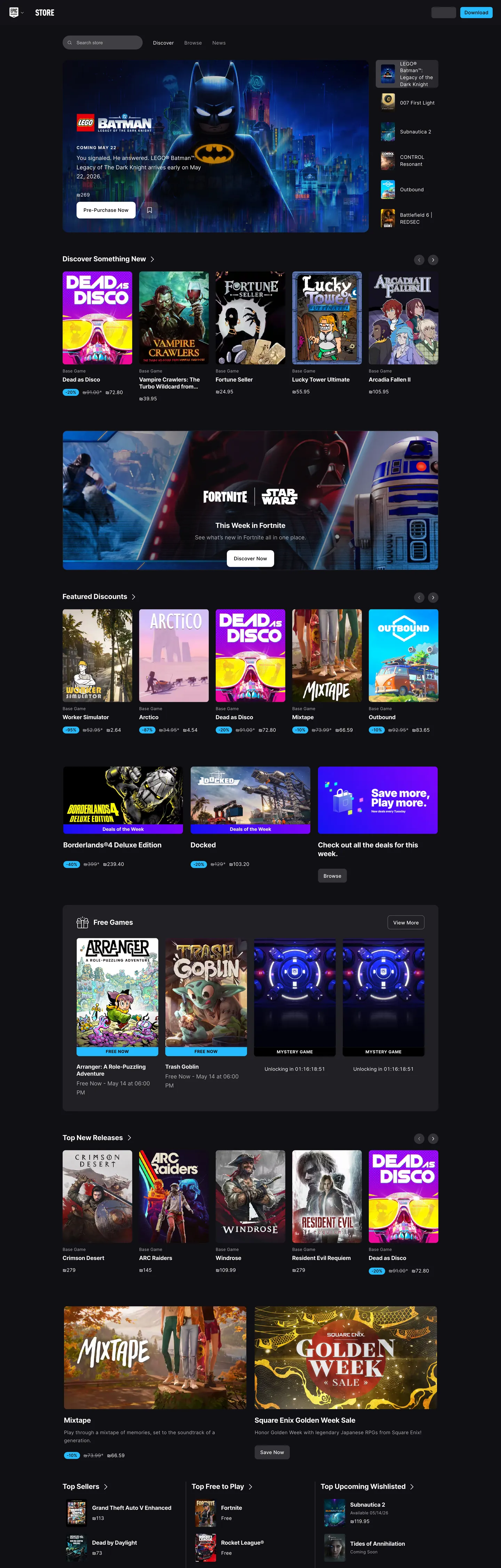
Epic Games Store reads as a catalog before it reads as a marketing surface. The page paints itself in a near-black charcoal ladder — "#101014" for the canvas, "#18181c" and "#202024" for the gradient bodies of tiles, "#28282c" for hover states, "#404044" for the rare divider — and every game key-art tile sits on this graded ink with an 8px radius. The single chromatic moment in the chrome is Epic Cyan "#26bbff", which appears on the price chip beneath each tile, on "Free Now" flags, on sale badges, and on the small dot that marks a wishlist filter. The voltage is precious: 37 occurrences across the full page versus 3,801 white-on-charcoal surfaces. Where PlayStation alternates three full-bleed canvases, Epic stacks one canvas — dark — and lets the cover art do the chapter work. The DESIGN.md file packages this storefront discipline as 19 colors tokens covering the five-layer charcoal ladder plus the cyan voltage, two link blues, and the on-dark text family; 11 typography tokens all set in Inter / Inter Tight with sizes capped at 20px because the brand reserves expressive headlines for the key-art layer; a four-radius shape scale where 8px (181 occurrences) carries every tile, 4px sits on inputs and chips, 50% renders avatars and dots, and 9999px pills sit on filter rows; and 19 components covering tile, hero carousel, genre pill, search field, top-nav, badge family, and the price-and-CTA row that closes every product card. Feed the file to Claude, Cursor, or Copilot and the agent will generate a games-storefront layout that mirrors Epic's restraint: a tile grid on graded charcoal with one cyan accent reserved for price and savings cues, Inter Tight at weight 700 for tile titles capped at 20px, and an 8px radius repeated across every card, filter, and surface. Reference the tokens directly when building a games catalog, a sale page, or a library grid. The system's value as a study is that it documents what happens when key art does the storytelling — the chrome compresses itself to a single accent and a single radius, and the catalog scans like a contact sheet rather than a marketing page.
What makes it distinct
5
- Single voltage on graded charcoalEpic Cyan #26bbff appears on price chips, sale flags, and the free-game wash, never as a primary surface
- Tile-first composition8px-radius cards repeat 181 times across the page, the storefront's only consistent geometry beyond the cyan accent
- Title type caps at 20pxInter Tight 700 carries every tile name and h6 row label, key art does the visual heavy lifting
- Five-layer charcoal ladder#101014 page through #18181c, #202024, #28282c, #404044 tiles, an extruded ink-on-ink elevation system
- Default text link "#0000ee" survives in body linksthe unstyled browser blue persists where the storefront does not theme inline anchors
store.epicgames.com
Live at store.epicgames.com
A snapshot of the brand in production. Scroll the frame to see the whole page.
Colors
19 colors
Epic Games Store's system runs on #26bbff as its primary voltage, used in 5 of 19 components. Type is set in Inter across 11 tokens from 12px to 20px, weights 400–700. Shape language is sharp — components average 3px corner radius, favoring crisp rectangles.
Brand & Accent
Sparing, CTA-only voltage · 1
Surface
Page and card backgrounds · 5
Text
Headlines, body, captions · 9
Borders & Hairlines
Dividers, outlines, rules · 2
Other
Specialty colors · 2
Typography
11 type tokens
Set in Inter across 11 tokens, from 12px to 20px, weights 400–700. Shown in its own stack: where the font isn't installed, the fallback the file names stands in.
- title-lg20px · weight 700 · lh 1.25 · tracking 0.4pxThe quick brown fox jumps over the lazy dog
- title-md16px · weight 700 · lh 1.25 · tracking 0.32pxThe quick brown fox jumps over the lazy dog
- body-md16px · weight 400 · lh 1.65 · tracking 0pxThe quick brown fox jumps over the lazy dog
- body-sm14px · weight 400 · lh 1.4 · tracking 0.28pxThe quick brown fox jumps over the lazy dog
- body-sm-strong14px · weight 500 · lh 1.4 · tracking 0.28pxThe quick brown fox jumps over the lazy dog
- body-sm-relaxed14px · weight 400 · lh 1.65 · tracking 0.28pxThe quick brown fox jumps over the lazy dog
- caption-md12px · weight 400 · lh 1.5 · tracking 0.24pxThe quick brown fox jumps over the lazy dog
- caption-strong12px · weight 500 · lh 1.5 · tracking 0.24pxThe quick brown fox jumps over the lazy dog
- caption-eyebrow12px · weight 700 · lh 1.33 · tracking 0.5pxThe quick brown fox jumps over the lazy dog
- caption-eyebrow-tight12px · weight 700 · lh 1 · tracking 1.2pxThe quick brown fox jumps over the lazy dog
- meta-sm14px · weight 400 · lh 1.43 · tracking 0.2pxThe quick brown fox jumps over the lazy dog
Layout
Radii and spacing
5 corner radii and 8 spacing values. Shape language: sharp.
Radii
- none0px
- sm4px
- md8px
- pill9999px
- circle50%
Spacing
- xxs4px
- xs5px
- sm8px
- md10px
- base16px
- lg18px
- xl24px
- xxl64px
Components
19 components
Each rendered from its tokens (color, type, radius, padding) on Epic Games Store's own canvas.
- Page Canvaspage-canvasPage Canvas
- Top Navtop-navTop Nav
- Nav Searchnav-searchNav Search
- Nav Avatarnav-avatarNav Avatar
- Hero Carousel Slidehero-carousel-slideHero Carousel Slide
- Carousel Paddlecarousel-paddleCarousel Paddle
- Game Tilegame-tileGame Tile
- Game Tile Hovergame-tile-hoverGame Tile Hover
- Tile Meta Rowtile-meta-rowTile Meta Row
- Price Chipprice-chipPrice Chip
- Price Chip Freeprice-chip-freePrice Chip Free
- Sale Badgesale-badgeSale Badge
- Genre Pillgenre-pillGenre Pill
- Genre Pill Activegenre-pill-activeGenre Pill Active
- Section Eyebrowsection-eyebrowSection Eyebrow
- Section Railsection-railSection Rail
- Filter Dotfilter-dotFilter Dot
- Footer Bandfooter-bandFooter Band
- Inline Linkinline-linkInline Link
In use
The system, in use
Epic Games Store's tokens on the kind of product it builds.
Build something people actually use.
A short paragraph of marketing copy that previews how the brand's display tier and body tier read together. Two sentences is usually enough.
FAQ
Epic Games Store design system FAQ
Common questions about Epic Games Store's tokens, components, and how to use this DESIGN.md in your project.
Read next
Related reading
Specs, directories, and component libraries that pair with this design system.
- Browse all design systemsThe full directory of DESIGN.md files on shadcn.io, with live mockups for each.shadcn.io
- Epic Games Store — official storefrontThe PC games and free-game-every-week storefront whose chrome this DESIGN.md describes.store.epicgames.com (opens in a new tab)
- The DESIGN.md specificationGoogle Labs' open spec for machine-readable design system files — the format this page is built on.github.com (opens in a new tab)
Use it
Use Epic Games Store in your project
One machine-readable file. Drop it into Claude, Cursor, or any AI tool that reads DESIGN.md.
Download the DESIGN.md
One machine-readable file: every color, type, radius, spacing, and component token of Epic Games Store.
Feed it to your AI tool
Drop it into Claude, Cursor, or GitHub Copilot. The agent writes React components and Tailwind classes that match Epic Games Store's visual language.
Reference the tokens directly
Or paste the values into your Tailwind config, CSS variables, or component library: every color, size and radius is a quoted, ready-to-copy value.
Read the full DESIGN.md: overview, rationale, do’s and don’ts
Overview
Epic Games Store paints one canvas and lets the catalog do the rest. The page background is a near-black {colors.canvas} ("#101014") and every game card sits on a graded charcoal — {colors.surface-tile-top} ("#18181c") fading into {colors.surface-tile-bottom} ("#202024") — at an 8px corner. The single chromatic accent is {colors.primary} ("#26bbff"), Epic Cyan, which appears 37 times against 3,801 white-on-charcoal surfaces. Where Steam decorates its store with green sale bands, orange "Featured" headers, and a busy chrome palette, Epic commits to one voltage and one canvas — the cyan flags price, savings, and free-game state, nothing else. Game key art carries every other moment of color.
Tile-as-chapter: the storefront has no full-bleed hero band the way PlayStation's marketing site does. Instead, the entire page is a contact sheet of {rounded.md} (8px) tiles — the hero carousel, the "Discover Something New" grid, "Featured Discounts," "Top Free Games," "Top Past Releases," "Mixtape," and "Golden Week" — and the 8px radius repeats 181 times across the captured page. The shape system is so committed that it functions as identity: scan a screenshot with the colors stripped and Epic is recognizable by tile cadence alone.
Caps-at-twenty type: Inter Tight at weight 700 carries titles, and the largest size in the chrome is 20px. There is no display-tier 48px, no editorial 64px, no banner head — because hero copy lives inside the key art, not above it. Below the tile, the chrome compresses to Inter at 12-16px for meta, price, and dev-credit lines. Where most game-store homepages stack a 60px headline over a 16px subhead, Epic keeps every text node under 20px and trusts the art to carry weight.
Key Characteristics:
- Single dark canvas
{colors.canvas}("#101014") — no light mode, no canvas alternation - Five-layer charcoal elevation ladder: "#101014" page, "#18181c" tile top, "#202024" tile bottom, "#28282c" hover, "#404044" divider
- One voltage
{colors.primary}("#26bbff") reserved for price chips, sale badges, free-game wash, and filter dots - Type tops out at 20px (
{typography.title-lg}) — Inter Tight 700 for tile titles, Inter for body and metadata - Load-bearing 8px radius (
{rounded.md}) appears 181 times across tiles, slides, and cards - Four-radius shape ladder: 4px inputs, 8px tiles, 9999px pills, 50% avatars and dots
- Default browser blue "#0000ee" survives in inline body links — the storefront does not override the user-agent anchor color
Colors
Epic's palette is a graded charcoal ladder plus one voltage. The palette is small on purpose: with 4014 elements scanned, only 10 distinct chrome hexes survived clustering, because every visual moment that wants color hands the moment to a game cover instead.
- Epic Cyan (
#26bbff) — frequency 37. Used as bg (37), text (0), border (0), gradient (0). The storefront's only chromatic chrome accent — price chips, sale-percentage badges, "Free Now" wash flags, and small filter-state dots. Never a primary surface, never a full-bleed band. The voltage is precious by design. - Page Canvas (
#101014) — frequency 67. Used as bg (65), gradient (2). The default page surface. Slightly warmer than pure black at OKLCH hue 285; this is what the body, every section rail, and the footer paint themselves on. - Tile Gradient Top (
#18181c) — frequency 114. Used as gradient (113), bg (1). The lighter half of the standard tile body gradient. Pairs with#202024to give every card a subtle top-to-bottom lift without a separate hover state. - Tile Gradient Bottom (
#202024) — frequency 114. Used as gradient (113), bg (1). The darker half of the tile gradient. The pairing reads as a single charcoal tile in screenshots but lifts under hover. - Surface Elevated (
#28282c) — frequency 6. Used as bg (6). The hover surface and the chip background for genre pills, the nav search field, and the avatar. One step lighter than tile bottom — the elevation cue is small but legible against the canvas. - Surface Divider (
#404044) — frequency 7. Used as bg (7). The rare lighter charcoal — used on dividers, the carousel pagination track, and the secondary-button surface when one appears in a "View All" position. - Ink (
#ffffff) — frequency 3801. Used as text (1898), border (1893). The dominant on-canvas color. Title rows, body rows, hairline borders for the focus ring, and every metadata line render in white or graded white. - Pitch (
#000000) — frequency 167. Used as text (82), border (82), bg (3). Reserved for on-cyan moments — the price-chip text reads#101014rather than pure black, but a few badge contexts use pitch directly for maximum contrast. - Link Default (
#0000ee) — frequency 2740. Used as text (1370), border (1370). The unstyled browser anchor color survives in inline body links — Epic does not override the user-agent default for legal-page anchors, FAQ rows, or support links. The volume comes from the page's footer-area legal copy. - Swiper Theme (
#007aff) — declared on:rootas--swiper-theme-color. The carousel library's default theme blue, scoped to pagination dots inside the Swiper instance. Rare in the chrome; included because it ships in the CSS.
Typography
Two faces from the Inter family carry every text node: Inter for body, metadata, and caption rows, and Inter Tight for the two tile-title sizes at weight 700. The pairing reads as one family because Inter Tight is the condensed sibling of Inter — the storefront looks single-faced at a glance, and the slight letterform tightening on 16px and 20px titles helps tile names like "Mortal Kombat 1: Komplete Edition" fit on two lines.
The notable strategic choice is the size cap: nothing in the chrome exceeds 20px. The largest type token in the captured surface is {typography.title-lg} (Inter Tight 700, 20px, 1.25 line-height, +0.4px tracking), used on h5 section heads like "Top Free Games" and "Top Past Releases." Tile titles drop to 16px ({typography.title-md}, Inter Tight 700). Body and metadata sit at 14px regular with +0.28px tracking. Eyebrow caps live at 12px weight 700 uppercase with +0.5px or +1.2px tracking, used on small section labels.
Where PlayStation runs SST at weight 300 across a six-step display ladder, Epic runs Inter / Inter Tight at weight 400-700 with no display tier at all — the key-art layer absorbs the moments a typical storefront would amplify with a 48-60px headline. The compression is deliberate: the catalog is the page.
Layout
The page is a single dark canvas with vertical rails of 8px-radius tiles. The default body container is 1232px wide centered on the canvas. Each section is an eyebrow caption (12px Inter 700 uppercase, +0.5px tracking) above a tile rail, with {spacing.xxl} (64px) of vertical separation between rails. There are no full-bleed colored bands and no decorative dividers between sections — the canvas color carries through and the rhythm comes from tile spacing alone.
Spacing in the chrome lives mostly at three steps: {spacing.md} (10px) gap between tile rows and meta lines, {spacing.sm} (8px) gap inside the tile meta footer, and {spacing.xxl} (64px) between sections. Inside tiles, padding is "0" because the cover art bleeds to the 8px corner and the title row sits below the image, not on top of it. The hero carousel uses a 44px circular paddle ({rounded.circle}) at {colors.hairline-mid} ("rgba(255,255,255,0.16)") on the left and right edge of the slide.
The sidebar pattern — Top Sellers, Top Wishlisted, Top Upcoming Wishlisted — runs three parallel single-column lists in the lower half of the page, each capped at five rows. Where Steam's storefront uses dense data tables for top-sellers, Epic uses three small column rails that read like a magazine "What's hot" sidebar.
Elevation & Depth
Epic's elevation system is ink-on-ink: the canvas at {colors.canvas} ("#101014") supports tiles painted in a {colors.surface-tile-top} → {colors.surface-tile-bottom} ("#18181c" → "#202024") gradient, with hover lifting to {colors.surface-elevated} ("#28282c"). The maximum surface in the ladder, {colors.surface-divider} ("#404044"), is reserved for narrow secondary chrome — pagination tracks, divider rules, and the rare "ghost" outline button.
There are no drop shadows in the chrome. The captured surfaces report a shadow count of zero on every clustered color; the entire elevation cue is the ladder. Where most dark-canvas storefronts (Steam, Discord, GOG Galaxy) layer 0-12px shadows on hover, Epic just shifts one step up the charcoal scale. The charcoal-as-elevation move keeps the page perceptually flat — game key art remains the only thing that "pops" off the canvas, exactly what a contact sheet wants.
Shapes
Four radii do the entire shape work. {rounded.md} (8px) is load-bearing at 181 occurrences — every tile, every carousel slide, every card, every wishlist row. {rounded.sm} (4px, 42 occurrences) handles the nav search input, dropdown rows, and small chips. {rounded.pill} (9999px, 35 occurrences) handles genre filter pills and the few sectional CTA buttons. {rounded.circle} (50%, 53 occurrences) renders the avatar in the top-right, the carousel paddles, and small status dots.
The two-shape rhythm of tile-and-pill is the entire vocabulary. There is no 12px or 16px radius in steady use — Epic commits to 8px or pill with no middle ground. The discipline reads in screenshots: every card corner is the same corner, so the eye can scan tiles by cover art alone.
Components
- page-canvas — the dark page surface at
{colors.canvas}("#101014"). No internal padding; child rails set their own rhythm. - top-nav — 72px tall (
--eg-global-nav-height: 4.5rem), full-width, painted on the canvas, with a horizontal row of{typography.body-sm-strong}nav links and a right-aligned search + avatar. - nav-search — a 4px-radius input painted on
{colors.surface-elevated}("#28282c"), housing the cross-store search. - nav-avatar — a 36px
{rounded.circle}painted on{colors.surface-elevated}, the only circular chrome that contains an image. - hero-carousel-slide — an 8px-radius slide with a full-bleed cover image and an inset title overlay. The chrome is reduced to the radius and the cyan price chip; no gradient overlay tints the art.
- carousel-paddle — 44px circular paddle (matches
--swiper-navigation-size) at{colors.hairline-mid}("rgba(255,255,255,0.16)") — visible only on hover over the slide region. - game-tile — the workhorse component. 8px corner, cover art bleeds to the edge, title and price stack below at
{typography.title-md}and{typography.body-sm-strong}. - game-tile-hover — the same shape, surface lifted from the gradient to
{colors.surface-elevated}("#28282c"). No scale transform, no shadow — only the ink-on-ink step. - tile-meta-row — the row beneath the cover image, padded
8px 12px, with a single-line dev/publisher caption at{typography.caption-md}and the price chip on the right. - price-chip — text-only chip in
{colors.primary}("#26bbff") at{typography.body-sm-strong}. No background fill in the default state — the cyan text alone signals the price. - price-chip-free — the "Free Now" variant. Cyan text on a
{colors.badge-free-wash}("rgba(38,187,255,0.16)") wash, the only filled chip in the system. - sale-badge — a small
{colors.primary}chip in{colors.on-primary}("#101014") text used for percentage-off labels like "-40%". Always sits above the price chip on a saled tile. - genre-pill — 9999px pill on
{colors.surface-elevated}for filter chips above the discount grid. Active state swaps fill to{colors.primary}. - section-eyebrow — uppercase 12px Inter 700 with +0.5px tracking. Sits above each rail (e.g., "FEATURED DISCOUNTS"). The single most-used display tier in the chrome despite being a 12px caption.
- section-rail — the wrapper container for a horizontal scroll of tiles. 64px bottom padding sets section rhythm.
- filter-dot — 8px
{rounded.circle}in{colors.primary}— used to mark an applied filter state next to a filter label. - footer-band — full-width canvas footer, 48px vertical padding, with three columns of
{typography.caption-md}legal and support links painted in{colors.ink-on-canvas-soft}. - inline-link — body anchors render at the default browser
{colors.link-default}("#0000ee") with no underline override. Epic does not retheme the unstyled anchor.
Do's and Don'ts
- Don't use Epic Cyan
{colors.primary}("#26bbff") as a primary button fill, full-bleed band, or hero accent. The captured page renders 37 cyan occurrences against 3,801 white-on-charcoal — the voltage is reserved for price, savings, and free-game state. Use{colors.surface-elevated}("#28282c") for the rare secondary action surface instead. - Don't stack a display headline above a tile rail at 40-60px. The chrome caps at 20px on purpose — the key art carries hero weight. Use
{typography.title-lg}(20px Inter Tight 700) or the 12px eyebrow caption, nothing larger. - Don't add drop shadows under tiles on hover. The captured chrome has zero shadow tokens; elevation is a one-step shift up the charcoal ladder from "#18181c" / "#202024" to "#28282c". A shadow on a near-black canvas reads as a smudge.
- Don't introduce a 12px or 16px radius. The shape vocabulary commits to 4px / 8px / pill / circle; a 12px or 16px corner is jarring next to a rail of 181 8px tiles.
- Don't retheme inline body links away from "#0000ee" without a reason. The default browser blue survives in legal and FAQ rows by design — overriding to the cyan voltage breaks the price-chip-only rule.
- Do repeat the 8px corner across every card-shaped component. The radius is identity; consistency is what makes the contact-sheet read work.
- Do use
{colors.surface-tile-top}→{colors.surface-tile-bottom}as a gradient pair on tile bodies rather than a single fill. The 4-OKLCH-lightness lift between the two ends gives the tile body a quiet vertical direction without a border.
Known Gaps
- Storefront only — product detail page, cart, checkout, library, and account chrome are not in this capture.
- Hover states are inferred from the
{colors.surface-elevated}("#28282c") token but not directly observed in the static screenshot. - Per-game theming — sale pages, mega-sale takeovers, and creator launches sometimes pull a per-title accent color outside the cyan voltage. Those overrides are out of scope here.
- Form chrome — login, sign-up, billing, password reset, and modal/toast styles are not captured; the document covers public storefront chrome only.
- Launcher and creator surfaces — the Epic Games Launcher desktop app and the Unreal-branded creator portal use different chrome that this document does not describe.
Gaming & Entertainment
More systems like this
More DESIGN.md files in Gaming & Entertainment.
Pricing
Build it with Pro
The DESIGN.md files are free. Pro adds 6,000+ blocks, premium templates and the MCP server, so your AI editor builds in your system for you.
4.9/5 out of 5 · 150+ reviewsfrom 150+ founders and developers.
Billing
Billed once a year in USD. Cancel anytime.
- How many people can use the license.
- Client work, SaaS products and anything you charge for.
- Production-ready React sections: hero, pricing, features, dashboards and more.
- Complete multi-page sites you can ship as they are.
- React icons from every major library, installable with one command.
- Presets that restyle every block, in light and dark.
- Lets your AI editor search, preview and install blocks for you.
- Priority requests are answered first.
Individual
For personal projects & open source
$32instead of $49/mo
$389 billed yearly
- Seats: 1 seat
- Commercial use: Personal & open source only
- Pro blocks: 6,000+ blocks
- Templates: All 14 templates
- React icons: 294k+ icons
- Themes: All 59 themes
- MCP server: Basic usage
- Support: Standard
Team
Most popularFor freelancers, agencies & startups
$66instead of $99/mo
$789 billed yearly · ≈ $13/dev/mo
- Seats: Up to 5 seats
- Commercial use: Included
- Pro blocks: 6,000+ blocks
- Templates: All 14 templates
- React icons: 294k+ icons
- Themes: All 59 themes
- MCP server: High usage
- Support: Priority
Organization
For companies with larger teams
$132instead of $199/mo
$1,589 billed yearly
- Seats: Unlimited seats
- Commercial use: Included
- Pro blocks: 6,000+ blocks
- Templates: All 14 templates
- React icons: 294k+ icons
- Themes: All 59 themes
- MCP server: Unlimited usage
- Support: Priority
Billed once a year in USD. Cancel anytime.
Individual
For personal projects & open source
$32instead of $49/mo
$389 billed yearly
- How many people can use the license.Seats: 1 seat
- Client work, SaaS products and anything you charge for.Commercial use: Personal & open source only
- Production-ready React sections: hero, pricing, features, dashboards and more.Pro blocks: 6,000+ blocks
- Complete multi-page sites you can ship as they are.Templates: All 14 templates
- React icons from every major library, installable with one command.React icons: 294k+ icons
- Presets that restyle every block, in light and dark.Themes: All 59 themes
- Lets your AI editor search, preview and install blocks for you.MCP server: Basic usage
- Priority requests are answered first.Support: Standard
Team
Most popularFor freelancers, agencies & startups
$66instead of $99/mo
$789 billed yearly · ≈ $13/dev/mo
Everything in Individual, plus
- How many people can use the license.Seats: Up to 5 seats
- Client work, SaaS products and anything you charge for.Commercial use: Included
- Lets your AI editor search, preview and install blocks for you.MCP server: High usage
- Priority requests are answered first.Support: Priority
Organization
For companies with larger teams
$132instead of $199/mo
$1,589 billed yearly
Everything in Team, plus
- How many people can use the license.Seats: Unlimited seats
- Lets your AI editor search, preview and install blocks for you.MCP server: Unlimited usage
- Secure checkout via Stripe
- Code lives in your repo
- Keep what you've shipped if you cancel
- License terms
Your system, built for you
Every block, template and icon, installed by your AI agent in your design system. The DESIGN.md files stay free.