Riot Games Design System
Riot Games' marketing-site design system as a DESIGN.md file. Crimson red #d1363a as a text and border voltage, Riot Sans Latin at 48px display, Inter V Latin at weight 800 for nav, 11 colors tokens, 15 components. For React, Next.js, and AI tools.
Add shadcn.io to your AI agent. · Pro It installs blocks, icons and templates in your design system from a prompt, with Pro.
Set up MCP- Primary
- #d1363a
- Typeface
- Inter V Latin
- Shape
- Soft
- Base radius
- 8px
- Colors
- 11
- Type tokens
- 12
- Components
- 15
- Spacing values
- 9
About
About Riot Games DESIGN.md
Curated by Dov Azencot · Updated May 19, 2026 · Source riotgames.com (opens in a new tab)
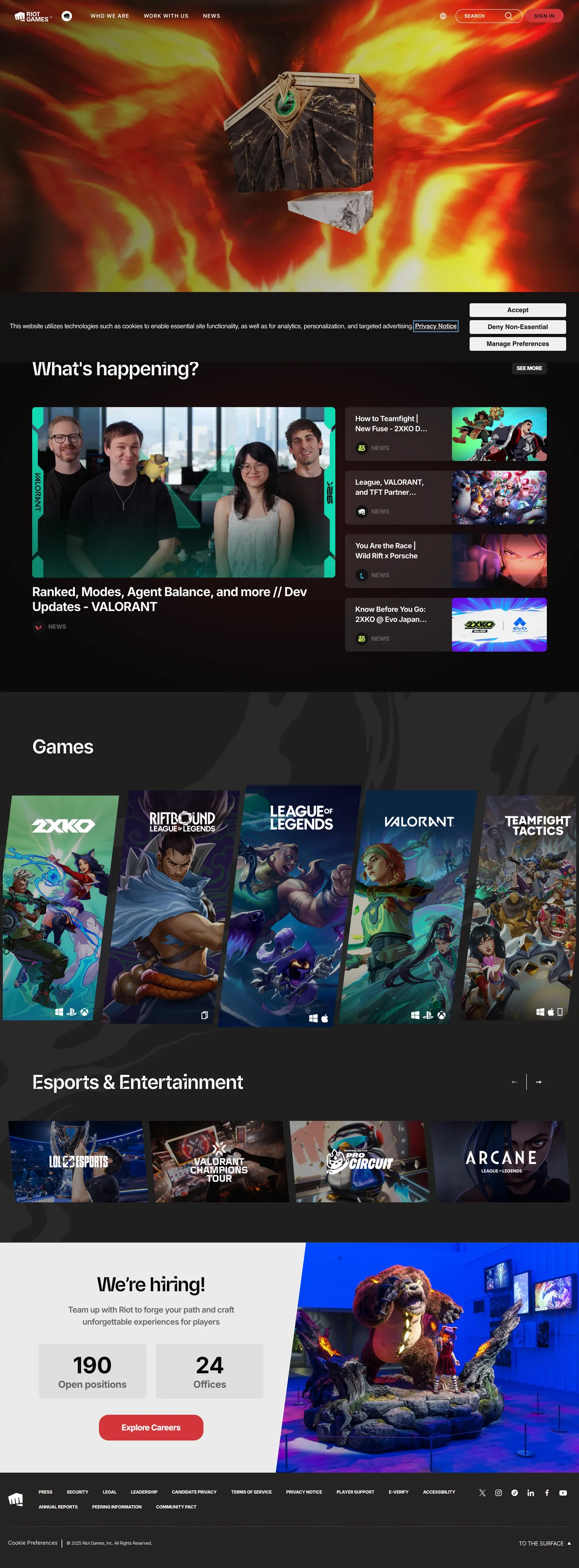
Riot Games' marketing site is a dark editorial grid where game-cover photography does every chromatic job that a brand accent would typically do — and crimson red does everything else. The hero banner is a full-bleed League of Legends or VALORANT key-art image, dark and cinematic; below it, a horizontal game-carousel shows each franchise (2XKO, Inbound, League of Legends, VALORANT, Teamfight Tactics) as a photograph-forward card. Section headings like "What's happening?" and "Games" appear in Riot Sans Latin at 48px / weight 700. Everything that is not a heading or photography runs Inter V Latin: navigation at 11px / weight 800 / uppercase, body copy at 20px / weight 600, the "Explore Games" CTA at 12px / uppercase with 0.96px letter-spacing. The brand crimson (#d1363a) appears 464 times — almost entirely as text and border color, never as a background fill. Unlike the game-marketing convention of coating every surface in franchise color, Riot uses red as an underlining discipline: active states, selected labels, and the nav hairline, not the hero fill.
The DESIGN.md file packages the system into a machine-readable spec for React and AI tools. Inside: 11 colors tokens anchored by the near-black canvas (#2b2a29), the brand crimson (#d1363a), white ink (#ffffff), and two text-muted tones (#656462, #808080); 12 typography tokens spanning Riot Sans Latin at two display sizes and Inter V Latin across 10 size-weight-transform combinations; 5 radius tokens centered on 8px; and 15 components definitions covering the crimson-accented nav, the all-uppercase pill CTA, the game-card photography containers, and the editorial section headings.
Feed this file to Claude or Cursor and it will reproduce Riot's specific moves: near-black canvas with warm gray cast instead of pure black, crimson as a text-and-border-only accent rather than a fill, two-font hierarchy where Riot Sans Latin appears only at display scale, and uppercase-with-tracking on every interactive label. The most transferable idea: photography as the only decoration. The UI system offers no gradient backgrounds, no color zones, no illustrated hero — just a disciplined dark frame that pushes every chromatic moment onto the game imagery inside it.
What makes it distinct
5
- Red as text and border, not fillthe brand voltage #d1363a appears 464 times but almost exclusively as text color and border; backgrounds stay near-black or photographic
- Riot Sans Latin for display onlythe custom headline face appears at 48px for section h2s; all other text runs Inter V Latin, creating a deliberate two-voice system
- Uppercase at every label tierInter V Latin nav links, section overlines, and CTA labels all carry text-transform: uppercase with tracking 0.96–1.04px for a command-line density
- Photography does all the chromatic workthe game-cover grid (2XKO, VALORANT, League of Legends, Arcane) supplies every non-brand color on the page; the UI system stays neutral
- Near-black canvas with warm tintthe page floor (#2b2a29) has a slight warm gray cast rather than pure black, softening the contrast with crimson-red border elements
riotgames.com
Live at riotgames.com
A snapshot of the brand in production. Scroll the frame to see the whole page.
Colors
11 colors
Riot Games's system runs on #d1363a as its primary voltage, used in 6 of 15 components. Type is set in Inter V Latin across 12 tokens from 11px to 56px, weights 400–800. Shape language is soft — components average 17px corner radius, with no sharp interactive edges.
Brand & Accent
Sparing, CTA-only voltage · 1
Surface
Page and card backgrounds · 3
Text
Headlines, body, captions · 3
Borders & Hairlines
Dividers, outlines, rules · 2
Other
Specialty colors · 2
Typography
12 type tokens
Set in Inter V Latin across 12 tokens, from 11px to 56px, weights 400–800. Shown in its own stack: where the font isn't installed, the fallback the file names stands in.
- display-xl48px · weight 700 · lh 72px · tracking -1.44pxThe quick brown fox jumps over the lazy dog
- display-md48px · weight 700 · lh 48px · tracking -1.44pxThe quick brown fox jumps over the lazy dog
- heading-lg56px · weight 700 · lh 67px · tracking -0.48pxThe quick brown fox jumps over the lazy dog
- heading-md31px · weight 700 · lh 37px · tracking -0.93pxThe quick brown fox jumps over the lazy dog
- heading-sm24px · weight 700 · lh 29px · tracking -0.48pxThe quick brown fox jumps over the lazy dog
- body-lg20px · weight 600 · lh 30px · tracking -0.6pxThe quick brown fox jumps over the lazy dog
- body-md18px · weight 700 · lh 25px · tracking -0.54pxThe quick brown fox jumps over the lazy dog
- label-md13px · weight 600 · lh 16px · tracking 1.04pxThe quick brown fox jumps over the lazy dog
- label-sm12px · weight 600 · lh 15px · tracking 0.96pxThe quick brown fox jumps over the lazy dog
- nav-link11px · weight 800 · lh 17px · tracking -0.33pxThe quick brown fox jumps over the lazy dog
- caption11px · weight 400 · lh 17px · tracking -0.48pxThe quick brown fox jumps over the lazy dog
- button-md12px · weight 600 · lh 15px · tracking 0.96pxThe quick brown fox jumps over the lazy dog
Layout
Radii and spacing
6 corner radii and 9 spacing values. Shape language: soft.
Radii
- none0px
- sm4px
- md8px
- lg24px
- pill32px
- full50%
Spacing
- xs4px
- sm8px
- md10px
- base16px
- lg24px
- xl30px
- 2xl32px
- 3xl60px
- 4xl80px
Components
15 components
Each rendered from its tokens (color, type, radius, padding) on Riot Games's own canvas.
- Button Primarybutton-primaryButton Primary
- Button Primary Hoverbutton-primary-hoverButton Primary Hover
- Button Secondarybutton-secondaryButton Secondary
- Button Ctabutton-ctaButton Cta
- Top Navtop-navTop Nav
- Nav Linknav-linkNav Link
- Nav Link Activenav-link-activeNav Link Active
- Hero Headinghero-headingHero Heading
- Section Headingsection-headingSection Heading
- Body Paragraphbody-paragraphBody Paragraph
- Game Cardgame-cardGame Card
- News Cardnews-cardNews Card
- Overline Labeloverline-labelOverline Label
- Section Dividersection-dividerSection Divider
- FooterfooterFooter
In use
The system, in use
Riot Games's tokens on the kind of product it builds.
Build something people actually use.
A short paragraph of marketing copy that previews how the brand's display tier and body tier read together. Two sentences is usually enough.
FAQ
Riot Games design system FAQ
Common questions about Riot Games's tokens, components, and how to use this DESIGN.md in your project.
Read next
Related reading
Specs, directories, and component libraries that pair with this design system.
- Browse all design systemsThe full directory of DESIGN.md files on shadcn.io, with live mockups for each.shadcn.io
- Riot Games — official siteRiot Games' public marketing site — the source of truth for the live tokens captured in this file.riotgames.com (opens in a new tab)
- The DESIGN.md specificationGoogle Labs' open spec for machine-readable design system files — the format this page is built on.github.com (opens in a new tab)
Use it
Use Riot Games in your project
One machine-readable file. Drop it into Claude, Cursor, or any AI tool that reads DESIGN.md.
Download the DESIGN.md
One machine-readable file: every color, type, radius, spacing, and component token of Riot Games.
Feed it to your AI tool
Drop it into Claude, Cursor, or GitHub Copilot. The agent writes React components and Tailwind classes that match Riot Games's visual language.
Reference the tokens directly
Or paste the values into your Tailwind config, CSS variables, or component library: every color, size and radius is a quoted, ready-to-copy value.
Read the full DESIGN.md: overview, rationale, do’s and don’ts
Overview
Riot Games' marketing surface is a disciplined dark editorial frame, not a game-marketing spectacle. Red as discipline, not decoration. The crimson voltage (#d1363a) appears 464 times on the page — but almost entirely as text color and border color, not background fill. Where Activision or EA flood hero panels with franchise color and 3D renders, Riot holds a near-black canvas and routes every chromatic impulse through photography of the games themselves. The brand color marks active states and hairline dividers; the games do the rest.
Typography reinforces the discipline. Riot Sans Latin appears at a single scale — 48px / weight 700 / -1.44px tracking — for section display headings only. Inter V Latin carries everything else, at extreme weights: weight 800 for nav labels (uppercase, negative tracking), weight 700 for card headings, weight 600 for body copy. The result is a system where the heaviest typographic moment in navigation (11px / 800) is smaller than the lightest typographic moment in body copy (20px / 600). Size and weight move in opposition, which is unusual in editorial systems.
Key Characteristics:
- Near-black canvas (#2b2a29) with a warm brownish cast — not pure black, matching the warm tones in VALORANT and League key-art photography.
- Crimson (#d1363a) as text-and-border-only voltage — 231 text uses, 231 border uses, 2 background uses in the full captured page.
- Two-font hierarchy: Riot Sans Latin for display h2 only; Inter V Latin at weights 400–800 for every other tier.
- Uppercase-with-tracking at every interactive label tier (nav: 11px / 800 / uppercase; CTAs: 12px / 600 / uppercase with 0.96px tracking).
- Photography-forward card grid where game covers (2XKO, League, VALORANT, TFT) supply all chromatic variety; no game-specific color bleeds into the card chrome.
- 8px as the dominant corner radius — cards, buttons, and secondary surfaces all share the same soft-but-not-pill rounding.
- "We're hiring" stats section pairs large counting numbers (190 disciplines / 24 offices) with the same uppercase Inter label treatment, extending the editorial register to the corporate identity surface.
Colors
Brand
- Crimson Primary (
{colors.primary}— #d1363a): frequency 464. Used as text (231), border (231), background (2). The system's single chromatic voltage — marks active nav links, section dividers, the Sign In CTA background, and occasionally text overlines. Almost never appears as a background fill; the near-black canvas is the floor.
Surface
- Canvas (
{colors.canvas}— #2b2a29): frequency 42 as background or border. The dominant page floor — a warm near-black with a brownish cast that matches the warm tones in game key-art. The themeColor declared in page meta is the closely related #252423, confirming the warm-tint intent. - Surface-1 (
{colors.surface-1}— #141212): frequency 12. Used for card surfaces, cookie-consent panel overlays, and the deepest dark regions behind photography. - Surface-2 (
{colors.surface-2}— #1f1f1f): frequency 1 as background. Reserved for secondary hover states. - Near-black (
{colors.near-black}— #000000): frequency 50 as text and border (osano dialog system). Pure black appears primarily in the cookie-consent dialog overlay and footer.
Text
- Ink (
{colors.ink}— #ffffff): frequency 221 — dominant text and border color. Pure white on near-black, the contrast is high. - Ink Muted (
{colors.ink-muted}— #656462): frequency 16 as text. Used for body copy and secondary meta text — a warm medium gray that echoes the canvas's warm cast. - Ink Subdued (
{colors.ink-subdued}— #808080): frequency 31 as background. Used in muted backgrounds, placeholder zones.
Hairlines
- Hairline (
{colors.hairline}— #e7e6e3): frequency 52. The light border tone for dividers and toggle-adjacent UI surfaces — a warm near-white, not pure white. - Hairline Dark (
{colors.hairline-dark}— #adacaa): frequency 2. Appears on mid-tone separator elements.
Typography
Font Families
Riot Sans Latin is a proprietary custom sans used exclusively at display scale (48px section h2s). The fallback is Arial, sans-serif. Inter V Latin is a variable-font variant of Inter that runs every other tier from nav labels to body copy. At the caption and small-label tiers, the standard Inter stack (Inter, Arial, sans-serif) is used without the variable suffix. There is no serif, monospace, or display-contrast second family.
Hierarchy
| Token | Size | Weight | Line Height | Use |
|---|---|---|---|---|
{typography.display-xl} | 48px | 700 | 72px | Section h2 ("What's happening?"), 1.5 leading |
{typography.display-md} | 48px | 700 | 48px | Section h2 alternate, tight 1.0 leading |
{typography.heading-lg} | 56px | 700 | 67px | Hero span counter (190 / 24) |
{typography.heading-md} | 31px | 700 | 37px | Sub-section h3 |
{typography.heading-sm} | 24px | 700 | 29px | Card link headlines |
{typography.body-lg} | 20px | 600 | 30px | Body paragraph / hero sub-copy |
{typography.body-md} | 18px | 700 | 25px | Card body / h3 sub-label |
{typography.label-md} | 13px | 600 | 16px | Section overline — uppercase, 1.04px tracking |
{typography.label-sm} | 12px | 600 | 15px | CTA button label — uppercase, 0.96px tracking |
{typography.nav-link} | 11px | 800 | 17px | Top nav labels — uppercase |
{typography.caption} | 11px | 400 | 17px | Small meta text |
{typography.button-md} | 12px | 600 | 15px | Primary button label — uppercase |
Principles
Riot's weight scale is inverted relative to size: nav links (the smallest text) are at the heaviest weight (800), while body copy (the largest regular text) is at weight 600. Every text element at 14px or smaller carries uppercase transform and positive letter-spacing. The only typography that stays lowercase is body paragraph text. For font substitutes: Riot Sans Latin → Barlow Condensed or Bebas Neue at display scale; Inter V Latin → Inter at identical weights.
Layout
Spacing System
- Base unit: 8px with a secondary 10px module (visible in card and nav padding).
- Tokens:
{spacing.xs}4px ·{spacing.sm}8px ·{spacing.md}10px ·{spacing.base}16px ·{spacing.lg}24px ·{spacing.xl}30px ·{spacing.2xl}32px ·{spacing.3xl}60px ·{spacing.4xl}80px. - Section vertical padding: ~60px between major editorial sections.
- Footer horizontal padding: 80px — the widest margin on the page.
Grid & Container
- Max content width: ~1280px — constrained editorial band on desktop.
- Hero: full-bleed photograph, 1440px wide, key-art video or still carrying franchise identity.
- Games carousel: horizontal scrollable row of game-cover cards, each approximately 200px wide × 280px tall at desktop, 8px rounding.
- News grid: 3-column asymmetric layout (one large feature card + smaller secondary cards).
- Esports section: 4-franchise horizontal strip, each card carrying a full-bleed franchise logo on dark background.
Rhythm
The page alternates between full-bleed photography and constrained dark editorial sections. All editorial bands rest on the same {colors.canvas} floor with no background color variation — depth comes from photography contrast, not background-color shifts. Section dividers are crimson ({colors.primary}) hairlines above section labels.
Elevation
The system has no shadow tier. The dark canvas floor is too dark for traditional drop shadows. Hierarchy comes from photography (maximum visual weight) versus editorial text (minimum visual weight). The elevated surface ({colors.surface-1}) appears on card backgrounds and cookie-consent dialogs — it sits 3–4 lightness points above the canvas, enough contrast to read as a lifted panel without any shadow drawn.
- Flat: 99% of surfaces — nav, editorial sections, footer, game-category strips.
- Tonal lift:
{colors.surface-1}(#141212) cards and panels. - Photography as elevation: full-bleed images carry the maximum visual mass on the page.
Shapes
The radius scale is minimal and consistent, centered on 8px:
{rounded.none}0px — form inputs and nav hairlines.{rounded.sm}4px — small chip elements and tight secondary surfaces.{rounded.md}8px — the dominant rounding for game cards, news cards, the Sign In CTA button, and most interactive surfaces.{rounded.lg}24px — larger promotional cards and pill-adjacent surfaces.{rounded.pill}32px — the "Explore Games" CTA pill and selected-state nav indicators.{rounded.full}50% — avatar thumbnails in news cards.
There is no 16px or 20px intermediate tier — the scale jumps from 8px directly to 24px, which gives card surfaces a specific editorial crispness at the 8px tier.
Components
button-primary — The Sign In CTA. Crimson {colors.primary} fill, white text, {rounded.lg} 24px rounding, 7.5x16 padding, 34px height. Inter at 12px / weight 600 / uppercase / 0.96px tracking. The only button on the page that uses the brand-voltage fill.
button-cta — The "Explore Games" pill CTA. Crimson fill, near-black text, {rounded.pill} 32px rounding, 10×30 padding. Heavier horizontal padding than the nav Sign In, marking it as a primary section CTA.
button-secondary — Outlined button with transparent fill, white text, 1px {colors.hairline} border.
top-nav — Near-black {colors.canvas} surface, white text in {typography.nav-link} (11px / weight 800 / uppercase), 48px height. Houses the Riot Games logo at left, links (Games, Esports, Universe, Jobs, More), and the red Sign In pill at right.
nav-link — Transparent, white text, 10px all-side padding. Uppercase.
nav-link-active — Same as nav-link but text color flips to {colors.primary} crimson — the only hover/active signal in the nav.
hero-heading — White text in {typography.display-xl} (48px / 700), rendered on a full-bleed photography background.
game-card — Full-bleed game key-art as the card surface, {colors.surface-1} fallback, {rounded.md} 8px rounding, 0 internal padding. Game logo overlaid at bottom-left in white.
news-card — Dark {colors.canvas} fill, white headline text, muted-gray body text, {rounded.md} 8px rounding, 16×8 padding.
body-paragraph — Transparent background, {colors.ink-muted} (#656462) text at {typography.body-lg} (20px / 600).
overline-label — Transparent background, {colors.primary} crimson text at {typography.label-sm} (12px / 600 / uppercase). Appears above section titles as category markers.
section-divider — A 1px horizontal rule in {colors.primary} crimson, placed above section labels.
footer — Pure black {colors.near-black} fill, muted-gray text, 30×80 padding. Wide horizontal margin echoes a newspaper footer rather than a standard nav-width container.
Do's and Don'ts
Do use the crimson voltage exclusively as text and border. The brand color's restraint is what makes the near-black canvas feel editorial rather than aggressive. Filling a hero section with {colors.primary} would collapse the distinction between brand chrome and game photography.
Do uppercase every label and nav text. The uppercase-with-tracking treatment at 11–13px is the system's most consistent typographic move — it distinguishes interactive labels from content text at a glance without any color signal needed.
Do use {colors.ink-muted} (#656462) for body copy on the dark canvas, not {colors.ink}. Pure white body text on near-black is too high-contrast for the reading cadence of longer paragraphs. The warm gray reads more comfortably across 3–4 sentence runs.
Do reserve {rounded.md} (8px) as the default for every card and button surface. The system's 8px discipline gives it an editorial crispness that distinguishes it from the rounded-card game-marketing convention.
Don't introduce game-franchise colors (VALORANT teal, League gold, Arcane purple) into the UI chrome. Those colors belong to game-specific brand assets, not to the marketing system's UI layer. Using them in buttons, labels, or card borders would make the corporate site look like a franchise sub-site.
Don't use weight 400 or 500 for nav links or interactive labels. The Inter V Latin nav tier runs weight 800 — cutting to 400 would eliminate the high-weight discipline that makes the small-text nav readable and intentional. Even 600 is too light for this context.
Don't use {colors.ink} (#ffffff) as card backgrounds. Card surface is {colors.surface-1} (#141212) or full-bleed photography — a white card on the near-black canvas would break the dark-editorial register entirely.
Don't add corner radii above 8px to cards without cause. The {rounded.lg} 24px and {rounded.pill} 32px tokens exist for promotional CTAs only — using them on game cards would make the editorial grid feel product-landing-page rather than publisher-marketing.
Known Gaps
- Hover and focus states: only the nav-link-active (crimson text) state is documented; no focus ring, disabled, or error state captured from the marketing surface.
- Mobile layout: the game carousel is horizontal-scroll on mobile, but the breakpoint widths, column collapse behavior, and touch-target sizes are not captured from this desktop extraction.
- Animation and video: the hero banner is a video loop (cinematic game key-art) that cannot be captured in a static DESIGN.md; easing curves, fade-in timing, and parallax scroll behavior are absent.
- Franchise sub-brand palettes: each Riot game (VALORANT, League, TFT, Arcane) has its own sub-brand design system with distinct color, typography, and illustration. This file captures only the corporate marketing surface.
- Esports-specific tokens: the Esports & Entertainment section shows franchise logos (Arcane, VALORANT esports, LoL esports, 2XKO) that carry their own visual identities not represented in the token set.
- Form and input states: the search field in the site uses system-default input styling with no brand token application captured.
- Dark mode toggle: no alternate theme captured; the marketing surface is dark-only.
Gaming & Entertainment
More systems like this
More DESIGN.md files in Gaming & Entertainment.
Pricing
Build it with Pro
The DESIGN.md files are free. Pro adds 6,000+ blocks, premium templates and the MCP server, so your AI editor builds in your system for you.
4.9/5 out of 5 · 150+ reviewsfrom 150+ founders and developers.
Billing
Billed once a year in USD. Cancel anytime.
- How many people can use the license.
- Client work, SaaS products and anything you charge for.
- Production-ready React sections: hero, pricing, features, dashboards and more.
- Complete multi-page sites you can ship as they are.
- React icons from every major library, installable with one command.
- Presets that restyle every block, in light and dark.
- Lets your AI editor search, preview and install blocks for you.
- Priority requests are answered first.
Individual
For personal projects & open source
$32instead of $49/mo
$389 billed yearly
- Seats: 1 seat
- Commercial use: Personal & open source only
- Pro blocks: 6,000+ blocks
- Templates: All 14 templates
- React icons: 294k+ icons
- Themes: All 59 themes
- MCP server: Basic usage
- Support: Standard
Team
Most popularFor freelancers, agencies & startups
$66instead of $99/mo
$789 billed yearly · ≈ $13/dev/mo
- Seats: Up to 5 seats
- Commercial use: Included
- Pro blocks: 6,000+ blocks
- Templates: All 14 templates
- React icons: 294k+ icons
- Themes: All 59 themes
- MCP server: High usage
- Support: Priority
Organization
For companies with larger teams
$132instead of $199/mo
$1,589 billed yearly
- Seats: Unlimited seats
- Commercial use: Included
- Pro blocks: 6,000+ blocks
- Templates: All 14 templates
- React icons: 294k+ icons
- Themes: All 59 themes
- MCP server: Unlimited usage
- Support: Priority
Billed once a year in USD. Cancel anytime.
Individual
For personal projects & open source
$32instead of $49/mo
$389 billed yearly
- How many people can use the license.Seats: 1 seat
- Client work, SaaS products and anything you charge for.Commercial use: Personal & open source only
- Production-ready React sections: hero, pricing, features, dashboards and more.Pro blocks: 6,000+ blocks
- Complete multi-page sites you can ship as they are.Templates: All 14 templates
- React icons from every major library, installable with one command.React icons: 294k+ icons
- Presets that restyle every block, in light and dark.Themes: All 59 themes
- Lets your AI editor search, preview and install blocks for you.MCP server: Basic usage
- Priority requests are answered first.Support: Standard
Team
Most popularFor freelancers, agencies & startups
$66instead of $99/mo
$789 billed yearly · ≈ $13/dev/mo
Everything in Individual, plus
- How many people can use the license.Seats: Up to 5 seats
- Client work, SaaS products and anything you charge for.Commercial use: Included
- Lets your AI editor search, preview and install blocks for you.MCP server: High usage
- Priority requests are answered first.Support: Priority
Organization
For companies with larger teams
$132instead of $199/mo
$1,589 billed yearly
Everything in Team, plus
- How many people can use the license.Seats: Unlimited seats
- Lets your AI editor search, preview and install blocks for you.MCP server: Unlimited usage
- Secure checkout via Stripe
- Code lives in your repo
- Keep what you've shipped if you cancel
- License terms
Your system, built for you
Every block, template and icon, installed by your AI agent in your design system. The DESIGN.md files stay free.