Nintendo Design System
Nintendo's design system as a DESIGN.md file. Red #e60012, Geologica Variable, 22 colors, 21 components. For React, Next.js, and AI tools.
Add shadcn.io to your AI agent. · Pro It installs blocks, icons and templates in your design system from a prompt, with Pro.
Set up MCP- Primary
- #e60012
- Typeface
- Geologica Variable
- Shape
- Mixed
- Base radius
- 8px
- Colors
- 22
- Type tokens
- 10
- Components
- 21
- Spacing values
- 10
About
About Nintendo DESIGN.md
Curated by Dov Azencot · Updated May 13, 2026 · Source nintendo.com (opens in a new tab)
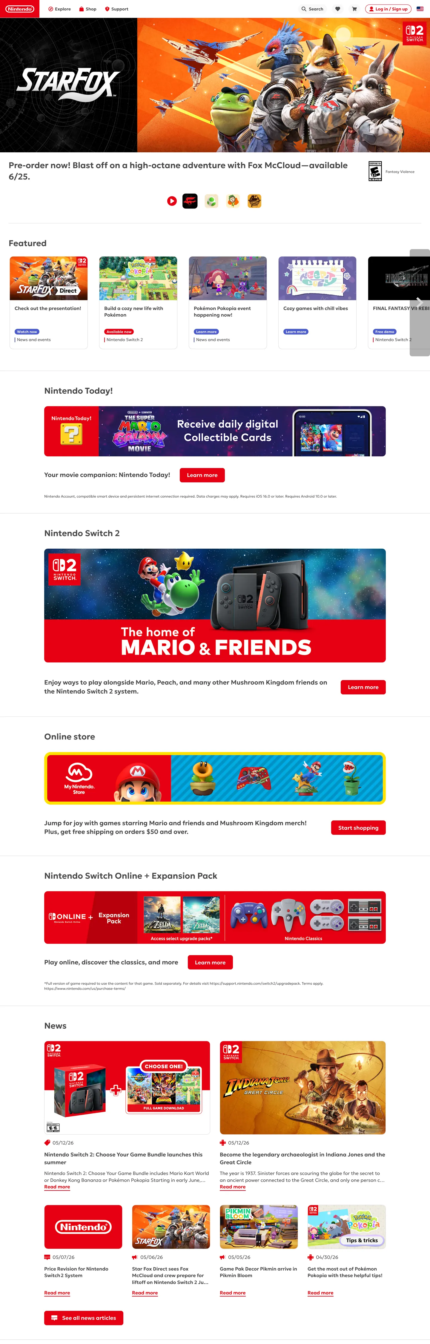
Nintendo's web chrome is what happens when a gaming brand decides the catalog matters more than the trailer. The page is a vertical stack of horizontally-scrolling product rails — Featured, Nintendo Today, Switch 2, Online store, Switch Online + Expansion Pack, News — each one rendered as 12px-radius white tiles on a flat white canvas, eyebrow-tagged with a small red "descriptionTag" pill, and titled in Geologica Variable at 18px weight 600. There is no atmospheric mesh, no full-bleed cinematic hero band, no parallax. The only saturated color is Nintendo Red "#e60012", and it appears on links, the primary CTA fill, the icon-primary slot, the error icon, and the red "descriptionTag" badge — five roles, one hex, 405 uses. Where most gaming brands carry players into a dark cinematic world, Nintendo carries them into a brightly-lit toy aisle.
This file captures the system as a Google Labs DESIGN.md spec. Inside: 22 colors tokens covering the load-bearing red, a deep indigo focus ring ("#3946a0"), four "descriptionTag" badge accents (red, blue "#4b5cce", violet "#9531b9", green "#2d8513"), the structural ink ladder ("#242424" → "#484848" → "#727272" → "#969696" → "#c8c8c8" → "#dadada"), and the white-plus-"#f8f8f8" two-tone canvas; 12 typography roles all set in Geologica Variable across weights 300 and 600 only (the system has no medium); a 5-step radius scale where 12px ("--theme-borderRadius") carries 296 of the captured radii; a 9-step spacing rhythm anchored on the "--theme-spacing-*" rem ladder (0.125rem through 8rem); and 21 components recipes covering primary/secondary/ghost/tertiary buttons, the storefront product card, the news card, the "descriptionTag" badge in its four colors, search input, top nav, and the red footer.
Feed this file to Claude, Cursor, or GitHub Copilot and the agent will produce React components that match Nintendo's actual restraint — flat 12px white tiles on white canvas, Geologica Variable at weight 600 on titles and weight 300 on legal copy, Nintendo Red reserved for the primary slot only, and the indigo focus ring quietly handling keyboard navigation. Or reference the tokens directly when building any storefront where the product catalog is the hero. The system's value as a study is that it proves a gaming brand can sit on a light canvas, refuse a secondary brand accent, and still read instantly as Nintendo — the red is enough.
What makes it distinct
5
- Single red voltageNintendo Red '#e60012' carries 405 uses across links, primary CTA fill, icon-primary, error icons, and the descriptionTag-red badge with no secondary brand accent on chrome
- Light canvas refusal of cinemawhite '#ffffff' and accent '#f8f8f8' surfaces under '#484848' ink reject the dark gaming convention entirely
- 12px radius rhythm'296' of 379 captured radii sit at 12px ('--theme-borderRadius: 0.75rem'), cards and panels share one corner across the storefront
- 172 exposed theme tokensevery surface, button slot, alert role, and spacing step is a named '--theme-*' CSS variable; the system is fully tokenized, not Tailwind-improvised
- Geologica Variable across every roledisplay through legal copy on one face, weights 300/600 only, lineHeight locked at '1.4' via '--theme-font-lineHeight'
nintendo.com
Live at nintendo.com
A snapshot of the brand in production. Scroll the frame to see the whole page.
Colors
22 colors
Nintendo's system runs on #e60012 as its primary voltage, used in 4 of 21 components. Type is set in Geologica Variable across 10 tokens from 12px to 28px, weights 300–600. Shape language is mixed across 21 components, blending pills, soft rounds, and squarer corners.
Brand & Accent
Sparing, CTA-only voltage · 3
Surface
Page and card backgrounds · 5
Text
Headlines, body, captions · 4
Borders & Hairlines
Dividers, outlines, rules · 1
Semantic
Status, errors, success, links · 1
Other
Specialty colors · 8
Typography
10 type tokens
Set in Geologica Variable across 10 tokens, from 12px to 28px, weights 300–600. Shown in its own stack: where the font isn't installed, the fallback the file names stands in.
- display-lg28px · weight 600 · lh 1.35 · tracking 0pxThe quick brown fox jumps over the lazy dog
- display-md21px · weight 600 · lh 1.4 · tracking 0pxThe quick brown fox jumps over the lazy dog
- heading-md18px · weight 600 · lh 1.4 · tracking 0pxThe quick brown fox jumps over the lazy dog
- body-bold16px · weight 600 · lh 1.4 · tracking 0pxThe quick brown fox jumps over the lazy dog
- body-light16px · weight 300 · lh 1.4 · tracking 0pxThe quick brown fox jumps over the lazy dog
- body-sm14px · weight 300 · lh 1.4 · tracking 0pxThe quick brown fox jumps over the lazy dog
- caption-bold12px · weight 600 · lh 1.4 · tracking 0pxThe quick brown fox jumps over the lazy dog
- caption-light12px · weight 300 · lh 1.4 · tracking 0pxThe quick brown fox jumps over the lazy dog
- button-md14px · weight 600 · lh 1 · tracking 0pxThe quick brown fox jumps over the lazy dog
- legal12px · weight 300 · lh 1.33 · tracking 0pxThe quick brown fox jumps over the lazy dog
Layout
Radii and spacing
6 corner radii and 10 spacing values. Shape language: mixed.
Radii
- none0px
- sm4px
- md8px
- lg12px
- pill20px
- full9999px
Spacing
- xxs2px
- xs4px
- sm8px
- md12px
- base16px
- lg24px
- xl32px
- 2xl48px
- 3xl64px
- 4xl96px
Components
21 components
Each rendered from its tokens (color, type, radius, padding) on Nintendo's own canvas.
- Top Navtop-navTop Nav
- Nav Linknav-linkNav Link
- Button Primarybutton-primaryButton Primary
- Button Primary Hoverbutton-primary-hoverButton Primary Hover
- Button Secondarybutton-secondaryButton Secondary
- Button Tertiarybutton-tertiaryButton Tertiary
- Button Ghostbutton-ghostButton Ghost
- Button Disabledbutton-disabledButton Disabled
- Search Inputsearch-inputSearch Input
- Product Cardproduct-cardProduct Card
- News Cardnews-cardNews Card
- Hero Bandhero-bandHero Band
- Rail Sectionrail-sectionRail Section
- Tag Redtag-redTag Red
- Tag Bluetag-blueTag Blue
- Tag Violettag-violetTag Violet
- Tag Greentag-greenTag Green
- DividerdividerDivider
- Alert Warningalert-warningAlert Warning
- Alert Successalert-successAlert Success
- Footer Bandfooter-bandFooter Band
In use
The system, in use
Nintendo's tokens on the kind of product it builds.
Build something people actually use.
A short paragraph of marketing copy that previews how the brand's display tier and body tier read together. Two sentences is usually enough.
FAQ
Nintendo design system FAQ
Common questions about Nintendo's tokens, components, and how to use this DESIGN.md in your project.
Read next
Related reading
Specs, directories, and component libraries that pair with this design system.
- Browse all design systemsThe full directory of DESIGN.md files on shadcn.io, with live mockups for each.shadcn.io
- Nintendo — official siteThe live source of this design system.nintendo.com (opens in a new tab)
- The DESIGN.md specificationGoogle Labs' open spec for machine-readable design system files.github.com (opens in a new tab)
Use it
Use Nintendo in your project
One machine-readable file. Drop it into Claude, Cursor, or any AI tool that reads DESIGN.md.
Download the DESIGN.md
One machine-readable file: every color, type, radius, spacing, and component token of Nintendo.
Feed it to your AI tool
Drop it into Claude, Cursor, or GitHub Copilot. The agent writes React components and Tailwind classes that match Nintendo's visual language.
Reference the tokens directly
Or paste the values into your Tailwind config, CSS variables, or component library: every color, size and radius is a quoted, ready-to-copy value.
Read the full DESIGN.md: overview, rationale, do’s and don’ts
Overview
Nintendo.com's chrome is a brightly-lit toy aisle rendered in code — a vertical stack of horizontally-scrolling product rails on a flat white canvas, with one saturated red voltage owning every primary action. The page sequence is editorial-storefront rather than cinematic-launch: a hero pre-order tile, a Featured rail, a Nintendo Today rail (with the red Collectible Cards CTA strip), a Switch 2 console band, an Online Store rail, a Switch Online + Expansion Pack band, then a News rail closed off by the saturated red footer. Each rail is built from 12px-radius white tiles {components.product-card} separated by 24px gutters, eyebrow-labelled with a small descriptionTag badge in red, blue, violet, or green, and titled in Geologica Variable at 18px weight 600.
Single-voltage discipline: Nintendo Red {colors.primary} ("#e60012") is the only saturated color on chrome — links, primary CTA fill, icon-primary slot, error icon, the red descriptionTag badge, and the footer. Five roles, one hex, 405 uses. Where most gaming brands carry players into a dark cinematic world with a multi-color accent palette, Nintendo refuses the convention entirely — the page sits on white, the secondary indigo {colors.secondary} ("#3946a0") is reserved for the focus ring and quaternary button background only, and the red works alone.
Light canvas as brand position: This is what happens when a gaming company decides the catalog matters more than the trailer. The captured theme is literally named "Nintendo Light Theme" (--theme-slug: nintendo-light-theme). The white-plus-"#f8f8f8" two-tone surface, the "#dadada" hairline grid, and the "#484848" workhorse ink are not aesthetic defaults — they are the brand position. Unlike PlayStation's three-canvas chapter rhythm and Xbox's dark editorial bands, Nintendo's homepage stays inside one light surface mode top to bottom; the warmth comes from product photography on white tiles, not from atmospheric backgrounds.
Key Characteristics:
- Single saturated voltage: Nintendo Red
{colors.primary}("#e60012") carries 405 uses across links, primary CTA fill, icon-primary, error icon, and the red descriptionTag — no secondary brand accent on chrome - Light Theme commitment: the captured
--theme-nameis literally "Nintendo Light Theme", with white{colors.canvas}("#ffffff") page canvas and"#f8f8f8"accent surface - 12px radius rhythm: 296 of 379 captured radii sit at
{rounded.lg}("12px",--theme-borderRadius: 0.75rem) — cards, panels, and the search field share one corner - Binary weight ladder: Geologica Variable runs weight 300 (legal, body-light, nav, captions) and weight 600 (titles, h2, h3, body-bold, buttons). Weight 400 and 500 are absent from the captured page
- Four-color descriptionTag badge system: red
{colors.primary}, blue{colors.tag-blue}("#4b5cce"), violet{colors.tag-violet}("#9531b9"), green{colors.tag-green}("#2d8513") — content categorization, never used for primary actions - 172 exposed
--theme-*CSS variables on:root— the system is fully tokenized for product, alert, button-slot, animation, and spacing roles
Colors
Nintendo's palette is structurally two-tier: one saturated brand voltage carrying every action and link, then a six-step grayscale ink ladder doing all the structural work. A handful of badge accents and alert backgrounds sit outside the main flow.
- Nintendo Red (
"#e60012") — frequency 405. Used as text (161), bg (75), border (169). The load-bearing brand voltage; owns--theme-color-primary,--theme-colors-text-link,--theme-colors-button-background-primary,--theme-colors-icon-primary,--theme-colors-alert-errorIcon. The pressed state drops to"#ac000d". - Workhorse Ink (
"#484848") — frequency 5058. Used as text (2654), border (2392), shadow (12). The dominant page color by far; owns--theme-colors-text-standard,--theme-colors-icon-standard,--theme-colors-alert-text. Carries 99% of body and heading copy across the marketing surface. - Canvas (
"#ffffff") — frequency 478. Used as bg (271), text (128), border (79). The page canvas (--theme-colors-ui-bgMain) and the on-color for every red, indigo, and tag-color button. - Ash (
"#c8c8c8") — frequency 417. Used as text (167), border (167), bg (83). The mid-gray for placeholder text, disabled labels, and secondary hairlines (--theme-color-lightGray1). - Hairline (
"#dadada") — frequency 248. Used as border (230), text (13), bg (5). The card border, divider, and disabled-button fill (--theme-colors-ui-line,--theme-colors-button-background-disabled). - Ink Muted (
"#727272") — frequency 144. Used as text (72), border (72). The secondary ink for captions and metadata (--theme-color-darkGray3). - Indigo Focus (
"#3946a0") — frequency 16. Used as bg (16). Reserved for the focus ring, the quaternary button background, and--theme-colors-alert-attentionIcon. Never used as a marketing color — it is structural chrome. - Tag Blue (
"#4b5cce") — frequency 16. Used as bg (16). The blue descriptionTag badge (--theme-colors-descriptionTag-blue) for content categorization. - Black Scrim (
"#000000") — frequency 10. Used as bg (5), shadow (5). The modal backdrop atrgba(0,0,0,0.6)(--theme-scrim-dark) and the ghost-button background.
Five named alert tints round out the palette: warning bg "#fffbb1" / icon "#bea000", success bg "#e1f7d6" / icon "#2d8513", attention bg "#e8ebfc" / icon "#3946a0". The violet descriptionTag ("#9531b9") carries 2 uses on the homepage but is a named token under --theme-colors-descriptionTag-violet. None of these accent colors leak into chrome — they are scoped strictly to their named slot.
Typography
The system runs entirely on Geologica Variable — a variable-axis brand sans-serif — declared once as --theme-font-family with -apple-system and system-ui fallbacks. The weight ladder is binary: 300 for body, legal, nav, and captions; 600 for titles, h2, h3, body-bold, and CTA labels. Weight 400 and 500 are absent from the captured page; the system jumps straight from light to semibold with no medium. The line-height base is locked at 1.4 via --theme-font-lineHeight.
The display tier sits at 28px / weight 600 on h2 (count 21 across the page), with h3 at 18-21px / weight 600. Body comes in two flavors — body-bold at 16px / weight 600 (count 198, the most-used signature on the page, carrying tile titles and section headings) and body-light at 16px / weight 300 (count 8) for prose paragraphs. The nav link sits at 16px / weight 300, the search field uses the same. Captions live at 12-14px split across weight 300 (159 uses for legal and metadata) and weight 600 (33 uses for tag-badge labels). The legal tier at 12px / weight 300 / lineHeight 1.33 handles fine print and footnotes.
Variable-axis brand voice: Geologica's CRSV axis is set to 1 via --theme-font-variation-settings, which subtly differentiates the brand voice from generic Inter or system-ui without committing to an obviously branded display face. Where Minecraft picks a literal pixel font and PlayStation picks proprietary SST at weight 300, Nintendo picks one variable face and uses its axis controls to whisper the brand identity rather than shout it.
Layout
The page is a one-column vertical stack of full-width rails capped at --theme-page-maxWidth: 90rem (1440px). Within each rail, horizontal scrolling carries 4-6 product tiles separated by 16px gutters. The spacing scale is a tight rem ladder under --theme-spacing-*: 0.125rem (2px), 0.25rem (4px), 0.5rem (8px), 0.75rem (12px), 1rem (16px), 1.25rem (20px), 1.5rem (24px), 1.75rem (28px), 2rem (32px), 2.25rem (36px), 2.5rem (40px), 2.75rem (44px), 3rem (48px), 4rem (64px), 5rem (80px), 6rem (96px), 7rem (112px), 8rem (128px). The 16px and 8px steps dominate (552 and 193 captured uses respectively) — Nintendo's catalog rhythm is built on a strict 8px subgrid.
The nav sits at exactly --theme-nav-desktop-height: 59px with a --theme-nav-desktop-logo-width: 132px. The slim content max-width drops to --theme-page-slimMaxWidth: 71.5rem (1144px) for prose-heavy contexts like the Nintendo Account or support pages.
Elevation & Depth
Nintendo's depth model is hairline-as-divider — the page has almost no shadows. Cards lift from canvas with a 1px solid "#dadada" hairline (--theme-colors-ui-line), not a drop shadow. The 12 captured shadow uses on the workhorse ink color are scoped to subtle elevation on the nav and dropdown menus only; cards, news tiles, and rails are flat-on-canvas. The only true overlay is the modal scrim at rgba(0,0,0,0.6) (--theme-scrim-dark) and the light variant at hsla(0,0%,100%,0.6) (--theme-scrim-light). Unlike PlayStation's section-as-divider model or Apple's signature product drop-shadow, Nintendo treats elevation as a hairline grid — the catalog reads as a flat shelf with goods laid out on it, not a stack of floating cards.
Shapes
The radius system anchors on 12px — --theme-borderRadius: 0.75rem — which carries 296 of the 379 captured radii. Smaller chips and inputs drop to 8px (--theme-borderRadiusSmall: 0.5rem, 17 uses). The 4px tier (43 uses) handles the descriptionTag badge. Pill buttons render at 20px on the inline-row primary CTA and at 36-48px on standalone circular icon buttons. The --theme-borderRadiusRound token sits at 1rem (16px) for rounded image frames. There is no 0px-corner surface on the marketing chrome — even the hero band inherits 12px — which gives the storefront its consistently soft, family-safe catalog-shelf feel.
Components
The component recipes mirror the keys in the frontmatter components: block. Every recipe references declared tokens via {colors.x}, {typography.x}, {rounded.x}.
{components.top-nav}— white canvas,"#484848"ink,body-lighttype, 59px height (--theme-nav-desktop-height), 0px corners. The brand logo width is locked at 132px.{components.nav-link}— transparent background,body-light16px / weight 300, no underline.{components.button-primary}— Nintendo Red"#e60012"fill, white text,button-md14px / weight 600, 20px pill radius, 32px height, 8px×16px padding. The single chrome carrier of the brand voltage.{components.button-primary-hover}— drops to"#ac000d"(--theme-color-primaryHover); pill radius preserved.{components.button-secondary}— Indigo"#3946a0"fill, white text. Reserved for the small set of structural actions that need to feel different from Buy.{components.button-tertiary}— White fill, red text, 1px red border. The "Learn more" / outline pattern used inside white tiles where a solid red would compete with product imagery.{components.button-ghost}—rgba(0,0,0,0.25)background with white text and 1px white border, for overlay placement on photography.{components.button-disabled}—"#dadada"fill (--theme-colors-button-background-disabled), muted gray text.{components.search-input}—"#efefef"(--theme-color-lightGray3) fill, ink text, pill radius, 32px height. Sits in the top nav.{components.product-card}— White canvas, 12px radius, 1px"#dadada"hairline, 16px inner padding. Title inbody-bold16px / weight 600. The workhorse rail unit.{components.news-card}— White canvas, 12px radius, 1px hairline, body inbody-light16px / weight 300. Visually identical to product-card but with prose-led content.{components.hero-band}— White canvas, ink text,display-lg28px / weight 600 on h2. 12px radius, 48px×24px padding — the only "hero" surface on the page inherits the same tile family, not a full-bleed cinematic band.{components.rail-section}— Container for horizontal-scroll product rails.display-md21px / weight 600 title, no radius (full-width strip), 32px×24px padding.{components.tag-red}/{components.tag-blue}/{components.tag-violet}/{components.tag-green}— The descriptionTag badge family. 12px caption-bold white text on the saturated tag color, 4px radius, 2px×8px padding. Content categorization only — never used for primary actions.{components.divider}— 1px"#dadada"hairline, full width.{components.alert-warning}—"#fffbb1"yellow tint background, ink text. Paired with the"#bea000"warning icon outside the component (--theme-colors-alert-warningIcon).{components.alert-success}—"#e1f7d6"green tint background, ink text. Paired with the"#2d8513"success icon.{components.footer-band}— Saturated Nintendo Red"#e60012"background, white text, no radius, 48px×24px padding. The only full-bleed saturated surface on the page — it earns its scale by being last.
Do's and Don'ts
- Do reserve
{colors.primary}("#e60012") for the primary CTA fill, link text, icon-primary, error icon, and the red descriptionTag — five named roles. If you find yourself using red as a secondary accent on a chart, a tag, or a divider, you are breaking the system. - Do put every card at
{rounded.lg}("12px") and every input or chip at{rounded.md}("8px"). The two-radius rhythm is the system; novel radii like 16px or 6px break the catalog-shelf feel. - Do treat weight 600 as the title weight and weight 300 as the body weight. The binary ladder is the brand voice — adding weight 500 medium fills will read as off-brand.
- Don't use
"#3946a0"indigo as a marketing accent or secondary brand color — it lives only on the focus ring (--theme-color-focus), the quaternary button background, and theattentionIcon. Painting a CTA or hero in indigo will read as a Microsoft brand, not Nintendo. - Don't lift product cards with drop shadows — Nintendo's depth model is hairline-as-divider with
1px solid "#dadada". Addingbox-shadowon tiles will break the flat-shelf composition that defines the storefront. - Don't drop the canvas to dark — the captured theme is literally
--theme-name: "Nintendo Light Theme". There is no dark-mode counterpart in the captured system. A dark canvas with red CTAs will read as Netflix or YouTube, not Nintendo. - Don't use the four-color descriptionTag badge for primary actions. The red tag (
"#e60012"), blue ("#4b5cce"), violet ("#9531b9"), and green ("#2d8513") are content-category labels at 12px caption-bold inside a 4px-radius chip — they share the brand voltage hex but they are NOT buttons. - Don't apply
Geologica Variableat weight 400 or 500 — the captured page never does. Those weights exist in the variable axis but are not part of the documented voice; using them will produce text that reads "almost-Nintendo" rather than Nintendo.
Known Gaps
- Store flow not captured — PDP, cart, checkout, and Nintendo Account sign-in surfaces use a denser data layout that this homepage extraction does not cover.
- MyNintendo rewards chrome and the per-game theming for first-party launches (which often borrow per-title brand colors outside the documented system) are out of scope.
- Mobile responsive screenshots not captured directly — responsive behavior synthesizes from the
--theme-font-size-*Mobiletokens (h1LMobile 1.75rem, h2Mobile 1.125rem, bodyMobile 0.875rem, captionMobile 0.75rem, legalMobile 0.625rem) rather than from a separate mobile capture. - Motion captured as tokens, not narrated — the
--theme-animation-button-hoverspring at stiffness 600, the--theme-animation-vertical-gentleBounce-damping: 18.3, and the 200ms--theme-movement-durationdefine the system's motion vocabulary but the actual hover, tap, and rail-snap interactions are not described here. - Dark mode counterpart — the captured theme is
--theme-slug: nintendo-light-theme. If a dark-mode Nintendo Account or game-detail page exists, it is not in scope. - Per-title brand theming — first-party game pages (Mario Kart, Star Fox, Donkey Kong) often pull in their own per-title color treatments that vary outside this documented system.
Gaming & Entertainment
More systems like this
More DESIGN.md files in Gaming & Entertainment.
Pricing
Build it with Pro
The DESIGN.md files are free. Pro adds 6,000+ blocks, premium templates and the MCP server, so your AI editor builds in your system for you.
4.9/5 out of 5 · 150+ reviewsfrom 150+ founders and developers.
Billing
Billed once a year in USD. Cancel anytime.
- How many people can use the license.
- Client work, SaaS products and anything you charge for.
- Production-ready React sections: hero, pricing, features, dashboards and more.
- Complete multi-page sites you can ship as they are.
- React icons from every major library, installable with one command.
- Presets that restyle every block, in light and dark.
- Lets your AI editor search, preview and install blocks for you.
- Priority requests are answered first.
Individual
For personal projects & open source
$32instead of $49/mo
$389 billed yearly
- Seats: 1 seat
- Commercial use: Personal & open source only
- Pro blocks: 6,000+ blocks
- Templates: All 14 templates
- React icons: 294k+ icons
- Themes: All 59 themes
- MCP server: Basic usage
- Support: Standard
Team
Most popularFor freelancers, agencies & startups
$66instead of $99/mo
$789 billed yearly · ≈ $13/dev/mo
- Seats: Up to 5 seats
- Commercial use: Included
- Pro blocks: 6,000+ blocks
- Templates: All 14 templates
- React icons: 294k+ icons
- Themes: All 59 themes
- MCP server: High usage
- Support: Priority
Organization
For companies with larger teams
$132instead of $199/mo
$1,589 billed yearly
- Seats: Unlimited seats
- Commercial use: Included
- Pro blocks: 6,000+ blocks
- Templates: All 14 templates
- React icons: 294k+ icons
- Themes: All 59 themes
- MCP server: Unlimited usage
- Support: Priority
Billed once a year in USD. Cancel anytime.
Individual
For personal projects & open source
$32instead of $49/mo
$389 billed yearly
- How many people can use the license.Seats: 1 seat
- Client work, SaaS products and anything you charge for.Commercial use: Personal & open source only
- Production-ready React sections: hero, pricing, features, dashboards and more.Pro blocks: 6,000+ blocks
- Complete multi-page sites you can ship as they are.Templates: All 14 templates
- React icons from every major library, installable with one command.React icons: 294k+ icons
- Presets that restyle every block, in light and dark.Themes: All 59 themes
- Lets your AI editor search, preview and install blocks for you.MCP server: Basic usage
- Priority requests are answered first.Support: Standard
Team
Most popularFor freelancers, agencies & startups
$66instead of $99/mo
$789 billed yearly · ≈ $13/dev/mo
Everything in Individual, plus
- How many people can use the license.Seats: Up to 5 seats
- Client work, SaaS products and anything you charge for.Commercial use: Included
- Lets your AI editor search, preview and install blocks for you.MCP server: High usage
- Priority requests are answered first.Support: Priority
Organization
For companies with larger teams
$132instead of $199/mo
$1,589 billed yearly
Everything in Team, plus
- How many people can use the license.Seats: Unlimited seats
- Lets your AI editor search, preview and install blocks for you.MCP server: Unlimited usage
- Secure checkout via Stripe
- Code lives in your repo
- Keep what you've shipped if you cancel
- License terms
Your system, built for you
Every block, template and icon, installed by your AI agent in your design system. The DESIGN.md files stay free.