Workflowy Design System
Workflowy's marketing system: charcoal-gray neutrals, a single sky-blue CTA pill, and grid-paper emptiness as the brand's core visual argument. Tokens for React, Next.js, and AI tools.
Add shadcn.io to your AI agent. · Pro It installs blocks, icons and templates in your design system from a prompt, with Pro.
Set up MCP- Primary
- #49baf2
- Typeface
- Open Sans
- Shape
- Mixed
- Base radius
- 8px
- Colors
- 9
- Type tokens
- 10
- Components
- 14
- Spacing values
- 9
About
About Workflowy DESIGN.md
Curated by Dov Azencot · Updated May 19, 2026 · Source workflowy.com (opens in a new tab)
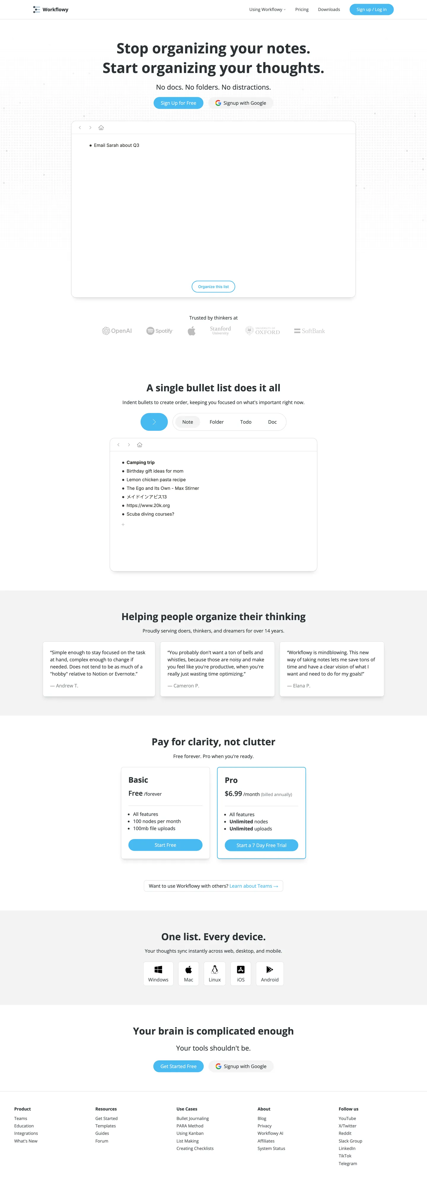
Workflowy's marketing page is an argument made in negative space. The hero shows a near-empty white card — one bullet labeled "Email Sarah about Q3" and nothing else — floating on a light-gray floor with no sidebar, no toolbar ribbon, no color. The headline above reads "Stop organizing your notes. Start organizing your thoughts." The visual and the verbal reinforce each other: this tool does not add complexity. Where Notion's marketing page shows populated databases and cover photos, and where Obsidian leads with the knowledge graph, Workflowy shows a single indented list on a white rectangle, betting that the right user immediately understands what's being offered.
The DESIGN.md file packages the system into a machine-readable spec for React tooling. Inside: 9 colors tokens built on a cool charcoal-gray base — the dominant tone is #2a3135 used 257 times across text and borders, with the single sky-blue voltage (#49baf2) appearing 9 times as CTA backgrounds and interactive toggles; 10 typography tokens running Open Sans across every tier from 48px hero to 12.6px caption; 5 corner-radius tokens centered on a pill default at 9999px; and 14 components definitions covering the pill CTA, hairline-bordered cards, the pricing comparison panel, and the feature category tabs.
Feed this file to an AI coding tool and it reproduces Workflowy's specific moves: charcoal-gray neutrals instead of black or warm-white, a single sky-blue voltage held for the two most interactive moments on the page (signup and the bullet toggle), pill geometry everywhere buttons appear, and Open Sans weight 700 used once and only once. The one principle worth borrowing with care is the empty-product-screenshot move. Workflowy gets away with a single bullet in the mockup because the product's point is the absence of friction — most SaaS products need to show more to build the case.
What makes it distinct
5
- Grid-paper restraintthe hero product mockup is a sparse bullet list on a white card, deliberately showing how little the tool imposes on the user's thinking
- Single sky-blue voltagethe sky blue (#49baf2) appears as CTA pills and the interactive bullet toggle, the only chromatic moment on an otherwise gray-neutral page
- Open Sans at modest weights400 for body and nav, 700 only for the 48px hero headline; no intermediate semibold tier drives section titles
- Pill-dominant geometrybuttons are fully pill-shaped at 9999px, the most-used radius in the system (frequency 13); cards and modals sit at 8px
- Gray-toned hairlinesborders run at #2a3135 (charcoal) and #dce0e2 (light gray), never black; the border-as-chrome gives the UI a low-key document feel
workflowy.com
Live at workflowy.com
A snapshot of the brand in production. Scroll the frame to see the whole page.
Colors
9 colors
Workflowy's system runs on #49baf2 as its primary voltage, used in 2 of 14 components. Type is set in Open Sans across 10 tokens from 14px to 48px, weights 400–700. Shape language is mixed across 14 components, blending pills, soft rounds, and squarer corners.
Brand & Accent
Sparing, CTA-only voltage · 1
Surface
Page and card backgrounds · 2
Text
Headlines, body, captions · 3
Borders & Hairlines
Dividers, outlines, rules · 2
Other
Specialty colors · 1
Typography
10 type tokens
Set in Open Sans across 10 tokens, from 14px to 48px, weights 400–700. Shown in its own stack: where the font isn't installed, the fallback the file names stands in.
- display-xl48px · weight 700 · lh 66pxThe quick brown fox jumps over the lazy dog
- display-md32px · weight 700 · lh 48pxThe quick brown fox jumps over the lazy dog
- heading-lg25px · weight 700 · lh 38pxThe quick brown fox jumps over the lazy dog
- heading-md22px · weight 400 · lh 34pxThe quick brown fox jumps over the lazy dog
- heading-sm22px · weight 600 · lh 34pxThe quick brown fox jumps over the lazy dog
- body-lg16px · weight 400 · lh 24pxThe quick brown fox jumps over the lazy dog
- body-md14px · weight 400 · lh 21pxThe quick brown fox jumps over the lazy dog
- body-bold16px · weight 700 · lh 24pxThe quick brown fox jumps over the lazy dog
- label-sm14px · weight 700 · lh 21pxThe quick brown fox jumps over the lazy dog
- mono14px · weight 400 · lh 21pxThe quick brown fox jumps over the lazy dog
Layout
Radii and spacing
5 corner radii and 9 spacing values. Shape language: mixed.
Radii
- none0px
- sm4px
- md8px
- lg16px
- full9999px
Spacing
- xs2px
- sm4px
- md8px
- base12px
- lg16px
- xl24px
- 2xl32px
- 3xl48px
- 4xl64px
Components
14 components
Each rendered from its tokens (color, type, radius, padding) on Workflowy's own canvas.
- Button Primarybutton-primaryButton Primary
- Button Secondarybutton-secondaryButton Secondary
- Button Googlebutton-googleButton Google
- Top Navtop-navTop Nav
- Nav Linknav-linkNav Link
- Hero Headinghero-headingHero Heading
- Section Headingsection-headingSection Heading
- Body Paragraphbody-paragraphBody Paragraph
- CardcardCard
- Product Mockupproduct-mockupProduct Mockup
- Pricing Cardpricing-cardPricing Card
- Pricing Card Featuredpricing-card-featuredPricing Card Featured
- Testimonial Cardtestimonial-cardTestimonial Card
- FooterfooterFooter
In use
The system, in use
Workflowy's tokens on the kind of product it builds.
Build something people actually use.
A short paragraph of marketing copy that previews how the brand's display tier and body tier read together. Two sentences is usually enough.
- · 1 project
- · Community support
- · 10k req/mo
- · 10 projects
- · Priority support
- · 1M req/mo
- · Custom domains
- · Unlimited
- · SLA
- · Audit log
- · SSO
FAQ
Workflowy design system FAQ
Common questions about Workflowy's tokens, components, and how to use this DESIGN.md in your project.
Read next
Related reading
Specs, directories, and component libraries that pair with this design system.
- Browse all design systemsThe full directory of DESIGN.md files on shadcn.io, with live mockups for each.shadcn.io
- Workflowy — official siteWorkflowy's public marketing site — the source of truth for the live tokens captured in this file.workflowy.com (opens in a new tab)
- The DESIGN.md specificationGoogle Labs' open spec for machine-readable design system files — the format this page is built on.github.com (opens in a new tab)
Use it
Use Workflowy in your project
One machine-readable file. Drop it into Claude, Cursor, or any AI tool that reads DESIGN.md.
Download the DESIGN.md
One machine-readable file: every color, type, radius, spacing, and component token of Workflowy.
Feed it to your AI tool
Drop it into Claude, Cursor, or GitHub Copilot. The agent writes React components and Tailwind classes that match Workflowy's visual language.
Reference the tokens directly
Or paste the values into your Tailwind config, CSS variables, or component library: every color, size and radius is a quoted, ready-to-copy value.
Read the full DESIGN.md: overview, rationale, do’s and don’ts
Overview
Workflowy's marketing site is a visual argument, not a showcase. Grid-paper restraint. The hero is a near-empty white card with one bullet item — no populated inbox, no calendar overlay, no example project board — floating on a light gray floor (#f3f4f4). The product's value proposition is that it disappears into your thinking, so the marketing surface makes the tool as visually absent as possible.
Unlike Notion, which proves value by showing populated tables and gallery views, and unlike Obsidian, which leads with the graph of interconnected nodes, Workflowy's hero mockup shows a single sparse list with room for dozens more bullets that aren't there. The deliberate emptiness reads as confidence: the right user understands immediately.
Chromatically the system is almost entirely gray. The ink color (#2a3135, used 257 times) is a cool charcoal that reads as near-black without reaching pure black. The only chromatic element is a sky-blue voltage (#49baf2) that appears 9 times — always as the interactive surface people click (the CTA pill or the bullet-toggle button). Everything else is structural gray.
Key Characteristics:
- Sky-blue voltage (#49baf2) appears exactly twice as CTA fill, once as an interactive toggle — the only chromatic moment on the page.
- Open Sans weight 700 used once at 48px for the hero headline; all other headings and body sit at 400 or 600.
- Pill radius (9999px) is the dominant button geometry (13 instances), giving the interface a note-card feel rather than an enterprise CTA square.
- Product mockup in the hero shows a single bullet item — deliberate emptiness as the brand's core visual argument.
- Pricing uses a sky-blue 2px border (not fill) on the featured column — highlighting by outline rather than tint, keeping the section visually quiet.
- Logo wall (OpenAI, Spotify, Apple, Stanford, Oxford, SoftBank) renders all marks in muted gray, not color, maintaining single-voltage discipline.
- The
--wf-font-family-monotoken exists in CSS but Andale Mono doesn't appear in the marketing surface — reserved for the product's code-block mode.
Colors
Brand
- Sky Blue (
{colors.primary}— #49baf2): frequency 9. Used as bg (6), border (2), text (1). The CTA pills, the featured pricing column outline, and the interactive bullet-toggle button. Every interactive surface the user clicks is sky blue; every passive surface is gray.
Ink
- Charcoal (
{colors.ink}— #2a3135): frequency 257. Used as text (135), border (122). The dominant text and border color for the entire system — not pure black but a slightly blue-shifted charcoal that keeps the page from reading as harsh. - Mid Gray (
{colors.ink-mid}— #4b5155): frequency 91. Used as text (48), border (43). Secondary text: nav links, feature labels, sub-headings in the feature section. Wired as --wf-gray-700. - Muted Gray (
{colors.ink-muted}— #868c90): frequency 8. Used as text (4), border (4). Tertiary labels, placeholder text, and footnotes. Wired as --wf-gray-500.
Canvas
- White (
{colors.canvas}— #ffffff): frequency 33. Used as bg (19), text (7), border (7). Page canvas, card fills, button text on the sky-blue CTA. - Off-White (
{colors.surface-1}— #f3f4f4): frequency 5. Used as bg (5). The testimonial band background and the footer band — a subtle step above white that sections the page without a hard border.
Hairlines
- Light Hairline (
{colors.hairline}— #dce0e2): frequency 15. Used as border (15). The card borders, product mockup frame, and form input outlines. Wired as --wf-gray-300. - Dark Hairline (
{colors.hairline-dark}— #4b5155): frequency 91 (shared with ink-mid). Used across nav dividers and bordered interactive elements.
Shadows
- Shadow (
{colors.shadow}— #000000): frequency 14 in shadow role only. The single shadow style (rgba(0,0,0,0.12) 0px 2px 20px) appears on the floating product mockup card — the only elevation moment on the page.
Typography
Font Family
The system runs Open Sans exclusively across every typographic tier. The CSS declares --wf-font-family-brand: "Open Sans", sans-serif and a system-ui stack as the body fallback. A mono token (--wf-font-family-mono: 'Andale Mono', Menlo, monospace) exists in the system CSS but does not appear in the marketing surface — it is reserved for code-block mode inside the product.
Hierarchy
| Token | Size | Weight | Line Height | Use |
|---|---|---|---|---|
{typography.display-xl} | 48px | 700 | 66px | Hero h1 — the one 700-weight headline |
{typography.display-md} | 32px | 700 | 48px | Section h2 headings |
{typography.heading-lg} | 25px | 700 | 38px | h3 sub-section titles |
{typography.heading-md} | 22px | 400 | 34px | Feature category headers (light) |
{typography.heading-sm} | 22px | 600 | 34px | Feature category headers (medium) |
{typography.body-lg} | 16px | 400 | 24px | Body paragraphs, card content |
{typography.body-md} | 14px | 400 | 21px | Nav links, button labels, secondary copy |
{typography.body-bold} | 16px | 700 | 24px | Inline emphasis, pricing tier names |
{typography.label-sm} | 14px | 700 | 21px | h5 feature titles, pricing feature items |
{typography.mono} | 14px | 400 | 21px | Reserved for code mode in the product |
Principles
Open Sans weight 700 appears exactly once at the display tier (48px hero headline) and then again at 32px for section headings. Below that everything sits at 400 or 600 — there is no intermediate semibold pattern for sub-headings. The absence of weight 700 below the main headings keeps the editorial voice flat and document-like, matching the outliner's minimal positioning.
Note on Font Substitutes
Open Sans is freely available on Google Fonts. No substitution is needed. If you want a slightly more geometric alternative at the same x-height, Nunito Sans or Lato match the open counters at 16px body sizes.
Layout
Spacing System
- Base unit: 4px, with 8px and 16px as the dominant module values.
- Tokens:
{spacing.xs}2px ·{spacing.sm}4px ·{spacing.md}8px ·{spacing.base}12px ·{spacing.lg}16px ·{spacing.xl}24px ·{spacing.2xl}32px ·{spacing.3xl}48px ·{spacing.4xl}64px. - Section vertical padding: 64px top + 16px horizontal (
--wf-space-4xl/--wf-space-l). - Card internal padding: 16px default; 24px on testimonial and pricing cards.
- Nav height: 48px (
--wf-header-height).
Grid & Container
- Max content width: ~960px on the hero text + centered CTA stack; product mockup card extends to ~720px.
- Hero layout: centered text column (headline + sub-copy + two pill CTAs) above a full-width bordered product mockup card.
- Feature section: centered headline + tab-strip (Note / Folder / Todo / Doc) + product screenshot below each tab.
- Testimonials: 3-column grid of cards on the off-white (#f3f4f4) surface.
- Pricing: 2-column comparison with the Pro column outlined in sky blue.
- Platform row: 5-icon grid (Windows / Mac / Linux / iOS / Android) with Lucide-style platform icons.
Rhythm
The page alternates between white-canvas editorial bands (hero, feature section, closing CTA) and a single off-white tonal lift (testimonials, platform availability). Section transitions are marked by tonal shift rather than divider lines.
Elevation
The system has a single elevation tier: the product mockup card. The shadow rgba(0,0,0,0.12) 0px 2px 20px (wired as --wf-box-shadow-m) lifts the hero product screenshot off the white canvas. Every other surface — testimonial cards, pricing panels, feature screenshots — rests flat with only a hairline border.
This flatness is a design choice consistent with the grid-paper restraint principle. The marketing page does not need depth hierarchy because it has almost no layered content — sections are sequential bands, not overlapping panels.
Shapes
The radius scale is binary: pill or card:
{rounded.none}0px — nav links, text elements.{rounded.sm}4px — small chips, toggle indicators.{rounded.md}8px — cards, product mockups, pricing panels, form inputs. Frequency 11 in the extraction — the default rounding for all container surfaces.{rounded.lg}16px — frequency 2 — larger modals and some feature illustration containers.{rounded.full}9999px — buttons and interactive toggles exclusively. Frequency 13 — the most-used radius value in the system.
The pill-or-card binary maps to the interaction model: everything you click is a pill, everything you read from is a card. No intermediate radius.
Components
button-primary — Sky-blue (#49baf2) fill, white text, pill radius (9999px), 8x24px padding, 37px height. "Sign Up for Free" is the canonical hero instance.
button-secondary — White fill with light hairline (#dce0e2) border, charcoal ink text, pill radius, same sizing. "Signup with Google" uses this treatment with the Google logo prefixed.
button-google — Identical treatment to button-secondary — white pill with border, no tint. Google-branded buttons never receive the sky-blue fill.
top-nav — White canvas, 48px height, hairline bottom border. Houses the Workflowy wordmark + logo, the "Using Workflowy" nav link with a dropdown caret, Pricing, Downloads, and the pill-shaped "Sign up / Log in" CTA on the right.
nav-link — Transparent background, mid-gray (#4b5155) text at 14px weight 400. Nav links read as secondary to the CTA button on the right.
hero-heading — Charcoal (#2a3135) text, Open Sans 48px weight 700. The singular bold moment: "Stop organizing your notes. Start organizing your thoughts."
section-heading — Charcoal text, 32px weight 700. Used for "A single bullet list does it all," "Helping people organize their thinking," "Pay for clarity, not clutter."
body-paragraph — Charcoal text, 16px weight 400. Hero sub-copy and feature section descriptions.
card — White fill, charcoal text, 8px radius, 16px padding, hairline border. The default container for feature screenshots and product illustrations.
product-mockup — White fill, 8px radius, 16px padding, hairline (#dce0e2) border, single medium shadow. The hero product screenshot card — the only elevated surface on the page.
pricing-card — White fill, 8px radius, 24px padding, light hairline border. The Basic (free) tier.
pricing-card-featured — White fill, 8px radius, 24px padding, sky-blue (#49baf2) border (2px). The Pro tier highlight — border treatment rather than background tint.
testimonial-card — Off-white (#f3f4f4) fill, 8px radius, 24px padding, no border. Three-column grid in the social-proof section.
footer — White canvas, muted-gray text, 48x16 padding. Five-column link grid (Product / Resources / Use Cases / About / Follow us) in 14px weight 400.
Do's and Don'ts
Do reserve the sky-blue (#49baf2) for interactive elements only — the CTA button and the bullet-toggle button. The brand's discipline is that every element that responds to a click is sky blue, and nothing else is.
Do use the medium shadow (rgba(0,0,0,0.12) 0px 2px 20px) for elevated product mockup cards and nothing else. The single-elevation model keeps the page composition unambiguous.
Do use the pill radius (9999px) for every button and interactive toggle, and the 8px radius for every card. Mixing radii — for example, using 4px on a CTA — breaks the binary radius contract that the system runs on.
Do render the pricing highlight column as a sky-blue border (2px, #49baf2) rather than a sky-blue background fill. A fill would use the brand voltage on a passive surface, which violates the interactive-only convention.
Don't add a second chromatic color alongside sky blue. The system runs on exactly one voltage — introducing a secondary tint (say, a warm amber for warnings) would break the argument that Workflowy is visually invisible. Use grays (#868c90 or #4b5155) for any secondary semantic need.
Don't bump the hero headline weight to 800 or 900. The 48px / weight 700 headline is the system's loudest typographic moment — adding a heavier weight would shift the editorial register from document-tool to SaaS marketing. Use 700 at this size, and nothing heavier.
Don't add shadows to the testimonial or pricing cards. Those surfaces sit flat on their background tones by design — shadow on a card inside the off-white (#f3f4f4) band would create false z-axis depth where the layout intends a horizontal band.
Don't use the light hairline (#dce0e2) for the featured pricing column border. That border must be sky blue (#49baf2, 2px) to signal interactivity. Using the structural hairline on the highlighted column removes the only visual cue that this tier is recommended.
Known Gaps
- Dark mode: Workflowy ships a dark theme in the product (using the
--wf-dark-*variable family visible in the CSS), but the marketing site renders in light mode only. The dark-mode palette is not captured here. - Hover and focus states: only the resting state is captured. The full state matrix (hover tint on nav links, focus ring on inputs, active state on the bullet toggle) lives in the product CSS and is not exposed on the marketing surface.
- Text input: the extraction returned
nullfor the input component — no visible text input appears on the marketing page. Token values are inferred from the spacing and radius system. - Mobile breakpoints: the marketing page shows a mobile-friendly layout with a condensed nav and stacked feature sections, but mobile-specific token overrides are not captured.
- Motion: the bullet-toggle animation (sliding between Note / Folder / Todo / Doc modes) runs via CSS transitions not captured in static extraction.
- Product color palette: the CSS declares a lime green family, a coral red (--wf-red-700), amber yellows, and semantic blues beyond the marketing sky-blue — these are the product's tag-color system and do not appear in the marketing chrome.
Productivity & SaaS
More systems like this
More DESIGN.md files in Productivity & SaaS.
Pricing
Build it with Pro
The DESIGN.md files are free. Pro adds 6,000+ blocks, premium templates and the MCP server, so your AI editor builds in your system for you.
4.9/5 out of 5 · 150+ reviewsfrom 150+ founders and developers.
Billing
Billed once a year in USD. Cancel anytime.
- How many people can use the license.
- Client work, SaaS products and anything you charge for.
- Production-ready React sections: hero, pricing, features, dashboards and more.
- Complete multi-page sites you can ship as they are.
- React icons from every major library, installable with one command.
- Presets that restyle every block, in light and dark.
- Lets your AI editor search, preview and install blocks for you.
- Priority requests are answered first.
Individual
For personal projects & open source
$32instead of $49/mo
$389 billed yearly
- Seats: 1 seat
- Commercial use: Personal & open source only
- Pro blocks: 6,000+ blocks
- Templates: All 14 templates
- React icons: 294k+ icons
- Themes: All 59 themes
- MCP server: Basic usage
- Support: Standard
Team
Most popularFor freelancers, agencies & startups
$66instead of $99/mo
$789 billed yearly · ≈ $13/dev/mo
- Seats: Up to 5 seats
- Commercial use: Included
- Pro blocks: 6,000+ blocks
- Templates: All 14 templates
- React icons: 294k+ icons
- Themes: All 59 themes
- MCP server: High usage
- Support: Priority
Organization
For companies with larger teams
$132instead of $199/mo
$1,589 billed yearly
- Seats: Unlimited seats
- Commercial use: Included
- Pro blocks: 6,000+ blocks
- Templates: All 14 templates
- React icons: 294k+ icons
- Themes: All 59 themes
- MCP server: Unlimited usage
- Support: Priority
Billed once a year in USD. Cancel anytime.
Individual
For personal projects & open source
$32instead of $49/mo
$389 billed yearly
- How many people can use the license.Seats: 1 seat
- Client work, SaaS products and anything you charge for.Commercial use: Personal & open source only
- Production-ready React sections: hero, pricing, features, dashboards and more.Pro blocks: 6,000+ blocks
- Complete multi-page sites you can ship as they are.Templates: All 14 templates
- React icons from every major library, installable with one command.React icons: 294k+ icons
- Presets that restyle every block, in light and dark.Themes: All 59 themes
- Lets your AI editor search, preview and install blocks for you.MCP server: Basic usage
- Priority requests are answered first.Support: Standard
Team
Most popularFor freelancers, agencies & startups
$66instead of $99/mo
$789 billed yearly · ≈ $13/dev/mo
Everything in Individual, plus
- How many people can use the license.Seats: Up to 5 seats
- Client work, SaaS products and anything you charge for.Commercial use: Included
- Lets your AI editor search, preview and install blocks for you.MCP server: High usage
- Priority requests are answered first.Support: Priority
Organization
For companies with larger teams
$132instead of $199/mo
$1,589 billed yearly
Everything in Team, plus
- How many people can use the license.Seats: Unlimited seats
- Lets your AI editor search, preview and install blocks for you.MCP server: Unlimited usage
- Secure checkout via Stripe
- Code lives in your repo
- Keep what you've shipped if you cancel
- License terms
Your system, built for you
Every block, template and icon, installed by your AI agent in your design system. The DESIGN.md files stay free.