Asana Design System
Asana's marketing system as a DESIGN.md file. Indigo #222875, Ghost display, TWK Lausanne body, 24 colors, 18 components. For React, Next.js, and AI tools.
Add shadcn.io to your AI agent. · Pro It installs blocks, icons and templates in your design system from a prompt, with Pro.
Set up MCP- Primary
- #0d0d0d
- Typeface
- TWK Lausanne
- Shape
- Soft
- Base radius
- 10px
- Colors
- 24
- Type tokens
- 12
- Components
- 18
- Spacing values
- 9
About
About Asana DESIGN.md
Curated by Dov Azencot · Updated May 13, 2026 · Source asana.com (opens in a new tab)
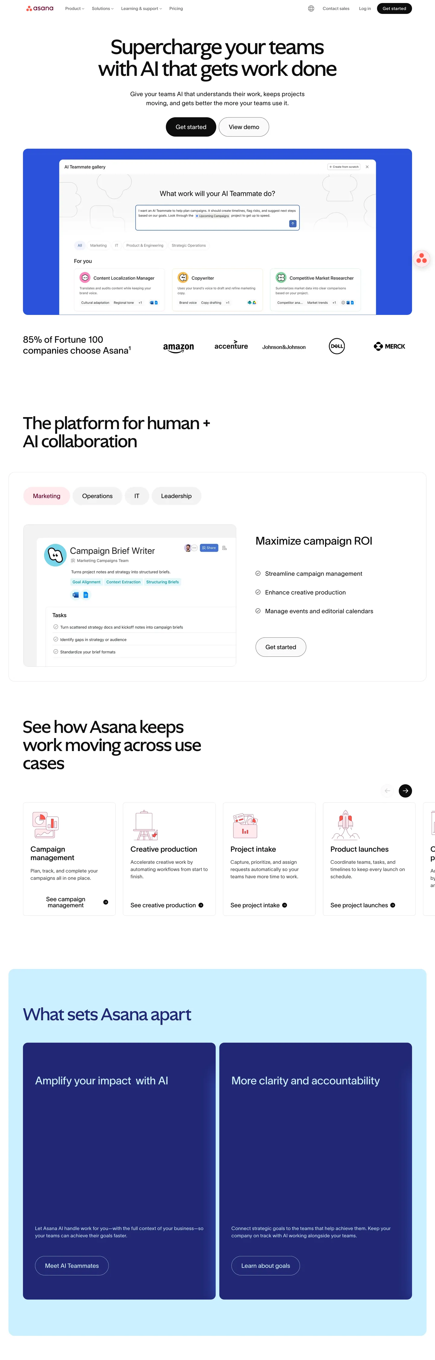
Asana's marketing page reads as a workspace catalog rather than a fintech pitch — the canvas is a true white ("#ffffff", 91 occurrences across bg, border, and inverted text) with the load-bearing color story split between deep indigo ("#222875") for product mockup chrome and a coral-rose family ("#e1bbc7", "#ffeaec") for the accent dots and chips inside those mockups. The hero composition opens with a 72px Ghost headline ("Supercharge your teams with AI that gets work done") that sits on the off-white floor, drops into a 1440-wide indigo card containing the AI Teammate Gallery, and continues into use-case tiles before the page floor turns pale-sky ("#cbefff") under the "What sets Asana apart" heading where two deep-indigo cards finally appear.
This file packages the spec into one DESIGN.md written to the Google Labs format. Inside: 24 colors tokens grouped into brand-indigo, coral-rose, pale-sky, off-white, and a graded near-black scale; 12 type tokens spanning Ghost display (72px / 60px / 36px / 30px / 24px h5) against TWK Lausanne body at sizes 20 / 16 / 14 / 12 / 11 with the body weight held at 300; a 6-step rounded scale (4px chips through 100px pills and 146px capsule chrome); a 9-step spacing rhythm built on 4/8/12/14/16/24/32/40/80 px; and 18 components covering primary and secondary pill buttons, the AI Teammate Gallery card, the "What sets Asana apart" indigo card, the campaign-brief mockup card, use-case tiles, pill tabs, the search-style hero input, and the dark top-nav row.
A working React developer feeds this file to Claude, Cursor, or Copilot and the agent reproduces Asana's specific moves — Ghost weight 500 against TWK Lausanne weight 300, indigo "#222875" used as panel fill rather than CTA color, a 100px-pill primary in near-black, coral chips inside product mockups — instead of a generic project-management theme. Reference the tokens directly inside Tailwind config or CSS variables; every hex, font, radius, and spacing value is a quoted scalar. The system rewards study because it inverts two project-management conventions at once: the brand color does not run the CTA, and the body family runs weight 300 rather than 400.
What makes it distinct
5
- Deep indigo voltage"#222875" reserved for the "What sets Asana apart" panel fill and the AI Teammate Gallery band, never as a CTA color
- Two-typeface rampGhost carries display at 60–72px weight 500, TWK Lausanne carries body at weight 300 with +0.4px letterspacing
- Pill CTA at 100px radiusprimary fills near-black "#0d0d0d" with a 1px white inner stroke, secondary inverts to white with a hairline border
- Coral-tint mockup chrome"#e1bbc7" and "#ffeaec" carry decorative dots, accent chips, and tag bubbles inside product mockups
- Off-white canvas with pale-sky calloutsbody sits on "#ffffff" while "What sets Asana apart" opens a "#cbefff" pale-sky section before dropping into the indigo cards
asana.com
Live at asana.com
A snapshot of the brand in production. Scroll the frame to see the whole page.
Colors
24 colors
Asana's system runs on #0d0d0d as its primary voltage, used in 1 of 18 components. Type is set in TWK Lausanne across 12 tokens from 11px to 72px, weights 300–500. Shape language is soft — components average 45px corner radius, with no sharp interactive edges.
Brand & Accent
Sparing, CTA-only voltage · 13
Surface
Page and card backgrounds · 2
Text
Headlines, body, captions · 6
Borders & Hairlines
Dividers, outlines, rules · 1
Semantic
Status, errors, success, links · 2
Typography
12 type tokens
Set in TWK Lausanne across 12 tokens, from 11px to 72px, weights 300–500. Shown in its own stack: where the font isn't installed, the fallback the file names stands in.
- display-xl72px · weight 500 · lh 72px · tracking -0.5pxThe quick brown fox jumps over the lazy dog
- display-lg60px · weight 500 · lh 60pxThe quick brown fox jumps over the lazy dog
- display-md36px · weight 400 · lh 43.2px · tracking -0.36pxThe quick brown fox jumps over the lazy dog
- display-md-light36px · weight 300 · lh 46.8px · tracking -0.36pxThe quick brown fox jumps over the lazy dog
- heading-md30px · weight 400 · lh 36pxThe quick brown fox jumps over the lazy dog
- heading-sm24px · weight 500 · lh 28.8pxThe quick brown fox jumps over the lazy dog
- body-lg20px · weight 300 · lh 30px · tracking 0.4pxThe quick brown fox jumps over the lazy dog
- body-md16px · weight 400 · lh 24pxThe quick brown fox jumps over the lazy dog
- body-md-light16px · weight 300 · lh 24px · tracking 0.32pxThe quick brown fox jumps over the lazy dog
- body-sm14px · weight 400 · lh 21pxThe quick brown fox jumps over the lazy dog
- button14px · weight 500 · lh 21px · tracking 0.5pxThe quick brown fox jumps over the lazy dog
- eyebrow11px · weight 500 · lh 16.5px · tracking 0.44pxThe quick brown fox jumps over the lazy dog
Layout
Radii and spacing
7 corner radii and 9 spacing values. Shape language: soft.
Radii
- xs4px
- sm8px
- md10px
- lg16px
- xl20px
- pill100px
- capsule146px
Spacing
- xxs4px
- xs8px
- sm12px
- base14px
- md16px
- lg24px
- xl32px
- xxl40px
- section80px
Components
18 components
Each rendered from its tokens (color, type, radius, padding) on Asana's own canvas.
- Button Primarybutton-primaryButton Primary
- Button Primary Hoverbutton-primary-hoverButton Primary Hover
- Button Secondarybutton-secondaryButton Secondary
- Button Secondary Hoverbutton-secondary-hoverButton Secondary Hover
- Pill Tab Defaultpill-tab-defaultPill Tab Default
- Pill Tab Selectedpill-tab-selectedPill Tab Selected
- Ai Gallery Bandai-gallery-bandAi Gallery Band
- Ai Prompt Inputai-prompt-inputAi Prompt Input
- Use Case Tileuse-case-tileUse Case Tile
- Feature Card Indigofeature-card-indigoFeature Card Indigo
- Feature Card Skyfeature-card-skyFeature Card Sky
- Mockup Cardmockup-cardMockup Card
- Mockup Chip Coralmockup-chip-coralMockup Chip Coral
- Customer Logo Tilecustomer-logo-tileCustomer Logo Tile
- Top Navtop-navTop Nav
- Top Nav Linktop-nav-linkTop Nav Link
- Type here…text-inputText Input
- FooterfooterFooter
In use
The system, in use
Asana's tokens on the kind of product it builds.
Build something people actually use.
A short paragraph of marketing copy that previews how the brand's display tier and body tier read together. Two sentences is usually enough.
FAQ
Asana design system FAQ
Common questions about Asana's tokens, components, and how to use this DESIGN.md in your project.
Read next
Related reading
Specs, directories, and component libraries that pair with this design system.
- Browse all design systemsThe full directory of DESIGN.md files on shadcn.io, with live mockups for each.shadcn.io
- Asana — official siteAsana's marketing surface — the source of the indigo, coral, and Ghost-display token set captured here.asana.com (opens in a new tab)
- The DESIGN.md specificationGoogle Labs' open spec for machine-readable design system files — the format this page is built on.github.com (opens in a new tab)
Use it
Use Asana in your project
One machine-readable file. Drop it into Claude, Cursor, or any AI tool that reads DESIGN.md.
Download the DESIGN.md
One machine-readable file: every color, type, radius, spacing, and component token of Asana.
Feed it to your AI tool
Drop it into Claude, Cursor, or GitHub Copilot. The agent writes React components and Tailwind classes that match Asana's visual language.
Reference the tokens directly
Or paste the values into your Tailwind config, CSS variables, or component library: every color, size and radius is a quoted, ready-to-copy value.
Read the full DESIGN.md: overview, rationale, do’s and don’ts
Overview
Asana's marketing chrome inverts two project-management conventions at once. First, the brand voltage {colors.brand-indigo} ("#222875") never fills a button — it fills the AI Teammate Gallery band and the two "What sets Asana apart" cards, two surfaces that read as panels rather than actions. Second, body type runs {typography.body-lg} at weight 300 with +0.4px letterspacing rather than the weight-400 default used by every adjacent SaaS site. The CTA pill {colors.primary} ("#0d0d0d") absorbs the action role so the indigo stays scenographic.
Panel-fill voltage: Where most project-management brands push the brand hue onto the primary button (Linear lavender on the CTA, Notion purple on "Get Notion free", Monday yellow on every action), Asana holds {colors.brand-indigo} for two flagship cards and a hero band. The deep indigo at OKLCH 0.33 / 0.13 / 273 carries enough chromatic weight that filling a 36px pill would undersaturate it; filling a 1440-wide band lets the hue do atmospheric work.
Weight as restraint: Display sits at Ghost weight 500 (60px / 72px). Body sits at TWK Lausanne weight 300. The display-to-body weight delta is 200 units, not the 400 units a heavy fintech site uses. Pairing display 500 with body 300 produces a typographic voice that reads quiet on the body and confident on the headline — the same restraint Stripe and Linear use, applied to a category that usually defaults to weight 600+ everywhere.
The page rhythm flows off-white → indigo card → off-white → pale-sky band → two indigo cards. The pale-sky {colors.accent-sky} ("#cbefff") opens the "What sets Asana apart" section before the indigo cards drop in, providing a chromatic ramp from canvas through accent into the brand voltage.
Key Characteristics:
- Panel-fill indigo
{colors.brand-indigo}("#222875") — band and card fill, never CTA. - Two-typeface ramp — Ghost (display 60–72px / 500) against TWK Lausanne (body 14–20px / 300).
- Primary CTA is a 100px-pill near-black at
{rounded.pill}— secondary inverts white over hairline. - Coral-rose tints (
{colors.accent-coral},{colors.accent-coral-soft}) live inside product mockups, never on chrome. - Pale-sky
{colors.accent-sky}("#cbefff") opens the apart-section before the indigo cards drop. - Off-white canvas (
{colors.canvas}"#ffffff", 91 occurrences) carries every above-fold surface. - 14px is the dominant spacing unit (count 56) — not the more common 16px or 8px scale.
Colors
- Near-black ink (
#0d0d0d) — frequency 936. Used as text (481), border (441), background (14). The load-bearing color of the entire chrome — every headline, body sentence, button fill, and hairline-as-text role traces back here. Asana avoids pure true black; the dark voltage carries the faintest gray cast. - Mid-gray (
#646f79) — frequency 239. Used as text (118), border (121). The workhorse muted text color for paragraphs that recede from headlines, footer rows, and secondary metadata. - Coral-rose (
#e1bbc7) — frequency 144. Used as text (72), border (72). Border-heavy: the rose tint outlines decorative dots, hairlines around product-mockup chips, and the soft-edge of inline labels. Never a fill on its own. - White (
#ffffff) — frequency 91. Used as bg (62), text (17), border (12). The page canvas, the secondary-button fill, and the text color flipped over the indigo bands. - Deep coral-burgundy (
#690031) — frequency 7. Used as bg (4), text (2), border (1). The dark complement to the coral-rose family; appears inside product mockups as chip text and a dot fill on a single accent illustration. - Indigo "#222875" — frequency 43. Used as text (20), border (19), bg (4). The brand voltage. Reserved for the AI Teammate Gallery hero band and the two "What sets Asana apart" feature cards. Never a CTA color.
- Hairline gray (
#e7e7e7) — frequency 38. Used as border (37). The default 1px divider — pill-button outlines, card borders, use-case tile separators. - Coral-tint (
#ffeaec) — frequency 44. Used as text (17), bg (10), border (17). Soft-edge hover surface for secondary buttons and the chip-fill behind small coral tags inside the campaign-brief mockup. - Dark gray (
#3d3d3d) — frequency 18. Used as text (9), border (9). The hovered state of#0d0d0d. Carries the lighter ink role inside the dark cards. - Pale-sky (
#cbefff) — frequency 15. Used as text (6), bg (4), border (5). Opens the "What sets Asana apart" band as a section background before the indigo cards drop in. - Mid-blue accent (
#879fc8) — frequency 2. The a11y focus ring token (--lightmode-a11y-focus-primary). Scarce, but functionally critical. - Glow-coral (
#ff584a) — frequency 1. Reserved for a single accent glow on the AI Teammate illustration.
The remaining tokens — #222875 siblings (#333c83, #6678ac), the green/yellow brand pegs at the -1000 scale, and the semantic error #a82424 and success #0c6410 — sit in the CSS variable layer for in-product mockups and a11y states but rarely render on the marketing chrome itself.
Typography
Asana runs two typefaces: Ghost (a custom display sans) for h1 and h2, and TWK Lausanne for every body, paragraph, button, link, label, and nav surface. The split is sharp — Ghost never runs below 60px and TWK Lausanne never runs above 36px. Open-source substitutes: Migra or Editorial New approximate Ghost's display character; Inter at weight 300 closely matches TWK Lausanne's body cut.
Three details define the ramp. (1) Display sits at Ghost weight 500 with negative tracking only at the top (-0.5px at 72px, normal at 60px) — the rest of the system uses 0 or +0.4px positive tracking. (2) Body paragraphs run at weight 300 with +0.4px letterspacing — the opposite move from sites that tighten body type. (3) Buttons use +0.5px letterspacing at 14px / 500 — wide-set caps signal the action without resorting to uppercase.
The 36px tier exists twice: {typography.display-md} at weight 400 for h3, and {typography.display-md-light} at weight 300 for the rare oversized paragraph quote. The eyebrow token sits at 11px / 500 / uppercase with +0.44px tracking — used on the four use-case-tile labels above the fold.
Layout
The page is a centered 1440 grid with 32px gutter ({spacing.xl}) and 80px section padding ({spacing.section}). The dominant inline rhythm is {spacing.base} 14px — appearing 56 times across pill padding, chip gaps, and inline element spacing — slightly tighter than the conventional 16px most adjacent SaaS sites default to. Card padding sits at {spacing.xl} 32px for hero cards and {spacing.lg} 24px for tiles.
Section blocks lock to either a single full-width band (AI Teammate Gallery, "What sets Asana apart") or a 4-up tile row (use cases, customer logos) — there is no 2-up split layout above the fold. Vertical rhythm between sections runs 32px 0px (count 27) inside cards and 80px between bands.
Elevation & Depth
Asana avoids drop shadows on the marketing chrome — every card uses a hairline border at {colors.hairline} ("#e7e7e7") to carry depth instead. The only shadow-adjacent move is a single glow-coral accent ("#ff584a", count 1) attached to the AI Teammate Gallery illustration via a CSS variable. Cards lift via background contrast: white canvas → white card with hairline → indigo card with no border. The indigo cards specifically drop their borders because the chromatic shift carries the lift on its own.
Shapes
The radius scale is bimodal. Buttons and tabs run pill at {rounded.pill} 100px (count 22) — the dominant pill geometry. Cards and surfaces run {rounded.md} 10px (count 30) for mockup cards and {rounded.sm} 8px (count 23) for chips and inputs. Hero cards lift to {rounded.lg} 16px (count 14) and {rounded.xl} 20px (count 14). A single {rounded.capsule} 146px appears 4 times — used for capsule-shaped chrome elements on the AI Teammate Gallery illustration.
Pill voltage: {rounded.pill} 100px is Asana's signature interactive geometry. Buttons, secondary buttons, and pill tabs all share the same radius — the consistency reads as "every action is an oval, every container is a rounded rectangle."
Components
The 18-component set covers every visible chrome surface above the fold. Below: {components.button-primary} is the near-black 100px-pill with white text and a 1px white inner stroke (the inner stroke shows on the JSON borderColor: #ffffff — a precise detail most agents would miss). {components.button-secondary} inverts to white over a {colors.hairline} 1px border. {components.pill-tab-default} carries the same pill geometry at smaller padding. {components.ai-gallery-band} fills {colors.brand-indigo} at 16px radius and 32px padding. {components.feature-card-indigo} is the "What sets Asana apart" panel; {components.feature-card-sky} is the pale-sky band that opens that section. {components.mockup-card} carries the campaign-brief illustration; {components.mockup-chip-coral} is the small coral-rose chip inside it. {components.ai-prompt-input} is the 64px-tall search-style input in the hero band. The {components.top-nav} row holds 56px height with 32px lateral padding.
Do's and Don'ts
- Don't fill the primary CTA with
{colors.brand-indigo}("#222875"). Indigo is a panel-fill voltage, not an action color. Use{colors.primary}("#0d0d0d") for every CTA; the deep indigo only fills the AI Teammate band and the two apart-section cards. - Don't set body paragraphs at weight 400. TWK Lausanne body runs at weight 300 with +0.4px letterspacing — using 400 reads heavier than Asana intends and breaks the display-to-body weight delta of 200 units.
- Don't use rectangular buttons. Every action surface on Asana's marketing chrome is
{rounded.pill}100px — primary, secondary, and pill tabs. Rectangular geometry is reserved for cards and inputs. - Don't use coral-rose (
#e1bbc7,#ffeaec) as a chrome accent. The coral family lives strictly inside product mockups — as decorative dots, chip backgrounds, and the soft-edge tag bubbles. Pulling coral onto buttons or section bands breaks the chrome-vs-illustration boundary. - Don't drop shadows on cards. The system uses
{colors.hairline}1px borders for white cards and bare chromatic shift for indigo cards. A shadow on either reads as a foreign visual language. - Don't swap Ghost for any neo-grotesk display (Inter, Geist, SF Pro). Ghost has a wider aperture and softer terminals than those neo-grotesks; substituting Inter at 72px loses the personality. Editorial New or Migra approximate Ghost more closely.
- Don't use the
glow-coral"#ff584a" beyond a single accent glow. It appears exactly once in the extraction (the AI Teammate Gallery illustration); treating it as a usable accent breaks the rarity that gives it impact.
Known Gaps
- Dark-mode token values are referenced by CSS variable name (
--darkmode-bg,--darkmode-text-strong,--darkmode-button-primary) but the marketing surface renders light-only — the dark theme is not captured here. - Form-field error and validation states are not visible above the fold;
{colors.semantic-error}"#a82424" lives in the variable layer but has no visible component instance. - The richer in-product color-tag palette (red
#a82424, green#0c6410, plus orange-yellow and purple tints living in the CSS variable layer) is used inside the workspace mockups but is not present on the marketing chrome itself. - Motion timings were not extracted; 200ms ease-out is a safe default for hover transitions on the pill buttons.
- Ghost and TWK Lausanne are proprietary; an open-source substitute (Editorial New, Migra; Inter at weight 300) is acceptable but loses the display character.
Project Management
More systems like this
More DESIGN.md files in Project Management.
Pricing
Build it with Pro
The DESIGN.md files are free. Pro adds 6,000+ blocks, premium templates and the MCP server, so your AI editor builds in your system for you.
4.9/5 out of 5 · 150+ reviewsfrom 150+ founders and developers.
Billing
Billed once a year in USD. Cancel anytime.
- How many people can use the license.
- Client work, SaaS products and anything you charge for.
- Production-ready React sections: hero, pricing, features, dashboards and more.
- Complete multi-page sites you can ship as they are.
- React icons from every major library, installable with one command.
- Presets that restyle every block, in light and dark.
- Lets your AI editor search, preview and install blocks for you.
- Priority requests are answered first.
Individual
For personal projects & open source
$32instead of $49/mo
$389 billed yearly
- Seats: 1 seat
- Commercial use: Personal & open source only
- Pro blocks: 6,000+ blocks
- Templates: All 14 templates
- React icons: 294k+ icons
- Themes: All 59 themes
- MCP server: Basic usage
- Support: Standard
Team
Most popularFor freelancers, agencies & startups
$66instead of $99/mo
$789 billed yearly · ≈ $13/dev/mo
- Seats: Up to 5 seats
- Commercial use: Included
- Pro blocks: 6,000+ blocks
- Templates: All 14 templates
- React icons: 294k+ icons
- Themes: All 59 themes
- MCP server: High usage
- Support: Priority
Organization
For companies with larger teams
$132instead of $199/mo
$1,589 billed yearly
- Seats: Unlimited seats
- Commercial use: Included
- Pro blocks: 6,000+ blocks
- Templates: All 14 templates
- React icons: 294k+ icons
- Themes: All 59 themes
- MCP server: Unlimited usage
- Support: Priority
Billed once a year in USD. Cancel anytime.
Individual
For personal projects & open source
$32instead of $49/mo
$389 billed yearly
- How many people can use the license.Seats: 1 seat
- Client work, SaaS products and anything you charge for.Commercial use: Personal & open source only
- Production-ready React sections: hero, pricing, features, dashboards and more.Pro blocks: 6,000+ blocks
- Complete multi-page sites you can ship as they are.Templates: All 14 templates
- React icons from every major library, installable with one command.React icons: 294k+ icons
- Presets that restyle every block, in light and dark.Themes: All 59 themes
- Lets your AI editor search, preview and install blocks for you.MCP server: Basic usage
- Priority requests are answered first.Support: Standard
Team
Most popularFor freelancers, agencies & startups
$66instead of $99/mo
$789 billed yearly · ≈ $13/dev/mo
Everything in Individual, plus
- How many people can use the license.Seats: Up to 5 seats
- Client work, SaaS products and anything you charge for.Commercial use: Included
- Lets your AI editor search, preview and install blocks for you.MCP server: High usage
- Priority requests are answered first.Support: Priority
Organization
For companies with larger teams
$132instead of $199/mo
$1,589 billed yearly
Everything in Team, plus
- How many people can use the license.Seats: Unlimited seats
- Lets your AI editor search, preview and install blocks for you.MCP server: Unlimited usage
- Secure checkout via Stripe
- Code lives in your repo
- Keep what you've shipped if you cancel
- License terms
Your system, built for you
Every block, template and icon, installed by your AI agent in your design system. The DESIGN.md files stay free.