monday.com Design System
monday.com's design system as a DESIGN.md file. Purple #6161ff CTA, Poppins, agent-tile palette, 22 components. For React, Next.js, and AI tools.
Add shadcn.io to your AI agent. · Pro It installs blocks, icons and templates in your design system from a prompt, with Pro.
Set up MCP- Primary
- #6161ff
- Typeface
- Poppins
- Shape
- Soft
- Base radius
- 12px
- Colors
- 31
- Type tokens
- 12
- Components
- 22
- Spacing values
- 9
About
About monday.com DESIGN.md
Curated by Dov Azencot · Updated May 13, 2026 · Source monday.com (opens in a new tab)
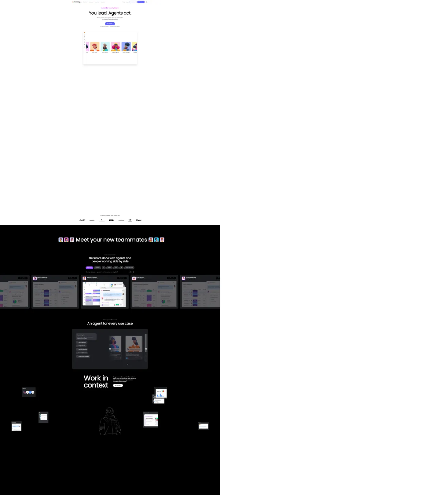
monday.com's homepage runs on two canvases stacked vertically. The first is white: a small "An monday AI work platform" tagline above a 128px Poppins headline reading "You lead. Agents act.", a single purple-pill CTA at "#6161ff", and a board mockup tiled with agent avatar cards. The second is full black ("#000000"): the "Meet your new teammates" section, a horizontally-scrolling row of dark agent tiles where each tile carries the muted version of the kanban board mockup behind a header in white text. Then comes "Work in context" — a 64px headline over the same black canvas, decorated with floating chat-bubble UI mockups scattered like sticky notes across the section, with a centered hooded-figure illustration anchoring the composition.
This DESIGN.md packages the system into one machine-readable file built on the Google Labs spec. Inside: 31 colors tokens grouped into a purple-led brand layer, the eight-tile agent spectrum, three product-line sub-palettes (CRM, Dev, Service), and structural canvas/ink/hairline tokens; 10 typography tokens running Poppins from the 128px hero down to a 13px nav-link, with the entire scale staying within weights 300 / 400 / 500 / 600; 6 corner radii from 8px chips to a 1600px decorative pill; 9 spacing tokens; and 22 components covering the purple pill, agent tile cards, the dark teammate carousel, floating context windows, the trust logo wall, body copy at "#676879", and the dark cta-band.
A working developer feeds the file to Claude, Cursor, or Copilot and gets components that match monday.com's specific moves — purple pill not gradient, black agent canvas not navy, Poppins not Inter, agent spectrum tinted instead of neutral. Reference the tokens directly inside Tailwind config or CSS variables. The system is worth studying for one reason: it shows how a project-management brand can lay an AI-agent identity over an existing kanban product without compromising either — the agents get their own canvas and their own eight-color taxonomy; the work boards keep the warm `#676879` body copy and the rounded 16px radius they already had.
What makes it distinct
5
- Two-canvas systemwhite marketing canvas for purple-CTA hero, full black ('#000000') canvas for the agent teammate carousel
- 128px hero display at weight 500Poppins set to -5.12px tracking, the loudest single typographic gesture on the page
- Eight-channel agent spectrumsky '#c6dfff', yellow '#ffe100', purple '#6161ff', cyan '#3ac9ff', orange '#fdab3d', pink '#fed4f5', magenta '#fe81e4', blue '#0074fd' indexed as `_agents---agent-01` through `_agents---agent-08`
- Purple voltage held to one button'#6161ff' appears as bg in just 3 places, never as body text or background fill on a major surface
- Three product sub-palettesCRM turquoise '#00d2d2', Dev green '#00c875', Service red '#ff3a5d' coexist with the agent spectrum without bleeding into marketing CTAs
monday.com
Live at monday.com
A snapshot of the brand in production. Scroll the frame to see the whole page.
Colors
31 colors
monday.com's system runs on #6161ff as its primary voltage, used in 3 of 22 components. Type is set in Poppins across 12 tokens from 13px to 128px, weights 300–600. Shape language is soft — components average 61px corner radius, with no sharp interactive edges.
Brand & Accent
Sparing, CTA-only voltage · 3
Surface
Page and card backgrounds · 5
Text
Headlines, body, captions · 7
Borders & Hairlines
Dividers, outlines, rules · 2
Other
Specialty colors · 14
Typography
12 type tokens
Set in Poppins across 12 tokens, from 13px to 128px, weights 300–600. Shown in its own stack: where the font isn't installed, the fallback the file names stands in.
- hero-display128px · weight 500 · lh 1.3 · tracking -5.12pxThe quick brown fox jumps over the lazy dog
- display-lg64px · weight 400 · lh 1.2 · tracking -1.92pxThe quick brown fox jumps over the lazy dog
- heading-152px · weight 500 · lh 1.1 · tracking -2.08pxThe quick brown fox jumps over the lazy dog
- heading-244px · weight 400 · lh 1.3 · tracking -0.88pxThe quick brown fox jumps over the lazy dog
- heading-324px · weight 400 · lh 1.4 · tracking -0.48pxThe quick brown fox jumps over the lazy dog
- subtitle-lg20px · weight 400 · lh 1.5 · tracking -0.4pxThe quick brown fox jumps over the lazy dog
- body-md16px · weight 400 · lh 1.5The quick brown fox jumps over the lazy dog
- body-md-medium16px · weight 500 · lh 1.3The quick brown fox jumps over the lazy dog
- body-md-semibold16px · weight 600 · lh 1.5The quick brown fox jumps over the lazy dog
- body-sm14px · weight 400 · lh 1.5The quick brown fox jumps over the lazy dog
- nav-link13px · weight 300 · lh 1.4The quick brown fox jumps over the lazy dog
- caption14px · weight 300 · lh 1The quick brown fox jumps over the lazy dog
Layout
Radii and spacing
6 corner radii and 9 spacing values. Shape language: soft.
Radii
- sm8px
- md12px
- lg16px
- xl24px
- pill160px
- full9999px
Spacing
- xxs4px
- xs8px
- sm10px
- md12px
- base16px
- lg24px
- xl32px
- section48px
- section-lg96px
Components
22 components
Each rendered from its tokens (color, type, radius, padding) on monday.com's own canvas.
- Button Primarybutton-primaryButton Primary
- Button Primary Hoverbutton-primary-hoverButton Primary Hover
- Button Primary Pressedbutton-primary-pressedButton Primary Pressed
- Button Secondarybutton-secondaryButton Secondary
- Button On Darkbutton-on-darkButton On Dark
- Button Ghostbutton-ghostButton Ghost
- Top Navtop-navTop Nav
- Nav Linknav-linkNav Link
- Hero Band Lighthero-band-lightHero Band Light
- Hero Band Darkhero-band-darkHero Band Dark
- Agent Tileagent-tileAgent Tile
- Agent Tile Headeragent-tile-headerAgent Tile Header
- Context Windowcontext-windowContext Window
- Board Mockup Cardboard-mockup-cardBoard Mockup Card
- Logo Wall Itemlogo-wall-itemLogo Wall Item
- Tagline Eyebrowtagline-eyebrowTagline Eyebrow
- Body Paragraphbody-paragraphBody Paragraph
- Type here…text-inputText Input
- Type here…text-input-focusedText Input Focused
- Badge Status Purplebadge-status-purpleBadge Status Purple
- Badge Agentbadge-agentBadge Agent
- Promo Dot Agent 03promo-dot-agent-03Promo Dot Agent 03
In use
The system, in use
monday.com's tokens on the kind of product it builds.
Build something people actually use.
A short paragraph of marketing copy that previews how the brand's display tier and body tier read together. Two sentences is usually enough.
FAQ
monday.com design system FAQ
Common questions about monday.com's tokens, components, and how to use this DESIGN.md in your project.
Read next
Related reading
Specs, directories, and component libraries that pair with this design system.
- Browse all design systemsThe full directory of DESIGN.md files on shadcn.io, with live mockups for each.shadcn.io
- monday.com homepageLive reference for the purple-pill CTA on white canvas and the black agent-tile carousel in production.monday.com (opens in a new tab)
- The DESIGN.md specificationGoogle Labs' open spec for machine-readable design system files — the format this page is built on.github.com (opens in a new tab)
Use it
Use monday.com in your project
One machine-readable file. Drop it into Claude, Cursor, or any AI tool that reads DESIGN.md.
Download the DESIGN.md
One machine-readable file: every color, type, radius, spacing, and component token of monday.com.
Feed it to your AI tool
Drop it into Claude, Cursor, or GitHub Copilot. The agent writes React components and Tailwind classes that match monday.com's visual language.
Reference the tokens directly
Or paste the values into your Tailwind config, CSS variables, or component library: every color, size and radius is a quoted, ready-to-copy value.
Read the full DESIGN.md: overview, rationale, do’s and don’ts
Overview
monday.com's marketing surface is a two-canvas system — a discipline rarer than the navy-hero / white-body alternation that dominates B2B SaaS. The first canvas is pure white; the second is pure black ("#000000"). On the white canvas, a small purple eyebrow reads "An monday AI work platform", the 128px Poppins hero reads "You lead. Agents act.", a single purple-pill primary CTA at "#6161ff" sits centered beneath, and a kanban-board mockup tiled with agent-avatar cards anchors the bottom. Then the page drops into full black for "Meet your new teammates" — a horizontally-scrolling row of dark agent tiles, each shrouding a muted version of the same kanban board behind a white-text header — and the canvas stays black for the "Work in context" section that follows, decorated with floating chat-bubble windows scattered like sticky notes around a centered hooded-figure illustration.
Poppins carries every token. There is no companion serif, no monospace, no italic, and no weight 700 — the scale runs 300 / 400 / 500 / 600 only, with weight 500 doing the heavy lifting on display ("You lead. Agents act." sits at 128px / weight 500 / -5.12px tracking) and weight 300 reserved for the 13px top-nav links. Loud display, restrained weight: where most enterprise platforms reach for 700+ at the hero, monday holds at 500 and lets the 128px gesture do the work instead of the weight. Where most project-management brands lay AI-agent identity on top of their existing UI as a tinted overlay, monday gives the agents their own canvas and their own eight-channel spectrum — sky "#c6dfff", yellow "#ffe100", purple "#6161ff" (the brand voltage doubles as agent-03), cyan "#3ac9ff", orange "#fdab3d", pink "#fed4f5", magenta "#fe81e4", blue "#0074fd" — keyed as --_agents---agent-01 through --_agents---agent-08 in the CSS.
The purple voltage is held to one button. "#6161ff" appears as a background fill in just 3 places across the entire homepage — every one a primary pill CTA. Body copy stays in "#676879" (--secondary), structural ink lives at "#323338" and "#1c1d21", and the trust-logo wall renders Coca-Cola, Vistra, Carrefour, and VML at "#7c7b7b" — saturated brand logos rendered in monochrome stone so the purple stays the only saturated mark below the fold.
Key Characteristics:
- Two-canvas alternation: white marketing canvas → black agent canvas ("#000000") → black "Work in context" canvas
- 128px Poppins hero at weight 500 / -5.12px tracking — the loudest single gesture on the page
- Single purple pill ("#6161ff") as the only primary CTA, only appearing 3 times as background fill
- Eight-channel agent spectrum mapped to
_agents---agent-01..08CSS variables - Three product sub-palettes — CRM turquoise "#00d2d2", Dev green "#00c875", Service red "#ff3a5d"
- Trust logo wall in monochrome stone ("#7c7b7b") so brand colors stay scarce on the marketing surface
- Floating context-window cards scattered like sticky notes around centered hooded-figure illustration
Colors
- Stripe Purple Voltage (
#6161ff) — frequency 8. Used as bg (3), border (4), text (1). Mapped to--purpleand--_agents---agent-03. The single primary-pill voltage; the brand color doubles as agent channel 03 inside the dark canvas teammate carousel. - Brand Primary Deep (
#642eff) — frequency 0 (referenced only in--flowui-component-library--primary-base). Reserve for hover/pressed state on the primary pill; the deeper purple absorbs the chromatic step down from "#6161ff" without breaking palette unity. - Brand Primary Darker (
#4b00d7) — frequency 1 as background. Even darker pressed-state purple; pairs with focus rings inside the white-canvas hero. - Agent-01 Sky (
#c6dfff) — agent channel 1 — never appears on the white canvas; reserved for the avatar dot on the first agent tile inside the dark band. - Agent-02 Yellow (
#ffe100) — agent channel 2 — second tile avatar accent. - Agent-04 Cyan (
#3ac9ff) — agent channel 4 — third tile avatar accent. - Agent-05 Orange (
#fdab3d) — agent channel 5 — fourth tile avatar; also doubles as the CRM--orangetoken in the product palette. - Agent-06 Pink (
#fed4f5) — agent channel 6 — pastel pink for tile 6. - Agent-07 Magenta (
#fe81e4) — frequency 8. Used as text (4), border (4). The hottest accent on the dark band — strong enough to read against "#000000" at small avatar sizes. - Agent-08 Blue (
#0074fd) — agent channel 8 — pure blue for the eighth tile. - CRM Turquoise (
#00d2d2) — product-line accent for the CRM sub-brand inside the platform; lives in--turquoiseand--crm--primary. - Dev Green (
#00c875) — product-line accent for the Dev sub-brand;--dev--primaryand--primary-green. - Service Red (
#ff3a5d) — product-line accent for the Service sub-brand;--products--service. - Status Purple (
#9d50dd) — frequency 0 (board mockup only) — status badge color used inside the kanban mockup, not on marketing chrome. - Canvas White (
#ffffff) — frequency 1756. Used as text on dark (884), border (855), bg (14). The dominant marketing canvas; carries the white "You lead. Agents act." hero. - Canvas Dark (
#000000) — frequency 806. Used as text on light (395), border (370), shadow (18), bg (23). The full-black agent canvas; the deliberate choice over navy or near-black distinguishes monday from every competitor in the project-management category. - Canvas Dark Soft (
#1c1d21) — frequency 40. Used as bg (16), gradient (10), text (7), border (7). The subtle gray-black for agent tile interiors against the "#000000" canvas — the only place a "near-black" appears anywhere. - Ink (
#323338) — frequency 87. Used as bg (62), border (20), text (5). Mapped to--dark-grey. The dominant text color on white surfaces — warmer than gray and cooler than charcoal. - Secondary Body (
#676879) — frequency 2. Mapped to--secondary. The body-paragraph color: "Where people and agents drive results together on one secure work platform" renders at exactly this token. - Steel (
#585965) — frequency 145. Used as border (74), text (71). The hairline accent that runs through nav-link separators and card borders on the white canvas. - Stone (
#7c7b7b) — frequency 6. Used as border (6). The trust-logo wall color; saturated brand marks rendered in monochrome stone so they don't compete with the purple CTA. - Hairline Soft (
#e6e7ea) — frequency 20. Used as border (20). The standard divider color on white surfaces. - Hairline Strong (
#c3c6d4) — frequency 107. Used as border (50), text (47), bg (10). The bolder hairline for cards and form inputs on the white canvas. - Surface (
#f3f4f5) — frequency 4. Used as bg (3), border (1). The off-white card-surface color, mapped to--surface-lightand--crm--surface. - Grey Background (
#f6f7fb) — referenced via--grey-background-color; the alternate page-section background tint.
Typography
monday.com runs Poppins as the single typographic family across every captured surface — every signature from the 5,343 scanned elements lists Poppins as the first family, with Arial then sans-serif as fallbacks. The scale spans weights 300, 400, 500, and 600 only; weight 700 is absent. There is no italic, no companion serif, and no monospace.
The scale spans 128px at the top to 13px at the bottom. The hero display ({typography.hero-display}) sits at 128px / weight 500 / 1.30 line-height / -5.12px tracking — calibrated to make "You lead. Agents act." land as four discrete typographic gestures over the white canvas. The dark-band display ({typography.display-lg}) drops to 64px / weight 400 / -1.92px for "Work in context" — a quieter weight that lets the floating chat-window decoration carry visual weight instead of the type. Section headings (heading-1) come in at 52px / weight 500 / -2.08px for "Get more done with agents and people working side by side". Body paragraphs run at 20px / weight 400 / 1.50 line-height with -0.4px tracking — generous for a B2B marketing surface. The 13px nav-link at weight 300 is the lightest text on the page — Poppins' weight 300 reads as quiet authority for top-nav rather than the gymnastics most enterprise nav bars use.
Layout
The page alternates two band widths. Light bands (hero, logo wall) center content inside a ~1200px column on a "#ffffff" canvas with 96px vertical section padding ({spacing.section-lg}). Dark bands (agent carousel, "Work in context") fill viewport-edge to viewport-edge on a "#000000" canvas, with the carousel breaking out horizontally beyond the column to imply infinite scroll. Internal element spacing settles at 12px ({spacing.md}) for control-to-control rhythm, 8px ({spacing.xs}) for tight pairs, 16px ({spacing.base}) for card interior gutters, and 24px ({spacing.lg}) between card and section header. The frequent 16px-vertical / 0-horizontal padding signature (16px 0px, 46 occurrences in the extraction) is the canonical card-section pattern.
Elevation & Depth
Shadows are scarce on the marketing canvas — the board-mockup card carries a single diffuse drop shadow (rgba(20, 20, 43, 0.06) 0px 12px 32px -4px) to lift it out of the hero band, and that's it. The dark canvas has zero shadows; depth comes from the soft-black "#1c1d21" agent-tile interior reading as a panel one step above the "#000000" canvas — surface-ladder elevation instead of cast shadows. The result: a system that feels weightless on the white canvas and tactile on the dark canvas, without crossing into the heavy gradient mesh that fintech brands use.
Shapes
The radius scale runs 8px → 12px → 16px → 24px → 160px → 9999px. Buttons render at the 160px pill ({rounded.pill}) — large enough to qualify as fully-rounded at every realistic button width. Cards, agent tiles, and the board mockup use 16px ({rounded.lg}). Inputs and small chips drop to 12px ({rounded.md}). Two decorative containers around the agent carousel use a 1600px radius to read as "circles cropped by the viewport edge" — those are not in the regular scale and stay scoped to one composition. Pills for everything you press, 16px for everything you read.
Components
button-primary— the single purple pill at "#6161ff" with white text, 14px medium Poppins, 14px×32px padding, 160px radiusbutton-primary-hover/button-primary-pressed— deeper-purple states stepping through "#642eff" and "#4b00d7"button-secondary— transparent fill with 1px "#c3c6d4" hairline; same pill geometry, ink textbutton-on-dark— white pill against the black agent canvas for "Get Started >" inside the carousel headertop-nav— white surface, 13px weight-300 nav-link Poppins, 12px×24px padding, 1px hairline-bottomhero-band-light/hero-band-dark— the two canvas modes; 96px section padding either wayagent-tile— "#1c1d21" interior on "#000000" canvas, 16px rounded, agent-channel accent dotagent-tile-header— 16px / weight 600 white Poppins inside the dark tilecontext-window— small floating chat-bubble panel scattered around the "Work in context" composition; "#1c1d21" surface with 12px rounded cornersboard-mockup-card— the kanban tile-board screenshot with 16px rounded corners and the only diffuse drop shadow on the pagelogo-wall-item— Coca-Cola, Vistra, Carrefour, VML rendered in stone "#7c7b7b"tagline-eyebrow— the small purple "An monday AI work platform" tagline above the herobody-paragraph— 20px / weight 400 Poppins in "#676879" with -0.4px trackingtext-input— 12px rounded, "#c3c6d4" hairline, 44px heightbadge-status-purple— the "#9d50dd" status badge that lives inside the kanban mockupbadge-agent— small dark-canvas chip with hairline outline used on agent tiles
Do's and Don'ts
Do reserve "#6161ff" for the primary pill CTA — it appears as background fill in just 3 places across the entire homepage. Multiplying its uses dilutes the single-CTA discipline.
Do drop to "#000000" canvas (not navy, not near-black) when introducing an agent-related section. The pure-black choice is what differentiates monday from competitors that use navy bands for the same purpose.
Do use the _agents---agent-XX spectrum only inside the dark band. The eight agent channels are bound to the carousel — surfacing yellow "#ffe100" or magenta "#fe81e4" on the white marketing canvas would override the purple-pill discipline.
Don't push Poppins to weight 700 — the scale stops at 600. The 128px hero at weight 500 is the loudest gesture on purpose; promoting it to 700 collapses the contrast between display and body.
Don't apply the 1600px decorative pill radius outside the carousel framing. Use {rounded.pill} (160px) for buttons and {rounded.lg} (16px) for cards; the 1600px value is composition-specific cropping, not a general token.
Don't use "#676879" for primary CTAs or large background fills — it's the body-paragraph token (--secondary) and reading-only. For dim large-area fills on white, use surface "#f3f4f5" instead.
Don't mix the three product sub-palettes (CRM turquoise "#00d2d2", Dev green "#00c875", Service red "#ff3a5d") on the marketing homepage. Each lives on its own product sub-page; surfacing all three on the master marketing canvas would dissolve the platform/sub-brand hierarchy.
Known Gaps
- Specific dark-mode token values are scoped to the two dark bands ("#000000" + "#1c1d21" surface); the full product-app dark theme is not captured
- Animation and transition timings were not extracted; recommend 150–200ms ease
- Form validation success state not explicitly captured beyond the focused-input purple border
- The eight-channel agent spectrum is read off the captured carousel; the brand's internal agent library may have more channels or alternate naming
- Three product sub-palettes (CRM, Dev, Service) are referenced via CSS variables but their full surface usage lives on sub-pages not captured here
Project Management
More systems like this
More DESIGN.md files in Project Management.
Pricing
Build it with Pro
The DESIGN.md files are free. Pro adds 6,000+ blocks, premium templates and the MCP server, so your AI editor builds in your system for you.
4.9/5 out of 5 · 150+ reviewsfrom 150+ founders and developers.
Billing
Billed once a year in USD. Cancel anytime.
- How many people can use the license.
- Client work, SaaS products and anything you charge for.
- Production-ready React sections: hero, pricing, features, dashboards and more.
- Complete multi-page sites you can ship as they are.
- React icons from every major library, installable with one command.
- Presets that restyle every block, in light and dark.
- Lets your AI editor search, preview and install blocks for you.
- Priority requests are answered first.
Individual
For personal projects & open source
$32instead of $49/mo
$389 billed yearly
- Seats: 1 seat
- Commercial use: Personal & open source only
- Pro blocks: 6,000+ blocks
- Templates: All 14 templates
- React icons: 294k+ icons
- Themes: All 59 themes
- MCP server: Basic usage
- Support: Standard
Team
Most popularFor freelancers, agencies & startups
$66instead of $99/mo
$789 billed yearly · ≈ $13/dev/mo
- Seats: Up to 5 seats
- Commercial use: Included
- Pro blocks: 6,000+ blocks
- Templates: All 14 templates
- React icons: 294k+ icons
- Themes: All 59 themes
- MCP server: High usage
- Support: Priority
Organization
For companies with larger teams
$132instead of $199/mo
$1,589 billed yearly
- Seats: Unlimited seats
- Commercial use: Included
- Pro blocks: 6,000+ blocks
- Templates: All 14 templates
- React icons: 294k+ icons
- Themes: All 59 themes
- MCP server: Unlimited usage
- Support: Priority
Billed once a year in USD. Cancel anytime.
Individual
For personal projects & open source
$32instead of $49/mo
$389 billed yearly
- How many people can use the license.Seats: 1 seat
- Client work, SaaS products and anything you charge for.Commercial use: Personal & open source only
- Production-ready React sections: hero, pricing, features, dashboards and more.Pro blocks: 6,000+ blocks
- Complete multi-page sites you can ship as they are.Templates: All 14 templates
- React icons from every major library, installable with one command.React icons: 294k+ icons
- Presets that restyle every block, in light and dark.Themes: All 59 themes
- Lets your AI editor search, preview and install blocks for you.MCP server: Basic usage
- Priority requests are answered first.Support: Standard
Team
Most popularFor freelancers, agencies & startups
$66instead of $99/mo
$789 billed yearly · ≈ $13/dev/mo
Everything in Individual, plus
- How many people can use the license.Seats: Up to 5 seats
- Client work, SaaS products and anything you charge for.Commercial use: Included
- Lets your AI editor search, preview and install blocks for you.MCP server: High usage
- Priority requests are answered first.Support: Priority
Organization
For companies with larger teams
$132instead of $199/mo
$1,589 billed yearly
Everything in Team, plus
- How many people can use the license.Seats: Unlimited seats
- Lets your AI editor search, preview and install blocks for you.MCP server: Unlimited usage
- Secure checkout via Stripe
- Code lives in your repo
- Keep what you've shipped if you cancel
- License terms
Your system, built for you
Every block, template and icon, installed by your AI agent in your design system. The DESIGN.md files stay free.