Atlassian Design System
Atlassian's design system as a DESIGN.md file. Charlie Display, Atlassian Blue #1868db, 468 :root vars, 22 components — for React, Next.js, and AI tools.
Add shadcn.io to your AI agent. · Pro It installs blocks, icons and templates in your design system from a prompt, with Pro.
Set up MCP- Primary
- #1868db
- Typeface
- Charlie Text
- Shape
- Mixed
- Base radius
- 10px
- Colors
- 24
- Type tokens
- 13
- Components
- 22
- Spacing values
- 10
About
About Atlassian DESIGN.md
Curated by Dov Azencot · Updated May 13, 2026 · Source atlassian.com (opens in a new tab)
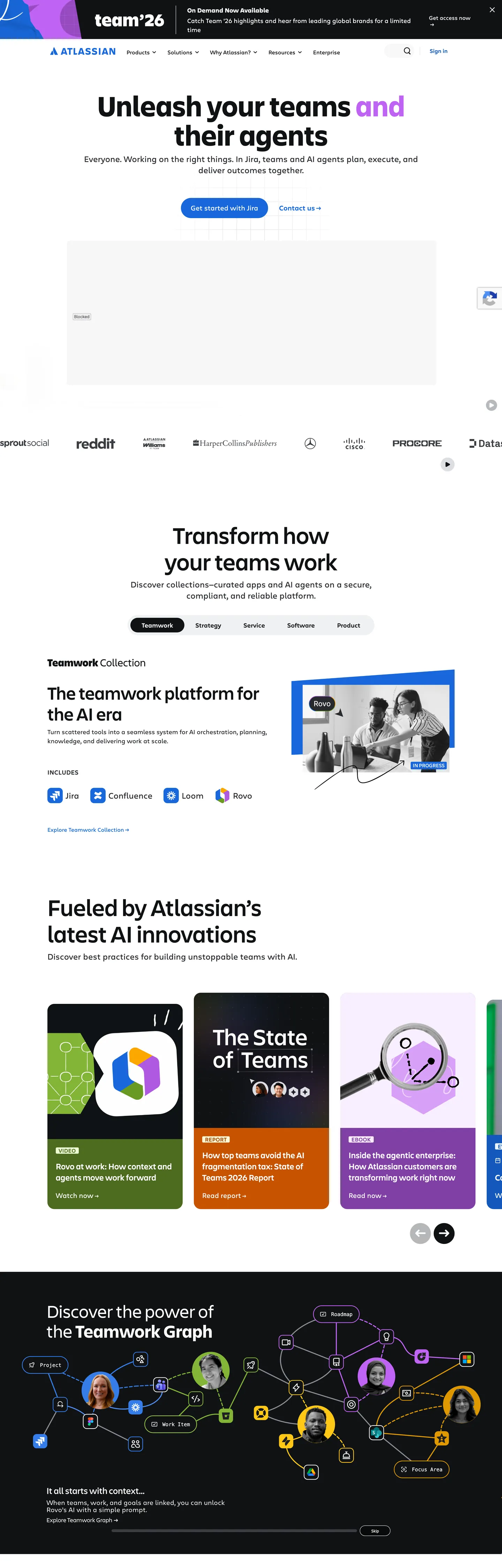
Atlassian's marketing surface is the rare enterprise homepage that ships its design tokens to the browser as `--ds-*` custom properties — 468 of them on `:root`, each carrying a hex value the DOM resolves at paint time. The canvas is pure white (`#ffffff`) and ink sits in a near-black (`#101214`); the only true chromatic event is Atlassian Blue (`#1868db`), bound to the `--ds-link` and `--ds-background-brand-bold` roles and reserved for the hero CTA pill ("Get started with Jira"). Display type is Charlie Display at 84px weight 600 across "Unleash your teams and their agents"; body and nav drop to Charlie Text at 16–20px weight 400. Where most enterprise homepages drown the action in three competing buttons and a gradient hero, Atlassian gates the entire above-the-fold composition through one blue pill. The DESIGN.md file packages 24 colors tokens, 11 typography styles, 8 corner radii, 10 spacing values, and 22 components. Colors split into ink (`#101214`, `#292a2e`, `#505258`, `#63666b`), surface (`#ffffff`, `#dddee1`, `#e9f2fe`), brand voltage (`#1868db` link / `#1c2b42` boldest navy / `#1558bc` pressed), and a semantic chart family (`#22a06b` green, `#357de8` blue, `#af59e1` purple, `#ae2e24` red) inherited from the open Atlassian Design System. The format is the Google Labs DESIGN.md spec — token references like `{colors.brand-bold}` and `{typography.display-xl}` that designers and AI agents can both parse without translation. Feed the file to Claude, Cursor, or GitHub Copilot and the agent reproduces Atlassian's specific gate: a white canvas, navy headlines, Charlie at weight 500 for display and 400 for body, and Atlassian Blue scoped to a single 10000px pill per viewport. Reference the tokens directly inside Tailwind config, CSS variables, or paste the component block into a brand audit. The discipline worth studying is the refusal of the enterprise CTA stack — Atlassian commits to one primary action per fold, lets the navy boldest fill `#1c2b42` carry the dark sections, and trusts product mockups in white cards to do the persuasion work decorative gradients do elsewhere.
What makes it distinct
5
- Live design tokens on `:root`468 `--ds-*` custom properties render every brand and structural color
- Single Atlassian Blue voltage`#1868db` fills the Jira CTA pill and link role; navy `#1c2b42` carries deep brand fills
- Two-typeface pairingCharlie Display at 84px weight 600 for hero, Charlie Text at 16–20px for body and nav
- Pill geometry on the primary CTA`10000px` radius button against 3px and 20px card corners elsewhere
- Semantic-token chromenames like `--ds-background-brand-bold` (`#1868db`) and `--ds-background-brand-boldest` (`#1c2b42`) ship straight to the page
atlassian.com
Live at atlassian.com
A snapshot of the brand in production. Scroll the frame to see the whole page.
Colors
24 colors
Atlassian's system runs on #1868db as its primary voltage, used in 2 of 22 components. Type is set in Charlie Text across 13 tokens from 12px to 84px, weights 400–600. Shape language is mixed across 22 components, blending pills, soft rounds, and squarer corners.
Brand & Accent
Sparing, CTA-only voltage · 3
Surface
Page and card backgrounds · 3
Text
Headlines, body, captions · 8
Borders & Hairlines
Dividers, outlines, rules · 2
Other
Specialty colors · 8
Typography
13 type tokens
Set in Charlie Text across 13 tokens, from 12px to 84px, weights 400–600. Shown in its own stack: where the font isn't installed, the fallback the file names stands in.
- display-xl84px · weight 600 · lh 1The quick brown fox jumps over the lazy dog
- display-lg68px · weight 500 · lh 1.12The quick brown fox jumps over the lazy dog
- display-md52px · weight 500 · lh 1.15The quick brown fox jumps over the lazy dog
- display-sm32px · weight 500 · lh 1.1The quick brown fox jumps over the lazy dog
- display-xs28px · weight 400 · lh 1.43The quick brown fox jumps over the lazy dog
- subhead24px · weight 500 · lh 1.33 · tracking 0.3pxThe quick brown fox jumps over the lazy dog
- body-lg24px · weight 400 · lh 1.33The quick brown fox jumps over the lazy dog
- body-md18px · weight 400 · lh 1.44The quick brown fox jumps over the lazy dog
- body-md-strong18px · weight 500 · lh 1.44The quick brown fox jumps over the lazy dog
- body-sm16px · weight 400 · lh 1.5The quick brown fox jumps over the lazy dog
- caption12px · weight 400 · lh 1.3The quick brown fox jumps over the lazy dog
- eyebrow16px · weight 500 · lh 1.13 · tracking 0.3pxThe quick brown fox jumps over the lazy dog
- button-md20px · weight 400 · lh 1.3The quick brown fox jumps over the lazy dog
Layout
Radii and spacing
8 corner radii and 10 spacing values. Shape language: mixed.
Radii
- none0px
- xs3px
- sm4px
- md10px
- lg20px
- xl40px
- full10000px
- circle100%
Spacing
- xxs4px
- xs6px
- sm8px
- md16px
- base20px
- lg24px
- xl32px
- xxl40px
- section64px
- gutter136px
Components
22 components
Each rendered from its tokens (color, type, radius, padding) on Atlassian's own canvas.
- Button Primarybutton-primaryButton Primary
- Button Primary Hoverbutton-primary-hoverButton Primary Hover
- Button Primary Pressedbutton-primary-pressedButton Primary Pressed
- Button Secondarybutton-secondaryButton Secondary
- Button On Darkbutton-on-darkButton On Dark
- Top Navtop-navTop Nav
- Nav Linknav-linkNav Link
- Hero Headinghero-headingHero Heading
- Product Cardproduct-cardProduct Card
- Product Card Darkproduct-card-darkProduct Card Dark
- Featured Card Brandfeatured-card-brandFeatured Card Brand
- Tab Defaulttab-defaultTab Default
- Tab Selectedtab-selectedTab Selected
- Eyebrow Labeleyebrow-labelEyebrow Label
- Link Textlink-textLink Text
- Badge Newsbadge-newsBadge News
- Chart Tile Greenchart-tile-greenChart Tile Green
- Chart Tile Purplechart-tile-purpleChart Tile Purple
- Chart Tile Orangechart-tile-orangeChart Tile Orange
- Section Darksection-darkSection Dark
- DividerdividerDivider
- FooterfooterFooter
In use
The system, in use
Atlassian's tokens on the kind of product it builds.
Build something people actually use.
A short paragraph of marketing copy that previews how the brand's display tier and body tier read together. Two sentences is usually enough.
FAQ
Atlassian design system FAQ
Common questions about Atlassian's tokens, components, and how to use this DESIGN.md in your project.
Read next
Related reading
Specs, directories, and component libraries that pair with this design system.
- Browse all design systemsThe full directory of DESIGN.md files on shadcn.io, with live mockups for each.shadcn.io
- Atlassian Design SystemThe open design system Atlassian ships — token names, components, and accessibility guidance.atlassian.design (opens in a new tab)
- The DESIGN.md specificationGoogle Labs' open spec for machine-readable design system files — the format this page is built on.github.com (opens in a new tab)
Use it
Use Atlassian in your project
One machine-readable file. Drop it into Claude, Cursor, or any AI tool that reads DESIGN.md.
Download the DESIGN.md
One machine-readable file: every color, type, radius, spacing, and component token of Atlassian.
Feed it to your AI tool
Drop it into Claude, Cursor, or GitHub Copilot. The agent writes React components and Tailwind classes that match Atlassian's visual language.
Reference the tokens directly
Or paste the values into your Tailwind config, CSS variables, or component library: every color, size and radius is a quoted, ready-to-copy value.
Read the full DESIGN.md: overview, rationale, do’s and don’ts
Overview
Atlassian's homepage is the rare enterprise marketing surface that ships its design system tokens to the browser as live --ds-* CSS custom properties — 468 of them on :root, each carrying a hex value the DOM resolves at paint time. The canvas commits to white (#ffffff); ink runs near-black (#101214); the single chromatic event above the fold is Atlassian Blue (#1868db), bound to the --ds-link and --ds-background-brand-bold roles and reserved for the hero CTA pill at 10000px corner radius.
Token transparency: the marketing site does not transcode design tokens into one-off marketing CSS — it loads the same --ds-background-brand-bold, --ds-text, and --ds-border vocabulary that styles Jira and Confluence inside the product, then resolves them on :root. The hex behind the Jira CTA pill (#1868db) is the same value an Atlaskit button renders in the app. Where most enterprise homepages route brand color through Webflow custom fields and bespoke marketing variables, Atlassian routes it through the same token graph the engineering team ships to product.
Display type is Charlie Display at weight 500–600, hitting 84px on the hero h1 ("Unleash your teams and their agents") with line-height equal to font-size (a tight 1.0 ratio). Body and nav drop to Charlie Text at 16–20px weight 400 with line-height 1.3–1.5. The hierarchy is engineered: there are no decorative weights between display and body — the brand earns presence through size jumps (84 → 52 → 32 → 24 → 18), not through bolds. Atlassian also runs a semantic chart family — green #22a06b, blue #357de8, purple #af59e1, red #ae2e24, teal #2898bd — pulled from the product's analytics surfaces and dropped into homepage product-tile illustrations.
Key Characteristics:
- Single action gate: every fold contains exactly one Atlassian Blue pill (
#1868db); secondary actions are white pills with hairline borders. - White canvas (
#ffffff) all the way down except for one anchored dark band (#000000) at the Teamwork Graph showcase. - Charlie Display for hero and section heads, Charlie Text for nav and body — two families, no third.
- Pill geometry (
10000px) only on buttons and chips; cards stay at20px, form fields at3px. - Navy boldest (
#1c2b42) carries dark product-card fills —--ds-background-brand-boldestresolved straight to the page. - The chart family (
#22a06b,#357de8,#af59e1,#ae2e24) appears only inside product-tile illustrations, never as section backgrounds.
Colors
- Atlassian Blue (
#1868db) — frequency 39. Used as text (18), border (18), background (3). Bound to--ds-link,--ds-background-brand-bold,--ds-icon-brand,--ds-border-selected,--ds-text-brand. The page's single chromatic voltage — the Jira CTA pill, every link, every focus indicator. - Atlassian Blue pressed (
#1558bc) — frequency 10. Used as text (3), background (4), border (3). The--ds-link-pressedand--ds-background-brand-bold-hoveredvalue — never appears at rest, only on active and hover states of the primary. - Brand boldest navy (
#1c2b42) — frequency 158. Used as text (79), border (79). Bound to--ds-background-brand-boldest. The dark fill for product cards that need brand atmosphere — appears across the "Featured apps" tiles and the Teamwork Platform header strip. - Ink primary (
#101214) — frequency 274. Used as text (133), bg (8), border (133). The page's load-bearing text color, bound to--ds-borderand--ds-skeleton-subtle. Reserved for headlines, body type, and the selected tab fill. - Ink neutral-bold (
#292a2e) — frequency 81. Used as text (41), border (40). The--ds-textand--ds-iconvalue — secondary type and default icon stroke. - Ink subtle (
#505258) — frequency 54. Used as text (27), border (27). Bound to--ds-text-subtleand--ds-icon-subtle— the workhorse for supporting paragraphs and inactive tabs. - Ink subtlest (
#63666b) — frequency 4. Used as text (2), border (2). The--ds-text-subtlestquietest grade — captions and legal type. - Canvas white (
#ffffff) — frequency 240. Used as text (113), bg (11), border (111), shadow (5). The default surface and--ds-surface. Also serves as inverse ink against the navy dark band. - Inverse canvas (
#000000) — frequency 1049. Used as text (524), border (524), bg (1). Resolves through--ds-UNSAFE-transparent(the alpha-overlay token) and the dark--ds-background-inverse-subtleband — most occurrences are transparent borders rather than fills. - Surface pressed (
#dddee1) — frequency 2. Used as bg (1), border (1). The--ds-surface-pressedhairline color — depressed-state fills on overlay cards. - Selected surface (
#e9f2fe) — frequency 4. Used as bg (4). Bound to--ds-background-selectedand--ds-background-brand-subtlest— the pale blue tint behind selected chips and badges. - Hairline strong (
#b7b9be) — frequency 1. Used as border (1). The--ds-border-inputvalue — applied to text-input outlines that lack a specific brand border. - Chart green (
#22a06b) — frequency 0. Bound to--ds-border-accent-greenand--ds-chart-green-bold. Reserved for product-tile illustration accents, never as a section background. - Chart blue (
#357de8) — frequency 0. Bound to--ds-chart-brandand--ds-chart-categorical-1— the analytics-categorical-1 hex inside dashboard mockups. - Chart purple (
#af59e1) — frequency 0. Bound to--ds-icon-discoveryand--ds-chart-purple-bolder— the "Discovery" semantic in product UI screenshots. - Chart red (
#ae2e24) — frequency 0. Bound to--ds-text-danger— danger semantic, no marketing exposure on the homepage above the fold. - Chart orange (
#c75300) — frequency 0. Bound to--ds-chart-warning-bold— warning semantic inside dashboard mockups.
Typography
Two proprietary families, no third. Charlie Display carries the hero h1 at 84px weight 600 with line-height 84px — a tight 1.0 ratio that pulls "Unleash your teams and their agents" into a dense two-line block. Section heads step down 68 → 52 → 32 px at weight 500 with line-height 1.10–1.15. The 28px tier (display-xs) drops to weight 400 — Atlassian uses size, not bold, to mark hierarchy from there down.
Charlie Text covers body, nav, and labels at 16–24px weight 400. The two flavors live at 16px line-height 1.5 (long-form paragraphs) and 18–20px line-height 1.44–1.30 (subheads inside cards). Eyebrow labels use weight 500 with letter-spacing 0.3px — the only place positive tracking appears.
The fallback chain is a long native stack: -apple-system, system-ui, Segoe UI, Roboto, Oxygen, Ubuntu, Fira Sans, Droid Sans, Helvetica Neue, sans-serif. If Charlie isn't licensed, Inter at weight 500 for display and 400 for body is the closest open substitute; Geist Sans also works. Avoid native Helvetica fallback — its heavier x-height clashes with Charlie's narrower letterforms.
Layout
The grid is centered with a maximum content width near 1168px and side gutters that step to 136px on wide viewports (the 0px 136px padding pattern appears 11 times in the extracted spacing histogram). Sections stack vertically with 64px of vertical rhythm between major bands. Inside sections, content blocks use 32px between heading and supporting copy, 24px between sibling cards, and 8px for micro-spacing inside list items.
The hero uses centered alignment with the heading at 968px width — type spans nearly the whole content frame, leaving only the side gutters as breathing room. Below the fold, three-tile card grids replace center alignment; tiles run at equal width with 24px gutters and 32px internal padding. The Teamwork Platform tabs sit inside a centered pill row, then unfold into a single full-width product-mockup card.
Elevation & Depth
Atlassian leans on hairline + surface contrast rather than drop shadows for elevation. The canvas is #ffffff; cards on the canvas use a 1px hairline border in #dddee1 (--ds-border) to lift off without a shadow. The only documented shadow surfaces live behind the white floating cards inside the Teamwork Graph dark band, where elevation reverses — cards float off #000000 with a soft --ds-shadow-overflow glow.
The Atlassian Design System ships --ds-elevation-surface-current, --ds-elevation-surface-raised, --ds-elevation-surface-overlay tokens that resolve to #ffffff on light mode — the elevation differentiator is z-index and shadow alpha, not surface color. The marketing homepage uses two elevation tiers (current for body content, raised for floating mockup cards) and skips the overlay tier entirely.
Shapes
Three-tier radius language by component role: 10000px (pill) on the primary CTA and chip badges, 20px (rounded-lg) on feature cards and product tiles, 3px (rounded-xs) on form fields and inputs. The 40px value appears on a handful of large illustration containers — never on type-bearing components.
A 100% (circle) radius is reserved for brand-logo avatars and the Atlassian logo lockup. The pill is gated to interactive surfaces; cards are gated to content surfaces; the near-square 3px is gated to engineered-control surfaces. Atlassian deliberately avoids the mid-range 8–12px register — the gap between 3px and 20px signals to the reader which components are containers and which are inputs.
Components
button-primary— Atlassian Blue (#1868db) fill, white text, Charlie Text 20px weight 400,10000pxradius, padding14px 26px, height58px. The Jira CTA — one per fold.button-primary-hover— same geometry, fill shifts to#1558bc(the--ds-background-brand-bold-hoveredvalue).button-secondary— white fill, ink text, 1px#b7b9beborder, same10000pxradius — pairs alongside primary as the muted alternative.button-on-dark— white pill with ink text, used on the navy and black bands.top-nav— white canvas, ink text, Charlie Text 16px, 72px height with10px 16pxpadding per link.nav-link— flat 44px height, no border, ink at default and#1868dbon hover.hero-heading— Charlie Display 84px weight 600 line-height84px, no padding, no border, sits centered at968pxwidth.product-card— white canvas, 1px#dddee1hairline,20pxradius,32pxpadding — the workhorse content tile.product-card-dark— navy boldest fill (#1c2b42), white text — appears in the "Featured apps" trio for emphasis.featured-card-brand— Atlassian Blue (#1868db) fill, white text — the singular branded tile in the product-tile grid.tab-default/tab-selected— pill chips at10000pxradius, padding8px 32px. Default is white-on-ink-subtle; selected flips to ink fill with white text.eyebrow-label— Charlie Text 16px weight 500, letter-spacing0.3pxuppercase — the only place positive tracking appears.link-text— inherits body-md sizing with#1868dbink — used inline inside paragraphs.badge-news— pale blue (#e9f2fe) fill, blue text, pill radius — the "On Demand Now Available" announcement chip.chart-tile-{green,purple,orange}— saturated chart-family fills, white text,20pxradius — the colored product-tile trio at "Fueled by Atlassian's latest AI innovations".section-dark—#000000fill, white text,64px 136pxpadding — the Teamwork Graph anchored band.divider— 1px hairline at#dddee1— section breaks above the footer.footer— white canvas, ink-subtle text, Charlie Text 12px caption sizing,64px 136pxpadding.
Do's and Don'ts
Do use #1868db ({colors.brand-bold}) exclusively for the primary CTA, inline links, and focus indicators. The hex shows up as a text color 18 times in the page, as a border 18 times, as a background 3 times — almost every appearance is for an interactive role.
Do stack hierarchy through size, not weight. Display drops 84 → 68 → 52 → 32 → 28 with weight 500–600 at the top and weight 400 by 28px. Add a bold at 28px and the page reads as a marketing one-pager, not the Atlassian product surface.
Don't apply 10000px pill radius to anything except buttons, chips, and pill badges. Use it on a 200px-tall card and the card reads as a giant button. Cards belong at {rounded.lg} (20px); form fields belong at {rounded.xs} (3px).
Don't use #1c2b42 for body text. The navy boldest is a background fill bound to --ds-background-brand-boldest — its contrast against #ffffff is fine for type at display sizes but fails the WCAG ratio against pale tints. For text on white, use #101214 ink instead.
Don't combine the chart family (#22a06b, #357de8, #af59e1, #ae2e24) with the brand voltage #1868db in the same component. The chart hexes are categorical tokens for analytics surfaces; pulling them into marketing chrome breaks the semantic gate Atlassian maintains between product UI and homepage.
Don't swap Charlie Display for Charlie Text on the hero. Charlie Display is the only family designed for tight lineHeight: 84px at fontSize: 84px — Charlie Text at the same size opens the tracking and breaks the engineered density of "Unleash your teams and their agents".
Known Gaps
- Form-input styling — the homepage does not expose a text-input component (the extractor returned
input: null). The--ds-background-inputtoken (#ffffff) and the implied#b7b9beborder outline an input recipe but Atlassian's full form chrome lives on signup pages, not the marketing hero. - Dark-mode product UI — Atlassian Design System ships a full dark theme for Jira and Confluence; the homepage stays light except for the single Teamwork Graph band. This DESIGN.md captures the marketing track only.
- Motion and animation timings — Atlassian uses entrance animations on tile reveals and tab transitions; durations and easings are not exposed via
--ds-*properties on:root. - Charlie Display and Charlie Text are proprietary — Inter at weight 500/400 is the closest open substitute.
- The 468
--ds-*variables include token roles not surfaced on this homepage (warning, danger, success, discovery semantics) — they ship to:rootbecause the page imports the full design-token stylesheet, but most don't paint pixels above the fold.
Project Management
More systems like this
More DESIGN.md files in Project Management.
Pricing
Build it with Pro
The DESIGN.md files are free. Pro adds 6,000+ blocks, premium templates and the MCP server, so your AI editor builds in your system for you.
4.9/5 out of 5 · 150+ reviewsfrom 150+ founders and developers.
Billing
Billed once a year in USD. Cancel anytime.
- How many people can use the license.
- Client work, SaaS products and anything you charge for.
- Production-ready React sections: hero, pricing, features, dashboards and more.
- Complete multi-page sites you can ship as they are.
- React icons from every major library, installable with one command.
- Presets that restyle every block, in light and dark.
- Lets your AI editor search, preview and install blocks for you.
- Priority requests are answered first.
Individual
For personal projects & open source
$32instead of $49/mo
$389 billed yearly
- Seats: 1 seat
- Commercial use: Personal & open source only
- Pro blocks: 6,000+ blocks
- Templates: All 14 templates
- React icons: 294k+ icons
- Themes: All 59 themes
- MCP server: Basic usage
- Support: Standard
Team
Most popularFor freelancers, agencies & startups
$66instead of $99/mo
$789 billed yearly · ≈ $13/dev/mo
- Seats: Up to 5 seats
- Commercial use: Included
- Pro blocks: 6,000+ blocks
- Templates: All 14 templates
- React icons: 294k+ icons
- Themes: All 59 themes
- MCP server: High usage
- Support: Priority
Organization
For companies with larger teams
$132instead of $199/mo
$1,589 billed yearly
- Seats: Unlimited seats
- Commercial use: Included
- Pro blocks: 6,000+ blocks
- Templates: All 14 templates
- React icons: 294k+ icons
- Themes: All 59 themes
- MCP server: Unlimited usage
- Support: Priority
Billed once a year in USD. Cancel anytime.
Individual
For personal projects & open source
$32instead of $49/mo
$389 billed yearly
- How many people can use the license.Seats: 1 seat
- Client work, SaaS products and anything you charge for.Commercial use: Personal & open source only
- Production-ready React sections: hero, pricing, features, dashboards and more.Pro blocks: 6,000+ blocks
- Complete multi-page sites you can ship as they are.Templates: All 14 templates
- React icons from every major library, installable with one command.React icons: 294k+ icons
- Presets that restyle every block, in light and dark.Themes: All 59 themes
- Lets your AI editor search, preview and install blocks for you.MCP server: Basic usage
- Priority requests are answered first.Support: Standard
Team
Most popularFor freelancers, agencies & startups
$66instead of $99/mo
$789 billed yearly · ≈ $13/dev/mo
Everything in Individual, plus
- How many people can use the license.Seats: Up to 5 seats
- Client work, SaaS products and anything you charge for.Commercial use: Included
- Lets your AI editor search, preview and install blocks for you.MCP server: High usage
- Priority requests are answered first.Support: Priority
Organization
For companies with larger teams
$132instead of $199/mo
$1,589 billed yearly
Everything in Team, plus
- How many people can use the license.Seats: Unlimited seats
- Lets your AI editor search, preview and install blocks for you.MCP server: Unlimited usage
- Secure checkout via Stripe
- Code lives in your repo
- Keep what you've shipped if you cancel
- License terms
Your system, built for you
Every block, template and icon, installed by your AI agent in your design system. The DESIGN.md files stay free.