Superlist Design System
Superlist's marketing site as a DESIGN.md file. Midnight indigo canvas, Haffer XH SemiBold display, tomato-red inline accent. Tokens for React, Next.js, and AI tools.
Add shadcn.io to your AI agent. · Pro It installs blocks, icons and templates in your design system from a prompt, with Pro.
Set up MCP- Primary
- #26253b
- Typeface
- Haffer XH SemiBold
- Shape
- Soft
- Base radius
- 10px
- Colors
- 15
- Type tokens
- 12
- Components
- 15
- Spacing values
- 10
About
About Superlist DESIGN.md
Curated by Dov Azencot · Updated May 18, 2026 · Source superlist.com (opens in a new tab)
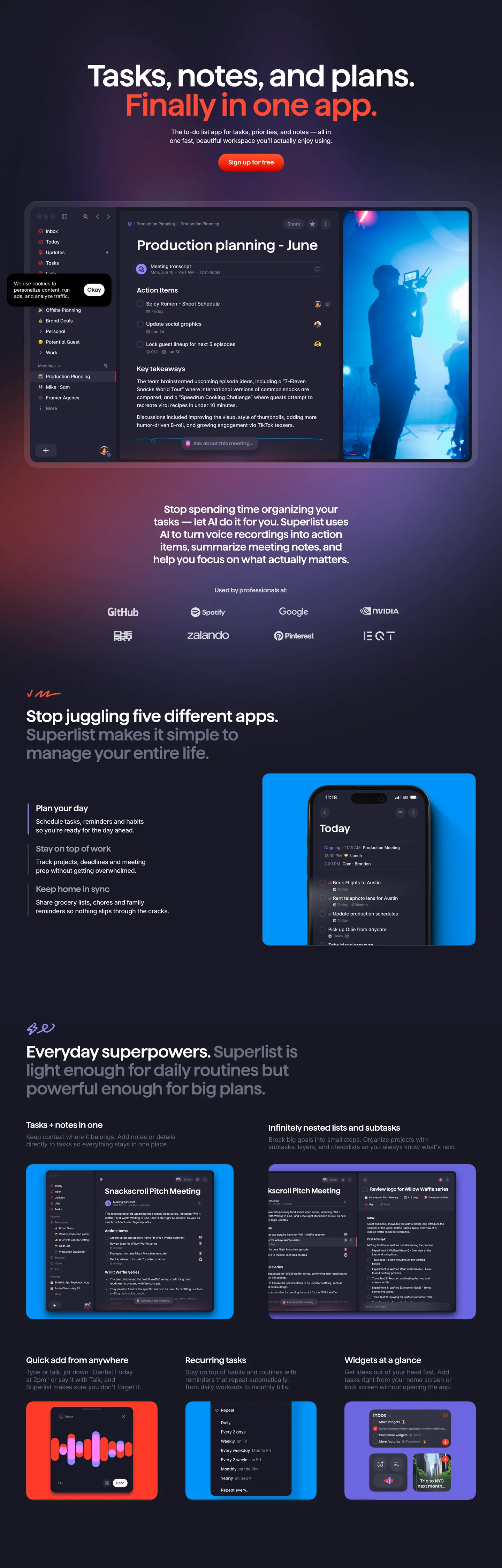
Superlist's marketing site opens with one of the more distinctive typographic moves in the productivity category: the hero h1 is split across two colors and two lines. "Tasks, notes, and plans." renders in white at 88px Haffer XH SemiBold, then "Finally in one app." flips to a saturated tomato-red in the same face and weight. It is the only saturated-text moment in the entire chrome — a single deliberate fracture of the display tier, signaling that the page is a statement rather than a checklist. Where Notion paints its hero in clay-warm whites and Linear sits on graphite, Superlist commits to a midnight-indigo floor at #181824, a near-black that is deliberately purple-shifted rather than blue-shifted or true neutral.
The DESIGN.md file packages the marketing system into a machine-readable spec. Inside: 15 colors tokens led by midnight-indigo canvas at #181824 (38 background occurrences), a tomato-red split-display accent at #ff4a36, a hot-magenta tile fill #f866db, and a citrine yellow at #fbe74e — all of which appear on the product screenshots themselves rather than in the chrome around them. Typography spans five families in measured proportion: Haffer XH SemiBold for every display and heading tier (88px hero, 48px section, 24px sub), Blender Medium as the body workhorse at 16px / 400, Inter for nav and footer at 14px / 400 with -0.07px tracking, Satoshi inside product mockups, and a single Jersey 10 pixel-font cameo at 70px that nods to retro game-text. Radii cluster on 20px (51 of 73 occurrences), with a 100px pill reserved for promotional CTAs. 15 components cover the split-color hero heading, the cobalt sample card, the magenta and yellow tiles, the pill nav buttons, the dark surface card, the recurring-tasks list, the testimonial strip, and the integration logo wall.
Feed this file to Claude or Cursor and the agent reproduces Superlist's specific moves: a purple-shifted near-black canvas instead of true #000000, a split-color display heading with the second line in red, generous 20px corner rounding everywhere except promotional pills, and product screenshots that carry the chromatic load rather than chrome decoration. The one move worth borrowing carefully is the split-color hero — it works because the brand has earned a single saturated accent over a near-monochrome page and uses it once. Multiply it and the entire restraint collapses.
What makes it distinct
5
- Split-color herothe h1 fractures into a white line and a tomato-red second line, the only saturated text moment in the chrome
- Midnight-indigo canvas#181824 carries 38 background occurrences, a deliberately purple-shifted near-black instead of true black or charcoal
- Multi-typeface display systemHaffer XH SemiBold for headlines plus a single Jersey 10 pixel-font cameo at 70px and Blender Medium for body
- Product-as-palettethe screenshots themselves provide the brand chromatic vocabulary (cobalt, magenta, yellow) so the chrome stays nearly monochrome
- Generous 20px corners51 of 73 captured radii sit at 20px, with pill chips at 100px reserved for promotional CTAs
superlist.com
Live at superlist.com
A snapshot of the brand in production. Scroll the frame to see the whole page.
Colors
15 colors
Superlist's system anchors on #26253b (primary) as its primary color. Type is set in Haffer XH SemiBold across 12 tokens from 12px to 88px, weights 400–600. Shape language is soft — components average 36px corner radius, with no sharp interactive edges.
Brand & Accent
Sparing, CTA-only voltage · 8
Surface
Page and card backgrounds · 2
Text
Headlines, body, captions · 4
Borders & Hairlines
Dividers, outlines, rules · 1
Typography
12 type tokens
Set in Haffer XH SemiBold across 12 tokens, from 12px to 88px, weights 400–600. Shown in its own stack: where the font isn't installed, the fallback the file names stands in.
- display-xl88px · weight 600 · lh 83.6px · tracking -1.76pxThe quick brown fox jumps over the lazy dog
- display-lg70px · weight 400 · lh 84px · tracking -1.4pxThe quick brown fox jumps over the lazy dog
- display-md48px · weight 600 · lh 52.8px · tracking -0.96pxThe quick brown fox jumps over the lazy dog
- display-sm30px · weight 600 · lh 36px · tracking -0.6pxThe quick brown fox jumps over the lazy dog
- heading-md24px · weight 400 · lh 28.8px · tracking -0.48pxThe quick brown fox jumps over the lazy dog
- heading-sm18px · weight 400 · lh 27px · tracking -0.27pxThe quick brown fox jumps over the lazy dog
- body-lg18px · weight 500 · lh 25.2px · tracking -0.36pxThe quick brown fox jumps over the lazy dog
- body-md16px · weight 400 · lh 20.8pxThe quick brown fox jumps over the lazy dog
- body-sm14px · weight 400 · lh 18.2px · tracking -0.07pxThe quick brown fox jumps over the lazy dog
- caption12px · weight 400 · lh 14.4pxThe quick brown fox jumps over the lazy dog
- ui-mock16px · weight 500 · lh 19.2pxThe quick brown fox jumps over the lazy dog
- display-pixel70px · weight 400 · lh 63px · tracking -1.4pxThe quick brown fox jumps over the lazy dog
Layout
Radii and spacing
7 corner radii and 10 spacing values. Shape language: soft.
Radii
- none0px
- sm8px
- md10px
- lg20px
- xl38px
- pill100px
- full200px
Spacing
- xxs2px
- xs6px
- sm8px
- base10px
- md16px
- lg20px
- xl30px
- 2xl40px
- 3xl60px
- 4xl64px
Components
15 components
Each rendered from its tokens (color, type, radius, padding) on Superlist's own canvas.
- Hero Heading Whitehero-heading-whiteHero Heading White
- Hero Heading Accenthero-heading-accentHero Heading Accent
- Section Headingsection-headingSection Heading
- Sub Headingsub-headingSub Heading
- Body Paragraphbody-paragraphBody Paragraph
- Body Paragraph Mutedbody-paragraph-mutedBody Paragraph Muted
- Button Primarybutton-primaryButton Primary
- Button Secondarybutton-secondaryButton Secondary
- Top Navtop-navTop Nav
- Nav Linknav-linkNav Link
- Card Darkcard-darkCard Dark
- Card Cobaltcard-cobaltCard Cobalt
- Card Magentacard-magentaCard Magenta
- Card Yellowcard-yellowCard Yellow
- Type here…text-inputText Input
In use
The system, in use
Superlist's tokens on the kind of product it builds.
Build something people actually use.
A short paragraph of marketing copy that previews how the brand's display tier and body tier read together. Two sentences is usually enough.
FAQ
Superlist design system FAQ
Common questions about Superlist's tokens, components, and how to use this DESIGN.md in your project.
Read next
Related reading
Specs, directories, and component libraries that pair with this design system.
- Browse all design systemsThe full directory of DESIGN.md files on shadcn.io, with live mockups for each.shadcn.io
- Superlist — official siteSuperlist's public marketing site — the source of truth for the live tokens captured in this file.superlist.com (opens in a new tab)
- The DESIGN.md specificationGoogle Labs' open spec for machine-readable design system files — the format this page is built on.github.com (opens in a new tab)
Use it
Use Superlist in your project
One machine-readable file. Drop it into Claude, Cursor, or any AI tool that reads DESIGN.md.
Download the DESIGN.md
One machine-readable file: every color, type, radius, spacing, and component token of Superlist.
Feed it to your AI tool
Drop it into Claude, Cursor, or GitHub Copilot. The agent writes React components and Tailwind classes that match Superlist's visual language.
Reference the tokens directly
Or paste the values into your Tailwind config, CSS variables, or component library: every color, size and radius is a quoted, ready-to-copy value.
Read the full DESIGN.md: overview, rationale, do’s and don’ts
Overview
Superlist's marketing site does something few productivity brands attempt. Split-color display. The hero h1 deliberately fractures across two lines and two colors — "Tasks, notes, and plans." renders in white Haffer XH SemiBold at 88px / 600, then "Finally in one app." flips to a saturated tomato-red {colors.accent-red} (#ff4a36) in the same face and weight. Color contrast does the work that a separate weight tier or a typographic accent would normally do. Where Notion paints its hero in clay-warm whites and Linear holds violet over graphite, Superlist commits to a midnight-indigo canvas {colors.canvas} (#181824) — a near-black deliberately shifted into the cool-purple range at OKLCH hue 284 — and trusts a single red phrase to carry the entire chromatic load above the fold.
The page's restraint is reinforced by where the brighter colors actually live. The cobalt-blue panel, hot-magenta tile, citrine-yellow card, and emerald accents that read as Superlist's signature all appear inside the product screenshots themselves rather than as chrome elements. The chrome around them stays nearly monochrome — white display, mid-violet secondary text {colors.ink-muted} (#8e8da0) at 31 occurrences, and the midnight-indigo floor. The brand has externalized its chromatic personality into the product canvas, which is a confident move only available to a team whose product UI is itself visually opinionated.
Typography runs five families in measured proportion. Haffer XH SemiBold carries every display and heading tier from 88px hero to 18px sub-head. Blender Medium handles body copy in the testimonial bands. Inter takes nav and footer duty. Satoshi runs inside the product mockups. And a single Jersey 10 pixel-font cameo at 70px provides one stylistic punctuation moment — a retro game-text reference that telegraphs the brand's playful DNA without compromising the surrounding editorial tone.
Key Characteristics:
- Midnight-indigo canvas
{colors.canvas}(#181824) — purple-shifted near-black, 38 background occurrences. The hue choice (OKLCH 284) is deliberate, not incidental. - Split-color hero h1 — white first line plus tomato-red
{colors.accent-red}(#ff4a36) second line. The only saturated text moment in the captured chrome. - Haffer XH SemiBold across display and heading tiers, with weights restricted to 400 and 600 — no 700+ moment.
- Five typeface system: Haffer XH SemiBold (display), Blender Medium (body), Inter (nav/caption), Satoshi (product mockups), Jersey 10 (single pixel-font cameo).
- Generous 20px default radius — 51 of 73 captured corner values; the rounding scale skips the 4–8px tight tier entirely.
- 100px pill rounding reserved for promotional CTAs; a 200px super-pill appears once on a circular badge.
- Product-as-palette — the cobalt, magenta, yellow, and emerald that signal "Superlist" all live inside the screenshots, not in surrounding chrome.
- 10px and 20px dominate the spacing scale (88 and 72 occurrences respectively), with section padding at 40–60px on the dark canvas.
Colors
Brand
- Accent Red (
{colors.accent-red}— #ff4a36): frequency 2. Used as the second-line text fill in the hero h1 and once as an inline icon. The single saturated-text moment in the captured chrome — Superlist's voltage is spent on one phrase. - Primary (
{colors.primary}— #26253b): frequency 3. A deeper indigo than the page canvas, used as a faint card-on-card surface tone where one elevated dark surface needs to read off the floor.
Surface
- Canvas (
{colors.canvas}— #181824): frequency 40 (38 background, 2 gradient). The page floor — a purple-shifted near-black at OKLCH lightness 0.21 / hue 284, deliberately not true#000000. Lets the saturated product screenshots feel like they belong to the same chromatic family. - Surface-1 (
{colors.surface-1}— #eeeeee): frequency 36 (18 text, 18 border). A near-white used inside the testimonial card and on small avatar borders — the only light surface in the captured chrome.
Text
- Ink (
{colors.ink}— #ffffff): frequency 339 across the captured chrome (166 text, 166 border, 4 shadow). The dominant text color on the dark canvas, used pure white without a muted variant for body display. - Ink Muted (
{colors.ink-muted}— #8e8da0): frequency 62 (31 text, 31 border). Mid-violet secondary text — the perfect compromise tone between the white display and the indigo canvas. Carries small captions, secondary labels, and divider-rule borders. - Ink Secondary (
{colors.ink-secondary}— #696f81): frequency 16. A deeper violet-grey, used inside product mockup text — slightly cooler than{colors.ink-muted}. - Ink Tertiary (
{colors.ink-tertiary}— #535676): frequency 2. Used for very-low-contrast micro labels inside the product UI screenshots.
Hairline
- Hairline (
{colors.hairline}— #000000): frequency 1372 (667 text, 667 border, 37 shadow, 1 background). Pure black is the dominant hairline tone — used as a 1px divider on every white card surface inside the product mockups. The chrome itself sits on midnight indigo, so true black borders only appear inside the product UI canvas.
Product Accents (live inside the screenshots, not the chrome)
- Accent Cobalt (
{colors.accent-cobalt}— #0000ee): frequency 104 (52 text, 52 border). The browser-default hyperlink blue. Used as the nav-link text color and as the fill of the cobalt-blue panel inside the "Production planning - June" screenshot. - Accent Magenta (
{colors.accent-magenta}— #f866db): frequency 32 (16 text, 16 border). The hot-pink tile inside the "Widgets at a glance" screenshot. - Accent Magenta Bright (
{colors.accent-magenta-bright}— #f739f7): frequency 2. A higher-saturation magenta cameo. - Accent Yellow (
{colors.accent-yellow}— #fbe74e): frequency 2. The citrine tile inside the "Recurring tasks" screenshot. - Accent Blue (
{colors.accent-blue}— #2590f1): frequency 2. A second-stop blue inside product mock illustrations. - Accent Emerald (
{colors.accent-emerald}— #22c55e): frequency 2. A status-success green inside product mocks.
Typography
Font Families
The system runs five families, each assigned to a specific surface role rather than to a generic display / body / mono split:
- Haffer XH SemiBold — every display and heading tier. The marketing chrome's dominant voice.
- Blender Medium — body copy in testimonial bands at 16px / 400.
- Inter — nav links, small captions, and footer text.
- Satoshi — text inside product UI screenshots at 16px / 500.
- Jersey 10 — a single 70px pixel-font cameo, used once as a stylistic punctuation moment.
Fallback chains walk to system-ui, sans-serif for the sans families and to monospace for Jersey 10.
Hierarchy
| Token | Size | Weight | Line Height | Letter Spacing | Use |
|---|---|---|---|---|---|
{typography.display-xl} | 88px | 600 | 83.6px | -1.76px | Hero h1 (both white and red lines) |
{typography.display-lg} | 70px | 400 | 84px | -1.4px | Tertiary display, captured once |
{typography.display-md} | 48px | 600 | 52.8px | -0.96px | Section h2 ("Everyday superpowers.", "Stop juggling five different apps.") |
{typography.display-sm} | 30px | 600 | 36px | -0.6px | Smaller section h3 |
{typography.heading-md} | 24px | 400 | 28.8px | -0.48px | Sub-heads on dark cards |
{typography.heading-sm} | 18px | 400 | 27px | -0.27px | Tertiary card heads |
{typography.body-lg} | 18px | 500 | 25.2px | -0.36px | Lead paragraphs, button labels |
{typography.body-md} | 16px | 400 | 20.8px | 0 | Default running text (Blender Medium) |
{typography.body-sm} | 14px | 400 | 18.2px | -0.07px | Nav links, footnotes (Inter) |
{typography.caption} | 12px | 400 | 14.4px | 0 | Micro-labels |
{typography.ui-mock} | 16px | 500 | 19.2px | 0 | Text inside product UI screenshots (Satoshi) |
{typography.display-pixel} | 70px | 400 | 63px | -1.4px | One-time Jersey 10 pixel-font cameo |
Principles
Display weights stay at 400 and 600 — no 700+ tier exists. The hero h1 at 88px / 600 is the loudest typographic moment in the system. Negative tracking scales with size: -1.76px on the 88px hero, -0.96px on the 48px section h2, -0.27px on the 18px sub-head. The hero's split-color treatment substitutes for what a typical SaaS system would do with a weight contrast or a typographic decoration — Superlist uses color alone to mark the resolution clause.
Note on Font Substitutes
Haffer XH SemiBold is a commercial release from Displaay. General Sans (free from Indian Type Foundry) is the closest open substitute at the same weights; its slightly looser counters read close to Haffer XH at body sizes, though the optical correction at 88px display is noticeably different. Blender Medium has no obvious open replacement — Inter Medium is the practical fallback. Satoshi is free from Indian Type Foundry and can be used directly. For the Jersey 10 cameo, VT323 or Pixelify Sans transfer the pixel-text feel.
Layout
Spacing System
- Base unit: 10px (the dominant gap at 88 occurrences), with 20px (72 occurrences) as the secondary module. The system runs on a 10/20 cadence rather than the 4/8 dominant in most dev-tools brands.
- Tokens:
{spacing.xxs}2px ·{spacing.xs}6px ·{spacing.sm}8px ·{spacing.base}10px ·{spacing.md}16px ·{spacing.lg}20px ·{spacing.xl}30px ·{spacing.2xl}40px ·{spacing.3xl}60px ·{spacing.4xl}64px. - Section padding (vertical): ~60px between major bands on the indigo canvas.
- Card internal padding:
{spacing.lg}(20px) on the dark surface cards;{spacing.2xl}(40px) on the testimonial strip. - Hero padding: 40px horizontal, ~80px vertical — the split-color h1 sits roughly centered with the CTA pill directly beneath.
Grid & Container
- Max content width: ~1280px on the hero and product-screenshot bands.
- Hero block: centered single-column with the split-color h1 stacked above the sub-paragraph and a "Get Started" pill CTA.
- Logo wall: a single-row "Stop spending time organizing your tasks — let us do it for you. Superlist uses AI to turn voice recordings into action items, summarize meeting notes, and help you focus on what actually matters." band sits above a 5-column row of integration logos (GitHub, Slack, Google, Outlook, Linear).
- Product screenshot bands: 2-column 50/50 splits pairing a phone or desktop product mockup with explanatory text. Each mockup carries its own embedded color palette (cobalt panel, magenta tile, yellow card).
- Three-up feature row: "Quick and fast voicenotes / Recurring tasks / Widgets at a glance" — three product cards in a row beneath the "Everyday superpowers." section heading.
Rhythm
The page alternates between dark-canvas editorial bands (display heading + body paragraph, no surface fill) and product-screenshot bands (chromatic mockups breaking the monochrome floor). Section breaks are marked by 60px vertical padding rather than by background-color shifts. There is no atmospheric gradient anywhere — every section terminates on the same indigo floor, and chromatic interest comes from the product mockups themselves.
Elevation
The system has essentially no shadow tier on the dark canvas. The chrome runs flat — display headings, body paragraphs, and section headings all sit directly on the indigo floor with no card surface around them.
- Flat (no shadow): hero, body bands, testimonial strip, integration logo wall — 95% of the chrome.
- Product-screenshot lift: the embedded mock product cards (cobalt, magenta, yellow) sit as flat
{rounded.lg}(20px) tiles on the indigo canvas. They read as elevated through saturation contrast rather than through any drawn shadow. - Inside-product shadows: within the product UI mockups themselves there is a small set of 1px hairline borders and faint drop-shadows on individual list-item rows — but these belong to the captured product UI, not to the marketing chrome.
The marketing surface trusts surface-color contrast (indigo floor vs. saturated product tiles) to carry every elevation cue.
Shapes
The radius scale is generous-soft, dominated by a single 20px value:
{rounded.none}0px — used on full-bleed photographic blocks.{rounded.sm}8px — frequency 11. Small UI surfaces inside product mocks.{rounded.md}10px — frequency 6. Inputs and small chips.{rounded.lg}20px — frequency 51. The dominant radius — used on every dark surface card, every product-screenshot tile, the testimonial strip, and the cobalt/magenta/yellow product mock surfaces.{rounded.xl}38px — frequency 1. A single larger softness used on one feature surface.{rounded.pill}100px — frequency 4. Promotional CTA pills (the hero "Get Started" button and the "Subscribe" CTA in the footer).{rounded.full}200px — frequency 1. A single super-rounded circular badge.
The scale skips the 4px tight tier and the 12 / 14 / 16px middle tier almost entirely — the system is binary, 8px on small surfaces or 20px everywhere else, with pills reserved for the two warmest CTAs on the page.
Components
hero-heading-white — White {colors.ink} text on the transparent indigo hero, {typography.display-xl} (88px / 600 / -1.76px). The first line of the split-color h1 ("Tasks, notes, and plans.").
hero-heading-accent — Tomato-red {colors.accent-red} (#ff4a36) text in the same {typography.display-xl} token. The second line of the split-color h1 ("Finally in one app."). The component pair is what makes the hero distinctive; rendering them as a single h1 fill would lose the entire move.
section-heading — White text, {typography.display-md} (48px / 600). Used for "Everyday superpowers.", "Stop juggling five different apps.", and section-band openers.
sub-heading — White text, {typography.heading-md} (24px / 400). Used on dark card titles and product-screenshot captions.
body-paragraph — White text at {typography.body-md} (Blender Medium 16px / 400). Default running text in testimonial bands.
body-paragraph-muted — Mid-violet {colors.ink-muted} text at {typography.body-sm} for secondary labels and footnotes.
button-primary — Tomato-red {colors.accent-red} fill, white text, {rounded.pill} 100px radius, 10x20 padding, 44px height. The "Get Started" pill in the hero — the only saturated CTA in the captured chrome.
button-secondary — Transparent fill, white text, 1px white border, {rounded.pill} radius. Reserved for tertiary actions.
top-nav — Indigo {colors.canvas} surface, 60px height, 20x40 padding. Houses the Superlist wordmark flush-left, product links centered, and "Sign in" / "Get Started" cluster flush-right.
nav-link — Cobalt-blue {colors.accent-cobalt} text at {typography.caption} (12px / 400). The hyperlink color is the saturated cobalt #0000ee — a deliberate choice that echoes the browser-default unstyled <a> color and gives the nav a distinctive web-native voltage.
card-dark — Indigo {colors.canvas} fill, white text, {rounded.lg} 20px radius, 20px internal padding. The default card surface in product-screenshot bands.
card-cobalt — Cobalt-blue {colors.accent-cobalt} fill, white text, {rounded.lg} radius. The bright-blue panel inside the "Production planning - June" hero screenshot.
card-magenta — Hot-pink {colors.accent-magenta} fill, white text, {rounded.lg} radius. The "Widgets at a glance" tile.
card-yellow — Citrine {colors.accent-yellow} fill, indigo text, {rounded.lg} radius. The "Recurring tasks" tile. The text color flips to dark on the yellow surface for contrast.
text-input — Indigo fill, white text, {rounded.md} 10px radius, 10x16 padding, 40px height, 1px {colors.ink-tertiary} border.
Do's and Don'ts
Do treat the split-color hero as a single deliberate fracture. The white-then-red two-line h1 is the system's signature move; multiplying it into three or more color shifts inside the headline would dilute the resolution clause and turn the editorial gesture into chromatic noise.
Do keep the canvas at the purple-shifted {colors.canvas} (#181824) rather than true black or a charcoal. The OKLCH hue 284 is the value that lets the saturated product screenshots feel like they belong; a neutral near-black would make those colors read as pasted-on.
Do put the chromatic load inside the product screenshots. Cobalt, magenta, yellow, and emerald all live inside the captured UI mocks — promoting them to chrome decoration would compete with the product itself and break the "product-as-palette" discipline.
Do restrict Haffer XH SemiBold to weights 400 and 600. The system has no 700+ moment; bumping the display to 800 turns the editorial dek into a generic enterprise hero and undercuts the playful Wunderlist-team DNA.
Don't swap the indigo canvas for pure #000000. True black flattens the contrast with the saturated product mockups and removes the violet undertone that ties the chromatic system together.
Don't use the tomato-red {colors.accent-red} (#ff4a36) anywhere outside the hero second line. It is a single-purpose accent — promoting it to a status-error tone or a CTA fill would over-spend the system's only saturated text moment.
Don't introduce a 4 / 12 / 14 / 16px middle radius tier. The shape system is binary — 8px on small surfaces or 20px on cards, with a 100px pill reserved for CTAs. A middle radius would soften the contrast between surface tiles and pill buttons.
Don't style nav links to a brand neutral. The cobalt-blue {colors.accent-cobalt} (#0000ee) link color is the browser-default hyperlink hue — Superlist surfaces it deliberately as a web-native signal. Restyling it to white or muted-grey loses the deliberate browser-default reference.
Known Gaps
- Hover and focus states: the captured page does not expose interactive-state styling for the primary or secondary buttons. The full state matrix (focus ring, disabled tint, press state) is not represented.
- Light mode: the marketing surface is dark-only. Superlist's product (web, iOS, Android, Mac) ships a light theme but it is not exposed on the marketing chrome.
- Form input error states:
{component.text-input}carries the resting state for the footer newsletter / sign-up field; error and validation styling lives inside the product UI. - Motion: the hero and product-screenshot bands include scroll-driven entrance animations and product UI demos that loop, but the spec captures end-state values only.
- Product surfaces: this DESIGN.md captures the marketing site only. The Superlist application (web
app.superlist.comand native clients) carries a richer token system — list view chrome, command palette, integration cards, calendar view — that is not represented here. - Pricing page chrome: the captured page is the marketing landing only; the
/pricingpage and the AI feature deep-dives use their own card layouts that are not extracted. - Jersey 10 placement: the single 70px pixel-font cameo is captured as a typography token but its exact in-page context is not documented; treat it as an opt-in stylistic punctuation rather than a recurring tier.
Productivity & SaaS
More systems like this
More DESIGN.md files in Productivity & SaaS.
Pricing
Build it with Pro
The DESIGN.md files are free. Pro adds 6,000+ blocks, premium templates and the MCP server, so your AI editor builds in your system for you.
4.9/5 out of 5 · 150+ reviewsfrom 150+ founders and developers.
Billing
Billed once a year in USD. Cancel anytime.
- How many people can use the license.
- Client work, SaaS products and anything you charge for.
- Production-ready React sections: hero, pricing, features, dashboards and more.
- Complete multi-page sites you can ship as they are.
- React icons from every major library, installable with one command.
- Presets that restyle every block, in light and dark.
- Lets your AI editor search, preview and install blocks for you.
- Priority requests are answered first.
Individual
For personal projects & open source
$32instead of $49/mo
$389 billed yearly
- Seats: 1 seat
- Commercial use: Personal & open source only
- Pro blocks: 6,000+ blocks
- Templates: All 14 templates
- React icons: 294k+ icons
- Themes: All 59 themes
- MCP server: Basic usage
- Support: Standard
Team
Most popularFor freelancers, agencies & startups
$66instead of $99/mo
$789 billed yearly · ≈ $13/dev/mo
- Seats: Up to 5 seats
- Commercial use: Included
- Pro blocks: 6,000+ blocks
- Templates: All 14 templates
- React icons: 294k+ icons
- Themes: All 59 themes
- MCP server: High usage
- Support: Priority
Organization
For companies with larger teams
$132instead of $199/mo
$1,589 billed yearly
- Seats: Unlimited seats
- Commercial use: Included
- Pro blocks: 6,000+ blocks
- Templates: All 14 templates
- React icons: 294k+ icons
- Themes: All 59 themes
- MCP server: Unlimited usage
- Support: Priority
Billed once a year in USD. Cancel anytime.
Individual
For personal projects & open source
$32instead of $49/mo
$389 billed yearly
- How many people can use the license.Seats: 1 seat
- Client work, SaaS products and anything you charge for.Commercial use: Personal & open source only
- Production-ready React sections: hero, pricing, features, dashboards and more.Pro blocks: 6,000+ blocks
- Complete multi-page sites you can ship as they are.Templates: All 14 templates
- React icons from every major library, installable with one command.React icons: 294k+ icons
- Presets that restyle every block, in light and dark.Themes: All 59 themes
- Lets your AI editor search, preview and install blocks for you.MCP server: Basic usage
- Priority requests are answered first.Support: Standard
Team
Most popularFor freelancers, agencies & startups
$66instead of $99/mo
$789 billed yearly · ≈ $13/dev/mo
Everything in Individual, plus
- How many people can use the license.Seats: Up to 5 seats
- Client work, SaaS products and anything you charge for.Commercial use: Included
- Lets your AI editor search, preview and install blocks for you.MCP server: High usage
- Priority requests are answered first.Support: Priority
Organization
For companies with larger teams
$132instead of $199/mo
$1,589 billed yearly
Everything in Team, plus
- How many people can use the license.Seats: Unlimited seats
- Lets your AI editor search, preview and install blocks for you.MCP server: Unlimited usage
- Secure checkout via Stripe
- Code lives in your repo
- Keep what you've shipped if you cancel
- License terms
Your system, built for you
Every block, template and icon, installed by your AI agent in your design system. The DESIGN.md files stay free.