Skip to content

Beehiiv Design System

Beehiiv's marketing system pairs uppercase Clash Grotesk display with Satoshi body on a near-black violet canvas, an indigo CTA pill, and a magenta gradient that paints only the last word of the hero. Tokens for React, Next.js, and AI coding tools.

Add shadcn.io to your AI agent. · Pro It installs blocks, icons and templates in your design system from a prompt, with Pro.

Set up MCP
Primary
#2f39ba
Typeface
Satoshi
Shape
Mixed
Base radius
6px
Colors
18
Type tokens
11
Components
17
Spacing values
10

About

About Beehiiv DESIGN.md

Curated by Dov Azencot · Updated May 18, 2026 · Source beehiiv.com (opens in a new tab)

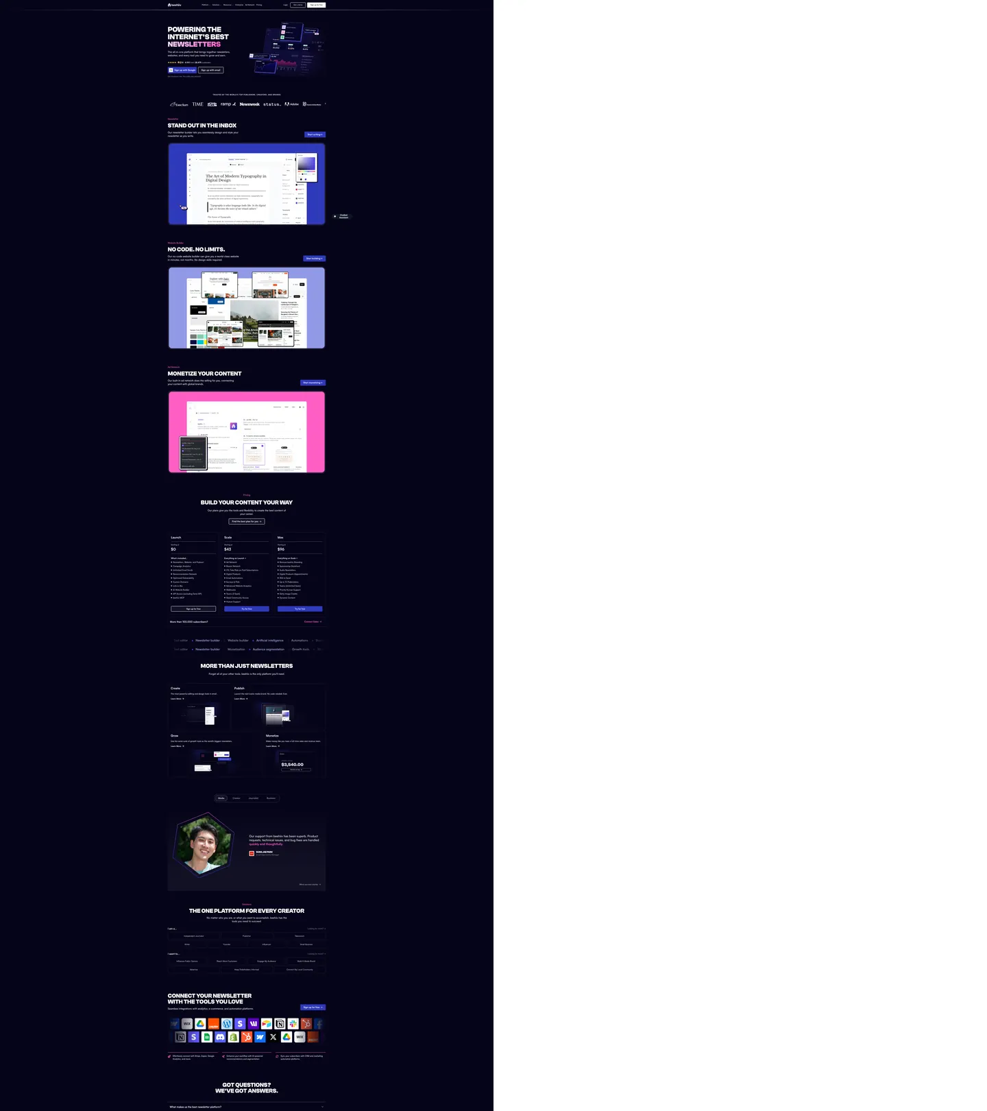
Beehiiv's marketing site is a creator-economy product wearing operator chrome. The page floor is a near-black violet — a deep indigo-black rather than pure black or charcoal — and the hero stacks an all-caps Clash Grotesk headline ("POWERING THE INTERNET'S BEST NEWSLETTERS") at 60px weight 700 in white, with only the final word fading from white into magenta via a left-to-right gradient. The CTA below it is an electric indigo pill, not the magenta the gradient introduces. Where Substack keeps its marketing surface on warm white with an unbordered serif column, and where ConvertKit leans on creator portraits over pastel washes, Beehiiv builds a control-panel aesthetic on a dark canvas and uses two distinct saturated tones to split the work — indigo for action, magenta for emphasis.

The DESIGN.md file packages the system into a machine-readable spec for React and AI coding tools. Inside: 18 colors tokens organized into a violet-canvas surface ladder (page floor at near-black, surface-1 and surface-2 a half-step lighter), a two-color brand voltage (indigo for button fills, magenta for gradient highlights), and a small structural set for ink, ink-muted, and disabled text. 11 typography tokens split across Clash Grotesk (display only, uppercase, 48-60px weight 700) and Satoshi (everything else, 14-24px weights 400-700). 6 corner-radius tokens centered on a 6px default — 70 occurrences of 6px in the captured page, with a small 12px tier for larger panels and a full pill for the hero CTA. 17 components cover the hero block, the indigo pill CTA, the dark hairline-edged product card, the pricing column, the logo strip, the FAQ accordion, and the testimonial card.

Feed this file to Claude or Cursor and it reproduces Beehiiv's specific moves: near-black violet canvas rather than pure black, two-voltage split between indigo and magenta with each scoped to a single role, uppercase Clash Grotesk display anchoring every section heading, Satoshi across body and button, and hairline-edged cards with no shadow tier. The token references resolve cleanly so the AI never has to guess a value. The one move worth borrowing only with deliberate intent: the split-voltage discipline. Most marketing systems collapse to a single accent; Beehiiv's two-color split works because each tone has exactly one job and never trades places.

What makes it distinct

5

  1. Split-voltage heroan electric indigo CTA pill carries the action, while magenta only colors the gradient on the final hero word, dividing what most platforms collapse into one accent
  2. Uppercase Clash Grotesk displaythe hero h1 and every section h2 render in all-caps Clash Grotesk weight 700 at 48-60px, the loudest typographic move on the page
  3. Two-typeface splitClash Grotesk for display only, Satoshi for nav, body, button, and label across the entire page below the hero
  4. Near-black violet canvasthe page floor is a deep blue-black at near-black, not pure black, with surface tiles lifted by 25-point lightness contrast
  5. Hairline-on-dark cardsevery card uses white-at-low-alpha borders (frequency 598), zero shadow tier, since shadows do not read on the violet floor across the captured surface

beehiiv.com

Live at beehiiv.com

A snapshot of the brand in production. Scroll the frame to see the whole page.

Beehiiv's website at beehiiv.com

Colors

18 colors

Beehiiv's system runs on #2f39ba as its primary voltage, used in 1 of 17 components. Type is set in Satoshi across 11 tokens from 14px to 60px, weights 400–700. Shape language is mixed across 17 components, blending pills, soft rounds, and squarer corners.

Brand & Accent

Sparing, CTA-only voltage · 3

Surface

Page and card backgrounds · 3

Text

Headlines, body, captions · 5

Borders & Hairlines

Dividers, outlines, rules · 2

Other

Specialty colors · 5

Typography

11 type tokens

Set in Satoshi across 11 tokens, from 14px to 60px, weights 400–700. Shown in its own stack: where the font isn't installed, the fallback the file names stands in.

  • display-xl60px · weight 700 · lh 60pxThe quick brown fox jumps over the lazy dog
  • display-lg48px · weight 700 · lh 48pxThe quick brown fox jumps over the lazy dog
  • display-outline60px · weight 400 · lh 60pxThe quick brown fox jumps over the lazy dog
  • heading-lg24px · weight 700 · lh 32pxThe quick brown fox jumps over the lazy dog
  • heading-md20px · weight 600 · lh 28pxThe quick brown fox jumps over the lazy dog
  • heading-sm18px · weight 700 · lh 28pxThe quick brown fox jumps over the lazy dog
  • body-lg24px · weight 500 · lh 32pxThe quick brown fox jumps over the lazy dog
  • body-md16px · weight 400 · lh 24pxThe quick brown fox jumps over the lazy dog
  • body-sm14px · weight 400 · lh 20pxThe quick brown fox jumps over the lazy dog
  • label-md14px · weight 500 · lh 20pxThe quick brown fox jumps over the lazy dog
  • button-md16px · weight 500 · lh 24pxThe quick brown fox jumps over the lazy dog

Layout

Radii and spacing

8 corner radii and 10 spacing values. Shape language: mixed.

Radii

  • none0px
  • xs2px
  • sm4px
  • md6px
  • lg8px
  • xl12px
  • 2xl24px
  • full9999px

Spacing

  • xs4px
  • sm8px
  • md10px
  • base12px
  • lg16px
  • xl20px
  • 2xl24px
  • 3xl32px
  • 4xl40px
  • 5xl64px

Components

17 components

Each rendered from its tokens (color, type, radius, padding) on Beehiiv's own canvas.

  • Hero Section
    hero-sectionHero Section
  • Hero Heading
    hero-headingHero Heading
  • Section Heading
    section-headingSection Heading
  • Body Paragraph
    body-paragraphBody Paragraph
  • Body Paragraph Emphasis
    body-paragraph-emphasisBody Paragraph Emphasis
  • Eyebrow Label
    eyebrow-labelEyebrow Label
  • Button Primary
    button-primaryButton Primary
  • Button Primary Hover
    button-primary-hoverButton Primary Hover
  • Button Secondary
    button-secondaryButton Secondary
  • Top Nav
    top-navTop Nav
  • Nav Link
    nav-linkNav Link
  • Card Hairline
    card-hairlineCard Hairline
  • Pricing Column
    pricing-columnPricing Column
  • Category Tab
    category-tabCategory Tab
  • Category Tab Active
    category-tab-activeCategory Tab Active
  • Testimonial Card
    testimonial-cardTestimonial Card
  • Type here…
    text-inputText Input

In use

The system, in use

Beehiiv's tokens on the kind of product it builds.

Build something people actually use.

A short paragraph of marketing copy that previews how the brand's display tier and body tier read together. Two sentences is usually enough.

Get startedLearn more
Marketing heroHeadline, sub-copy, primary CTA — the universal homepage opener.
Reporting · 14 min read

The quiet collapse of an old idea

For decades the consensus held that the system would correct itself. Then it didn't. This is the inside story of what changed, told by the people who watched it unravel.

"Nobody noticed because the failure was indistinguishable from progress."

By Sam Reporter · Updated 2 hours ago

Editorial articleMagazine-style longform with display headline.

FAQ

Beehiiv design system FAQ

Common questions about Beehiiv's tokens, components, and how to use this DESIGN.md in your project.

Read next

Specs, directories, and component libraries that pair with this design system.

Use it

Use Beehiiv in your project

One machine-readable file. Drop it into Claude, Cursor, or any AI tool that reads DESIGN.md.

Download DESIGN.md
  1. Download the DESIGN.md

    One machine-readable file: every color, type, radius, spacing, and component token of Beehiiv.

  2. Feed it to your AI tool

    Drop it into Claude, Cursor, or GitHub Copilot. The agent writes React components and Tailwind classes that match Beehiiv's visual language.

  3. Reference the tokens directly

    Or paste the values into your Tailwind config, CSS variables, or component library: every color, size and radius is a quoted, ready-to-copy value.

Read the full DESIGN.md: overview, rationale, do’s and don’ts

Overview

Beehiiv's marketing site is a creator-economy product wearing operator chrome. Split voltage: where Substack collapses its system into a single warm orange and ConvertKit holds a single coral pink across CTAs and emphasis alike, Beehiiv splits the work between two saturated tones. An electric indigo ({colors.primary} — #2f39ba) fills every primary CTA pill — the hero "Sign up with Google" button, the pricing "Try for free" buttons, the "Sign up for free" footer CTA. A hot magenta ({colors.secondary} — #ff5ec4) never fills a button; it appears only as the gradient endpoint that paints the final word of the hero headline ("LETTERS") and as text-accent for the section eyebrow labels above each h2. The split is the system's defining typographic and chromatic move: indigo signals where to click, magenta signals where to read.

The canvas is a near-black violet ({colors.canvas} — #060419), not pure black. Where Linear sits on a violet-graphite ladder and Vercel sits on matte black, Beehiiv shifts the undertone toward indigo so the page floor coheres with the brand voltage rather than reading as a developer-tools surface. Surface tiles ride 30-50 points lighter ({colors.surface-1} — #0b0d2a, {colors.surface-2} — #15194f), lifted off the floor by tonal contrast and a thin white-alpha hairline border rather than by any shadow. The captured page has only 6 shadow occurrences across 2730 scanned elements — depth is a surface-ladder job, not a shadow-stack one.

The typographic split is bicameral: Clash Grotesk at 48-60px in weight 700, all-caps, for the hero h1 and every section h2 — and Satoshi at 14-24px in weights 400-700 for nav, body, button, label, and footer. There is no third family. The Clash uppercase display is loud — 60px / weight 700 is the heaviest typographic moment in the entire 71-entry directory — and the Satoshi body is correspondingly quiet at weight 400. The contrast is deliberate: shouting headlines bracketing whispered body, with the magenta gradient acting as a single chromatic punctuation on the hero word.

Key Characteristics:

  • Split-voltage discipline: indigo ({colors.primary}) carries 100% of CTA fills; magenta ({colors.secondary}) carries 100% of gradient highlights and eyebrow labels. Neither color does the other's job.
  • Near-black violet canvas ({colors.canvas} — #060419) — indigo-tinted dark rather than pure black or charcoal, coheres with the brand voltage.
  • All-caps Clash Grotesk display: 60px / weight 700 hero h1, 48px / weight 700 section h2. No title-case display anywhere.
  • Satoshi for everything below display tier — nav, body, button, label, pricing-feature list, footer.
  • Surface ladder of three violets: page floor at #060419, surface-1 at #0b0d2a, surface-2 at #15194f — depth comes from lightness gaps of 25-50 points.
  • Hairline borders dominate the card chrome: 598 of 825 captured borders are white-at-low-alpha ({colors.hairline} rendered through the --border-subtle, --border-default, and --border-strong variables at 6%, 12%, and 20% alpha).
  • Radius scale clustered at 6px (70 captured) plus 12px for larger panels (18) and full pill for the CTA (9). No 16px or 20px middle tier.
  • Two-color secondary palette beyond the magenta — a soft pink ({colors.tertiary-soft} — #ffc8eb) and a hot pink ({colors.tertiary} — #f092dd) appear inside the "Monetize Your Content" section's bright-pink illustration band, the single warm interruption in the otherwise dark page.

Colors

Brand

  • Indigo Primary ({colors.primary} — #2f39ba): frequency 23. Used as background (8), border (8), gradient (6), text (1). Wired in CSS as --button-primary-fill, --border-accent-blue, --border-fusion-blue. The action voltage — every primary CTA pill on the page fills with this exact value, never with the magenta. The split between indigo-for-action and magenta-for-emphasis is the system's defining discipline.
  • Indigo Hover ({colors.primary-hover} — #2a33a3): wired as --button-primary-fill-hover. One step darker than the resting indigo; absent from the captured static render but declared in the CSS variable graph.
  • Indigo Pressed ({colors.primary-pressed} — #20288c): wired as --button-primary-fill-pressed. The press-state variant — darker still — also absent from the static capture.
  • Magenta ({colors.secondary} — #ff5ec4): frequency 17. Used as gradient (7), text (7), border (3). Wired as --button-accent-fill, --text-accent-pink, --border-flamingo. The emphasis voltage — paints the gradient endpoint on the hero's final word ("LETTERS") and the eyebrow label above each section h2. Despite the --button-accent-fill variable name, the captured marketing surface never renders magenta as a button background.
  • Magenta Hover ({colors.secondary-hover} — #e040a8): wired as --button-accent-fill-hover. Declared as a hover-state variant; not rendered in the captured static surface.
  • Pink Bright ({colors.tertiary} — #f092dd): frequency 11, all as background. Fills the "Monetize Your Content" illustration band — the single warm rectangular interruption in the otherwise dark page. A lighter, less saturated cousin of the magenta voltage.
  • Pink Soft ({colors.tertiary-soft} — #ffc8eb): frequency 11, all as background. The companion pastel that pairs with the bright pink inside the monetize illustration.

Surface

  • Canvas ({colors.canvas} — #060419): frequency 12, used as background (9). Wired as --surface-page and --button-accent-text. The page floor — a near-black violet, not pure black. The undertone keeps the surface from reading as developer-tools chrome.
  • Surface-1 ({colors.surface-1} — #0b0d2a): frequency 26, used as background (4), border (22). Wired as --surface-1 and --surface-2. The first elevated surface — pricing columns, testimonial cards, FAQ accordion panels.
  • Surface-2 ({colors.surface-2} — #15194f): frequency 4, used as border (4). Wired as a custom property absent from the visible page name list. The second elevated tier — used for active category tabs and selected pricing columns.

Text

  • Ink ({colors.ink} — #ffffff): frequency 302 as text (292). Wired as --text-primary, --button-primary-text, --border-strong. The dominant text color — every heading, every primary body paragraph, every button label. Pure white on the near-black violet floor.
  • Ink Muted ({colors.ink-muted} — #c4c2d6): frequency 16. Wired as --text-tertiary. Used for secondary body copy, the pricing-column feature list, and the footer category sub-labels.
  • Ink Tertiary ({colors.ink-tertiary} — #9d9db8): frequency 11. The third text tier — caption rows, supporting metadata under cards, the "More than 100,000 subscribers?" enterprise upsell row.
  • Ink Disabled ({colors.ink-disabled} — #4e4e6c): frequency 27, all as border. Wired as --text-disabled. Used despite the variable name as a hairline-strong border tone for disabled inputs and inactive category tabs.
  • Ink Link ({colors.ink-link} — #b3b8f0): frequency 7. Wired as --text-accent-lavender and --button-link-text-hover. The hover-state link color — a pale lavender that picks up the violet canvas undertone.

Hairlines

  • Hairline ({colors.hairline} — #ffffff at low alpha): frequency 598 as border. Rendered through the --border-subtle, --border-default, and --border-strong CSS variables at 6%, 12%, and 20% alpha respectively. The single dominant border tone on the dark canvas — white-with-alpha is the only border color that reads softly without disappearing against the violet floor.
  • Hairline Strong ({colors.hairline-strong} — #393a5a): frequency 1 as border. The opaque hairline alternative — appears once on the captured page, reserved for borders that need to read as a deliberate edge rather than a soft separation.

Shadow

  • Shadow ({colors.shadow} — #000000): frequency 6 as shadow ink. Used for the single subtle elevation on the indigo CTA pill and on a small number of dropdowns. The system has essentially no shadow tier — depth is a surface-ladder job.

Typography

Font Families

The system runs two voices: Clash Grotesk for display only (hero h1 and section h2, all-caps, 48-60px, weight 700) and Satoshi for nav, body, button, label, and footer (14-24px, weights 400-700). Clash declares with the fallback stack "ClashGroteskFont Fallback", sans-serif; Satoshi declares with "SatoshiFont Fallback", system-ui, -apple-system, Roboto, Arial, sans-serif. Neither typeface ever crosses into the other's tier — display is never Satoshi, body is never Clash.

The pairing reads as a creator-tools brand rather than a publishing one: Clash's compressed condensed proportions in uppercase give the page a bulletin-board or zine register, while Satoshi's modest geometric body sits closer to a software-tool sans (Inter, General Sans) than to a publishing serif. The split divides the labor cleanly — Clash shouts, Satoshi explains.

Hierarchy

TokenSizeWeightLine HeightUse
{typography.display-xl}60px70060pxHero h1 — uppercase, "POWERING THE INTERNET'S BEST NEWSLETTERS"
{typography.display-lg}48px70048pxSection h2 — uppercase, "STAND OUT IN THE INBOX", "NO CODE. NO LIMITS.", "BUILD YOUR CONTENT YOUR WAY"
{typography.display-outline}60px40060pxOutline / lighter Clash variant — appears in the gradient-text treatment on the final hero word
{typography.heading-lg}24px70032pxSub-section heading, pricing-column title
{typography.heading-md}20px60028pxCard title inside the "More Than Just Newsletters" grid
{typography.heading-sm}18px70028pxFeature-cell title
{typography.body-lg}24px50032pxTestimonial body, hero sub-paragraph
{typography.body-md}16px40024pxDefault running text, pricing feature-list items
{typography.body-sm}14px40020pxCaption, footnote, FAQ collapsed-state subtitle
{typography.label-md}14px50020pxEyebrow label above each section h2 (rendered in magenta)
{typography.button-md}16px50024pxPrimary and secondary button labels

Principles

Display weight is the maximum the system reaches — 700. The hero h1 at 60px / weight 700 in all-caps Clash is the loudest typographic moment in the directory; the section h2s drop to 48px but hold the weight and the all-caps treatment. There is no title-case display tier anywhere. Body weight is correspondingly modest — most running paragraphs sit at weight 400 with the only emphasis variant at weight 500 for labels and buttons. The contrast between display weight 700 and body weight 400 is the wider gap most marketing systems avoid; Beehiiv leans into it to make the headlines do the chromatic and structural work that color and decoration would otherwise have to.

The eyebrow label above each section h2 — "Editor", "Website Builder", "Ad Network" — renders in magenta {colors.secondary} at Satoshi 14px / 500. This is the single typographic context where magenta does work as text; it cues the reader that an h2 is about to land below. The magenta-eyebrow-then-Clash-h2 stack is the page's repeating section anchor.

Note on Font Substitutes

Both typefaces are licensed. The closest open-source substitute for Clash Grotesk at the display tier is Bebas Neue at slightly tighter tracking, or General Sans Variable at the same weight in uppercase. Satoshi has no perfect free analog — Inter at weights 400 and 500 transfers most cleanly across the body, button, and label tiers; General Sans is closer in feel but is also licensed.

Layout

Spacing System

  • Base unit: 8px — the dominant gap value, appearing 43 times in the captured page. 16px appears 55 times as a padding value, making it the dominant card-internal padding.
  • Tokens: {spacing.xs} 4px · {spacing.sm} 8px · {spacing.md} 10px · {spacing.base} 12px · {spacing.lg} 16px · {spacing.xl} 20px · {spacing.2xl} 24px · {spacing.3xl} 32px · {spacing.4xl} 40px · {spacing.5xl} 64px.
  • Section padding (vertical): 96px on the hero band (96px 128px captured 5 times); ~64px between major sections below the fold.
  • Card internal padding: {spacing.2xl} (24px) for {component.card-hairline} and pricing columns; {spacing.4xl} (40px) for the testimonial card.
  • Button padding: {spacing.sm} (8px) vertical, {spacing.2xl} (24px) horizontal — the captured 8px 24px pattern appears 13 times.

Grid & Container

  • Max content width: ~1120px on the hero (with the indigo dashboard mockup occupying the right column), ~1120px on the pricing 3-column row, ~960px on the "More Than Just Newsletters" 2x2 grid.
  • Hero block: 2-column split — left column carries the eyebrow ("4.7 / 5 stars · 16,672 reviews"), the all-caps Clash headline, the Satoshi sub-paragraph, and the dual CTA stack (indigo "Sign up with Google" + outlined "Sign up with email"); right column holds the indigo-tinted product screenshot.
  • Pricing strip: 3-column equal-width grid — Launch ($0), Scale ($43), Max ($96) — with each column on the same {colors.surface-1} panel.
  • Logo wall: single-row horizontal strip rendered in monochrome white above the "STAND OUT IN THE INBOX" section.
  • Integration grid: 2-row icon grid below the "CONNECT YOUR NEWSLETTER" header — full-color brand glyphs (Slack, Stripe, Notion, Google Drive, Webflow, Adobe) lifted on dark hairline tiles.

Rhythm

The page alternates between dark surface-only sections (hero, "Stand out in the inbox", "No code. No limits.", pricing) and single chromatic interruption bands (the magenta-pink "Monetize Your Content" illustration). The pink band reads as a deliberate visual break — every other band terminates on the same violet floor, so the warm rectangular interruption pulls the eye and breaks the dark continuity exactly once.

Elevation

The system has essentially no shadow tier. The captured page has 6 occurrences of #000000 used as shadow ink, almost all of them confined to a subtle elevation on the indigo CTA pill. Depth is a surface-ladder job: three violet tones ({colors.canvas} at #060419 → {colors.surface-1} at #0b0d2a → {colors.surface-2} at #15194f) carry the entire elevation story by 25-50 point lightness gaps.

  • Flat (no shadow): hero, body bands, feature cells, footer — 99% of surfaces.
  • CTA elevation: the indigo {component.button-primary} pill carries a faint 1-pixel shadow — the only meaningfully-elevated element on the page.
  • Tonal lift: {colors.surface-1} cards sit on {colors.canvas} floor — the 25-point lightness gap reads as elevation without any shadow being drawn.
  • Hairline outlines: {colors.hairline} (white at 6-20% alpha) marks every card edge, every pricing column, every testimonial. White-with-alpha is the only border tone that survives on the violet floor without becoming a hard rule.

Shapes

The radius scale is small-step plus pill, centered on 6px:

  • {rounded.none} 0px — only on the hero block and section dividers.
  • {rounded.xs} 2px / {rounded.sm} 4px — small chips and tightly-rounded input borders (3 captured occurrences combined).
  • {rounded.md} 6px — frequency 70, the dominant radius. Cards, dropdowns, inputs, secondary buttons, primary buttons all sit at this tier.
  • {rounded.lg} 8px — frequency 13. Larger surface tiles inside the 2x2 "More Than Just Newsletters" grid.
  • {rounded.xl} 12px — frequency 18. Larger panels — pricing columns, the testimonial card, the FAQ accordion items.
  • {rounded.2xl} 24px — frequency 1. A single large illustration container.
  • {rounded.full} 9999px — frequency 9. The category-tab strip and the audience-tab pills below the pricing row.

There is no 16px or 20px middle tier. The system jumps from 12px directly to the fully-rounded pill, keeping the scale binary at the upper end. The 6px default is tighter than most newsletter platforms (Substack, Ghost) and lends the dark canvas a software-tool register rather than a publishing one.

Components

hero-section — Full-bleed {colors.canvas} near-black violet canvas, 96x128px padding, no border-radius. Holds the eyebrow rating row, the Clash all-caps h1 in {typography.display-xl} (60px / 700) with the magenta gradient on the final word, the Satoshi sub-paragraph in {typography.body-md}, and the dual CTA stack.

hero-heading — White {colors.ink} text on the violet canvas, Clash Grotesk 60px / 700 uppercase. The last word ("LETTERS") receives a left-to-right gradient that fades from white into magenta — the single magenta moment in the hero block.

section-heading — White text, Clash Grotesk 48px / 700 uppercase, {typography.display-lg}. Used for "STAND OUT IN THE INBOX", "NO CODE. NO LIMITS.", "MONETIZE YOUR CONTENT", "BUILD YOUR CONTENT YOUR WAY", "MORE THAN JUST NEWSLETTERS", "THE ONE PLATFORM FOR EVERY CREATOR", "GOT QUESTIONS? WE'VE GOT ANSWERS."

body-paragraph — {colors.ink-muted} (#c4c2d6) text at {typography.body-md} (16px / 400). The default Satoshi running-text style — slightly de-saturated against the pure white headings.

body-paragraph-emphasis — White {colors.ink} text at {typography.body-lg} (24px / 500). Used for the testimonial quote and the hero sub-paragraph.

eyebrow-label — Magenta {colors.secondary} text in Satoshi 14px / 500, sitting above each section h2 as the section anchor — "Editor", "Website Builder", "Ad Network", "Pricing", "Use cases", "Reviews", "FAQ". The single typographic context where magenta does work as text rather than as gradient.

button-primary — Indigo {colors.primary} (#2f39ba) fill, white text, {rounded.md} 6px radius, 8x24px padding, 40px height, weight 500. The "Sign up with Google" hero CTA, the pricing "Try for free" buttons, the "Sign up for free" footer CTA — every primary action.

button-primary-hover — Background flips to {colors.primary-hover} (#2a33a3) — one step darker indigo.

button-secondary — Transparent fill with white text and a 1px white-alpha border. {rounded.md} 6px radius, 8x24px padding, 40px height. Used for "Sign up with email" beside the primary CTA and for "Login" in the top nav.

top-nav — Near-black violet {colors.canvas} surface, 64px height, 16x24px padding. Holds the Beehiiv wordmark flush left, the product-nav links (Editors, Resources, Customers, Pricing) centered, and the right-aligned "Login" / "Get a demo" / "Sign up for free" cluster.

nav-link — Transparent background, white text in {typography.body-md} (16px / 400), 8x12px padding. No hover-state pill visible in the captured static surface.

card-hairline — {colors.surface-1} (#0b0d2a) fill, white text, white-alpha {colors.hairline} 1px border, {rounded.xl} 12px radius, 24px internal padding. The default content card across the page.

pricing-column — {colors.surface-1} fill, white text, white-alpha hairline border, {rounded.xl} 12px radius, 24x16px padding. The three pricing columns (Launch / Scale / Max) sit at the same dimensions; the headline price uses {typography.heading-lg} (24px / 700) and the feature list uses {typography.body-md}.

category-tab — Transparent fill, muted text in {typography.button-md}, fully-rounded {rounded.full} pill, 8x24px padding, 40px height, 1px hairline border. The inactive tab in the audience strip ("Newsletter builder · Artificial intelligence · Automations").

category-tab-active — {colors.surface-2} (#15194f) fill, white text, full pill. The active tab — same dimensions as the inactive but with the deeper violet fill instead of the transparent background.

testimonial-card — {colors.surface-1} fill, white text, {rounded.xl} 12px radius, 40px internal padding, hairline border. Houses the quote ("Our support from beehiiv has been superb…"), the avatar in the hexagonal frame at left, and the attribution row beneath.

text-input — {colors.surface-1} fill, white text, {rounded.md} 6px radius, 10x12px padding, 40px height, 1px hairline border. Used for the newsletter signup field and the FAQ search box.

Do's and Don'ts

Do keep the two voltages scoped to a single role each. Indigo {colors.primary} (#2f39ba) carries 100% of CTA fills; magenta {colors.secondary} (#ff5ec4) carries 100% of gradient highlights and eyebrow labels. Treating them as interchangeable accents collapses the split and turns the page back into single-accent SaaS chrome.

Do use {colors.canvas} (#060419) — the near-black violet — as the page floor, not pure #000000. The undertone is the move that shifts the system away from a developer-tools register; using true black undoes the cohesion between canvas and brand.

Do render every section heading in all-caps Clash Grotesk at weight 700. The system has no title-case display tier; reaching for Satoshi at large sizes for a heading breaks the bicameral split between display and body.

Do lean on the violet surface ladder ({colors.canvas} → {colors.surface-1} → {colors.surface-2}) for elevation instead of shadow. The system has only 6 captured shadow occurrences; the 25-50 point lightness gaps between the three surfaces do the entire depth job.

Don't fill a primary button with magenta {colors.secondary} (#ff5ec4). The CSS variable graph calls magenta --button-accent-fill, but the captured marketing surface never renders it as a button background — magenta is a gradient-and-text role only. Fill primary buttons with {colors.primary} indigo instead.

Don't use {colors.ink-disabled} (#4e4e6c) for resting body text. The variable name describes its semantic role inside form controls, but on the violet canvas the captured page uses it 27 times as a border tone for disabled inputs and inactive category tabs — not as a text fill. For muted body text, use {colors.ink-muted} (#c4c2d6).

Don't introduce a 16px or 20px middle radius tier. The system jumps from 12px ({rounded.xl}) directly to a full pill — adding a middle value blurs the contrast between body chrome (6-12px) and the two pill surfaces (category tabs, secondary buttons).

Don't render the hero h1 in title-case or at weight 400-500. The system commits to Clash Grotesk uppercase weight 700 at 60px as the loudest typographic moment in the directory; softening the weight or dropping the all-caps turns the bulletin-board hero into a generic SaaS dek.

Known Gaps

  • Hover and focus states: documented for {component.button-primary-hover} only; the full state matrix (focus rings, disabled tints, error states) is declared in CSS variables (--button-primary-fill-pressed, --button-accent-fill-pressed) but not rendered in the captured static surface.
  • Form input error states: {component.text-input} carries the resting state; an --rt-color-error desaturated brick-red variable is declared in the CSS but no error-state input is exposed on the captured marketing surface.
  • Light mode: the captured marketing surface is dark-only. There is no light-canvas variant declared in the public CSS variable graph.
  • Motion: the hero dashboard mockup includes scroll-triggered animations and the magenta gradient on "LETTERS" may animate, but the spec captures end-state values only. Easing curves and timing live in the live runtime.
  • Product surfaces: this DESIGN.md captures the marketing site only. The Beehiiv dashboard (app.beehiiv.com), the in-product editor, and the public newsletter sites carry their own token systems that are not represented here.
  • Secondary-brand button tokens: the CSS exposes --button-accent-fill-hover and --button-accent-fill-pressed (the deeper magenta hover-and-press variants) as if magenta were a button-fill role, but the captured marketing page renders magenta only as gradient endpoint and eyebrow text. The button-as-magenta treatment may be product-surface only.

Marketing & CRM

More systems like this

More DESIGN.md files in Marketing & CRM.

Pricing

Build it with Pro

The DESIGN.md files are free. Pro adds 6,000+ blocks, premium templates and the MCP server, so your AI editor builds in your system for you.

4.9/5 out of 5 · 150+ reviewsfrom 150+ founders and developers.

Billed once a year in USD. Cancel anytime.

Individual

For personal projects & open source

$32instead of $49/mo

$389 billed yearly

  • How many people can use the license.Seats: 1 seat
  • Client work, SaaS products and anything you charge for.Commercial use: Personal & open source only
  • Production-ready React sections: hero, pricing, features, dashboards and more.Pro blocks: 6,000+ blocks
  • Complete multi-page sites you can ship as they are.Templates: All 14 templates
  • React icons from every major library, installable with one command.React icons: 294k+ icons
  • Presets that restyle every block, in light and dark.Themes: All 59 themes
  • Lets your AI editor search, preview and install blocks for you.MCP server: Basic usage
  • Priority requests are answered first.Support: Standard

Team

Most popular

For freelancers, agencies & startups

$66instead of $99/mo

$789 billed yearly · ≈ $13/dev/mo

Everything in Individual, plus

  • How many people can use the license.Seats: Up to 5 seats
  • Client work, SaaS products and anything you charge for.Commercial use: Included
  • Lets your AI editor search, preview and install blocks for you.MCP server: High usage
  • Priority requests are answered first.Support: Priority

Organization

For companies with larger teams

$132instead of $199/mo

$1,589 billed yearly

Everything in Team, plus

  • How many people can use the license.Seats: Unlimited seats
  • Lets your AI editor search, preview and install blocks for you.MCP server: Unlimited usage
  • Secure checkout via Stripe
  • Code lives in your repo
  • Keep what you've shipped if you cancel
  • License terms

Your system, built for you

Every block, template and icon, installed by your AI agent in your design system. The DESIGN.md files stay free.

Get Pro