Segment Design System
Twilio Segment's marketing-system tokens as a DESIGN.md file. Twilight navy canvas, cobalt-pill CTA, Twilio Red iso block, Whitney SSm display, 12 colors, 12 components. For React, Next.js, and AI coding tools.
Add shadcn.io to your AI agent. · Pro It installs blocks, icons and templates in your design system from a prompt, with Pro.
Set up MCP- Primary
- #1866ee
- Typeface
- Whitney SSm
- Shape
- Soft
- Base radius
- 10px
- Colors
- 12
- Type tokens
- 13
- Components
- 12
- Spacing values
- 9
About
About Segment DESIGN.md
Curated by Dov Azencot · Updated May 19, 2026 · Source twilio.com (opens in a new tab)
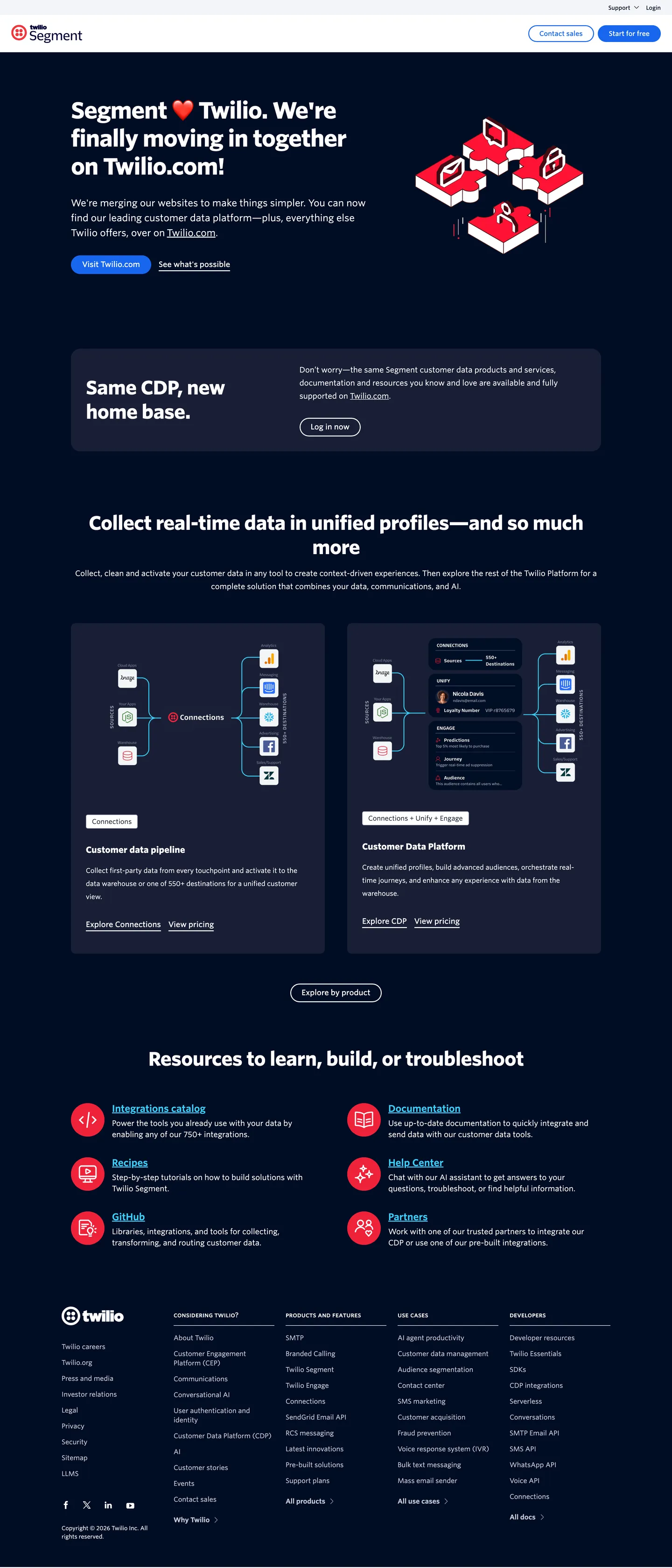
Segment's marketing surface is no longer Segment's. The page lives at twilio.com/en-us/segment, runs on Twilio's twilight-navy canvas in deep blue-black #000d25, and uses Twilio's typeface (Whitney SSm), Twilio's red iso-block hero illustration #ef223a, and Twilio's cobalt-pill CTA #1866ee. The legacy Segment chromatic identity — the deep emerald green that defined the standalone Segment brand for a decade — is entirely absent from this surface. The hero headline reads "Segment heart Twilio. We're finally moving in together on Twilio.com!" — the page itself is the announcement that the brand merger has resolved into a single visual identity.
The DESIGN.md file packages the post-merger system into a machine-readable spec. Inside: 12 colors tokens — a structural set of twilight navy, cobalt blue, pale steel hairline, and a single Twilio Red brand block — plus a darker variant #121c2d for elevated card surfaces and a sky-blue tone #3acefa for diagram-annotation glyphs. 13 typography tokens run Whitney SSm exclusively, from a 48px / weight 700 hero display down to 12px button labels. The Twilio CSS layer exposes 200+ named custom properties (a full color-token graph spanning blue, red, orange, yellow, green, purple, gray families, plus three radius scales and nine spacing scales) but the captured marketing page renders only the navy + cobalt + Twilio-red subset. 12 components cover the cobalt-pill primary, the iso-block hero, the navy section card, the two-up diagram band, and the white-band instructions footer.
Feed this file to Claude or Cursor and it reproduces the Twilio-Segment marketing surface: twilight navy canvas instead of any Segment-specific color, Twilio Red iso block as the hero brand chrome rather than a green logomark, cobalt 50px pill CTA, Whitney SSm at 48px / 700 display weight, and the two-up product-diagram band below the fold. The one move worth noting: this DESIGN.md captures the post-merger identity. The standalone Segment chromatic system (deep green, sharper edges, lighter canvas) lived at segment.com before the redirect and is no longer accessible as a current marketing surface — for that you'd need to read the archive.
What makes it distinct
5
- Twilight navy canvasthe page floor is #000d25 with white type, anchored on the Twilio header system rather than a Segment-specific color
- Twilio Red iso-block hero illustration#ef223a appears only as the floating brand block beside the headline, never as a CTA color
- Cobalt-pill CTAprimary button is #1866ee at 36px height with a 50px fully-rounded pill, dressed in Twilio's standard CTA voice
- Whitney SSm across every tierdisplay at 48px in weight 700, body at 14-16px in weight 400, no second typeface family
- Diagram-anchored bodytwo side-by-side product diagrams below the fold show CDP profile and Data Platform flows in cobalt-on-navy
twilio.com
Live at twilio.com
A snapshot of the brand in production. Scroll the frame to see the whole page.
Colors
12 colors
Segment's system runs on #1866ee as its primary voltage, used in 1 of 12 components. Type is set in Whitney SSm across 13 tokens from 12px to 48px, weights 400–700. Shape language is soft — components average 17px corner radius, with no sharp interactive edges.
Brand & Accent
Sparing, CTA-only voltage · 2
Surface
Page and card backgrounds · 2
Text
Headlines, body, captions · 3
Borders & Hairlines
Dividers, outlines, rules · 2
Other
Specialty colors · 3
Typography
13 type tokens
Set in Whitney SSm across 13 tokens, from 12px to 48px, weights 400–700. Shown in its own stack: where the font isn't installed, the fallback the file names stands in.
- display-xl48px · weight 700 · lh 60px · tracking -1.44pxThe quick brown fox jumps over the lazy dog
- display-lg40px · weight 700 · lh 52px · tracking -0.8pxThe quick brown fox jumps over the lazy dog
- heading-md20px · weight 600 · lh 32pxThe quick brown fox jumps over the lazy dog
- heading-sm18px · weight 700 · lh 28pxThe quick brown fox jumps over the lazy dog
- body-lg20px · weight 400 · lh 32pxThe quick brown fox jumps over the lazy dog
- body-md16px · weight 400 · lh 28pxThe quick brown fox jumps over the lazy dog
- body-md-tight16px · weight 400 · lh 24pxThe quick brown fox jumps over the lazy dog
- body-sm14px · weight 400 · lh 20pxThe quick brown fox jumps over the lazy dog
- label-md16px · weight 500 · lh 24pxThe quick brown fox jumps over the lazy dog
- label-sm14px · weight 500 · lh 20pxThe quick brown fox jumps over the lazy dog
- label-bold14px · weight 600 · lh 20pxThe quick brown fox jumps over the lazy dog
- button-md16px · weight 500 · lh 24pxThe quick brown fox jumps over the lazy dog
- caption12px · weight 500 · lh 21pxThe quick brown fox jumps over the lazy dog
Layout
Radii and spacing
7 corner radii and 9 spacing values. Shape language: soft.
Radii
- none0px
- xs2px
- sm4px
- md10px
- lg20px
- pill50px
- full50%
Spacing
- xs4px
- sm6px
- base8px
- md12px
- lg16px
- xl24px
- 2xl32px
- 3xl48px
- 4xl64px
Components
12 components
Each rendered from its tokens (color, type, radius, padding) on Segment's own canvas.
- Button Primarybutton-primaryButton Primary
- Button Secondarybutton-secondaryButton Secondary
- Top Navtop-navTop Nav
- Nav Linknav-linkNav Link
- Hero Sectionhero-sectionHero Section
- Hero Headinghero-headingHero Heading
- Section Headingsection-headingSection Heading
- Body Paragraphbody-paragraphBody Paragraph
- Diagram Carddiagram-cardDiagram Card
- Cta Stripcta-stripCta Strip
- Type here…text-inputText Input
- Card Hairlinecard-hairlineCard Hairline
In use
The system, in use
Segment's tokens on the kind of product it builds.
Build something people actually use.
A short paragraph of marketing copy that previews how the brand's display tier and body tier read together. Two sentences is usually enough.
FAQ
Segment design system FAQ
Common questions about Segment's tokens, components, and how to use this DESIGN.md in your project.
Read next
Related reading
Specs, directories, and component libraries that pair with this design system.
- Browse all design systemsThe full directory of DESIGN.md files on shadcn.io, with live mockups for each.shadcn.io
- Segment — official siteTwilio Segment's public marketing site — the source of truth for the live tokens captured in this file.twilio.com (opens in a new tab)
- The DESIGN.md specificationGoogle Labs' open spec for machine-readable design system files — the format this page is built on.github.com (opens in a new tab)
Use it
Use Segment in your project
One machine-readable file. Drop it into Claude, Cursor, or any AI tool that reads DESIGN.md.
Download the DESIGN.md
One machine-readable file: every color, type, radius, spacing, and component token of Segment.
Feed it to your AI tool
Drop it into Claude, Cursor, or GitHub Copilot. The agent writes React components and Tailwind classes that match Segment's visual language.
Reference the tokens directly
Or paste the values into your Tailwind config, CSS variables, or component library: every color, size and radius is a quoted, ready-to-copy value.
Read the full DESIGN.md: overview, rationale, do’s and don’ts
Overview
Segment's marketing surface is no longer Segment's. Parent-brand absorption. The page lives at twilio.com/en-us/segment, runs on Twilio's twilight-navy canvas in {colors.canvas} (#000d25), and uses Twilio's typeface (Whitney SSm), Twilio's red iso-block hero illustration in {colors.twilio-red} (#ef223a), and Twilio's cobalt-pill CTA in {colors.primary} (#1866ee). The legacy Segment chromatic identity — the deep emerald green that defined the standalone Segment brand for a decade — is entirely absent. Where Mixpanel commits its below-fold to violet and Amplitude reserves a cobalt voltage for a single animated word, the post-Twilio Segment system has no separate brand voltage at all; it inherits Twilio's full chromatic and typographic system without alteration.
The chromatic restraint is the move. Twilight navy {colors.canvas} fills the page canvas (576 captured occurrences), the cobalt-blue CTA pill appears 17 times, and Twilio Red {colors.twilio-red} shows up exactly 6 times — all as the background fill on the floating iso-block hero illustration. There is no card-fill tier, no second accent color, no chart palette exposed in the marketing surface. The exposed Twilio CSS layer carries 200+ named custom properties spanning blue, red, orange, yellow, green, purple, and gray families — but the captured page renders only the navy + cobalt + Twilio-red subset.
The primary CTA is the Twilio standard. Cobalt pill, full round. "Start for free" sits at 36px tall in {colors.primary} (#1866ee) with a 50px fully-rounded {rounded.pill} corner radius — paired with a transparent secondary that carries the same dimensions and a 1px white border. The pill voice is consistent with Twilio's other product pages (Voice, Messaging, Flex) — the merger has resolved the brand into a single CTA component shared across every product surface.
Typography is Whitney SSm exclusively. Display tops at 48px in weight 700 with -1.44px tracking, section heads at 40px / 700, body at 14-16px / 400. There is no second typeface family — no mono, no serif, no display alternative.
Key Characteristics:
- Twilight navy canvas —
{colors.canvas}(#000d25) fills the entire above-fold and the body-section card surfaces; 576 captured occurrences as text / border / background. - Twilio Red
{colors.twilio-red}(#ef223a) appears exactly 6 times, all as background fill on the floating iso-block hero illustration. Never used as a CTA color. - Cobalt-pill primary CTA —
{colors.primary}(#1866ee) fill, white text, 50px fully-rounded{rounded.pill}, 36px height. The Twilio standard CTA voice. - Whitney SSm across every tier — 48px / 700 display, 40px / 700 section heads, 14-16px / 400 body. No second typeface family.
- 200+ exposed CSS custom properties (
--color-blue-100through--color-blue-900,--color-red-100through--color-red-70,--color-orange-*,--color-green-*,--color-purple-*,--color-gray-*, plus radius and spacing scales) — most absent from the rendered surface, available for downstream product pages. - Two-up product-diagram band — "Customer data pipeline" and "Customer Data Platform" diagrams side-by-side in cobalt-annotation-on-navy below the fold.
- Sky-blue annotation accent —
{colors.primary-sky}(#3acefa) used only on diagram glyphs as the secondary diagram tone, not as brand chrome. - Pale-steel hairline —
{colors.hairline}(#cacdd8) carries 112 of the captured border occurrences; the dominant outline on white below-fold sections.
Colors
Brand
- Twilio Red (
{colors.twilio-red}— #ef223a): frequency 6, all as background. The floating iso-block hero illustration's fill color. Never used as a text color, never as a CTA. Wired into Twilio's CSS layer as--color-red-lightand--color-twilio-red. - Cobalt Primary (
{colors.primary}— #1866ee): frequency 17. Used as text (6), bg (2), border (6), shadow (3). The CTA pill fill, diagram-annotation color, and the link-emphasis tone. Wired in CSS as--color-blue-500and--color-link. - Sky (
{colors.primary-sky}— #3acefa): frequency 12. Used as text (6), border (6). The secondary diagram-annotation color — appears only on chart glyphs and node-graph illustrations. Wired as--color-blue-200.
Surface
- Canvas (
{colors.canvas}— #000d25): frequency 576. Used as text (284), bg (8), border (284). The page floor — the deep twilight navy that Twilio uses as its full-bleed marketing canvas. Wired as--color-default,--color-blue-900, and--color-ink. - Surface-1 (
{colors.surface-1}— #121c2d): frequency 6. Used as text (2), bg (3), shadow (1). The slightly lighter card-surface tone for the "Same CDP, new home base" section card and the diagram-band frames. Wired as--color-gray-100-legacy. - Card Tonal (
{colors.card-tonal}— #f3f4f7): frequency 1, as background. A very light cool-gray surface used inside one feature card on the below-fold white instruction band. Wired as--color-gray-50.
Text / Ink
- Cream (
{colors.cream}— #ffffff): frequency 201. Used as text (98), bg (3), border (98), shadow (2). The dominant text color on the navy canvas. Pure white — Twilio does not warm it to a cream the way Cloudflare does. - Ink Soft (
{colors.ink-soft}— #9aa0b4): frequency 2, all as border. A muted blue-gray for the rare secondary border below the fold. Wired as--color-gray-300. - Ink Pure (
{colors.ink-pure}— #000000): frequency 8. Used as text (4), border (4). Reserved for pure-black text on the rare white card surfaces in the below-fold instruction band.
Hairline
- Hairline (
{colors.hairline}— #cacdd8): frequency 224. Used as text (112), border (112). The dominant hairline tone — a pale steel-gray that carries every below-fold card outline and divider. Wired as--color-gray-30. - Hairline Light (
{colors.hairline-light}— #dde0e6): frequency 1, as shadow. A very faint border-light tone used inside one shadow halo.
Typography
Font Family
The system runs Whitney SSm for every display, heading, body, button, nav, label, and caption surface. Whitney SSm is the small-cap variant of Whitney by Hoefler&Co, a humanist sans built for screen reading. Fallbacks walk helvetica, arial, sans-serif. There is no second typeface family — no monospace, no serif, no display alternative. This is unusually monolithic for a B2B marketing surface; most peer brands (Cloudflare, Stripe, Vercel) run a sans + mono pairing.
The CSS layer exposes --font-family-default as Whitney SSm, --font-family-mono as "Twilio Sans Mono,monospace" (declared but absent from rendered surfaces), and --font-family-buffalo as "Buffalo" (a display family also absent). The Segment page renders only the default sans.
Hierarchy
| Token | Size | Weight | Line Height | Letter Spacing | Use |
|---|---|---|---|---|---|
{typography.display-xl} | 48px | 700 | 60px | -1.44px | Hero h1 — "Segment heart Twilio" |
{typography.display-lg} | 40px | 700 | 52px | -0.8px | Section h2 — "Same CDP, new home base", "Collect real-time data in unified profiles" |
{typography.heading-md} | 20px | 600 | 32px | 0 | Anchor links, large emphasized labels |
{typography.heading-sm} | 18px | 700 | 28px | 0 | h5 — instruction-section headings |
{typography.body-lg} | 20px | 400 | 32px | 0 | Section sub-heading paragraph |
{typography.body-md} | 16px | 400 | 28px | 0 | Body paragraph (loose line-height) |
{typography.body-md-tight} | 16px | 400 | 24px | 0 | Body paragraph (tight line-height) |
{typography.body-sm} | 14px | 400 | 20px | 0 | Default running text — 53 captured occurrences |
{typography.label-md} | 16px | 500 | 24px | 0 | Nav link labels — 8 occurrences |
{typography.label-sm} | 14px | 500 | 20px | 0 | Smaller nav / footer labels — 6 occurrences |
{typography.label-bold} | 14px | 600 | 20px | 0 | Bold emphasis inside labels — 4 occurrences |
{typography.button-md} | 16px | 500 | 24px | 0 | Primary and secondary button labels |
{typography.caption} | 12px | 500 | 21px | 0 | Small captions, footer category sub-labels |
Principles
Display weight stays at 700 on both the 48px hero and the 40px section heads — a single bold display tier, with no editorial weight-500 alternative. The tight -1.44px tracking on the hero is what gives it the marketing-banner authority; the section heads at -0.8px tracking sit one step calmer.
Body and labels divide on weight rather than family. Weight 400 carries every body paragraph (60+ captured occurrences across the 14-20px body sizes). Weight 500 carries every label and button. Weight 600 sits between for the rare bold emphasis. Weight 700 is reserved for the display tier only.
Note on Font Substitutes
Whitney SSm is a Hoefler&Co licensed family. Inter at 95% line-height is the closest open-source substitute; the proportions transfer cleanly. Source Sans Pro at the same weights captures Whitney's slightly warmer humanist cast — pick based on what fits your project's overall feel. There is no substitute needed for the mono or serif tiers because the system does not use them.
Layout
Spacing System
- Base unit: 8px. The dominant gap is
{spacing.base}8px (74 captured occurrences) and{spacing.md}12px (68). - Tokens:
{spacing.xs}4px ·{spacing.sm}6px ·{spacing.base}8px ·{spacing.md}12px ·{spacing.lg}16px ·{spacing.xl}24px ·{spacing.2xl}32px ·{spacing.3xl}48px ·{spacing.4xl}64px. - CSS layer exposes a parallel rem scale:
--spacing-size-10.8rem ·--spacing-size-21.2rem ·--spacing-size-31.6rem ·--spacing-size-42.4rem ·--spacing-size-53.2rem ·--spacing-size-64.8rem ·--spacing-size-76.4rem ·--spacing-size-89.6rem ·--spacing-size-912.8rem. These resolve to the same values as the px tokens. - Section padding (vertical): ~48px on the hero band; below the fold sections run at ~32px between blocks.
- Card internal padding: 32px on the navy
{component.diagram-card}and 48×32px on the{component.cta-strip}; 24px on white hairline cards in the bottom band. - Top-nav padding:
{spacing.md}(12px) vertical,{spacing.xl}(24px) horizontal.
Grid & Container
- Max content width: ~1136px on the body paragraph (the captured paragraph reports a 1136px parent width); ~653px on the hero headline so the multi-line dek wraps in three measured lines.
- Hero block: full-bleed navy canvas with the iso-block illustration floating to the right of the headline cluster.
- "Same CDP, new home base" card: centered on a slightly-lighter surface card with the CTA pill anchored beneath.
- Two-up diagram band: "Customer data pipeline" and "Customer Data Platform" diagrams sit side-by-side in 50/50 columns on the navy canvas.
- Below-fold instruction band: returns to white canvas with red Twilio-icon glyphs above three-column instruction blocks.
Rhythm
The page alternates between navy chromatic and white instruction. Hero, section card, and two-up diagram band run on the twilight navy canvas in white-on-navy type. The bottom instruction band ("Resources to learn, build, or troubleshoot") inverts to white-on-white with red Twilio icons. This pacing is the structural device — the navy bands carry the brand announcement and product overview; the white band carries the developer-facing instructional content.
Elevation
The system has essentially no shadow tier. The captured page exposes --shadow-card (0 8px 24px 0 rgba(18,28,45,0.1)), --shadow-image (0 4px 16px 0 rgba(18,28,45,0.15)), --shadow-large (0 16px 60px 0 rgba(18,28,45,0.15)), --shadow-navigation (0 14px 25px 0 rgba(18,28,45,0.12)), and --filter-shadow (drop-shadow(0 0.6rem 1.2rem rgba(13,21,55,0.1))) — but the captured render has only 5 occurrences of shadow ink on the entire page. Hierarchy comes from surface-color contrast (navy / lighter navy / white) rather than from layered elevation.
- Flat (no shadow): hero, body bands, diagram band, instruction band, footer — 95% of surfaces.
- Card-tonal elevation: the "Same CDP, new home base" card sits with a near-imperceptible 8px navy-cast shadow that grounds it on the canvas.
- Iso-block hero shadow: the floating Twilio Red iso-block carries a subtle ground shadow that gives the impression of a physical object sitting on the navy surface.
Shapes
The radius scale is small-step plus pill:
{rounded.none}0px — the navy canvas section, image edges, the iso-block illustration.{rounded.xs}2px — declared as--radius-small. Not visible on the captured surface but present in the CSS layer.{rounded.sm}4px — 11 occurrences, the dominant tight radius. Carries cards, dropdowns, inline tags.{rounded.md}10px — 2 occurrences. Larger cards, image containers.{rounded.lg}20px — 1 occurrence. A single rounded illustration block.{rounded.pill}50px — 5 occurrences. The primary and secondary CTAs.{rounded.full}50% — 6 occurrences. Circular icon backgrounds, avatar chips.
The CSS layer also exposes --radius-extra-large 2rem and --radius-2x-large 5rem as available scales, but neither renders on the captured Segment page.
Components
button-primary — The signature CTA. Cobalt-blue {colors.primary} (#1866ee) fill, white {colors.cream} text, {rounded.pill} 50px radius, 6×24px padding, 36px height, weight 500. "Start for free" is the canonical instance. The pill is the Twilio standard CTA component, shared across every product page.
button-secondary — Transparent fill, white text, 1px white border, {rounded.pill} 50px radius, 6×24px padding, 36px height. Used for "See what's available" alongside the primary in the hero. Inverts to a navy fill on hover.
top-nav — White {colors.cream} surface, 56px height, 12×24px padding. Sits above the navy canvas as a separate band. Houses the Twilio wordmark flush left, Products / Solutions / Resources / Customers / Pricing links center, and a Contact sales / Sign in / Start for free cluster flush right.
nav-link — Transparent background, navy {colors.ink} text in {typography.label-md} (16px / 500), 8×12px padding. Sits on the white top-nav band — the only place navy text appears in the marketing surface.
hero-section — Full-bleed {colors.canvas} (#000d25) navy fill, white text, 48×24px padding. Holds the hero h1, sub-paragraph, primary and secondary CTAs, and the floating Twilio Red iso-block illustration to the right.
hero-heading — White text on the navy canvas, {typography.display-xl} (48px / 700) with -1.44px tracking. The marketing-banner display — confidence through bold weight and tight tracking.
section-heading — White text at {typography.display-lg} (40px / 700) on the navy canvas. Used for the "Same CDP, new home base" card and "Collect real-time data in unified profiles" sections.
body-paragraph — White text at {typography.body-md} (16px / 400 / 28px line-height) on the navy canvas. The default running text for hero sub-paragraphs and section leads.
diagram-card — {colors.surface-1} (#121c2d) fill, white text, {rounded.md} 10px radius, 32px padding. Hosts the "Customer data pipeline" and "Customer Data Platform" diagrams in the two-up band, with cobalt and sky diagram annotations inside.
cta-strip — {colors.surface-1} fill, white text, {rounded.md} 10px radius, 48×32px padding. Wraps the "Same CDP, new home base" announcement card with the primary CTA anchored beneath.
text-input — White surface, navy text, 1px {colors.hairline} border, {rounded.sm} 4px radius, 8×12px padding, 40px height.
card-hairline — White surface, navy text, 1px {colors.hairline} border, {rounded.md} 10px radius, 24px padding. The below-fold instruction cards inside the white band.
Do's and Don'ts
Do treat the navy {colors.canvas} (#000d25) as the inherited parent-brand canvas. The post-merger Segment surface lives inside Twilio's identity — pulling the navy from the Twilio header rather than coining a new background tone is the structural move.
Do reserve {colors.twilio-red} (#ef223a) for the floating iso-block hero illustration only. The Twilio Red appears 6 times in the captured page, all as background on the iso-block — using it as a CTA color or as accent text would collapse the parent-brand chromatic discipline.
Do use the cobalt {colors.primary} (#1866ee) for the CTA pill and for diagram annotations only. The cobalt is the Twilio standard CTA voice — using it as a body-text color or section background would dilute the click-target signal.
Do keep Whitney SSm as the single typographic voice. The system has no second family — adding a mono or serif tier would break the monolithic Twilio surface treatment.
Don't introduce the legacy Segment emerald green. The standalone Segment chromatic identity is no longer part of this surface; bringing back a green accent would visually un-merge the brand.
Don't swap the cobalt CTA {colors.primary} for the Twilio Red. The two colors carry distinct semantic roles — cobalt for click-targets, red for brand iconography. Combining them on a single element reads as a system fault.
Don't add a 12 / 16 / 24px middle radius tier. The system uses small-step (2-10px) plus pill (50px) and full-circle (50%); a middle tier would soften the contrast between hairline cards and the warm pill CTAs.
Don't render the hero heading at weight 500 or below. The 48px hero at weight 700 with -1.44px tracking is the marketing-banner treatment — dropping to a lighter weight would tip the page into editorial territory and lose the conversion-page authority Twilio applies across every product surface.
Known Gaps
- Legacy Segment identity: the standalone segment.com chromatic system (deep emerald green, sharper edges, lighter canvas, distinct Segment wordmark) is not represented here. That system was retired when the page redirected into twilio.com/en-us/segment in 2026.
- 200+ exposed CSS custom properties: the Twilio CSS layer exposes a full token graph spanning blue, red, orange, yellow, green, purple, gray families plus three radius scales and nine spacing scales — only the subset actually rendered on this page is captured as primary tokens. The full graph is available in the cssVariables capture for cross-product reference.
- Dark mode: the marketing page already runs the navy canvas as its dominant surface; there is no separately documented dark variant.
- Hover and focus states: the system declares the resting state for
{component.button-primary}and{component.button-secondary}; hover / focus / disabled tints were not exposed on the captured surface. - Form input error states:
{component.text-input}carries only the resting state; validation styling lives inside the Twilio Console product surfaces. - Twilio Sans Mono: declared in CSS as
--font-family-monobut absent from the rendered marketing surface. The mono family is reserved for code blocks on developer-doc pages elsewhere on twilio.com. - Buffalo display: declared as
--font-family-buffalobut absent from the rendered surface. Reserved for promotional / event-page headlines elsewhere in the Twilio system.
Analytics & Data
More systems like this
More DESIGN.md files in Analytics & Data.
Pricing
Build it with Pro
The DESIGN.md files are free. Pro adds 6,000+ blocks, premium templates and the MCP server, so your AI editor builds in your system for you.
4.9/5 out of 5 · 150+ reviewsfrom 150+ founders and developers.
Billing
Billed once a year in USD. Cancel anytime.
- How many people can use the license.
- Client work, SaaS products and anything you charge for.
- Production-ready React sections: hero, pricing, features, dashboards and more.
- Complete multi-page sites you can ship as they are.
- React icons from every major library, installable with one command.
- Presets that restyle every block, in light and dark.
- Lets your AI editor search, preview and install blocks for you.
- Priority requests are answered first.
Individual
For personal projects & open source
$32instead of $49/mo
$389 billed yearly
- Seats: 1 seat
- Commercial use: Personal & open source only
- Pro blocks: 6,000+ blocks
- Templates: All 14 templates
- React icons: 294k+ icons
- Themes: All 59 themes
- MCP server: Basic usage
- Support: Standard
Team
Most popularFor freelancers, agencies & startups
$66instead of $99/mo
$789 billed yearly · ≈ $13/dev/mo
- Seats: Up to 5 seats
- Commercial use: Included
- Pro blocks: 6,000+ blocks
- Templates: All 14 templates
- React icons: 294k+ icons
- Themes: All 59 themes
- MCP server: High usage
- Support: Priority
Organization
For companies with larger teams
$132instead of $199/mo
$1,589 billed yearly
- Seats: Unlimited seats
- Commercial use: Included
- Pro blocks: 6,000+ blocks
- Templates: All 14 templates
- React icons: 294k+ icons
- Themes: All 59 themes
- MCP server: Unlimited usage
- Support: Priority
Billed once a year in USD. Cancel anytime.
Individual
For personal projects & open source
$32instead of $49/mo
$389 billed yearly
- How many people can use the license.Seats: 1 seat
- Client work, SaaS products and anything you charge for.Commercial use: Personal & open source only
- Production-ready React sections: hero, pricing, features, dashboards and more.Pro blocks: 6,000+ blocks
- Complete multi-page sites you can ship as they are.Templates: All 14 templates
- React icons from every major library, installable with one command.React icons: 294k+ icons
- Presets that restyle every block, in light and dark.Themes: All 59 themes
- Lets your AI editor search, preview and install blocks for you.MCP server: Basic usage
- Priority requests are answered first.Support: Standard
Team
Most popularFor freelancers, agencies & startups
$66instead of $99/mo
$789 billed yearly · ≈ $13/dev/mo
Everything in Individual, plus
- How many people can use the license.Seats: Up to 5 seats
- Client work, SaaS products and anything you charge for.Commercial use: Included
- Lets your AI editor search, preview and install blocks for you.MCP server: High usage
- Priority requests are answered first.Support: Priority
Organization
For companies with larger teams
$132instead of $199/mo
$1,589 billed yearly
Everything in Team, plus
- How many people can use the license.Seats: Unlimited seats
- Lets your AI editor search, preview and install blocks for you.MCP server: Unlimited usage
- Secure checkout via Stripe
- Code lives in your repo
- Keep what you've shipped if you cancel
- License terms
Your system, built for you
Every block, template and icon, installed by your AI agent in your design system. The DESIGN.md files stay free.