Heap Design System
Heap's marketing design system as a DESIGN.md file — mint green as border voltage, dual typefaces, ink-black CTAs, 16 colors tokens, 16 components for React and AI tools.
Add shadcn.io to your AI agent. · Pro It installs blocks, icons and templates in your design system from a prompt, with Pro.
Set up MCP- Primary
- #31d891
- Typeface
- Circular Standard
- Shape
- Soft
- Base radius
- 10px
- Colors
- 16
- Type tokens
- 13
- Components
- 16
- Spacing values
- 8
About
About Heap DESIGN.md
Curated by Dov Azencot · Updated May 19, 2026 · Source heap.io (opens in a new tab)
Heap's marketing site makes a counterintuitive choice: the electric mint green that defines the visual identity never fills a button. The primary CTA uses ink-black fill with a 2px mint border, and when mint appears as text it marks a highlight or a link — never a background swatch. Unlike Mixpanel, which commits its product color to every interactive element, or Amplitude, which tints hero bands with its orange, Heap treats the mint as a precision signal: it shows up on borders and underlines to indicate meaning, not decoration.
The DESIGN.md file packages the system into a machine-readable spec for React and AI tools. Inside: 16 colors tokens built around the ink-black primary, a pure-white canvas, the mint green trio (full saturation, muted, and deep tint), and a deep-navy band color; 13 typography tokens spanning Circular Standard (display, nav, section headings, eyebrow labels) and Lettera Text (body paragraphs, pull quotes, form labels); 5 radius tokens anchored at 4-5px tight; 8 spacing values on a 16-48px scale; and 16 components definitions covering the mint-bordered primary button, the dual-font feature cards, and the Contentsquare co-brand dark block.
Feed this file to Claude or Cursor and it reproduces Heap's specific moves: ink-black primary CTA with mint border instead of a mint fill, weight-400 display at 72px, Circular Standard for everything structural and Lettera Text for every paragraph, tight 4px rounding, and the deep-navy dark section isolated to the acquisition co-brand block. The dual-typeface split is the most transferable pattern — using a geometric sans for navigation and headings while switching to a text-optimized serif-adjacent for prose is a technique that makes body copy feel editorial without requiring a separate font for display.
What makes it distinct
5
- Border-only brand voltagemint green #31d891 appears on button borders and text highlights, never as a fill; the button body stays ink-black #111111
- Dual-typeface splitCircular Standard carries display and nav at weight 400; Lettera Text handles body prose and pull quotes; the division is by semantic register, not size
- Weight-400 display headingsthe 72px hero h1 runs at weight 400, not 700; Heap signals confidence through scale rather than typographic weight
- Deep-navy section island#100841 is the single dark band on the page, used for the Contentsquare co-brand block only
- 4px tight card radiussmallest radius in the analytics peer group; Mixpanel and Amplitude both use 8px+, Heap runs 4-5px throughout
heap.io
Live at heap.io
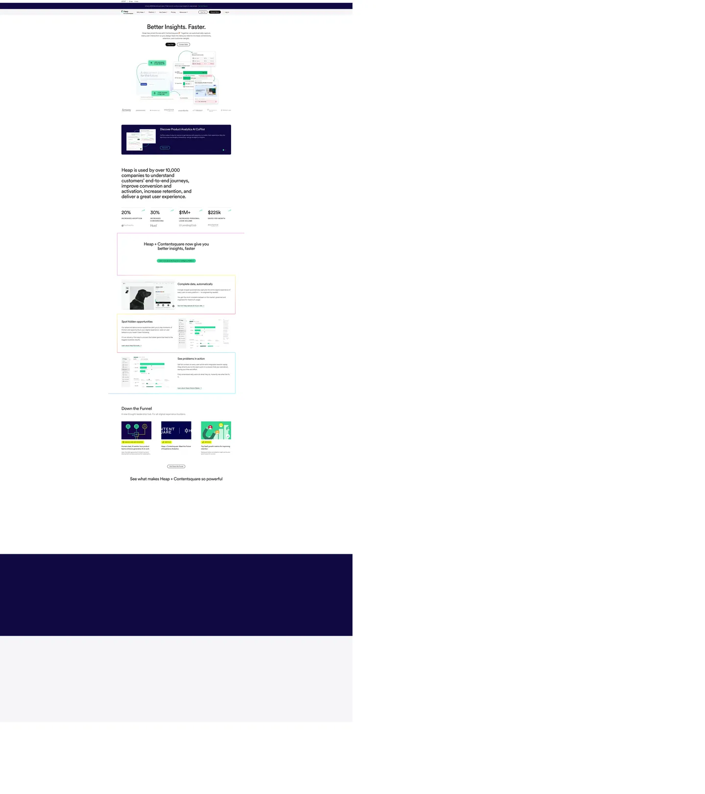
A snapshot of the brand in production. Scroll the frame to see the whole page.
Colors
16 colors
Heap's system runs on #31d891 as its primary voltage, used in 3 of 16 components. Type is set in Circular Standard across 13 tokens from 14px to 72px, weights 400–700. Shape language is soft — components average 37px corner radius, with no sharp interactive edges.
Brand & Accent
Sparing, CTA-only voltage · 4
Surface
Page and card backgrounds · 4
Text
Headlines, body, captions · 4
Borders & Hairlines
Dividers, outlines, rules · 1
Semantic
Status, errors, success, links · 2
Other
Specialty colors · 1
Typography
13 type tokens
Set in Circular Standard across 13 tokens, from 14px to 72px, weights 400–700. Shown in its own stack: where the font isn't installed, the fallback the file names stands in.
- display-xl72px · weight 400 · lh 70px · tracking -2.16pxThe quick brown fox jumps over the lazy dog
- display-lg56px · weight 400 · lh 61.6px · tracking -1.68pxThe quick brown fox jumps over the lazy dog
- display-md48px · weight 400 · lh 50px · tracking -1.44pxThe quick brown fox jumps over the lazy dog
- heading-lg32px · weight 400 · lh 40px · tracking -0.96pxThe quick brown fox jumps over the lazy dog
- heading-sm20px · weight 400 · lh 28px · tracking -0.6pxThe quick brown fox jumps over the lazy dog
- eyebrow18px · weight 700 · lh 28px · tracking 1.8pxThe quick brown fox jumps over the lazy dog
- nav-link16px · weight 400 · lh 16pxThe quick brown fox jumps over the lazy dog
- body-lg18px · weight 400 · lh 28pxThe quick brown fox jumps over the lazy dog
- body-md16px · weight 400 · lh 24pxThe quick brown fox jumps over the lazy dog
- body-sm14px · weight 400 · lh 20pxThe quick brown fox jumps over the lazy dog
- label-bold14px · weight 700 · lh 20pxThe quick brown fox jumps over the lazy dog
- pull-quote20px · weight 700 · lh 30pxThe quick brown fox jumps over the lazy dog
- caption14px · weight 400 · lh 21pxThe quick brown fox jumps over the lazy dog
Layout
Radii and spacing
6 corner radii and 8 spacing values. Shape language: soft.
Radii
- none0px
- xs4px
- sm5px
- md10px
- lg16px
- pill70px
Spacing
- xs16px
- sm20px
- md24px
- base32px
- lg40px
- xl48px
- 2xl96px
- 3xl96px
Components
16 components
Each rendered from its tokens (color, type, radius, padding) on Heap's own canvas.
- Button Primarybutton-primaryButton Primary
- Button Primary Hoverbutton-primary-hoverButton Primary Hover
- Button Secondarybutton-secondaryButton Secondary
- Top Navtop-navTop Nav
- Nav Linknav-linkNav Link
- Hero Headinghero-headingHero Heading
- Section Headingsection-headingSection Heading
- Body Paragraphbody-paragraphBody Paragraph
- Eyebrow Labeleyebrow-labelEyebrow Label
- CardcardCard
- Dark Banddark-bandDark Band
- Type here…text-inputText Input
- Pull Quote Blockpull-quote-blockPull Quote Block
- Stat Metricstat-metricStat Metric
- Highlight Markhighlight-markHighlight Mark
- FooterfooterFooter
In use
The system, in use
Heap's tokens on the kind of product it builds.
Build something people actually use.
A short paragraph of marketing copy that previews how the brand's display tier and body tier read together. Two sentences is usually enough.
FAQ
Heap design system FAQ
Common questions about Heap's tokens, components, and how to use this DESIGN.md in your project.
Read next
Related reading
Specs, directories, and component libraries that pair with this design system.
- Browse all design systemsThe full directory of DESIGN.md files on shadcn.io, with live mockups for each.shadcn.io
- Heap — official siteHeap's public marketing site — the source of truth for the live tokens captured in this file.heap.io (opens in a new tab)
- The DESIGN.md specificationGoogle Labs' open spec for machine-readable design system files — the format this page is built on.github.com (opens in a new tab)
Use it
Use Heap in your project
One machine-readable file. Drop it into Claude, Cursor, or any AI tool that reads DESIGN.md.
Download the DESIGN.md
One machine-readable file: every color, type, radius, spacing, and component token of Heap.
Feed it to your AI tool
Drop it into Claude, Cursor, or GitHub Copilot. The agent writes React components and Tailwind classes that match Heap's visual language.
Reference the tokens directly
Or paste the values into your Tailwind config, CSS variables, or component library: every color, size and radius is a quoted, ready-to-copy value.
Read the full DESIGN.md: overview, rationale, do’s and don’ts
Overview
Heap's marketing page runs a two-typeface system where the division follows semantic register rather than type size — a choice that positions the brand as editorial rather than purely technical. Typeface as register split. Circular Standard (a geometric sans from Lineto) handles everything structural: display headings, nav links, section subheadings, eyebrow labels in uppercase. Lettera Text (a slightly warmer companion from the same foundry) handles everything expressive: body paragraphs, pull quotes, form labels. The system never mixes them at the same hierarchical level. Where Mixpanel uses a single typeface throughout, and Amplitude uses a geometric for all tiers, Heap achieves tonal depth through font-family switching rather than weight switching.
The brand voltage is mint green (#31d891) — and it never fills a button. The primary CTA carries a 2px mint border on an ink-black body with ink-black text; hover inverts the body to full ink with white text. The mint appears on borders and text marks. This is the opposite of how most analytics brands handle their voltage (Mixpanel uses purple fills on CTAs, Amplitude uses orange backgrounds) — Heap treats the mint as a structural annotation, not a paint bucket.
Key Characteristics:
- Mint green (
{colors.primary}— #31d891) used as border and text-highlight only; ink-black fills the primary CTA body. - 72px Circular Standard hero h1 at weight 400 with -2.16px letter-spacing — the heaviest display moment uses no extra weight.
- Two-family split: Circular Standard for structure, Lettera Text for prose — divided by semantic role, not type size.
- Pure-white canvas with a single deep-navy dark band (#100841) anchoring the Contentsquare co-brand section.
- Tight 4px card radius across feature modules — the tightest in the analytics peer group.
- Uppercase eyebrow labels at 18px / 700 / 1.8px letter-spacing — Circular Standard in its most compressed form.
- No shadow system; elevation comes entirely from 2px
{colors.hairline}borders.
Colors
Brand Greens
- Primary (
{colors.primary}— #31d891): frequency 34. Used as text (17), border (17), bg (0). The mint is exclusively structural — border voltage and text highlight, never a background. Wired as--color-green,--color-bd-btn,--color-mark-bg. - Primary Muted (
{colors.primary-muted}— #31a679): frequency 4. Used as text (2), border (2). Mid-tone of the mint family — secondary link states and inline emphasis. - Primary Dark (
{colors.primary-dark}— #31715f): frequency 5. Used as text (3), border (2). The link color for standard body links (--color-link) and success text (--color-text-success). - Primary Link Hover (
{colors.primary-link-hover}— #1b4438): frequency 0. The deep forest-green hover state for links (--color-link-hover).
Ink & Canvas
- Ink (
{colors.ink}— #111111): frequency 719. Used as text (363), border (356). The dominant color on the page — every headline, nav link, body paragraph, card border, and primary button fill. Wired across 11 CSS variables including--color-text,--color-dark,--color-accent,--color-bd. - Canvas (
{colors.canvas}— #ffffff): frequency 391. Used as text (187), bg (15), border (187), gradient (2). The page floor and the inverse-text color on dark surfaces. The extraction merged near-white variants into this token; inputs render the faintest tonal offset against the page floor.
Dark Surface
- Surface Dim (
{colors.surface-dim}— #100841): frequency 9. Used as background (5), text (2), border (2). The deep-navy band for the Contentsquare acquisition section only — the one dark island on the page. Wired as--color-bg-dim.
Hairlines
- Hairline (
{colors.hairline}— #dfdfdf): frequency 7. Used as border (7). The standard card border (--color-list-bd). All feature-section separators use this tone. - Hairline Muted (
{colors.hairline-muted}— #c4c9ce): frequency 0. Declared as--color-bd-dimfor disabled or secondary border states.
Text Mutes
- Ink Muted (
{colors.ink-muted}— #4f525d): frequency 2. Used as text (1), border (1). Mid-level secondary text for supporting captions. - Ink Dim (
{colors.ink-dim}— #868c95): frequency 1. Used as text (1). The dimmest text tone (--color-text-dim). Input placeholder text and meta labels. - Placeholder (
{colors.placeholder}— #6b707a): frequency 0. Declared as--color-placeholder-txtfor form inputs.
Status
- Error (
{colors.error}— #df0134): frequency 0. Declared as--color-text-criticalfor critical error states. - Error Dark (
{colors.error-dark}— #a80125): frequency 0. Declared as--color-text-errorfor error text.
Typography
Font Families
The system runs two proprietary typefaces from Lineto. Circular Standard (--ff-sans-display) covers the display and navigation register: headlines, nav items, section subheadings, eyebrow labels. Lettera Text (--ff-sans) covers the prose register: body paragraphs, pull quotes, form labels, captions. The two families share a similar x-height and weight range, so they mix at adjacent sizes without clashing, but Circular Standard's geometric construction reads as structured while Lettera Text's slight warmth reads as editorial. The mono stack (--ff-mono: SF Mono, Monaco, Inconsolata, Fira Mono, Source Code Pro) appears in code contexts only.
Hierarchy
| Token | Family | Size | Weight | Line Height | Letter Spacing | Use |
|---|---|---|---|---|---|---|
{typography.display-xl} | Circular Standard | 72px | 400 | 70px | -2.16px | Hero h1 |
{typography.display-lg} | Circular Standard | 56px | 400 | 61.6px | -1.68px | Large section headers |
{typography.display-md} | Circular Standard | 48px | 400 | 50px | -1.44px | Section h2 |
{typography.heading-lg} | Circular Standard | 32px | 400 | 40px | -0.96px | Sub-section h2 and h3 |
{typography.heading-sm} | Circular Standard | 20px | 400 | 28px | -0.6px | h3 card headers |
{typography.eyebrow} | Circular Standard | 18px | 700 | 28px | 1.8px | Uppercase eyebrow labels |
{typography.nav-link} | Circular Standard | 16px | 400 | 16px | 0 | Top-nav links and CTA labels |
{typography.body-lg} | Lettera Text | 18px | 400 | 28px | 0 | Primary body prose |
{typography.body-md} | Lettera Text | 16px | 400 | 24px | 0 | Card body text |
{typography.body-sm} | Lettera Text | 14px | 400 | 20px | 0 | Supporting captions |
{typography.label-bold} | Lettera Text | 14px | 700 | 20px | 0 | Form labels |
{typography.pull-quote} | Lettera Text | 20px | 700 | 30px | 0 | Testimonial / stat callouts |
{typography.caption} | Lettera Text | 14px | 400 | 21px | 0 | Fine metadata |
Principles
Circular Standard carries the structural skeleton at weight 400 throughout — only the eyebrow label goes to 700. The display hierarchy is achieved through size and letter-spacing, not weight: the 72px hero at -2.16px reads as dominant through geometry alone. Lettera Text mirrors this restraint: pull quotes go to 700, everything else stays 400.
Note on Font Substitutes
Both Circular Standard and Lettera Text are Lineto proprietary faces. For Circular Standard, Inter or DM Sans are the closest open-source geometric substitutes; for Lettera Text's editorial warmth, Plus Jakarta Sans carries a similar character. Preserve the negative letter-spacing values — they are critical to the heading's personality.
Layout
Spacing System
- Base module: 16px, with 48px as the section-level dominant (21 occurrences).
- Tokens:
{spacing.xs}16px ·{spacing.sm}20px ·{spacing.md}24px ·{spacing.base}32px ·{spacing.lg}40px ·{spacing.xl}48px ·{spacing.2xl}96px. - Section padding (vertical): 96px (--space-outer-v) for major section breaks; 48px (--space-gutter-v) for internal section padding.
- Card internal padding: 32px (
{spacing.base}) on feature cards; 24px on smaller metric tiles. - Nav height: 70px (--nav-height: 4.375rem).
Grid & Container
- Max content width: 83.75rem / ~1340px (
--maw). - 12-column grid:
--grid: repeat(12, minmax(10px, 1fr))— standard editorial grid. - Feature section: alternating left/right two-column layouts with product UI screenshots on one side and prose on the other.
- Metric strip: 4-stat horizontal row using
{typography.display-md}for numbers.
Rhythm
The page is a pure-white editorial surface that breaks exactly once — the Contentsquare dark band. Every other section change is signaled by vertical spacing only (96px gaps) rather than background color. The dark band acts as a single strong punctuation mark: one tonal island in a long white editorial document.
Elevation
The system has no shadow tokens. Depth comes from two signals only:
- 2px ink-black border (
{colors.hairline}and a 2px-wide{colors.ink}edge in some contexts): the dominant edge definition across cards and buttons. Not a hairline at 0.5px — the 2px border is deliberately visible. - Tonal surface shift: the white canvas vs. very lightly tinted inputs creates a subtle depth in form contexts — the input background is a near-white shade clustered into
{colors.canvas}by the extractor.
Heap's mint-bordered buttons are not elevation signals — they are interaction markers. The absence of shadow keeps the page flat and editorial, consistent with a data-analytics product that trusts its charts to provide visual complexity.
Shapes
The radius scale is tight-tight: 4-5px for nearly everything, with a single pill for CTAs:
{rounded.none}0px — section dividers and flush image panels.{rounded.xs}4px (--bdrs-s: 0.3125rem) — inputs, small chips, form elements. 9 instances — the dominant radius.{rounded.sm}5px — secondary form element rounding.{rounded.md}10px (--bdrs: 0.625rem) — feature cards and panels. 6 instances.{rounded.lg}16px — larger feature panels and the Contentsquare dark block.{rounded.pill}70px (--bdrs-l: 1.25rem) — the primary CTA button and rounded action chips.
The 4px-dominant scale is the tightest in the analytics-tools peer group. Mixpanel and Amplitude both default to 8-12px; Heap's tight radius gives form elements and cards a data-table precision.
Components
button-primary — Ink-black {colors.ink} fill, white text, 2px {colors.primary} mint border, {rounded.pill} 70px radius, 11.4x24 padding, 44px height. The mint border is the only place brand green appears on an interactive element.
button-primary-hover — Same ink fill, white text, 2px ink border (the mint transitions away on hover). Hover makes the button fully monochrome — the color signal disappears on engagement.
button-secondary — Transparent fill, ink text, 2px {colors.primary} mint border. Used for secondary CTAs — the mint border does double duty as both brand accent and interactive affordance.
top-nav — White canvas background, 70px height, 0x48 padding. Ink-black nav links at {typography.nav-link} (16px / 400). A 2px bottom border in hairline separates it from the hero.
hero-heading — Transparent background, ink-black text, {typography.display-xl} (72px / 400 / -2.16px tracking). The weight-400 constraint at 72px is the single most distinctive token in the system.
section-heading — Ink-black text, {typography.heading-lg} (32px / 400 / -0.96px). Used for "Complete data, automatically," "Spot hidden opportunities," "See problems in action."
eyebrow-label — Transparent background, ink-black text, {typography.eyebrow} (18px / 700 / 1.8px letter-spacing, uppercase). The uppercase-with-tracking style is the visual key for section openers.
card — White fill, ink-black text, {rounded.md} 10px radius, 32px padding, 2px {colors.hairline} border. Feature content cards throughout the capability sections.
dark-band — Deep-navy {colors.surface-dim} fill, white text, 48x32 padding. Used exclusively for the Heap + Contentsquare acquisition announcement section.
text-input — White fill, ink-black text, {rounded.xs} 4px radius, 2x10 padding, 32px height, 1px hairline border.
highlight-mark — Mint-green {colors.primary} fill, ink-black text, {rounded.none}, 2x4 padding. Used inline as a text marker (the --color-mark-bg usage).
pull-quote-block — Transparent background, {typography.pull-quote} (20px / Lettera Text / 700). Used for testimonial excerpts and statistical callouts.
footer — Ink-black {colors.ink} fill, white text, 48x32 padding. The footer inverts the page — dark fill mirrors the Contentsquare band color family.
Do's and Don'ts
Do keep the primary button body ink-black with a mint border. The 2px mint border is carrying the entire brand identity for the button — removing it to use a mint-fill instead breaks the signal pattern the page establishes. If you need a stronger CTA emphasis, increase the border to 3px; don't switch to a mint fill.
Do use Circular Standard for display headings and nav, Lettera Text for body prose. The font-family switch at the heading/body boundary is the system's editorial register signal. Mixing — using Circular Standard for body, or Lettera Text for headings — collapses the distinction.
Do keep display heading weight at 400 even at 72px. The scale communicates hierarchy, not the weight. Adding bold (700) to the hero h1 converts it from an editorial opening to a typical SaaS shout.
Do reserve the dark-navy {colors.surface-dim} for exactly one section. The deep-navy band works because it is the single tonal break in a long white page. Using it for multiple sections removes its punctuation function.
Don't use {colors.primary} (#31d891) as a button background fill. The mint is structurally wired as a border-only token (--color-bd-btn, --color-mark-bg) — it appears 17 times as border and 17 times as text mark, zero times as background fill. A mint button fill would look like a data visualization color accidentally applied to UI.
Don't apply the -2.16px letter-spacing below 48px. The tight tracking is calibrated for the 72px hero; at 24px it makes text illegible. Below 32px, letter-spacing should be at 0 or lightly negative (no tighter than -0.5px).
Don't add box shadows to cards. The system has no shadow tokens — elevation comes from the 2px hairline border alone. Adding shadows creates a visual depth model that contradicts the flat-editorial page aesthetic.
Don't use {colors.ink-dim} (#868c95) for secondary headings. It appears once on the page as a declared variable for placeholder text. For secondary text, use {colors.primary-dark} (#31715f) when green tint is appropriate, or {colors.ink-muted} (#4f525d) for neutral secondary text.
Known Gaps
- Mobile typography scale: the extracted CSS includes responsive font-size variables (--fz-headline-100 through -600 in rem units) but no captured breakpoint values; the mobile type scale is not represented.
- Dark mode: the page is light-mode only on the marketing surface; the product app likely carries a dark theme not captured here.
- Button animation: the --trs transition token (all 0.3s ease-in-out) is declared but the full hover-state motion matrix is not captured.
- Form validation states: error and warning colors are declared in CSS variables (
--color-text-critical,--color-text-warning) but not visible on the marketing surface; error inputs and form feedback UI are not represented. - Product UI screenshots: the feature sections include product UI screenshots with their own color system (dashboards, funnels, journey maps) that is not captured in this marketing-surface extraction.
- Acquisition-era tokens: some CSS variables may reflect Contentsquare's design system; the boundary between original Heap tokens and Contentsquare-merged tokens is not determinable from the marketing surface alone.
Analytics & Data
More systems like this
More DESIGN.md files in Analytics & Data.
Pricing
Build it with Pro
The DESIGN.md files are free. Pro adds 6,000+ blocks, premium templates and the MCP server, so your AI editor builds in your system for you.
4.9/5 out of 5 · 150+ reviewsfrom 150+ founders and developers.
Billing
Billed once a year in USD. Cancel anytime.
- How many people can use the license.
- Client work, SaaS products and anything you charge for.
- Production-ready React sections: hero, pricing, features, dashboards and more.
- Complete multi-page sites you can ship as they are.
- React icons from every major library, installable with one command.
- Presets that restyle every block, in light and dark.
- Lets your AI editor search, preview and install blocks for you.
- Priority requests are answered first.
Individual
For personal projects & open source
$32instead of $49/mo
$389 billed yearly
- Seats: 1 seat
- Commercial use: Personal & open source only
- Pro blocks: 6,000+ blocks
- Templates: All 14 templates
- React icons: 294k+ icons
- Themes: All 59 themes
- MCP server: Basic usage
- Support: Standard
Team
Most popularFor freelancers, agencies & startups
$66instead of $99/mo
$789 billed yearly · ≈ $13/dev/mo
- Seats: Up to 5 seats
- Commercial use: Included
- Pro blocks: 6,000+ blocks
- Templates: All 14 templates
- React icons: 294k+ icons
- Themes: All 59 themes
- MCP server: High usage
- Support: Priority
Organization
For companies with larger teams
$132instead of $199/mo
$1,589 billed yearly
- Seats: Unlimited seats
- Commercial use: Included
- Pro blocks: 6,000+ blocks
- Templates: All 14 templates
- React icons: 294k+ icons
- Themes: All 59 themes
- MCP server: Unlimited usage
- Support: Priority
Billed once a year in USD. Cancel anytime.
Individual
For personal projects & open source
$32instead of $49/mo
$389 billed yearly
- How many people can use the license.Seats: 1 seat
- Client work, SaaS products and anything you charge for.Commercial use: Personal & open source only
- Production-ready React sections: hero, pricing, features, dashboards and more.Pro blocks: 6,000+ blocks
- Complete multi-page sites you can ship as they are.Templates: All 14 templates
- React icons from every major library, installable with one command.React icons: 294k+ icons
- Presets that restyle every block, in light and dark.Themes: All 59 themes
- Lets your AI editor search, preview and install blocks for you.MCP server: Basic usage
- Priority requests are answered first.Support: Standard
Team
Most popularFor freelancers, agencies & startups
$66instead of $99/mo
$789 billed yearly · ≈ $13/dev/mo
Everything in Individual, plus
- How many people can use the license.Seats: Up to 5 seats
- Client work, SaaS products and anything you charge for.Commercial use: Included
- Lets your AI editor search, preview and install blocks for you.MCP server: High usage
- Priority requests are answered first.Support: Priority
Organization
For companies with larger teams
$132instead of $199/mo
$1,589 billed yearly
Everything in Team, plus
- How many people can use the license.Seats: Unlimited seats
- Lets your AI editor search, preview and install blocks for you.MCP server: Unlimited usage
- Secure checkout via Stripe
- Code lives in your repo
- Keep what you've shipped if you cancel
- License terms
Your system, built for you
Every block, template and icon, installed by your AI agent in your design system. The DESIGN.md files stay free.