PostHog Design System
PostHog's design system as a DESIGN.md file. Cream canvas #eeefe9, yellow #f7a501, IBM Plex Sans, 30 components. For React, Next.js, and AI tools.
Add shadcn.io to your AI agent. · Pro It installs blocks, icons and templates in your design system from a prompt, with Pro.
Set up MCP- Primary
- #f7a501
- Typeface
- IBM Plex Sans Variable
- Shape
- Mixed
- Base radius
- 6px
- Colors
- 29
- Type tokens
- 20
- Components
- 30
- Spacing values
- 8
About
About PostHog DESIGN.md
Curated by Dov Azencot · Updated May 12, 2026 · Source posthog.com (opens in a new tab)
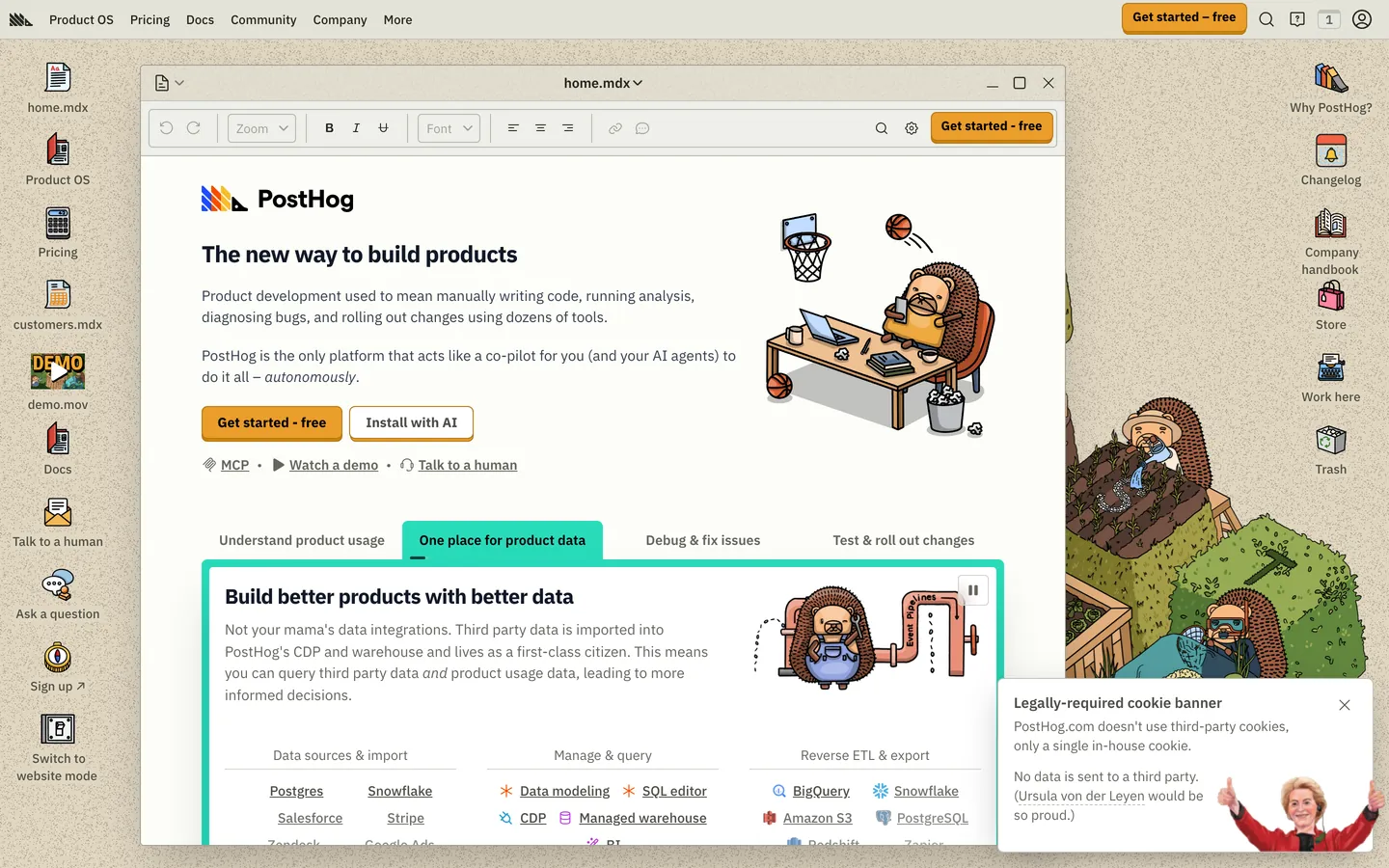
PostHog's design system pulls off an unusual feat: it makes a serious open-source product analytics platform feel like a friendly engineering sketchbook. The base canvas is a warm cream #eeefe9 — not white, not dark — and every page is dotted with hand-drawn hedgehog mascots in lab coats, hammocks, terminals, and reading glasses. Type runs IBM Plex Sans Variable at olive-gray #4d4f46 for body and deep olive-charcoal #23251d for headlines. Hierarchy is built from weight contrast (400, 500, 600, 700, 800) more than size, which gives the layout its textbook-chapter rhythm. The single saturated chromatic moment is the yellow-orange #f7a501 pill that anchors every primary CTA — "Get started — free" in the sticky nav, the hero call to action, and pricing-tier subscribes.
This page packages the full marketing surface into one DESIGN.md file built on the Google Labs spec. Inside: 29 colors tokens covering cream surfaces, olive ink, four pastel callout pairs, and link blue/teal; 21 typography tokens at five weights across IBM Plex Sans Variable plus Source Code Pro for code; 6 radius steps (0, 2, 4, 6, 8, 9999px); 8 spacing values including an 80px section rhythm; and 30 components covering buttons, pill chips, doc cards, hedgehog mascot cards, four colored callout banners, code blocks, sticky doc sidebar, and a six-column footer.
Feed the file to Claude, Cursor, or GitHub Copilot and the agent reproduces PostHog's specific dialect — cream canvas, weight-driven type, dark code islands on white doc cards, hedgehog mascot in the margin — instead of defaulting to a generic dashboard theme. Or reference the tokens directly in Tailwind config or CSS variables. The system is worth studying because it solves a problem most analytics tools dodge: how to make a data-dense product feel approachable without infantilizing the engineers who actually use it.
What makes it distinct
5
- Cream canvas anchor#eeefe9 runs edge-to-edge on every page; pure white never carries the background
- Single saturated CTA#f7a501 yellow-orange pill is the only loud color in the entire 32-component system
- Hedgehog mascots as the decoration layerhand-drawn characters replace gradients, mesh, and atmospheric depth entirely
- Weight-driven hierarchyIBM Plex Sans Variable stepped across 400/500/600/700/800 instead of leaning on size or color
- Four-pastel doc calloutssoft blue/green/red/purple tinted bands restricted to inline documentation, never marketing
posthog.com
Live at posthog.com
A snapshot of the brand in production. Scroll the frame to see the whole page.
Colors
29 colors
PostHog's system runs on #f7a501 as its primary voltage, used in 1 of 30 components. Type is set in IBM Plex Sans Variable across 20 tokens from 12px to 36px, weights 400–800. Shape language is mixed across 30 components, blending pills, soft rounds, and squarer corners.
Brand & Accent
Sparing, CTA-only voltage · 11
Surface
Page and card backgrounds · 5
Text
Headlines, body, captions · 6
Borders & Hairlines
Dividers, outlines, rules · 2
Other
Specialty colors · 5
Typography
20 type tokens
Set in IBM Plex Sans Variable across 20 tokens, from 12px to 36px, weights 400–800. Shown in its own stack: where the font isn't installed, the fallback the file names stands in.
- display-xl36px · weight 700 · lh 1.5The quick brown fox jumps over the lazy dog
- display-lg24px · weight 800 · lh 1.33 · tracking -0.6pxThe quick brown fox jumps over the lazy dog
- heading-lg21px · weight 700 · lh 1.4 · tracking -0.5pxThe quick brown fox jumps over the lazy dog
- heading-md20px · weight 700 · lh 1.4The quick brown fox jumps over the lazy dog
- heading-sm18px · weight 700 · lh 1.5The quick brown fox jumps over the lazy dog
- heading-sm-mixed18px · weight 600 · lh 1.56The quick brown fox jumps over the lazy dog
- body-md16px · weight 400 · lh 1.5The quick brown fox jumps over the lazy dog
- body-strong16px · weight 600 · lh 1.5The quick brown fox jumps over the lazy dog
- body-sm15px · weight 400 · lh 1.71The quick brown fox jumps over the lazy dog
- body-sm-strong15px · weight 600 · lh 1.71The quick brown fox jumps over the lazy dog
- body-xs14px · weight 500 · lh 1.43The quick brown fox jumps over the lazy dog
- caption-md14px · weight 700 · lh 1.71The quick brown fox jumps over the lazy dog
- caption-sm13px · weight 500 · lh 1.5The quick brown fox jumps over the lazy dog
- caption-xs12px · weight 600 · lh 1.33The quick brown fox jumps over the lazy dog
- utility-xs12px · weight 700 · lh 1.33The quick brown fox jumps over the lazy dog
- link-md16px · weight 400 · lh 1.5The quick brown fox jumps over the lazy dog
- button-md14px · weight 700 · lh 1.5The quick brown fox jumps over the lazy dog
- button-sm13px · weight 500 · lh 1The quick brown fox jumps over the lazy dog
- code-sm14px · weight 400 · lh 1.43The quick brown fox jumps over the lazy dog
- code-xs14px · weight 500 · lh 1.43The quick brown fox jumps over the lazy dog
Layout
Radii and spacing
6 corner radii and 8 spacing values. Shape language: mixed.
Radii
- none0px
- xs2px
- sm4px
- md6px
- lg8px
- full9999px
Spacing
- xxs2px
- xs4px
- sm8px
- md12px
- lg16px
- xl24px
- xxl32px
- section80px
Components
30 components
Each rendered from its tokens (color, type, radius, padding) on PostHog's own canvas.
- Button Primarybutton-primaryButton Primary
- Button Primary Pressedbutton-primary-pressedButton Primary Pressed
- Button Secondarybutton-secondaryButton Secondary
- Button Tertiarybutton-tertiaryButton Tertiary
- Button Disabledbutton-disabledButton Disabled
- Type here…text-inputText Input
- Type here…text-input-focusedText Input Focused
- Search Inputsearch-inputSearch Input
- Product Cardproduct-cardProduct Card
- Doc Carddoc-cardDoc Card
- Feature Tilefeature-tileFeature Tile
- Pricing Tier Cardpricing-tier-cardPricing Tier Card
- Hedgehog Mascot Cardhedgehog-mascot-cardHedgehog Mascot Card
- Product Tabproduct-tabProduct Tab
- Product Tab Activeproduct-tab-activeProduct Tab Active
- Pill Tabpill-tabPill Tab
- Pill Tab Activepill-tab-activePill Tab Active
- Badge Uppercasebadge-uppercaseBadge Uppercase
- Badge Promobadge-promoBadge Promo
- Banner Tip Bluebanner-tip-blueBanner Tip Blue
- Banner Tip Greenbanner-tip-greenBanner Tip Green
- Banner Tip Redbanner-tip-redBanner Tip Red
- Banner Tip Purplebanner-tip-purpleBanner Tip Purple
- Code Blockcode-blockCode Block
- Inline Codeinline-codeInline Code
- Primary Navprimary-navPrimary Nav
- Sub Nav Stripsub-nav-stripSub Nav Strip
- Doc Sidebardoc-sidebarDoc Sidebar
- Footer Sectionfooter-sectionFooter Section
- Link Inlinelink-inlineLink Inline
In use
The system, in use
PostHog's tokens on the kind of product it builds.
Build something people actually use.
A short paragraph of marketing copy that previews how the brand's display tier and body tier read together. Two sentences is usually enough.
FAQ
PostHog design system FAQ
Common questions about PostHog's tokens, components, and how to use this DESIGN.md in your project.
Read next
Related reading
Specs, directories, and component libraries that pair with this design system.
Use it
Use PostHog in your project
One machine-readable file. Drop it into Claude, Cursor, or any AI tool that reads DESIGN.md.
Download the DESIGN.md
One machine-readable file: every color, type, radius, spacing, and component token of PostHog.
Feed it to your AI tool
Drop it into Claude, Cursor, or GitHub Copilot. The agent writes React components and Tailwind classes that match PostHog's visual language.
Reference the tokens directly
Or paste the values into your Tailwind config, CSS variables, or component library: every color, size and radius is a quoted, ready-to-copy value.
Read the full DESIGN.md: overview, rationale, do’s and don’ts
Overview
PostHog's marketing system is built on the visual contradiction at the heart of the brand: a serious open-source product analytics platform rendered as if it were a friendly engineering sketchbook. The chrome runs on a warm cream canvas ({colors.canvas} — #eeefe9) — not white — and every page is dotted with hand-drawn hedgehog mascots in lab coats, lounge chairs, terminals, and reading glasses, scattered across the layout like marginalia in a textbook. Type sits in IBM Plex Sans Variable at olive-gray ({colors.body} — #4d4f46) for body and deep olive-charcoal ({colors.ink} — #23251d) for headlines, with weights stepped tightly between 400, 600, 700, and 800 to create hierarchy without color. The single saturated yellow-orange pill ({colors.primary} — #f7a501) is the brand's only loud chromatic moment; everything else is cream, olive, white card, and the occasional pastel callout band.
The system has a distinctive two-mode body layout: marketing pages (home, workflows, pricing) lean on alternating-pastel callout bands and feature tiles in white cards on cream, while documentation pages add a sticky 240px left sidebar with a rounded outline-icon section list. Code samples are full-width dark blocks on {colors.surface-dark} (the same olive-charcoal that carries body ink, used inverted) inside white doc cards, creating the system's most distinctive visual moment: a dark-on-dark code island floating inside a white card on a cream canvas, with a hedgehog mascot doodled in the margin.
Sections stack at {spacing.section} (80px) rhythm with cream canvas continuing edge-to-edge between them. The only color bands that interrupt the cream are pastel {component.banner-tip-blue} / -green / -red / -purple callout panels inside doc articles — soft tinted boxes that carry "💡 Tip", "✅ Success", "⚠️ Warning", "📘 Info" inline annotations. There are no decorative gradients, no atmospheric mesh backgrounds, and no full-bleed dark hero chapters; the cream canvas runs uninterrupted top to bottom and the hedgehogs are the entire visual identity.
Key Characteristics:
- Warm cream canvas (
{colors.canvas}— #eeefe9) end-to-end with no surface alternation between sections — the page is one continuous sheet - Single yellow-orange CTA pill (
{colors.primary}— #f7a501) with deep olive text ({colors.on-primary}) — the brand's only saturated color - IBM Plex Sans Variable across every text role with weights 400/500/600/700/800 — no other typeface in the system
- Hand-drawn hedgehog mascots scattered across the layout as the entire decorative system — no gradients, no mesh, no atmospheric backgrounds
- 4–8px radius card vocabulary:
{rounded.md}(6px) for most components,{rounded.lg}(8px) for select containers, fully rounded for pill chips - Pastel callout banners (
{colors.accent-blue-soft},{colors.accent-green-soft},{colors.accent-red-soft},{colors.accent-purple-soft}) break up doc article body with soft tinted side rails for tips/warnings/info - Documentation pages add a sticky 240px
{component.doc-sidebar}with rounded outline-icon section nav and an "Ask PostHog AI" CTA at the top
Known Gaps
- Mobile screenshots not captured — responsive behavior synthesizes PostHog's mobile pattern (hamburger drawer, single-column grid, doc sidebar accordion) from desktop evidence and the breakpoint stack.
- Hover states not documented by system policy.
- In-product app chrome (PostHog dashboard, charts, session replay player) not in the captured set — the marketing site is documented here, not the in-product analytics interface.
- Authenticated chrome (login modal, account dashboard, billing settings) not in the captured pages.
- Form validation states beyond the focused-state input not present in the captured surfaces.
- Marketing illustration set — the full library of hedgehog character poses is not enumerated here; specific poses (lab coat hedgehog, terminal hedgehog, hammock hedgehog) are noted as visible in screenshots but the full asset library is page-specific.
Analytics & Data
More systems like this
More DESIGN.md files in Analytics & Data.
Pricing
Build it with Pro
The DESIGN.md files are free. Pro adds 6,000+ blocks, premium templates and the MCP server, so your AI editor builds in your system for you.
4.9/5 out of 5 · 150+ reviewsfrom 150+ founders and developers.
Billing
Billed once a year in USD. Cancel anytime.
- How many people can use the license.
- Client work, SaaS products and anything you charge for.
- Production-ready React sections: hero, pricing, features, dashboards and more.
- Complete multi-page sites you can ship as they are.
- React icons from every major library, installable with one command.
- Presets that restyle every block, in light and dark.
- Lets your AI editor search, preview and install blocks for you.
- Priority requests are answered first.
Individual
For personal projects & open source
$32instead of $49/mo
$389 billed yearly
- Seats: 1 seat
- Commercial use: Personal & open source only
- Pro blocks: 6,000+ blocks
- Templates: All 14 templates
- React icons: 294k+ icons
- Themes: All 59 themes
- MCP server: Basic usage
- Support: Standard
Team
Most popularFor freelancers, agencies & startups
$66instead of $99/mo
$789 billed yearly · ≈ $13/dev/mo
- Seats: Up to 5 seats
- Commercial use: Included
- Pro blocks: 6,000+ blocks
- Templates: All 14 templates
- React icons: 294k+ icons
- Themes: All 59 themes
- MCP server: High usage
- Support: Priority
Organization
For companies with larger teams
$132instead of $199/mo
$1,589 billed yearly
- Seats: Unlimited seats
- Commercial use: Included
- Pro blocks: 6,000+ blocks
- Templates: All 14 templates
- React icons: 294k+ icons
- Themes: All 59 themes
- MCP server: Unlimited usage
- Support: Priority
Billed once a year in USD. Cancel anytime.
Individual
For personal projects & open source
$32instead of $49/mo
$389 billed yearly
- How many people can use the license.Seats: 1 seat
- Client work, SaaS products and anything you charge for.Commercial use: Personal & open source only
- Production-ready React sections: hero, pricing, features, dashboards and more.Pro blocks: 6,000+ blocks
- Complete multi-page sites you can ship as they are.Templates: All 14 templates
- React icons from every major library, installable with one command.React icons: 294k+ icons
- Presets that restyle every block, in light and dark.Themes: All 59 themes
- Lets your AI editor search, preview and install blocks for you.MCP server: Basic usage
- Priority requests are answered first.Support: Standard
Team
Most popularFor freelancers, agencies & startups
$66instead of $99/mo
$789 billed yearly · ≈ $13/dev/mo
Everything in Individual, plus
- How many people can use the license.Seats: Up to 5 seats
- Client work, SaaS products and anything you charge for.Commercial use: Included
- Lets your AI editor search, preview and install blocks for you.MCP server: High usage
- Priority requests are answered first.Support: Priority
Organization
For companies with larger teams
$132instead of $199/mo
$1,589 billed yearly
Everything in Team, plus
- How many people can use the license.Seats: Unlimited seats
- Lets your AI editor search, preview and install blocks for you.MCP server: Unlimited usage
- Secure checkout via Stripe
- Code lives in your repo
- Keep what you've shipped if you cancel
- License terms
Your system, built for you
Every block, template and icon, installed by your AI agent in your design system. The DESIGN.md files stay free.