dbt Labs Design System
dbt Labs' marketing system pairs near-black ink on white with transform orange #fe6703 CTAs and gradient feature cards. Polymath display, Polymath-text body, IBM Plex Mono metadata. Tokens for React, Next.js, and AI coding tools.
Add shadcn.io to your AI agent. · Pro It installs blocks, icons and templates in your design system from a prompt, with Pro.
Set up MCP- Primary
- #fe6703
- Typeface
- Polymath Text
- Shape
- Soft
- Base radius
- 12px
- Colors
- 20
- Type tokens
- 15
- Components
- 17
- Spacing values
- 9
About
About dbt Labs DESIGN.md
Curated by Dov Azencot · Updated May 19, 2026 · Source getdbt.com (opens in a new tab)
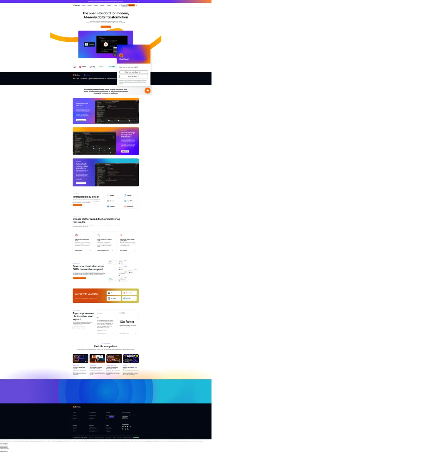
dbt Labs' marketing site positions the analytics engineer as the audience and the marketing chrome reflects it. The hero "The open standard for modern, AI-ready data transformation" sits at 64px Polymath weight 600 in near-black on a pure-white canvas, framed by two transform-orange ribbon-arcs (a left-side cyan-violet glow and a right-side orange swoosh) that wrap around a paired video mockup beneath. The composition reads closer to a developer-conference keynote than to a SaaS pricing page — restrained display type plus dynamic abstract chrome, with the brand orange surfacing only on the primary CTA pill and on the AI-ready accent strip.
The DESIGN.md file packages the system into a machine-readable spec for React tooling. Inside: 20 colors tokens drawn from the 42 raw hex values rendered on the page — the near-black ink (`#030711`, 757 occurrences, wired as `--color-terminal-black-950`) as the dominant text and border surface, transform orange (#fe6703 / #ff8c00, the brand-layer voltage) on CTAs and inline accents, and a constellation of 13 gradient-only brand hex codes (purple, blue, magenta, cyan, yellow) that appear exclusively inside feature-card backdrops. 16 typography tokens span Polymath (display) and Polymath-text (body) at weights 400–600 plus IBM Plex Mono for small-caps eyebrows, code blocks, and metadata strips. 17 components cover the orange-pill primary CTA, the gradient feature cards, the dark IDE-mockup panels, the hairline-bordered customer cards, and the form-input ladder.
Feed this file to Claude or Cursor and it reproduces dbt Labs' specific moves: near-black on white as the primary surface, single transform-orange voltage on the CTA only, gradient-fill feature cards for the three product narratives, and the 12 / 16px radius ladder with no 8px or 20px middle tier. The token references resolve cleanly — `{colors.transform-orange}` for the CTA voltage, `{colors.terminal-black}` for ink, `{typography.display-xl}` for the hero. The one move worth borrowing only if your product is itself developer-facing: the gradient-feature-card strategy works because the three cards each carry a distinct product story (Fusion engine, lineage, refactor) — applying the same pattern to a homogeneous feature set would read as decorative rather than as informational.
What makes it distinct
5
- Single transform-orange voltage#fe6703 fills the primary CTA pill and a single inline highlight on the hero; the brand color is held in reserve against the near-black ink
- Gradient feature cardsthe 3 main product-feature panels cycle through purple-blue, orange-magenta, and cyan-violet gradients; 13 brand-layer hex codes appear only inside these card backdrops
- Polymath + Polymath-text + IBM Plex MonoPolymath carries display at 600 weight, Polymath-text runs body at 400–500, IBM Plex Mono handles small-caps eyebrows and code metadata
- 12 / 16px radius ladder30 occurrences of 12px on smaller surfaces, 36 of 16px on cards; the system has no 8px or 20px tier
- Terminal-black palettethe color tokens are named --color-terminal-black-50 through 950, signaling the developer-tools positioning even before any color is applied
getdbt.com
Live at getdbt.com
A snapshot of the brand in production. Scroll the frame to see the whole page.
Colors
20 colors
dbt Labs's system runs on #fe6703 as its primary voltage, used in 2 of 17 components. Type is set in Polymath Text across 15 tokens from 12px to 64px, weights 400–600. Shape language is soft — components average 15px corner radius, with no sharp interactive edges.
Brand & Accent
Sparing, CTA-only voltage · 3
Surface
Page and card backgrounds · 1
Text
Headlines, body, captions · 2
Other
Specialty colors · 14
Typography
15 type tokens
Set in Polymath Text across 15 tokens, from 12px to 64px, weights 400–600. Shown in its own stack: where the font isn't installed, the fallback the file names stands in.
- display-xl64px · weight 600 · lh 76.8pxThe quick brown fox jumps over the lazy dog
- display-lg48px · weight 600 · lh 57.6pxThe quick brown fox jumps over the lazy dog
- display-md32px · weight 600 · lh 38.4pxThe quick brown fox jumps over the lazy dog
- heading-md24px · weight 600 · lh 28.8pxThe quick brown fox jumps over the lazy dog
- heading-sm18px · weight 600 · lh 21.6pxThe quick brown fox jumps over the lazy dog
- body-lg18px · weight 400 · lh 28pxThe quick brown fox jumps over the lazy dog
- body-md16px · weight 400 · lh 24pxThe quick brown fox jumps over the lazy dog
- body-sm14px · weight 400 · lh 20pxThe quick brown fox jumps over the lazy dog
- body-emphasis16px · weight 500 · lh 24pxThe quick brown fox jumps over the lazy dog
- body-lead24px · weight 600 · lh 32pxThe quick brown fox jumps over the lazy dog
- label-md20px · weight 500 · lh 28pxThe quick brown fox jumps over the lazy dog
- nav-link16px · weight 400 · lh 24pxThe quick brown fox jumps over the lazy dog
- mono-md16px · weight 500 · lh 24pxThe quick brown fox jumps over the lazy dog
- mono-sm14px · weight 500 · lh 20pxThe quick brown fox jumps over the lazy dog
- mono-xs12px · weight 500 · lh 16pxThe quick brown fox jumps over the lazy dog
Layout
Radii and spacing
6 corner radii and 9 spacing values. Shape language: soft.
Radii
- none0px
- xs4px
- sm8px
- md12px
- lg16px
- full9999px
Spacing
- xs4px
- sm8px
- md12px
- base16px
- lg24px
- xl32px
- 2xl40px
- 3xl48px
- 4xl64px
Components
17 components
Each rendered from its tokens (color, type, radius, padding) on dbt Labs's own canvas.
- Button Primarybutton-primaryButton Primary
- Button Secondarybutton-secondaryButton Secondary
- Button Ghostbutton-ghostButton Ghost
- Top Navtop-navTop Nav
- Nav Linknav-linkNav Link
- Hero Headinghero-headingHero Heading
- Section Headingsection-headingSection Heading
- Body Paragraphbody-paragraphBody Paragraph
- Body Paragraph Mutedbody-paragraph-mutedBody Paragraph Muted
- Eyebrow Monoeyebrow-monoEyebrow Mono
- Card Feature Purplecard-feature-purpleCard Feature Purple
- Card Feature Orangecard-feature-orangeCard Feature Orange
- Card Feature Cyancard-feature-cyanCard Feature Cyan
- Card Ide Darkcard-ide-darkCard Ide Dark
- Card Customercard-customerCard Customer
- Card Ide Stripecard-ide-stripeCard Ide Stripe
- Type here…text-inputText Input
In use
The system, in use
dbt Labs's tokens on the kind of product it builds.
Build something people actually use.
A short paragraph of marketing copy that previews how the brand's display tier and body tier read together. Two sentences is usually enough.
import { build } from "./build"

export async function main() {
  const result = await build()
  console.log("done", result)
}
FAQ
dbt Labs design system FAQ
Common questions about dbt Labs's tokens, components, and how to use this DESIGN.md in your project.
Read next
Related reading
Specs, directories, and component libraries that pair with this design system.
- Browse all design systemsThe full directory of DESIGN.md files on shadcn.io, with live mockups for each.shadcn.io
- dbt Labs — official sitedbt Labs' public marketing site — the source of truth for the live tokens captured in this file.getdbt.com (opens in a new tab)
- The DESIGN.md specificationGoogle Labs' open spec for machine-readable design system files — the format this page is built on.github.com (opens in a new tab)
Use it
Use dbt Labs in your project
One machine-readable file. Drop it into Claude, Cursor, or any AI tool that reads DESIGN.md.
Download the DESIGN.md
One machine-readable file: every color, type, radius, spacing, and component token of dbt Labs.
Feed it to your AI tool
Drop it into Claude, Cursor, or GitHub Copilot. The agent writes React components and Tailwind classes that match dbt Labs's visual language.
Reference the tokens directly
Or paste the values into your Tailwind config, CSS variables, or component library: every color, size and radius is a quoted, ready-to-copy value.
Read the full DESIGN.md: overview, rationale, do’s and don’ts
Overview
dbt Labs' marketing site positions the analytics engineer as the audience and the marketing chrome reflects it. Analytics-engineer voltage. Where Snowflake leans on uppercase Texta-900 over isometric line-art and Databricks holds a cream-into-navy editorial inversion, dbt Labs runs near-black ink ({colors.terminal-black} — #030711) on a pure-white canvas with a single saturated transform-orange ({colors.primary} — #fe6703) reserved for the primary CTA. The hero — a single sentence about the open standard for AI-ready data transformation — sits at 64px Polymath weight 600, framed by two ribbon-arc gradients (a cyan-violet glow on the left and an orange swoosh on the right) that wrap around a paired video mockup beneath. Restraint in display weight, dynamic abstract chrome in the surround.
The chromatic system is structural plus gradient. The terminal-black ink does 757 occurrences of structural work — 384 as text, 371 as borders, 2 as background. Transform orange handles the CTA voltage and the AI-ready accent strip. Below the fold, three main product-feature cards each carry a distinct gradient backdrop: purple-to-blue on the "Transform data with SQL" card (the Fusion engine narrative), orange-to-magenta on the "Interactive lineage across projects" card, and cyan-to-violet on the "Automatically refactor models" card. The 13 brand-layer hex codes the extraction surfaces — #6355fd, #6a00ff, #062ae0, #be43b0, #d535c2, #23daff, #4400ff, #ff8c00, #ff2600, #ffde39, #ffae00, #fff069, #7853fd — appear exclusively inside these card backdrops, never as standalone UI surfaces. The gradients work as narrative devices: each card is about a different product capability and the color shift signals the change in subject.
Typography is three voices. Polymath (a custom proprietary display family) carries every h-level surface at weight 600. Polymath Text (the sibling text-variant) runs body and nav at weights 400–500. IBM Plex Mono does the work of an uppercase eyebrow tier, code blocks, and metadata strips at 10–16px / 500. The pairing reads as engineering-credible — display weight 600 holds the line on warmth without tipping into bold authority, and the mono eyebrow tier signals the developer-tools audience the way a sans-uppercase label would not.
Key Characteristics:
- Near-black on white as the primary surface —
{colors.terminal-black}(#030711, 757 occurrences) is the dominant ink, paired with the pure-white canvas (163 occurrences). - Single transform-orange voltage (
{colors.primary}— #fe6703) reserved for the primary CTA pill and the AI-ready accent strip; the brighter{colors.primary-bright}(#ff8c00) handles inline ribbon gradients. - Three gradient feature cards — purple-blue on "Transform data with SQL," orange-magenta on "Interactive lineage," cyan-violet on "Automatically refactor." 13 brand-layer hex codes appear only inside these card backdrops.
- Polymath + Polymath Text + IBM Plex Mono — three families, with Polymath at display, the text-variant at body, and IBM Plex Mono at eyebrows and metadata.
- 12 / 16px radius ladder — 30 occurrences of 12px on smaller surfaces, 36 of 16px on cards; the system has no 8px or 20px middle tier.
- Fully-rounded CTA —
{rounded.full}9999px on the primary and secondary buttons; cards stay at 12–16px. - Terminal-black naming — the structural ink ladder runs
--color-terminal-black-50through--color-terminal-black-950, a developer-tools naming convention that signals the audience before any color is applied. - 16px base spacing module (57 occurrences). Major rhythm at
{spacing.base}(16px),{spacing.lg}(24px),{spacing.2xl}(40px), with section padding at 48–64px between bands.
Colors
Brand
- Transform Orange (
{colors.primary}— #fe6703): frequency 5 — 4 as background, 1 as gradient. The dominant CTA voltage — wired as--color-transform-orange-600. Fills the primary "Get demo" pill in the top-nav and the "Read announcement" pill above the hero. Held in deliberate reserve against the near-black ink. - Transform Orange Bright (
{colors.primary-bright}— #ff8c00): frequency 8 — 2 as background, 6 as gradient. Wired as--color-transform-orange-500. The brighter amber variant used inside the AI-ready ribbon-arc and the "Works with your IDEs" stripe card. - Transform Orange Deep (
{colors.primary-deep}— #dd5604): wired as--color-transform-orange-700but absent from the captured render. Reserved for hover/press states.
Gradient Palette
These 13 brand-layer hex codes appear exclusively inside gradient feature-card backdrops, never as standalone UI surfaces:
- Coalesce Purple (
{colors.coalesce-purple}— #632ff5): frequency 21 — wired as--color-coalesce-purple-600. The dominant purple gradient stop, used on the "Transform data with SQL" card backdrop. - Coalesce Purple Mid (
{colors.coalesce-purple-mid}— #7853fd): frequency 1 as gradient. The mid-stop on the purple ribbon. - Coalesce Purple Deep (
{colors.coalesce-purple-deep}— #5720e1): wired as--color-coalesce-purple-700. The deepest purple variant. - Coalesce Purple Pale (
{colors.coalesce-purple-pale}— #9786ff): wired as--color-coalesce-purple-400. The light end-stop on purple ribbons. - Electric Blue (
{colors.electric-blue}— #062ae0): frequency 6 — 2 background, 4 gradient. The blue stop on the purple-to-blue ribbon-arc behind the hero video. - Cyan (
{colors.cyan}— #23daff): frequency 4 as gradient. The bright cyan stop on the "Automatically refactor" card backdrop. - Magenta (
{colors.magenta}— #be43b0): frequency 2 as gradient. The magenta stop on the orange-to-magenta ribbon over the "Interactive lineage" card. - Pink (
{colors.pink}— #d535c2): frequency 1 as gradient. A brighter pink-magenta on the lineage card. - Amber (
{colors.amber}— #ffae00): frequency 2 — 1 background, 1 gradient. The mid-amber on the AI-ready ribbon. - Yellow (
{colors.yellow}— #ffde39): frequency 4 as gradient. The yellow stop on the orange-to-yellow ribbon over the "Works with your IDEs" panel. - Yellow Pale (
{colors.yellow-pale}— #fff069): frequency 1 as gradient. The pale-yellow end-stop.
Surface
- Terminal Black (
{colors.terminal-black}— #030711): frequency 757 — 384 as text, 371 as borders, 2 as background. The dominant near-black ink — carries every body paragraph, every hero h1, every nav link, and the dark "Works with your IDEs" panel background. Wired as--color-terminal-black-950. Pure near-black with a slight blue undertone (OKLCH hue 260). - Terminal Black 800 (
{colors.terminal-black-800}— #1e2939): frequency 10 — 5 text, 5 border. The slightly-lighter dark used on icon strokes and on the IDE-mockup panels. Wired as--color-terminal-black-800. - Terminal Black 500 (
{colors.terminal-black-500}— #6a7282): frequency 2. The mid-gray used on muted body-paragraph copy beneath the hero. Wired as--color-terminal-black-500. - Terminal Black 200 (
{colors.terminal-black-200}— #e5e7eb): frequency 16 — 4 background, 12 border. The dominant hairline tone — used on every card outline, every input border, and the divider beneath the customer logo wall. Wired as--color-terminal-black-200. - Canvas (
{colors.canvas}— #ffffff): frequency 163 — 70 as text (reversed on dark surfaces), 23 as background, 70 as border. Pure white floor across the entire above-fold and the body bands.
Semantic
- Blue Link (
{colors.blue-link}— #0467b7): wired as--color-blue-600but absent from the captured render. Reserved for inline-link text in long-form prose contexts (blog posts, documentation).
Typography
Font Families
The system runs three voices: Polymath for every display, h2, h3 surface (weights 400–700); Polymath Text for every body, nav, and emphasis surface (weights 400–600); and IBM Plex Mono for small-caps eyebrows, code blocks, and metadata strips (weights 400–500). Polymath and Polymath Text are custom proprietary families from dbt Labs' brand refresh — display and text-variant siblings that share metrics but differ in stroke contrast (Polymath has higher contrast, Polymath Text reads tighter at body sizes). IBM Plex Mono is open-source via Google Fonts.
The mono tier does the labor a sans uppercase eyebrow tier would normally do. The "FROM YOUR LABS" or "WHO IT'S FOR" labels above section headings render in IBM Plex Mono 12–14px / 500 — the result reads quietly technical without committing to an italic or small-caps variant of the body family.
Hierarchy
| Token | Family | Size | Weight | Line Height | Use |
|---|---|---|---|---|---|
{typography.display-xl} | Polymath | 64px | 600 | 76.8px | Hero h1 (the AI-ready data transformation lede) |
{typography.display-lg} | Polymath | 48px | 600 | 57.6px | Section h2 |
{typography.display-md} | Polymath | 32px | 600 | 38.4px | Smaller section displays, dark-band CTA headlines |
{typography.heading-md} | Polymath | 24px | 600 | 28.8px | Sub-section h3 titles |
{typography.heading-sm} | Polymath | 18px | 600 | 21.6px | h5 / feature-card titles |
{typography.body-lg} | Polymath Text | 18px | 400 | 28px | Hero sub-paragraph and section leads |
{typography.body-md} | Polymath Text | 16px | 400 | 24px | Default running text |
{typography.body-sm} | Polymath Text | 14px | 400 | 20px | Caption rows, secondary body, footer copy |
{typography.body-emphasis} | Polymath Text | 16px | 500 | 24px | Emphasized inline text, nav links, button labels |
{typography.body-lead} | Polymath Text | 24px | 600 | 32px | Pull quotes and short editorial leads |
{typography.label-md} | Polymath Text | 20px | 500 | 28px | Small section labels |
{typography.nav-link} | Polymath Text | 16px | 400 | 24px | Top-nav link labels |
{typography.mono-md} | IBM Plex Mono | 16px | 500 | 24px | Code blocks, multi-line monospace samples |
{typography.mono-sm} | IBM Plex Mono | 14px | 500 | 20px | Small-caps eyebrows, metadata captions |
{typography.mono-xs} | IBM Plex Mono | 12px | 500 | 16px | Small uppercase labels, footnote strips |
Principles
Display weight stays at 600. The hero h1 at 64px / 600 sits one step heavier than dbt's nearest peers (Databricks at 500, Snowflake at 900) — a deliberate middle that holds engineering-credible authority without committing to either editorial restraint or industrial mass. Polymath at 600 reads as a contemporary serif-influenced grotesk, slightly higher contrast than Inter, with measured display tracking.
The body-variant Polymath Text does the running-text labor. The pairing — display at Polymath, body at Polymath Text — is closer to a print magazine's serif/sans split than to a typical SaaS marketing page's single-family hierarchy. The mono eyebrow tier at IBM Plex Mono 12–14px / 500 carries the small-caps duty an italic or true small-caps variant would normally handle.
Note on Font Substitutes
Polymath is a custom proprietary display family from dbt Labs' 2024 brand refresh, with a sibling Polymath Text variant. The closest open-source substitute is Inter at weights 600/400 with a slight tracking adjustment (-0.01em on display sizes to match Polymath's tighter cap height); General Sans is closer in feel but not free. For the mono tier, IBM Plex Mono is itself open-source via Google Fonts — no substitute is needed.
Layout
Spacing System
- Base unit: 16px — the dominant gap value, appearing 57 times in the captured page.
- Tokens:
{spacing.xs}4px ·{spacing.sm}8px ·{spacing.md}12px ·{spacing.base}16px ·{spacing.lg}24px ·{spacing.xl}32px ·{spacing.2xl}40px ·{spacing.3xl}48px ·{spacing.4xl}64px. - Section padding (vertical): ~64px between major sections on the white canvas (the dominant compound-padding value at
64px 0px, 11 occurrences). - Card internal padding:
{spacing.2xl}(40px) for the gradient feature cards and 24px for the customer cards. - Top-nav padding:
{spacing.base}(16px) vertical,{spacing.lg}(24px) horizontal.
Grid & Container
- Max content width: ~1136px on display headlines, ~1312px on the gradient feature-card band, ~1456px on the customer logo wall and footer.
- Hero block: white canvas with the headline centered, framed by two ribbon-arc gradients (cyan-violet left, orange right) that wrap around the paired video mockup beneath.
- Gradient feature-card band: stacked single-column layout with three full-width cards — "Transform data with SQL" (purple gradient), "Interactive lineage across projects" (orange-magenta gradient), "Automatically refactor models" (cyan-violet gradient). Each card pairs a left-column heading / body / CTA with a right-column dark IDE mockup showing the actual product UI.
- "Choose dbt" band: 3-up feature cells on white, divided by hairlines, each carrying an icon + heading + body paragraph.
- "Works with your IDEs" stripe: a single full-width orange-amber gradient panel listing IDE integrations (Cursor, Claude Code, dbt Studio, VS Code).
- Customer logo wall: monochrome customer logos arranged in a 5-column grid, each rendered in the terminal-black ink at uniform size.
Rhythm
The page alternates between white density and gradient bursts. The hero is white with the ribbon-arcs as the only chromatic moment. The gradient feature-card band is the page's chromatic high point — three full-width gradient panels in succession. The "Choose dbt" 3-up returns to white density. The "Works with your IDEs" amber stripe inverts again. The customer band returns to white. This rhythm — white-dense / gradient-burst — is the page's structural device.
Elevation
The system has essentially no shadow tier. The captured page has no extracted shadow values; depth comes entirely from gradient surfaces and from {colors.terminal-black-200} hairline borders on cards.
- Flat (no shadow): hero, every body band, the customer cards, the footer — 100% of surfaces.
- Gradient elevation: the three feature cards each carry a saturated gradient backdrop that lifts them visually off the white canvas — gradient as elevation.
- Hairline outlines:
{colors.terminal-black-200}(#e5e7eb) carries every card outline and input border. Single hairline tone across the system.
Shapes
The radius scale is two-step: 12px and 16px on cards, fully-rounded pill on CTAs.
{rounded.none}0px — full-bleed bands and the top-nav surface.{rounded.xs}4px (5 occurrences) — small chips and narrow input borders.{rounded.sm}8px (3 occurrences) — secondary card variants.{rounded.md}12px (30 occurrences) — the dominant smaller-surface radius. Inputs, secondary chips, the IDE-mockup panels inside feature cards.{rounded.lg}16px (36 occurrences) — the dominant card radius. Every gradient feature card, every customer card, the "Works with your IDEs" stripe.{rounded.full}9999px — the primary CTA pill ({component.button-primary}), the secondary outlined CTA, the ghost CTA.
There is no 8px or 20px middle tier and no 24px+ tier. The system commits to 12 and 16 as the card radius, with the CTA going to a fully-rounded pill. The pill treatment is the warmest surface in the system — the transform-orange "Get demo" pill on the white hero is the single most-tappable element on the page.
Components
button-primary — The signature CTA. Transform-orange {colors.primary} fill, white text, fully-rounded {rounded.full} pill, 12x24 padding, 44px height. "Get demo" is the canonical top-nav instance; "Read announcement" appears above the hero h1.
button-secondary — White fill with terminal-black text and a 1px {colors.terminal-black-200} border, fully-rounded pill. Used for "Book a Demo" and tertiary CTAs across the body.
button-ghost — Transparent fill with terminal-black text, fully-rounded pill. The lightest interactive surface — used inside chat-widget popovers and secondary nav clusters.
top-nav — White surface, 64px height, 16x24 padding. dbt Labs wordmark flush left, product-nav links (Product, Solutions, Customers, Resources, Community, Pricing) center, "Get demo" transform-orange CTA + login cluster flush right.
nav-link — Transparent background, terminal-black text in {typography.nav-link} (16px / 400 Polymath Text), 8x16 padding. No hover background visible in the captured surface.
hero-heading — Terminal-black text on the white hero, Polymath 64px / 600. The display tier — engineering-credible authority without committing to either editorial restraint or industrial mass.
section-heading — Terminal-black text, Polymath 48px / 600. Used for "Choose dbt for speed, trust, and delivering real results," "Top companies use dbt to deliver real impact," "Find dbt everywhere."
body-paragraph — Default terminal-black running-text at Polymath Text 16px / 400. The hero sub-paragraph and section leads.
body-paragraph-muted — {colors.terminal-black-500} (#6a7282) variant for secondary copy beneath the hero h1.
eyebrow-mono — Transform-orange text in IBM Plex Mono 14px / 500. Sits above section displays — the small-caps tier the system uses instead of a colored eyebrow sans. The single chromatic moment of orange outside the CTA pill.
card-feature-purple — Coalesce-purple {colors.coalesce-purple} fill, white text, {rounded.lg} 16px radius, 40px internal padding. The "Transform data with SQL" feature card — pairs the heading / body / CTA on the left with a dark IDE mockup on the right.
card-feature-orange — Transform-orange-bright {colors.primary-bright} fill, white text, {rounded.lg} 16px radius, 40px padding. The "Interactive lineage across projects" card.
card-feature-cyan — Cyan {colors.cyan} fill, terminal-black text, {rounded.lg} 16px radius, 40px padding. The "Automatically refactor models and columns" card — the lightest gradient backdrop, hence dark text.
card-ide-dark — Terminal-black {colors.terminal-black} fill, white text, {rounded.md} 12px radius, 24px padding. The IDE-mockup panel that sits inside each gradient feature card — shows the dbt Fusion engine and lineage UI in monospace.
card-customer — White fill, terminal-black text, 1px {colors.terminal-black-200} border, {rounded.lg} 16px radius, 24px padding. The customer-quote card — holds product testimonials from JetBlue, KPMG, and similar enterprise references.
card-ide-stripe — Transform-orange-bright {colors.primary-bright} fill, terminal-black text, {rounded.lg} 16px radius, 24px padding. The "Works with your IDEs" stripe panel listing integration logos (Cursor, Claude Code, dbt Studio, VS Code).
text-input — White surface, terminal-black text, 1px {colors.terminal-black-200} border, {rounded.md} 12px radius, 12x16 padding, 44px height. Form-field outline for the demo-request and newsletter forms.
Do's and Don'ts
Do keep the transform-orange CTA the single primary chromatic moment outside gradient cards. The system has one orange surface on the body chrome — multiplying it into secondary buttons or inline accents dilutes the only chromatic voltage on the page.
Do use the gradient feature cards as narrative devices. Each card backdrop signals a different product capability (Fusion engine on purple, lineage on orange-magenta, refactor on cyan). Applying the same gradient to all three or to a homogeneous feature set reads as decorative rather than as informational.
Do render small-caps eyebrows in IBM Plex Mono 12–14px / 500. The system uses no sans uppercase eyebrow tier — reaching for an all-caps Polymath Text label breaks the typographic split.
Do keep display weight at Polymath 600. The hero at 64px / 600 sits deliberately in the middle ground between editorial restraint (Stripe at 300) and industrial mass (Snowflake at 900). Bumping to 700+ reads as a fintech-style shout.
Don't use {colors.terminal-black-200} (#e5e7eb) for background fills or text — it is a hairline-only token (the dominant border surface). For a light surface, use {colors.canvas} (#ffffff); for an off-white, the system does not expose a token.
Don't introduce an 8px or 20px middle radius on cards. The system commits to 12 and 16 as the card scale; adding a middle value softens the contrast between body chrome and the fully-rounded CTA pill.
Don't apply gradient backdrops to general body surfaces. The 13 brand-layer hex codes ({colors.coalesce-purple}, {colors.cyan}, {colors.magenta}, etc.) exist only inside the three product-feature cards and the "Works with your IDEs" stripe — using them as standalone UI backgrounds reads as decorative chaos.
Don't swap {colors.terminal-black} (#030711) for a softer slate-gray or charcoal. The system commits to the near-pure-black ink against the pure-white canvas; softening to a slate undercuts the developer-tools positioning the --color-terminal-black-950 token name signals.
Known Gaps
- Hover and focus states: the captured surface exposes resting states only. The
{colors.primary-deep}(#dd5604) variant is wired as--color-transform-orange-700but absent from the captured render — reserved for the hover/press state on the primary CTA. - Form input states:
{component.text-input}carries the resting state; error / validation styling lives inside the demo-request flow not exposed on the marketing surface. - Dark mode for body bands: the captured marketing surface is light-only. The dbt Cloud product UI carries a dark variant not represented here.
- Motion: the ribbon-arc gradients animate on scroll (subtle parallax) and the gradient feature cards have hover-state interaction; the spec captures end-state values only. Easing curves, duration, and stagger timing live in the live page runtime.
- Product surfaces: this DESIGN.md captures the marketing site only. The dbt Cloud IDE, the lineage UI, the Studio (Cursor-like dbt-specific editor), and the dbt Docs surface each carry their own token systems not represented here.
- Coalesce sub-brand: the
--color-coalesce-purple-*family is wired as the sub-brand identity for the Coalesce conference (coalesce.getdbt.com). On the main marketing site it appears only inside gradient feature-card backdrops, not as a standalone sub-brand chrome surface. - Polymath custom-family substitution: Polymath and Polymath Text are proprietary; reproducing the system at scale without the licensed family is a real limitation. Inter at weights 600/400 is the closest open-source approximation but has different stroke contrast.
Analytics & Data
More systems like this
More DESIGN.md files in Analytics & Data.
Pricing
Build it with Pro
The DESIGN.md files are free. Pro adds 6,000+ blocks, premium templates and the MCP server, so your AI editor builds in your system for you.
4.9/5 out of 5 · 150+ reviewsfrom 150+ founders and developers.
Billing
Billed once a year in USD. Cancel anytime.
- How many people can use the license.
- Client work, SaaS products and anything you charge for.
- Production-ready React sections: hero, pricing, features, dashboards and more.
- Complete multi-page sites you can ship as they are.
- React icons from every major library, installable with one command.
- Presets that restyle every block, in light and dark.
- Lets your AI editor search, preview and install blocks for you.
- Priority requests are answered first.
Individual
For personal projects & open source
$32instead of $49/mo
$389 billed yearly
- Seats: 1 seat
- Commercial use: Personal & open source only
- Pro blocks: 6,000+ blocks
- Templates: All 14 templates
- React icons: 294k+ icons
- Themes: All 59 themes
- MCP server: Basic usage
- Support: Standard
Team
Most popularFor freelancers, agencies & startups
$66instead of $99/mo
$789 billed yearly · ≈ $13/dev/mo
- Seats: Up to 5 seats
- Commercial use: Included
- Pro blocks: 6,000+ blocks
- Templates: All 14 templates
- React icons: 294k+ icons
- Themes: All 59 themes
- MCP server: High usage
- Support: Priority
Organization
For companies with larger teams
$132instead of $199/mo
$1,589 billed yearly
- Seats: Unlimited seats
- Commercial use: Included
- Pro blocks: 6,000+ blocks
- Templates: All 14 templates
- React icons: 294k+ icons
- Themes: All 59 themes
- MCP server: Unlimited usage
- Support: Priority
Billed once a year in USD. Cancel anytime.
Individual
For personal projects & open source
$32instead of $49/mo
$389 billed yearly
- How many people can use the license.Seats: 1 seat
- Client work, SaaS products and anything you charge for.Commercial use: Personal & open source only
- Production-ready React sections: hero, pricing, features, dashboards and more.Pro blocks: 6,000+ blocks
- Complete multi-page sites you can ship as they are.Templates: All 14 templates
- React icons from every major library, installable with one command.React icons: 294k+ icons
- Presets that restyle every block, in light and dark.Themes: All 59 themes
- Lets your AI editor search, preview and install blocks for you.MCP server: Basic usage
- Priority requests are answered first.Support: Standard
Team
Most popularFor freelancers, agencies & startups
$66instead of $99/mo
$789 billed yearly · ≈ $13/dev/mo
Everything in Individual, plus
- How many people can use the license.Seats: Up to 5 seats
- Client work, SaaS products and anything you charge for.Commercial use: Included
- Lets your AI editor search, preview and install blocks for you.MCP server: High usage
- Priority requests are answered first.Support: Priority
Organization
For companies with larger teams
$132instead of $199/mo
$1,589 billed yearly
Everything in Team, plus
- How many people can use the license.Seats: Unlimited seats
- Lets your AI editor search, preview and install blocks for you.MCP server: Unlimited usage
- Secure checkout via Stripe
- Code lives in your repo
- Keep what you've shipped if you cancel
- License terms
Your system, built for you
Every block, template and icon, installed by your AI agent in your design system. The DESIGN.md files stay free.