Amplitude Design System
Amplitude's marketing-system tokens as a DESIGN.md file. Cobalt voltage on a near-monochrome canvas, IBM Plex Sans / Gellix display, black-pill CTA, 18 colors, 16 components. For React, Next.js, and AI coding tools.
Add shadcn.io to your AI agent. · Pro It installs blocks, icons and templates in your design system from a prompt, with Pro.
Set up MCP- Primary
- #1e61f0
- Typeface
- Gellix
- Shape
- Mixed
- Base radius
- 8px
- Colors
- 18
- Type tokens
- 14
- Components
- 16
- Spacing values
- 9
About
About Amplitude DESIGN.md
Curated by Dov Azencot · Updated May 19, 2026 · Source amplitude.com (opens in a new tab)
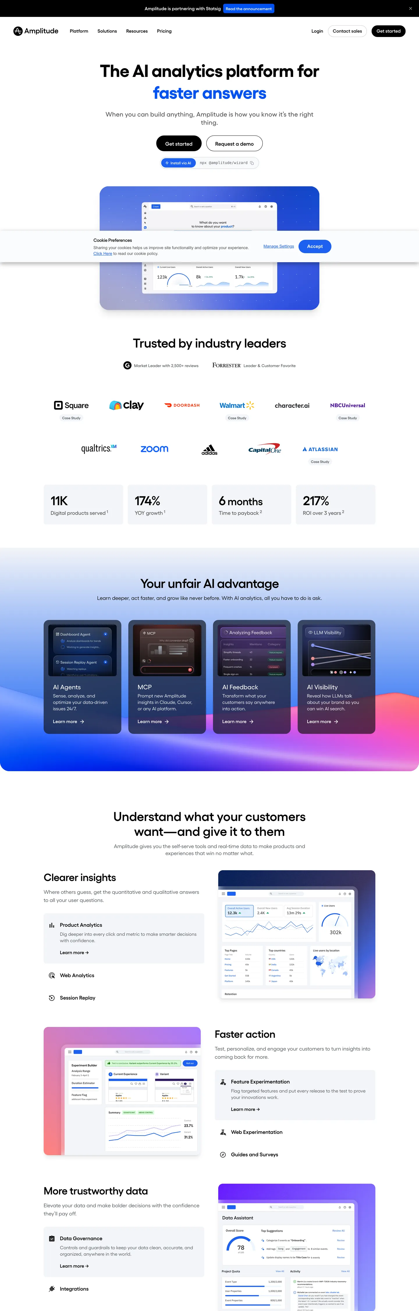
Amplitude's marketing site does the opposite of what its category usually does. Where Mixpanel paints the hero violet and Segment fills its CDP page with deep navy, Amplitude sits on a near-monochrome canvas — a 60px IBM Plex Sans headline in pure black on white, with one cobalt-blue word that animates through "faster answers," "testing everything," "non-stop optimizations." The brand voltage is reserved entirely for that rotating verb. The primary CTA beneath the headline does not even use the cobalt — it is a 56px-tall near-black pill in ink #1a1f23 with white text, sitting next to a transparent secondary that opens a request-demo flow.
The DESIGN.md file packages the system into a machine-readable spec. Inside: 18 colors tokens drawn from a structural palette of near-blacks, cool grays, and a hairline cream, plus a brand tier of cobalt #1e61f0, deep cobalt #0052f2, navy #001a4f, and a single accent violet #a273ff that appears only in the "unfair advantage" band below the fold. 14 typography tokens span the Gellix display stack with IBM Plex Sans as the loaded body family — sizes go from 60px hero down to 12px metadata, with weight 600 doing the heading work and weight 400 the body. 16 components cover the black-pill primary, the dashboard-mock embed, the six-up advantage tile band, hairline cards, and the top-nav.
Feed this file to Claude or Cursor and it reproduces Amplitude's specific moves: near-monochrome canvas instead of brand-tinted gradient, cobalt voltage reserved for a single animated word, near-black pill CTA over the brand cobalt, and the embedded dashboard mock that does the chromatic job the hero itself refuses to do. The one move worth borrowing only if your product has a genuine analytics surface: the dashboard-as-hero embed. Most teams reach for an abstract brand gradient because they have nothing real to show.
What makes it distinct
5
- Black CTA, blue voltagethe primary button fills with near-black #1a1f23 while cobalt #1e61f0 is reserved for the rotating tagline word
- Animated word-swap headlinethe hero h1 cycles through four taglines, each rendered as a cobalt span inside a black sentence
- Embedded dashboard herothe above-fold area shows a real-looking purple-tinted analytics mock rather than abstract brand chrome
- Six-up advantage tile bandsaturated-fill cards in cobalt, indigo, violet, and ink build a horizontal advantage strip below the fold
- IBM Plex Sans across every tierGellix is the visible display family but the loaded font variables walk IBM Plex Sans and IBM Plex Serif
amplitude.com
Live at amplitude.com
A snapshot of the brand in production. Scroll the frame to see the whole page.
Colors
18 colors
Amplitude's system runs on #1e61f0 as its primary voltage, used in 2 of 16 components. Type is set in Gellix across 14 tokens from 12px to 60px, weights 400–700. Shape language is mixed across 16 components, blending pills, soft rounds, and squarer corners.
Brand & Accent
Sparing, CTA-only voltage · 5
Surface
Page and card backgrounds · 2
Text
Headlines, body, captions · 9
Borders & Hairlines
Dividers, outlines, rules · 2
Typography
14 type tokens
Set in Gellix across 14 tokens, from 12px to 60px, weights 400–700. Shown in its own stack: where the font isn't installed, the fallback the file names stands in.
- display-xl60px · weight 700 · lh 70px · tracking -1pxThe quick brown fox jumps over the lazy dog
- display-md44px · weight 600 · lh 48px · tracking -1pxThe quick brown fox jumps over the lazy dog
- heading-lg24px · weight 600 · lh 30px · tracking -0.12pxThe quick brown fox jumps over the lazy dog
- heading-md22px · weight 500 · lh 24pxThe quick brown fox jumps over the lazy dog
- heading-sm18px · weight 600 · lh 28pxThe quick brown fox jumps over the lazy dog
- body-lg18px · weight 400 · lh 23.4pxThe quick brown fox jumps over the lazy dog
- body-md16px · weight 400 · lh 22pxThe quick brown fox jumps over the lazy dog
- body-sm14px · weight 400 · lh 18.9pxThe quick brown fox jumps over the lazy dog
- label-md16px · weight 600 · lh 21.6px · tracking -0.04pxThe quick brown fox jumps over the lazy dog
- label-sm14px · weight 600 · lh 18.9px · tracking -0.035pxThe quick brown fox jumps over the lazy dog
- button-md16px · weight 600 · lh 24pxThe quick brown fox jumps over the lazy dog
- nav-link18px · weight 400 · lh 28pxThe quick brown fox jumps over the lazy dog
- caption12px · weight 600 · lh 16pxThe quick brown fox jumps over the lazy dog
- body-serif14.4px · weight 400 · lh 21.6pxThe quick brown fox jumps over the lazy dog
Layout
Radii and spacing
8 corner radii and 9 spacing values. Shape language: mixed.
Radii
- none0px
- sm6px
- md8px
- lg12px
- xl16px
- 2xl18px
- pill30px
- full9999px
Spacing
- xxs2px
- xs6px
- sm8px
- md12px
- base16px
- lg20px
- xl24px
- 2xl32px
- 3xl48px
Components
16 components
Each rendered from its tokens (color, type, radius, padding) on Amplitude's own canvas.
- Button Primarybutton-primaryButton Primary
- Button Secondarybutton-secondaryButton Secondary
- Button Cobaltbutton-cobaltButton Cobalt
- Top Navtop-navTop Nav
- Nav Linknav-linkNav Link
- Hero Headinghero-headingHero Heading
- Hero Tagline Highlighthero-tagline-highlightHero Tagline Highlight
- Section Headingsection-headingSection Heading
- Body Paragraphbody-paragraphBody Paragraph
- Body Paragraph Mutedbody-paragraph-mutedBody Paragraph Muted
- Card Hairlinecard-hairlineCard Hairline
- Card Surfacecard-surfaceCard Surface
- Advantage Tile Cobaltadvantage-tile-cobaltAdvantage Tile Cobalt
- Advantage Tile Violetadvantage-tile-violetAdvantage Tile Violet
- Type here…text-inputText Input
- Stat Calloutstat-calloutStat Callout
In use
The system, in use
Amplitude's tokens on the kind of product it builds.
Build something people actually use.
A short paragraph of marketing copy that previews how the brand's display tier and body tier read together. Two sentences is usually enough.
FAQ
Amplitude design system FAQ
Common questions about Amplitude's tokens, components, and how to use this DESIGN.md in your project.
Read next
Related reading
Specs, directories, and component libraries that pair with this design system.
- Browse all design systemsThe full directory of DESIGN.md files on shadcn.io, with live mockups for each.shadcn.io
- Amplitude — official siteAmplitude's public marketing site — the source of truth for the live tokens captured in this file.amplitude.com (opens in a new tab)
- The DESIGN.md specificationGoogle Labs' open spec for machine-readable design system files — the format this page is built on.github.com (opens in a new tab)
Use it
Use Amplitude in your project
One machine-readable file. Drop it into Claude, Cursor, or any AI tool that reads DESIGN.md.
Download the DESIGN.md
One machine-readable file: every color, type, radius, spacing, and component token of Amplitude.
Feed it to your AI tool
Drop it into Claude, Cursor, or GitHub Copilot. The agent writes React components and Tailwind classes that match Amplitude's visual language.
Reference the tokens directly
Or paste the values into your Tailwind config, CSS variables, or component library: every color, size and radius is a quoted, ready-to-copy value.
Read the full DESIGN.md: overview, rationale, do’s and don’ts
Overview
Amplitude's marketing site refuses the convention of its category. Voltage-as-verb. Where Mixpanel paints its hero violet and Segment fills its CDP page with deep navy, Amplitude sits on a near-monochrome canvas — a 60px display headline in pure black {colors.ink} on white {colors.canvas}, with one cobalt-blue word that animates through "faster answers," "testing everything," "non-stop optimizations." The brand voltage {colors.primary} (#1e61f0) is reserved entirely for that rotating verb. The primary CTA beneath the headline does not even use the cobalt — it is a 56px-tall near-black pill in {colors.ink-pill} (#1a1f23) with white text, sitting next to a transparent secondary that opens a request-demo flow.
The chromatic discipline is the move. The brand cobalt appears six times in the captured page — twice as text on the rotating word, twice as a background fill inside the embedded dashboard mock, twice as a border. Deeper cobalts ({colors.primary-dark} #0052f2 and {colors.primary-navy} #001a4f) live almost entirely inside the dashboard-mock chrome and the cobalt advantage tile below the fold. Where Vercel holds matte black across the page and Linear runs a violet-graphite surface ladder, Amplitude does neither — it runs an explicitly editorial white canvas and lets a single in-product mock carry the chromatic anchor.
Typography is the loaded IBM Plex stack (--font-ibm-plex-sans, --font-ibm-plex-serif) with Gellix as the rendered display family. Display tops at 60px in weight 700 with -1px tracking, headings at 18-24px in weight 600, body at 14-16px in weight 400. Weight 600 is the system's emphasis tier — there is no 800+ moment.
Key Characteristics:
- Near-monochrome canvas (
{colors.canvas}— #ffffff) with pure black{colors.ink}body text; the brand cobalt reserved for one animated headline word. - Black-pill primary CTA — 56px tall,
{colors.ink-pill}(#1a1f23) fill, white text, 6px corner radius. Sits next to a hairline-bordered transparent secondary. - Three brand cobalt tiers — primary cobalt
{colors.primary}(#1e61f0) for the animated word, primary-dark{colors.primary-dark}(#0052f2) inside the dashboard-mock gradient, primary-navy{colors.primary-navy}(#001a4f) as the surface fill of the cobalt advantage tile. - Six-up "Your unfair advantage" tile band — saturated-fill cards in navy, violet
{colors.accent-violet}, periwinkle{colors.accent-periwinkle}, and ink, each carrying a white heading. The only chromatic band on the page outside the hero mock. - Embedded dashboard hero — the above-fold area shows a real-looking purple-tinted analytics mock with overlapping panels rather than abstract brand chrome.
- IBM Plex Sans / Gellix across every typographic tier — weight 600 emphasis, weight 400 body, no 800+ display weight.
- Small-step radius scale anchored at
{rounded.sm}6px (55 occurrences); the pill at 30px / 9999px carries only the primary CTA and the rotating-tagline highlight chip. - 4px base spacing unit. The dominant tokens are
{spacing.md}12px (48 occurrences) and{spacing.base}16px (42); section vertical padding sits at 48px.
Colors
Brand
- Cobalt (
{colors.primary}— #1e61f0): frequency 6. Used as text (2), bg (2), border (2). The single brand voltage — reserved for the animated headline word and for a single accent fill inside the dashboard mock. Wired in CSS without a custom property name; the cobalt is applied inline through Tailwind utility classes. - Cobalt Dark (
{colors.primary-dark}— #0052f2): frequency 4. Used as background (2), border (1), gradient (1). The end-stop on the dashboard-mock background gradient and on a single hover-state callout. - Cobalt Navy (
{colors.primary-navy}— #001a4f): frequency 3, all as background. The fill tone of the cobalt advantage tile in the six-up band below the fold. - Accent Violet (
{colors.accent-violet}— #a273ff): frequency 3, all as background. The fill tone of the violet advantage tile in the six-up band. - Accent Periwinkle (
{colors.accent-periwinkle}— #6980ff): frequency 1, as background. The fill tone of a smaller secondary tile within the advantage band.
Surface
- Canvas (
{colors.canvas}— #ffffff): frequency 539. Used as text on dark surfaces (262), border (261), background (16). The page floor — pure white, no cream undertone. - Surface-1 (
{colors.surface-1}— #f2f4f8): frequency 14, all as background. The faint cool-gray surface used inside the "trusted by industry leaders" logo strip and a handful of feature cells.
Text / Ink
- Ink (
{colors.ink}— #000000): frequency 379. Used as text (166), border (169), background (22), shadow (13), gradient (9). The dominant text and border tone — pure black, deliberately not softened to a charcoal. - Ink Pill (
{colors.ink-pill}— #1a1f23): the fill of the primary CTA button. Slightly warmer than pure ink, which keeps the button reading as a separate object from black running text. - Ink Soft (
{colors.ink-soft}— #171717): frequency 110. Used as text (56), border (54). A secondary near-black tone for body emphasis where pure ink would feel too heavy. - Ink Muted (
{colors.ink-muted}— #373d42): frequency 110. Used as text (55), border (55). The body-running-text alternative for long-form paragraphs. - Muted (
{colors.muted}— #565656): frequency 922. Used as text (462), border (460). The dominant secondary text and border tone — captions, sub-labels, section dividers. - Muted Cool (
{colors.muted-cool}— #697077): frequency 31. Used as text (15), border (15), background (1). Tertiary metadata. - Muted Warm (
{colors.muted-warm}— #868d95): frequency 60. Used as text (30), border (30). The lightest gray in the system for de-emphasized labels. - Body Text (
{colors.body-text}— #333333): the rendered text color of the body paragraph component. A measured charcoal that sits between ink-muted and pure ink. - Cookie Ink (
{colors.cookie-ink}— #1f1f1f): the text color of the cookie-preferences h2 modal. Captured because it represents a distinct UI surface tier.
Hairline
- Hairline (
{colors.hairline}— #d5d9e0): frequency 1, as border. The single rendered hairline tone on the captured page — used on the secondary button outline and on feature-cell dividers. Most other "borders" use one of the ink tones at low opacity. - Hairline Strong (
{colors.hairline-strong}— #9fa5ad): frequency 5. Used as text (3), border (2). A heavier outline tone for separator strips and form field outlines.
Typography
Font Family
The system loads IBM Plex Sans (--font-ibm-plex-sans) and IBM Plex Serif (--font-ibm-plex-serif) as the named webfonts but renders Gellix as the visible display family across body and headings. The fallback stack walks Arial, ui-sans-serif, system-ui, sans-serif, with emoji fallbacks behind that. IBM Plex Serif appears only inside the cookie-preferences modal body copy — the rest of the page is sans throughout.
The dual-loaded stack is the typographic move. Gellix carries the rendered look while Plex Sans is the licensable substitute kept warm in the variable name — feeding the design tokens into a Plex-only project still reads as Amplitude.
Hierarchy
| Token | Size | Weight | Line Height | Letter Spacing | Use |
|---|---|---|---|---|---|
{typography.display-xl} | 60px | 700 | 70px | -1px | Hero h1 — the rotating-tagline headline |
{typography.display-md} | 44px | 600 | 48px | -1px | Section h3 — "Your unfair advantage" / "Understand what your customers want" |
{typography.heading-lg} | 24px | 600 | 30px | -0.12px | Sub-section titles |
{typography.heading-md} | 22px | 500 | 24px | 0 | h6 / large card titles |
{typography.heading-sm} | 18px | 600 | 28px | 0 | h4 / advantage-tile titles |
{typography.body-lg} | 18px | 400 | 23.4px | 0 | Hero sub-paragraph, section leads |
{typography.body-md} | 16px | 400 | 22px | 0 | Default running text |
{typography.body-sm} | 14px | 400 | 18.9px | 0 | Caption rows, footnote text |
{typography.label-md} | 16px | 600 | 21.6px | -0.04px | Nav labels, card titles |
{typography.label-sm} | 14px | 600 | 18.9px | -0.035px | h4 small titles, feature-cell labels |
{typography.button-md} | 16px | 600 | 24px | 0 | Primary and secondary button labels |
{typography.nav-link} | 18px | 400 | 28px | 0 | Top-nav link labels |
{typography.caption} | 12px | 600 | 16px | 0 | Small-caps badges, stat callouts |
{typography.body-serif} | 14.4px | 400 | 21.6px | 0 | IBM Plex Serif body — cookie modal only |
Principles
Display weight tops at 700 only on the 60px hero — every other heading sits at weight 600, which is the system's true emphasis tier. The hero h1 with -1px tracking reads loud without going into the 800-900 range a typical fintech or enterprise hero would use. The 600-weight emphasis carries from label tier all the way up to the 44px section displays, anchoring the system on a single weight rather than a ladder.
Body and nav both run weight 400. The nav link at 18px / 400 is notably larger than most marketing systems run their nav (Stripe and Vercel sit at 14px / 500); Amplitude's choice keeps the top band feeling editorial rather than transactional.
Note on Font Substitutes
Gellix is a licensed display family. Inter at the same weights is the closest open-source substitute; the proportions transfer cleanly. IBM Plex Sans itself is free under the SIL Open Font License — and since it is already loaded into Amplitude's CSS variables as the named fallback, the licensable substitute is built into the system. For the serif tier, IBM Plex Serif is also OFL and reproduces the cookie-modal body identically.
Layout
Spacing System
- Base unit: 4px. The dominant gap is
{spacing.md}12px (48 captured occurrences) and{spacing.base}16px (42). - Tokens:
{spacing.xxs}2px ·{spacing.xs}6px ·{spacing.sm}8px ·{spacing.md}12px ·{spacing.base}16px ·{spacing.lg}20px ·{spacing.xl}24px ·{spacing.2xl}32px ·{spacing.3xl}48px. - Section padding (vertical): ~48px between major sections; the hero band sits noticeably more generous with ~96px of breathing room above and below the headline.
- Card internal padding:
{spacing.xl}(24px) on{component.card-hairline}and{component.advantage-tile-cobalt};{spacing.xl}paired with 16px horizontal inset on{component.card-surface}. - Top-nav padding:
{spacing.md}(12px) vertical,{spacing.xl}(24px) horizontal.
Grid & Container
- Max content width: ~1392px on the full-bleed sections (the captured primary button reports a 1392px parent width); the hero headline itself constrains to ~756px so the rotating tagline lands without wrapping awkwardly.
- Hero block: white canvas, embedded dashboard mock pinned beneath the CTA cluster, all centered.
- Advantage band: 6-up tile grid spanning the content width, each tile fixed to roughly the same height with a colored background and a white heading inside.
- Feature rows below: alternating 2-column "image + body" splits with the image side carrying a faint purple-tinted surface fill.
Rhythm
The page alternates between monochrome editorial and saturated tile bands. Hero and the long-form feature explainers run on pure white with black type. The "unfair advantage" band, the embedded dashboard mock, and the feature-image surfaces are the only chromatic moments. This pacing is the structural device — the cobalt and violet land harder because they are surrounded by white.
Elevation
The system has essentially no shadow tier. The captured page has 13 occurrences of #000000 used as shadow ink — almost all confined to faint elevations on the embedded dashboard-mock chrome and to subtle drop shadows beneath the advantage tiles. Hairline borders and surface-color contrast do the elevation work that shadows would carry on a typical analytics product.
- Flat (no shadow): hero, body bands, feature cells, footer — 99% of surfaces.
- Dashboard-mock elevation: the embedded analytics panel sits with a soft 8px black-at-low-opacity shadow that gives the impression of a real product window floating above the page.
- Advantage-tile shadow: the six-up colored tiles carry a faint 4px shadow that grounds them on the white canvas without competing with the saturated fills.
Shapes
The radius scale is small-step plus pill:
{rounded.none}0px — only on the top-nav surface and embedded image edges.{rounded.sm}6px — the dominant radius, 55 captured occurrences. Carries the primary button, secondary button, feature cells.{rounded.md}8px — 20 occurrences. Larger cards, dropdown menus.{rounded.lg}12px — 5 occurrences. Image surrounds, larger feature cells.{rounded.xl}16px — 10 occurrences. The cards on the advantage tile band, the hairline-bordered content cards below the fold.{rounded.2xl}18px — 4 occurrences. The embedded dashboard-mock chrome.{rounded.pill}30px (3 occurrences) / 32px (3) /{rounded.full}9999px (15) — the primary CTA, the rotating-tagline highlight chip, and a small set of dashboard-mock pills.
There is no 4px tight tier. The 6px floor keeps the surface language warmer than a typical dev-tools system; pairing it with the pill on the primary CTA puts the warmest, most-tappable element at the top of the hierarchy.
Components
button-primary — The signature CTA. Near-black {colors.ink-pill} (#1a1f23) fill, white text, {rounded.sm} 6px radius, 16px padding, 56px height, weight 600. The fill is a measured warm-black rather than pure ink — keeps the button reading as a separate object on the white canvas. "Amplitude Solutions →" is the canonical instance.
button-secondary — Transparent fill, black {colors.ink} text, 1px {colors.hairline} border, {rounded.sm} 6px radius, 7×16px padding, 40px height. Used for "Request demo" and other tertiary actions.
button-cobalt — {colors.primary} fill, white text, 6px radius, 10×12px padding. Reserved for in-product callouts and dashboard-mock action buttons — never the hero primary.
top-nav — White {colors.canvas} surface, 64px height, 12×24px padding. Above it floats a black announcement bar carrying promotional text. Houses the Amplitude wordmark flush left, product / solutions / customers / developers / pricing links center, and a Log in / Get started cluster flush right.
nav-link — Black {colors.ink} text in {typography.nav-link} (18px / 400). Notably larger than most marketing nav systems run.
hero-heading — Pure black {colors.ink} text on the white canvas, {typography.display-xl} (60px / 700) with -1px tracking. Holds the static portion of the sentence.
hero-tagline-highlight — Cobalt {colors.primary} text at the same {typography.display-xl} size — the rotating verb portion of the headline. Wrapped in a span that animates through four tagline values: "faster answers," "testing everything," "non-stop optimizations."
section-heading — Black {colors.ink} text at {typography.display-md} (44px / 600). Used for "Your unfair advantage," "Understand what your customers want," and the lower feature-band headings.
body-paragraph — Default body text in {colors.body-text} (#333333) at {typography.body-md} (16px / 400). The measured charcoal sits between ink-muted and pure ink — readable but never harsh.
body-paragraph-muted — {colors.muted} variant for secondary copy.
card-hairline — White {colors.canvas} surface, 1px {colors.hairline} border, {rounded.xl} 16px radius, 24px internal padding. The default content card below the fold.
card-surface — {colors.surface-1} (#f2f4f8) fill, {rounded.xl} 16px radius, 24×16px padding. The faint cool-gray card used inside the logo strip.
advantage-tile-cobalt — {colors.primary-navy} (#001a4f) fill, white text, {rounded.xl} 16px radius, 24px padding, {typography.heading-sm}. The cobalt tile in the six-up "unfair advantage" band.
advantage-tile-violet — {colors.accent-violet} (#a273ff) fill, black text, {rounded.xl} 16px radius, 24px padding. The violet sibling to the cobalt advantage tile. Three additional tiles use periwinkle, deep cobalt, and ink as fills.
text-input — White {colors.canvas} surface, black text, 1px {colors.hairline} border, {rounded.sm} 6px radius, 10×12px padding, 40px height. No glow, no ring on focus — just a hairline thickness shift.
stat-callout — Transparent, black text at {typography.display-md} (44px / 600). The big-number stats inside the logo / industry-leader strip ("19K," "171%," "6 months," "217%").
Do's and Don'ts
Do reserve {colors.primary} (#1e61f0) for one animated headline word. The brand cobalt's entire job on this page is to highlight a rotating verb inside an otherwise black sentence — multiplying it into multiple cobalt elements dilutes the only chromatic brand signal above the fold.
Do fill the primary CTA with {colors.ink-pill} (#1a1f23), not the brand cobalt. The deliberate split — brand color in the headline, near-black in the button — keeps both moments legible. Switching the CTA to cobalt and the headline to black would collapse them into the same voice.
Do use the embedded dashboard mock to do the chromatic anchoring the hero refuses to do. Removing the mock and leaving the hero as pure typography would leave the page feeling under-pigmented.
Do keep display weight at 700 only on the 60px hero. Every other heading drops to weight 600, which is the system's true emphasis tier. Pushing section displays to 700 turns the editorial dek into a generic SaaS shout.
Don't introduce a 4px tight radius tier. The system starts at {rounded.sm} 6px (55 occurrences) and never goes tighter. Adding a 4px corner would feel borrowed from a Vercel/Linear dev-tools system rather than from Amplitude's softer surface language.
Don't render the body paragraph in pure {colors.ink} (#000000). The body component sits at {colors.body-text} (#333333), a measured charcoal — pure ink is reserved for the hero heading, top-nav links, and high-emphasis labels.
Don't color the advantage-tile band in a single brand cobalt. The six-up band gets its rhythm from rotating across {colors.primary-navy}, {colors.accent-violet}, {colors.accent-periwinkle}, and ink. Flattening it to one color removes the visual labor the band does for the page.
Don't swap {colors.canvas} (pure #ffffff) for a cream undertone. The system is explicitly pure-white — Cloudflare runs cream because of its orange canvas; Amplitude has nothing to warm against, so the page stays bright.
Known Gaps
- Dark mode: the captured marketing surfaces are light-only. A dark variant likely exists inside the product dashboard but is not represented here.
- Hover and focus states: the system declares the resting state for
{component.button-primary}and{component.button-secondary}; hover / focus / disabled tints were not exposed on the captured surface. - Form input error states:
{component.text-input}carries only the resting state; validation styling lives inside the product surfaces. - Motion: the hero headline rotates through four tagline values via a JavaScript text-cycle animation, but timing curves, dwell duration, and the cross-fade easing are not captured here.
- Product surfaces: this DESIGN.md captures the marketing site only. The Amplitude Dashboard, Experiment, and Session Replay product surfaces carry their own token systems and chart palettes that are not represented.
- Chart palette: the embedded dashboard mock shows multi-color chart series (purple, cyan, magenta gradients) but those are decorative mock-data rather than a documented chart-color scale.
- Six-up advantage band fills: the band uses at least four distinct colored tiles; only
{colors.primary-navy},{colors.accent-violet}, and{colors.accent-periwinkle}are extracted as primary tokens — the remaining ink / charcoal tile is captured under{colors.ink}.
Analytics & Data
More systems like this
More DESIGN.md files in Analytics & Data.
Pricing
Build it with Pro
The DESIGN.md files are free. Pro adds 6,000+ blocks, premium templates and the MCP server, so your AI editor builds in your system for you.
4.9/5 out of 5 · 150+ reviewsfrom 150+ founders and developers.
Billing
Billed once a year in USD. Cancel anytime.
- How many people can use the license.
- Client work, SaaS products and anything you charge for.
- Production-ready React sections: hero, pricing, features, dashboards and more.
- Complete multi-page sites you can ship as they are.
- React icons from every major library, installable with one command.
- Presets that restyle every block, in light and dark.
- Lets your AI editor search, preview and install blocks for you.
- Priority requests are answered first.
Individual
For personal projects & open source
$32instead of $49/mo
$389 billed yearly
- Seats: 1 seat
- Commercial use: Personal & open source only
- Pro blocks: 6,000+ blocks
- Templates: All 14 templates
- React icons: 294k+ icons
- Themes: All 59 themes
- MCP server: Basic usage
- Support: Standard
Team
Most popularFor freelancers, agencies & startups
$66instead of $99/mo
$789 billed yearly · ≈ $13/dev/mo
- Seats: Up to 5 seats
- Commercial use: Included
- Pro blocks: 6,000+ blocks
- Templates: All 14 templates
- React icons: 294k+ icons
- Themes: All 59 themes
- MCP server: High usage
- Support: Priority
Organization
For companies with larger teams
$132instead of $199/mo
$1,589 billed yearly
- Seats: Unlimited seats
- Commercial use: Included
- Pro blocks: 6,000+ blocks
- Templates: All 14 templates
- React icons: 294k+ icons
- Themes: All 59 themes
- MCP server: Unlimited usage
- Support: Priority
Billed once a year in USD. Cancel anytime.
Individual
For personal projects & open source
$32instead of $49/mo
$389 billed yearly
- How many people can use the license.Seats: 1 seat
- Client work, SaaS products and anything you charge for.Commercial use: Personal & open source only
- Production-ready React sections: hero, pricing, features, dashboards and more.Pro blocks: 6,000+ blocks
- Complete multi-page sites you can ship as they are.Templates: All 14 templates
- React icons from every major library, installable with one command.React icons: 294k+ icons
- Presets that restyle every block, in light and dark.Themes: All 59 themes
- Lets your AI editor search, preview and install blocks for you.MCP server: Basic usage
- Priority requests are answered first.Support: Standard
Team
Most popularFor freelancers, agencies & startups
$66instead of $99/mo
$789 billed yearly · ≈ $13/dev/mo
Everything in Individual, plus
- How many people can use the license.Seats: Up to 5 seats
- Client work, SaaS products and anything you charge for.Commercial use: Included
- Lets your AI editor search, preview and install blocks for you.MCP server: High usage
- Priority requests are answered first.Support: Priority
Organization
For companies with larger teams
$132instead of $199/mo
$1,589 billed yearly
Everything in Team, plus
- How many people can use the license.Seats: Unlimited seats
- Lets your AI editor search, preview and install blocks for you.MCP server: Unlimited usage
- Secure checkout via Stripe
- Code lives in your repo
- Keep what you've shipped if you cancel
- License terms
Your system, built for you
Every block, template and icon, installed by your AI agent in your design system. The DESIGN.md files stay free.