Mixpanel Design System
Mixpanel's marketing-system tokens as a DESIGN.md file. Deep-purple chromatic range, ink-pill CTA with cobalt-link text, Garnett Medium display, 20 colors, 15 components. For React, Next.js, and AI coding tools.
Add shadcn.io to your AI agent. · Pro It installs blocks, icons and templates in your design system from a prompt, with Pro.
Set up MCP- Primary
- #7856ff
- Typeface
- Garnett Medium
- Shape
- Soft
- Base radius
- 8px
- Colors
- 20
- Type tokens
- 15
- Components
- 15
- Spacing values
- 10
About
About Mixpanel DESIGN.md
Curated by Dov Azencot · Updated May 19, 2026 · Source mixpanel.com (opens in a new tab)
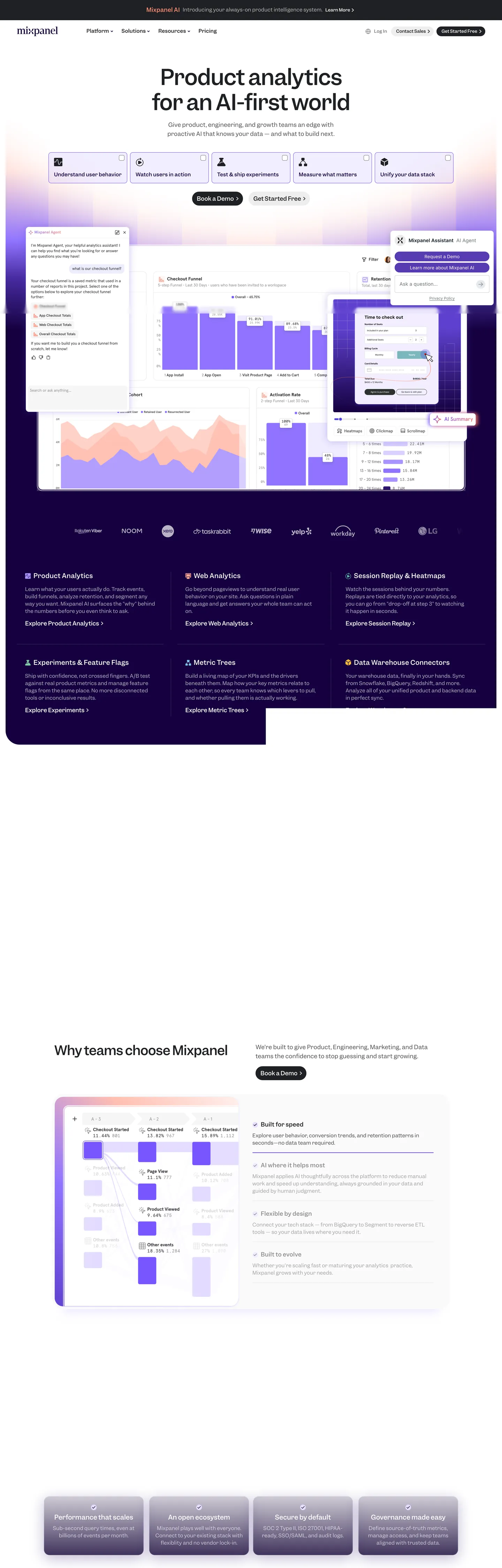
Mixpanel's marketing site does what its peers in product analytics refuse to do: it commits to a deep violet chromatic system as the page's structural device. The hero opens on white with a 60px Garnett Medium display headline in near-black ink #1f2023 — "Product analytics for an AI-first world" — sitting above an embedded mock that already glows lavender and grape. Then the page drops, mid-scroll, into a full-bleed eggplant section in deep purple #15003f that hosts the four-up product-feature band, the testimonial card in white-on-eggplant, and a coral-orange #ff8e75 accent moment. Where Amplitude keeps a near-monochrome editorial canvas and lets one cobalt word do the brand work, Mixpanel commits the entire below-fold to its violet voltage.
The DESIGN.md file packages the system into a machine-readable spec. Inside: 20 colors tokens drawn from the eggplant-to-coral chromatic range — grape #472ba0, electric violet #7856ff, lavender #9074ff, deep eggplant #15003f, indigo gradient #2e1670, plus the coral #ff8e75 and peach #ffd7cf accent pair — alongside the structural near-black ink #1f2023, pure white #ffffff, and a single mint #7fe1d8 accent that appears as a chart-series color. 15 typography tokens run Garnett Medium and Garnett Regular across every display, body, and label tier, with Apercu Pro Medium reserved for the 2.4px-letter-spaced small-caps eyebrow labels. 15 components cover the cobalt-link primary CTA, the eggplant feature tile, the white-on-eggplant testimonial card, the four-up product-feature strip, and the top-nav.
Feed this file to Claude or Cursor and it reproduces Mixpanel's specific moves: deep-purple chromatic system as the structural device, two-canvas page split between white and eggplant, cobalt-link CTA text dressed as a button, Garnett Medium at modest weight 400 across every display tier, and Apercu Pro Medium tracked at 2.4px for small-caps labels. The one move worth borrowing only if your product has a real chromatic range to support it: the mid-page canvas inversion. A white-only or eggplant-only page would lose the structural rhythm; the inversion is the page.
What makes it distinct
5
- Eggplant-to-coral chromatic rangethe system tracks from grape #472ba0 through lavender #9074ff to coral #ff8e75 across hero and feature bands
- Cobalt-link CTA textthe primary button uses #0000ee #0000ee underlined text inside a near-black pill, dressing a hyperlink as a button
- Two-canvas page splitbright white above the fold, eggplant #15003f below; the chromatic break carries the rhythm
- Garnett Medium across every tierdisplay at 60px in weight 400, body at 14-16px, with Apercu Pro Medium reserved for small-caps eyebrow labels
- Four-up product-feature bandInsights / Funnels / Experiments / Reports tiles in lavender on eggplant carry the product taxonomy below the fold
mixpanel.com
Live at mixpanel.com
A snapshot of the brand in production. Scroll the frame to see the whole page.
Colors
20 colors
Mixpanel's system anchors on #7856ff (primary) as its primary color. Type is set in Garnett Medium across 15 tokens from 12px to 60px, weights 400–500. Shape language is soft — components average 33px corner radius, with no sharp interactive edges.
Brand & Accent
Sparing, CTA-only voltage · 13
Surface
Page and card backgrounds · 1
Text
Headlines, body, captions · 4
Borders & Hairlines
Dividers, outlines, rules · 1
Other
Specialty colors · 1
Typography
15 type tokens
Set in Garnett Medium across 15 tokens, from 12px to 60px, weights 400–500. Shown in its own stack: where the font isn't installed, the fallback the file names stands in.
- display-xl60px · weight 400 · lh 72px · tracking -1.2pxThe quick brown fox jumps over the lazy dog
- display-lg48px · weight 400 · lh 57.6px · tracking -0.96pxThe quick brown fox jumps over the lazy dog
- display-md36px · weight 400 · lh 43.2px · tracking -0.72pxThe quick brown fox jumps over the lazy dog
- heading-lg28px · weight 400 · lh 33.6px · tracking 0.28pxThe quick brown fox jumps over the lazy dog
- heading-md18px · weight 400 · lh 25.2pxThe quick brown fox jumps over the lazy dog
- heading-sm18px · weight 400 · lh 25.2px · tracking 0.36pxThe quick brown fox jumps over the lazy dog
- body-lg16px · weight 400 · lh 25.6px · tracking 0.32pxThe quick brown fox jumps over the lazy dog
- body-md14px · weight 400 · lh 21px · tracking 0.28pxThe quick brown fox jumps over the lazy dog
- body-sm12px · weight 400 · lh 20.16px · tracking 0.24pxThe quick brown fox jumps over the lazy dog
- label-md16px · weight 500 · lh 16pxThe quick brown fox jumps over the lazy dog
- label-sm14px · weight 400 · lh 16.8px · tracking 0.28pxThe quick brown fox jumps over the lazy dog
- caption12px · weight 400 · lh 12px · tracking 0.24pxThe quick brown fox jumps over the lazy dog
- eyebrow-caps12px · weight 500 · lh 21.6px · tracking 2.4pxThe quick brown fox jumps over the lazy dog
- eyebrow-caps-garnett12px · weight 500 · lh 21.6px · tracking 2.4pxThe quick brown fox jumps over the lazy dog
- button-md12px · weight 400 · lh 16pxThe quick brown fox jumps over the lazy dog
Layout
Radii and spacing
8 corner radii and 10 spacing values. Shape language: soft.
Radii
- none0px
- sm4px
- md8px
- lg12px
- xl16px
- 2xl24px
- pill100px
- full9999px
Spacing
- xxs2px
- xs3px
- sm4px
- md6px
- base8px
- lg10px
- xl16px
- 2xl24px
- 3xl40px
- 4xl80px
Components
15 components
Each rendered from its tokens (color, type, radius, padding) on Mixpanel's own canvas.
- Button Primarybutton-primaryButton Primary
- Button Secondarybutton-secondaryButton Secondary
- Top Navtop-navTop Nav
- Nav Linknav-linkNav Link
- Hero Headinghero-headingHero Heading
- Section Heading Lightsection-heading-lightSection Heading Light
- Section Heading Darksection-heading-darkSection Heading Dark
- Body Paragraphbody-paragraphBody Paragraph
- Body Paragraph Darkbody-paragraph-darkBody Paragraph Dark
- Eyebrow Labeleyebrow-labelEyebrow Label
- Eggplant Sectioneggplant-sectionEggplant Section
- Feature Tilefeature-tileFeature Tile
- Testimonial Cardtestimonial-cardTestimonial Card
- Card Hairlinecard-hairlineCard Hairline
- Type here…text-inputText Input
In use
The system, in use
Mixpanel's tokens on the kind of product it builds.
Build something people actually use.
A short paragraph of marketing copy that previews how the brand's display tier and body tier read together. Two sentences is usually enough.
FAQ
Mixpanel design system FAQ
Common questions about Mixpanel's tokens, components, and how to use this DESIGN.md in your project.
Read next
Related reading
Specs, directories, and component libraries that pair with this design system.
- Browse all design systemsThe full directory of DESIGN.md files on shadcn.io, with live mockups for each.shadcn.io
- Mixpanel — official siteMixpanel's public marketing site — the source of truth for the live tokens captured in this file.mixpanel.com (opens in a new tab)
- The DESIGN.md specificationGoogle Labs' open spec for machine-readable design system files — the format this page is built on.github.com (opens in a new tab)
Use it
Use Mixpanel in your project
One machine-readable file. Drop it into Claude, Cursor, or any AI tool that reads DESIGN.md.
Download the DESIGN.md
One machine-readable file: every color, type, radius, spacing, and component token of Mixpanel.
Feed it to your AI tool
Drop it into Claude, Cursor, or GitHub Copilot. The agent writes React components and Tailwind classes that match Mixpanel's visual language.
Reference the tokens directly
Or paste the values into your Tailwind config, CSS variables, or component library: every color, size and radius is a quoted, ready-to-copy value.
Read the full DESIGN.md: overview, rationale, do’s and don’ts
Overview
Mixpanel's marketing site commits to a chromatic move that its peers refuse. Two-canvas split. Where Amplitude keeps an editorial near-monochrome canvas and lets one cobalt word do the brand work, Mixpanel divides its page into two distinct canvas zones — bright white above the fold, full-bleed deep eggplant {colors.primary-eggplant} (#15003f) below. The hero opens on white with a 60px Garnett Medium display headline in near-black ink {colors.ink} (#1f2023), then mid-scroll the page drops into the eggplant section that hosts the four-up product-feature band, the testimonial card in white-on-purple, and a coral accent moment.
The chromatic range is the structural device. Eggplant {colors.primary-eggplant} fills the below-fold canvas and the testimonial card surface; electric violet {colors.primary} (#7856ff) carries the product-mock highlights and the four-up feature tiles; lavender {colors.primary-lavender} (#9074ff) and indigo {colors.primary-indigo} (#2e1670) sit inside the gradient backgrounds behind the hero embed; grape {colors.primary-deep} (#472ba0) drops one step deeper for tile fills. The coral {colors.accent-coral} (#ff8e75) and peach {colors.accent-peach} (#ffd7cf) pair appears only inside the product mock and a single feature illustration. Where Cloudflare runs one orange voltage and Spline runs one cobalt, Mixpanel runs a six-color chromatic range and treats the whole thing as the brand voice.
The primary CTA is the inverse of a typical sales button. Cobalt-link in an ink pill. The "Get Started Free" pill sits at 28px tall with a 100px corner radius in ink {colors.ink-pill}, but the label text is cobalt blue {colors.cta-link} (#0000ee) — the browser default hyperlink color, underlined. The button reads as a hyperlink wrapped in a pill, an invitation rather than a conversion shout.
Typography is Garnett Medium and Garnett Regular across every tier. Display tops at 60px in weight 400 — there is no 600+ moment anywhere on the page. Apercu Pro Medium is the second voice, reserved for 12px small-caps eyebrow labels tracked at 2.4px.
Key Characteristics:
- Two-canvas page split — bright
{colors.canvas}(#ffffff) above the fold, full-bleed{colors.primary-eggplant}(#15003f) below. The chromatic break carries the page rhythm. - Six-color chromatic range —
{colors.primary-eggplant}(805 captured ink occurrences),{colors.primary}(5 bg),{colors.primary-lavender}(15 gradient),{colors.primary-deep}(16 gradient + shadow),{colors.primary-indigo}(4 shadow), and a coral/peach accent pair. - Cobalt-link CTA text — primary button label rendered in
{colors.cta-link}(#0000ee), the browser default hyperlink color, with an underline. Dresses the CTA as an invitation rather than a sales button. - Garnett Medium / Garnett Regular across every tier — display at 60px in weight 400, body at 14-16px in weight 400. No 600+ weight anywhere.
- Apercu Pro Medium for small-caps eyebrow labels only — 12px with 2.4px letter-spacing, uppercase.
- Pill-heavy radius scale —
{rounded.pill}100px (25 occurrences) carries the primary CTA, the nav-link backgrounds, and the testimonial card outline; the small-step{rounded.sm}4px (57 occurrences) handles cards and dropdowns. - 4px base spacing unit. The dominant tokens are
{spacing.sm}4px (112) and{spacing.xl}16px (75); large vertical padding sits at{spacing.4xl}80px on the eggplant section. - Four-up product-feature band — Insights / Funnels / Experiments / Reports tiles in lavender-on-indigo, anchored on the eggplant canvas.
Colors
Brand
- Electric Violet (
{colors.primary}— #7856ff): frequency 6. Used as background (5), shadow (1). The brightest violet in the range — fills the smaller product-mock callouts and the active state on the four-up feature tiles. - Grape (
{colors.primary-deep}— #472ba0): frequency 17. Used as gradient (16), shadow (1). The mid-tone of the violet range, doing the heavy lifting inside the hero-background gradients and beneath the eggplant section. - Lavender (
{colors.primary-lavender}— #9074ff): frequency 15, all as gradient. The lightest purple — sits inside the gradient stops behind the embedded product mock and carries the chart-line tints inside the funnel illustrations. - Eggplant (
{colors.primary-eggplant}— #15003f): frequency 33. Used as text (5), bg (2), border (5), gradient (21). The deepest violet — the full-bleed canvas tone of the below-fold section and the testimonial-card surface. - Indigo (
{colors.primary-indigo}— #2e1670): frequency 4, all as shadow. The shadow-ink tone beneath the four-up feature tiles, used in place of pure black to preserve the purple-cast on elevation. - Purple Mid (
{colors.primary-purple}— #6041cf): frequency 3. Used as shadow (2), gradient (1). A mid-violet shadow / accent tone.
Accent
- Coral (
{colors.accent-coral}— #ff8e75): frequency 2. Used as text (1), border (1). The warmest accent in the palette — appears as the color of a single chart-line callout inside the product mock. - Peach (
{colors.accent-peach}— #ffd7cf): frequency 18. Used as border (2), gradient (14), shadow (2). The lighter coral — fills the soft pinkish glow behind product illustrations. - Orange (
{colors.accent-orange}— #ff7557): frequency 2. Used as background (1), shadow (1). The mid-saturation accent in the coral range. - Crimson (
{colors.accent-crimson}— #33001f): frequency 2. Used as bg (1), gradient (1). A very dark mulberry tone — sits inside a single deep-shadow gradient. - Burgundy (
{colors.accent-burgundy}— #661d2d): frequency 16. Used as bg (5), gradient (10), shadow (1). The warm dark tone, used as a fill on a single feature illustration that contrasts the violet range. - Mint (
{colors.accent-mint}— #7fe1d8): frequency 6. Used as text (3), border (3). The single non-purple/non-coral color — a chart-series mint, appears as a contrasting line color inside the product mock charts. - Cream (
{colors.accent-cream}— #fff0ed): frequency 1, as gradient. A warm cream end-stop on a single feature gradient.
Surface
- Canvas (
{colors.canvas}— #ffffff): frequency 275. Used as text (115), bg (20), border (115), shadow (10), gradient (15). The above-fold floor and the dominant text color on the eggplant section. - Lilac (
{colors.lilac}— #dad0ff): frequency 3, all as shadow. A light-lavender shadow color used beneath certain product illustrations to preserve the purple cast.
Text / Ink
- Ink (
{colors.ink}— #1f2023): frequency 64. Used as text (29), bg (6), border (29). The dominant text color on the white above-fold canvas — a near-black with the slightest cool cast, never pure ink. - Ink Pill (
{colors.ink-pill}— #1f2023): the fill of the primary CTA button — same hex as the body ink. The CTA reads as an opaque block of body-text color rather than as a chromatic accent. - Muted (
{colors.muted}— #797979): frequency 2. Used as text (1), border (1). A secondary gray for captions and metadata under the body text. - CTA Link (
{colors.cta-link}— #0000ee): the label color of the primary CTA and most nav links. The browser default hyperlink color — chosen deliberately to dress every interactive element as a hyperlink rather than as a styled button.
Hairline
- Hairline (
{colors.hairline}— #cacaca): frequency 4. Used as text (2), border (2). The dominant border tone on card outlines and dividers — a measured light-gray.
Typography
Font Families
The system runs two voices: Garnett Medium and Garnett Regular for every display, heading, body, and button surface; Apercu Pro Medium as the second voice reserved for small-caps eyebrow labels. Garnett is a contemporary humanist sans by Connary Fagen, with a rounded character that sits warmer than Inter or Helvetica. Fallbacks walk sans-serif — there is no system-ui safety stack declared.
The pairing is the typographic move. Garnett carries everything spoken; Apercu Pro Medium handles only the 12px eyebrow labels above section blocks, tracked at 2.4px in uppercase. The two voices divide labor the way Cloudflare divides FT Kunst Grotesk and Apercu Mono Pro — sans for everything, second-family for everything labeled.
Hierarchy
| Token | Size | Weight | Line Height | Letter Spacing | Use |
|---|---|---|---|---|---|
{typography.display-xl} | 60px | 400 | 72px | -1.2px | Hero h1 — "Product analytics for an AI-first world" |
{typography.display-lg} | 48px | 400 | 57.6px | -0.96px | Section h2 — "Why teams choose Mixpanel" |
{typography.display-md} | 36px | 400 | 43.2px | -0.72px | Sub-section displays |
{typography.heading-lg} | 28px | 400 | 33.6px | 0.28px | Testimonial pull-quote text |
{typography.heading-md} | 18px | 400 | 25.2px | 0 | h6 feature-tile titles |
{typography.heading-sm} | 18px | 400 | 25.2px | 0.36px | Smaller h6 titles with tracking |
{typography.body-lg} | 16px | 400 | 25.6px | 0.32px | Hero sub-paragraph |
{typography.body-md} | 14px | 400 | 21px | 0.28px | Default running text |
{typography.body-sm} | 12px | 400 | 20.16px | 0.24px | Footnote rows, secondary metadata |
{typography.label-md} | 16px | 500 | 16px | 0 | Card titles, in-product labels |
{typography.label-sm} | 14px | 400 | 16.8px | 0.28px | Form labels |
{typography.caption} | 12px | 400 | 12px | 0.24px | Small captions, dates |
{typography.eyebrow-caps} | 12px | 500 | 21.6px | 2.4px | Small-caps eyebrow labels — Apercu Pro Medium |
{typography.eyebrow-caps-garnett} | 12px | 500 | 21.6px | 2.4px | Small-caps eyebrow labels — Garnett fallback |
{typography.button-md} | 12px | 400 | 16px | 0 | Primary CTA label text |
Principles
Display weight stays at 400 across every tier. The hero h1 at 60px / 400 with -1.2px tracking is the editorial-magazine treatment — confidence through tracking and size, not through weight. Garnett's humanist proportions read warm at the 400 weight; pushing to 600 or 700 would shift the system toward a typical SaaS hero and lose the editorial cast.
The Apercu Pro Medium eyebrow at 2.4px letter-spacing is the system's only uppercase moment. It does the labor an all-caps sans heading would normally do, but read quietly rather than shouted.
Note on Font Substitutes
Garnett is a licensed family from Connary Fagen Type Design. Inter at the same weights with slightly tighter tracking (-0.04em on display sizes) is the closest open-source substitute; Hanken Grotesk at the same weights is closer in cap-height feel. For Apercu Pro Medium, Inter Tight at uppercase with 2.4px tracking transfers the small-caps eyebrow cleanly — Apercu itself is licensed.
Layout
Spacing System
- Base unit: 4px. The dominant gap is
{spacing.sm}4px (112 captured occurrences), with{spacing.xl}16px (75) and{spacing.lg}10px (71) as the secondary tokens. - Tokens:
{spacing.xxs}2px ·{spacing.xs}3px ·{spacing.sm}4px ·{spacing.md}6px ·{spacing.base}8px ·{spacing.lg}10px ·{spacing.xl}16px ·{spacing.2xl}24px ·{spacing.3xl}40px ·{spacing.4xl}80px. - Section padding (vertical): ~80px on the eggplant section; the hero band sits at ~40px and the upper white section runs at ~24px between blocks.
- Card internal padding: 24-40px on the feature tiles and testimonial card; the testimonial card pushes to 40px because its pull-quote runs across multiple lines.
- Top-nav padding: 0px vertical (the nav links carry their own height), 24px horizontal.
Grid & Container
- Max content width: ~1000px on the hero headline (the captured h1 reports a 1000px parent width); ~1200px on the eggplant section.
- Hero block: white canvas, embedded product mock pinned beneath the headline, all centered with generous vertical air.
- Four-up feature band: equal-width tile grid spanning the content width on the eggplant canvas, each tile carrying a Garnett heading and a body paragraph in white.
- Testimonial card: centered, 616px wide, the pull-quote in 28px Garnett Medium on the eggplant canvas.
- Footer: returns to a lighter gradient surface as the conversion / footer band.
Rhythm
The page alternates between white editorial and eggplant chromatic. Hero, logo strip, and feature introductions run on white with ink type. The full-bleed eggplant section runs the four-up feature band, testimonial, and bottom CTA. The footer band returns to a lighter gradient. This pacing is the structural device — every section terminates either on pure white or on deep purple, with no mid-tone gradient between them, and the chromatic break does the work that section dividers would carry on a single-canvas page.
Elevation
The system uses shadow as chromatic device. The captured page has 8 occurrences of pure black used as shadow ink, but the meaningful shadow work happens in {colors.primary-indigo} (#2e1670, 4 occurrences as shadow), {colors.primary-deep} (#472ba0, 1 as shadow), {colors.accent-burgundy} (#661d2d, 1 as shadow), and {colors.lilac} (#dad0ff, 3 as shadow). The shadow tones carry the chromatic cast of the surfaces they sit beneath — purple shadows on purple surfaces, pink shadows on coral surfaces.
- Flat (no shadow): the white above-fold body bands — 60% of surfaces.
- Chromatic-shadow: feature tiles on the eggplant canvas carry indigo
{colors.primary-indigo}shadows; product illustrations carry lilac{colors.lilac}or peach{colors.accent-peach}shadows to preserve the chromatic cast. - CTA elevation: the primary CTA pill sits with no shadow — the pill's ink fill against the white canvas does the work.
Shapes
The radius scale is small-step plus pill, with the pill doing more work than in a typical system:
{rounded.none}0px — only on the eggplant section block and image edges.{rounded.sm}4px — 57 occurrences, the dominant tight radius. Carries small chips, dropdown items, and inline tags.{rounded.md}8px — 9 occurrences. Form inputs, smaller cards.{rounded.lg}12px — 10 occurrences. Mid-size cards, secondary feature blocks.{rounded.xl}16px — 22 occurrences. The four-up feature tiles, hairline content cards.{rounded.2xl}24px — 5 occurrences. Larger cards, testimonial-card outline (with a slight pill bias).{rounded.pill}100px — 25 occurrences. The primary CTA, the nav-link backgrounds, the bottom CTA cluster.{rounded.full}9999px / 100% — 4 occurrences. Avatar chips and a handful of icon backgrounds.
The pill at 100px is the warmest surface in the system. The primary CTA, the nav-link active states, and the bottom conversion strip all use it — making it the most-tappable shape on the page.
Components
button-primary — The signature CTA. Near-black {colors.ink-pill} (#1f2023) fill, cobalt {colors.cta-link} (#0000ee) underlined text, {rounded.pill} 100px radius, 4×6×4×14px padding, 28px height. "Get Started Free" is the canonical instance. The label color is the browser default hyperlink — dresses the button as a hyperlink wrapped in a pill.
button-secondary — Transparent fill, ink text, 1px ink border, {rounded.pill} 100px radius, 4×14px padding, 28px height. Used for "Watch Demo" and tertiary actions.
top-nav — White {colors.canvas} surface, 56px height, 0px vertical / 24px horizontal padding. Houses the Mixpanel wordmark flush left, product / customers / pricing / docs links center, and the Sign in / Get Started Free cluster flush right.
nav-link — Transparent background, {colors.cta-link} cobalt text in {typography.body-sm} (12px / 400). Almost every link on the page uses the cobalt color — a deliberate move that signals every text link as a navigable hyperlink.
hero-heading — Ink {colors.ink} text on the white canvas, {typography.display-xl} (60px / 400) with -1.2px tracking. The editorial-magazine display moment — confidence through size and tracking, not weight.
section-heading-light — Ink text at {typography.display-lg} (48px / 400) on the white canvas. Used for "Why teams choose Mixpanel" and other above-fold section headers.
section-heading-dark — White {colors.canvas} text at {typography.display-md} (36px / 400) on the eggplant canvas. Used for "Product Analytics" and the other below-fold section titles.
body-paragraph — Ink text at {typography.body-md} (14px / 400) on the white canvas. The above-fold default running text.
body-paragraph-dark — White text at {typography.body-lg} (16px / 400) on the eggplant canvas. The below-fold default — slightly larger than the above-fold body because the dark surface needs more text weight to read comfortably.
eyebrow-label — Ink text at {typography.eyebrow-caps} (12px / 500 / 2.4px tracking / uppercase) in Apercu Pro Medium. The small-caps label above section headings — the system's only uppercase typographic moment.
eggplant-section — Full-bleed {colors.primary-eggplant} (#15003f) fill, white text, 80px vertical / 24px horizontal padding, 0 radius. The page's structural chromatic device — hosts the four-up feature band, testimonial, and bottom CTA.
feature-tile — {colors.primary-indigo} (#2e1670) fill, white text, {rounded.xl} 16px radius, 24px padding, {typography.heading-md} title. The Insights / Funnels / Experiments / Reports tile in the four-up band. The indigo fill sits one step darker than the eggplant canvas for clear elevation.
testimonial-card — {colors.primary-eggplant} fill, white text, {rounded.2xl} 24px radius, 40px padding, {typography.heading-lg} (28px / 400) pull-quote text. Holds a customer testimonial with a logo strip beneath.
card-hairline — White {colors.canvas} surface, 1px {colors.hairline} border, {rounded.xl} 16px radius, 24px padding. The default content card on the above-fold white canvas.
text-input — White surface, ink text, 1px {colors.hairline} border, {rounded.md} 8px radius, 8×14px padding, 40px height.
Do's and Don'ts
Do commit the below-fold to the eggplant {colors.primary-eggplant} (#15003f) canvas. The two-canvas page split is the structural device — removing the chromatic break and running the entire page on white would lose the visual rhythm.
Do keep the primary CTA label in {colors.cta-link} (#0000ee) underlined. The cobalt hyperlink-color dressing on the ink pill is the brand's signature CTA voice — switching to white text inside the pill would turn it into a generic dark-button conversion moment.
Do keep display weight at 400 across every tier. The 60px hero h1 at weight 400 with -1.2px tracking is the editorial-magazine treatment — bumping to 600 or 700 would tip the page into typical-SaaS territory.
Do reserve {typography.eyebrow-caps} Apercu Pro Medium for small-caps labels only. The Apercu voice has one job — the 12px uppercase eyebrow above section headers. Using it for body or button labels collapses the two-voice split.
Don't dilute the violet chromatic range by introducing a competing brand color (a teal, a yellow, a green). The system commits to the eggplant-to-coral range; adding a competing color breaks the chromatic discipline. The mint {colors.accent-mint} (#7fe1d8) is the only non-violet/non-coral hue and it appears only as a chart-series accent, not as brand chrome.
Don't render the eyebrow label in lowercase or without the 2.4px tracking. The label's identity is entirely in the tracking + uppercase combination — losing either turns it into a generic small-caps label.
Don't use pure black for body text. The system uses {colors.ink} (#1f2023), a near-black with a slight cool cast. The difference is small but consistent across the entire system.
Don't put the four-up feature band on the white canvas. The tiles in {colors.primary-indigo} need the eggplant background to read as elevation; on white the indigo fill becomes a flat purple block with no surface contrast.
Known Gaps
- Dark mode: the page already runs a dark canvas as its below-fold section; there is no separately documented dark variant.
- Hover and focus states: the system declares the resting state for
{component.button-primary}and{component.button-secondary}; hover / focus / disabled tints were not captured on the surface. - Form input error states:
{component.text-input}carries only the resting state; validation styling lives inside the product surfaces. - Chart palette: the embedded product mock shows multi-color chart series (lavender, coral, mint, peach) but those are decorative mock-data rather than a documented chart-color scale.
- Product surfaces: this DESIGN.md captures the marketing site only. The Mixpanel product Dashboard, Reports, Experiments, and Funnels carry their own surface tokens and chart-color scales that are not represented.
- Motion: the product mock animates as it scrolls into view; timing curves, easing, and scroll-trigger thresholds are not captured here.
- Footer band: the footer returns to a lighter gradient surface but the specific gradient stops were not extracted as primary tokens.
Analytics & Data
More systems like this
More DESIGN.md files in Analytics & Data.
Pricing
Build it with Pro
The DESIGN.md files are free. Pro adds 6,000+ blocks, premium templates and the MCP server, so your AI editor builds in your system for you.
4.9/5 out of 5 · 150+ reviewsfrom 150+ founders and developers.
Billing
Billed once a year in USD. Cancel anytime.
- How many people can use the license.
- Client work, SaaS products and anything you charge for.
- Production-ready React sections: hero, pricing, features, dashboards and more.
- Complete multi-page sites you can ship as they are.
- React icons from every major library, installable with one command.
- Presets that restyle every block, in light and dark.
- Lets your AI editor search, preview and install blocks for you.
- Priority requests are answered first.
Individual
For personal projects & open source
$32instead of $49/mo
$389 billed yearly
- Seats: 1 seat
- Commercial use: Personal & open source only
- Pro blocks: 6,000+ blocks
- Templates: All 14 templates
- React icons: 294k+ icons
- Themes: All 59 themes
- MCP server: Basic usage
- Support: Standard
Team
Most popularFor freelancers, agencies & startups
$66instead of $99/mo
$789 billed yearly · ≈ $13/dev/mo
- Seats: Up to 5 seats
- Commercial use: Included
- Pro blocks: 6,000+ blocks
- Templates: All 14 templates
- React icons: 294k+ icons
- Themes: All 59 themes
- MCP server: High usage
- Support: Priority
Organization
For companies with larger teams
$132instead of $199/mo
$1,589 billed yearly
- Seats: Unlimited seats
- Commercial use: Included
- Pro blocks: 6,000+ blocks
- Templates: All 14 templates
- React icons: 294k+ icons
- Themes: All 59 themes
- MCP server: Unlimited usage
- Support: Priority
Billed once a year in USD. Cancel anytime.
Individual
For personal projects & open source
$32instead of $49/mo
$389 billed yearly
- How many people can use the license.Seats: 1 seat
- Client work, SaaS products and anything you charge for.Commercial use: Personal & open source only
- Production-ready React sections: hero, pricing, features, dashboards and more.Pro blocks: 6,000+ blocks
- Complete multi-page sites you can ship as they are.Templates: All 14 templates
- React icons from every major library, installable with one command.React icons: 294k+ icons
- Presets that restyle every block, in light and dark.Themes: All 59 themes
- Lets your AI editor search, preview and install blocks for you.MCP server: Basic usage
- Priority requests are answered first.Support: Standard
Team
Most popularFor freelancers, agencies & startups
$66instead of $99/mo
$789 billed yearly · ≈ $13/dev/mo
Everything in Individual, plus
- How many people can use the license.Seats: Up to 5 seats
- Client work, SaaS products and anything you charge for.Commercial use: Included
- Lets your AI editor search, preview and install blocks for you.MCP server: High usage
- Priority requests are answered first.Support: Priority
Organization
For companies with larger teams
$132instead of $199/mo
$1,589 billed yearly
Everything in Team, plus
- How many people can use the license.Seats: Unlimited seats
- Lets your AI editor search, preview and install blocks for you.MCP server: Unlimited usage
- Secure checkout via Stripe
- Code lives in your repo
- Keep what you've shipped if you cancel
- License terms
Your system, built for you
Every block, template and icon, installed by your AI agent in your design system. The DESIGN.md files stay free.