Databricks Design System
Databricks' marketing system pairs a deep teal-navy canvas with a single Databricks-red CTA, DM Sans display and DM Mono numerics. Tokens for React, Next.js, and AI coding tools.
Add shadcn.io to your AI agent. · Pro It installs blocks, icons and templates in your design system from a prompt, with Pro.
Set up MCP- Primary
- #eb1600
- Typeface
- DM Sans
- Shape
- Mixed
- Base radius
- 6px
- Colors
- 19
- Type tokens
- 15
- Components
- 16
- Spacing values
- 9
About
About Databricks DESIGN.md
Curated by Dov Azencot · Updated May 19, 2026 · Source databricks.com (opens in a new tab)
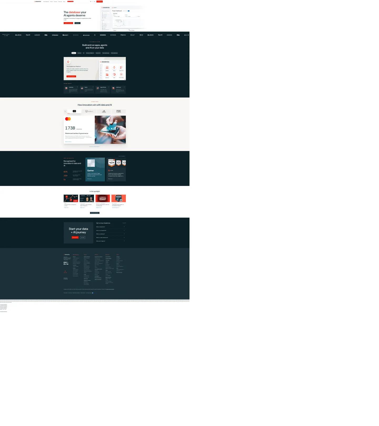
Databricks' marketing site inverts the data-cloud convention. Where Snowflake sits on pure white with snowflake-blue voltage and dbt holds an ink-on-cream canvas with orange gradient bursts, Databricks runs a deep teal-navy floor (#1b3139) across most of the page and reserves a saturated red (#eb1600) for the single primary CTA. The hero band sits on a warm cream surface with the headline "The database your AI agents deserve" in DM Sans 60px weight 500, then the page drops into the teal-navy floor for the platform diagram, the product-card grid, the customer band, the awards strip, the "in the spotlight" media wall, and the footer. Six full-bleed inverted bands carry the bulk of the page; cream and white surfaces appear only inside framed dialogs.
The DESIGN.md file packages the system into a machine-readable spec for React tooling. Inside: 19 colors tokens drawn from the 21 clustered hex values rendered on the page — the teal-navy canvas (976 occurrences) as the load-bearing surface, the Databricks red (12 bg occurrences) as the single brand voltage, a soft cool-gray (`#90a5b1`, 360 occurrences) carrying every secondary text and divider role, and a cream off-white (`#eeede9`, 21 bg occurrences) holding the hero band. 20 typography tokens span DM Sans in three display sizes plus body and nav tiers, and DM Mono in 4 mono tiers — the 88px / 400 mono is reserved for the giant statistic numerics on the customer band. 16 components cover the red-pill CTA, the dark `card-product` surface on the teal-navy floor, the cream-hero panel, the awards band, and the form-input ladder.
Feed this file to Claude or Cursor and it reproduces Databricks' specific moves: deep teal-navy as the dominant canvas rather than the white floor most data tools default to, single saturated red on the primary CTA only, DM Sans body + DM Mono statistic numerics, and the 20px-default card radius. The token references resolve cleanly — `{colors.navy-canvas}` for the teal floor, `{colors.databricks-red}` for the CTA voltage, `{typography.numeric-xl}` for the statistic tier. The one move worth borrowing only if your product narrative leans on engineering credibility: the cream-hero into dark-body inversion creates a distinct above-fold-to-below-fold rhythm that flat all-white marketing sites cannot match.
What makes it distinct
5
- Single red voltageDatabricks red #eb1600 appears only on the primary CTA pill and a single inline highlight; 12 occurrences total
- Teal-navy as canvasthe deep #1b3139 floor (976 occurrences) carries the platform diagram, product cards, footer, and customer band — six full-bleed bands of inverted chrome
- DM Sans + DM MonoDM Sans does every body/display surface at weight 400–500, DM Mono carries 88px statistic numerics and uppercase eyebrows
- 20px radius defaultthe dominant card radius is 20px (14 occurrences); buttons sit at 6px, statistic tiles at 16px
- Cream-cream hero, navy bodythe above-fold hero sits on a warm cream surface, then every band below the fold inverts to the deep teal-navy floor
databricks.com
Live at databricks.com
A snapshot of the brand in production. Scroll the frame to see the whole page.
Colors
19 colors
Databricks's system runs on #eb1600 as its primary voltage, used in 2 of 16 components. Type is set in DM Sans across 15 tokens from 12px to 88px, weights 400–600. Shape language is mixed across 16 components, blending pills, soft rounds, and squarer corners.
Brand & Accent
Sparing, CTA-only voltage · 4
Surface
Page and card backgrounds · 1
Text
Headlines, body, captions · 5
Borders & Hairlines
Dividers, outlines, rules · 2
Other
Specialty colors · 7
Typography
15 type tokens
Set in DM Sans across 15 tokens, from 12px to 88px, weights 400–600. Shown in its own stack: where the font isn't installed, the fallback the file names stands in.
- display-xl60px · weight 500 · lh 66pxThe quick brown fox jumps over the lazy dog
- display-md48px · weight 500 · lh 56px · tracking -0.48pxThe quick brown fox jumps over the lazy dog
- display-sm32px · weight 500 · lh 40pxThe quick brown fox jumps over the lazy dog
- heading-md28px · weight 400 · lh 36pxThe quick brown fox jumps over the lazy dog
- heading-sm24px · weight 400 · lh 32pxThe quick brown fox jumps over the lazy dog
- heading-xs20px · weight 600 · lh 28pxThe quick brown fox jumps over the lazy dog
- body-lg20px · weight 400 · lh 28pxThe quick brown fox jumps over the lazy dog
- body-md16px · weight 400 · lh 24pxThe quick brown fox jumps over the lazy dog
- body-sm14px · weight 400 · lh 20pxThe quick brown fox jumps over the lazy dog
- body-caption12px · weight 400 · lh 20pxThe quick brown fox jumps over the lazy dog
- button-md14px · weight 500 · lh 20pxThe quick brown fox jumps over the lazy dog
- nav-link16px · weight 500 · lh 24pxThe quick brown fox jumps over the lazy dog
- numeric-xl88px · weight 400 · lh 88pxThe quick brown fox jumps over the lazy dog
- mono-eyebrow12px · weight 400 · lh 15pxThe quick brown fox jumps over the lazy dog
- mono-label16px · weight 400 · lh 16pxThe quick brown fox jumps over the lazy dog
Layout
Radii and spacing
6 corner radii and 9 spacing values. Shape language: mixed.
Radii
- none0px
- xs2px
- sm4px
- md6px
- lg16px
- xl20px
Spacing
- xxs2px
- xs4px
- sm8px
- md12px
- base16px
- lg24px
- xl32px
- 2xl40px
- 3xl60px
Components
16 components
Each rendered from its tokens (color, type, radius, padding) on Databricks's own canvas.
- Button Primarybutton-primaryButton Primary
- Button Secondarybutton-secondaryButton Secondary
- Button Ghost Darkbutton-ghost-darkButton Ghost Dark
- Top Navtop-navTop Nav
- Nav Linknav-linkNav Link
- Hero Headinghero-headingHero Heading
- Section Heading Lightsection-heading-lightSection Heading Light
- Section Heading Darksection-heading-darkSection Heading Dark
- Body Paragraphbody-paragraphBody Paragraph
- Mono Eyebrowmono-eyebrowMono Eyebrow
- Hero Bandhero-bandHero Band
- Card Productcard-productCard Product
- Card Statcard-statCard Stat
- Card Awardcard-awardCard Award
- Numeric Displaynumeric-displayNumeric Display
- Cta Band Darkcta-band-darkCta Band Dark
In use
The system, in use
Databricks's tokens on the kind of product it builds.
Build something people actually use.
A short paragraph of marketing copy that previews how the brand's display tier and body tier read together. Two sentences is usually enough.
FAQ
Databricks design system FAQ
Common questions about Databricks's tokens, components, and how to use this DESIGN.md in your project.
Read next
Related reading
Specs, directories, and component libraries that pair with this design system.
- Browse all design systemsThe full directory of DESIGN.md files on shadcn.io, with live mockups for each.shadcn.io
- Databricks — official siteDatabricks' public marketing site — the source of truth for the live tokens captured in this file.databricks.com (opens in a new tab)
- The DESIGN.md specificationGoogle Labs' open spec for machine-readable design system files — the format this page is built on.github.com (opens in a new tab)
Use it
Use Databricks in your project
One machine-readable file. Drop it into Claude, Cursor, or any AI tool that reads DESIGN.md.
Download the DESIGN.md
One machine-readable file: every color, type, radius, spacing, and component token of Databricks.
Feed it to your AI tool
Drop it into Claude, Cursor, or GitHub Copilot. The agent writes React components and Tailwind classes that match Databricks's visual language.
Reference the tokens directly
Or paste the values into your Tailwind config, CSS variables, or component library: every color, size and radius is a quoted, ready-to-copy value.
Read the full DESIGN.md: overview, rationale, do’s and don’ts
Overview
Databricks' marketing site inverts the data-cloud convention. Cream hero, navy body. Where Snowflake sits on a pure-white canvas and dbt holds an ink-on-warm-cream surface, Databricks runs a warm cream above-fold hero on {colors.cream} (#eeede9) and then drops the entire page into a deep teal-navy floor ({colors.navy-canvas} — #1b3139) for six full-bleed bands: the platform diagram, the product-card grid, the customer band, the awards strip, the "in the spotlight" media wall, and the footer. The cream-to-teal inversion is the page's primary rhythmic device — every band either sits on cream (above the fold) or on the deep navy (below it).
The chromatic system is binary plus voltage. The teal-navy canvas does 976 occurrences of structural work — text (459), borders (439), backgrounds (6), shadows (72). A saturated red voltage ({colors.primary} — #eb1600) fires 12 times, exclusively as background fills on the primary CTA pill ("Get started", "Try Databricks") and on a single inline word in the hero headline (the word "database" renders red in "The database your AI agents deserve"). The red is the lone color the extraction classifies as a brand layer; every other tone does structural duty. Where Cloudflare paints the whole hero canvas with its brand orange and Spline reserves cobalt for a single CTA, Databricks keeps the red even scarcer — there is no secondary red, no hover-state variant, and no inline-link red. The brand voltage exists only as the single most-clickable element.
Typography is the DM Sans + DM Mono pairing. DM Sans carries every display, heading, body, and nav surface at weights 400–500 — the hero h1 sits at 60px / 500, the h2 at 48px / 500 with -0.48px tracking, and body at 14–16px / 400. DM Mono does the work of an uppercase eyebrow tier and the giant statistic numerics on the customer band ("173B transactions" runs in 88px / 400 DM Mono). Both faces are open-source via Google Fonts. Engineering authority without ornament — the modest weight 500 display rather than the 700+ that fintech leans on, paired with mono numerics that read as instrumentation rather than as marketing copy.
Key Characteristics:
- Single red voltage (
{colors.primary}— #eb1600), 12 occurrences only — primary CTA pill and a single inline highlight in the hero h1. No secondary red. - Teal-navy canvas (
{colors.navy-canvas}— #1b3139), 976 occurrences across text/border/background/shadow. The dominant surface across six full-bleed inverted bands. - Cream hero band (
{colors.cream}— #eeede9) sits above the fold; the page inverts to the teal-navy floor for everything below. - DM Sans display tier at weight 500 — hero 60px, h2 48px with -0.48px tracking, h3 32px. No 700+ weight tier.
- DM Mono carries the small uppercase eyebrows (12–16px) and the 88px statistic numerics on the customer band — instrumentation as typography.
- 20px default radius (
{rounded.xl}— 14 occurrences). Smaller surfaces use 16px and 6px; the system never goes to a fully-rounded pill on the captured page. - 16px base spacing module (38 occurrences). Major rhythm at
{spacing.base}(16px),{spacing.xl}(32px), with 60x48px section padding inside{component.cta-band-dark}panels. - Cool secondary text (
{colors.ink-secondary}— #90a5b1, 360 occurrences) does the muted-paragraph work — a desaturated slate-blue that reads as engineering-credible against either the cream or the navy.
Colors
Brand
- Databricks Red (
{colors.primary}— #eb1600): frequency 12, all as background. The lone brand-layer color the extraction surfaces — fires on the primary CTA pill ("Get started", "Try Databricks") and on the inline-highlighted word "database" in the hero h1. No secondary red, no hover-state variant on the captured surface. The most-tappable element on the page is the single chromatic moment.
Surface (Dark)
- Navy Canvas (
{colors.navy-canvas}— #1b3139): frequency 976 — text (459), border (439), background (6), shadow (72). The dominant teal-navy floor — carries the platform-diagram band, the product-card grid, the customer-band background, the awards strip, the "in the spotlight" media wall, and the footer. Six full-bleed bands. - Navy Darker (
{colors.navy-darker}— #0b2026): frequency 7. The slightly-deeper teal used inside the product-card surfaces on the platform-diagram band — sits one step deeper than the canvas to elevate the cards. - Navy Mid (
{colors.navy-mid}— #143d4a): frequency 8 as border. The hairline color for product-card outlines on the dark floor — a slightly-lighter teal that reads as a divider without disappearing into the navy canvas. - Navy Sub (
{colors.navy-sub}— #1b5162): frequency 18. A lighter teal-navy used inside the awards-band cards and on secondary information surfaces. - Navy Deeper (
{colors.navy-deeper}— #10121e): frequency 14. The deepest tone — used sparingly inside the footer band.
Surface (Light)
- Canvas (
{colors.canvas}— #ffffff): frequency 612 — text (290), border (287), background (19), gradient (16). Pure white inside framed dialogs and product-screenshot mockups; never the page floor. - Cream (
{colors.cream}— #eeede9): frequency 23 — 21 as background, 2 as border. The warm off-white hero band that sits above the fold. Carries the headline "The database your AI agents deserve" and the customer-band background where the 88px mono statistic ("173B transactions") sits.
Text
- Ink (
{colors.ink}— #1b3139): frequency 976 as text — the dominant ink color. Identical to the canvas color; on the cream hero band the teal-navy reads as a soft, slightly-warm body tone rather than as pure black. The display tier uses this tone on cream rather than committing to a hard black. - Ink Soft (
{colors.ink-soft}— #5a6f77): frequency 24. The body-paragraph color the hero uses below the H1 — a desaturated slate-blue that reads slightly cooler than the ink. - Ink Muted (
{colors.ink-muted}— #618794): frequency 10. Tertiary text on caption rows and small labels. - Ink Secondary (
{colors.ink-secondary}— #90a5b1): frequency 360 — text (146), border (148), gradient (62). The cool secondary text and divider tone that does the muted-paragraph work; visible on the navy floor where it reads as a soft body color and on the cream band where it reads as a muted divider.
Hairline
- Hairline (
{colors.hairline}— #c4ccd6): frequency 6 as text/border. A cool light slate used for hairlines on the cream-band surfaces — secondary card outlines and form-field borders. - Hairline Soft (
{colors.hairline-soft}— #dce0e2): frequency 4 as border. The faintest hairline tone — used inside small chip and tab outlines.
Semantic
- Link Blue (
{colors.link-blue}— #016bc1): frequency 229 — text (115), border (111), gradient (3). The inline-link blue used for "Read more" links across the body and for inline references inside paragraph text. The single non-red interactive color on the page. - Accent Orange (
{colors.accent-orange}— #ff5f46): frequency 34 — text (17), border (17). A bright coral-orange used on the awards band ("60%", "20K+", "5x" statistic tiles) — the lone warm secondary that breaks the red/navy/cream system. Visible only inside the Gartner / G2 awards strip. - Accent Orange Soft (
{colors.accent-orange-soft}— #ff9e94): frequency 4. The lighter variant of the awards-band orange. - Accent Blue Soft (
{colors.accent-blue-soft}— #8acaff): frequency 5. A pale sky-blue used inside product-screenshot mockups and on the platform-diagram node tiles.
Shadow
- Shadow (
{colors.shadow}— #000000): frequency 4. The system uses neutral-ink shadows rather than tinted shadows — confined to soft elevations on the cream-hero band cards.
Typography
Font Families
The system runs two voices: DM Sans for every display, heading, body, button, and nav surface (weights 400–600), and DM Mono for the small uppercase eyebrows and the giant statistic numerics on the customer band (weights 400–500). Both faces are open-source via Google Fonts and share metrics — the pairing reads as a single typographic voice rather than as two distinct families. There is no third typeface on the captured surface.
The mono tier does the labor a numeric monospace or a small-caps eyebrow would normally do. The 88px / 400 mono on the "173B transactions" tile is the single most distinctive typographic moment on the page — a giant statistic rendered as instrumentation rather than as marketing copy.
Hierarchy
| Token | Size | Weight | Line Height | Use |
|---|---|---|---|---|
{typography.display-xl} | 60px | 500 | 66px | Hero h1 ("The database your AI agents deserve") |
{typography.display-md} | 48px | 500 | 56px | Section h2 ("Build and run apps, agents and AI on your data") — -0.48px tracking |
{typography.display-sm} | 32px | 500 | 40px | Smaller section displays and the dark-band CTA headline |
{typography.heading-md} | 28px | 400 | 36px | Sub-section h3 titles |
{typography.heading-sm} | 24px | 400 | 32px | Feature-card titles and pull quotes |
{typography.heading-xs} | 20px | 600 | 28px | h4 / product-card titles |
{typography.body-lg} | 20px | 400 | 28px | Hero sub-paragraph and section leads |
{typography.body-md} | 16px | 400 | 24px | Default running text |
{typography.body-sm} | 14px | 400 | 20px | Caption rows, button labels, secondary body |
{typography.body-caption} | 12px | 400 | 20px | Footnote text, small metadata |
{typography.button-md} | 14px | 500 | 20px | Primary and secondary button labels |
{typography.nav-link} | 16px | 500 | 24px | Top-nav link labels |
{typography.numeric-xl} | 88px | 400 | 88px | DM Mono — the giant statistic numerics on the customer band |
{typography.mono-eyebrow} | 12px | 400 | 15px | DM Mono uppercase eyebrows above feature cells |
{typography.mono-label} | 16px | 400 | 16px | DM Mono uppercase labels — sits beside small icons |
Principles
Display weight stays at 500. The hero h1 at 60px / 500 and the h2 at 48px / 500 sit lighter than the 700+ tier most data tools use. Stripe at weight 300 sits at the opposite end; Databricks meets it at 500, which holds the line on warmth without tipping into bold authority. The 48px h2 carries -0.48px tracking — the single tracking adjustment in the system; every other size runs at normal letter-spacing.
The mono numeric tier is the signature move. The 88px / 400 DM Mono numeric on the customer band ("173B transactions") reads as instrumentation rather than as decorative typography. The DM Mono eyebrow tier (12px / 400 uppercase) does the small-caps duty an italic or small-caps sans variant would normally handle — the result reads quietly technical without ever shouting "DEVELOPERS" the way an all-caps sans heading would.
Note on Font Substitutes
Both DM Sans and DM Mono are open-source via Google Fonts — no substitutes are needed. The pairing is itself a deliberate move; the families share metrics, which is why the mix reads as a single typographic voice rather than as two distinct families.
Layout
Spacing System
- Base unit: 16px — the dominant gap value, appearing 38 times in the captured page.
- Tokens:
{spacing.xxs}2px ·{spacing.xs}4px ·{spacing.sm}8px ·{spacing.md}12px ·{spacing.base}16px ·{spacing.lg}24px ·{spacing.xl}32px ·{spacing.2xl}40px ·{spacing.3xl}60px. - Section padding (vertical): ~96px between major bands on the navy floor; the hero band sits with 60px top padding.
- Card internal padding:
{spacing.lg}(24px) for{component.card-product}on the navy floor,{spacing.xl}(32px) for{component.card-stat}on the cream-hero band. - CTA band padding: 60x48x60x60px (the dominant compound-padding value on the captured page) — used inside the dark
{component.cta-band-dark}near the page foot.
Grid & Container
- Max content width: ~1136px (
--content-width-md) on display headlines, ~1312px (--content-width-xl) on the platform diagram and customer band, ~1456px (--content-width-xxl) on the awards strip and footer. - Hero block: cream-band canvas with the headline left-aligned at ~40% column width, and a product-screenshot mockup (the project-dashboard with monitoring panels) occupying the right ~60%.
- Platform-diagram band: full-bleed teal-navy panel with a centered illustration mapping the Databricks Data Intelligence Platform — Lakebase, Genie, Agent Bricks, and the lakehouse modules as snowflake-icon nodes wired by faint navy hairlines.
- Product-card grid: 4-up dark cards on the navy floor (Lakehouse / Genie / Agent Bricks / Lakebase), each with a
{colors.navy-darker}fill and a{colors.navy-mid}1px border. - Customer band: cream-band canvas with the giant 88px DM Mono statistic ("173B transactions") flush left and a photographic product mockup flush right.
- Awards strip: dark navy panel with 3-column statistic tiles ("60%", "20K+", "5x") in the bright accent-orange.
Rhythm
The page alternates between cream-band warmth above the fold and navy-floor density below. The hero is cream and generous. The platform-diagram band is navy and dense (illustration plus 4-up cards). The customer band returns to cream with the giant mono statistic. The awards strip is navy and packed. The "in the spotlight" media wall is navy with media-card thumbnails. The CTA band is navy and generous again. The cream-to-navy inversion happens 3–4 times across the page — never adjacent bands of the same surface color.
Elevation
The system has essentially no shadow tier on the navy floor; depth on the dark surface comes from the {colors.navy-darker} → {colors.navy-mid} → {colors.navy-canvas} lightness ladder. On the cream-hero band, the system uses 72 occurrences of {colors.navy-canvas} as shadow ink — soft elevations on the product-screenshot mockups and on the statistic-tile cards.
- Flat (no shadow): every navy-floor band, every dark product card, the footer — 99% of dark surfaces.
- Cream-band elevation: the product-screenshot mockup on the hero sits with a faint navy-tinted shadow; the customer-band statistic tile lifts with a similar soft shadow.
- Tonal lift on the navy floor:
{colors.navy-darker}(#0b2026) cards sit on{colors.navy-canvas}(#1b3139) — the ~7% lightness gap reads as elevation without any shadow being drawn. - Hairline outlines:
{colors.navy-mid}(#143d4a) marks product-card borders on the navy floor;{colors.hairline}(#c4ccd6) handles cream-band card outlines.
Shapes
The radius scale is generous-soft, dominated by 20px:
{rounded.none}0px — full-bleed bands and the top-nav.{rounded.xs}2px (5 occurrences) — small input borders, narrow chips.{rounded.sm}4px (1 occurrence) — a single small surface.{rounded.md}6px (3 occurrences) — primary and secondary buttons; the CTA pill is a small-radius rounded rectangle rather than a fully-rounded pill.{rounded.lg}16px (4 occurrences) — secondary cards, awards-band tiles.{rounded.xl}20px (14 occurrences) — the dominant radius. Every product card on the platform-diagram band, every customer-stat tile, the cream-band statistic surface.
There is no fully-rounded pill anywhere on the captured surface. Buttons sit at 6px; the warmest surface in the system is the 20px-rounded product card. The system never reaches for a 9999px or full-circle treatment.
Components
button-primary — The signature CTA. Databricks-red {colors.primary} fill, white text, {rounded.md} 6px radius, 8x24 padding, 40px height. "Get started", "Try Databricks" are the canonical instances — appear on the cream hero band and inside the dark CTA band near the page foot.
button-secondary — Transparent fill with ink text and a 1px ink border, {rounded.md} 6px radius. Used for "Watch demo" and tertiary CTAs on the cream hero band.
button-ghost-dark — Transparent fill with white text and a 1px white border. The secondary CTA on the dark navy bands — sits beside the red primary CTA.
top-nav — White surface, 62px height, 12x32 padding. Databricks wordmark flush left, product-nav links (Why Databricks, Product, Solutions, Resources, About) center, a red "Try Databricks" CTA + "Log in" cluster flush right.
nav-link — Transparent background, ink text in {typography.nav-link} (16px / 500), 8x12 padding. No hover background visible in the captured surface.
hero-heading — Ink text on the cream hero band, DM Sans 60px / 500. The display tier — confidence by typographic restraint, with the single inline-red highlight on the word "database" carrying the only chromatic moment in the display tier.
section-heading-light — Ink text on cream surfaces, DM Sans 48px / 500, -0.48px tracking. Used below the cream-band leads.
section-heading-dark — White text on the navy floor, DM Sans 48px / 500. The dominant display surface for the platform-diagram band, product-card band, and CTA band.
body-paragraph — Default ink-soft running-text at DM Sans 16px / 400 in {colors.ink-soft} (#5a6f77). The hero sub-paragraph and section leads use this color rather than the canvas ink.
mono-eyebrow — Databricks-red text in DM Mono 12px / 400 uppercase. Sits above section displays — the small-caps tier the system uses instead of a colored eyebrow sans. The single chromatic moment of red outside the CTA pill.
hero-band — Cream {colors.cream} fill, ink text, no radius (full-bleed band), 60x48x60x60 padding. The single above-fold surface — carries the hero headline, the body lead, the red primary CTA, and the product-screenshot mockup.
card-product — Navy-darker {colors.navy-darker} fill, white text, 1px {colors.navy-mid} border, {rounded.xl} 20px radius, 24px internal padding. The default content card on the navy floor — holds product descriptions on the 4-up Lakehouse / Genie / Agent Bricks / Lakebase grid.
card-stat — White {colors.canvas} fill, ink text, {rounded.xl} 20px radius, 32px padding. The customer-band statistic tile that holds the 88px mono numeric — sits on the cream hero band.
card-award — Navy-sub {colors.navy-sub} fill, white text, {rounded.lg} 16px radius, 24px padding. The awards-band card carrying the "60%", "20K+", "5x" accent-orange statistic tiles.
numeric-display — DM Mono 88px / 400 in ink on cream. The signature numeric treatment — the "173B transactions" tile on the customer band. Reads as instrumentation rather than as marketing copy.
cta-band-dark — Full-bleed navy {colors.navy-canvas} panel near the page foot, 60x48 padding, no radius. Carries the "Start your data + AI journey" headline in DM Sans 32px / 500 reversed in white, with a red primary CTA pill flush left.
Do's and Don'ts
Do keep the brand red on the primary CTA only. The system has exactly one Databricks-red surface across all 12 occurrences — multiplying it into secondary CTAs, hover states, or inline accents dilutes the only chromatic signal on the page.
Do use the cream-to-navy inversion as the primary rhythmic device. The hero sits on cream, then every band below the fold inverts to the teal-navy floor; alternating cream/navy bands creates the page's structural cadence.
Do render statistic numerics in DM Mono at 88px / 400. The "173B transactions" tile is the system's signature typographic move — reaching for DM Sans on a numeric surface loses the instrumentation tone.
Do keep display weight at 500. The hero at 60px / 500 and the h2 at 48px / 500 sit deliberately light; bumping to 700 turns the engineering-credible tone into a SaaS hero and undercuts the page's restraint.
Don't introduce a fully-rounded pill on buttons. The system never reaches for a 9999px or pill radius on the captured surface — buttons sit at 6px, cards at 16–20px. A pill CTA reads as borrowed from a different design language.
Don't use {colors.navy-mid} (#143d4a) or {colors.navy-sub} (#1b5162) as the dominant body canvas — they are surface-ladder tones (border and elevated-card respectively) on the navy floor. The dominant teal-navy is {colors.navy-canvas} (#1b3139); using a lighter teal as the floor breaks the depth ladder.
Don't mix the Databricks red with the accent orange ({colors.accent-orange} — #ff5f46) in the same composition. The orange is scoped to the Gartner / G2 awards-band statistic tiles only; placing it adjacent to the brand red reads as a chromatic clash.
Don't render the cream-hero ink as pure black. The system uses {colors.ink} (#1b3139) — the same teal-navy as the canvas — on the cream surface; pure black ink reads as harder than the warm cream needs.
Known Gaps
- Hover and focus states: the captured surface exposes resting states only. The full state matrix (hover, active, focus ring, disabled tint) for
{component.button-primary}and{component.nav-link}lives in the product UI. - Form input states: the extraction did not surface an input component on the marketing page. Form chrome lives in the trial-signup flow and the Databricks Workspace app.
- Light-mode for the body bands: the marketing site is committed to the cream-above / navy-below split. There is no all-light variant of the platform-diagram or product-card surfaces represented here.
- Motion: the platform-diagram and product-card grids animate on scroll-into-view (fade-up, stagger) but the spec captures end-state values only. Easing curves, duration, and stagger timing live in the live page runtime.
- Product surfaces: this DESIGN.md captures the marketing site only. The Databricks Workspace (
*.cloud.databricks.com), the Lakehouse IDE, the SQL editor, and the Genie chat surface carry their own token systems not represented here. - The
{colors.accent-orange}and{colors.accent-blue-soft}tones: these belong to the Gartner / G2 awards strip and to the product-screenshot mockups respectively; they appear sparingly outside those contexts and may read as one-off accents rather than as system tokens. - The hero's inline-red highlight on the word "database": this is a single editorial moment, not a reusable component pattern. There is no
<mark>ortext-emphasisstyle worth promoting to a token.
Analytics & Data
More systems like this
More DESIGN.md files in Analytics & Data.
Pricing
Build it with Pro
The DESIGN.md files are free. Pro adds 6,000+ blocks, premium templates and the MCP server, so your AI editor builds in your system for you.
4.9/5 out of 5 · 150+ reviewsfrom 150+ founders and developers.
Billing
Billed once a year in USD. Cancel anytime.
- How many people can use the license.
- Client work, SaaS products and anything you charge for.
- Production-ready React sections: hero, pricing, features, dashboards and more.
- Complete multi-page sites you can ship as they are.
- React icons from every major library, installable with one command.
- Presets that restyle every block, in light and dark.
- Lets your AI editor search, preview and install blocks for you.
- Priority requests are answered first.
Individual
For personal projects & open source
$32instead of $49/mo
$389 billed yearly
- Seats: 1 seat
- Commercial use: Personal & open source only
- Pro blocks: 6,000+ blocks
- Templates: All 14 templates
- React icons: 294k+ icons
- Themes: All 59 themes
- MCP server: Basic usage
- Support: Standard
Team
Most popularFor freelancers, agencies & startups
$66instead of $99/mo
$789 billed yearly · ≈ $13/dev/mo
- Seats: Up to 5 seats
- Commercial use: Included
- Pro blocks: 6,000+ blocks
- Templates: All 14 templates
- React icons: 294k+ icons
- Themes: All 59 themes
- MCP server: High usage
- Support: Priority
Organization
For companies with larger teams
$132instead of $199/mo
$1,589 billed yearly
- Seats: Unlimited seats
- Commercial use: Included
- Pro blocks: 6,000+ blocks
- Templates: All 14 templates
- React icons: 294k+ icons
- Themes: All 59 themes
- MCP server: Unlimited usage
- Support: Priority
Billed once a year in USD. Cancel anytime.
Individual
For personal projects & open source
$32instead of $49/mo
$389 billed yearly
- How many people can use the license.Seats: 1 seat
- Client work, SaaS products and anything you charge for.Commercial use: Personal & open source only
- Production-ready React sections: hero, pricing, features, dashboards and more.Pro blocks: 6,000+ blocks
- Complete multi-page sites you can ship as they are.Templates: All 14 templates
- React icons from every major library, installable with one command.React icons: 294k+ icons
- Presets that restyle every block, in light and dark.Themes: All 59 themes
- Lets your AI editor search, preview and install blocks for you.MCP server: Basic usage
- Priority requests are answered first.Support: Standard
Team
Most popularFor freelancers, agencies & startups
$66instead of $99/mo
$789 billed yearly · ≈ $13/dev/mo
Everything in Individual, plus
- How many people can use the license.Seats: Up to 5 seats
- Client work, SaaS products and anything you charge for.Commercial use: Included
- Lets your AI editor search, preview and install blocks for you.MCP server: High usage
- Priority requests are answered first.Support: Priority
Organization
For companies with larger teams
$132instead of $199/mo
$1,589 billed yearly
Everything in Team, plus
- How many people can use the license.Seats: Unlimited seats
- Lets your AI editor search, preview and install blocks for you.MCP server: Unlimited usage
- Secure checkout via Stripe
- Code lives in your repo
- Keep what you've shipped if you cancel
- License terms
Your system, built for you
Every block, template and icon, installed by your AI agent in your design system. The DESIGN.md files stay free.