Comet Design System
Comet's marketing-site design system: periwinkle violet accent on deep navy, lavender-gray secondary, Roboto + Roboto Mono, 12px card radius. For React, Next.js, and AI tools.
Add shadcn.io to your AI agent. · Pro It installs blocks, icons and templates in your design system from a prompt, with Pro.
Set up MCP- Primary
- #6064ff
- Typeface
- Roboto
- Shape
- Mixed
- Base radius
- 8px
- Colors
- 14
- Type tokens
- 15
- Components
- 14
- Spacing values
- 8
About
About Comet DESIGN.md
Curated by Dov Azencot · Updated May 19, 2026 · Source comet.com (opens in a new tab)
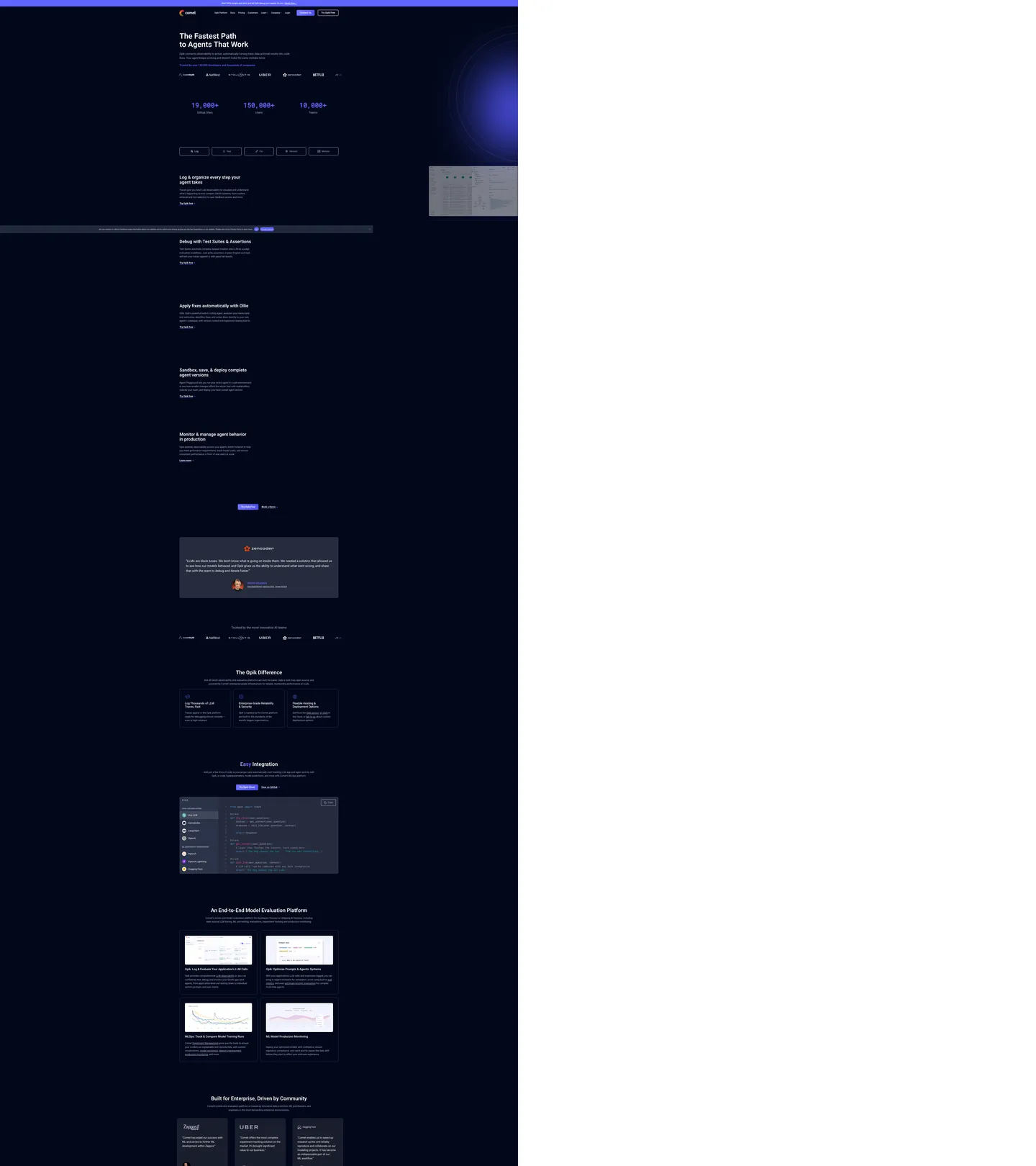
Comet's marketing site runs on a deep navy-black canvas with a periwinkle-violet accent and a lavender-gray secondary that, unusually, outpaces the accent in raw frequency — 972 uses of lavender-gray versus 87 uses of the periwinkle accent. The secondary tone is not a faded version of the accent; it is a distinct color occupying the muted-text, border, and secondary-button roles simultaneously. The effect is a page that feels cooler and more restrained than competitors like Weights & Biases (which uses brighter gold on black) or MLflow (which sits on white). The periwinkle accent is reserved for CTAs, active highlights, and gradient stop-points; the lavender-gray handles everything in between.
The typography system is fully Roboto — no display-family switch, no editorial serif. What distinguishes it is the specific deployment of Roboto Mono for the social-proof counter section: "19,000+ GitHub Stars", "150,000+ Users", and "19,000+ Tests" render at 50px / weight 700 in Roboto Mono, making the numbers read as precise machine-generated output rather than marketing copy. This is the inverse of most platforms that render large numbers in a display sans at maximum weight. Roboto's regular body at 18–24px / weight 400–600 handles all editorial sections.
The sub-product Opik — Comet's open-source AI observability layer — has its own visual signature: a warm orange-to-red gradient (wired as --gradient-opik) that decorates its header strip, distinct from the periwinkle-violet of the parent brand. The two identities share the same canvas, type system, and radius scale, but the gradient marks the boundary clearly. Feed this file to an AI coding tool and it reproduces the periwinkle-lavender dark-navy system, the Roboto Mono counter section, and the Opik gradient strip.
What makes it distinct
5
- Periwinkle accent over lavender secondarythe periwinkle accent (87 uses) is outpaced by the lavender-gray secondary (972 uses), inverting the usual primary-dominant convention
- Roboto Mono for hero numbersRoboto Mono at 50px / weight 700 renders large social-proof counters (19,000+ users, 150,000+ runs), not just code blocks
- Sub-product Opik gradienta warm orange-to-red linear gradient (--gradient-opik) marks the Opik AI observability layer distinctly from the parent Comet brand
- 12px default card radius, 9999px CTA pillbinary radius system with no middle tier between the conservative 12px content surface and the fully-rounded pill CTA
- Lavender hairlines everywherethe lavender-gray secondary appears 474 times as a border tone, creating a distinctly soft blue-gray perimeter around every card and button
comet.com
Live at comet.com
A snapshot of the brand in production. Scroll the frame to see the whole page.
Colors
14 colors
Comet's system runs on #6064ff as its primary voltage, used in 2 of 14 components. Type is set in Roboto across 15 tokens from 14px to 58px, weights 400–700. Shape language is mixed across 14 components, blending pills, soft rounds, and squarer corners.
Brand & Accent
Sparing, CTA-only voltage · 4
Surface
Page and card backgrounds · 3
Text
Headlines, body, captions · 3
Borders & Hairlines
Dividers, outlines, rules · 1
Other
Specialty colors · 3
Typography
15 type tokens
Set in Roboto across 15 tokens, from 14px to 58px, weights 400–700. Shown in its own stack: where the font isn't installed, the fallback the file names stands in.
- display-xl58px · weight 600 · lh 65pxThe quick brown fox jumps over the lazy dog
- display-md40px · weight 600 · lh 45pxThe quick brown fox jumps over the lazy dog
- display-sm34px · weight 600 · lh 38pxThe quick brown fox jumps over the lazy dog
- heading-lg22px · weight 500 · lh 25pxThe quick brown fox jumps over the lazy dog
- heading-md22px · weight 600 · lh 25pxThe quick brown fox jumps over the lazy dog
- body-xl24px · weight 400 · lh 38pxThe quick brown fox jumps over the lazy dog
- body-lg20px · weight 400 · lh 32pxThe quick brown fox jumps over the lazy dog
- body-md18px · weight 400 · lh 29pxThe quick brown fox jumps over the lazy dog
- body-sm16px · weight 400 · lh 26pxThe quick brown fox jumps over the lazy dog
- button-md18px · weight 700 · lh 18pxThe quick brown fox jumps over the lazy dog
- nav-link16px · weight 500 · lh 16pxThe quick brown fox jumps over the lazy dog
- mono-xl50px · weight 700 · lh 80pxThe quick brown fox jumps over the lazy dog
- mono-md18px · weight 400 · lh 29pxThe quick brown fox jumps over the lazy dog
- caption14px · weight 400 · lh 22pxThe quick brown fox jumps over the lazy dog
- label-caps14px · weight 600 · lh 15pxThe quick brown fox jumps over the lazy dog
Layout
Radii and spacing
9 corner radii and 8 spacing values. Shape language: mixed.
Radii
- none0px
- xs3px
- sm5px
- md8px
- lg10px
- xl12px
- 2xl32px
- pill9999px
- full100%
Spacing
- xs8px
- sm12px
- base16px
- md20px
- lg24px
- xl40px
- 2xl50px
- 3xl80px
Components
14 components
Each rendered from its tokens (color, type, radius, padding) on Comet's own canvas.
- Button Primarybutton-primaryButton Primary
- Button Secondarybutton-secondaryButton Secondary
- Top Navtop-navTop Nav
- Nav Linknav-linkNav Link
- Hero Headinghero-headingHero Heading
- Section Headingsection-headingSection Heading
- Body Paragraphbody-paragraphBody Paragraph
- Body Paragraph Mutedbody-paragraph-mutedBody Paragraph Muted
- CardcardCard
- Card Hovercard-hoverCard Hover
- Counter Statcounter-statCounter Stat
- Type here…text-inputText Input
- Testimonial Cardtestimonial-cardTestimonial Card
- FooterfooterFooter
In use
The system, in use
Comet's tokens on the kind of product it builds.
Build something people actually use.
A short paragraph of marketing copy that previews how the brand's display tier and body tier read together. Two sentences is usually enough.
FAQ
Comet design system FAQ
Common questions about Comet's tokens, components, and how to use this DESIGN.md in your project.
Read next
Related reading
Specs, directories, and component libraries that pair with this design system.
- Browse all design systemsThe full directory of DESIGN.md files on shadcn.io, with live mockups for each.shadcn.io
- Comet — official siteComet's public marketing site — the source of truth for the live tokens captured in this file.comet.com (opens in a new tab)
- The DESIGN.md specificationGoogle Labs' open spec for machine-readable design system files — the format this page is built on.github.com (opens in a new tab)
Use it
Use Comet in your project
One machine-readable file. Drop it into Claude, Cursor, or any AI tool that reads DESIGN.md.
Download the DESIGN.md
One machine-readable file: every color, type, radius, spacing, and component token of Comet.
Feed it to your AI tool
Drop it into Claude, Cursor, or GitHub Copilot. The agent writes React components and Tailwind classes that match Comet's visual language.
Reference the tokens directly
Or paste the values into your Tailwind config, CSS variables, or component library: every color, size and radius is a quoted, ready-to-copy value.
Read the full DESIGN.md: overview, rationale, do’s and don’ts
Overview
Comet's marketing site anchors itself on a deep navy-black canvas and a periwinkle-violet accent, but the page's true chromatic workhorse is neither — it is a lavender-gray secondary tone that outpaces every other color on the page by a 10:1 margin. Secondary-dominant branding. The lavender-gray secondary appears 972 times across text, border, and hover roles, while the periwinkle accent appears 87 times in CTAs and highlights. This inversion — where the secondary color is more visible than the primary — produces a page that reads as deliberately cool and restrained, closer to an academic research tool than to the brighter, higher-chroma ML platforms like Weights & Biases.
The comparison to competitors is precise: Weights & Biases uses gold-yellow on black with heavy visual density; MLflow sits on white with plain navy typography; Neptune.ai uses a teal-on-white system. Comet's periwinkle-on-dark-navy with lavender-gray borders is the quietest visual approach in the ML tracking category — the color says "infrastructure for engineers" rather than "dashboard for everyone."
The Roboto Mono counter section is the single most distinctive typographic moment: "19,000+ GitHub Stars" and "150,000+ Users" rendered in monospace at 50px / weight 700, making social proof read as instrument output rather than marketing copy. No other platform in the directory uses monospace as the vehicle for social-proof numbers.
Key Characteristics:
- Deep navy-black canvas (
{colors.canvas}— #02081b) — cooler and slightly bluer than Spline's pure near-black or Earthly's navy-blue canvas. - Lavender-gray secondary (
{colors.secondary}— #afafce) outpaces the periwinkle accent by 10:1 in total frequency — the dominant border and muted-text tone. - Periwinkle accent (
{colors.primary}— #6064ff) reserved for CTA fills, active tab highlights, and gradient stop-points. - Roboto Mono at 50px / weight 700 for social-proof counters — the most distinctive typographic move in the system.
- Binary radius: 12px for content cards, 9999px for CTA pill buttons. No 20–24px middle tier.
- Sub-product Opik gradient (--gradient-opik, orange-to-red at 280°) marks the AI observability layer with a warm orange-to-red identity strip.
- Card hover state flips the lavender-gray border to periwinkle — the only hover signal in the system.
Colors
Brand
- Primary (
{colors.primary}— #6064ff): frequency 87. Used as text (38), bg (10), border (39). The CTA button fill, active tab, inline text highlight, gradient stop. Wired as --wp--preset--color--accent. - Primary Dark (
{colors.primary-dark}— #4d50e8): frequency 5. Gradient stop in the accent-background and dark-heading-highlight gradients. Wired into --wp--preset--gradient--custom-accent-background. - Primary Light (
{colors.primary-light}— #7377ff): frequency 4. The light stop on the heading-highlight-dark gradient. Appears in gradient-only contexts. - Secondary (
{colors.secondary}— #afafce): frequency 972. Text (494), border (474), bg (4). The dominant surface-level color — card outlines, secondary button borders, muted text, hover-state border for interactive elements. Wired as --wp--preset--color--secondary and multiple button-hover variables.
Text
- Ink (
{colors.ink}— #ffffff): frequency 326. Primary heading and body text. Pure white on the dark navy canvas. - Ink Muted (
{colors.ink-muted}— #5f677e): frequency 22. Secondary body copy, footer text, nav submenu labels. Wired as --wp--preset--color--foreground and --wp--custom--color--foreground. - Ink Soft (
{colors.ink-soft}— #8c95a8): frequency 10. Tertiary text — the medium-gray body tier below muted.
Surface
- Canvas (
{colors.canvas}— #02081b): frequency 15. The primary page floor and section backgrounds. Wired as --wp--preset--color--custom-background-dark. - Surface-1 (
{colors.surface-1}— #1a1e2d): frequency 15. Elevated card and tile surfaces — the card background above the deep-navy floor. Wired as --wp--preset--color--custom-alt-background-dark. - Surface-2 (
{colors.surface-2}— #262c3e): frequency 9. The secondary elevated surface — testimonial cards, feature-tile overlays. Wired as --wp--custom--color--tertiary and --wp--preset--color--tertiary.
Hairline
- Hairline (
{colors.hairline}— #212d54): frequency 22, all as border. The structural card-divider tone — a mid-navy between the canvas and the surface-1 card color. Wired as --wp--preset--color--custom-decorative-border-dark.
Accent
- Teal Accent (
{colors.teal-accent}— #12a4b4): frequency 8. Text (4) and border (4). Used for the teal accent tier in feature labels and category chips — not a primary or secondary brand tone, but present in the product-feature grid. - Blue Soft (
{colors.blue-soft}— #5899da): frequency 18. Text (9) and border (9). A sky-blue accent used in secondary link and highlight contexts — the softer blue in the periwinkle family.
Typography
Font Families
The system runs Roboto for every editorial surface — display, heading, body, button, nav, caption, label — with no second display family. The fallback stack is sans-serif only. Roboto Mono handles code blocks and the social-proof counter section. The Roboto Mono counter section ({typography.mono-xl} — 50px / weight 700 / line-height 80px) is the standout: rendering "19,000+" in a fixed-width font at this size makes the number read as a precisely measured instrument value rather than a marketing claim.
Hierarchy
| Token | Size | Weight | Line Height | Use |
|---|---|---|---|---|
{typography.display-xl} | 58px | 600 | 65px | Hero h1 ("The Fastest Path to Agents That Work") |
{typography.display-md} | 40px | 600 | 45px | Section h2 display tier |
{typography.display-sm} | 34px | 600 | 38px | Sub-section display ("Log & organize every step your agent takes") |
{typography.heading-lg} | 22px | 500 | 25px | Card h3 titles |
{typography.heading-md} | 22px | 600 | 25px | Bolder card h3 variant |
{typography.body-xl} | 24px | 400 | 38px | Large lead paragraph / testimonial pull-quote |
{typography.body-lg} | 20px | 400 | 32px | Feature row lead copy |
{typography.body-md} | 18px | 400 | 29px | Default running text (most-used body size) |
{typography.body-sm} | 16px | 400 | 26px | Secondary body, footer copy |
{typography.button-md} | 18px | 700 | 18px | CTA button labels |
{typography.nav-link} | 16px | 500 | 16px | Top-nav link labels |
{typography.mono-xl} | 50px | 700 | 80px | Social-proof counters in Roboto Mono |
{typography.mono-md} | 18px | 400 | 29px | Code block body text |
{typography.caption} | 14px | 400 | 22px | Sub-labels, metadata |
{typography.label-caps} | 14px | 600 | 15px | Uppercase section category labels |
Principles
The display tier tops at weight 600 — Comet avoids the 700+ display-weight arms race. The hero h1 at 58px / 600 is the loudest typographic moment, and its authority comes from size rather than weight. The monospace counter at 50px / 700 is actually heavier but narrower — the fixed-width rhythm of Roboto Mono reads as technical precision rather than marketing boldness. Body copy runs at weight 400 throughout.
Note on Font Substitutes
Roboto is open-source (Google Fonts). For the display and body tier, Inter maps directly at the same sizes and weights. For Roboto Mono at the counter tier, JetBrains Mono or IBM Plex Mono at weight 700 read similarly — the key is preserving the fixed-width character at 50px. The counters should remain in a monospace family; switching to a proportional sans at that size removes the "instrument output" reading.
Layout
Spacing System
- Base unit: 8px (xs).
- Tokens:
{spacing.xs}8px ·{spacing.sm}12px ·{spacing.base}16px ·{spacing.md}20px ·{spacing.lg}24px ·{spacing.xl}40px ·{spacing.2xl}50px ·{spacing.3xl}80px. - Card internal padding:
{spacing.xl}×{spacing.2xl}(40×36px) on feature cards and testimonial blocks. - Section padding (vertical): 50–80px between major sections.
- Nav padding: 0×36px horizontal; the nav bar sits at 56px height.
Grid & Container
- Max content width: ~865px content column (
--wp--style--global--content-size: 865px), 1228px wide-size for full-bleed sections. - Hero: two-column layout at desktop — text column left (~40%) with the hero h1, sub-copy, and primary CTA; visual column right with animated product screenshot.
- Feature sections: alternating left/right two-column layout for the product feature rows.
- Counter strip: horizontal row of three Roboto Mono counter blocks (19,000+ Stars / 150,000+ Users / 19,000+ Tests).
- Social proof: 3-column customer testimonial grid at desktop.
Rhythm
The page uses consistent dark canvas throughout — no section inversion to white, no alternating light/dark bands. Section separation comes from slight surface elevation ({colors.surface-1} card fills on {colors.canvas} floor) and from the periwinkle accent reappearing as section heading emphasis. The monotone-dark rhythm reinforces the "infrastructure tool" positioning — it reads as a dashboard, not a campaign.
Elevation
The system uses tonal lift with a subtle drop shadow declared in CSS presets:
- Flat (no shadow): hero, nav, editorial text sections, footer.
- Tonal lift:
{colors.surface-1}and{colors.surface-2}cards on{colors.canvas}— the 10–20 lightness-point gap between canvas and surface reads as elevation. - CTA pill shadow:
--wp--preset--shadow--natural: 6px 6px 9px rgba(0, 0, 0, 0.2)— a soft black shadow on the primary CTA pill, barely visible against the dark canvas. One of the few shadow declarations in the system. - Deep shadow:
--wp--preset--shadow--deep: 12px 12px 50px rgba(0, 0, 0, 0.4)— declared but not visually prominent on the marketing surfaces.
Shapes
The radius scale is binary: conservative small-step for content, full pill for CTAs.
{rounded.none}0px — hero section edges, full-width banner strips.{rounded.xs}3px — the smallest chip (1 occurrence).{rounded.sm}5px — form input borders (--wp--custom--button--border--radius: 4px, captured as 5px).{rounded.md}8px — secondary card tier and tag chips (15 occurrences).{rounded.lg}10px — medium content tiles (5 occurrences).{rounded.xl}12px — the dominant card radius (26 occurrences — used on feature cards, testimonial cards, code demo blocks).{rounded.2xl}32px — large promotional container (2 occurrences).{rounded.pill}9999px — primary and secondary CTA buttons (19 occurrences). The single warm surface in the system.{rounded.full}100% — avatar and logo circles (12 occurrences).
The 12px-to-9999px jump is the defining shape decision — there is no 20 or 24px transitional tier. Every content surface uses 12px; every interactive CTA uses the full pill.
Components
button-primary — Periwinkle {colors.primary} fill, white text, Roboto 18px / 700, full-pill {rounded.pill} 9999px radius, 12×20px padding, 52px height. "Try Comet Free" and "Log" are canonical instances.
button-secondary — Transparent fill, white text, 2px lavender-gray {colors.secondary} border, same pill radius and padding. Used for secondary CTAs adjacent to the primary.
top-nav — Dark canvas surface, 56px height, 0×36px padding. Comet wordmark flush left, product links (Platform, Pricing, Customers, Blog, Docs, Company, Log in), "Try for Free" primary CTA flush right.
nav-link — Transparent, white text at Roboto 16px / 500, 0×7.5px padding. The nav links render in pure white rather than the brand accent — ink is the nav default, not the violet.
hero-heading — Pure white text, Roboto 58px / 600 / line-height 65px. The hero h1 on the dark navy canvas.
section-heading — White text, Roboto 40px or 34px / 600 depending on section prominence.
body-paragraph — White text at Roboto 20px / 400. Feature row lead copy.
body-paragraph-muted — Muted {colors.ink-muted} text at Roboto 18px / 400. Secondary descriptions, footer categories.
card — {colors.surface-1} fill, white text, 2px lavender-gray {colors.secondary} border, 12px radius, 40×36px padding. The default feature card — lavender border in resting state.
card-hover — Same card but border flips to periwinkle {colors.primary} on hover. The only hover signal in the system; the color shift from lavender to violet is the interaction cue.
counter-stat — Transparent background, white text, Roboto Mono 50px / 700 / line-height 80px. The social-proof counter row (19,000+, 150,000+, 19,000+).
testimonial-card — {colors.surface-2} (#262c3e) fill, white text, mid-navy {colors.hairline} border, 12px radius, 40×36px padding.
text-input — Transparent fill, white text, 2px {colors.secondary} border, 5px radius, 12px padding, 48px height. Email / form inputs in the contact and demo-request flows.
footer — Deep canvas {colors.canvas} floor, muted text, Roboto 16px / 400, 50×36px padding.
Do's and Don'ts
Do let the lavender-gray secondary ({colors.secondary}) carry the border and muted-text roles. Its 10:1 frequency advantage over the periwinkle accent is not a mistake — the system achieves its cool, restrained quality precisely because the secondary dominates the visible border surface. Replacing lavender-gray borders with periwinkle borders would produce a page that reads as aggressive rather than technical.
Do keep the Roboto Mono counter section at 50px / weight 700. The monospace-at-scale move is the system's most distinctive typographic choice; swapping to Roboto Regular at 50px removes the instrument-output reading and turns the counter into a conventional marketing number.
Do use the card hover state exactly as specified — lavender-gray border at rest, periwinkle border on hover. This is the only interactive-state signal in the system. Introducing a background-color hover (e.g., a purple fill) would add a second hover cue on top of the border signal.
Do reserve the Opik gradient (--gradient-opik) exclusively for Opik-branded identity moments — header strips, product-tier labels, and Opik-specific CTAs. It reads as a warm energetic burst against the cold navy canvas; deploying it elsewhere weakens the sub-product identity distinction.
Don't introduce a light-mode or white-canvas variant without also defining alternative lavender-gray and canvas tokens. The lavender-gray secondary ({colors.secondary}) is calibrated for legibility against the dark navy canvas; it would read as washed-out and low-contrast against a white surface.
Don't use {colors.teal-accent} (#12a4b4) or {colors.blue-soft} (#5899da) as primary or secondary brand accents. Both appear at low frequency (8 and 18 occurrences respectively) in specific product-surface contexts; treating them as general-purpose accents would create a five-color system with no clear hierarchy.
Don't add a mid-range card radius between 12px and the full pill. The binary system is its own design statement — conservative content surfaces vs. warm pill CTAs. Adding a 20px or 24px transitional card variant dissolves the categorical distinction.
Don't render the hero h1 above weight 600. The display tier is calibrated at size 58px / weight 600 — bumping to 700 or 800 on Roboto at that size would tip from confident to heavy and lose the academic-instrument aesthetic.
Known Gaps
- Light mode: the captured marketing surface is dark-only. Comet's product dashboard may carry a light-mode token set not represented here.
- Hover and focus matrix: the card hover state (lavender border → periwinkle border) is captured; the full interactive-state matrix (button active, input focus ring, nav link hover, link underline) is not fully visible on the static captured surface.
- Form validation states:
{component.text-input}captures the resting state; error, success, and focus-ring variants are not exposed. - Opik sub-product token set: the Opik gradient (--gradient-opik), the Opik amber-orange, and the Opik signal-red form the beginning of a sub-brand palette, but the complete Opik design system is not captured here.
- Motion and animations: the hero product screenshot animates, and the counter section may use count-up animation. Easing curves and duration values are not represented.
- Product surfaces: this DESIGN.md captures the comet.com marketing site. The Comet experiment tracking dashboard and the Opik platform UI carry their own denser token systems for charts, experiment cards, metric plots, and annotation tools.
- WordPress-scoped variables: Comet's site is built on WordPress; many CSS custom properties are prefixed --wp--preset-- and --wp--custom--, which limits portability. The tokens in this file strip the WP namespace for direct usability in React projects.
AI & LLM Platforms
More systems like this
More DESIGN.md files in AI & LLM Platforms.
Pricing
Build it with Pro
The DESIGN.md files are free. Pro adds 6,000+ blocks, premium templates and the MCP server, so your AI editor builds in your system for you.
4.9/5 out of 5 · 150+ reviewsfrom 150+ founders and developers.
Billing
Billed once a year in USD. Cancel anytime.
- How many people can use the license.
- Client work, SaaS products and anything you charge for.
- Production-ready React sections: hero, pricing, features, dashboards and more.
- Complete multi-page sites you can ship as they are.
- React icons from every major library, installable with one command.
- Presets that restyle every block, in light and dark.
- Lets your AI editor search, preview and install blocks for you.
- Priority requests are answered first.
Individual
For personal projects & open source
$32instead of $49/mo
$389 billed yearly
- Seats: 1 seat
- Commercial use: Personal & open source only
- Pro blocks: 6,000+ blocks
- Templates: All 14 templates
- React icons: 294k+ icons
- Themes: All 59 themes
- MCP server: Basic usage
- Support: Standard
Team
Most popularFor freelancers, agencies & startups
$66instead of $99/mo
$789 billed yearly · ≈ $13/dev/mo
- Seats: Up to 5 seats
- Commercial use: Included
- Pro blocks: 6,000+ blocks
- Templates: All 14 templates
- React icons: 294k+ icons
- Themes: All 59 themes
- MCP server: High usage
- Support: Priority
Organization
For companies with larger teams
$132instead of $199/mo
$1,589 billed yearly
- Seats: Unlimited seats
- Commercial use: Included
- Pro blocks: 6,000+ blocks
- Templates: All 14 templates
- React icons: 294k+ icons
- Themes: All 59 themes
- MCP server: Unlimited usage
- Support: Priority
Billed once a year in USD. Cancel anytime.
Individual
For personal projects & open source
$32instead of $49/mo
$389 billed yearly
- How many people can use the license.Seats: 1 seat
- Client work, SaaS products and anything you charge for.Commercial use: Personal & open source only
- Production-ready React sections: hero, pricing, features, dashboards and more.Pro blocks: 6,000+ blocks
- Complete multi-page sites you can ship as they are.Templates: All 14 templates
- React icons from every major library, installable with one command.React icons: 294k+ icons
- Presets that restyle every block, in light and dark.Themes: All 59 themes
- Lets your AI editor search, preview and install blocks for you.MCP server: Basic usage
- Priority requests are answered first.Support: Standard
Team
Most popularFor freelancers, agencies & startups
$66instead of $99/mo
$789 billed yearly · ≈ $13/dev/mo
Everything in Individual, plus
- How many people can use the license.Seats: Up to 5 seats
- Client work, SaaS products and anything you charge for.Commercial use: Included
- Lets your AI editor search, preview and install blocks for you.MCP server: High usage
- Priority requests are answered first.Support: Priority
Organization
For companies with larger teams
$132instead of $199/mo
$1,589 billed yearly
Everything in Team, plus
- How many people can use the license.Seats: Unlimited seats
- Lets your AI editor search, preview and install blocks for you.MCP server: Unlimited usage
- Secure checkout via Stripe
- Code lives in your repo
- Keep what you've shipped if you cancel
- License terms
Your system, built for you
Every block, template and icon, installed by your AI agent in your design system. The DESIGN.md files stay free.