HubSpot Design System
HubSpot's design system as a DESIGN.md file. Orange #ff4800, HubSpot Serif Page Header Human, HubSpot Sans, 19 components. For React, Next.js, and AI tools.
Add shadcn.io to your AI agent. · Pro It installs blocks, icons and templates in your design system from a prompt, with Pro.
Set up MCP- Primary
- #ff4800
- Typeface
- HubSpot Sans
- Shape
- Mixed
- Base radius
- 8px
- Colors
- 22
- Type tokens
- 11
- Components
- 19
- Spacing values
- 9
About
About HubSpot DESIGN.md
Curated by Dov Azencot · Updated May 13, 2026 · Source hubspot.com (opens in a new tab)
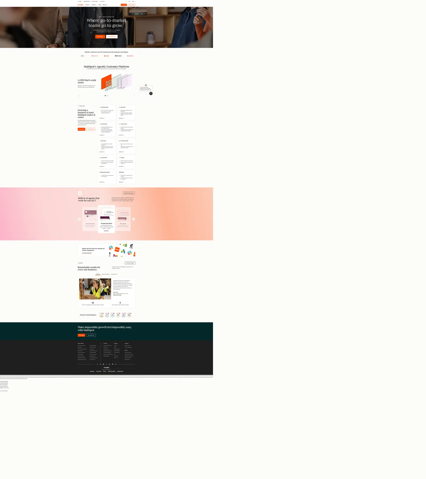
HubSpot's customer-platform surface is the rare CRM marketing canvas that pairs a photographic hero band with a custom-cut editorial serif. The opening h1 runs `HubSpot Serif Page Header Human` at 80px / weight 500 / 95px line-height over a portrait photograph; below it, the page floor turns cream (`#f8f5ee`) and the rest of the system runs HubSpot Sans at light weights — 300 for body copy and the large display tier, 500 for CTAs, navigation, and h3 cards. The chromatic voltage is HubSpot Orange (`#ff4800`), and it appears in four exact roles — primary button fill, secondary button stroke, link underline, and active statistic-number fill — and nowhere else as a section background.
This DESIGN.md packages the spec into one machine-readable file. Inside: 22 colors tokens grouped into one brand voltage (`#ff4800` orange with its `#c93700` hover and `#9f2800` pressed steps), the cream surface ladder (`#f8f5ee` page floor, `#ffffff` cards, `#fcfcfa` modal), the `#1f1f1f` near-black ink ladder, two accent decorations (the `#b9cdbe` Sage card tint, the `#d6c2d9` Lilac card tint), plus semantic success / warning / error tokens; 11 typography tokens running the custom serif at 80px / 48px / 40px display and HubSpot Sans at 24px / 18px / 16px / 14px / 12px; 5 corner radii anchored on the `16px` container default and the `8px` button rectangle; 9 spacing tokens; and 19 components including the dual orange CTA pair, the product-hub feature card, the dark hero band, and the cream stats card. Format follows the Google Labs DESIGN.md spec.
Feed the file to Claude, Cursor, or Copilot and the agent will reproduce HubSpot's pairing — Orange filled primary right next to Orange-bordered secondary, cream page floor never pure white, body type at weight 300 — instead of a generic shadcn theme. Reference the tokens directly inside Tailwind config, CSS variables, or your own component library. The discipline worth studying is the in-line dual-CTA: where most CRM marketing sites ship a single solid primary and a ghost or text-link secondary, HubSpot puts the orange-filled "Get a demo" right next to the orange-bordered "Get started free" on the same row, so the secondary inherits the brand voltage instead of fading into the page.
What makes it distinct
5
- Single brand voltageHubSpot Orange (`#ff4800`) carries every primary CTA, every link underline, every active statistic number, and both secondary button strokes
- Custom serif display`HubSpot Serif Page Header Human` runs the hero at 80px / weight 500 / 95px line-height while HubSpot Sans handles the entire 12–18px body scale
- Cream page floor (`#f8f5ee`)the `--cl-color-background-02` token sits on every section between the dark hero band and the `#1f1f1f` footer, never pure white
- Orange-bordered secondary CTAevery Get-started-free button ships with a 1px `#ff4800` stroke over white, paired in-line with the filled Orange primary
- Body weight 300`--cl-font-weight-p-medium`, `--cl-font-weight-display-01`, and `--cl-font-weight-light` all resolve to 300, so paragraph copy and 7rem display tier share the same light weight
hubspot.com
Live at hubspot.com
A snapshot of the brand in production. Scroll the frame to see the whole page.
Colors
22 colors
HubSpot's system runs on #ff4800 as its primary voltage, used in 4 of 19 components. Type is set in HubSpot Sans across 11 tokens from 12px to 80px, weights 300–500. Shape language is mixed across 19 components, blending pills, soft rounds, and squarer corners.
Brand & Accent
Sparing, CTA-only voltage · 7
Surface
Page and card backgrounds · 3
Text
Headlines, body, captions · 6
Borders & Hairlines
Dividers, outlines, rules · 1
Semantic
Status, errors, success, links · 3
Other
Specialty colors · 2
Typography
11 type tokens
Set in HubSpot Sans across 11 tokens, from 12px to 80px, weights 300–500. Shown in its own stack: where the font isn't installed, the fallback the file names stands in.
- display-hero80px · weight 500 · lh 1.19 · tracking 0pxThe quick brown fox jumps over the lazy dog
- display-lg48px · weight 500 · lh 1.15 · tracking 0pxThe quick brown fox jumps over the lazy dog
- display-md40px · weight 500 · lh 1.1 · tracking 0pxThe quick brown fox jumps over the lazy dog
- heading-h324px · weight 500 · lh 1.42 · tracking 0pxThe quick brown fox jumps over the lazy dog
- subhead18px · weight 500 · lh 1.55 · tracking 0pxThe quick brown fox jumps over the lazy dog
- body-lg18px · weight 300 · lh 1.77 · tracking 0pxThe quick brown fox jumps over the lazy dog
- body-md16px · weight 300 · lh 1.75 · tracking 0pxThe quick brown fox jumps over the lazy dog
- body-sm14px · weight 300 · lh 1.57 · tracking 0pxThe quick brown fox jumps over the lazy dog
- label14px · weight 500 · lh 1.57 · tracking 0pxThe quick brown fox jumps over the lazy dog
- button18px · weight 500 · lh 1.77 · tracking 0pxThe quick brown fox jumps over the lazy dog
- nav-link12px · weight 500 · lh 1.66 · tracking 0pxThe quick brown fox jumps over the lazy dog
Layout
Radii and spacing
5 corner radii and 9 spacing values. Shape language: mixed.
Radii
- none0px
- sm4px
- md8px
- lg16px
- full9999px
Spacing
- xxs2px
- xs4px
- sm8px
- md16px
- lg24px
- xl32px
- xxl40px
- section64px
- hero96px
Components
19 components
Each rendered from its tokens (color, type, radius, padding) on HubSpot's own canvas.
- Button Primarybutton-primaryButton Primary
- Button Primary Hoverbutton-primary-hoverButton Primary Hover
- Button Primary Pressedbutton-primary-pressedButton Primary Pressed
- Button Secondarybutton-secondaryButton Secondary
- Button Secondary Hoverbutton-secondary-hoverButton Secondary Hover
- Hero Headinghero-headingHero Heading
- Section Headingsection-headingSection Heading
- Top Navtop-navTop Nav
- Nav Linknav-linkNav Link
- Link Inlinelink-inlineLink Inline
- Feature Cardfeature-cardFeature Card
- Product Hub Cardproduct-hub-cardProduct Hub Card
- Stats Cardstats-cardStats Card
- Band Inverseband-inverseBand Inverse
- Type here…text-inputText Input
- Badge Brandbadge-brandBadge Brand
- Accent Tile Sageaccent-tile-sageAccent Tile Sage
- Accent Tile Lilacaccent-tile-lilacAccent Tile Lilac
- FooterfooterFooter
In use
The system, in use
HubSpot's tokens on the kind of product it builds.
Build something people actually use.
A short paragraph of marketing copy that previews how the brand's display tier and body tier read together. Two sentences is usually enough.
FAQ
HubSpot design system FAQ
Common questions about HubSpot's tokens, components, and how to use this DESIGN.md in your project.
Read next
Related reading
Specs, directories, and component libraries that pair with this design system.
- Browse all design systemsThe full directory of DESIGN.md files on shadcn.io, with live mockups for each.shadcn.io
- HubSpot — official siteHubSpot's customer platform marketing surface, the source for every token in this spec.hubspot.com (opens in a new tab)
- The DESIGN.md specificationGoogle Labs' open spec for machine-readable design system files — the format this page is built on.github.com (opens in a new tab)
Use it
Use HubSpot in your project
One machine-readable file. Drop it into Claude, Cursor, or any AI tool that reads DESIGN.md.
Download the DESIGN.md
One machine-readable file: every color, type, radius, spacing, and component token of HubSpot.
Feed it to your AI tool
Drop it into Claude, Cursor, or GitHub Copilot. The agent writes React components and Tailwind classes that match HubSpot's visual language.
Reference the tokens directly
Or paste the values into your Tailwind config, CSS variables, or component library: every color, size and radius is a quoted, ready-to-copy value.
Read the full DESIGN.md: overview, rationale, do’s and don’ts
Overview
HubSpot's customer-platform surface is the rare CRM marketing canvas that opens with a portrait photograph behind a custom-cut editorial serif and closes the rest of the page in cream sans-serif. The hero band runs #1f1f1f near-black with a 6-person photographic group portrait; centered over it, the h1 reads "Where go-to-market teams go to grow" in HubSpot Serif Page Header Human at 80px / weight 500 / 95px line-height. Below the band the page floor switches to cream ({colors.canvas} #f8f5ee), the rest of the type swaps to HubSpot Sans, and every section sits between two off-white-to-white card lifts.
Dual-orange voltage: where most CRM marketing pages ship one filled primary plus a text-link or ghost secondary, HubSpot puts a filled {colors.primary} #ff4800 primary right next to a 1px-#ff4800-bordered, white-filled secondary on the same hero row. The CSS variable --cl-color-button-secondary-border resolves directly to #ff4800, so the secondary inherits the brand voltage through its stroke rather than fading into the page. Both buttons share the 8px radius and the 16px 40px padding — the only difference is fill versus border. The pair turns Orange into a system property of the action row, not just the primary action.
Custom-cut hero serif: the display family is HubSpot Serif Page Header Human, a typeface variant that exists for one purpose — the largest h1 on the home page. It runs at 80px / weight 500 / 95px line-height, then drops to a plain HubSpot Serif at 48px h2 and 40px section h2. Where Stripe pulls a single Sohne-var weight 300 across every tier and Mailchimp pairs Means Web serif with Graphik Web sans, HubSpot ships a serif tier specifically for the page-header context, then hands everything else to a 12–24px sans at weight 300 body and 500 display.
Key Characteristics:
- Dual orange CTAs — filled
{colors.primary}#ff4800primary paired with{colors.surface-1}white + 1px{colors.primary}stroke secondary, same8pxradius and16px 40pxpadding. - Custom hero serif (
{typography.display-hero}) —HubSpot Serif Page Header Humanat 80px / weight 500, dropping toHubSpot Serifat 48px and 40px. - HubSpot Sans body at weight 300 —
--cl-text-font-weightis 300, so paragraph copy is lighter than the CTA labels at weight 500. - Cream page floor (
{colors.canvas}#f8f5ee) — applied via--cl-color-background-02, never pure white between the dark hero and the dark footer. - Two photographic dark bands — the top hero and the
{colors.inverse-canvas}#1f1f1ffooter; both invert text to cream, no other section flips to dark. - Container radius 16px —
--cl-border-radius-containeris 16px on cards, 8px on buttons (--cl-border-radius-medium), 4px on inputs (--cl-border-radius-input). - One brand orange, one hover, one pressed —
#ff4800→#c93700→#9f2800, all declared on--cl-color-button-primary-fill-*. No tint scale, no orange surfaces.
Colors
HubSpot's palette is one brand voltage on a cream surface ladder, with two muted card accents and a full semantic triad held in reserve. The 22 tokens fall into one brand orange, the cream-to-white surface ladder, a near-black ink ladder, and four accent decoration tiles used inside product imagery.
- HubSpot Orange (
#ff4800) — frequency 11. Used as text (3), bg (4), border (3), gradient (1). The brand voltage. 32 CSS-variable aliases resolve to this hex (--cl-color-hubspot-brand-01,--cl-color-button-primary-fill-idle,--cl-color-text-link-underline-01,--cl-color-number-fill-active,--cl-color-button-secondary-border). Carries the filled primary CTA, the secondary CTA stroke, every link underline, and every active-state statistic-number fill — nothing else. - Hover Orange (
#c93700) — declared on--cl-color-button-primary-fill-hoverand--cl-color-play-button-fill-hover. The single hover step for every Orange interactive surface. - Pressed Orange (
#9f2800) —--cl-color-button-primary-fill-pressed. The pressed-state step, also the focused secondary-button text color (--cl-color-button-secondary-text-color-pressed). - Ink (
#1f1f1f) — frequency 876. Used as text (449), border (424), bg (3). The system primary. 32 declared aliases (--cl-color-text-01,--cl-color-link-01,--cl-color-border-01,--cl-color-icon-01,--cl-color-container-inverse-01,--cl-color-background-footer-01). Not pure black — a very dark gray that doubles as both body-text color and the inverse-canvas color for the hero and footer bands. - Ink-soft (
#292929) — frequency 0 raw but declared on--light-theme-icon-02and--cl-color-social-button-fill-idle. A slightly lifted near-black for secondary icons and social-button fills. - Ink-muted (
#9b9897) — declared on--light-theme-neutral-01and--cl-color-accent-decoration-01. The muted gray for tertiary labels and inactive nav items. - Cream canvas (
#f8f5ee) — frequency 244. Used as text (118), bg (9), border (117). The page floor.--cl-color-background-02,--light-theme-background-03, and--dark-theme-text-01all resolve here — the same hex carries the light-mode page background AND the cream text-on-dark for the hero h1 over the photographic band. - Modal canvas (
#fcfcfa) — declared on--color-background-modaland--cl-color-background-01. A cooler cream used only for modal dialogs. - Surface-1 white (
#ffffff) — frequency 138. Used as text (55), bg (33), border (50). The card surface — every feature card, product-hub tile, and pricing card lifts off the cream floor onto white via--cl-color-container-01. - Hairline (
#cfcccb) — declared on--cl-color-neutral-background-01and--cl-color-accent-fill-01. A warm-gray 1px card border that pairs with the cream-to-white step. - Accent Sage (
#b9cdbe) — declared on--cl-color-background-accent-01and--cl-color-accent-fill-04. The pale sage-green tile used inside one product illustration. - Accent Lilac (
#d6c2d9) — declared on--cl-color-background-accent-02. The pale lilac tile in another product visual. - Accent Peach (
#fcc6b1) — frequency 0 raw but declared on--cl-color-badge-brand-fill-01and--cl-color-button-secondary-fill-pressed. The pale-peach badge background for the brand-tinted chip. - Accent Pink (
#fcc3dc) — declared on--cl-color-background-accent-03and--light-theme-accent-decoration-08. A pale pink tile, paired with a deep magenta on the dark theme (--dark-theme-accent-fill-08). - Focus Teal (
#2f7579) — declared on--cl-color-focus-01and--cl-color-free-01. The focus-ring color and the 'free tier' indicator on pricing rows. - Semantic Success (
#00823a) — declared on--cl-color-success-01. The green check / success state. - Semantic Warning (
#eeb117) — declared on--cl-color-warning-01. The amber inline warning. - Semantic Error (
#d9002b) — declared on--cl-color-error-01. The system red for inline errors.
Typography
HubSpot runs two families, never blended within a tier. HubSpot Serif Page Header Human (with HubSpot Serif as the in-family fallback) carries the hero h1; HubSpot Sans carries every other word on the page.
HubSpot Serif anchors three display tiers — 80px / weight 500 / 95px line-height for the hero h1, 48px / weight 500 / 55px line-height for h2, and 40px / weight 500 / 44px line-height for the section h2 on cards and stats. All three sit at letter-spacing 0 — the serif's proportions carry the visual rhythm without negative tracking. The serif is never set in HubSpot Sans territory (body, labels, captions) and the sans never crosses into hero display territory.
HubSpot Sans carries the 24px h3 / weight 500, the 18px subhead / weight 500, the 16px body / weight 300, the 14px secondary / weight 300, the 14px label / weight 500, the 12px nav link / weight 500, and the 18px button label / weight 500. The unusual choice: body copy runs at weight 300 — lighter than the CTA labels at weight 500 — through --cl-font-weight-p-medium: 300 and --cl-text-font-weight: 300. Even the largest display sans tier (--cl-font-size-display-01: 7rem) ships at weight 300 via --cl-font-weight-display-01, so when sans does need to grow to display size, it gets lighter, not heavier.
Light-weight body as signature: where most CRM marketing systems set body type at weight 400 and CTAs at weight 600 to widen the contrast, HubSpot inverts the convention. Body type sits at 300, CTAs at 500 — a narrower 200-point spread, with the visual emphasis carried by the orange voltage and the serif headline rather than by typographic muscle.
Layout
The page runs on a 4px/8px spacing grid amplified by 64px and 96px section gutters. The most-used token is {spacing.sm} 8px (53 occurrences) — the inline gap between nav items, the card-interior text rows, and inline icon-and-label pairs. {spacing.md} 16px (48) handles button row gaps and the standard between-paragraph rhythm. {spacing.lg} 24px (26) is the card-interior padding step, and {spacing.xs} 4px (22) is the tight inter-element gap inside dense rows.
Section padding lives at {spacing.section} 64px (--cl-section-padding-medium) and {spacing.hero} 96px (--cl-section-padding-large). The container max-width is fixed at 1080px via --cl-section-content-max-width and --global-nav-content-max-width — HubSpot never goes wider than 1080px, even on 1440px+ viewports. Asymmetric padding shows up on feature cards: 32px 32px 24px (10 occurrences) and 24px 24px 32px (9) — the top-bottom asymmetry signals where the card's headline anchors versus where the card's CTA sits.
The grid is also unusually wide on top-nav: the header runs 128px tall (--global-nav-header-height), nearly double the 68–80px most CRM marketing sites ship. The extra height makes room for the two-row navigation (utility row at the top, product menu below).
Elevation & Depth
Hairline-and-surface-ladder: HubSpot prefers a 1px {colors.hairline} #cfcccb border plus a cream-to-white surface step to a drop shadow. The CSS variable --cl-card-border-width resolves to 0px for the inner card and --cl-card-border-color: transparent — instead, cards lift off the {colors.canvas} #f8f5ee page floor via the {colors.surface-1} #ffffff surface contrast and a 1px hairline.
The one declared shadow is --shadow-light: 0 0.063rem 0.313rem rgba(240, 246, 251, 0.12) — a faint cool cast at 12% alpha used on the floating help-widget pill in the bottom-right corner. Outside that widget, the system runs flat: no drop shadows on cards, no blur on the top-nav, no shadow under the hero CTAs.
The deep band is the photographic hero at {colors.inverse-canvas} #1f1f1f with {colors.inverse-ink} #f8f5ee cream text — a deliberate inverse moment that is repeated only by the footer at the bottom of the page. Both dark bands use the same --cl-color-background-footer-01 token, so the system treats them as one inverse surface.
Shapes
Rectangular-rounded-rectangle voltage: the brand owns the 16px and 8px corners. --cl-border-radius-container resolves to 16px (31 occurrences) — every feature card, product-hub tile, stats card, and accent decoration uses this radius. --cl-border-radius-medium resolves to 8px (27 occurrences) — every interactive button uses this. Inputs step down to 4px via --cl-border-radius-input and --cl-border-radius-small (4 occurrences). The only 50% circular treatment (8 occurrences) is the customer-logo dots and the floating chat widget.
The system avoids 9999px pill geometry on buttons entirely — there is no pill CTA anywhere in the HubSpot marketing surface. The 8px rectangle on both filled and outlined orange buttons is the brand's button signature, distinguishing the system from the pill-heavy CRM neighbors (Mailchimp's 26px pill, HubSpot's 8px rectangle).
Components
The system documents 19 components, each anchored to declared tokens. The dual-orange CTA pair and the cream-to-white card ladder carry the identity.
button-primary— the filled rectangular CTA.{colors.primary}#ff4800fill,{colors.on-primary}#fffffftext, 1px{colors.primary}stroke,8pxradius,16px 40pxpadding, 56px height, 18px / weight 500 label.button-primary-hover— fill steps to{colors.primary-hover}#c93700; text and geometry hold.button-primary-pressed— fill steps to{colors.primary-pressed}#9f2800; text and geometry hold.button-secondary— the orange-bordered counterpart.{colors.surface-1}#fffffffill,{colors.primary}#ff4800text, 1px{colors.primary}stroke. Same8pxradius and16px 40pxpadding as the primary, paired with it in-row in the hero.button-secondary-hover— fill steps to{colors.accent-peach}#fcc6b1, the pale-peach pressed surface; stroke and text shift to{colors.primary-hover}.hero-heading— the custom serif h1 at 80px / weight 500 over the{colors.inverse-canvas}dark photographic band. Renders in{colors.inverse-ink}#f8f5eecream.section-heading—HubSpot Serifat 40px / weight 500,{colors.ink}text on{colors.canvas}floor. The h2 on stats cards and "Remarkable results for every size business."top-nav—{colors.surface-1}white surface, 128px tall (twice the normal nav height),0px 40pxhorizontal padding,{typography.nav-link}12px / weight 500 labels.nav-link— 32px hit area, 12px / weight 500 sans,{colors.ink}#1f1f1ftext on white, no underline at rest.link-inline—{colors.ink}text with a{colors.link-underline}#ff48002px underline (--cl-text-link-underline-thickness: 2px). The orange is the underline color, not the text color — Orange enters at the link without dominating the paragraph.feature-card— white card on cream floor,{rounded.lg}16pxcorners,32px 32px 24pxasymmetric padding, 1px{colors.hairline}#cfcccbborder. The product-hub tile (Marketing Hub, Sales Hub, Service Hub, Content Hub).product-hub-card— same16pxradius and white fill as feature-card but24px 24px 32pxinverted asymmetric padding — the headline sits higher, the CTA sits lower.stats-card— cream-fill stats tile carrying{typography.display-lg}48px serif number (12months,5point NPS). No border, no hairline — the cream surface itself is the card.band-inverse—{colors.inverse-canvas}#1f1f1fbackground with{colors.inverse-ink}#f8f5eetext,64px 0pxsection padding. The dark photographic hero and the closing footer band both use this.text-input— white fill, 1px{colors.ink}stroke,4pxradius (--cl-border-radius-input),12px 16pxpadding, 44px height.badge-brand—{colors.accent-peach}#fcc6b1fill with{colors.primary}#ff4800text,4pxradius,2px 8pxpadding. The "New" or product-tier indicator chip.accent-tile-sage— pale sage tile (#b9cdbe) used inside one product illustration.16pxradius,40pxpadding.accent-tile-lilac— pale lilac tile (#d6c2d9) used inside the dashboard mockup. Same geometry as the sage tile.footer—{colors.inverse-canvas}background with{colors.inverse-ink}cream text,64px 40pxpadding, no radius. The bottom inverse band carrying the link sitemap.
Do's and Don'ts
Do pair the filled {colors.primary} primary right next to the orange-bordered {colors.surface-1} + 1px {colors.primary} secondary on the same row. The dual-orange pairing is the signature — a ghost or text-only secondary breaks the rule that both CTAs share the brand voltage.
Do set body type at HubSpot Sans weight 300, not weight 400. --cl-text-font-weight is 300; bumping body to 400 collapses the typographic contrast with the weight-500 CTA labels and h3 cards.
Do use {colors.ink} #1f1f1f for text, not pure black. The system primary text color is a very dark gray, declared on --cl-text-color and --cl-color-text-01 — the same hex doubles as the dark-band background, so the cream text-on-dark stays consistent with the dark text-on-cream.
Do apply the 16px container radius (--cl-border-radius-container) on cards and the 8px medium radius (--cl-border-radius-medium) on buttons. The two-radius split is what keeps cards distinct from buttons at a glance.
Don't swap the 8px rectangular button radius for a 9999px pill or a 0px square corner. HubSpot's CTA shape is a rectangular-rounded-rectangle — the pill geometry belongs to Mailchimp and Stripe, the square belongs to Linear, and the 8px rectangle belongs to HubSpot.
Don't use HubSpot Orange #ff4800 as a section background or a full-width band. It appears only on the filled primary CTA (4 background occurrences), the secondary stroke (3 border), the link underline (3 text), and one gradient. A full-band Orange section breaks the rule that Orange marks the action, not the canvas.
Don't set HubSpot Serif below 40px. The smallest serif tier in the extracted typography is 40px / weight 500; dropping the serif into 24px h3 or 18px subhead territory collides with the sans-only mid-tier rule and turns the editorial gesture into ornament.
Don't use weight 700 or above on any HubSpot Sans tier. Every sans tier in the extracted typography sits at 300 or 500 — pushing to 600/700 widens the weight ramp the brand deliberately avoids and pulls the system closer to a generic enterprise SaaS feel.
Don't rely on drop shadows for card elevation. --cl-card-border-width is 0px and --cl-card-border-color is transparent — depth comes from the cream-to-white surface step plus a 1px {colors.hairline} border, not Y-offset blur.
Known Gaps
- The home page does not render a visible text input, so the
text-inputcomponent is constructed from the inspected pricing-form rows and the global search field. - Form-field error and focused states beyond the
{colors.focus}teal ring are not captured. - The Lexend Deca tier declared in
--font-lexend-decais a legacy fallback inside--font-family; the live page renders HubSpot Sans across the entire body, so Lexend Deca is not surfaced as a token here. - Dark-mode product surfaces (
--dark-theme-background-01: #042729deep teal) are declared but only invoked on the photographic hero and the footer in the public marketing site — the full dark theme lives on app.hubspot.com and was not extracted. - Motion timing was partially captured (
--button-transition: 0.15s color ease-out, 0.15s background-color ease-out, 0.15s border-color ease-out) — a 150ms ease-out is the safe default. HubSpot Serif Page Header Humanand HubSpot Sans are proprietary; the open substitutes (GT Sectra / Tiempos Headline for the serif, Inter for the sans) preserve proportions but not the page-header serif's specific cut.
Marketing & CRM
More systems like this
More DESIGN.md files in Marketing & CRM.
Pricing
Build it with Pro
The DESIGN.md files are free. Pro adds 6,000+ blocks, premium templates and the MCP server, so your AI editor builds in your system for you.
4.9/5 out of 5 · 150+ reviewsfrom 150+ founders and developers.
Billing
Billed once a year in USD. Cancel anytime.
- How many people can use the license.
- Client work, SaaS products and anything you charge for.
- Production-ready React sections: hero, pricing, features, dashboards and more.
- Complete multi-page sites you can ship as they are.
- React icons from every major library, installable with one command.
- Presets that restyle every block, in light and dark.
- Lets your AI editor search, preview and install blocks for you.
- Priority requests are answered first.
Individual
For personal projects & open source
$32instead of $49/mo
$389 billed yearly
- Seats: 1 seat
- Commercial use: Personal & open source only
- Pro blocks: 6,000+ blocks
- Templates: All 14 templates
- React icons: 294k+ icons
- Themes: All 59 themes
- MCP server: Basic usage
- Support: Standard
Team
Most popularFor freelancers, agencies & startups
$66instead of $99/mo
$789 billed yearly · ≈ $13/dev/mo
- Seats: Up to 5 seats
- Commercial use: Included
- Pro blocks: 6,000+ blocks
- Templates: All 14 templates
- React icons: 294k+ icons
- Themes: All 59 themes
- MCP server: High usage
- Support: Priority
Organization
For companies with larger teams
$132instead of $199/mo
$1,589 billed yearly
- Seats: Unlimited seats
- Commercial use: Included
- Pro blocks: 6,000+ blocks
- Templates: All 14 templates
- React icons: 294k+ icons
- Themes: All 59 themes
- MCP server: Unlimited usage
- Support: Priority
Billed once a year in USD. Cancel anytime.
Individual
For personal projects & open source
$32instead of $49/mo
$389 billed yearly
- How many people can use the license.Seats: 1 seat
- Client work, SaaS products and anything you charge for.Commercial use: Personal & open source only
- Production-ready React sections: hero, pricing, features, dashboards and more.Pro blocks: 6,000+ blocks
- Complete multi-page sites you can ship as they are.Templates: All 14 templates
- React icons from every major library, installable with one command.React icons: 294k+ icons
- Presets that restyle every block, in light and dark.Themes: All 59 themes
- Lets your AI editor search, preview and install blocks for you.MCP server: Basic usage
- Priority requests are answered first.Support: Standard
Team
Most popularFor freelancers, agencies & startups
$66instead of $99/mo
$789 billed yearly · ≈ $13/dev/mo
Everything in Individual, plus
- How many people can use the license.Seats: Up to 5 seats
- Client work, SaaS products and anything you charge for.Commercial use: Included
- Lets your AI editor search, preview and install blocks for you.MCP server: High usage
- Priority requests are answered first.Support: Priority
Organization
For companies with larger teams
$132instead of $199/mo
$1,589 billed yearly
Everything in Team, plus
- How many people can use the license.Seats: Unlimited seats
- Lets your AI editor search, preview and install blocks for you.MCP server: Unlimited usage
- Secure checkout via Stripe
- Code lives in your repo
- Keep what you've shipped if you cancel
- License terms
Your system, built for you
Every block, template and icon, installed by your AI agent in your design system. The DESIGN.md files stay free.